Who has the Bare-faced Cheek to Dare to be a Bear? A look at Indexes, Oil, Gold and the Quid21/5/2017
What a beautiful afternoon - and I hear on the Forecast that tomorrow is going to be the warmest day of the year - what a wonderful change. I spent most of the afternoon digging in the garden and finally got the Horse Poo dug in - I love the way that Garden Centres call it “Soil Improver” when we all know it is the smelly brown stuff that comes out of a Nag’s backside !!
I talked about this on Twitter and I think it is something worth noting about the Markets last week (not the Horse Poo !!). As things stood with plenty of Economic and Political travails and of course the usual Seasonal Effect of weak Markets at the end of May, Bears had every excuse to take the Markets down last week and they managed to an extent but were totally unable to ‘follow through’ - I think this could be taken as a positive.
Of course all Markets are 2-sided with Bulls and Bears and not only did the Bears fail to really take control and smash the Indexes, but clearly Bulls were not prepared to give up so easily and as soon as we got a sizeable drop on Wednesday 17th May, the Bulls charged in and drove it back up.
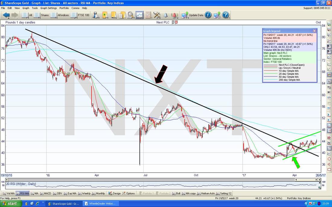
The end of May is traditionally a weak period so we still have about 1.5 weeks to go and of course we have the UK General Election and even God has no idea what The Trump will do next - so despite the let-off Bulls got last week, we are clearly still in a difficult period. Time is short because I have spent a lot of time in the Garden today and watching an outstanding MotoGP Race from Le Mans (a repeat usually appears on Channel 5 at 7pm on Monday and it is certainly a classic example of what makes Bike Racing so good - if you think you can predict the Winner at any time before the last corner of the last lap then you are deluded !!) - oh and then I got a Power Cut when my Kettle Element blew-up - so chuffed I have a reserve Appliance !! Anyway, the point is that I will get straight into the Charts and do a few Stock ones first. Next NXT I think I might have shown this one a couple of weeks ago so apologies if I am repeating myself but I know a lot of People are holding this Stock and things are looking pretty good here from a Chart viewpoint (and from a Fundamentals View there is a stonking huge Dividend here). I do not hold NXT myself but I do like the look of it - I already hold lots of Fashion Clothing Stocks and I can’t buy everything !! My Chart below has the Daily Candles for NXT going back about 3 years nearly. My Black Line with the Black Arrow marks a Downtrend Line which has dominated this Chart but note how back in April the Price started to walk out of this Downtrend and we now have an Uptrend forming as per my Green Lines and the Green Arrow (note, I have put in the Upper Green Line as a projection - this is not a Line that has a solid basis in Charting ‘Touch Points’.) In addition look how the Darker Blue Wavy Line which is the 50 Day Moving Average is heading towards the Lighter Blue Wavy Line which is the 200 Day Moving Average - if these cross over, then we will have a Bullish ‘Golden Cross’ and this tends to mean more Gains in coming Weeks/Months. As always, all the Charts shown here are from the outstanding ShareScope software. One day I might even show some SharePad screens !!
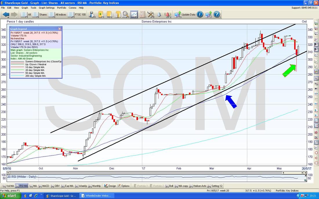
Somero Enterprises SOM
The Chart below has the Daily Candles for SOM going back about 7 Months or so. I have drawn in some reasonably well-fitting Uptrend Channel Lines in Black but the main thing to note is how the Price has really been finding good Support whenever it drops back to the Blue Wavy Line which is the 50 Day Moving Average (as pointed at by my Blue Arrow). At this point in time, the Price is still moving nicely within the Uptrend Channel. My Green Arrow is pointing to a pretty tasty ‘Hammer Candle’ kind of thing from Thursday 18th May which is a great example of an ‘Intraday Reversal’ / ‘Capitulation’ kind of thing. What has happened here is that the Bears have tried to drive the Price down during the day and many of them will be disgruntled and weak Holders who will have panicked and sold out. After selling pressure drove the Price down to 283p, Buyers have rushed in and driven the Price back up again - hence the ‘Reversal’. Just to make this look even better, on Friday we got a nice White Up Candle which shows that Bulls were ‘Confirming’ the Hammer and/or ‘Following Through’ on the Reversal of Thursday. I hold SOM.
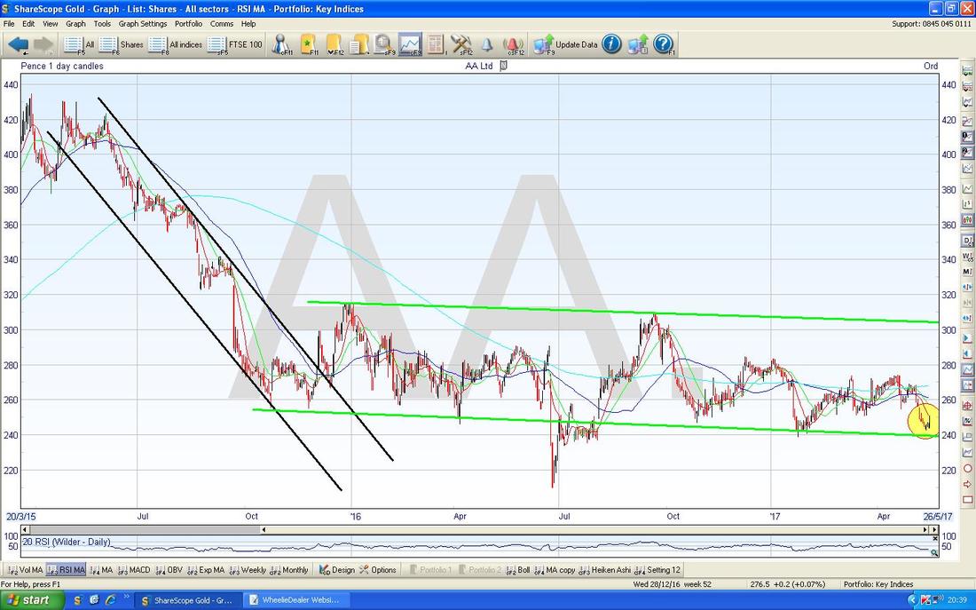
The AA (AA.)
I hold AA. and it has been quite frustrating - with a Dividend Yield of just under 4% it is worth holding for the Income and the key here is for the Management to branch out into other Products to exploit the AA Brand and to get the Debt down which puts off Investors (it shouldn’t - AA. has immense and reliable CashFlow). The Chart below has the Daily Candlesticks for AA. going back about 2 years or so. Note towards the Left of the Chart the Price was very much in a sharp Downtrend Channel as marked by my Parallel Black Lines and then since late 2016 the Price has mostly been in a Sideways Channel (Range) as delineated by my Green Parallel Lines (although note that Sideways Channel does have a bit of a Downwards tilt to it). My Yellow Circle is showing where the Price is now at the Bottom of the Range.
Enough of that, let’s do some Indexes……
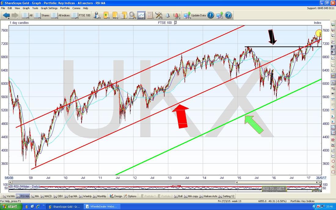
FTSE100 Funnily enough I started looking at this Index on quite a tight timeframe and it didn’t really scream at me what was going on - so as per Charting ‘Best Practice’ I decided to go back to the Long Term view and then to work forwards from there and figure out the situation. As always, Long Term Trends dominate over Shorter Term Moves. The Chart below is the latest incarnation of the Long Term Daily Candles view that I often show for the FTSE100 going back to the Lows of 2009. The most important thing here is the Uptrend Channel which has its Bottom Line as the Red Line marked by my Red Arrow and note how at the Current Price Level (as per my Small Yellow Circle) we are nicely inside this Uptrend Channel again. Note also the Black Horizontal Line at 7100 which is a Strong Support Line from where the Price broke-out of Long Term Resistance that went back for Donkey’s Years - remember, “Former Resistance becomes Support” as per the usual Charting adage. The Green Line at the bottom is a Parallel Line which I have drawn in as a Possible Support Line - this is not particularly useful at the moment but if we do get a panic Sell-off (perhaps in the Autumn?) then this Line might be important.
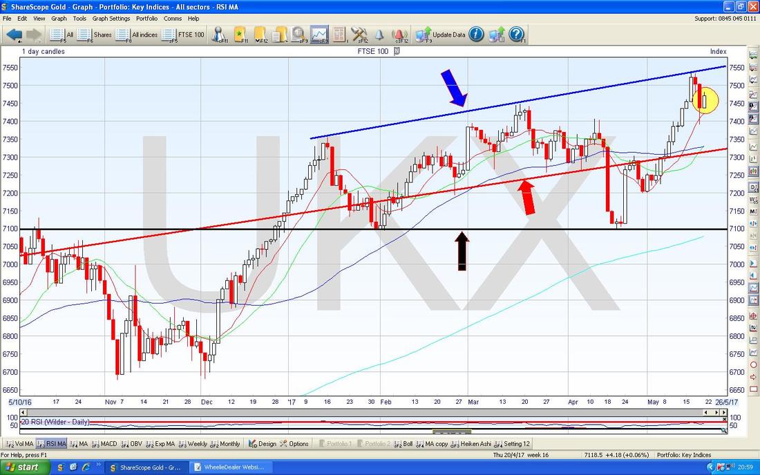
On the Chart below I have zoomed in on the Daily Candles to about the last 7 Months. The thing that stands out to me is how we seem to have an Uptrend Channel with the Long Term Red Line from the Previous Chart at the Bottom and the Blue Line (with the Blue Arrow) at the top which I have drawn in. If this Channel can hold in place for a while, then it means Support will kick in around that Red Line again.
My Yellow Circle is highlighting what could be a 2-Day ‘Bullish Harami’ Candlestick Pattern (you know, the Preggers Lady one) but it is worth bearing in mind that the ‘context’ is not great because for such a Harami to really be reliable I would want to see more of an extended Down Move beforehand really (perhaps 5 Days or something). However, note that on Thursday 18th May we had a bit of an Intraday Reversal like on the SOM Chart - this also suggests we might be able to move up from here. Note the Black Line with the Black Arrow at 7100 - this is important because if we do get any serious Sell-off, then it is highly likely that this will kick in as Support and if this Support was to fail, then that would be pretty darned serious.
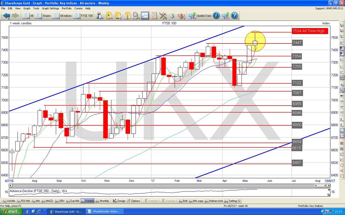
The Chart below has some cause for concern. This shows the Weekly Candlesticks for the FTSE100 going back a couple of years. My Yellow Circle is highlighting a ‘Spinning Top’ type Doji which we got for last Week and in the context of the run up, this suggests the power of the move is waning.
This kind of Doji is not necessarily a Reversal Signal in itself (something more like an ‘Inverted Hammer’ or ‘Shooting Star’ kind of Doji would be) but it tells us to beware because there could be a Trend Change soon.
DAX30 German
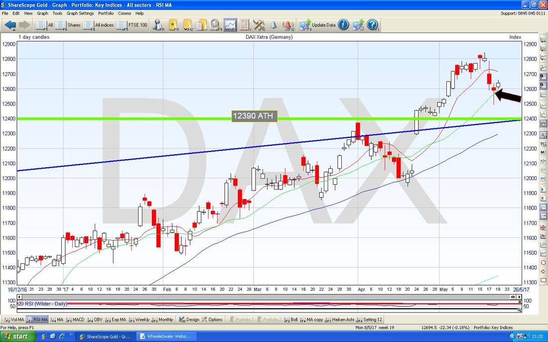
The Chart below has the Daily Candles for the DAX going back for most of 2017 so far. If you have been reading my Chart updates in recent Weeks you might have seen me mention that I thought there could be a good Trade to go Long if the Price broke above the Previous All Time High at 12390 (the Horizontal Green Line on the Chart) but in the event I missed the Trade because of a ‘Gap’ which put me off. Anyway, it looks like that Long Trade might be on again. Since the Breakout of 12390 the Price moved up for about 3 Weeks or so but after Peaking at 12841 on Tuesday 16th May, the Price then fell back and where my Black Arrow is pointing we seem to have a Hammer Reversal Candle from Thursday 18th May which didn’t quite make it back to 12390 but came fairly close to doing a ‘Confirmation’ of the previous Breakout and I expect this is good enough to go Long on. However, it is worth noting that on Friday we didn’t really get much of a move up after the Hammer on Thursday - this makes me a bit wary of going Long. I am not going to place a Trade tonight but I will see how things look on Monday Night and perhaps do a Small Long Spreadbet if things look bullish. The obvious place to put a Stoploss would be just below the bottom of the ‘Tail’ on the Hammer Candle at about 12485 ish.
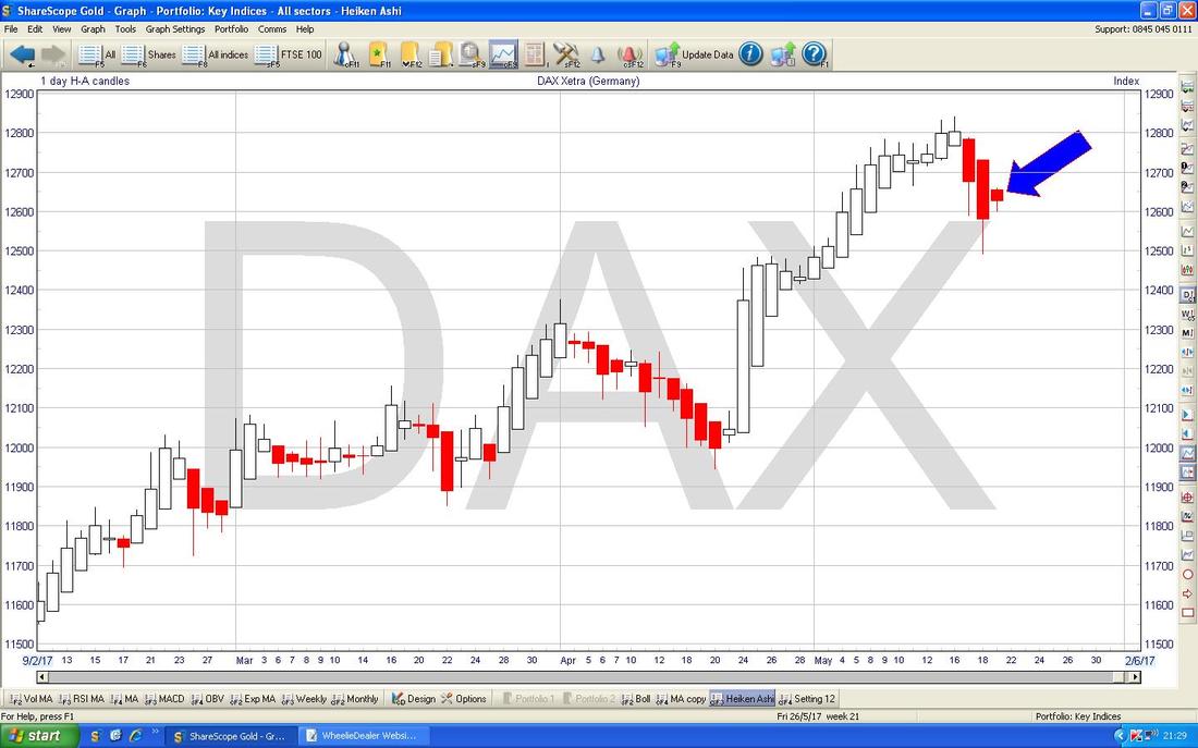
The Chart below has the Daily Heiken Ashi Candles for the DAX. My Blue Arrow is pointing at where the Red Down Candles have narrowed and this could be a precursor to the Candles changing colour to White and moving up. No need to jump the gun but I will be looking at this Tomorrow night.
Dow Jones Industrials Index (US)
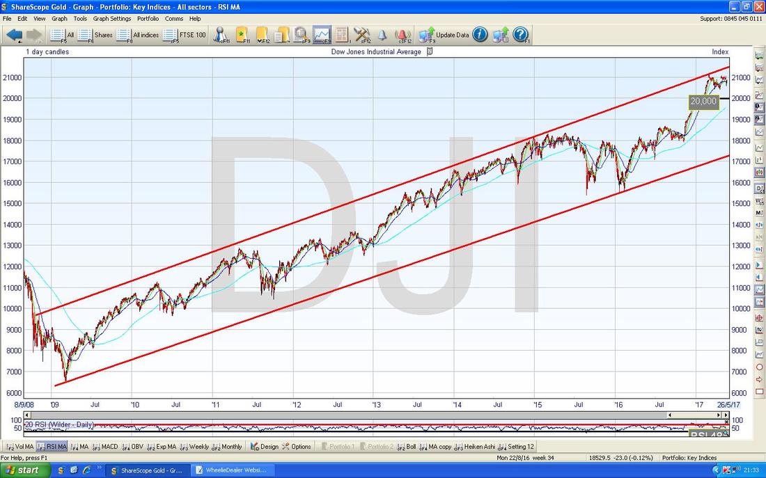
The Chart below is the Long Term jobbie for the DOW. At the moment we are nicely within this Uptrend Channel and near the Top of it.
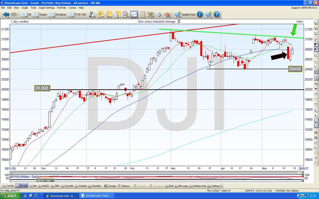
The Screen Below zooms in on the DOW to about the last 5 Months. First off note the 20000 Level which was an extremely important Psychological Resistance Line for some time and now after being Broken-above, it is an important Support Level.
Next look at my Green Downwards Sloping Line marked with my Green Arrow. This is a Resistance Line which needs to be got over if the Bulls are to really crack on with things. My Black Arrow is pointing to a Big Red Down Candle from Wednesday 17th May where the Bears put in a solid attempt to bring the Index down, but on Thursday and Friday the Market put in White Up Candles and it seems likely we will see more Gains this week. On the Downside note that 20400 is a good Support Level. The S&P500 looks quite similar to the DOW.
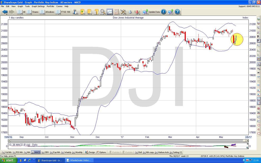
The Chart below has the Daily Candles for the DOW going back about 8 Months with the Blue Wavy Bollinger Bands above and below the Price Line. My Yellow Circle is trying to show how the Price fell back to the Bottom Bollinger Band and has now turned up from it - this is good textbook Price behaviour.
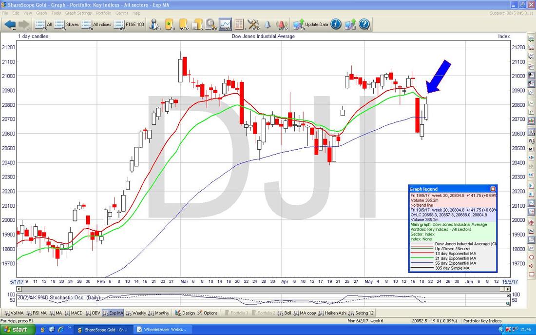
The Chart below is showing how the Red 13 Day Exponential Moving Average is trying to cross over the Green 21 Day EMA Line and do a Bearish ‘Death Cross’. It might just ‘skim-off’ and avoid this scenario and we should know this after Monday’s trading I would guess. A Death Cross would be bad news as it tends to mean some falls for a few weeks.
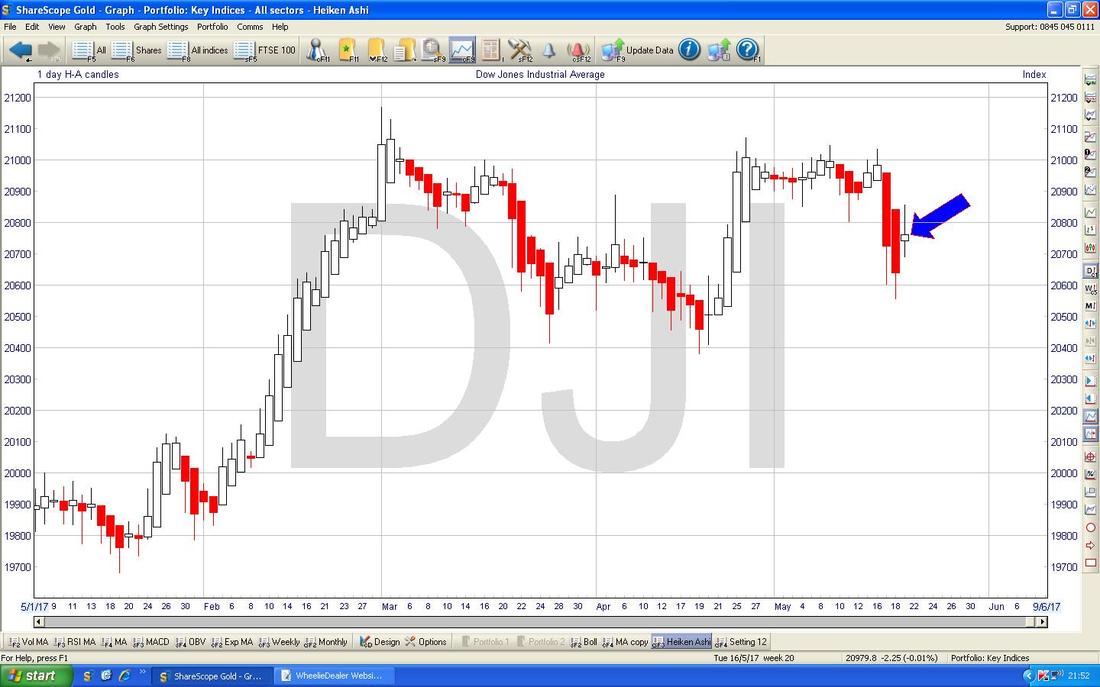
The Chart below has the Daily Heiken Ashi Candles going back for 2017 so far but the time period is less critical here as I have really chosen a Timescale which just means the Candles are nice and visible for Readers. Anyway, the point is that my Blue Arrow is pointing to a Change of Colour in the HA Candles from Red to White and perhaps this is marking the start of a move up now.
Euro vs. Dollar
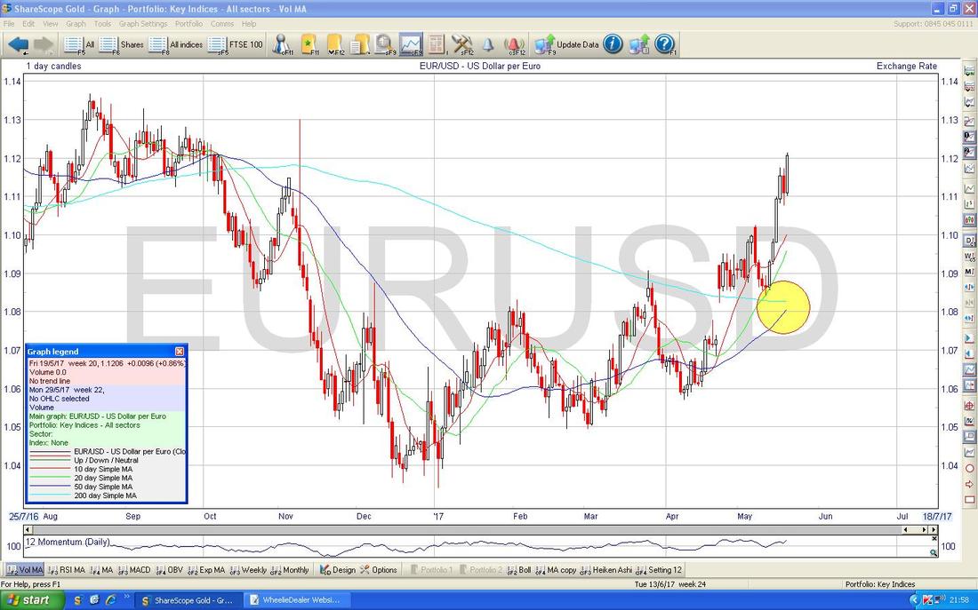
I don’t usually look at this one much but it is interesting because on the Chart below you should see where my Yellow Circle is that we are very near a Bullish ‘Golden Cross’ on the 50/200 Day Moving Averages which suggests we will see more Gains for the Euro and Weakness in the Dollar.
Pound vs. Dollar
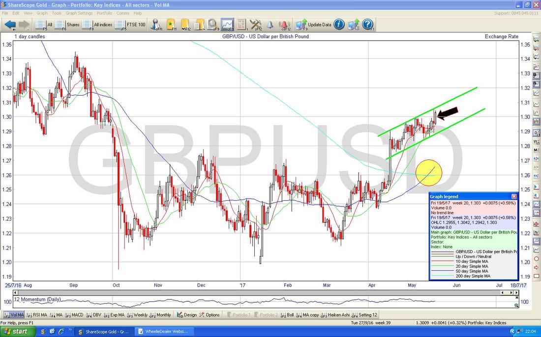
Usually I show a really ‘busy’ and messy Chart here but this Week I will keep it simple. The Chart below has the Daily Candles going back about 9 Months on the £/$ and the most important thing here is how we have the Bullish ’Golden Cross’ between the 50 and 200 Day Moving Averages as shown in my Yellow Circle. This suggests more gains for the Pound and Dollar Weakness in relative terms. My Black Arrow is pointing at a big White Up Candle from Friday and note how we are moving up within a tight Channel as shown by my Parallel Green Lines. Of course strength in the Pound might cause problems with the FTSE100 - although I do get the impression that this Inverse Relationship has been waning a bit recently with both the Pound and the FTSE100 having made good gains……
Brent Crude Oil (Spot)
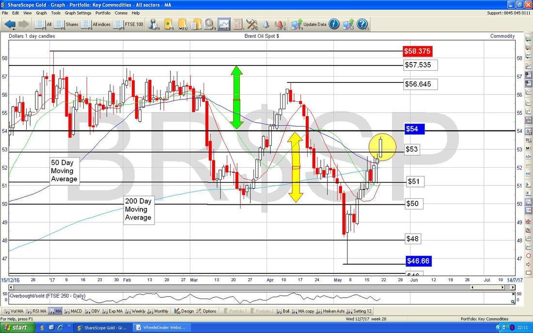
The Chart below has the Daily Candles for Brent going back about 5 months. I guess the key thing that hits me about this Chart (apart from the fairly wide swings we have had of late) is how really all the Price Action is taking place around the 200 Day Moving Average Line which is at about $52. My Yellow Circle is highlighting a Big White Up Candle from Friday which looks pretty Bullish but there is clearly a lot of Resistance up above around $54 and up to $57 or so.
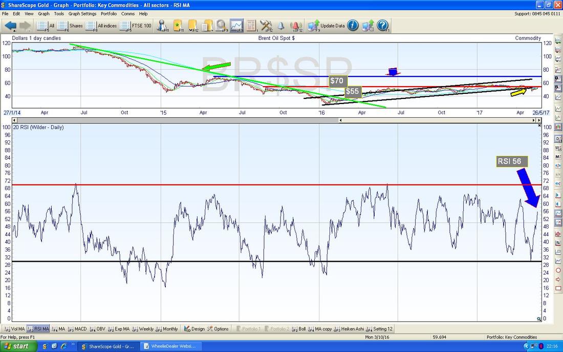
In the bottom window on the Chart below we have the Relative Strength Index (RSI) for Brent Oil (Spot) Daily. On a reading of RSI 56 and moving up this can go a lot higher and suggests we might see more Gains here. If Oil can rise, then that might be supportive of the FTSE100.
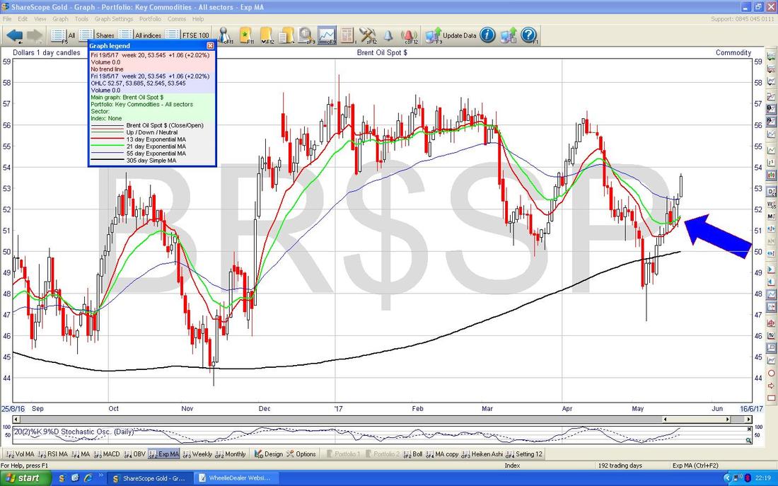
The Chart below has the Daily Candles for Brent but the key thing I want to show here is where my Blue Arrow is which is pointing how we are very close to a 13/21 Day EMA ‘Golden Cross’ - if we get the Cross, then this suggests more gains in coming weeks.
Gold (Spot)
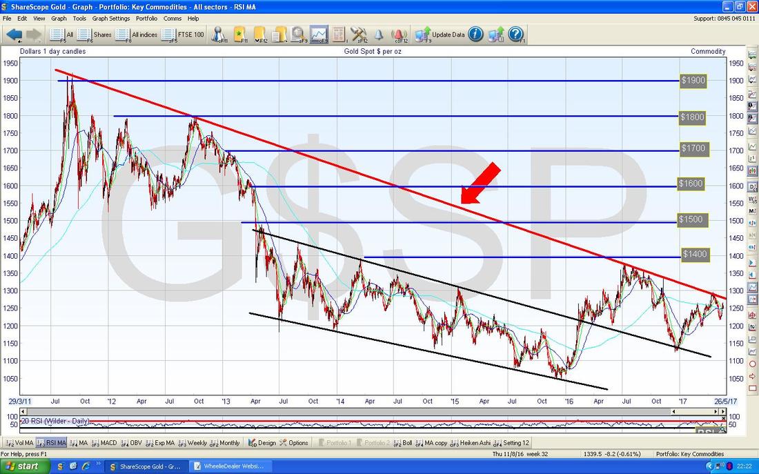
First off the Long Term Chart with the infamous Red Downtrend Resistance Line which is marked by my Red Arrow and we need to break-out of this Line if the Gold Bugs are really going to make proper headway.
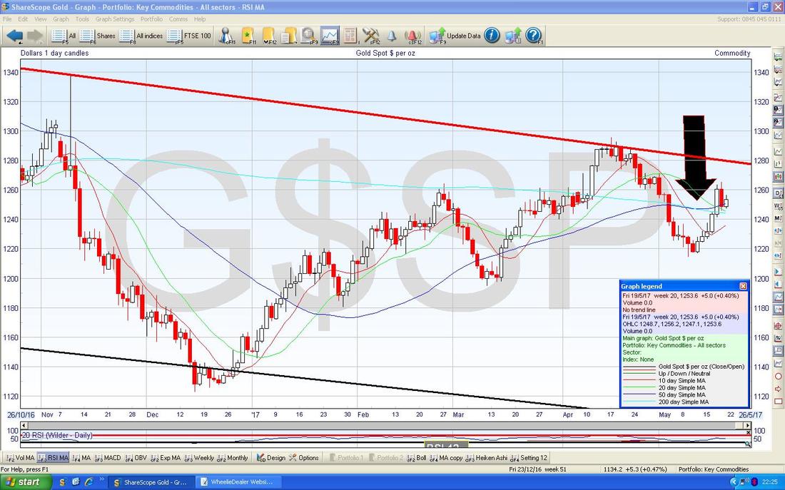
There has been an important development on Gold Spot though. My Chart below has a Big Black Arrow which is pointing to where we have just been treated to a 50/200 Day Moving Average Bullish ‘Golden Cross’ - it hardly smashed through with oomph but the fact is we got the Golden Cross and this suggests we will see more Gains in coming Weeks/Months - perhaps we will get the Breakout of the Downtrend Line soon !!
Right, that’s it for this Weekend - I hope everyone has a prosperous Week ahead and try to get some time away from your Screens/Desks and get out in the Sunshine !! Cheers, WD.
0 Comments
Leave a Reply. |
'Educational' WheelieBlogsWelcome to my Educational Blog Page - I have another 'Stocks & Markets' Blog Page which you can access via a Button on the top of the Homepage. Archives
May 2024
Categories
All
Please see the Full Range of Book Ideas in Wheelie's Bookshop.
|

