

|
educational blogs |
|
Yet again Major Indexes have been making new highs - it seems like they are unstoppable but of course that is never the case and at some point we will get a Correction. As ever, my task with these Chart Blogs is to try and get a sense of where we are and how close a Correction is - I suspect before getting into the Charts that there is little sign of significant bearishness. The Bulls are Running………
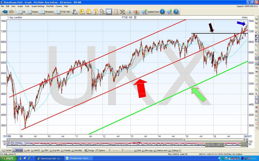
FTSE100 As usual, I will kick off with the ‘Big Picture’ and here is the Long Term Chart from the 2009 Low Point. As you should be able to see, the current Price (where my Blue Arrow is) is pretty much at an All Time High again and obviously this in itself is very bullish behaviour. In addition, we are nicely back inside the Uptrend Channel defined by my Red Parallel Lines (pointed at with the huge Red Arrow) and this is really helpful for Bulls because it also means we have good Support Areas established not far below which I will probably look at closer on the next Chart where we will drill in a bit. As ever, all Charts are from ShareScope which I cannot praise enough.
Note also we are nicely above the Horizontal Black Support Line marked by my Black Arrow around 7130. This has a couple of ‘touch points’ and is a great example of “former Resistance becomes Support” and as such should be a big help if we do get some kind of Pullback.
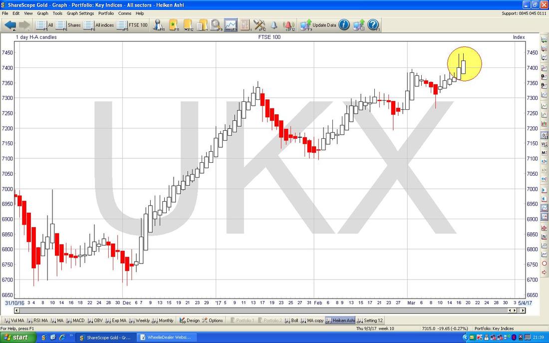
In the Chart below I have zoomed in on the FTSE100 Daily Candlesticks to roughly the last 6 months ish. The first thing to note is my Yellow Circle which captures a sort of ‘Shooting Star’ or ‘Inverted Hammer’ type Doji Candle from Friday 17th March - this hints at a drop in the very Short Term but this would be no surprise as it often seems to be the case that Monday does the reverse of whatever Friday did !!
Now look at my Text Box with ‘7263’ in it - this is the Intraday Low point from a Hammer Candle which was produced on Thursday 9th March (if you follow the 7263 line back to the left then it should be obvious which Candle I am referring to [I hope so anyway !!]). Back on that Thursday, the Bears had the upper hand for a while and dragged the FTSE100 Price down to 7263 but at that point the Bulls decided enough was enough and they charged in and took control and the Market has risen ever since. This is really important now because it means that 7263 is a very strong Support level and if the Bears do drag us back there, it will be quite difficult for them to take it any lower. This Support is also bolstered by the 50 Day Moving Average Line which is the Blue Wavy Line pointed at with my Blue Arrow. Currently this is very near that 7263 Level and adds to the strength of Support. Next along we have the Red Line marked by my Red Arrow which is the oft mentioned Bottom Line of the Long Term Uptrend Channel that I pointed out in the previous Big Picture Chart. This is really strong Support and it kicks in at around 7250 - so again we are adding to this picture of overall there being a lot of Support not far down from where we are now. Next up we have a lot of Horizontal Support around the 7200 level and then just below at 7130 we have the Black Line marked with my Black Arrow which is the Support Level I mentioned in the Big Picture Chart. The point I am hoping to get across is that even though we are rightly all concerned about some sort of significant Correction (the Technical Definition of a ‘Correction‘ is a drop of 10% I believe), the simple reality is that there is really strong Support not far down and it will be very very difficult for the Bears to drag us down there - so my overall thesis here is that I am still right to be 100% long of Stocks. In fact, I would only get a bit worried if Support at 7100 and then 7000 was to fail. I doubt this will happen. Note also there is another Support area down near the 200 Day Moving Average at around 6900 - I haven’t specifically marked this one but it is the Faint Blue Wavy Line at the very bottom of the Screen. 
The Chart below has the Daily Heiken Ashi Candlesticks - remember, these things are very different to ‘normal’ Candles and my Yellow Circle is highlighting how the Candles from recent Days are still big and white and Bullish.
DAX 30 (German)
The Chart below has the Big Picture for the DAX going back to the 2009 Lows. This one is particularly interesting because of course the DAX is probably the most important Index in Europe and because Germany is by far the dominant Power in the EU Trading Block. For Global Indexes to be universally Bullish, it is vital that we have the DAX in a Bullish frame of mind as well as the FTSE100 and the critical US Indexes. Again I have drawn in Parallel Red Lines to show an Uptrend Channel which has been in place since the Credit Crunch Lows and my Yellow Half Circle points to where the Price is now - so we are nicely in the Uptrend. However, it was very easy for me to draw the Bottom Red Line of the Uptrend Channel and it has a lot of ‘touch points’ but the Upper Red Line that I have drawn is merely a Parallel Line and it has few touch points - so this might not be particularly valid. Due to this obvious limitation, I have drawn in another Parallel Line which has loads of touch points and this is my Blue Line marked with the Blue Arrow - this suggests to me that perhaps we are near the Top of this Channel and there might be Resistance soon. 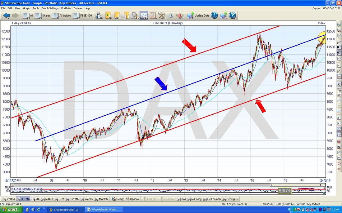
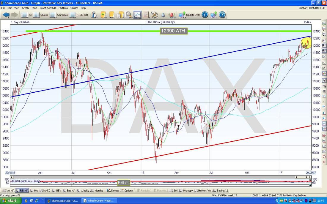
I could have made this point on the previous Chart but for some crazy illogical reason I have decided to do a new Chart. In this one I have zoomed in on the DAX to just the last couple of years really and the key thing here is the crazily thick Green Horizontal Line at the Top of the Chart with the numbers ‘12390’ and letters ‘ATH’ on it. This is hugely significant - with the DAX currently at 12095 we are really near this All Time High and if the Price ‘Breaks-out’ above this level then that should mean more gains to come quickly - a Breakout at this level could well be worth going Long on. With the current mood of the Market we could see this gap to the ATH being closed very fast - maybe within a couple of weeks we could be there.
Dow Jones Industrials Index
This is perhaps the most widely watched Index in the World but it only has 30 MegaCap Stocks so it is not particularly representative - although when it goes up the S&P500 and Nasdaq tend to do similar moves. Note, the S&P500 is extremely close to the DOW in terms of how it looks from a Charting viewpoint at the moment. Looking at the Big Picture first (this is always ‘Best Practice’ when it comes to Technical Analysis / Charting stuff), as with the other Indexes, I have gone back to the 2009 Credit Scrunch Lows and drawn in 2 Parallel Red Lines which denote a very well defined Uptrend Channel. My Yellow Circle shows roughly where we are now and it is obvious we are near the Top Line of the Uptrend Channel - this suggests we might get a drop soon or at least go Sideways. Note, any such kind of Price Movement would still be well within the confines of the Uptrend Channel and even though it might cause some Short Term angst and stress, the Bigger Picture can stay intact as long as Support around 17000 holds - and that is a long way below where we are now at 20914. 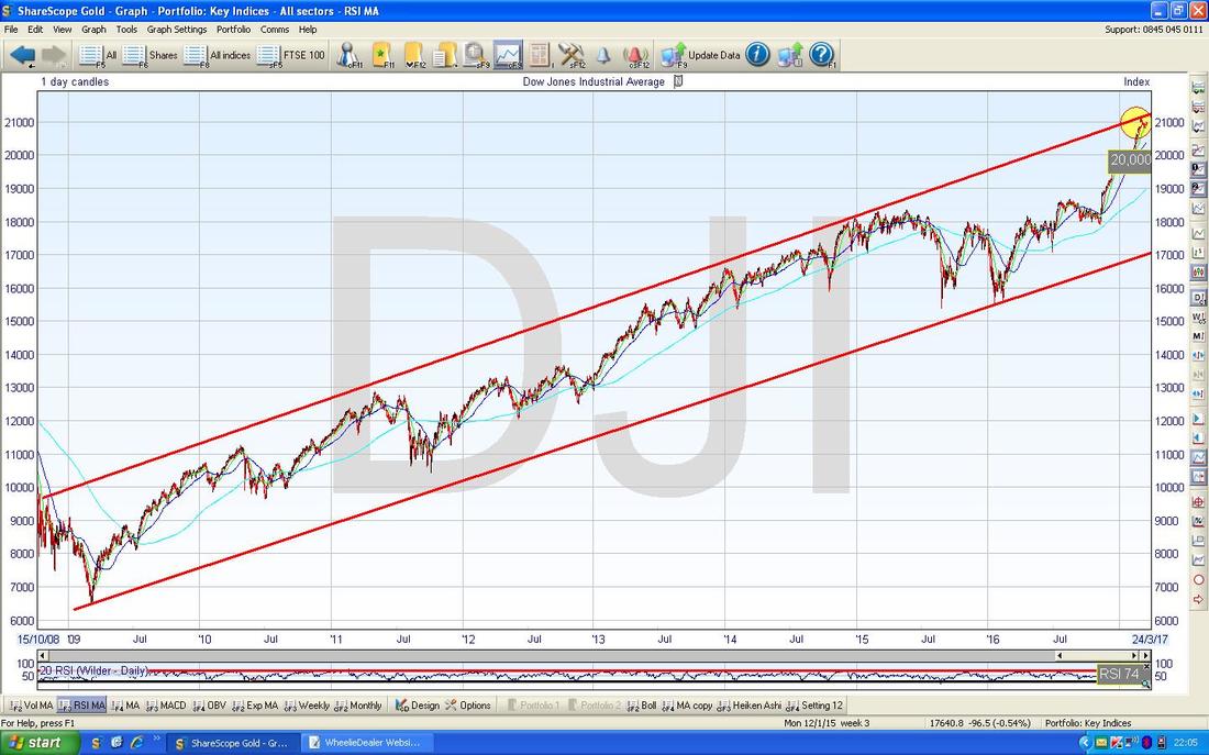
The Chart below has the Weekly Candles for the DOW and there are some significant things going on here. First off my Green Arrow is pointing to a bit of an ‘Inverted Hammer’ which was produced 3 Weeks ago and this has a ‘Tail’ or ‘Wick’ which goes up to the New All Time High at 21169 - as ever, a Breakout above this ATH would be ultra bullish.
Last week we got a classic ‘Spinning Top’ Doji (that’s probably not the correct Name but that’s what I call them - basically a Small Candle with a Narrow Body bit) - this suggests that after the strong move up and the Inverted Hammer from 3 weeks ago, the Market is now going Sideways with neither the Bulls nor the Bears really in command. My best guess at this point would be that we do some Sideways Consolidation before another move up - but of course we could drop and if we do then the first sign will be if Support at about 20800 fails - however, as with the other Charts we have looked at, there is a lot of good Support not far down below - so I doubt we will get a huge Drop. My Blue Arrow is pointing to the Dark Blue Wavy Line which is the 50 Day Moving Average - this is very likely to kick in as Support if we see a drop down to around 20400. If this level fails, then there is very strong Support at 20000 which was a Key Psychological Level which we cracked some weeks back and will revert from being “previous Resistance to becoming Support”. 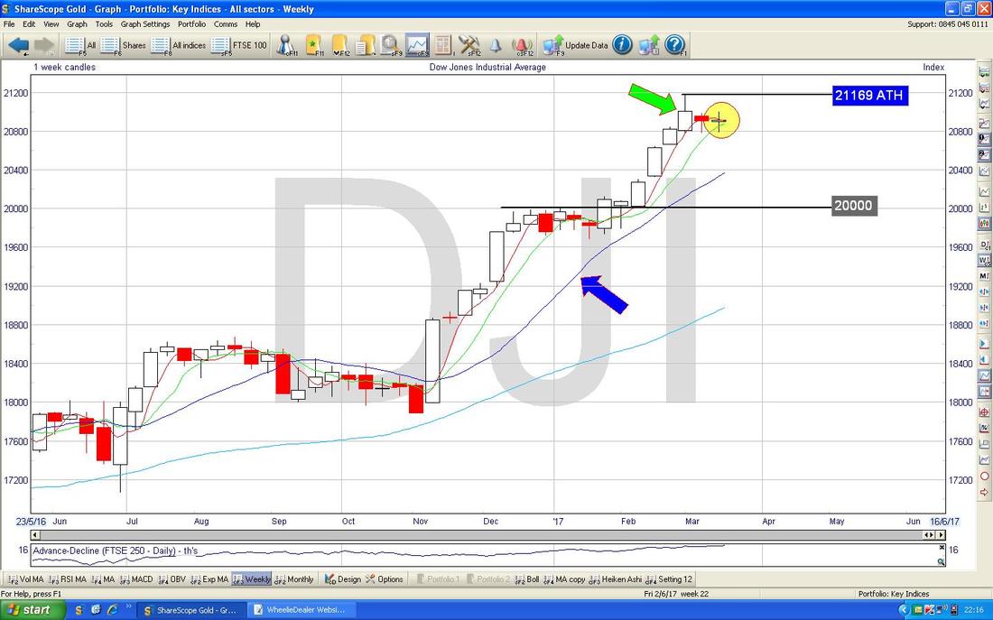
Pound vs. US Dollar
This is such an important Market to track these days because it has such a profound bearing on how the FTSE100 moves, with a weakening Pound tending to mean a rising FTSE100 - although this correlation does not always hold true and it is my sense that the worst of the Pound falls are over now. Apologies for the messy Chart but I just want to remind Readers of the Big Picture here. The key thing to note is that we seem to have 2 Big Ranges here - currently the Price is wiggling around inside a Range between 1.1947 at the Bottom and 1.28 at the Top (the Green Lines and the Blue Text Boxes are what you need to be looking at !!); and then a Higher Range between 1.28 at the Bottom and 1.35 at the Top - we need to see the Pound back in that Higher Range to really get the sense that the Weakness is ending - this could be a long wait. 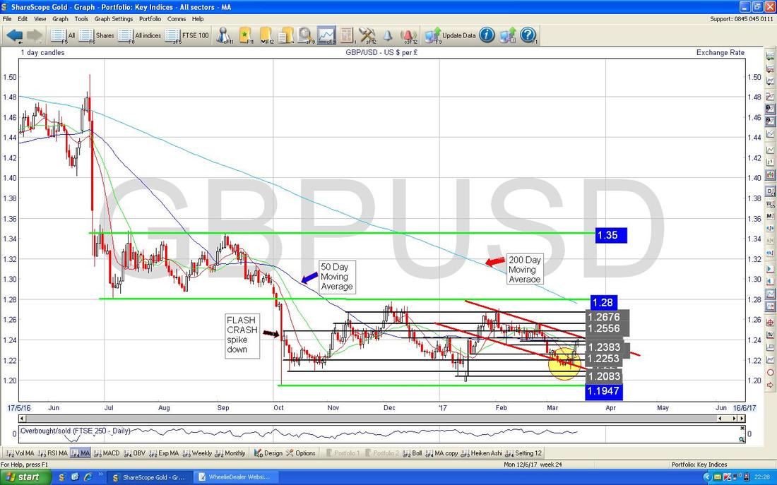
In the Chart below I have zoomed in to around the last 6 months on the Daily Candles and you should be able to see the Bottom and Top Green Lines of the Range from 1.1947 to 1.28. My Yellow Circle was actually on the Chart which I showed last week and I suspect my comments last week were suggesting that a Bounce was due - I haven’t checked and I am probably giving myself way too much credit !!
Anyway, the Price has since jumped up with 3 Big White Candles as the Dollar has weakened after The Fed raised Interest Rates (this might seem paradoxical to many Readers - you would think the Dollar would strengthen on a Rate Rise in the US - however, this is a classic example of the old saying “it is better to travel than to arrive” and in fact the Market had priced in the Dollar strength in advance of the Fed Rate Hike and once that was confirmed, the Dollar sold off and the Pound therefore strengthened. It is worth remembering that Forex Rates are a 2-way street - many people say that Brexit will mean a Weaker Pound but you cannot just view it just from this perspective - you also need to consider the Dollar side of the ‘Cross’ - although it seems likely to me that the Dollar will tend towards Strength anyway as the US Economy accelerates and Rate Rises continue with steady increases over 2017 and into 2018 most likely.) The Pound has moved up a lot in the last 3 Days but my Big Pinky Circle highlights a strong area of Resistance from about 1.24 to 1.26 where the Pound will find further moves up difficult. It seems likely to me that we get into a Tighter Range between maybe 1.21 at the bottom and 1.27 at the top. But I am pretty sure we will not go below the Lows at 1.1947. 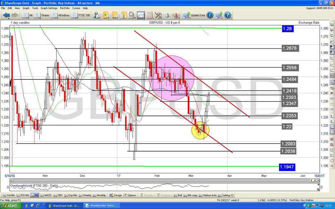
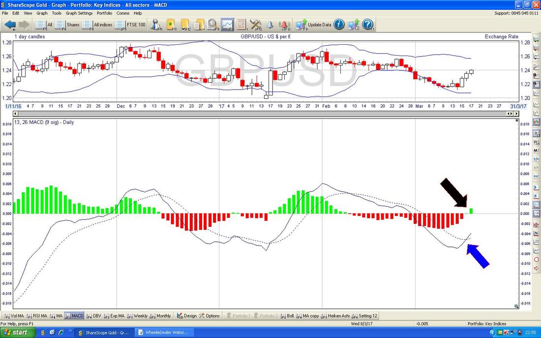
In the bottom window on the Chart below we have the MACD (Moving Average Convergence Divergence) for the Quid vs. the Buck - my Blue Arrow marks in the ‘Signal Lines’ format a Bullish MACD Cross and my Black Arrow shows the same thing in the ‘Histogram’ form.
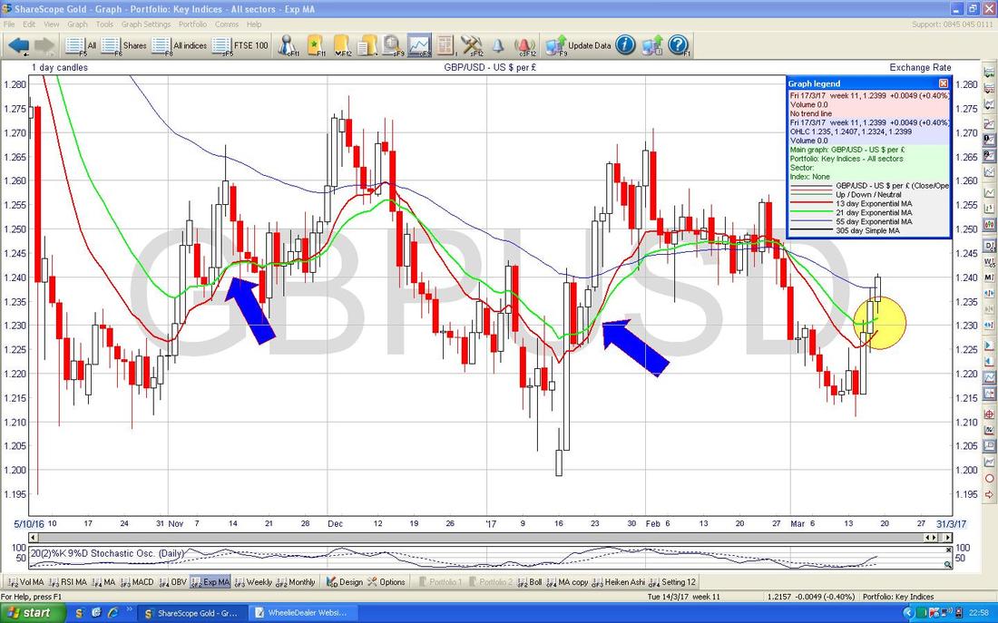
The Chart below has the Daily Candles going back around 6 Months but the thing I am interested in here is the crossing of the Red Wavy Line 13 Day Exponential Moving Average and the ‘slower’ Green Wavy Line 21 Day EMA. If you look at the Blue Arrows you can see 2 recent cases where we got Bullish ‘Golden Crosses’ of the 13/21 Day EMAs and my Yellow Circle highlights where we might be seeing this about to take place again - this hints at further gains in the Pound if we get the Cross.
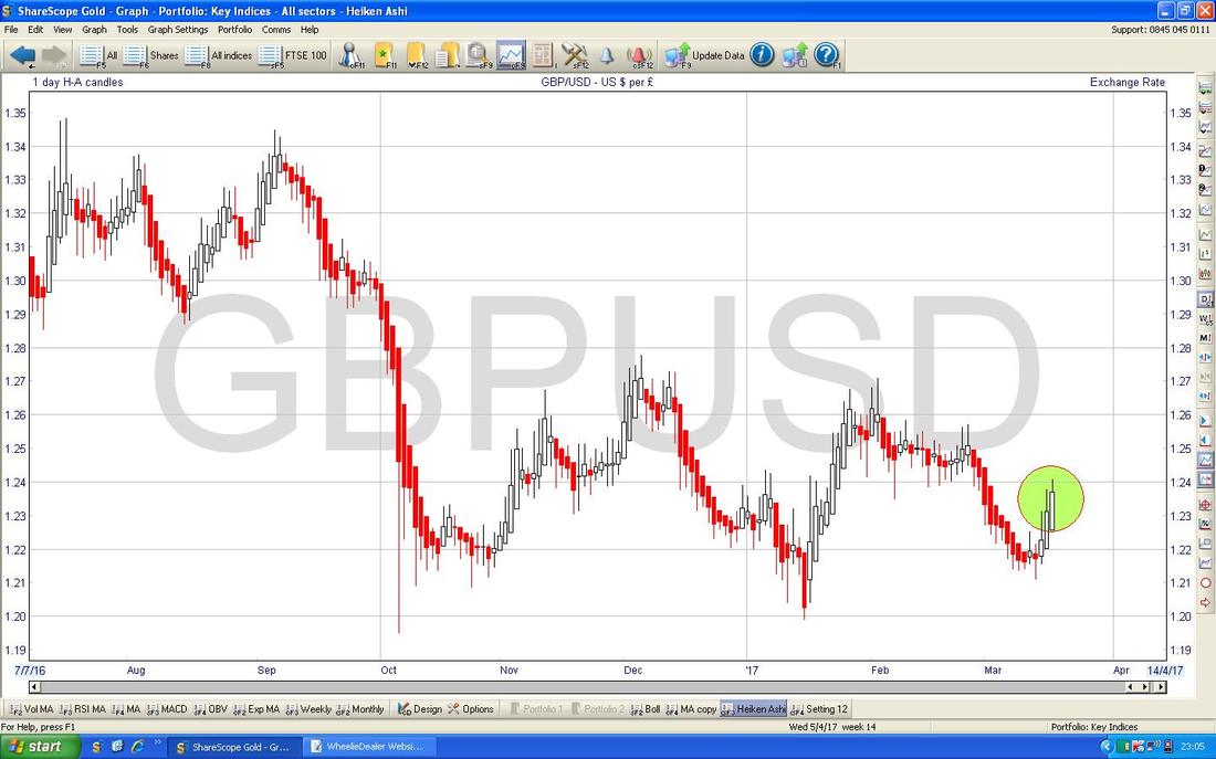
The Chart below has the Heiken Ashi Candles for the Daily £/$. My Green Circle is highlighting some Bullish looking White Up Candles. This suggests more gains in the Pound which could of course drag on the FTSE100.
Brent Crude Oil (Spot)
The Screen below has the Daily Candles for Brent Oil (Spot) for about the last 5 months. The key thing here is that we have fallen out of the Sideways Range which was running between about $54 and $57.535 as marked by my Green Arrows - this surprised me and was quite a negative development. My Yellow Arrow is pointing to a Hammer Candle from Tuesday 14th March where the Price dipped down to pretty much $50 Intraday and then the Price moved up a bit and on Thursday 16th March we got an Inverted Hammer which I have marked with my Blue Arrow. This suggests to me a very tight Range at the moment between $50 at the Bottom and about $53 at the Top. Note the 200 Day Moving Average Line (very faint and blue) around $50 and this should act as good Support. $50 is a key Psychological number as well. 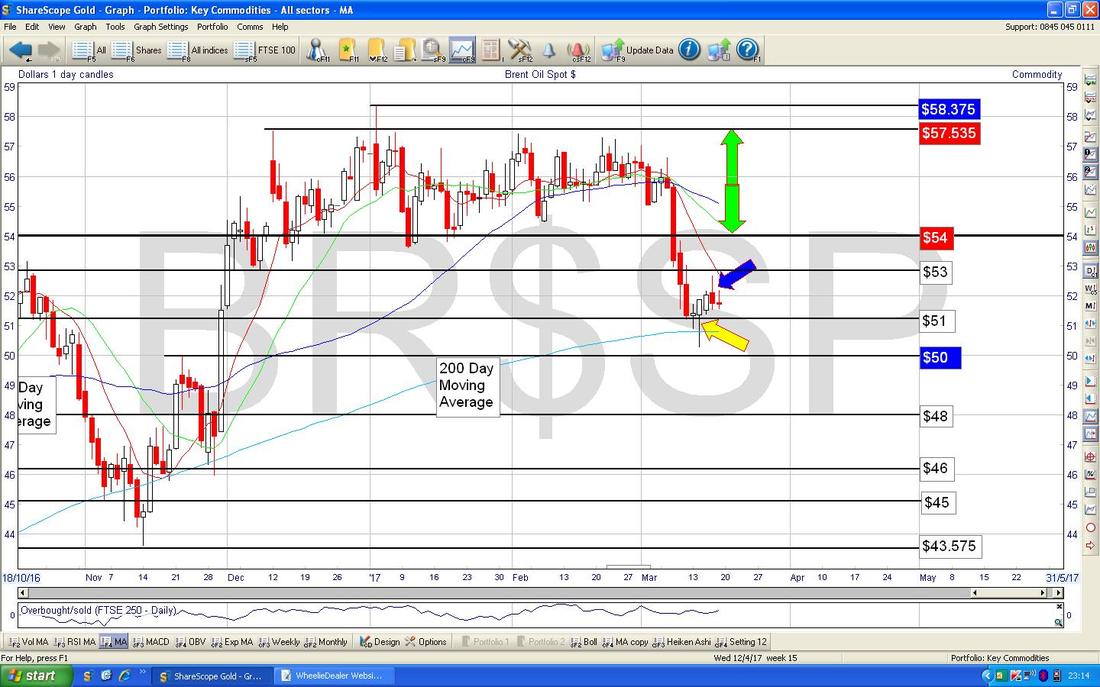
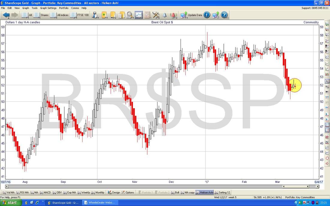
The Chart below has the Daily Heiken Ashi Candles for Brent Oil (Spot). My Yellow Circle is highlighting how the Candles in recent days have turned colour from Red to White and have gone narrow - this hints that a move up could be starting although I suspect we will be Range-bound as I mentioned above.
Gold (Spot)
It’s been a while since I looked at the Big Picture on Gold so here it is. This Chart goes back to 2006 and you should be able to see a clear Uptrend Channel marked with my Parallel Red Lines until about late 2012 and since that we have been in a Downtrend Channel which I have marked with my Parallel Green Lines. 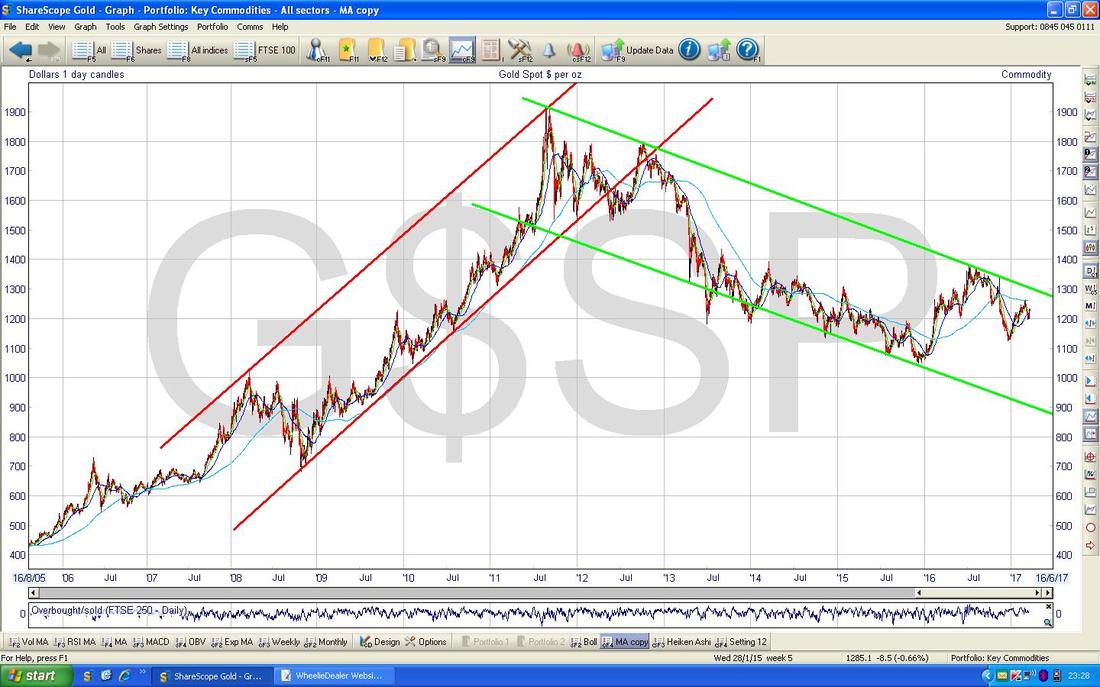
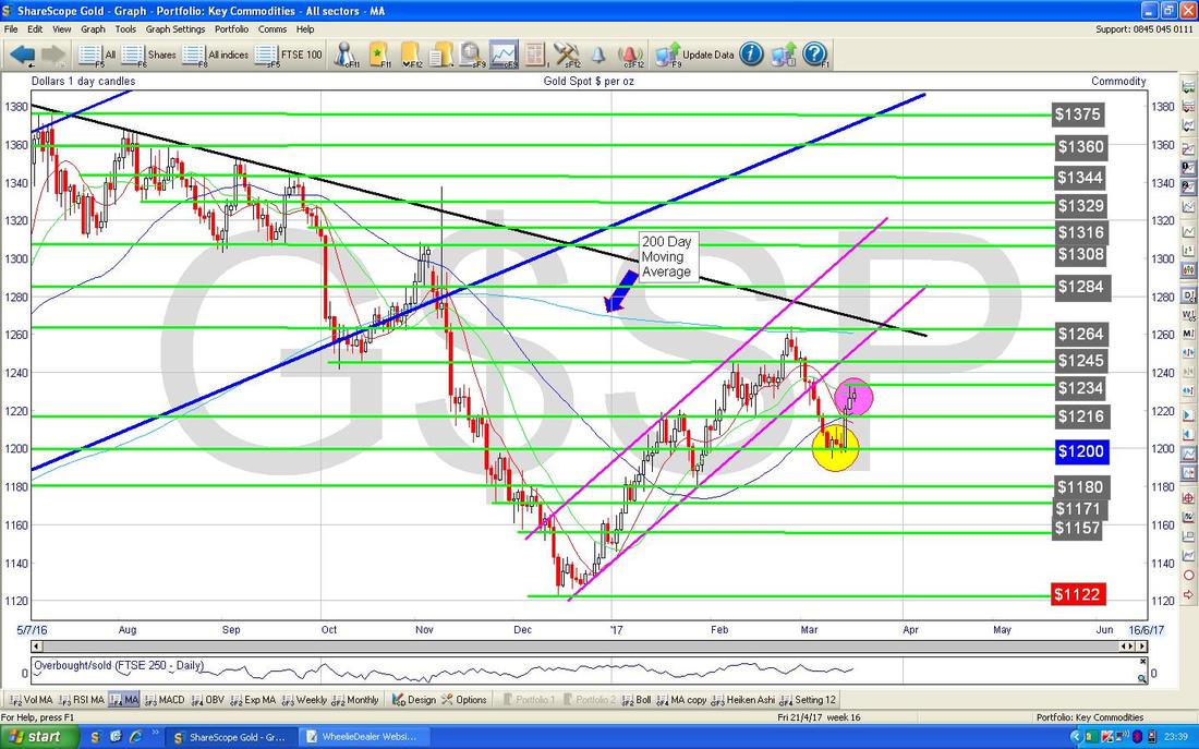
The Chart below zooms in on the Daily Candles for Gold (Spot) - my Pink sort of Circle is highlighting where the Candles suggest some Resistance at about $1234 and down below where the Yellow Circle is we have Support around $1200 - funnily enough this mirrors Brent Crude Oil and the £/$ and it alls points to Dollar Weakness after the Rate Rise by the Fed being the driver here.
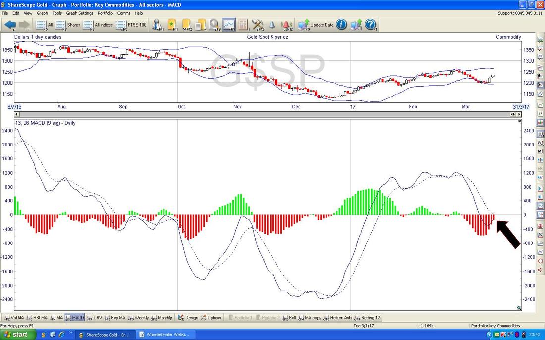
In the bottom window on the Screen below we have the MACD for Gold (Spot) Daily - note where my Black Arrow is that we are quite near a Bullish MACD Cross - there are no guarantees this will happen, but it is something to watch for in coming days.
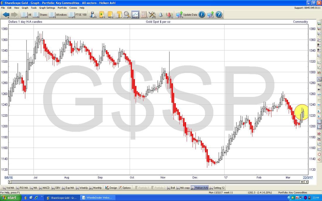
The Chart below has the Heiken Ashi Candles for Gold (Spot) - my Yellow Circle highlights some Bullish looking White Up Candles - this suggests more gains to come in the Short Term.
Utilitywise UTW
I wanted to chuck in a couple of Stock charts and by sheer fluke I had ShareScope open on this one and there are some interesting things going on which are worth being aware of. UTW is a huge position for me (and for many Readers I know) and I am expecting sweet things here but of course it is regularly criticised for questionable Accounting Policies although it has made recent steps towards improving this situation - the main thing outstanding now is a habit of recognising Revenue before it has actually happened which is quite undesirable to say the least !! The Chart below has the Daily Candles for UTW going back about 4 months and a Downtrend Channel marked by the Parallel Green Lines should be discernible. My Black Arrow is pointing to a small ‘Doji’ Candle from Friday which is right at the top of the Downtrend Channel and we are at the point where a Breakout is now required. If it can breakout of the Downtrend Channel, then this would be a Bullish development. 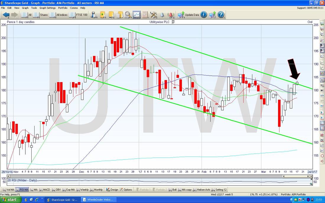
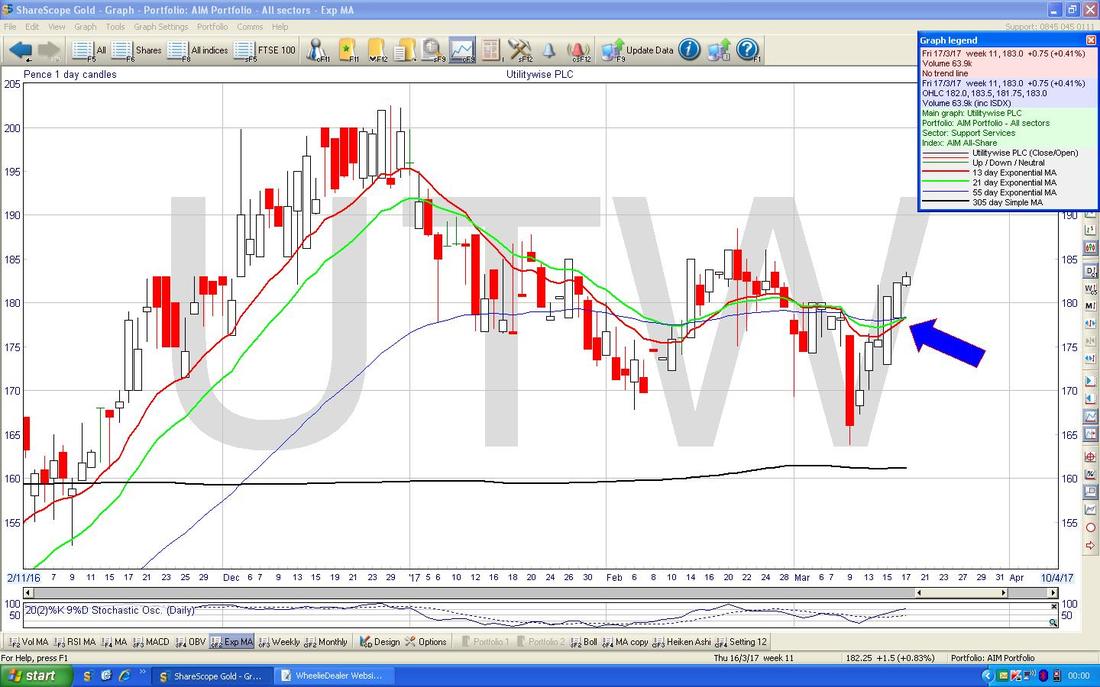
The Screen below has the Daily Candles with the Red 13 Day EMA Line and the Green 21 Day EMA Line. Note how we are very near a Bullish 13/21 Day EMA ‘Golden Cross’.
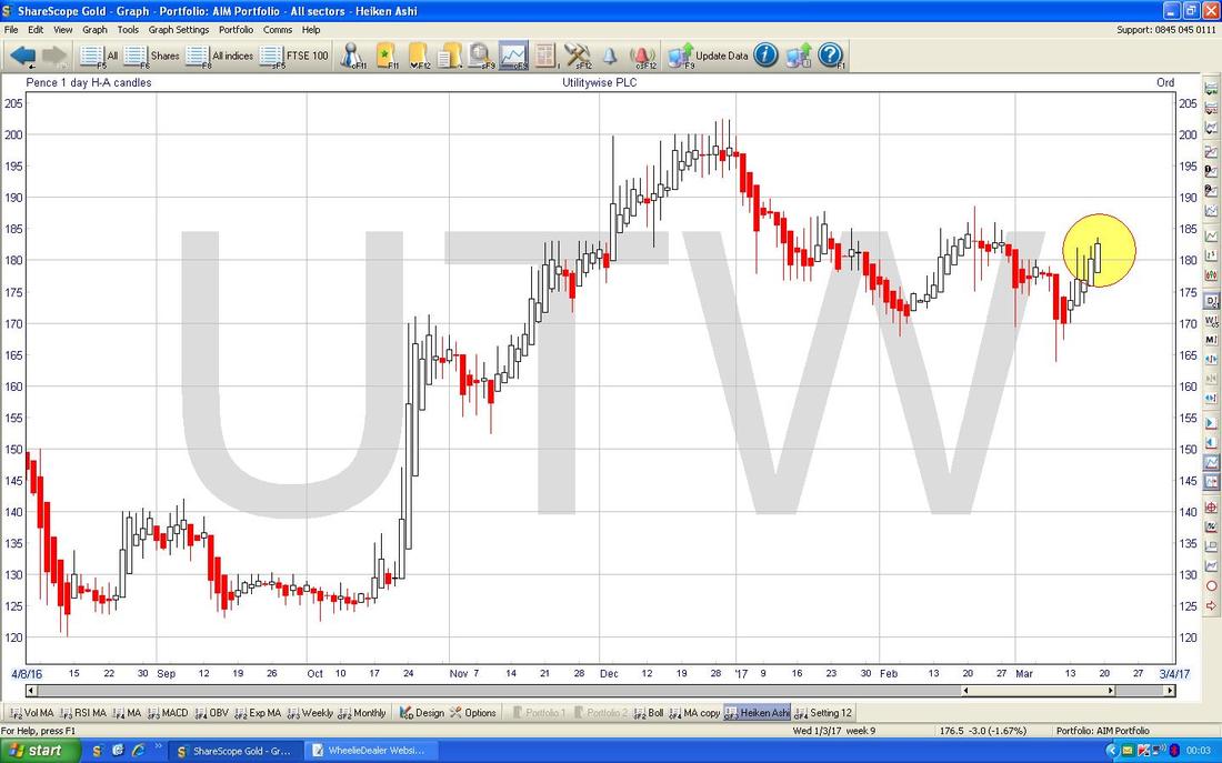
The Chart below has the Daily Heiken Ashi Candles for UTW - my Yellow Circle highlights Big Bullish White Up Candles. Note, UTW is a very choppy and volatile Stock and this often makes the Chart hard to ‘read’ - I find that HA Candles really help cut out the ‘Noise’ this choppiness creates on the other Charts and gives a much clearer and more useable picture. This is worth remembering whenever you are looking at the Chart of something Choppy and Illiquid - switch to the HA Candles and it might make more sense.
Somero Enterprises SOM
Readers who were awake last week might have spotted that I bought a bit of SOM at 282p for some Shares and 284p on a Spreadbet. I might do more on SOM Blog-wise in coming Days but for now here is a Chart. This goes back about 7 Months and has the Daily Candles. Note the Uptrend Channel here that I have marked with the Green Lines but it is slightly concerning that rather than being a nice ‘clean’ Parallel Lines Uptrend Channel, it is more of a ‘Wedgey’ shape which could cause trouble - although I suspect this is more because SOM is choppy and doesn’t fit Charts well than because there is trouble ahead (I say this because the Trading Update a few days ago was excellent). Note how this Chart tends to move up in ‘Steps’ - this is a common sight on Charts of Smaller Stocks and I remember Robbie Burns (the Trader with no Clothes) going on about this in his Books. As an example, my Black Arrows are pointing to a period of Sideways Consolidation before the Stock broke-out and jumped up just recently on the Results - this is classic ‘Step’ behaviour. OK, I am well behind tonight. It is 12.15am on Monday Morning so I better proof-read this and get it loaded up to the Website. Best Regards for the coming week, WD. 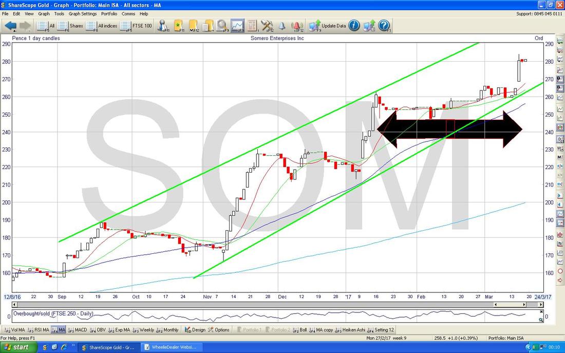
1 Comment
25/3/2017 07:51:02 am
Global forex trading is a huge and incredibly liquid market that unveils an opportunity for those individuals who are looking to exchange currencies around the world. Leave a Reply. |
'Educational' WheelieBlogsWelcome to my Educational Blog Page - I have another 'Stocks & Markets' Blog Page which you can access via a Button on the top of the Homepage. Archives
May 2024
Categories
All
Please see the Full Range of Book Ideas in Wheelie's Bookshop.
|
