

|
educational blogs |
|
I am in theory out all day tomorrow attempting to roll around ‘The Long Walk’ in Windsor, weather permitting, and it is MotoGP from Texas in the evening so I won’t have time to look at the Charts, so they are going up on a Saturday Night for a change.
According to the UK Stockmarket Almanac 2016, this coming week, commencing Monday 11th April 2016, is on average Up for 47% of years with an average Gain of 0.1% - so it is usually a pretty flat sort of week. However, April is historically the 2nd Strongest Month of the year before we head into Summer, so it is still quite likely that Stocks can keep rising. However, this year of course we have the Brexit Vote coming up on June 23rd, so this might cause the “Sell in May and go away…….” heuristic to kick in a bit earlier than usual.
One thing I saw in the Charts was that Oil looks pretty bullish - this may drive the FTSE100 up, but if anything, the US looks a bit weak, especially on the Weekly Candles. Europe looks pants as does Japan.
Loads of Charts this week because I have shoved in a look at some of the Global Indexes at a high level, so we better crack on. FTSE100 First off, a reminder of the ‘Bigger Picture’ - this ScreenScrape from the superb ShareScope software shows the FTSE100 going back about 6 years or so - note the Uptrend marked with the Black Bottom Line (pointed at with my Black Arrow) and the Red Parallel Line at the top. My Blue Circle encapsulates (wow, big word Wheelie !!) all of the Price Action since the Index fell out of the Uptrend - obviously we need the Price to get back up above the Black Bottom Line, if this happens, it would most likely cross over somewhere near my Green Arrow - this is around 6800 ish. I think this is a big ask in 2016. 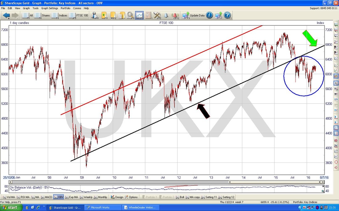
My Chart below zooms in to about the last year sort of. Note we are nicely above my Red Downtrend Line (marked with the Red Arrow) but that the 200 Day Moving Average is still falling - marked with my Black Arrow.
My Pinky Arrow points to the 50 Day Moving Average which is curling up and not all that far away from crossing the 200 Day MA from underneath and giving us a very welcome (for Bulls) ‘Golden Cross’. Note the Price is currently just underneath the 200 Day Moving Average which could be acting as Resistance - once over this, that would be a pretty positive development. The catch here is that even if we can get over the 200 Day MA - there is a lot of Horizontal Resistance around 6300 to 6500 - this could be very difficult to get over, especially if Overseas Stocks find the going tough. 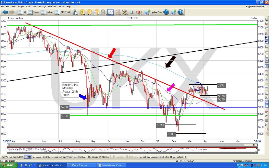
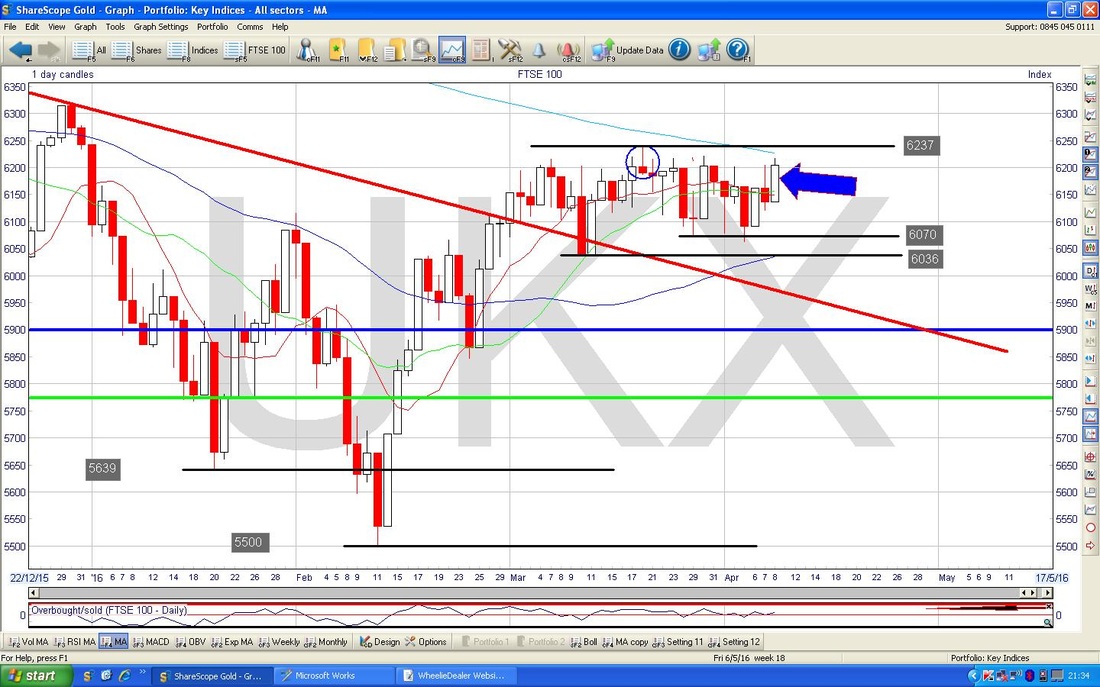
My Screenshot below zooms in to about most of 2016 so far. My Blue Arrow is pointing to a nice Big Bullish Candle that was generated on Friday 8th April 2016 - however, there is a lot of Resistance up above with 6237 being the Key Level that needs to be broken over. You can see here the 200 Day Moving Average and how close it is to the current Price Level.
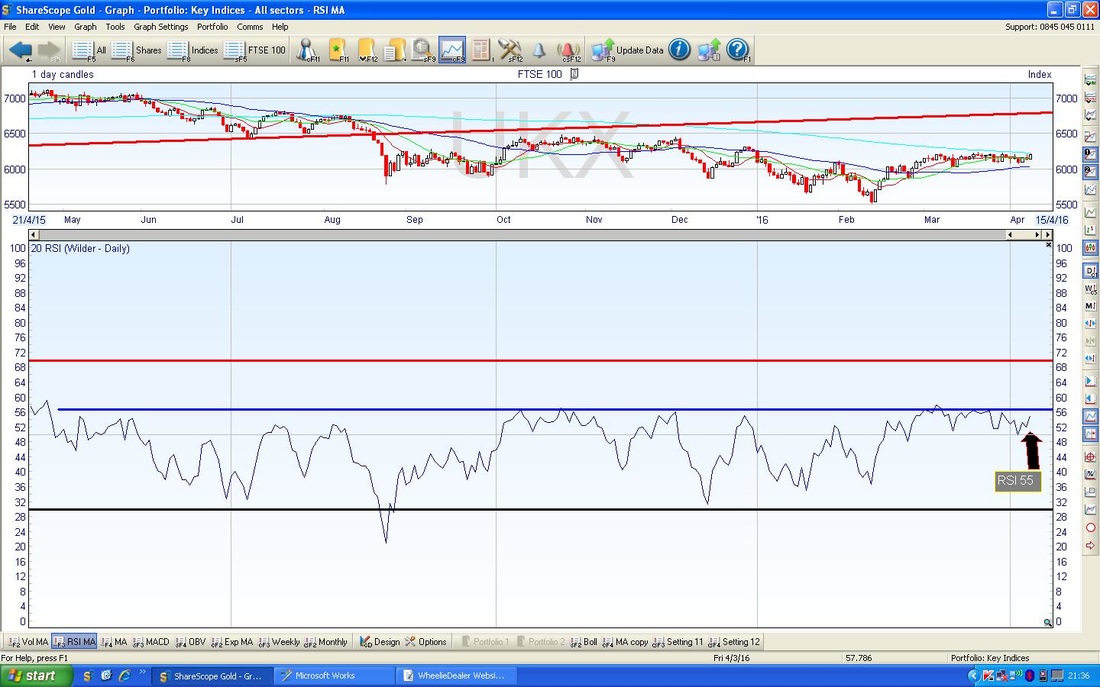
The Screen below has the Relative Strength Index (RSI) in the bottom window - my Black Arrow is pointing to the current level which is RSI 55 - this is not a particularly high level, but in the context of recent behaviour of the FTSE100 over the last year or so, you can see the Blue Horizontal Line at about RSI 57 which tends to cap any rises in the RSI.
The Screen below has the Price Candles for the last year nearly and has the Blue Bollinger Bands above and below the Price Line. My Green Circle is highlighting where we are now and that the Bollinger Bands have squeezed together to an extent. The relevance of this is that when Bands tend to tighten up, it usually means an EXPLOSIVE MOVE (I bet that made you jump !!) - but the catch is, it can be Up or Down !!
It will be very interesting to see how much longer this Range can go on for and how the Bands move in coming Days/Weeks. 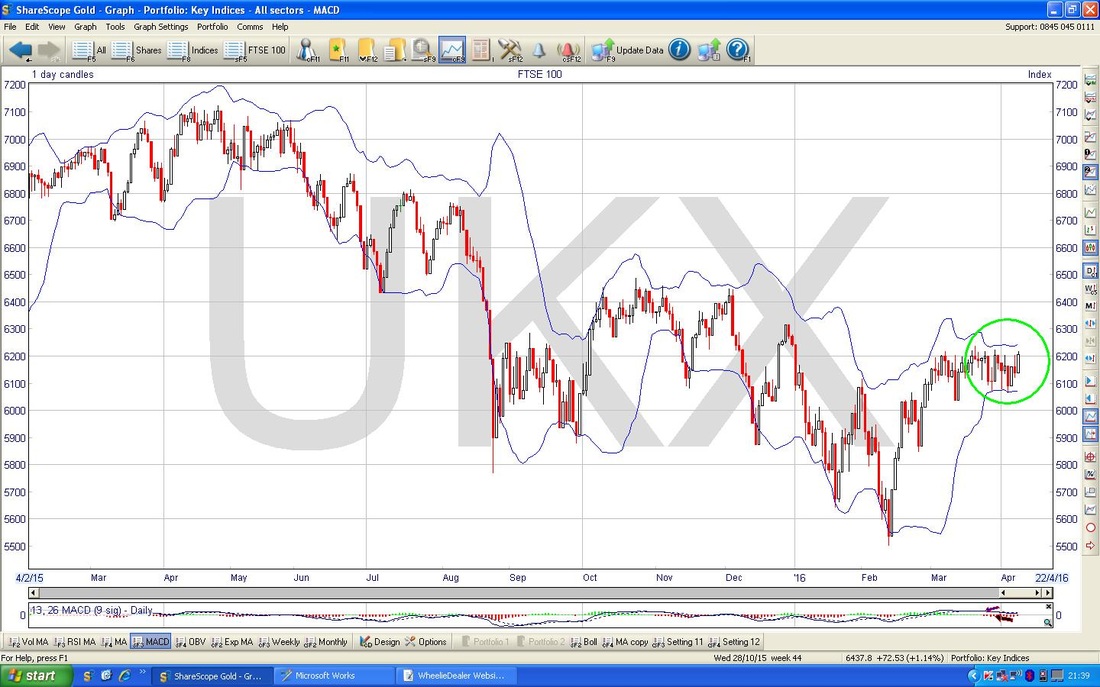
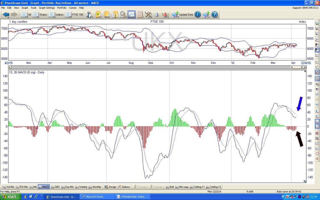
The bottom window on the Screenshot below has the Moving Average Convergence Divergence (MACD). The ‘Histograms’ which I have pointed at with my Black Arrow seem to be showing that the Red ‘Hump’ is moving to a more Bullish scenario - my Blue Arrow marks a similar development, but this time in the form of Lines. In other words, the Histograms and the Lines are just ways of representing the same thing - which is a MACD that seems to be turning more positive.
French CAC40
I very rarely show the CAC, although sometimes I mention it on a Tweet late at night or something. The chart below goes back a few years and shows an Uptrend Channel with my Black Parallel Lines and then it shows a Short Term Downtrend Channel marked with the Red Parallel Lines. My Blue Circle marks the Price Action over the last few weeks and it looks like the Price is falling down the Downtrend Channel - this is a pretty weak looking Chart. 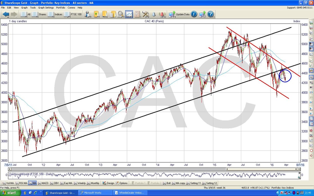
German DAX
I guess it is no great surprise, but the DAX looks about the same as the CAC and looks a bit rubbish. We seem to be in my Red Parallel Lines Downtrend Channel here and what I find interesting is that despite all the talk of Super Mario’s “Whatever it takes, Bazooka, QE“, the reality is that these Charts are some of the worst in the World !!! It is pretty obvious that the Eurozone Economy has huge problems (and if the UK is sensible enough to leave the EU, it will have even more !!) and these Charts show that the Stockmarkets look as sick as a pig. It makes me quite pleased that I sold out of my European Unit Trust earlier this year. 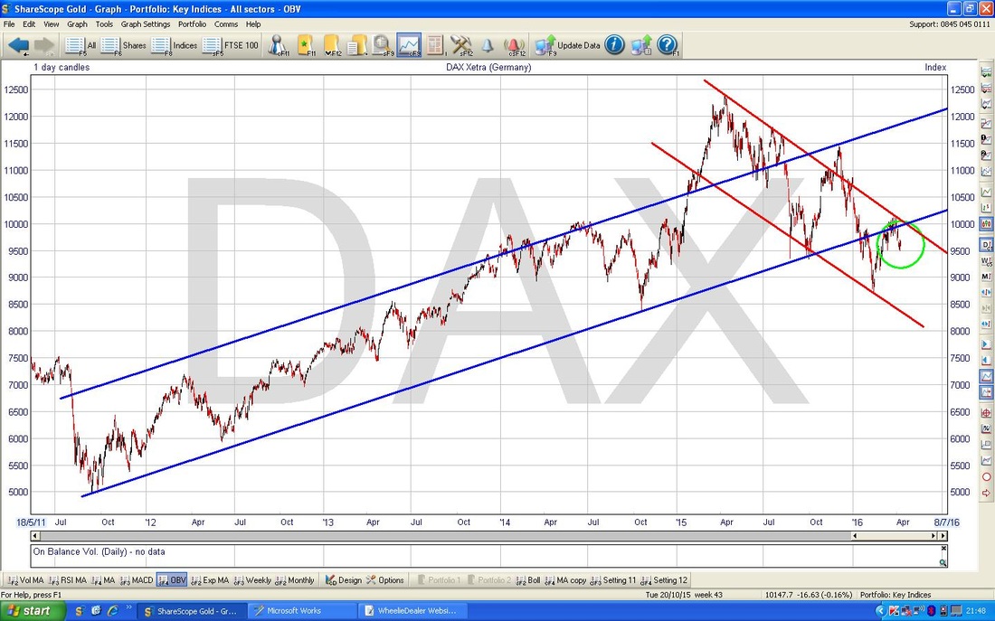
FTSE Smallcap
I very rarely talk about the Smaller Cap Indexes, but this one struck my attention hard while I was punching the ‘Spacebar’ on my ShareScope Charts (if you whack the Spacebar, then ShareScope cycles down one at a time through the Charts you have setup in a ‘Portfolio’). I know many Readers play in this Smallcap space, so it may be of interest. The Chart below goes back about 20 years and I have marked an Uptrend Channel with Blue Parallel Lines over the last 6 years. What is really interesting here is that Smallcaps are pretty near All Time Highs (ATH) and still look pretty bullish - note, this is not the case with the AIM All Share (sorry, I have not included this Chart, please take my word for it.) 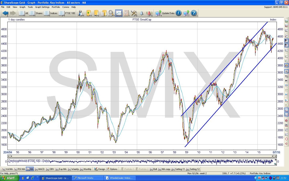
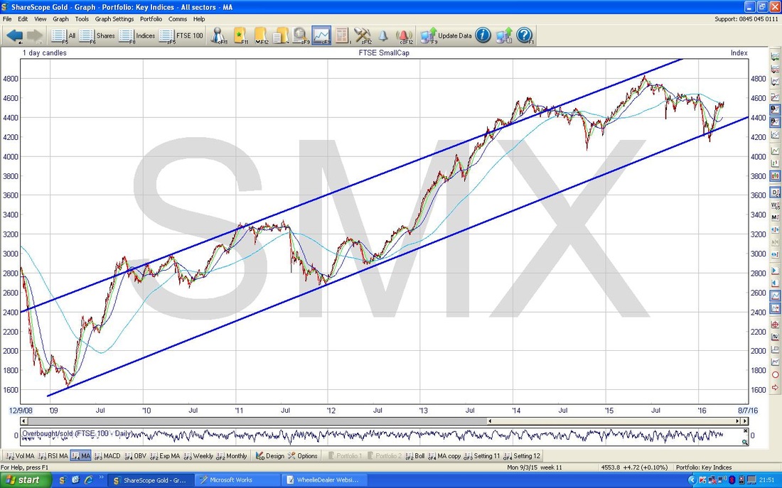
The Chart below zooms in on this Blue Parallel Lines Uptrend Channel - it’s nice, innit?
Hong Kong Hang Seng HSI
The Chart below goes back 20 years - despite various Ups and Downs, I reckon there is a Long Term Uptrend Channel as marked with my Blue Parallel Lines - if it falls out of this Channel in a ‘clean‘ way, that would be very bad. A similar break of an Uptrend Channel is what happened on the FTSE100 in August 2015. 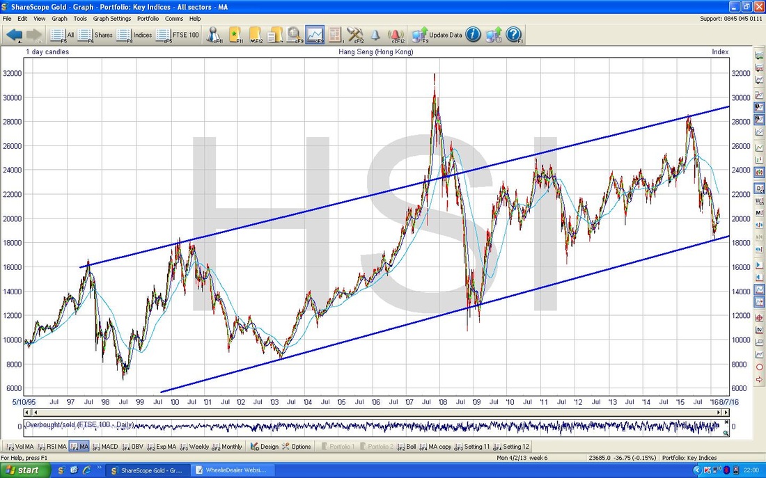
Japanese NIKKEI 225
On longer timeframes the Chart for the NIKKEI is a bit messy with lots of Uptrends, Downtrends, Sideways Ranges and repeats of these. The following Chart goes back about 2 years or so and gives an example where an Uptrend Channel is just about discernible - I have drawn this in with the Blue Parallel Lines. My Red Parallel Lines show a shorter term Downtrend which is really where we are now. My Black Arrow is pointing to the 200 Day Moving Average which is clearly falling (this also denotes a Downtrend and is probably the easiest way to determine what state the Market is in - i.e. Uptrend, Sideways or Downtrend). My Green Arrow shows the 50 Day Moving Average and this also looks pretty weak which is not a good combination. Readers and Tweet endurers will know I am no fan of the Japanese Market and I frankly cannot understand why anyone invests in it. My suspicion is that People only ‘Invest’ in Japan because the Media tells them that “you must buy Japan because Abenomics and QE will drive Shares up” - for me that is not Investing, that is gambling and basing your Investment Thesis on other people’s views (none of whom you even know !!). As far as I can tell (and that is part of the problem, I think it is impossible to understand the bizarre Macroeconomic and Monetary experiments that the Country is hell-bent to perform), Japan is a total Basket-Case and there is no way I would put Money in it. For me, it is a no-brainer - ONLY INVEST IN THINGS YOU CAN EASILY UNDERSTAND and if you can put numbers on it, then that is even better (Divvy Yield, P/E, PEG, Growth %, Debt levels, etc.) 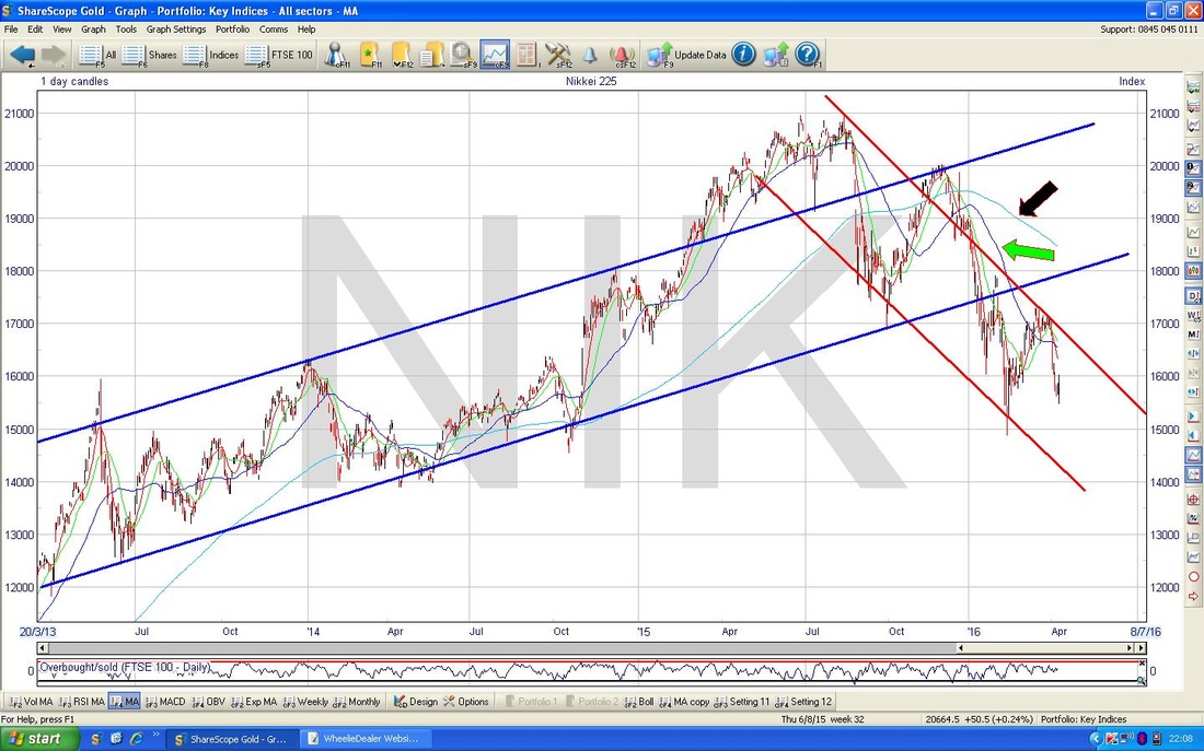
S&P500
First off, let’s do a look at the Big Picture - which shows we are still in an Uptrend Channel - one of the few Indexes around the World to show this. 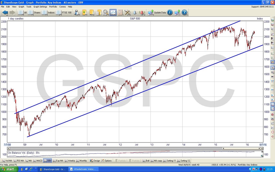
The Screen below is a bit messy - please ignore all the little Red Lines and stuff which are all over the Chart - this is because it is one of my ‘Working’ Screens where I do all sorts of Chart ‘scribbles’ as I muck around on a daily basis. It was just that I wanted to point out the Uptrend in the 2 Blue Parallel Lines and I had no free Screens to put this on !!
The Bottom Line of this Uptrend is not great and I have used some Charting ‘Poetic Licence’ when I have drawn this Channel. However, I think it could be valid and it is something to monitor in coming days. The Point here is that my Green Circle seems to mark where the Price might be dropping out of this Uptrend - keep an eye on this as it would be Bearish. 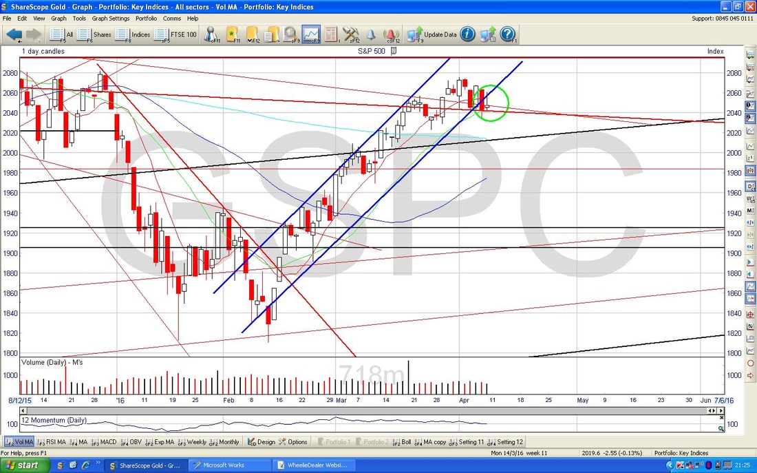
The Chart below has the Daily Candlesticks for the last 6 months or so for the S&P500 - the main US Index in my view. My Green Arrow is pointing to the 200 Day Moving Average which seems to be trying to level out, which would be good, and my Red Arrow is pointing to the 50 Day Moving Average which has clearly turned up nicely - we are not a million miles away from a ‘Golden Cross’. However, look back to my Green Circle and this shows where there was a Golden Cross but it very soon failed and we got a subsequent ‘Death Cross’ - so it is possible we can get a repeat of this.
My Black Arrow is pointing to a sort of ‘Hammer Candle’ kind of thing that was knocked out on Friday 8th April. It is hard to draw much conclusion from this - if we had seen a string of Up Days or Down Days and then got a Candle like this, then it would probably mark a Trend Reversal. In the context of not really going in any particular direction for a few Days, it doesn’t really mean a lot. If anything, I guess you could argue it is a bit Bearish in that the Market was unable to hold onto its gains Intraday. Note the Support Level at 2022 - this is a Key Level in the near term if we do get some weakness in coming Days. 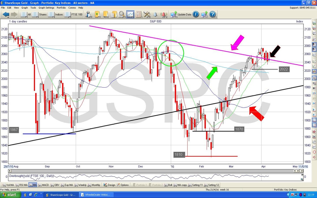
My Screen below has the Bollinger Bands for the S&P500 going back about a year. My Green Circle is showing how the Price Action of the last week has fallen away from the Top Bollie Band - this is negative.
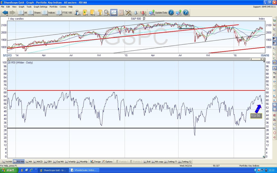
In the bottom window of my Screen below, we have the RSI for the S&P500. The current reading of RSI 56 is certainly not all that high, but the key thing here is that the RSI is falling - a drop down through RSI 50 (the ‘Neutral’ level) is seen as being very Bearish. We need to watch for this in coming days.
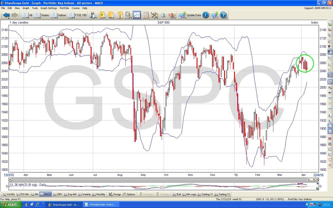
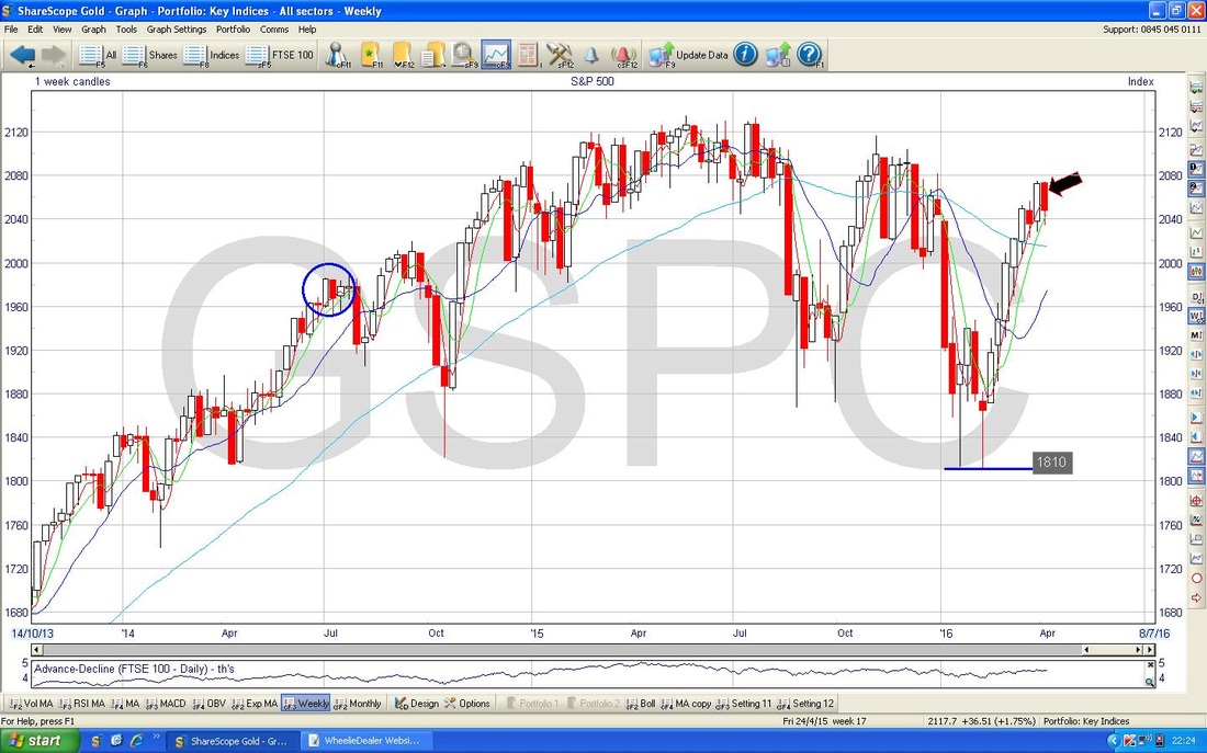
The Chart below shows the Weekly Candlesticks for the S&P500 - my Black Arrow is pointing to the Big Red Down Candle we got from last week and in the context of a Market that has risen strongly for about 7 weeks, this looks like the Candles from the last 2 Weeks combined form a ‘Dark Cloud Cover’ pattern or something like that. If you look back in time, I have put in a Blue Circle which marks where a very similar 2 day Pattern happened in the context of a big Run Up before - I often use this kind of idea to look in the past for where similar Candle Patterns were generated, and what followed afterwards.
Brent Crude Oil
My Chart below showing Brent Oil over the last 8 Months or so, builds on a Chart I have been showing in my Blogs for many weeks. Interestingly my Blue Parallel Lines which mark an Uptrend have started to look pretty well established and things look quite positive. My Green Arrow points to a lovely Bullish Up Candle that was generated on Friday 8th April 2016 and this is very good obviously. The catch is that my Big Black Circle marks an area of Strong Resistance ($46 to $54) which will be difficult to wade through. In addition, the $42.5 Resistance Level needs to be beaten and then we have the 200 Day Moving Average at around $43 to crack. Note we are lining up a Bullish Golden Cross on the 50 and 200 Day Moving Averages……….. 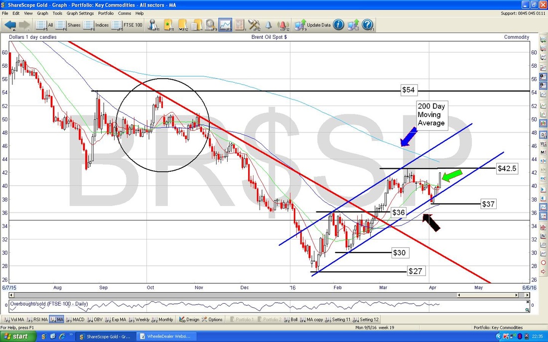
My Screen below has the Bollinger Bands - my Red Arrow is showing how the Candle from Friday 8th April is nearly touching the Top Bollie Band - this might act as Resistance. However, the Price can ‘hug’ a Bollie Band for some time and therefore we could see gains.
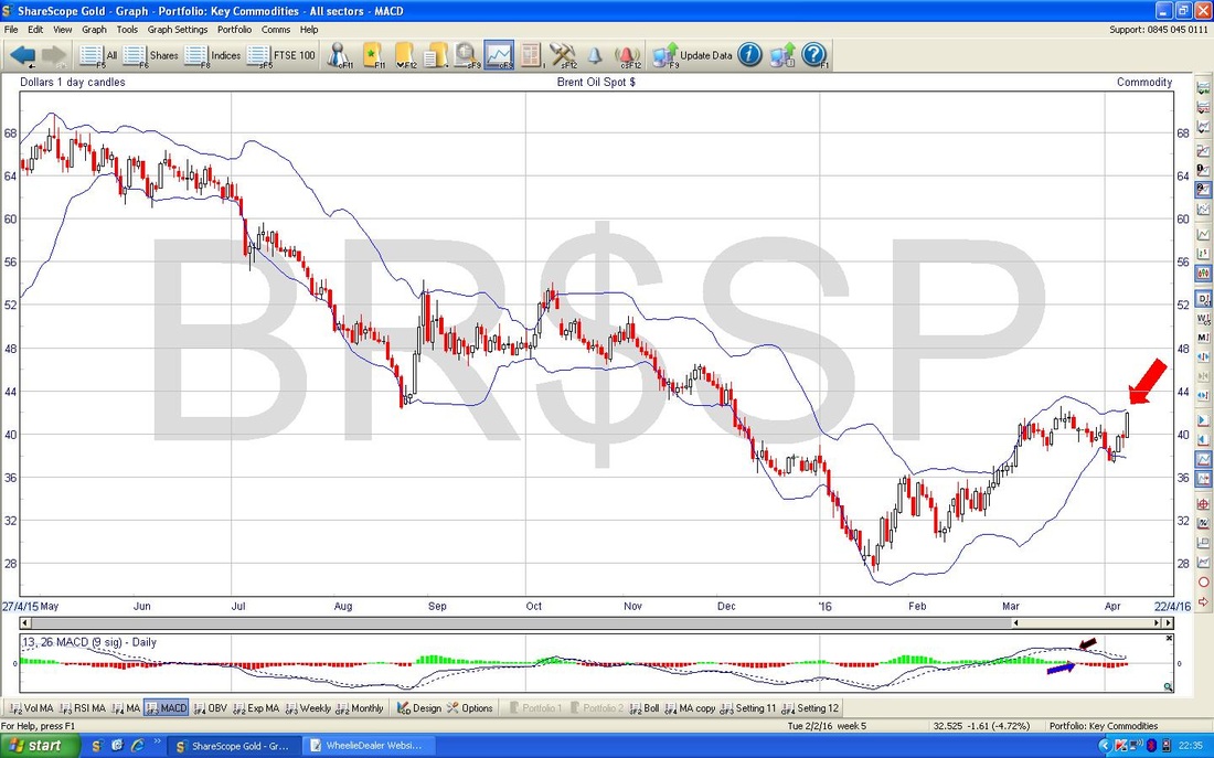
My Screen below shows the MACD for Brent Oil and it is clear that things look like they are turning Bullish. I find the Histograms show these things the clearest - as per my Blue Arrow.
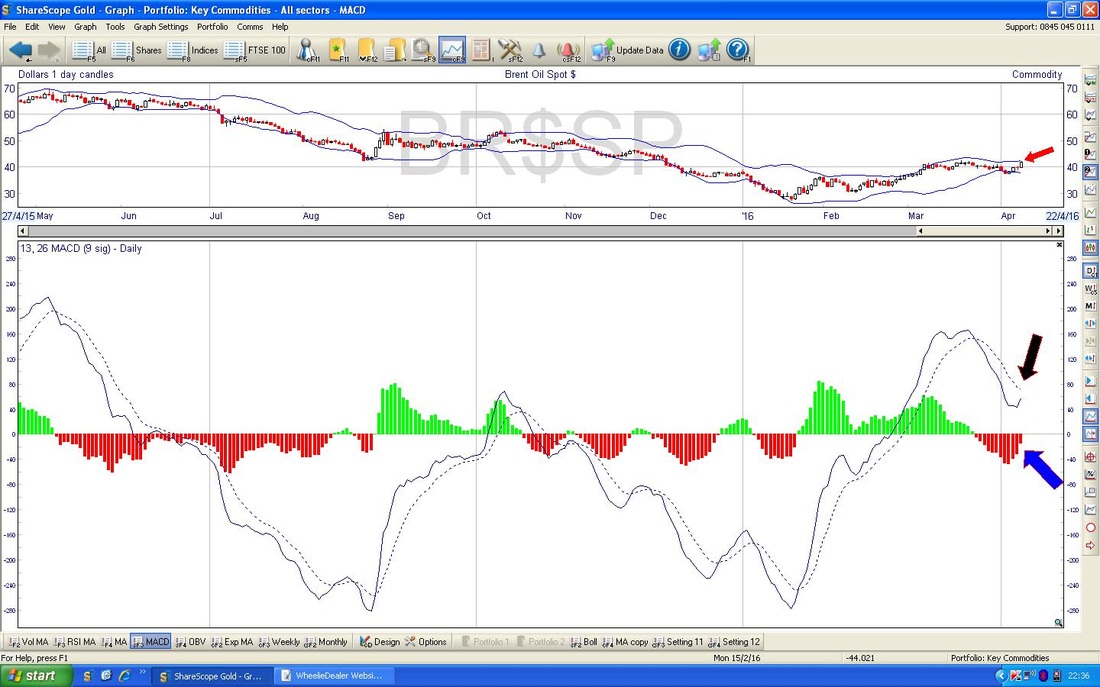
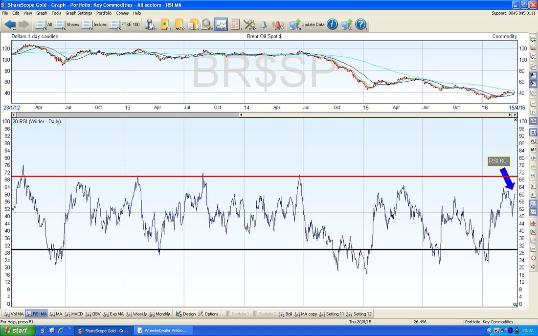
On the Screen below we have the RSI for Brent oil - a reading of RSI 60 is not all that high, but if you look back in time, the RSI 70 level tends to cap things - so we have some room to go up.
Gold
As usual, let’s finish off with Gold - I don’t have any exposure to Gold myself, but I do find that movements in Gold can give clues with regard to where Stocks are likely to go. Not much has changed here really, we are still sort of in a Range. My Black Arrow points to a Hammer Candle from Friday 8th April, but in this context, I don’t really think it tells us a lot. When I looked at Gold in my Blog last week, I put in the 3 Red Circles that might mark a Bearish ‘Head & Shoulders’ pattern - this may still be valid, so it is something to watch out for. The first Resistance Level to crack is $1243 - if it is going to, then I would expect this to happen soon. 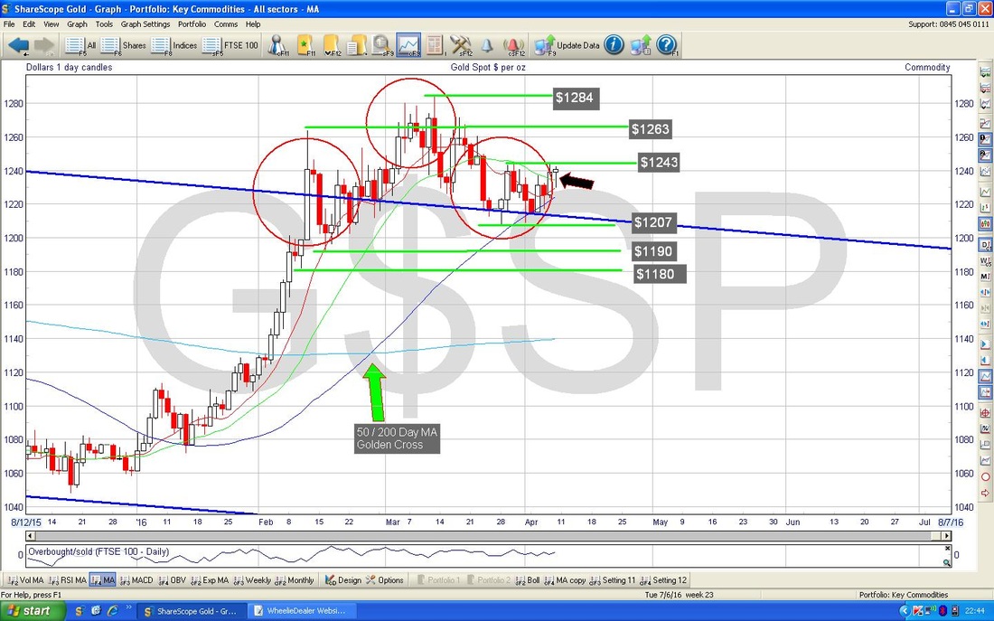
OK, this is the last Chart - if you look in the bottom window, you should see a pretty positive looking MACD for Gold - my Blue Arrow shows this the clearest.
Right, that’s it, I better do a Proof Read and load the blighter into the System - I hope Readers are all well and you have a decent Week, cheers, WD. 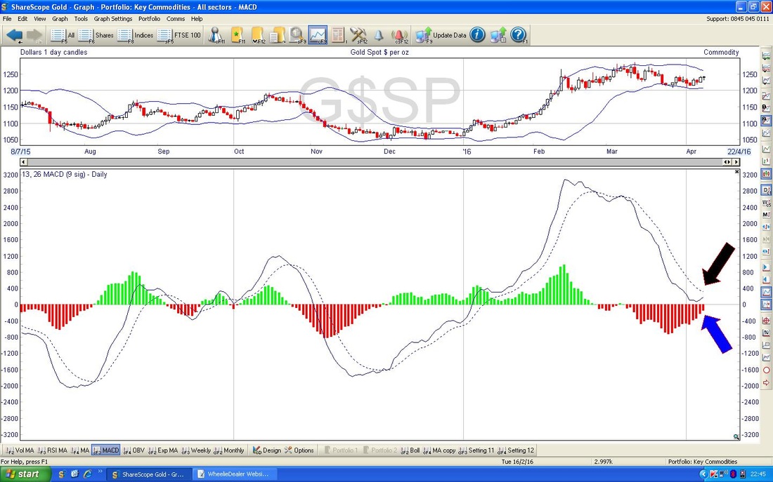
4 Comments
catflap
10/4/2016 01:15:15 pm
Thanks. May be gains in oil might push the FTSE100 higher this week? Its looking like it wants to go up. 6300 looks possible to me.
WheelieDealer
11/4/2016 09:15:35 pm
Hi catflap, thanks for your thoughts - it makes sense that stronger Oil will keep FTSE100 rising - they do seem very correlated recently. If the 6237 level gets broken, then 6300 must be likely and there is a lot of Resistance up above, particularly as April is usually a strong month, cheers, WD
Father Ted
10/4/2016 11:57:01 pm
Hi WD, enjoyed your blog and noted your dislike of all things Japanese.
WheelieDealer
11/4/2016 09:19:56 pm
Hi Father Ted, great to hear from you and I hope things are good over there !! Interesting that you say Japan has a thriving consumer bit - I have not looked at the numbers around that but I find it surprising as the population has been aging and Economic Growth looks dire - but maybe Consumers are doing ok. As you say, a weak Yen could help exporters but of course Hedging the currency would be essential. Thanks for the link, WD Leave a Reply. |
'Educational' WheelieBlogsWelcome to my Educational Blog Page - I have another 'Stocks & Markets' Blog Page which you can access via a Button on the top of the Homepage. Archives
May 2024
Categories
All
Please see the Full Range of Book Ideas in Wheelie's Bookshop.
|
