

|
educational blogs |
|
Well, Markets continue their powerful run, particularly the FTSE100. I can’t help feeling that this is all a bit too easy and some sort of Pullback could come at any moment - I am not expecting a major collapse or anything dramatic but it does seem a normal and healthy drop is needed to unwind some ‘heat’.
In simple terms as an Investor I really want to be ‘Buying Low and Selling High’ and apart from odd Stock-specific situations, I would be very wary buying Stocks at the moment - Traders of course will have a very different view to this and will no doubt be leaping into the Momentum Trades with considerable glee - however, Trends always end (or at least ease back) and this of course will catch out any Trader who does not have proper Risk Management Controls in place.
Many will claim that Stocks are independent of Indexes and to a degree this is true - however, as I am sure I have mentioned before, the stats are that something like 70% of any FTSE100 Stock’s movement is explained by correlation with the Wider Market, 50% for FTSE250 Stocks and 30% for SmallCaps and AIM - so we need to be aware of the Wider Market and not just blindly ignore it.
In line with ‘Buy Low, Sell High’ a case could probably be made that this is more a time to be Selling rather than Buying as a Long Term Investor - I am certainly happy to keep my Small Short on the FTSE100 running and I will be looking to Short more (with a Stoploss !!) if the opportunity is clear. There have been a couple of interesting events on the Brexit Fiasco this weekend - and both could have conflicting impacts on the Quid and therefore by extension on the FTSE100. Firstly Michel Barnier who is the EU Chief Brexit Negotiator has spoken off the record and said he wants EU Banks to continue to be able to use The City of London for Financial Transactions (this gives the lie to any claims that expertise from The City will go to Paris or Frankfurt etc.) and this implies UK Banks will have a pretty easy ride of getting EU Passporting Rights - this could be Sterling positive. The next big thing is that Theresa May will come clean in a speech on Tuesday and admit that leaving the EU means leaving The Single Market (apparently there is no reference to ‘The Single Market’ in any EU Treaties and it is called ‘The Internal Market’ - there is a huge clue here that such a Market is only for EU Members - although every country in the World has ACCESS to the Single Market). This may be negative for the Pound although much of this could already be priced-in as the Market has been very down on the Pound for some time now. I suspect Traders will try to batter the Pound but there is very Strong Support down around 1.19 or whatever it is against the Dollar and I suspect that will hold. Of course any such falls in the Pound would help the FTSE100 most likely. Something else that is helping the strength in the FTSE100 is the strength in Commodities - even if we get a Pullback in coming Days/Weeks, it seems likely that Commodities will keep rising and this will be very supportive of the FTSE100 in coming Months - although or course the EU has loads of Election challenges coming up starting in March with the Dutch Vote. This week we have Trumpington’s inauguration but it is unclear to me if this will make much difference to how Markets behave - I would guess it is already priced-in, despite all the Demonstrations and Protestations from the ‘Never Trump’ people. Oh, something else which I think I might have mentioned on the Podcast earlier in the week is that Economies all over the Globe seem to be doing better than Economists have predicted and this does seem quite strange. US appears to be doing quite well and this has enabled the Fed to start raising Interest Rates (although whether there will be a need for so many Rate Rises this year is debatable - a lot of the Monetary Tightening that such Rate Rises would give may already have happened by increased Dollar Strength). Germany had some decent Numbers in recent weeks and the UK is defying all predictions - we live in bizarre times but buoyant Economies is a nice backdrop for further gains on Stocks. Charts time……… FTSE100 As per usual we start off with the ‘Big Picture’ - and again as is customary, all Screen Scrapes are from the cracking ShareScope Software that I use. The Chart below has the FTSE100 Daily Candlesticks going back to the Credit Crunch Lows and the key thing here is that the Price is now nicely back inside the Parallel Red Lines Uptrend Channel - sweet. For clarity, I have pointed to the current Price Level with my Blue Arrow in the Top Right Hand Corner. Note also that we broke-out to New All Time Highs some Weeks back and this Breakout Level is marked with my Black Horizontal Line and Black Arrow. Any Pullback should find Support at this Level - ‘former Resistance becomes Support’ and all that. 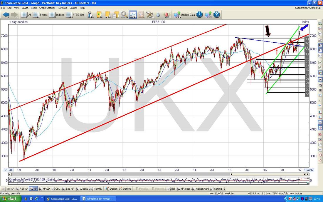
The Screen below zooms in on the FTSE100 Daily Candles and goes back to the start of 2015. Note the nice Uptrend Channel marked by my Parallel Green Lines (also marked with the Green Arrows) and it is good news if the Price can stay wiggling around inside this Uptrend Channel. This also gives some idea of Upside and Downside Targets in the near term - it is likely that any rise would run out of puff up around the Top Green Line at perhaps 7500/7600 ish and on the downside I would expect good Support from the lower Green Line at about 6800/6900.
My Big Blue Arrows are pointing out how powerful and long lasting the recent Rally has been - I think I heard something about this being one of the Longest Rallies ever in terms of consecutive Up Days - obviously this won’t continue forever. My Black Horizontal Line marked with the Black Arrow shows the Breakout Level at 7122 where New All Time Highs started - this should be very good Support. There is also Support from the Red Line at around 7200 ish - so I think it is fair to say that even though we have had a powerful run up, there is actually a lot of Support not far below which is a nice situation really. 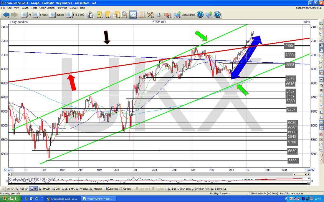
In the bottom window of the Screen below we have the Overbought/Oversold Oscillator - I am showing this because the current situation has highlighted an important aspect of this Oscillator. The point is that even after one of the best ever runs in history for the FTSE100, the OB/OS Osc is not even at its high points - the implication is that this Osc shows highs when the moves are fast and powerful, but when the Market moves up in a slower and more measured way, it does not necessarily throw up a really Overbought reading. This is something to watch for on other Indicators / Oscillators - they often behave differently in a variety of scenarios.
Having said all that, it is obviously quite high now. 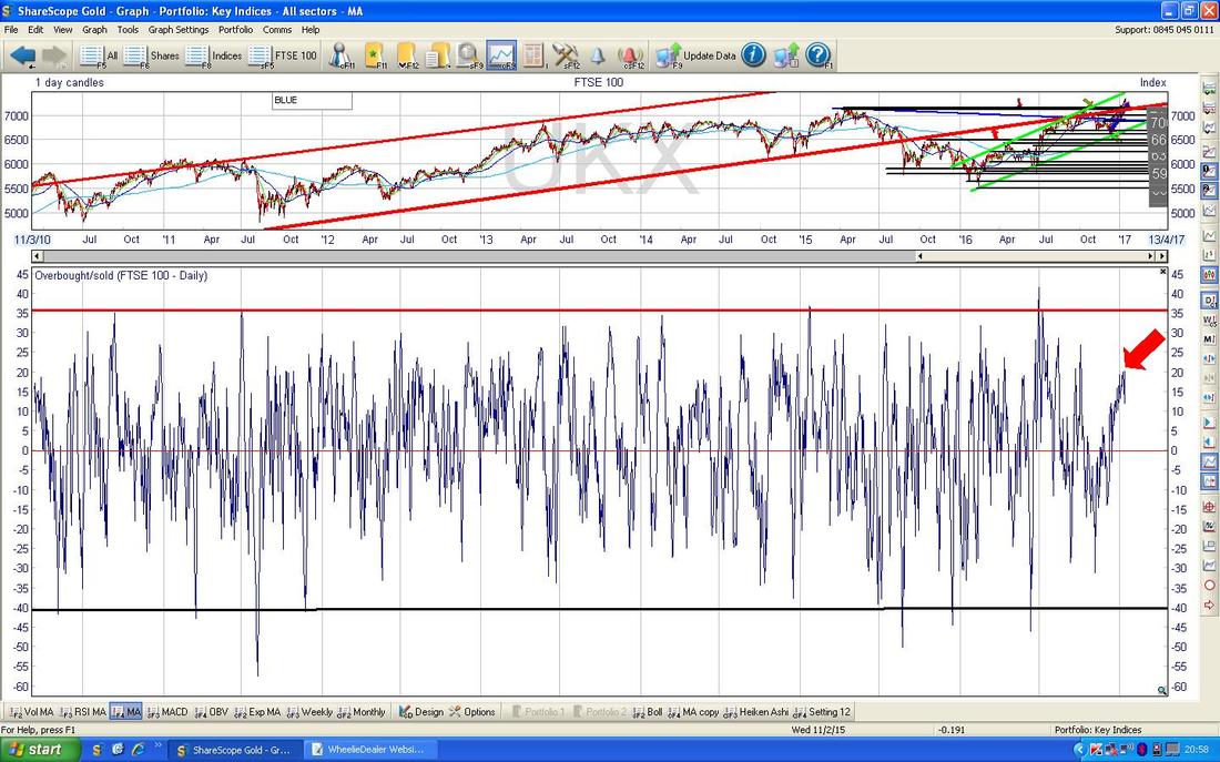
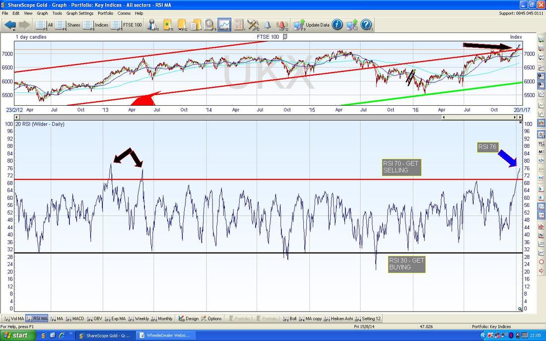
In the bottom window below we have the RSI (Relative Strength Index) for the FTSE100 Daily - as you can see, on a reading of RSI 76 this is insanely high and it is clear this needs to calm down soon. It does not necessarily mean a drop - it could just be that the FTSE100 goes sideways for a bit.
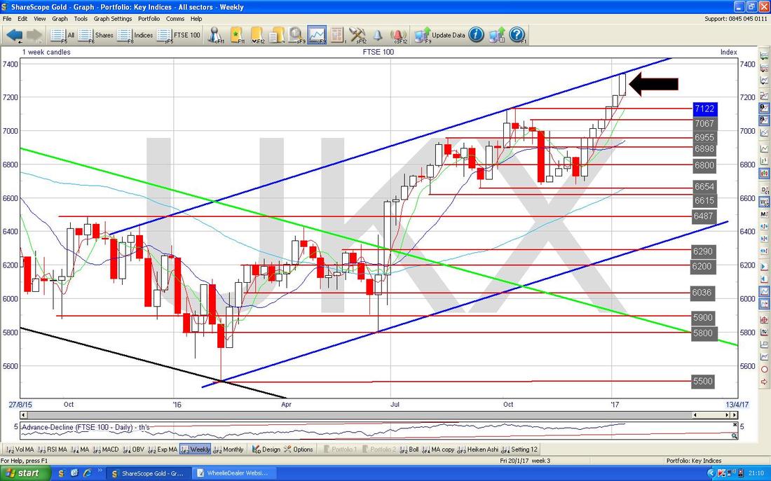
The screen below is worth a look - this is the Weekly Candles for the FTSE100 going back to about the start of 2015. Instead of the Green Parallel Uptrend Lines which were on my Daily Chart earlier, now I have 2 Parallel Blue Lines which mark the same Uptrend Channel. However, note in this case that because we are using bigger Candles, they give more clarity on best placement of the Uptrend Channel Top and Bottom Lines - this suggests that in fact we are right at the Top Line and it could be time for a pullback very soon. My Black Arrow shows the nice Big White Up Candle we had last week and this would normally be bullish but with all the other Indicators looking very stretched we might be limited in terms of how much more upside there can be in the very short term.
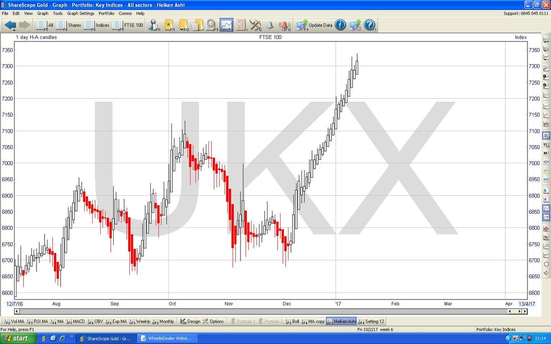
The Daily Heiken Ashi Candles shown below are still Bullish - there is no sign yet of a narrowing in the size of the Candles or that they are changing colour to Red. However, the length of the Rally is really obvious on this Chart.
Dow Jones Industrials Index (USA)
This is only 30 huge MegaCap Stocks, but is one of the most widely followed Indexes globally. My Chart below has the DOW going back to the Credit Crunch Lows and again we have a lovely Uptrend Channel as per my Parallel Green Lines. At the moment we are struggling to get over 20,000 but the Price is clearly well within this Uptrend. 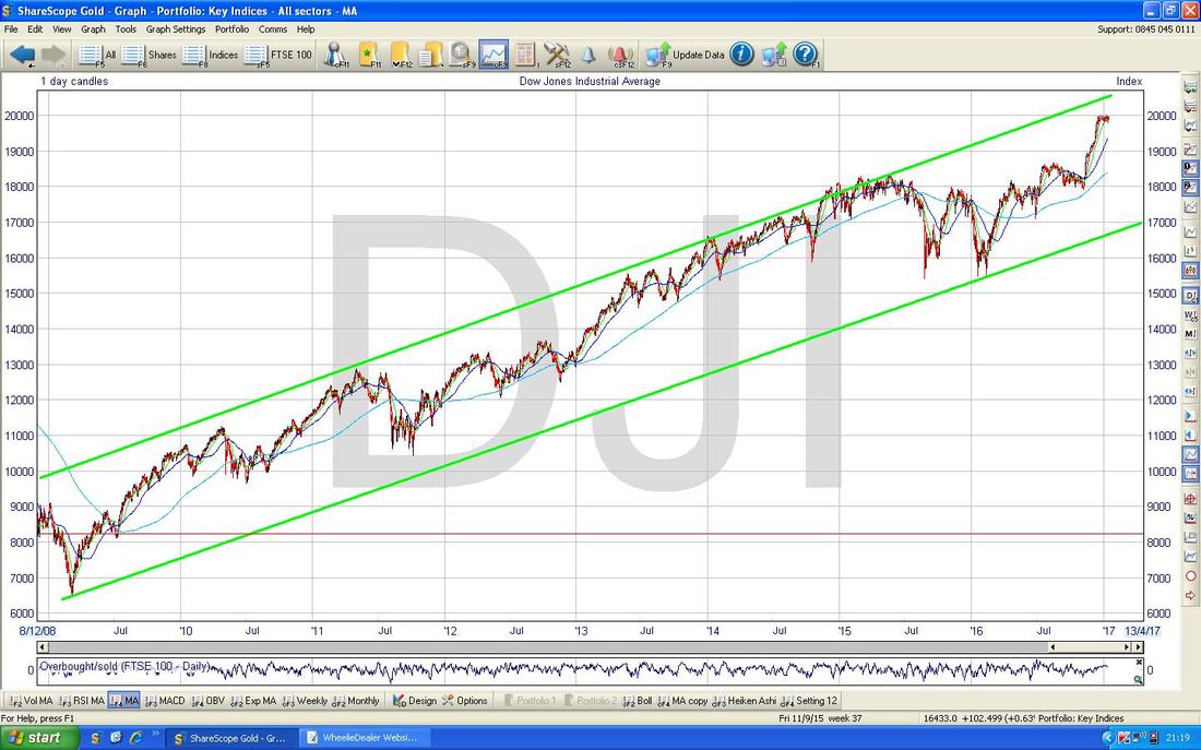
The chart below has the DOW Daily Candles going back about 8 months. Note how the Price is now running along below the 20,000 level and this is clearly a huge psychological number to crack - if it can manage such a Breakout, then it should set up more gains to come this year.
There is something slightly worrying though - if we do get a drop, there really is not much Support below until we get down to 19200 and then the previous All Time High Breakout Level at 18668 (marked with my Red Line and Red Arrow). This suggests that if a proper Sell-off starts it could mean a hefty drop on the DOW and by extension on the S&P500 and Nasdaq - I doubt UK and European Markets could escape such a fall. 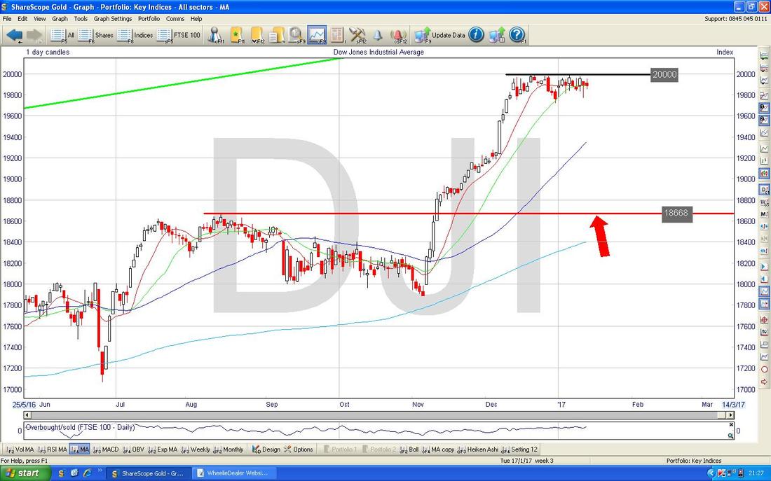
There is an interesting technical thing on the Chart below. This shows the Daily Candles for the DOW with the Bollinger Bands being the Blue Wavy Lines above and below the Price Line. Note how the Bollie Bands are a bit like a big Sausage - and at times the Sausage gets ‘squeezed’ and then pops out wide again. My Big Yellow Circle and Big Green Circle show where this squeezing has happened before and my Black Arrow points to where it is happening again (if you are struggling to envision this, then go and get some Cumberland Sausages out of the fridge and try it yourself). The key thing here is that when the Bands tend to squeeze like this, it usually resolves in an ‘Explosive’ move but we can never tell in advance from these Bands which way the move will be - Up or Down.
In other words, in the context of the DOW now we are likely to get a strong move either up above 20,000 or dropping back towards those Support Levels I mentioned earlier. 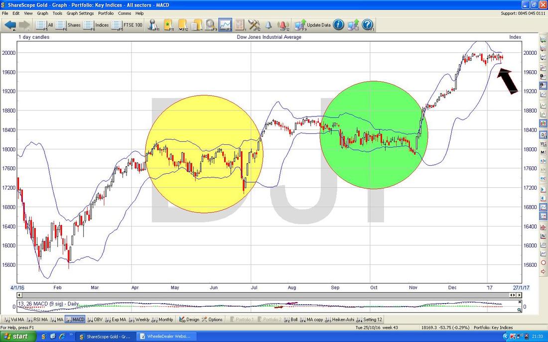
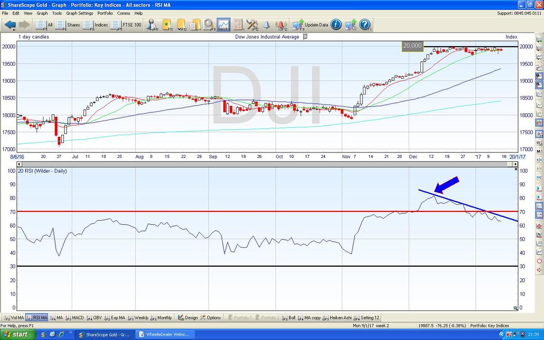
The Chart below is worth considering. In the bottom window we have the RSI for the DOW Daily which is shown in the top window. Note how the Price Line in the top window has been going sideways for about 3 weeks or so but that the RSI line has been falling - as marked with my Blue Line and Blue Arrow. This is interesting because it shows how an ‘Overbought’ RSI can be unwound by going sideways rather than falling but it also has the implication of a ‘Bearish RSI Divergence’ - this could be telling us that a Drop is coming soon.
Pound/Dollar
Things are defo hotting up with the Quid. The Chart below has the recent Daily Price action for the £/$ going back about 4 months - starting off pretty much with the ‘Flash Crash’ spike down. Note firstly my Parallel Red Lines marked with the Red Arrows which seem to be showing a Downtrend Channel - this needs to be broken-out of for the Pound to start to recover - I suppose this means we need to see the £ over 1.23 and certainly 1.24. To the downside, the key level is now the Flash Crash low at 1.1947 - it is vital that this holds. If it fails, then we might see the FTSE100 go to the Moon !! Before we get there, there is Support at 1.2083 and 1.2038 - if these fail then I expect 1.1947 would hold at first attempt but may fail later. To the upside, the 50 Day Moving Average around 1.24 looks difficult to get over. 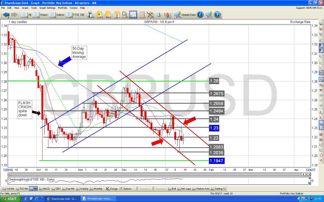
VIX Volatility Index
The Chart below has the VIX Index ‘The Fear Gauge’ going back a few years - as you can see it is extremely low - this suggests huge complacency and a Low VIX tends to lead to a High VIX. 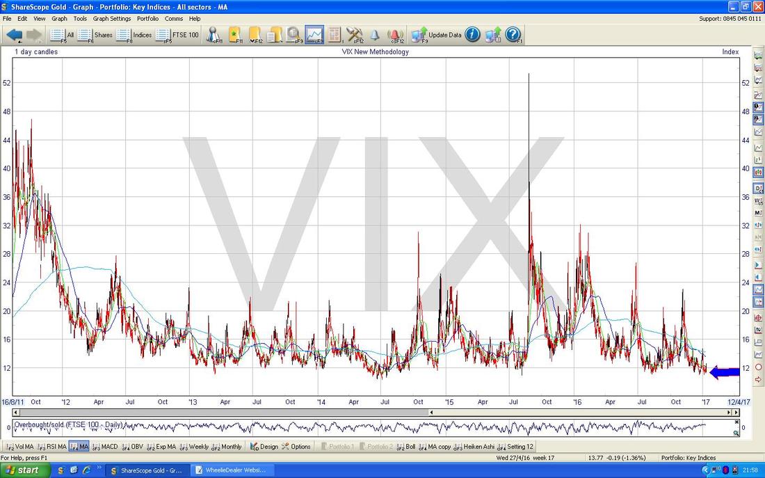
Brent Crude Oil (Spot)
The Chart below has Brent Oil Daily Candles going back nearly 2 years. It might be hard to see on this scale but the Price fell back in recent Days to the $54 Support Level which was the previous Breakout Resistance Level and we have now moved up from this. However, up above at $58.375 there is very Strong Resistance and if we can crack this level, then there is a lot of Resistance up above between about $60 and $70 as marked by my Yellow Circle. As with all these Charts, if you are struggling to see them you can click on them and they sort of grow bigger so you should get a better look. 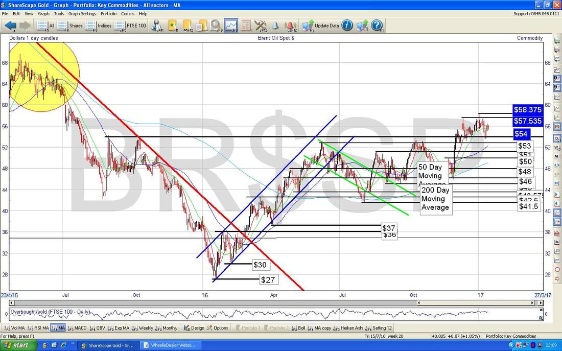
Copper
I am using an ETF Price Chart as a proxy for Copper - this is because the ShareScope Charts only go back a couple of years on the Copper Chart if I choose the ‘Copper Composite’ Chart. However, they do seem to move closely together as you would expect. It is not easy to fit the Lines around this Chart but on the Chart below we have the Daily Candles going back about 5 years and I have attempted to draw a Downtrend Channel. If I am roughly right with my Lines, then we are at a key Level for the Copper Price and we need a Breakout to the upside out of this Downtrend Channel. 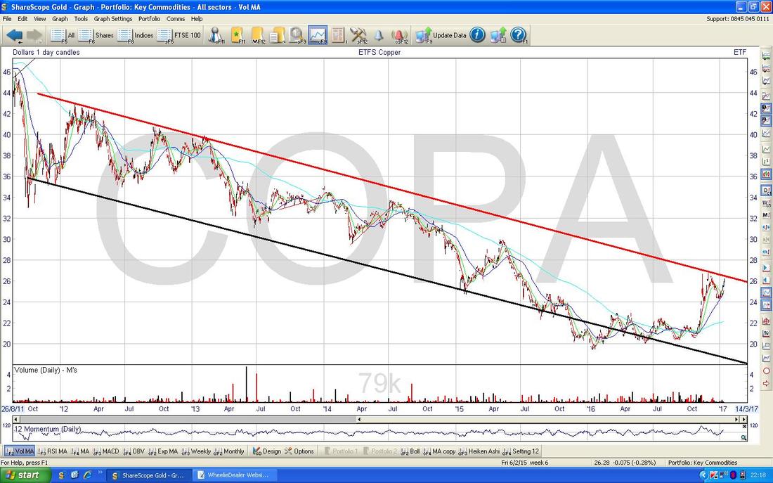
The Chart below zooms in on the Chart I just showed to about 8 months or so. My Red Arrow is pointing to where the Price is pretty much on the Top Line of the Downtrend Channel from the previous Chart and it is clear that we need to breakout very soon if we are to go higher.
My Blue Arrow is pointing to where we had a recent ‘Golden Cross’ between the Dark Blue Wavy Line 50 Day Moving Average and the Lighter Blue Wavy Line 200 Day Moving Average - this was a Bullish development. 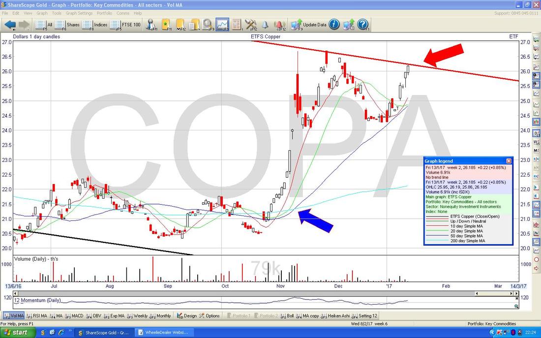
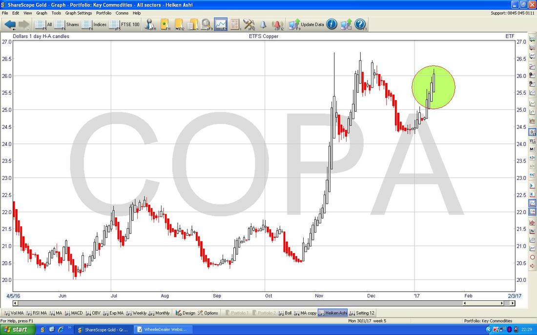
The Heiken Ashi Candles on Copper ETF still look good - my Green Circle is highlighting how we have nice Big White Up Candles which is Bullish. If these are right, then we will get the Breakout.
Gold (Spot)
The Chart below has the Daily Candles for Gold (Spot) going back a few months. My Black Arrow is pointing to an Inverted Hammer Candle which was generated on Thursday 12th January 2017 and this could mark a Top in the very Short Term at about $1207. To the downside, there is strong Support at $1122 and this must hold. 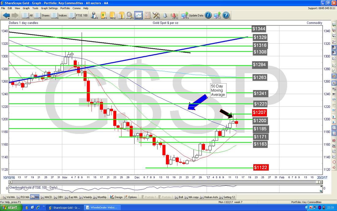
The Chart below in the bottom window has the RSI for Gold Spot. Note with a reading of RSI 56 it is not particularly high but with recent behaviour of Gold it has often peaked out at RSI 56 sort of levels before falling back.
Right, that’s enough for now, I hope you all have a Trumpingly good week !! Cheers, WD. 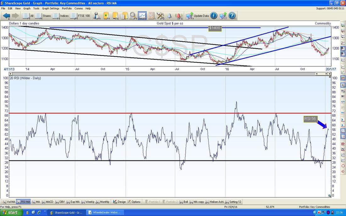
0 Comments
Leave a Reply. |
'Educational' WheelieBlogsWelcome to my Educational Blog Page - I have another 'Stocks & Markets' Blog Page which you can access via a Button on the top of the Homepage. Archives
May 2024
Categories
All
Please see the Full Range of Book Ideas in Wheelie's Bookshop.
|
