

|
educational blogs |
|
You may have picked up from comments I have made on the Website, but more particularly on Twitter, that I am feeling extremely Bullish about Markets at the moment and I am more than Fully Invested with a Long Spreadbet on the S&P500 and I might even add to that position.
There are 2 main reasons for this - firstly the recent Breakout to New All Time Highs on the US Major Indexes (and also on the FTSE100) is Technically a very Bullish event. In the early part of the Week just gone we had a bit of a Pullback but this already seems to have sucked in a new load of Bulls and it looks to me like Markets are turning up again - Friday was especially strong after a big Jobs Number in the US (I will move on to some Charts later where I will show these moves). Secondly, despite the confusion this Price Bullishness has caused among Investors, the Fundamentals look highly supportive of this move - and a Programme I heard on BBC Radio 4 on Thursday demonstrates this very well.
By sheer fluke I was driving to the PUB for Quiz Night and happened to have the Radio tuned to Radio 4 and there was a discussion about Trump’s Economic Policies and what they could mean for the US Economy. The Programme was ‘The Briefing Room’ from Thursday 2nd February 8pm on BBC Radio 4 and here is a link so you can listen to it - and I recommend that you do because it is quite an eye-opener for the potential boost to US GDP Growth that Trump’s Policies could provide, and the Historical Precedents from the Reagan era support the view that his Policies probably will make a huge difference:
http://www.bbc.co.uk/programmes/b08byp9l The blurb for the Programme is as follows: Trump’s Economy “President Trump says he'll make America richer. He's promised a raft of radical economic reforms including a huge cut in tax on businesses, an income tax cut, a massive reduction in regulation, and investment in America's infrastructure. His goal is to get America's economy growing at roughly double its current rate. He also wants to create 25 million new jobs, and put 'America first' in every policy decision. But are these goals achievable and are the measures he's proposing likely to work? David Aaronovitch explores what 'Trumponomics' might mean in practice and asks a range of experts whether his plans for the economy will lead to boom or bust. Guests include Arthur Laffer, Professor John Kay, Diana Furchtgott-Roth and Jim Tankersley.” The Key Points I took from the discussion are as follows:
Anyway, that’s the gist of it and much of what was said makes a lot of sense to me and I expect to see a big change in how Economies are managed as a result of this. If Europeans see the US booming they will soon realise that the crop of Politicians that have been ruling the roost for recent decades has let them down badly and we will see a clamour for more Free Market thinking and some proper Growth Policies. It is certainly shaping up to be a very interesting period for both Economics and Politics around the World after much tedium. Of course, a really scary idea is that if Trump is successful in boosting US growth, then he will most definitely be President for 8 years - remember, “it’s the economy, stupid”………. When looking at this sort of stuff we must throw away our Political Biases and try to think rationally and objectively about what Trump’s Policies are most likely to bring in terms of the effect on Stocks. It is pretty basic Economics that lowering Taxes and cutting Regulations will boost Economic Growth and if Trump’s Infrastructure Plans are anything like what he suggests, then this will give a huge Keynesian type Boost. In such an environment I think Stocks can go massively higher and we could be on the verge of a big Stockmarket Boom - as ever, we will face countless problems along the way, particularly stemming from Europe over 2017 but overall I am going to be positioned very much on the Long tack and I will just use bits of Hedging to tactically ride out any Pullbacks along the way. Something else to consider is that many Stocks (and Stockmarket Indexes) appear to be very fully Valued if not Over-Valued. However, if Growth is set to take off like I think it might, then these apparent Over Valuations might actually not be anything like as bad as they appear as Upgrades by Brokers to Earnings Forecasts could make those P/E Valuations a lot lower. FREE Share-Talk Investor Evening in Cardiff My mate @conkers3 on Twitter is arranging an Investor Evening which takes place in Cardiff on Saturday 18th February and has Fund Manager Gervais Williams doing a talk and Chris Bailey of Financial Orbit who is worth listening to. I quite like listening to Fund Managers because they often mention particular Companies they like and why they are attractive and this is often a good route to new Ideas. Anyway, the Event is FREE to attend and if you live in that vicinity it might be worth the trip. You can register here: https://www.eventbrite.co.uk/e/share-talk-investors-evening-with-gervais-williams-eg-solutions-widecells-tickets-30351580394 Gold Rosland Capital created the picture below which Readers might find interesting. It is originally based on the part of their US site that includes Gold IRAs and a Gold-US dollar chart which you can view here (be warned it‘s got a rather scary ‘US National Debt‘ counter at the top of the page !!): You can see more stuff like this on their UK website too, although I have had no dealings with Rosland themselves so I make no recommendations or anything: http://www.rosland.co.uk/ 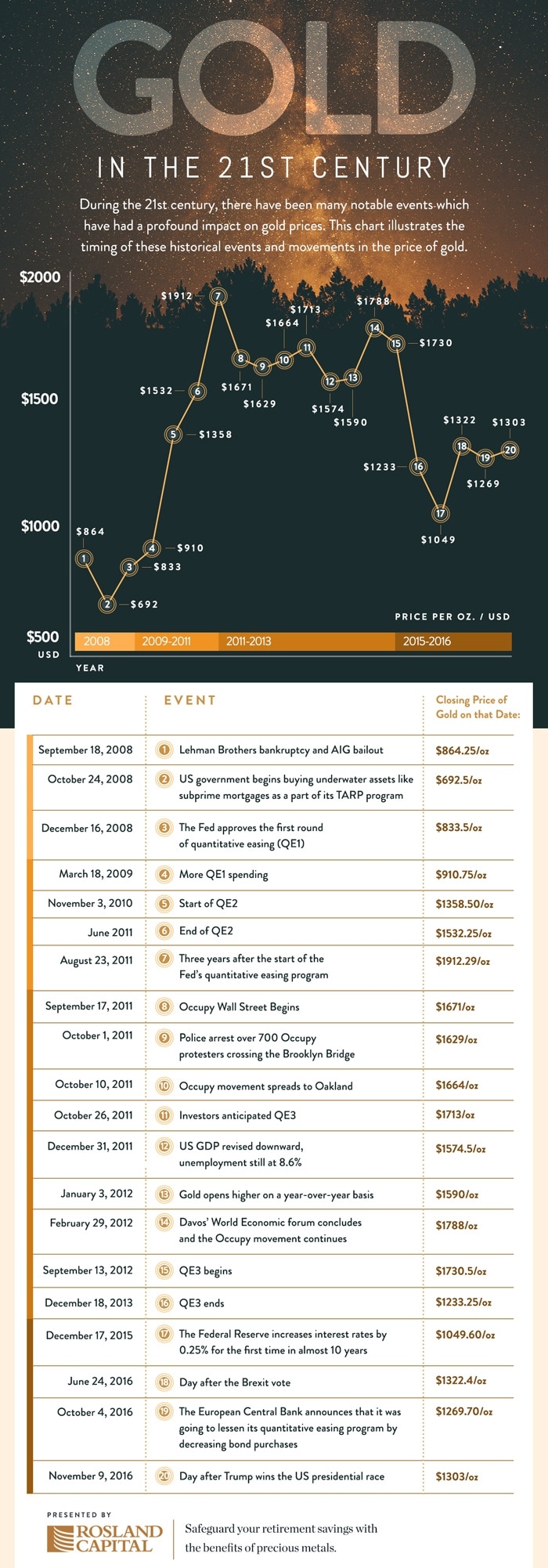
Right, let’s see how them Charts are shaping up…….
FTSE100 First off I will repeat yet again the Long Term FTSE100 Chart going back to the 2009 Lows - as ever the Charts are all Screen Grabs from the Top Quality ShareScope Software that I use. I know Regular Readers like to flagellate themselves and do penury to the Market Gods by reading this stuff over and over again so your masochism is duly fulfilled by this Chart. The reason I make you all suffer is because this Chart is just so important and so relevant to what is happening on the FTSE100 and what is likely to occur going forwards. The Red Lines (I have marked the bottom one with the big Red Arrow) mark the Long Term Uptrend Channel and my small Yellow Circle highlights where the Price got back into the Uptrend Channel in mid January but early last week it fell back outside the Channel but only marginally and it looks like it is pretty much back inside now. 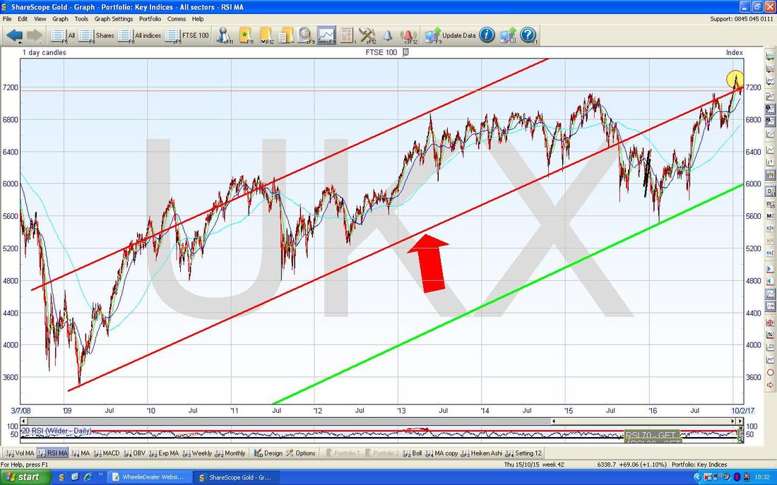
The screen below has the FTSE100 Daily Candlesticks going back to the tail end of 2015. I have included this Chart because it shows the Green Lines which mark an Uptrend Channel that seems to be running and my Red Arrow is pointing to the Bottom Line of the Long Term Uptrend Channel from my previous Chart and you can perhaps see that we are just back inside it (obviously this depends on how you draw the Lines and there is some leeway here).
My Black Arrow is pointing to a Black Horizontal Line at about 7130 which was a Previous All Time High from October 2016 and which was Broken Over back in the dying days of 2016. Such Breakouts are extremely Bullish and note that in the recent Pullback earlier this Week we got back to about 7100 and then turned up again - so there was a slight over-shoot but the 7130 Level is clearly important Support. The New All Time High is 7354 and we need to see the FTSE100 breakout over that level. 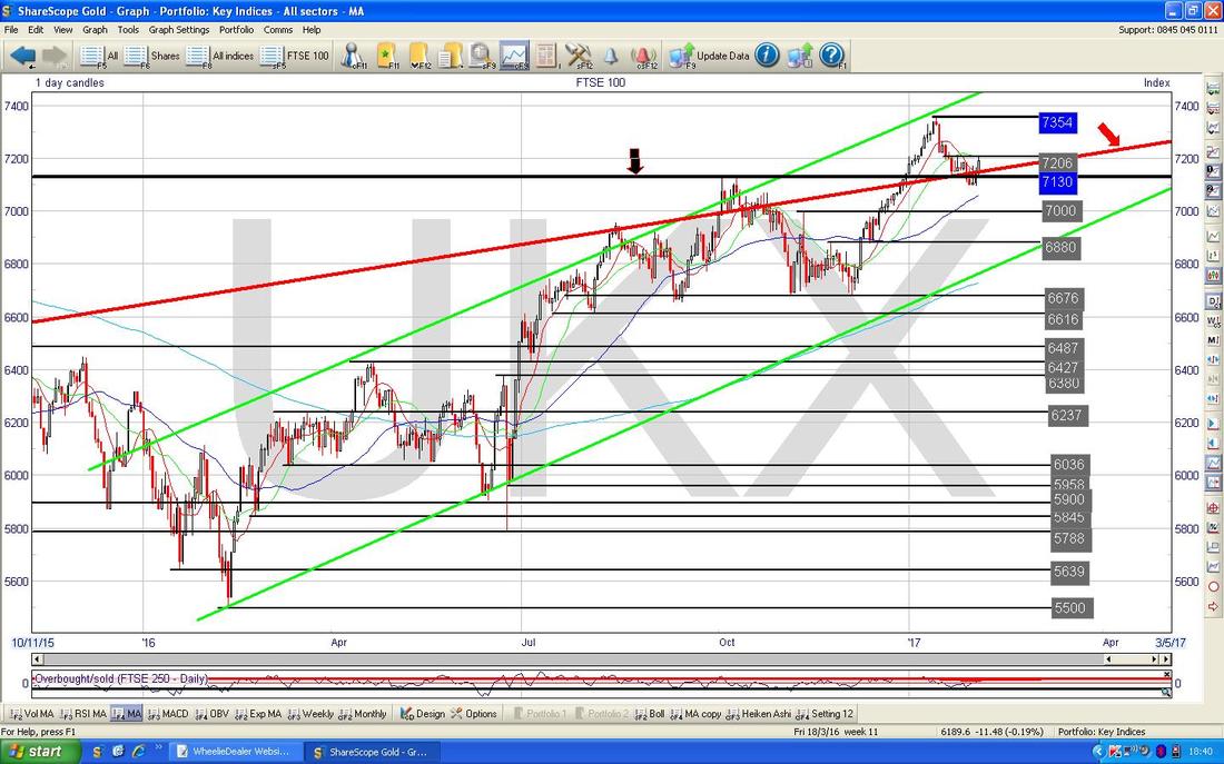
The Chart below zooms in on the FTSE100 Daily Candles to about the last 4 Months. My Green Arrow points to a nice Big White Up Candle from Friday which looks pretty Bullish and note how it has turned up off the ‘Inverted Hammer’ Candle on Wednesday which I have pointed to with my Blue Candle. This is something to note because in the Context of a downwards move, it is usually a normal Hammer where the turn pivots from - with an Intraday Reversal where the Bulls win out over the Bears during the day. Inverted Hammers can mark the turn and clearly in this case it did. Likewise, in the Context of an up move, a Hammer can mark the Turn back down although normally you would expect to find an Inverted Hammer.
7206 is immediate Resistance now and we need to see the FTSE100 get over this early next week. 7260 is then the next level to take out. Clearly there is good Support just below at 7130, 7100. 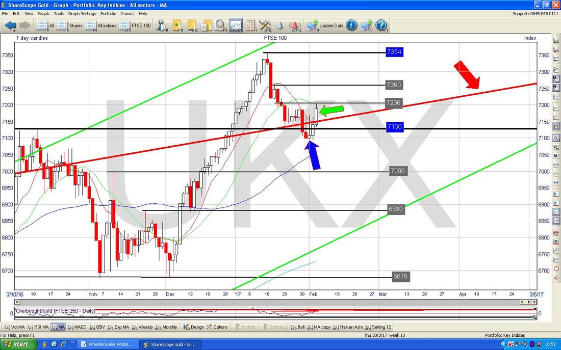
In the bottom window below we have the ‘Overbought/Oversold Oscillator’ - my Red Arrow is pointing to where this is at a pretty high level and we might need to see the Market calm down a bit in the very Short Term. Note this is an extremely Short Term Indicator and just 1 or 2 weak days (or even sideways) would be enough to calm things down on this measure.
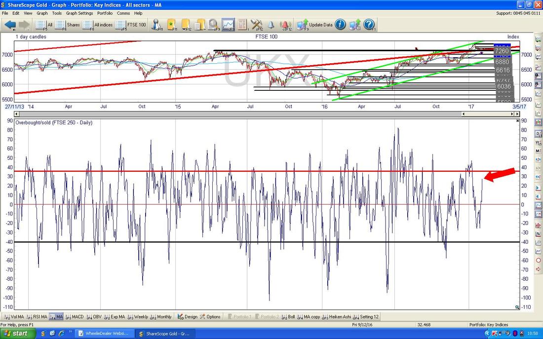
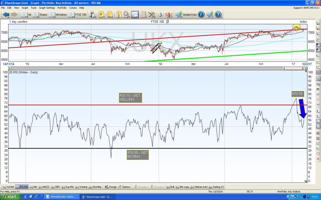
In the bottom window below we have the Relative Strength Index (RSI) for the FTSE100 Daily. With a current reading of RSI 56 this still has loads of room to rise.
In the top window below, we have the FTSE100 Daily Candles with the Blue Wavy Bollinger Bands both above and below them. My Green Circle highlights how in the last 2 days we have moved up off the Bottom BB - that’s good for Bulls.
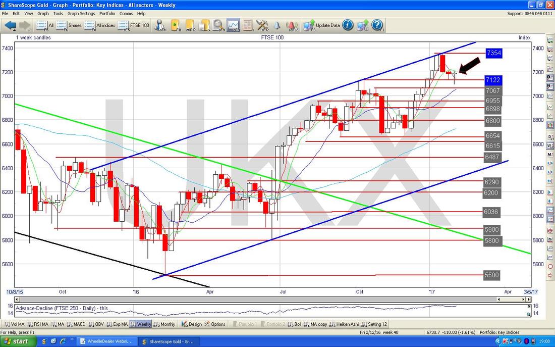
The Chart below has the Weekly Candles for the FTSE100. My Black Arrow is pointing to a Hammer Candle from last Week which suggests that the Downmove from earlier has faltered already and the Bulls are back in charge. A Hammer after such a short move down is not brilliant in terms of Context - ideally you get the Hammer after much more of a sustained drop.
The Chart below is something a bit less Bullish. Here we have the Monthly Candles for the FTSE100 and my Yellow Circle is highlighting an Inverted Hammer after a big move upwards for many many Months - on a strict interpretation this could be marking January as a Top for the FTSE100. Obviously we need to be on our guard even though other Shorter Timeframe Indicators look Bullish. Of course none of these Indicators are certain and the FTSE100 could keep rising in spite of the Inverted Hammer.

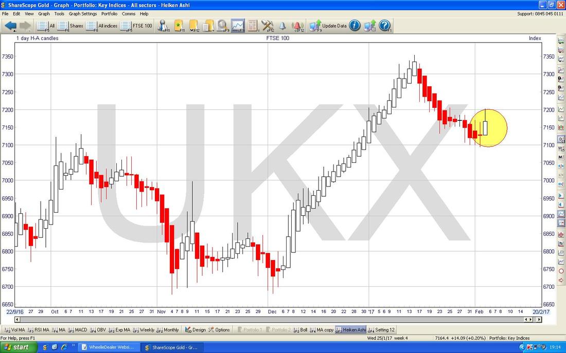
The Chart below has the Daily Heiken Ashi Candles for the FTSE100. I utterly love these things because they cut out so much Noise and give very clear Signals. My Yellow Circle is highlighting where the Down Red Candles narrowed up on Wednesday and Thursday last Week and then we got a big Bullish White Up Candle on Friday - this looks promising.
Dow Jones Industrials Index
The Chart below is a zoomed in view on the Daily Candles for the DOW. The Key thing here is the Sideways Range between 19678 and 20000 and my Green Arrow shows where the DOW Broke-out over 20000 in late January but then it fell back inside the Range as per my Yellow Circle. We then had some sogginess but still within the Range and then my Blue Arrow points to where we have popped out of the Top again and we are back over 20000. 20126 is the next All Time High Resistance that needs to be taken out - it looks pretty likely. 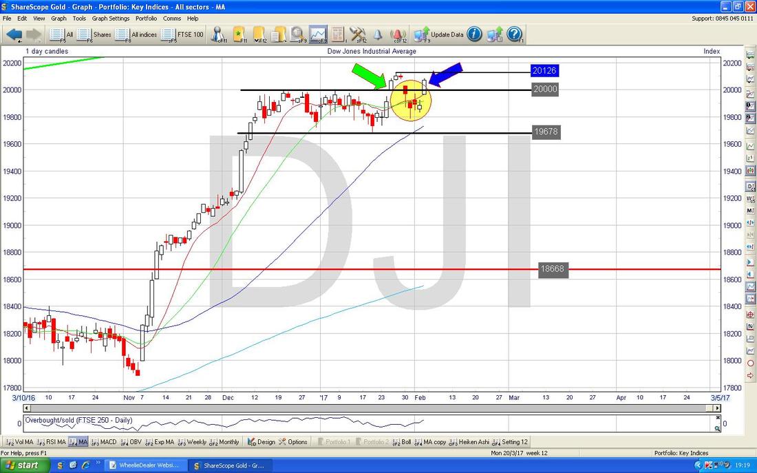
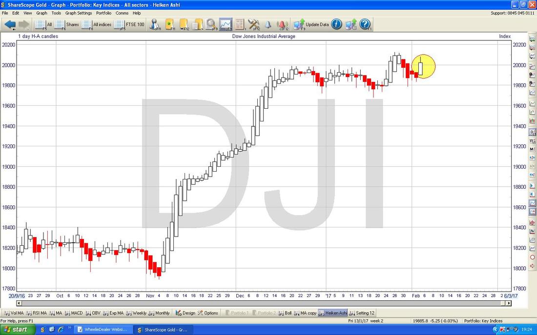
The Chart below has the Daily Heiken Ashi Candles for the DOW and my Yellow Circle highlights where we have a Bullish Looking Big White Up Candle after a string of Red Down Candles - of course there are no guarantees (remember, all TA stuff is probabilistic and just shows the path of least resistance) but this looks promising for Bulls.
FTSE250
This is interesting so I will bung it in. The Chart below has the Daily Candles for the FTSE250 with the Long Term View going back to the 2009 Lows. As you should be able to see, there is a clear Uptrend Channel here - don’t dwell on this Chart, this is just to set the context. Having said that, note we are up at All Time Highs as I will show closer in a mo. 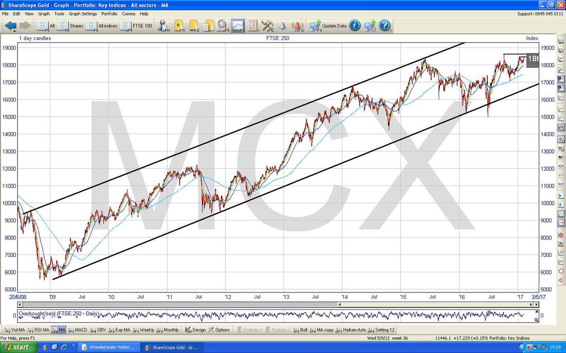
Wow, some colour !! The Chart below zooms in on the FTSE250 Daily Candles and the All Time High is marked at 18607 and this is obviously a Strong Resistance Level that needs to be taken out. My Blue Arrow points to a Big White Up Candle from Friday and the immediate Resistance to overcome is at 18300.
At the very last minute I noticed what might be a Cup & Handle Pattern - my Huge Yellow Circle points out the Cup bit and my Smaller Pinky Circle shows the delicate Handle bit (clearly a proper China Tea Cup like you see on Antiques Roadshow) - the implication of this is that this Cup & Handle Pattern should be bullish if it can breakout over the top of the Handle and it looks like it will do that. 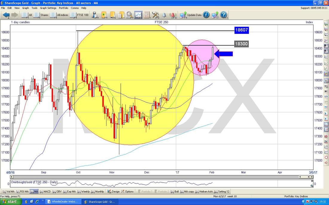
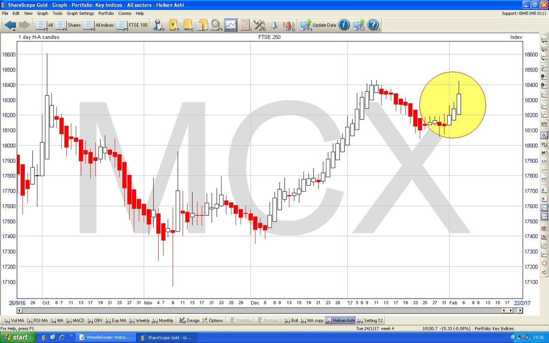
The Chart below has the Daily Heiken Ashi Candles for the FTSE250. My Yellow Circle shows how the Red Candles went narrow and then changed to White and now we have a Big White Up Candle from Friday - looks very bullish.
FTSE Small Caps
I don’t usually show this but I know many Readers (and myself) have exposure to this lower size part of the Market - the Chart below goes back to the 2009 Lows and clearly the Price has stayed within an Uptrend Channel with pretty good discipline since that time. Looks a powerful trend to me. I knew that would make you smile !! 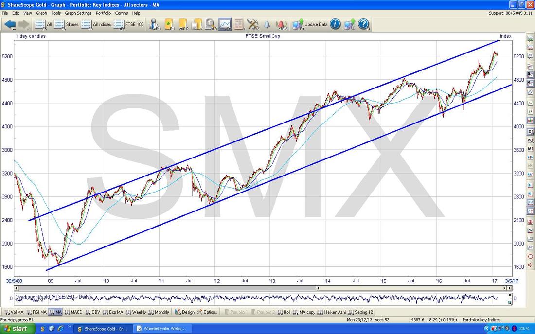
Pound Vs Dollar
As is Charting Best Practice, I want to show a Longer Term view first off and the Chart below shows the Daily Candles for the £/$ going back about 8 Months. OK, this is not what some people would call ‘Long Term’ but what I mean is that it is longer than the Chart I will show you next !! The key point here is that there seems to be 2 Sideways Ranges as marked by the Green Horizontal Lines. The Higher one is from about 1.28 to 1.35 and the Lower one is from about 1.1947 to 1.28. I am showing these because I think it is highly relevant - if the £ is going to recover then it needs to escape the Lower Range and get back into the Higher Range - at the moment it is struggling to do this although I suspect it is far more likely to breakout Upwards rather than Downwards - despite what all the Media Scare Stories will tell you. Remember, the FTSE100 has been reacting very closely to how the £ moves since the Brexit Vote and a Stronger Pound might drag on the FTSE100 whereas a Weaker Pound is generally good for the FTSE100. 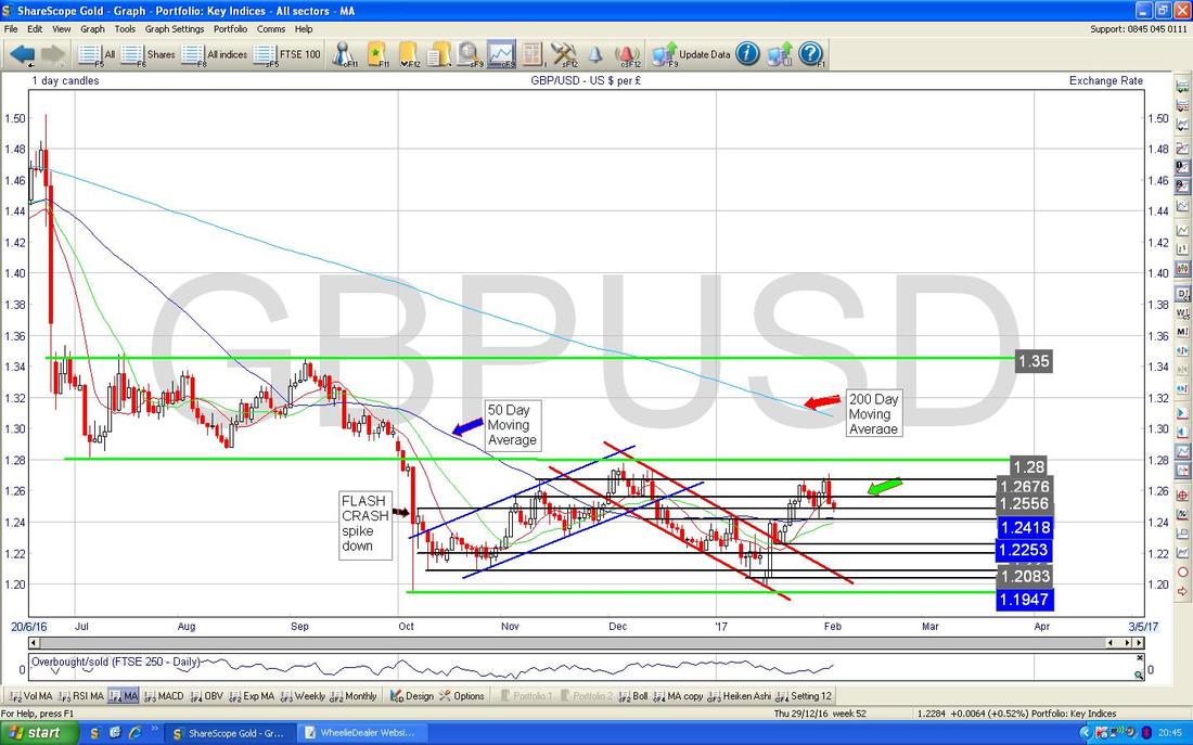
On the Chart below I have zoomed in on the Daily Candles and gone back about 6 Months. My Yellow Circle highlights a sort of ‘Cotton Reel’ Doji from Friday which was Down but didn’t have much push downwards so perhaps there were some Bulls around - this is not a Reversal Candle though and I might be reading too much into it.
However, I have drawn in a Top Line of a possible Uptrend Channel and done this in sort of Mauve or Purple maybe - this is the Line that has the large Arrow pointing at it in a similar horrible colour. I am quite happy with the placement of this Top Line but my Lower Parallel Line only has a couple of weak touch points so it might not be particularly valid - however, if it is correct, then perhaps the £ will turn up earlier than we expect. Something to watch in coming Days. Support is clearly very strong at 1.2418. Overall it is a mixed picture. I am not going to show them here but other Indicators such as the RSI, MACD, Bollinger Bands, Heiken Ashi Candles all look Bearish in the short term so we might see more of a downwards move - the key is for that 1.24 ish level to hold as Support. 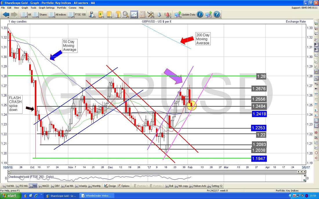
S&P500
I am particularly keen on this one as I have a Long Spreadbet Position which I will talk about next. The Chart has the Daily Candles going back about 3 Months and as you can see we are butting up against the New All Time High (ATH) at 2301 - a Breakout above this would be another Bullish Sign and I am tempted to put another Long Spreadbet on here if it happens. My Black Line marked with the Black Arrow marks a cap on a tight Range that was running for about 7 Months before we got a Breakout to the Upside back on Wednesday 25th January before we had a small Pullback. After this Breakout I took this as a Technically Bullish Signal and I went Long on the S&P500 at 2299. I thought it very possible that it would build on the Breakout straightaway but in practice it fell back but after just 6 soggy Days it looks like the S&P500 is challenging the Highs again as per the Candle from Friday in my Green Circle. It looks to me like the Pullback was a very healthy and normal occurrence within a Bull Move and it merely created an opportunity to take some ‘Heat’ out and calm all the excitement down a little. My Yellow Circle highlights a Hammer Candle that was formed back on Thursday 12th January 2017 where we had a big Reversal during the Day putting in a Low at 2254. I took this as a good level to put my Stoploss under and I have done a Stoploss at 2250 - if it falls through this level I will close the Long Spreadbet. Let me clarify something here. I have mentioned on the Chart that the Stoploss is on an “EOD Close basis” - what I mean by this is that I do not have a ‘programmed in’ Stoploss Order with igIndex but that I will initiate the Stoploss Manually if the Price falls below my Stoploss level. The reason for this is because if you have a firm Stoploss Order with the Broker then it is extremely likely that a Spike Down will close the Stoploss just before the Price reverses and starts to move up and go your way - I try to avoid this particularly because the Markets have a nasty habit of ‘hunting your Stops’. The EOD bit means End of Day Close - so I am not interested in the wobbles during the Day, I will only Trigger the Stoploss if it Closes below my Level at the End of the Day. The obvious risk with this type of ‘manual’ Stoploss is that you must have iron discipline to make sure you execute them. However, it is easy for me because if I do not trigger it then somebody reading the Website will soon let me know !!! 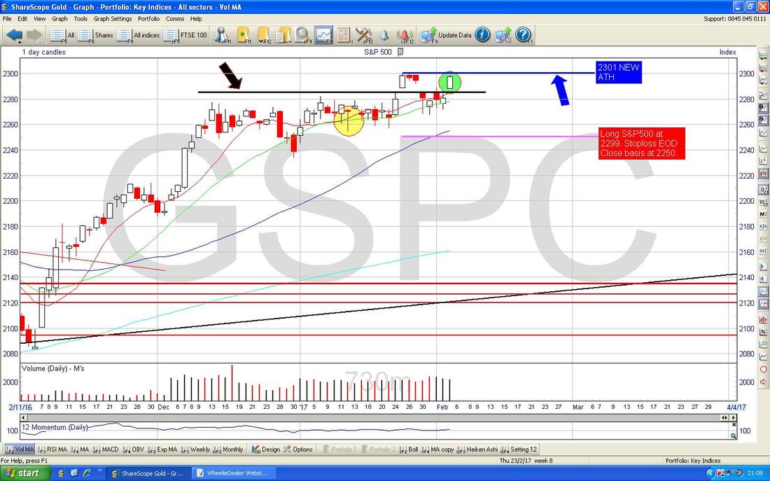
Brent Oil (Spot)
The Chart below has the Daily Candles for Brent Oil (Spot) going back around 6 Months. The Key thing now is that we seem to be in a bit of a Range as marked by my Green Arrows - between about $54 and $57.535 and perhaps as high as $58.375 (note this last number looks like very Strong Resistance and I think this will be difficult to get over - however, if the Oil Price does get over this, then that would be a Very Bullish sign and we might push up to the mid $60s. Support is clearly very Strong at $54 and just below at $53 - if these levels fail, then expect more falls. I doubt this will happen and I think the Oil Price looks pretty happy up around here. My Yellow Circle is highlighting an Inverted Hammer which was bashed out on Thursday and a Narrow Body Doji (Spinning Top) from Friday - both of these suggest the Price will drop in the very short term (which of course would be very consistent with the Range idea I talked about). 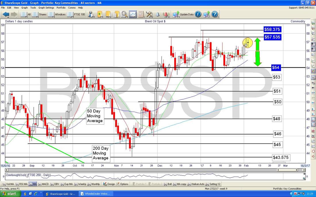
Gold (Spot)
The Chart below has the Daily Candles for Gold (Spot) going back about 4 Months. It is great that we are back over $1200 and I take this as a positive for a while, although Longer Term this could be just a bit of a Recovery before more drops - the recent Low at $1122 is critical here and it must hold. We now seem to be battling with Resistance around $1220 and the Price managed to get up to $1225 Intraday on Thursday 2nd February but it then fell back below $1220. I would like to see a convincing break upwards over $1225 to really feel that things are Bullish again with a fairly short term horizon - as I mentioned earlier the Bigger Picture still looks a bit weak (particularly with the Moving Averages looking a bit ropey). 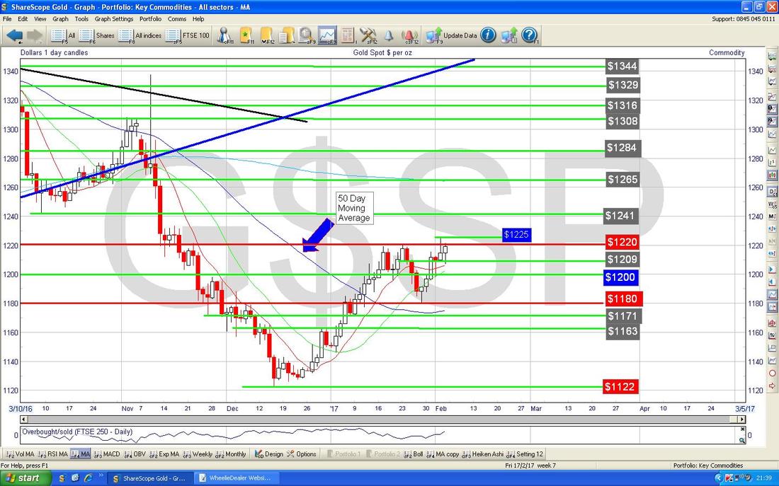
The Chart below has the Daily Heiken Ashi Candles for Gold (Spot) - my Yellow Circle is highlighting how things look quite bullish with some nice Up White Candles.
Right, that’s it for this week - what an epic !!! I better proof read it now or it will be nowt but Spelinhglmistakes and grammatical errors. Laters Peeps, WD. 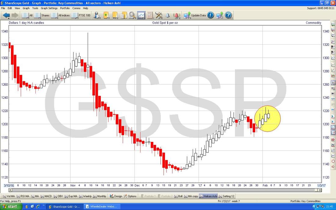
0 Comments
Leave a Reply. |
'Educational' WheelieBlogsWelcome to my Educational Blog Page - I have another 'Stocks & Markets' Blog Page which you can access via a Button on the top of the Homepage. Archives
May 2024
Categories
All
Please see the Full Range of Book Ideas in Wheelie's Bookshop.
|
