|
“The Trump Shutdown” is how Nancy Pelosi of the Democrats is labelling the latest fiasco with the US Government and clearly this is a direct attempt (which will most likely succeed) to blame Trump for the Shutdown.
As always this is really about Politics and the Democrats see a great opportunity to engineer the Shutdown and pin it on the President - and with Public support overwhelmingly on the side of an Amnesty for the DACA ‘Dreamers’, and with Trump’s Approval Ratings an all time low for a President after 1 year of Office, their timing is probably spot on. This also managed to disrupt Trump’s one year Anniversary celebrations and of course will set the Dems up nicely for the upcoming Mid-term Elections.
Things don’t look great for Trump - his Base is pretty solid and they seem to just close their minds to all the nonsense he Tweets and they see any shortcomings as a fabrication by an Elite-Supporting, Left-wing Media. The only thing in Trump’s favour is the strength of the US Economy - in fact his Approval Ratings here are very high. As Billy Clinton used to say “it’s the Economy, Stupid” but whether that will save Trump this time is unclear. Once the Tax Cuts and Wage Checks with any Bonuses from large employers start to come through (some ‘normal‘ Workers will be getting an extra £1000 or so), this could well change how Voters view Trump.
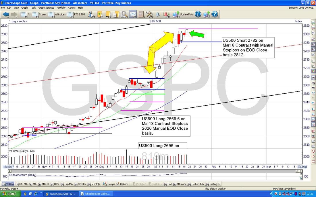
One clear problem the Dems have is that they don’t really have any Policies that appeal to the average working Voter - being ‘the Trump Resistance Movement’ isn’t really a manifesto for Office and of course they lack any inspiring Leadership - even if that is all just words like their last President. Lord only knows what the Markets will make of the Government Shutdown and I guess it depends on how long it drags on for. If it can be resolved in a few Days then perhaps it is no big deal but if it drags on for longer than this, then it must start to have an impact on Confidence of Consumers etc. To an extent the Shutdown makes no difference for some Days but it means that many Government Employees will be served their Notice and things like Expenses Claims won’t get paid - so the effect on the US Economy if it drags on could be quite damaging. At least I would expect some impact on the Dollar and it most likely means more weakness ahead - that would be supportive of Metals and Oil perhaps, which might help the FTSE100.…… As I go to publish this, Bloomberg is talking about a ‘Compromise Vote’ to try to avert the Shutdown - this could take place in the early hours of Monday morning in UK time. Last week Last week was very similar to the week before for me with my Portfolio struggling all week - Monday to Thursday but then putting in a bit of a recovery on Friday - however, that was not a large enough improvement to make a big difference and my Portfolio ended up down 0.5% on the week - nothing disastrous obviously. Last week was a bit funny for me because despite owning in excess of 50 Stocks, I actually had very little News from them (if it was going to be Profit Warnings then maybe that was a good thing !!) - however, this week coming I have a few that are due to report so I might see some more action - one direction or another !! February Remarkably there is only one more week to go in January so I thought I might as well cast my mind forwards to what February is likely to bring us. According to my old copy of the ‘UK Stockmarket Almanac 2016’, a typical February means that the FTSE100 rises 1.1% on average and for 61% of Februarys which makes it the 3rd best month - so it has a strong record. A usual February sees the FTSE100 rise in the first 2.5 weeks but then it drifts off for the remainder of the month. Along with January, since 2000 Mid Cap Stocks have tended to outperform the FTSE100 with an average outperformance of 1.7% - which is quite a lot (remember these figures do not include February 2017 results cos my Book is too old !!). The US Indexes strike me as very toppy at the moment (I have a tiny Short on the S&P500 which we will look at in a tad) and the FTSE100 and FTSE250 seem to have come off the boil a bit already - this makes me think that we might see some softness in the coming weeks and this could chime nicely with the idea that in a typical February we see Stocks rise in the first few weeks (obviously the timing of such periods starting or ending is never exactly spot on and having now looked at the FTSE100 and FTSE250 Charts, they might be turning up.) S&P500 As always my Charts are from the brilliant ShareScope Software that I use and if you click on them they should grow bigger for you to see the details better (assuming I loaded them into the Website system correctly of course !!). The Screen below is my actual ‘working’ Chart that I use to track my S&P500 Short and the Blue Horizontal Line at 2782 is where I opened my Short and the Pinky/Mauve sort of Horizontal Line right at the top at 2812 marks my Stoploss Level - in fact, this screen is my Trigger and once the Price closes over my Stoploss Level that will be the Manual Trigger for me to go to my igIndex Platform and Close the Short and take a small Loss. The Green Arrow is pointing to a small White Up Doji Candle from Friday 19th January and on the face of this I would expect it to go above my Stoploss Line very soon - however, with the Government Shutdown, perhaps the Price will fall. We shall see and I am not going to worry about it too much and I will let the Stoploss do its job if need be. I will be checking this Chart on Monday Night after the Market is Closed. My big Yellow Arrows are just trying to point to how we have had an amazingly Strong and Steep run up in the Price over about 3 Weeks - this looks really Toppy and precarious but of course Markets can always stay daft for quite a long time.
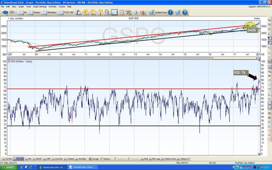
In the bottom Window on the Chart below we have the RSI (Relative Strength Index) for the S&P500 Daily Chart. On a Reading of RSI 79 this is extremely high and of course such a level is not sustainable - in the very short term it is possible that it can go higher, but not by much, and in order to unwind such a high RSI Reading the Price will need to either go Sideways for a bit (Consolidation by time) or drop back (Consolidation by Price).
However, if either of these Scenarios plays out, it does not mean that we are doomed and the US Markets are going to tank - if anything, I would see this as a Healthy Pullback and just set up the perfect conditions for the Markets to move higher. As I have mentioned before, I am more concerned about what might happen around April/May as we get towards the historically weaker Summer Months (my goodness I would appreciate a bit of Summer !!).
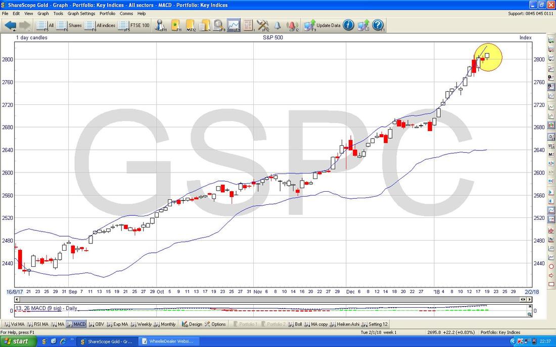
The Chart below has the Daily Price Candlesticks with the Blue Wobbly ‘Bollinger Bands’ above and below. My Yellow Circle is capturing where in the last couple of Days the Price Candles have moved away from the Upper Bollinger Band - this suggest the force of the move up is weakening and it could at best go Sideways.
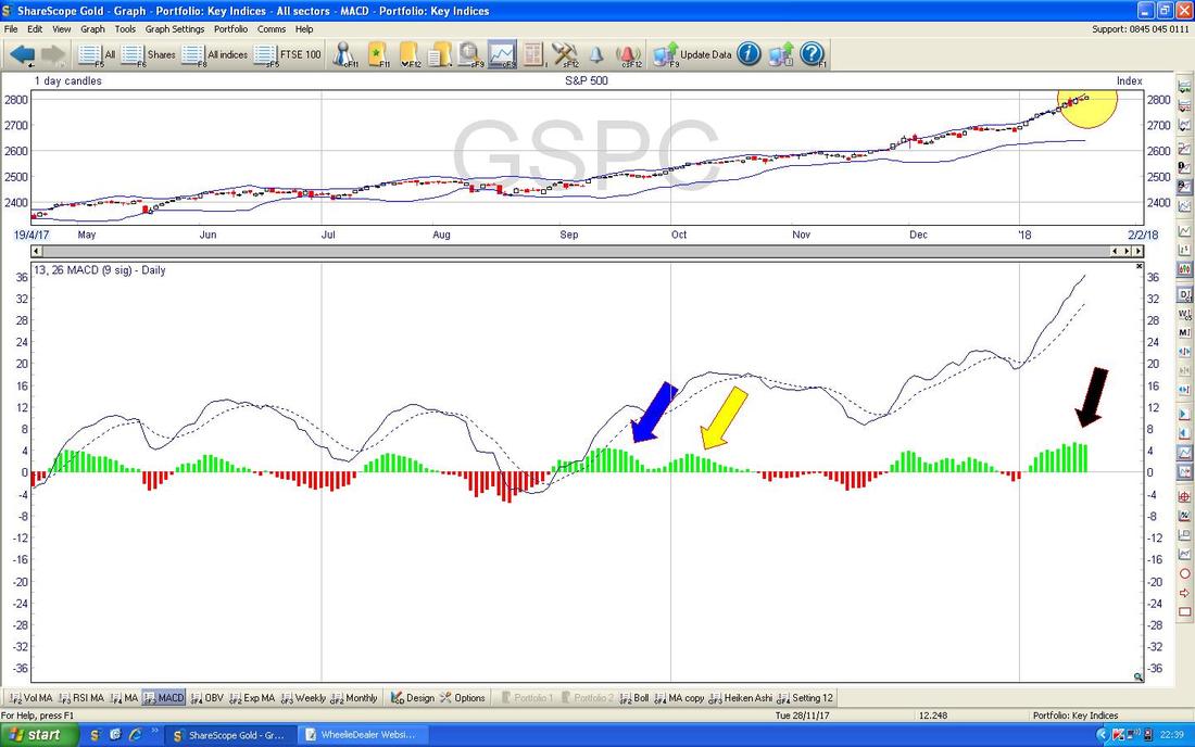
In the bottom window on the Screen below we have the MACD (Moving Average Convergence Divergence) for the S&P500. My Black Arrow is pointing to where the Green MACD ‘Hump’ is starting to curve over but if you look back to where my Blue Arrow is, this shows how a similar Hump formed up but it did not actually become a Negative Red Hump but managed to turn up again and form another Green Hump where my Yellow Arrow is.
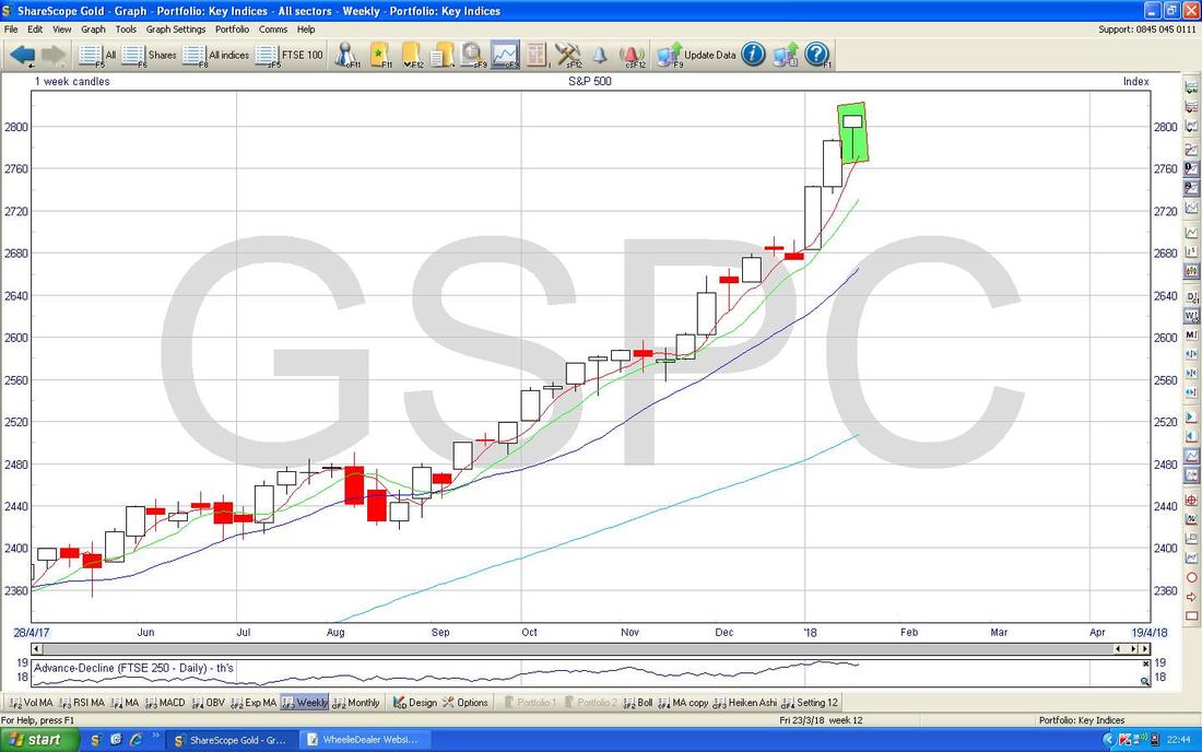
On the Screen below we have the Weekly Candles for the S&P500 - my Green Rectangle is capturing the Candle from last Week and it is clearly some sort of Hammer - this is unusual because a normal Reversal Signal would be an Inverted Hammer (in other words the Metal Bit of the Hammer, if you see what I mean, would be at the Bottom and the Wooden Handle would be pointing upwards - so this one is upside down.) However, in the context of the strong run up and very Overbought RSI Readings, I suspect this Hammer could be marking a Reversal - we shall see.
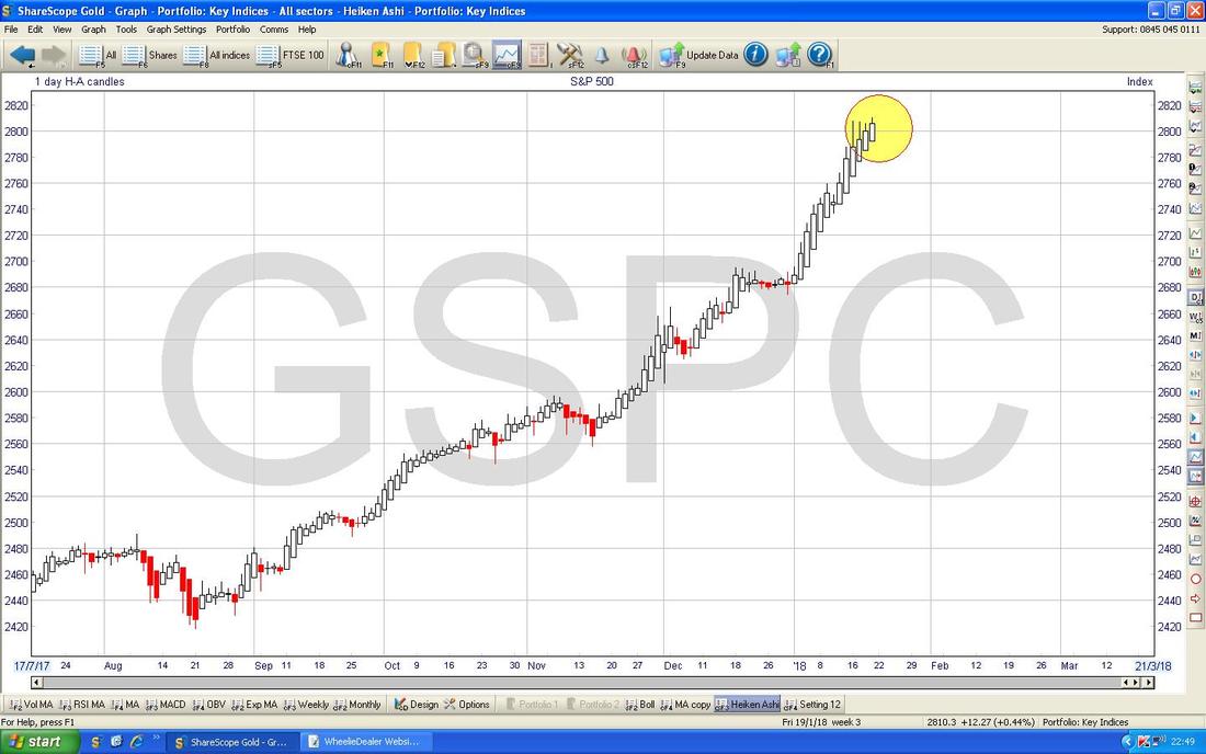
The Chart below has the Daily Heiken Ashi Candles - remember these things are very different to ‘Normal’ Candles and they are ‘slower’ but give very clear Signals and are easy to read. My Yellow Circle is showing how we are still seeing Big White Up Candles and at the moment they are not signalling a Reversal. Note my comment about HA Candles being ‘slower’ - it is very normal to get a Reversal Signal from the Normal Candles but not to get one immediately from the HA Candles - but it would appear soon afterwards if the Price does drop.
Over time I have been refining precisely how I place Index Shorts and Longs and my intention is to produce a brief Blog in coming Weeks which outlines exactly what my thinking is around this now.
Dow Jones Industrials Index - The DOW
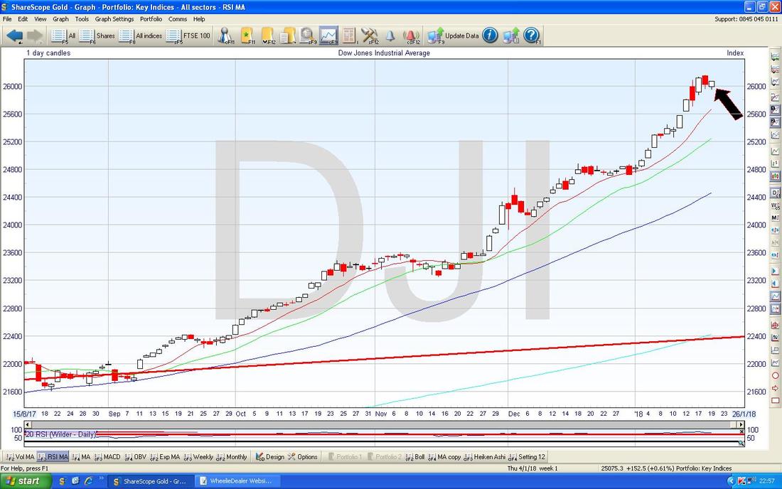
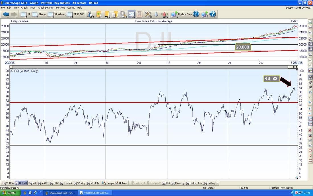
The DOW comprises just 30 enormous Stocks in the US and is therefore a very ‘narrow’ Index compared to the 500 Stocks in the S&P500. My Chart below has the Daily Candles for the DOW and my Black Arrow is pointing to a Small White Up Candle from Friday but note this didn’t get up near the All Time High - compare and contrast this to the Candles on the S&P500 which I showed earlier.
In the bottom window on the Screen below we have the RSI for the DOW Daily, and on a Reading of RSI 82 it is extremely high and ‘overbought’ and note how it has flicked down a bit.
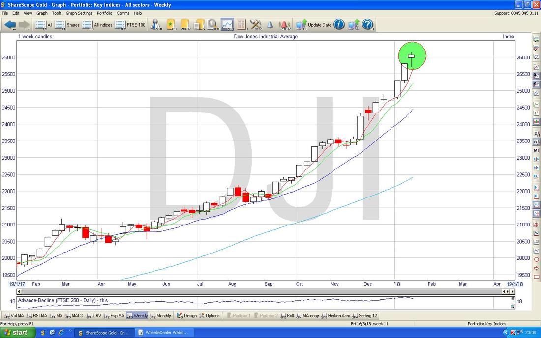
My Chart below has the Weekly Candles for the DOW - look how again we have a Hammer (arguably this is a ‘Hanging Man’ I think) marked by my Green Circle and this could mark a Reversal Point.
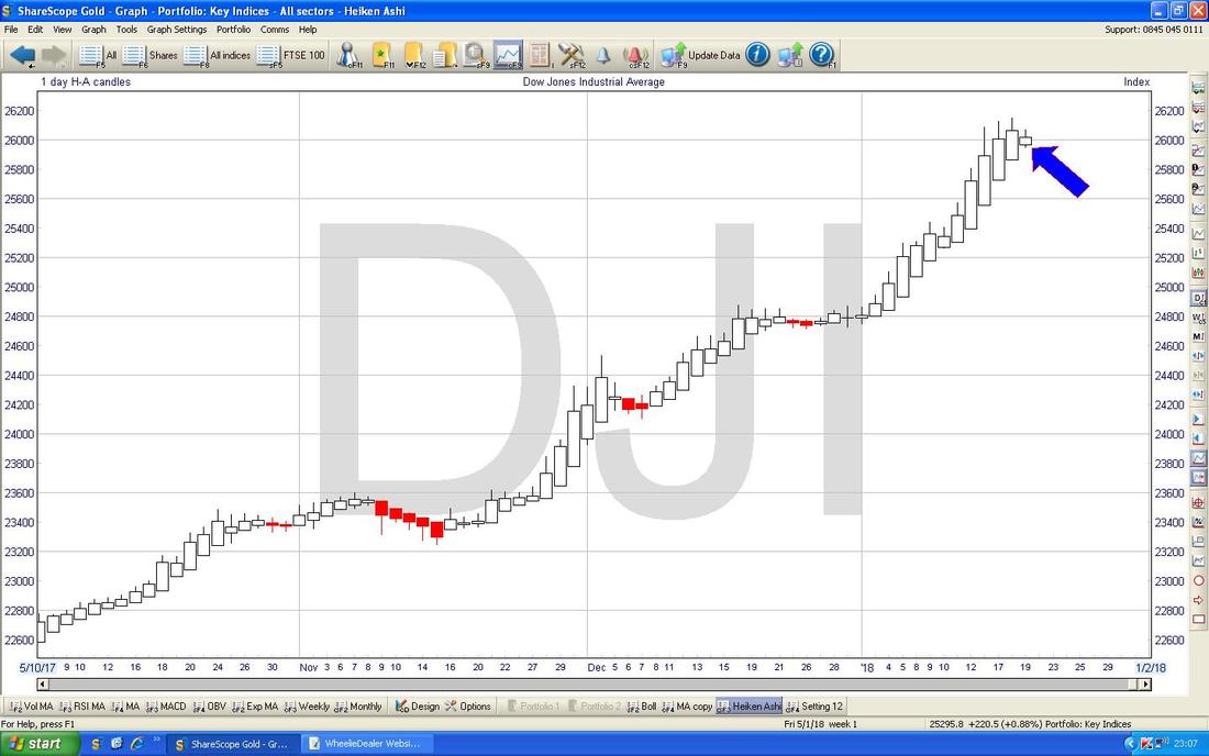
My Chart below has the Heiken Ashi Candles for the DOW Daily - my Blue Arrow is pointing out something quite important here - note how even though we got a White Up Candle on Friday, it has narrowed and this suggests we could be nearing a turn.
The Nasdaq Comp is much nearer the S&P500 so I won’t bother showing it here.
Brent Crude Oil (Spot)
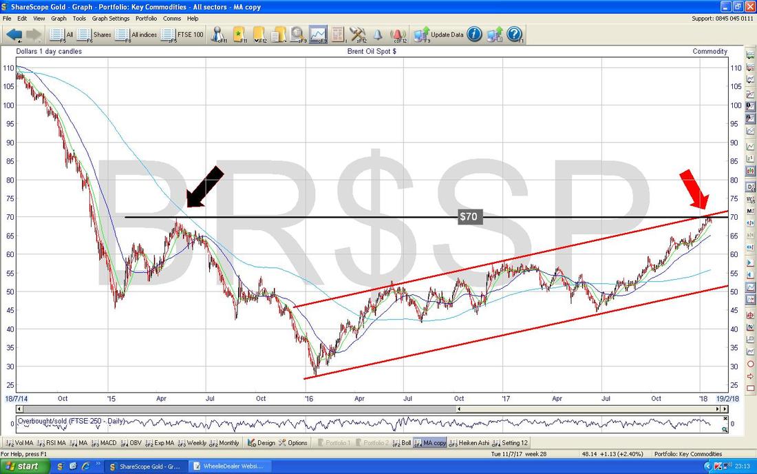
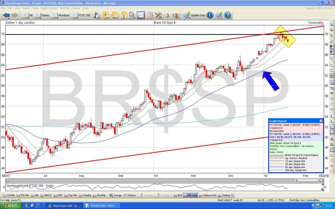
The Chart below attempts to do a bit of ‘Big Picture’ stuff which is always essential looking at any Chart - start big and then drill down to shorter timeframes (because the Long Term more established Trends will dominate over the Shorter Term happenings.) This is a great Chart because it is remarkably simple but it shows such a Key Factor in how Brent Oil is likely to behave in coming Days/Weeks. The Main thing here is clearly the $70 Resistance Line which is marked by my Horizontal Black Line which stems from the Peak back in May 2015 but note also how we have my Parallel Red Lines from the January 2016 Low which denote a very clean and disciplined Uptrend Channel. Where my Red Arrow is, note how the Price is now butting up against the Upper Red Line of the Uptrend Channel but also the Long Term Horizontal Resistance at $70 - this is telling us that $70 is a critical level. It is most likely that the Price would fall back from $70 I would think but if it does manage to Break above the Black Line, then this would suggest a high degree of Bullishness and it would set up more gains - we would probably see $80 quite soon. If the US Government Slowdown drags on and weakens the Dollar a lot, then perhaps we will see such a Bullish Breakout. This might be supportive of the FTSE100 - remember that Shell RDSB and BP. are both huge Weightings within the FTSE100 so they have a disproportionate impact on how that wider Index moves.
On the Chart below I have kept all the Lines from the previous Chart exactly the same but just moved the Grey Slider at the bottom of my ShareScope Screen to shorten the Timeframe. My Yellow Rectangle is highlighting how in the last few Days we have seen the Price drop back from the Peak around $70 but note my Blue Arrow which is marking the Blue 50 Day Moving Average Line and look how this has been an excellent area of Support for all of this Uptrend and it is pretty likely that continues to be the case.
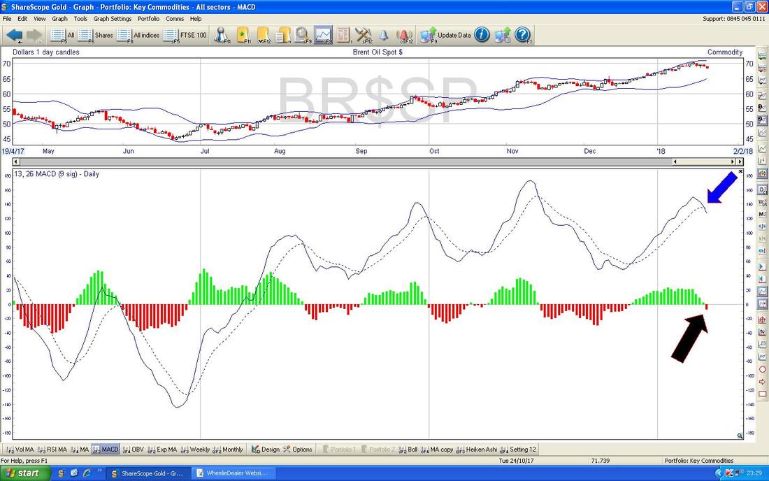
The bottom window on the Chart below has the MACD for Brent Oil Spot Daily - my Black Arrow is pointing to where we got a ‘Bearish MACD Cross’ on Friday and my Blue Arrow is showing exactly the same Signal but this time in the ‘Signal Lines’ format rather than the Histogram Humps.
This suggests more falls but note as per the Chart above that we could easily see a pullback towards the 50 Day Moving Average Line without disrupting the Uptrend at all. It would merely be a ‘Retracement’ within the Major Uptrend.
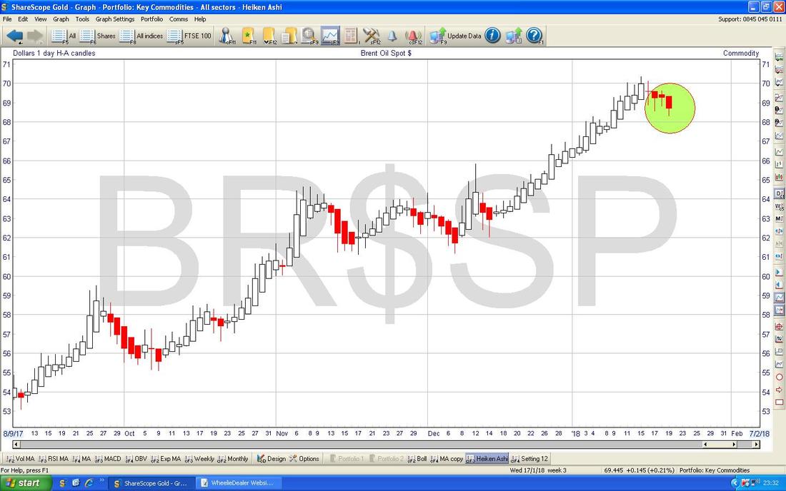
I have included the Daily Heiken Ashi Candles for Brent Crude Oil (Spot) Daily partly to show the usefulness of this tool - I adore them to be honest (ok, that might not be healthy). My Green Circle highlights where we now have a Big Red Down Candle from Friday and this suggests more falls ahead (although remember this is a ‘slow’ Indicator so a turn up could happen before it is reflected here).
FTSE100
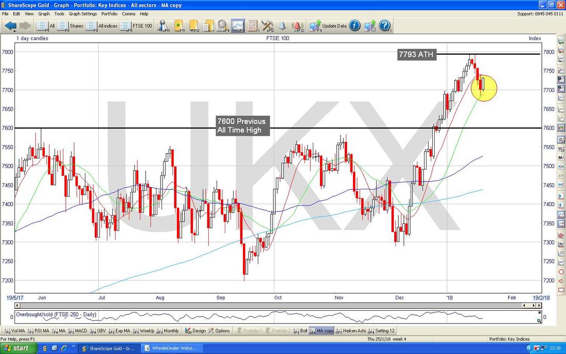
There’s not much point looking at ‘The Big Picture’ here - we are up near All Time Highs (7793 the latest one) and recently Broke-out above 7600 which was a very Bullish development. My Chart below has the Daily Candles going back about 7 Months or so and my Yellow Circle is highlighting how on Thursday the FTSE100 fell but managed to Close up off the Low point of the Day and then on Friday we had a nice White Up Candle - and this can only really be seen as Bullish. If the FTSE100 does drop back, then I would expect the 7600 Level which was the Previous All Time High would now be very good Support - this gives some hope to those who fear that a Huge Drop is coming - it needs to break below 7600 first - so unless that occurs, there’s not much point worrying about it !! To the upside, 7793 is the New All Time High and a move over this would be very bullish - in truth, I would fudge this to 7800 as being the really important Level for Bulls to crack. If this happens, then I would expect 8000 to be very possible……….
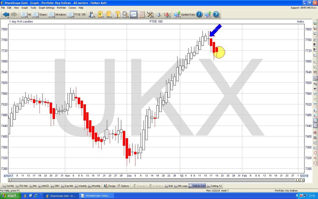
I have included the HA Candles below because they give some great examples of how useful these things are. This is the Daily HAs again and first off look at my Blue Arrow which is pointing to where we got a Candle with a Body so narrow that it is just a line - a great Signal that the Upmove of White Candles was perhaps about to end. This played out exactly and it then fell for the next few days but note were my Yellow Circle is that on Friday we still got a Red Down Candle but the Body has started to narrow - this might come to nothing, but it is a hint that a change back to an Upmove might be imminent (and we know the normal Candles are hinting at such a possibility and they tend to be a more timely Indicator).
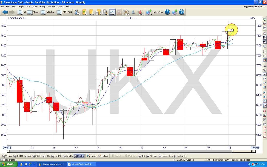
Last week we got a Big Red Down Candle on the FTSE100 which pretty much wiped out an Up Week from the week before. However, I am not going to show that because it is quite boring but on the Chart below I have the Monthly Candles and I am jumping the gun here to show you something that could be forming up and it is something we need to monitor in coming Days - if things don’t change much and we get a Candle very similar to the one that I am pointing out in my Yellow Circle, then this would hint that the force of the move up on the FTSE100 Monthly Candles is weakening and it could even be a Reversal Point which would mean falls ahead. Another week and we will know.
FTSE250
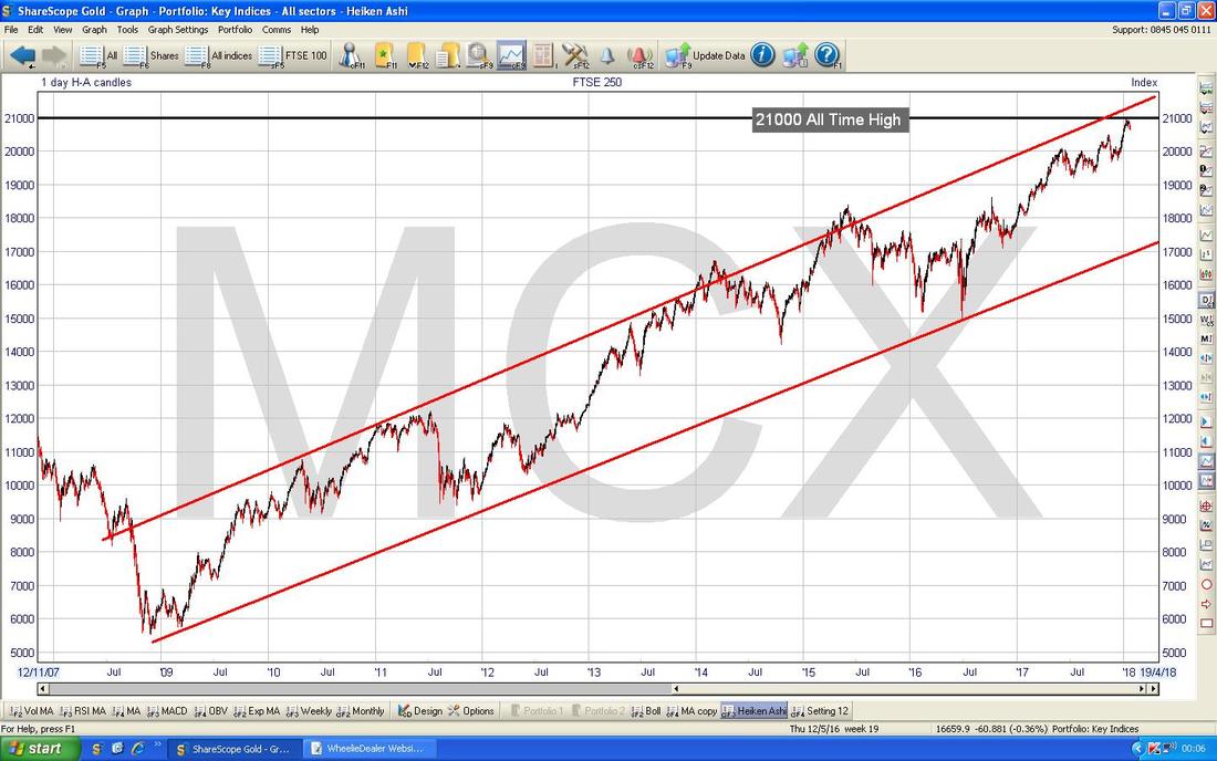
This is perhaps the most relevant Index for most Readers of the WD Website stuff as it reflects not only Stocks that make up the FTSE250 but it also acts as a good proxy for where the Smaller Indexes (FTSE Smallcap, AIM All-Share etc.) are likely to go. My Chart below is the Big Picture and the clear story here is the superb Uptrend Channel marked by my Parallel Red Lines since the 2009 Lows and the New All Time High which is pretty much up at 21000. As always, a Breakout over 21000 would be extremely bullish. I just realised I ballsed up here and actually used the Heiken Ashi Candles to create this chart - however, it is not much different with Normal Candles so I am not going to alter it.
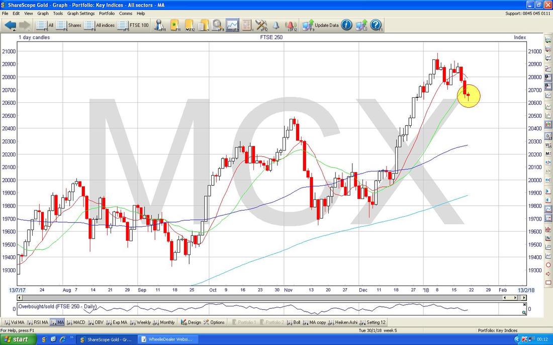
On my Chart below we have the NORMAL Daily Candles and my Yellow Circle is highlighting a small Hammer Candle sort of thing from Friday and this suggests that the move down in the previous few Days might be about to change direction and move up again.
Time’s running tight so I will now look at a brace of Stocks that did interesting things last week (like a prime pair of plump plucked pheasants).
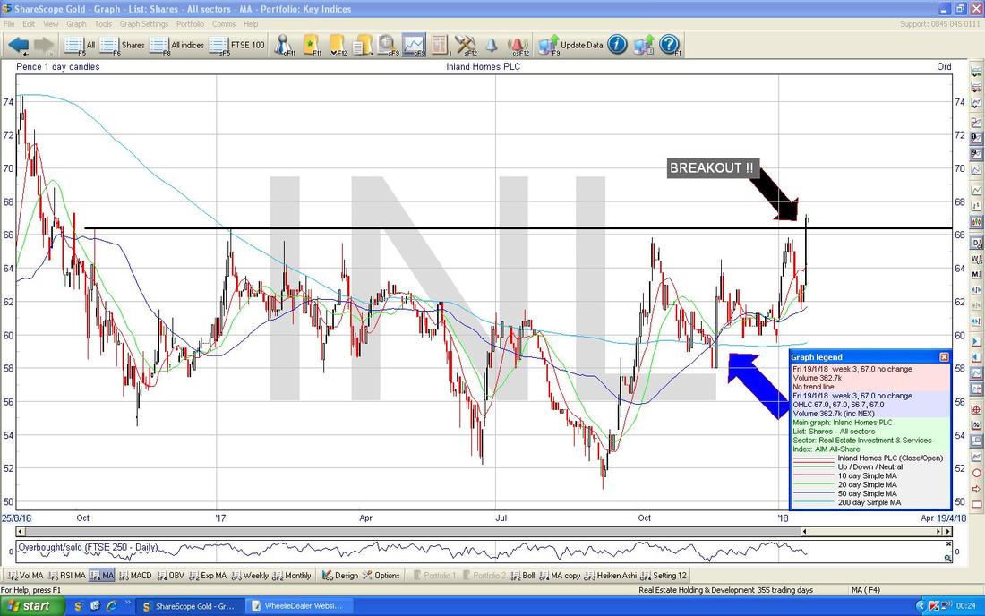
Inland Homes INL Inland is quite an interesting business from several viewpoints - firstly there is clearly a massive shortage of Housing in the UK and this is a very hot Political Topic which no Government will ignore going forwards - but whatever Policies are spewed out, it is highly probable that not enough Houses are going to be built fast enough and this is highly supportive of not only House Prices but also the Wheezes that are used to try to “help First Time Buyers” etc. It is quite a tradition for Housebuilding Stocks to do very well in Quarter 1 of a Calendar Year and of course INL could benefit if such a trend plays out this year. In terms of Valuation, INL is on a Discount to Net Asset Value (NAV) of about 40% or so I understand (you need to check this !!) and with a Forward Dividend Yield of nearly 3.7% and a Forward P/E of 7.8 it looks pretty good. Anyway, the Chart looks great - my Black Arrow below is showing where we got a Bullish Breakout of my Black Line at about 66.5p which had penned in the Price for about 1.5 Years (Breakouts after long time periods are especially significant) and my Blue Arrow is pointing to a Bullish ‘Golden Cross’ between the Darker Blue Wavy Line which is the 50 Day Moving Average and the Lighter Blue Wavy Line which is the 200 Day MA - this implies more gains to come in the Weeks/Months ahead. Simon Thompson in the Investors Chronicle covers INL. I do not hold them myself but I am a fan.
Fevertree Drinks FEVR
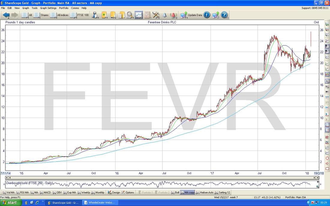
I hold FEVR myself and bought fairly recently on the basis that the Forecasts for Revenue, Profits and Earnings per Share look far too low and are assuming pretty sedate Growth which I think will turn out to be hugely wrong. I won’t go into this here because I have written about it lots of times (if you go to my ‘Trades’ page you can see my recent Buys and I think I mention the Growth Forecasts there). Anyway, the Chart below is the All Time Chart and shows the powerful Uptrend and Momentum which has been behind this Stock and note in particular how the Light Blue Wavy Line which is the 200 Day Moving Average has acted as very good Support.
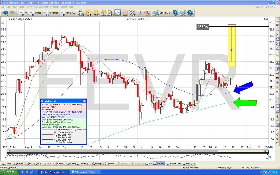
Zooming in, the Chart below has the Daily Candles for FEVR and on Friday we were treated to that impressive ‘Long Tails Doji’ which is captured in my Yellow Rectangle after Takeover Rumours from Unilever ULVR started doing the rounds (with a Bid Takeout Price of 2800p being suggested). The Intraday High on Friday was at 2569p and this is now the All Time High which needs to be broken over - if this is achieved, that would be Super Bullish.
I mentioned on a Tweet a few Days before the Bid Rumours that the FEVR Chart seemed to be turning up and I won’t go into all of the reasons I was thinking this but an important one was that the Darker Blue Wavy Line (marked by my Blue Arrow) which is the 50 Day Moving Average had been heading down towards the Lighter Blue Wavy Line which is the 200 Day Moving Average (marked by my Green Arrow). If these 2 had crossed over, then we would have had a Bearish ‘Death Cross’ which would have suggested more falls ahead in coming Weeks and Months - however, note how the 50 Day Moving Average managed to avoid the Cross and it started to turn up again - this is Bullish.
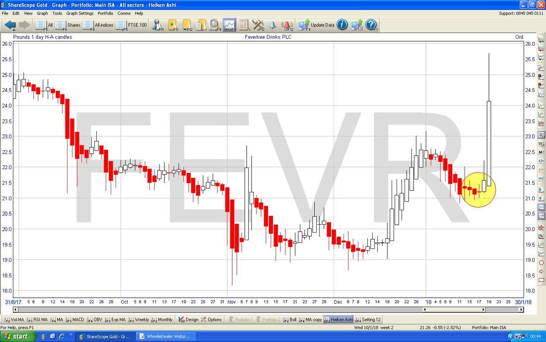
My Chart below has the Daily Heiken Ashi Candles for FEVR. Note where my Yellow Circle is how the Price had been falling with a string of about 5 or so Big Red Down Candles but then the Candle Bodies started to narrow and then in the middle of my Circle the Body went to just a Line and then the Body opened up and Turned White - and then we got the Bid on Friday.
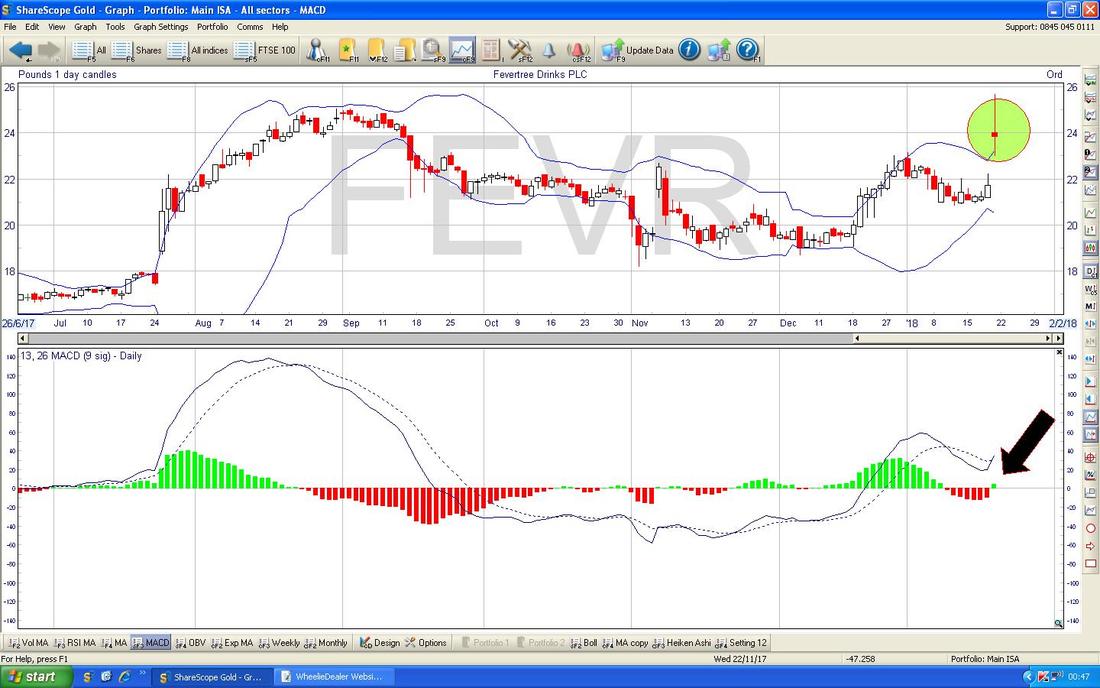
This will have to be my last Chart as it is now nearly 1am and I need to Proof Read this twaddle and upload it to the System etc. In the top Window on the Screen below we have the Big Long Tails Doji from Friday in my Green Circle and note it is totally outside the Upper Blue Wavy Bollinger Band - this suggests it needs to drop back inside the Bands or if a Takeover Bid is coming, we need it fast or the Price will need to consolidate a bit (it could go Sideways).
On the flipside, in the Bottom Window we have the MACD for FEVR Daily and my Black Arrow is pointing out a Bullish MACD Cross on the Histogram format. I haven’t marked it, but you might be able to make out the same thing in the Signal Lines format just above it. OK, that’s it for this week - good luck y’all, Cheers, WD
0 Comments
Leave a Reply. |
'Educational' WheelieBlogsWelcome to my Educational Blog Page - I have another 'Stocks & Markets' Blog Page which you can access via a Button on the top of the Homepage. Archives
May 2024
Categories
All
Please see the Full Range of Book Ideas in Wheelie's Bookshop.
|

