

|
educational blogs |
|
As always, I am running behind, this time due to the MotoGP getting delayed by rain in the Qatar Desert (yes, how nuts is that?) so I will try and whizz through this one and get into the Charts quickly. Before I do that, with the Clocks changing in the UK it means that the US Markets are now back to what we normally expect with them opening at 2.30pm UK time and closing at 9pm UK time.
Something that has been taking my attention lately has been the strength of Economies the world over - and I noticed in Investors Chronicle this weekend that we are due a fair bit of Economic Data from Europe and the US in particular and this will be worth keeping an eye on to see if we get more evidence of a pretty buoyant backdrop for Stocks. It is also worth noting how the UK had some really strong Retail Sales numbers last week and nobody saw this coming.
I was very distracted on Friday (this is not unusual, as to me it is a ‘Day of Rest’ cos I find the Markets very choppy and unpredictable and by the end of the Week I have lost interest and the PUB has much more appeal) partly because I was off to see Rob Brydon in Basingstoke and I set off before the Markets closed. I got back home very late (Brydon was really good though - well worth seeing) and ended up doing my Daily and Weekly Numbers at about 1am - and the thing that struck me was how the DOW had dropped below its recent Low after Trumpy had failed to get his replacement for Obamacare through Congress. The Markets seemed to take this as a negative because it suggests he may have trouble getting other Policies through - although it might actually be more nuanced than this and the Healthcare issue had some very opposing views within the Republican Party but we might not see such polarisation when it comes to things like Tax Reform.
There is also a positive in that it now means the focus will move from the Healthcare Bill to addressing Tax Reform and this brings the latter forwards by about 3 months apparently - this is a key Reform that could boost the US Economy and the Markets might really like this. Bearing all this in mind, let’s start with the DOW and the US Charts as they could be setting the tone for the week ahead. Dow Jones Industrials Index Big picture first - as you can see a very sweet and pretty nicely defined Uptrend Channel since the 2009 Lows. A thing of beauty and no need to get too worried at all unless we see a drop below the Bottom Line of the Channel at about 17500 to 18000 ish. Of course, as we go into Spring it would not be unusual to see Markets dropping off a bit - especially after the strong run up we have had since the tail end of 2016. 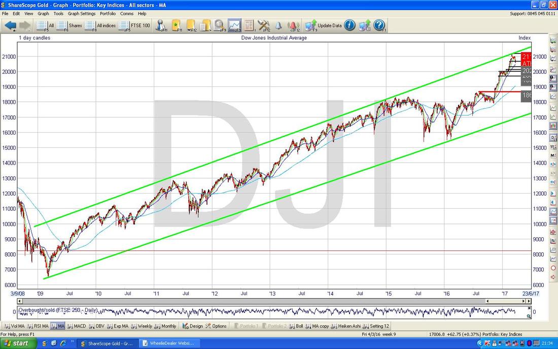
Following Good Practice of how things should be done, after showing you this first Chart I then started drilling down to shorter timeframes and noticed another Uptrend Channel which has been in place since early 2016. The Chart below shows this with the Blue Lines marked by the Blue Arrows. This Uptrend Channel has the Bottom Line at around 19500 and of course we need the Price to stay in this Uptrend Channel if possible over coming Months although if it does fail, we still have the bigger Long Term Uptrend Channel which I showed in the previous Chart. As I mentioned last week, there is a lot of Support all over this Chart which bodes very well for us in the near future - in other words, if we do get a drop, it probably won’t amount to much.
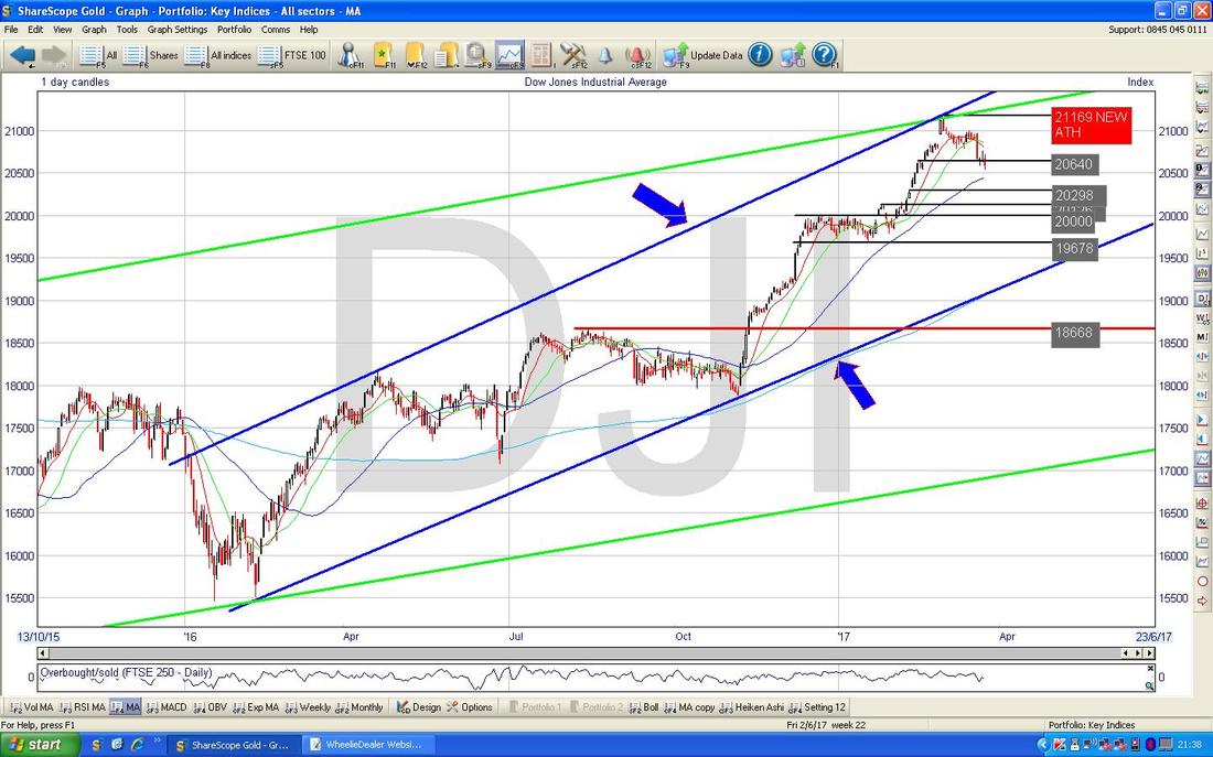
I have now drilled in a lot more to just the last 4 months ish. Here we have the Daily Candlesticks for the DOW and my Red Arrow is pointing to a ‘Doji’ Candle which we had on Friday 24th March and as I mentioned at the start of this Blog, it went below the Low Point of the Candle from 2 days before (Wednesday 22nd March). Following this we now have Support at 20529 first off and then the 50 Day Moving Average (which is the Blue Wiggly Line I have prodded with the Black Arrow) should act as Support at about 20450 ish. Note how in recent Weeks the Price has dropped down towards the 50 Day Moving Average as a sort of normal Pullback - it could well be that what we are witnessing now could simply be more of the same - this is most likely in my view.
Note to the Upside we now have Resistance up at 20800 in particular which may prove difficult to get over and after that we had a recent New All Time High at 21169 which obviously needs to be taken out. 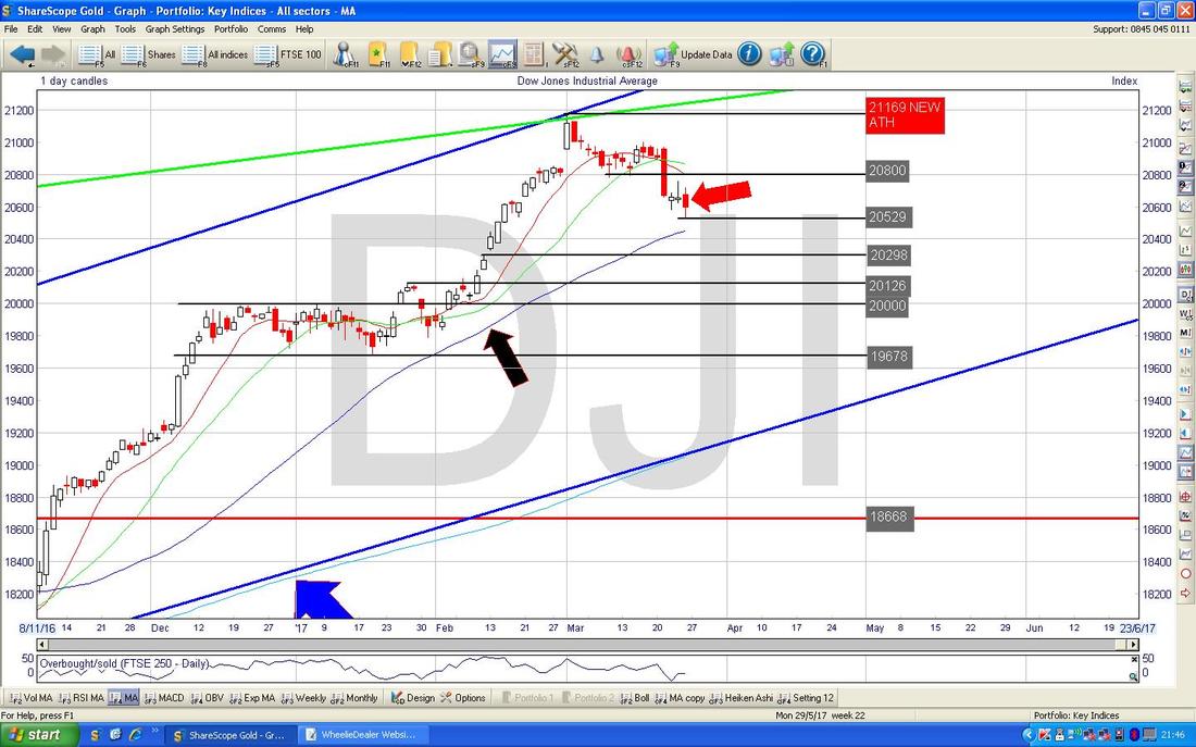
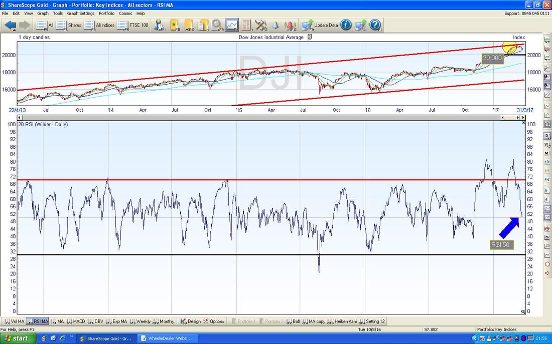
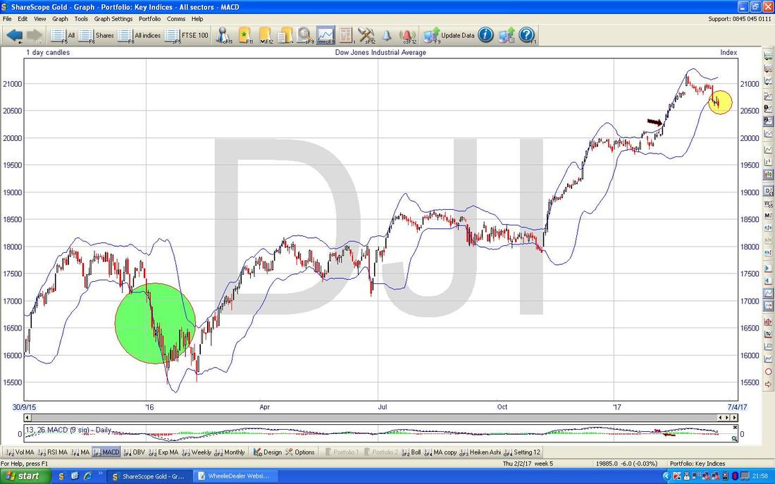
In the bottom window on the ScreenShot below (as always, the Piccies are courtesy of the Award-breaking ShareScope software that I use) we have the RSI (Relative Strength Indicator) for the DOW - on a reading of RSI 50 this is at the ‘Neutral’ level but it has downwards momentum and can easily drop a whole lot more.
On the Chart below we have the Daily Candles for the DOW with the Bollinger Bands being the wiggly Blue Lines above and below. My Yellow Circle shows that we are on the Bottom Bollie Band which could be a place to rebound from but note my big Green Circle to the left where we ‘hugged’ the Bottom Band and fell a lot. The Doji Candle from Friday does not particularly suggest a Reversal and I suspect we could fall a bit more before turning up again - but I see no big need for panic.
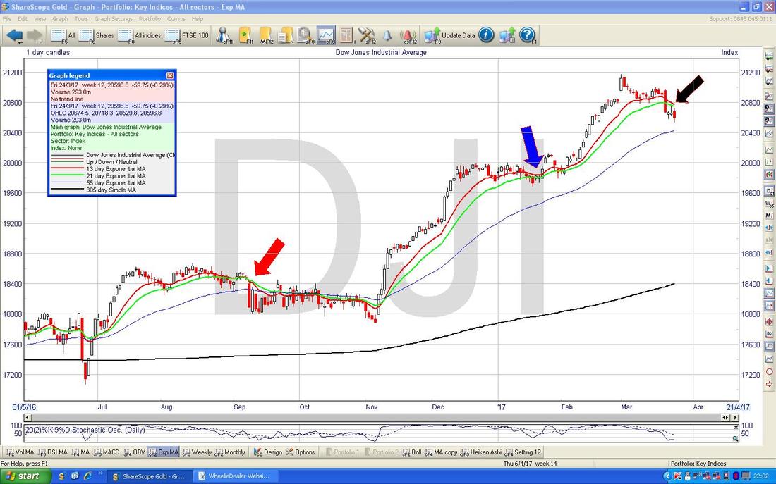
On the Chart below we are concerned with the Red Wavy Line which is the 13 Day Exponential Moving Average and the Green Wavy Line which is the 21 Day EMA. My Black Arrow is pointing to where we might be on the verge of a Bearish ‘Death Cross’ - look back to my Blue Arrow however and this is where we managed to avoid such an occurrence although under my Red Arrow we did get a Death Cross and this led to many Weeks of falls which is what I would normally expect on such a Bearish Cross. Something to watch for in the next couple of days.
The Chart below has the Weekly Candles for the DOW. This is not too pretty because after the sort of ‘Inverted Hammer’ we got at the top which I have marked with my Green Arrow, we now have a Big Red Down Candle from Last Week which suggests more falls. Note I pointed out this Inverted Hammer a couple of Weeks ago and the predictive power of the Candles has done a fine job yet again.
We now need a Reversal Candle such as a Hammer or small Doji or something by the end of the coming Week if we are to turn back up soon. 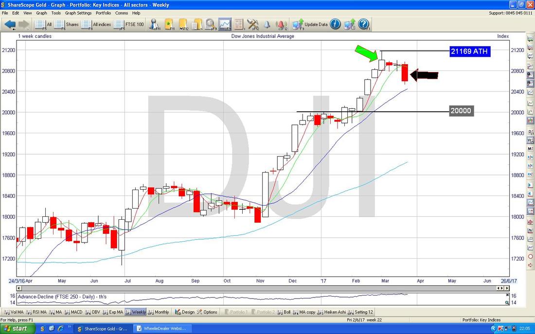
The Chart below has the Daily Heiken Ashi Candles - my Green Circle is highlighting some Bearish looking Candles from the end of last Week.
The S&P500 is pretty much the same as the DOW so I won’t show it this Week. 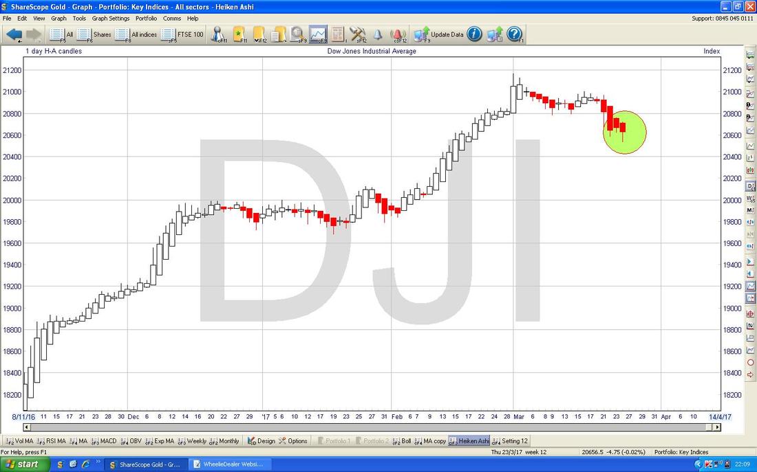
Nasdaq Composite
This is the US Tech Index - the Chart below has the Daily Candles going back around 4 months and my Blue Arrow is pointing to a ‘Doji’ Candle we were treated to on Friday 24th March and this could be seen as disappointing because in the 2 Days prior to this it looked like the Index was moving up again. It is now all about the Support at 5781 and the Resistance at 5859 - whichever one the Price breaks through will dictate the likely direction in coming Days. Note the Blue Wavy 50 Day Moving Average (marked by Green Arrow) which is just below the current Price at about 5750 - it is very likely this acts as Support if we do get more falls. I must add though that this Index looks much better than the DOW and S&P500. 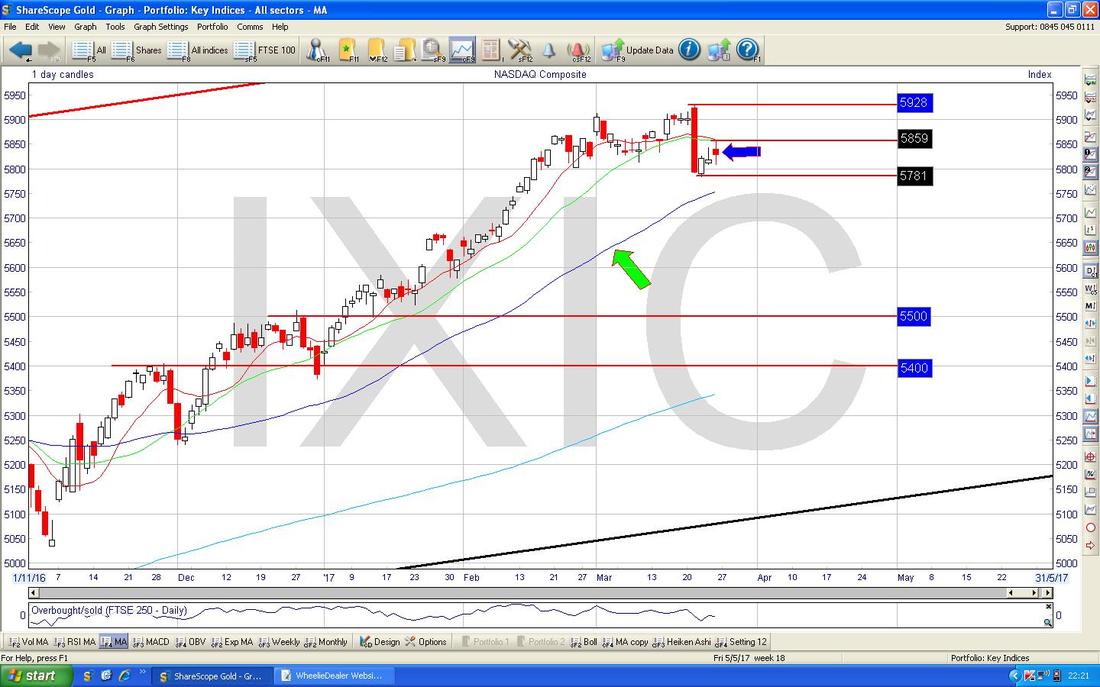
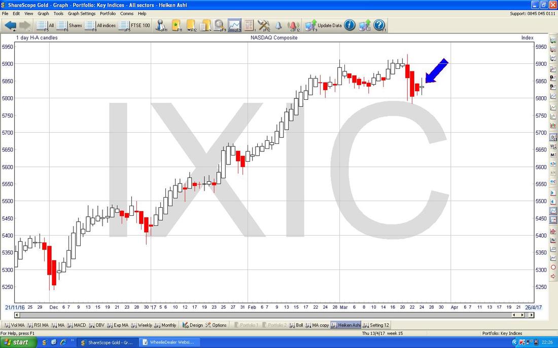
The Chart below has the Heiken Ashi Candles for the Nasdaq Composite - note my Blue Arrow which is pointing at a White Narrow Body Candle which suggests we might be turning up after the falls from the 3 Red Candles before.
FTSE100
I won’t show the Big Piccie on FTSE100 this week - if you want to see it then look back at last week’s because little has changed on that timeframe. The Chart below has the Daily Candles for the FTSE100 going back about 4 Months and my Green Arrow is pointing to a Doji Candle from Friday 24th March which shows some weakness after failing to build on the Up Candle from the Day before. This is about Support and Resistance again - to the Downside, Support at 7301 needs to hold in the coming Week and to the Upside we need to get over 7354 ish. Note as with the DOW, there is a lot of good Support just below where we are now from Levels such as 7263 and 7192 and 7093. Note also that the 50 Day Moving Average (the Wavy Blue Line pointed at with my Black Arrow) is likely to act as Support at around 7265. 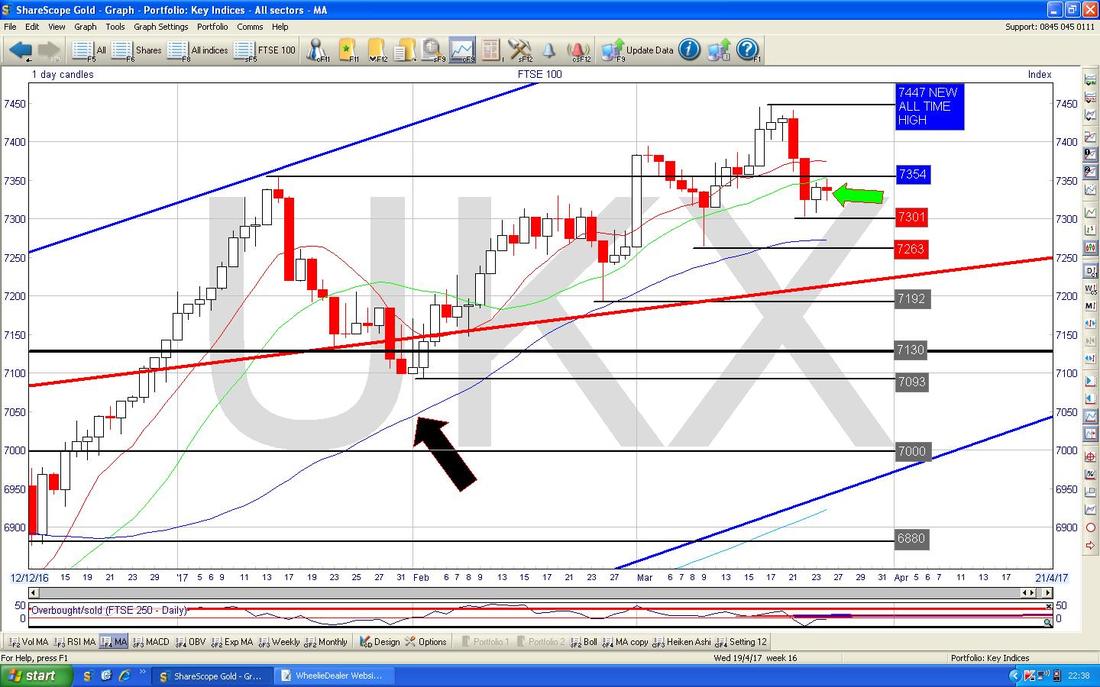
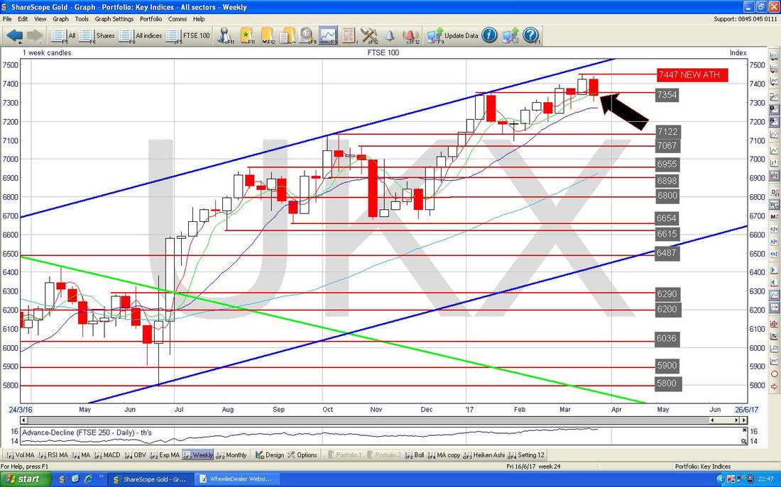
The Chart below has the Weekly Candles for the FTSE100. My Big Black Arrow is pointing at an Ugly Red Down Candle from last week - on this evidence alone, you would expect more falls. This would suit me as I still have a small Short Position running on the FTSE100 (see the ‘Trades’ page for more details.)
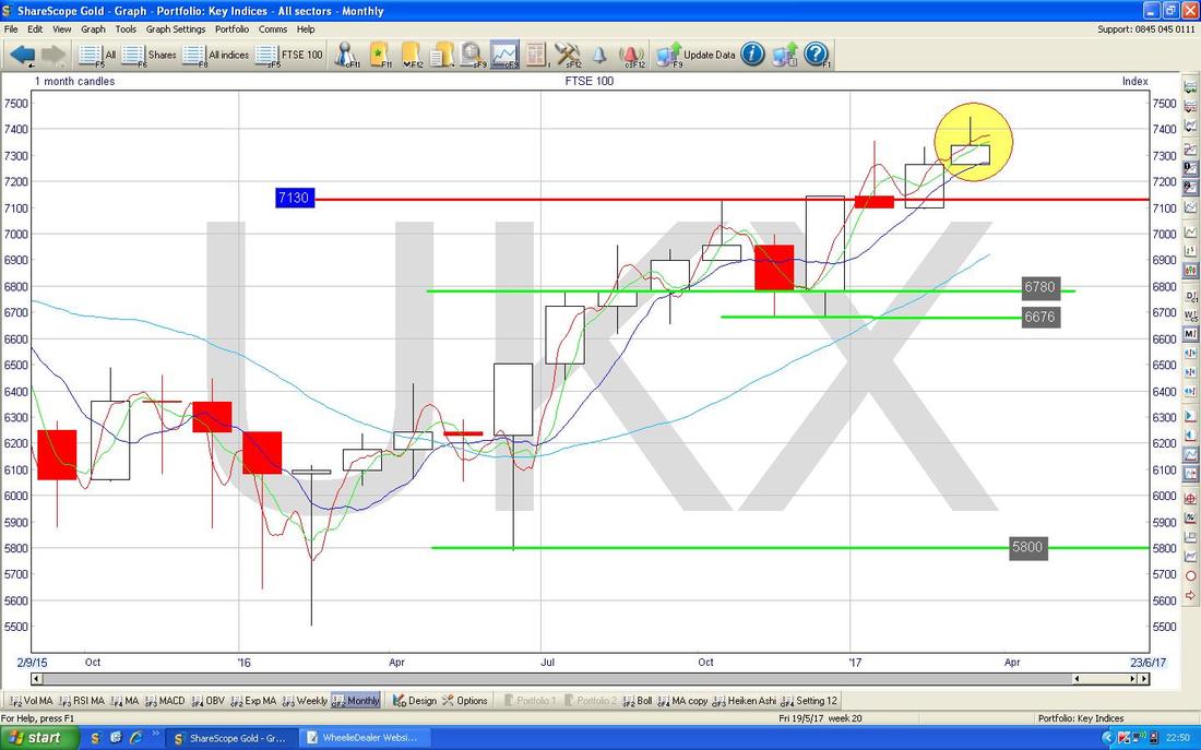
The Chart below has the Monthly Candles for the FTSE100. I am jumping the gun here because we have not had a Full Month for March but of course we are now heading into the Final Week. I want to point out where my Yellow Circle is that we are possibly facing an ‘Inverted Hammer’ type of Candle and if we have weakness in the coming Week, then we might form up a negative looking Reversal Candle when March completes. No doubt I will look at this one next week when it is completed, but this is something to watch for.
The Chart below has the Daily Heiken Ashi Candles for the FTSE100 and my Yellow Circle highlights Bearish Red Down Candles from the end of last week.
Note the FTSE250 looks quite similar to the FTSE100 so I won’t show it this week. 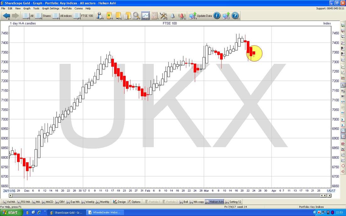
Pound vs. Dollar
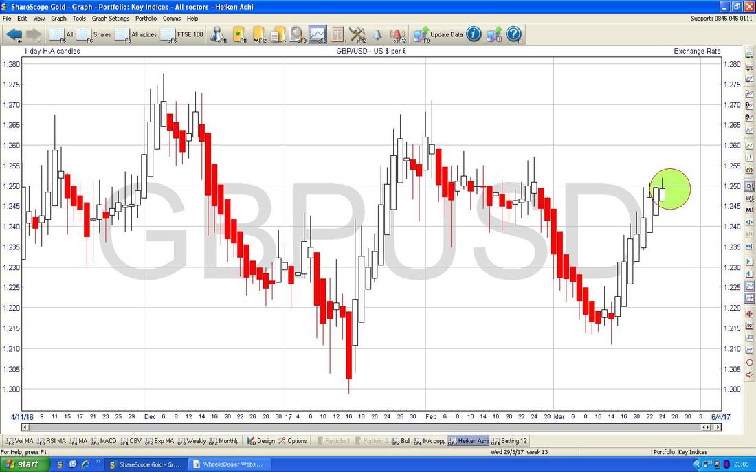
The Chart below has the £/$ going back about 4 months - my Yellow Circle is highlighting how we got a big Red Down Candle on Friday and this suggests that perhaps the Pound will weaken against the Dollar in the short term. The Intraday High from Thursday was 1.2533 and this is immediate Resistance to get over (that would mean the £ getting stronger) and above this there is a lot of Resistance around 1.26, 1.27, 1.28. My huge Mauve/Pink/whatever Circle is showing how there is a lot of strong Resistance to wade through now. Of course the big event this week is the Trigger of Article 50 on Wednesday 29th March - I doubt this will have much effect as it is probably priced-in by now, although perhaps there will be some volatility on that day. 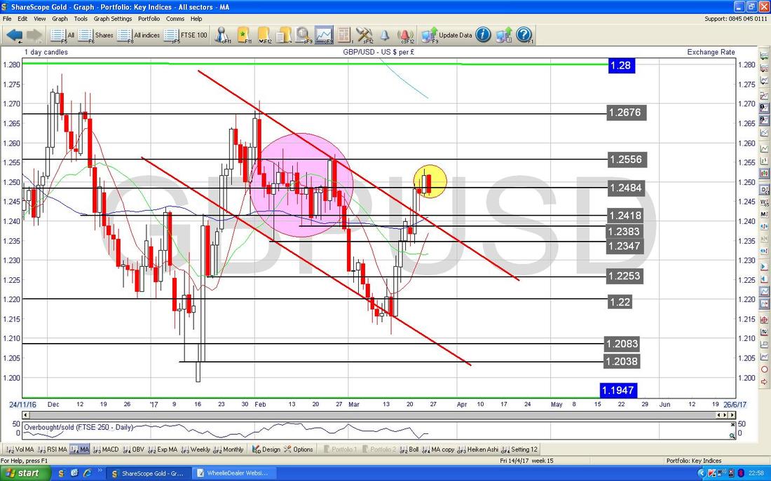
The Chart below has the Daily Candles for £/$ with the Bollinger Bands above and below. My Green Circle is showing how the Candles in recent Days are up near the Top Bollie Band and dropping away. This suggests the £ may weaken which the FTSE100 might like.
The Screen below has the Daily Heiken Ashi Candles for £/$ - my Green Circle is highlighting some White Up Candles from recent Days and this suggests the Pound can keep strengthening for a bit - which the FTSE100 would probably not like.
Brent Oil (Spot)
Regular Readers may remember my Range which the Green Arrows on the Chart of the Daily Brent Oil (Spot) Candles are pointing to between about $54 and $57.535. Anyway, we dropped out of this Range which was not a good thing but I wonder now if we will trade in a Lower Range between about $50 and $54 which I have marked with the Yellow Arrows. $50 is obviously a Psychological Support Level and note the 200 Day Moving Average at about $51 which is also a Support area. If Brent Oil moves in a Range like this, then the FTSE100 might not be affected all that much by its wiggles. Normally the FTSE100 would like higher Oil Prices. 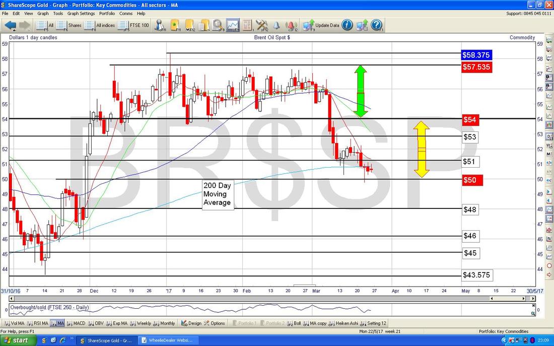
Gold (Spot)
I’m starting off with a Big Picture Chart on Gold cos I haven’t shown it for a while. To be honest it is not pretty and it has got me wondering about my Golden Prospect GPM Position - the trouble comes from the Upper Green Line of the Downtrend Channel which I am pointing at with my Green Arrow. This will most likely cap any gains that Gold can make in coming Weeks with Resistance at around $1300 ish. 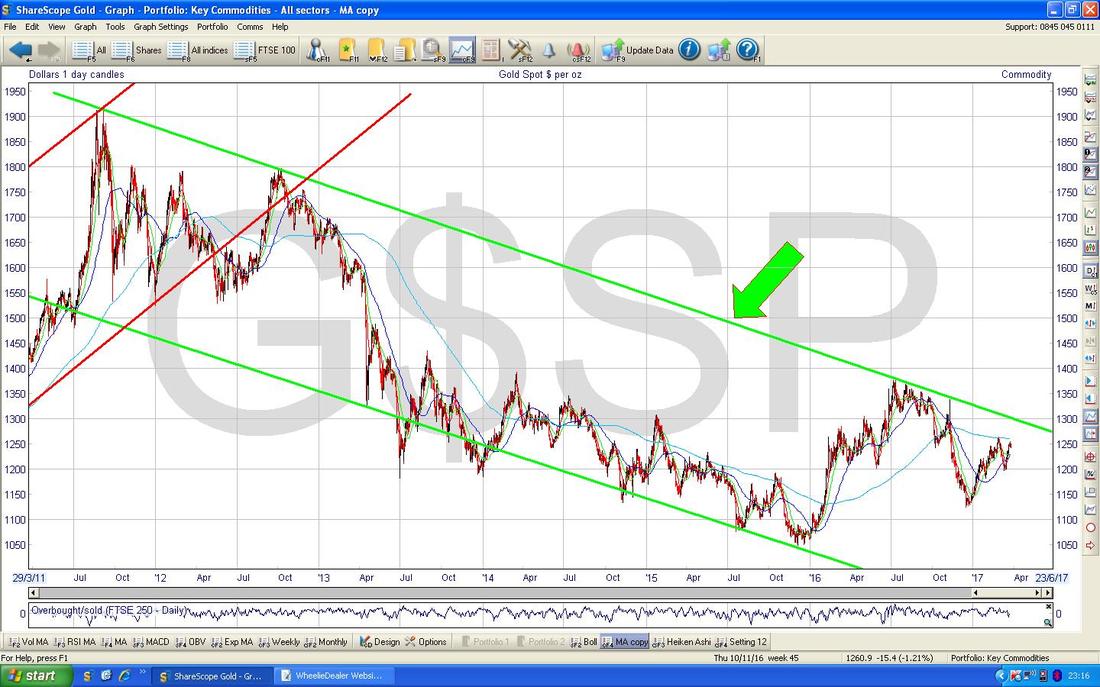
The Chart below is the usual ‘busy’ one I normally show of the Daily Candles for Gold (Spot) - I really ought to clean this up but time is precious !! My Yellow Circle is highlighting 3 Doji Candles from the end of last week and these suggest that Gold might be getting Toppy now. Note there is Resistance at $1253 first and then at $1264 - the latter looks quite a tough level to get over.
Note the Blue Wavy Line which is the 200 Day Moving Average (marked by Blue Arrow) will also be Resistance at about £1260. 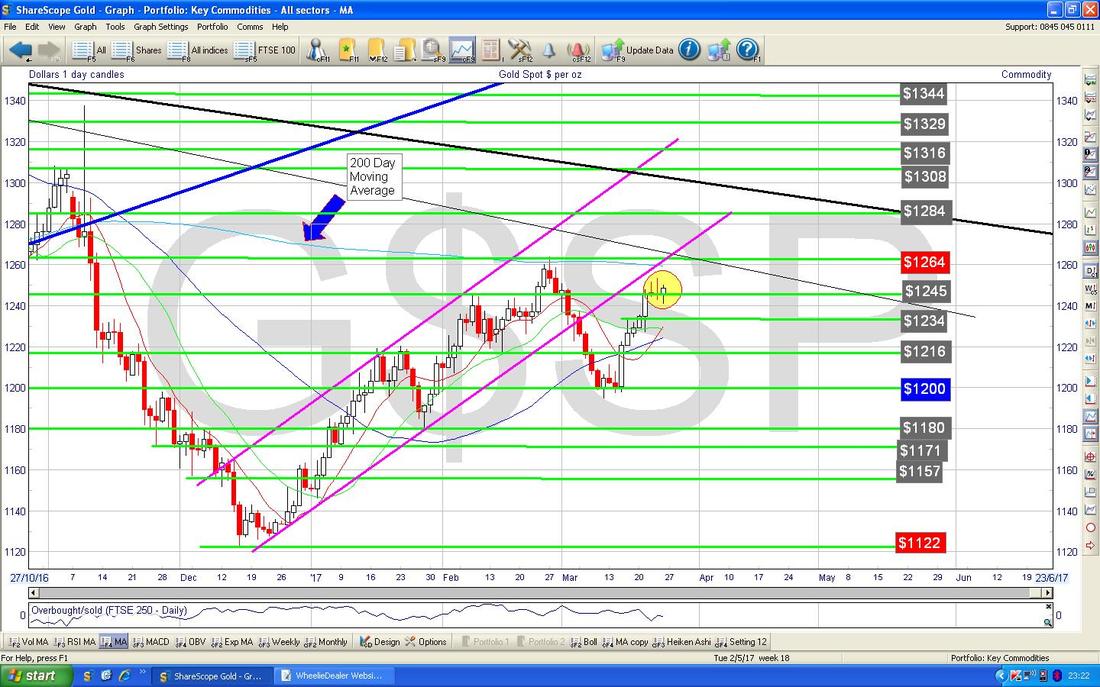
The Chart below has the Daily Candles but what I am trying to show here is how the Darker Blue Wavy Line which is the 50 Day Moving Average (Black Arrow) is moving up below the Lighter Blue Wavy Line 200 Day Moving Average - if they cross, then we will have a Bullish ‘Golden Cross’ and that would be good to see for Gold Bulls.
That’s it for this week, Happy Hunting Peeps, Cheers, WD. 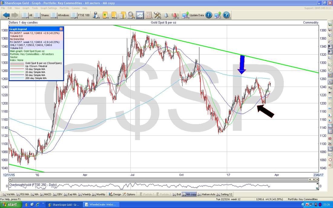
0 Comments
Leave a Reply. |
'Educational' WheelieBlogsWelcome to my Educational Blog Page - I have another 'Stocks & Markets' Blog Page which you can access via a Button on the top of the Homepage. Archives
May 2024
Categories
All
Please see the Full Range of Book Ideas in Wheelie's Bookshop.
|
