

|
educational blogs |
|
As always I am running late so I’ll go straight into the Charts……..
FTSE100 I am starting with a Daily Chart showing the FTSE100 over the last 3 months or so. The first thing I notice is how the Price Action now is around the 50 Day Moving Average which is the Blue Wiggly Line marked with my Black Arrow. Next thing that stands out is the Support at 7255 - note the Price has dipped down to this 3 times in recent Weeks and buyers have come in here. Next we have the Red Line marked with my Red Arrow which is the Bottom Line of the Long Term Uptrend Channel from the 2009 Lows which I have shown many a time in the past. It is important that the FTSE100 stays nicely above this line and there is Support here around 7250. If all these Support Levels fail, then we have more Support at 7192, 7130 and 7093 - so there is a lot of Support which helps us a lot if the Markets do get wobbly.
My Blue Arrow is pointing to a big Up Candle from Friday 7th April - this has turned up nicely from the Hammer Candle of the Day before. There is Resistance up above at 7362, 7385, 7395, 7400, 7447 (the All Time High). From what I am seeing I would expect the FTSE100 to rise from here and any moves down are well supported. My Green Arrow is pointing to a shorter timeframe Downtrend Line (in Green) which needs to be broken very soon - this will most likely be broken out of in coming days - this would be bullish in the very short term.
Of course much of the moves from FTSE100 recently have been down to movements in the Pound - I will look at that in a bit. Oil is also a driver in part. 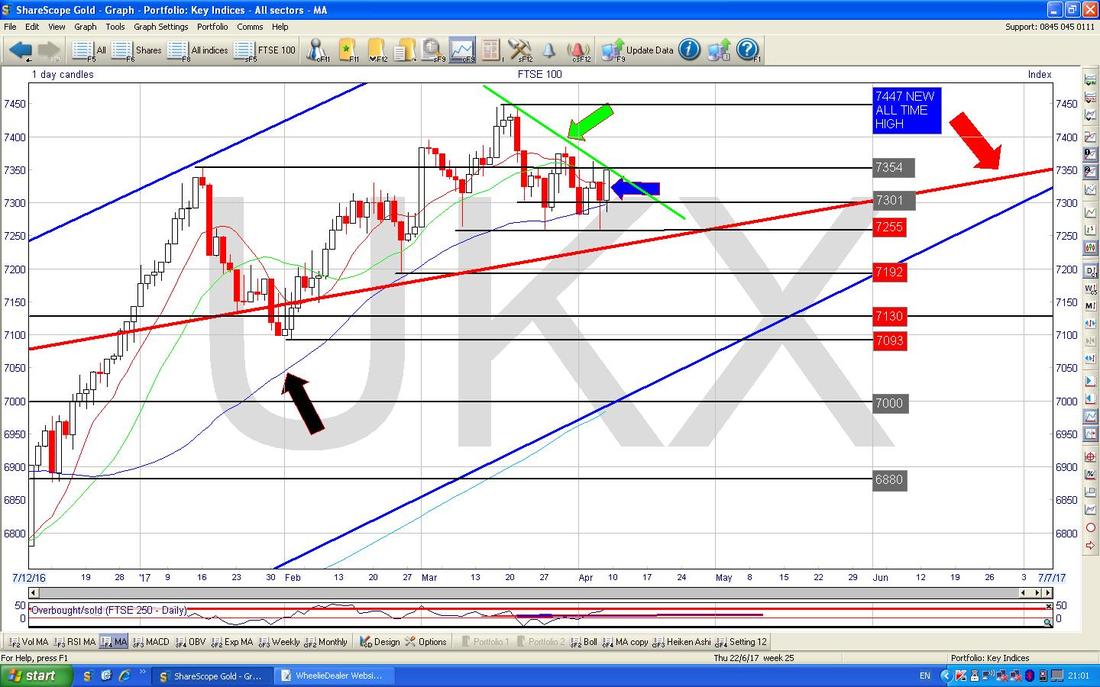
The Chart below has the Daily Candles for the FTSE100 over the last 3 months ish but this time with the Blue Wiggly Bollinger Bands above and below the Price Line. My Black Arrow is pointing to the Bottom Bollinger Band and note how in my Green Circle the Red Hammer Candle from Thursday moved up off the bottom Band and the White Up Candle from Friday built on this move. This looks bullish as the Price is coming up off the Lower Band.
The chart below (as always, these charts are from the magnificent ShareScope software that I subscribe to - worth every penny) has the Weekly Candlesticks for the FTSE100 going back 7 months ish. My Black Arrow is pointing to a White Hammer Candle from last week and note how it found Support down near 7255 which was also a Support Area from the Week before. As with the Daily Candles, it looks like the FTSE100 is turning up again.
Note my Green Arrow which is pointing to the Light Blue Wiggly Line which is the 200 Day Moving Average - this is nice because again it is more Support not far below which means that if we do get a Sell-off, then there are plenty of levels where Buyers will be attracted. The 200 Day MA gives Support around 7000. 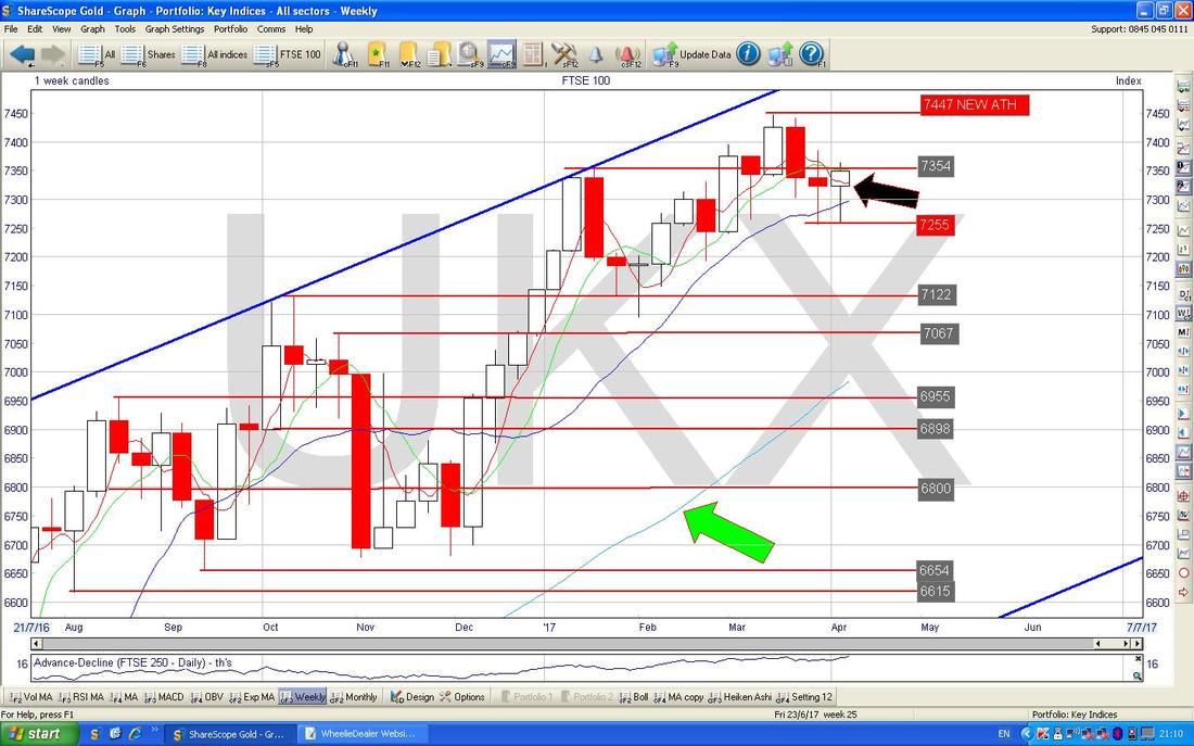
DAX (German)
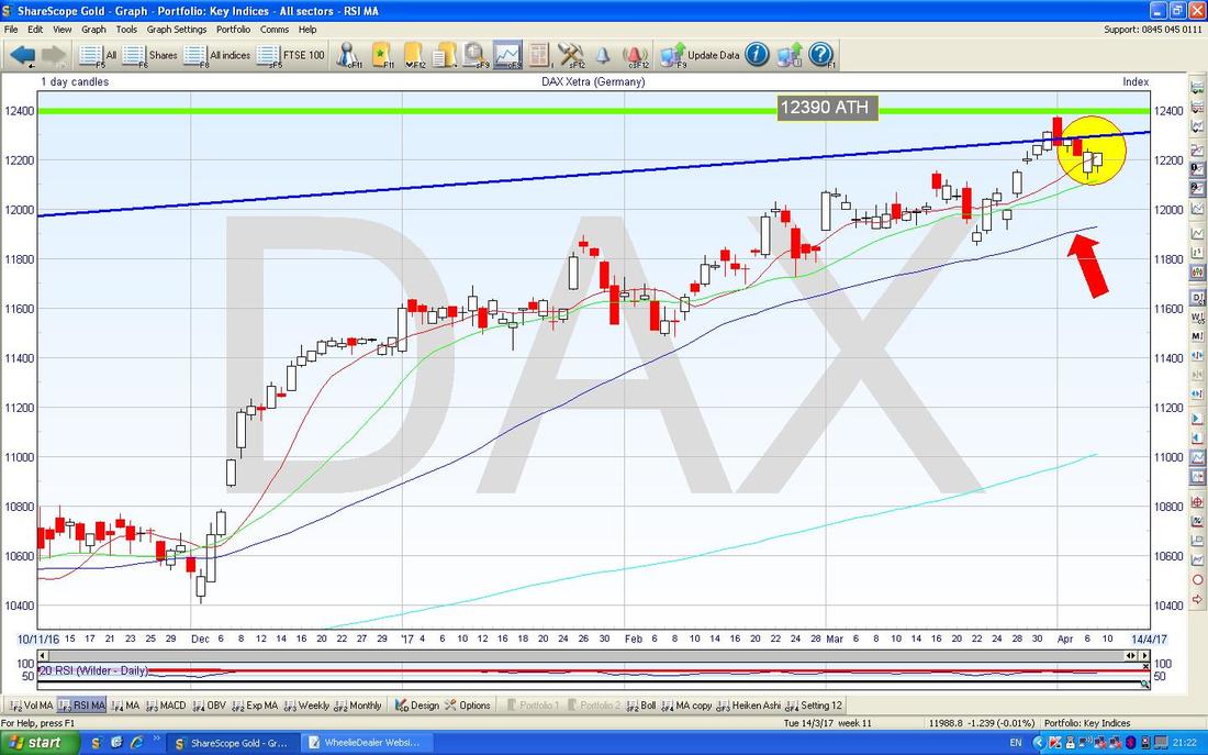
I mentioned this one last week because I think there could be a sweet Long Trade here once we get a Breakout of the All Time High at 12390 (marked with my Green Horizontal Line on the Chart below). Last week the Price pulled back a bit but I still think the Trade is on - just need patience and to wait for it to come to us. 
On the Chart below I have zoomed in on the DAX Daily Candles to show what I talked about above in close up. My Yellow Circle is highlighting how the Price dropped back after nearly touching the All Time High at 12390 and my Red Arrow is pointing at the Blue Wavy Line which is the 50 Day Moving Average down at about 11900 and I would expect this area to be Support if we do get more of a Pullback in the Short Term.
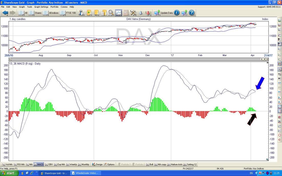
In the bottom window on the ScreenShot below we have the MACD (Moving Average Convergence Divergence) for the DAX Daily. We are looking at a Bearish MACD Cross set-up here in the short term - which suggests the Price will drop a bit more. My Blue Arrow is pointing to the Bearish MACD Cross set-up in the Signal Lines format and my Black Arrow is pointing to the same thing but in Histogram Bar format (I like the Bars because they are easier to visual and interpret).
Dow Jones Industrials Index
Let’s start here with the Long Term Picture just to sort of set the scene. The Chart below has the Long Term Uptrend Channel marked with the Parallel Green Lines which runs since the Credit Crunch Lows back in 2009. My Black Arrow is trying to point out how the current Price is up near the Top Green Line - so maybe the upside from here is limited and we need to go Sideways for a while or to drop back. With Summer upon us soon, it would not be a shock for us to go Sideways for a while. 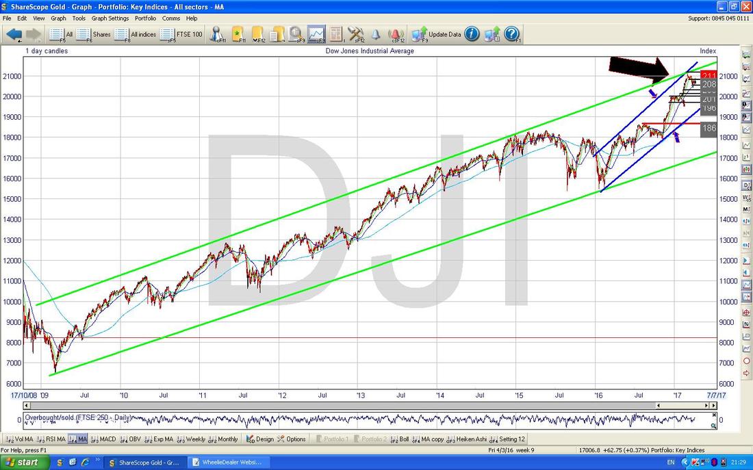
On the Chart below I have zoomed in on the DOW Daily Candles to just over the last year or so. The Key thing here is how we have another Uptrend Channel (marked with the Blue Lines and my Blue Arrows) running inside the Longer Term Uptrend Channel (the Green Lines from the previous Chart). If you look back on the previous Chart the Blue Lines are clear on that one as well.
My Black Arrow is pointing to the Blue Wavy Line which is the 50 Day Moving Average which should act as Support around the current Price Levels which I have shown within the Yellow Circle. 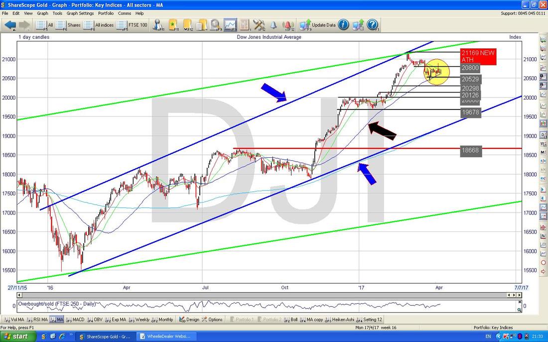
I think I showed this Chart last week and not much has changed but it does put a Bearish taint on the DOW. This Chart has the Daily Candles with the Red Wavy Line being the 13 Day Exponential Moving Average (EMA) and the Green Line being the 21 Day EMA. Note where my Blue Arrow is that the 13 Day EMA crossed down through the 21 Day EMA (this is not easy, or even possible !!, to see on my chart so you will have to believe me), forming a ‘Death Cross’ - this suggests more drops ahead.
Note the Nasdaq and S&P500 are pretty similar to the DOW. 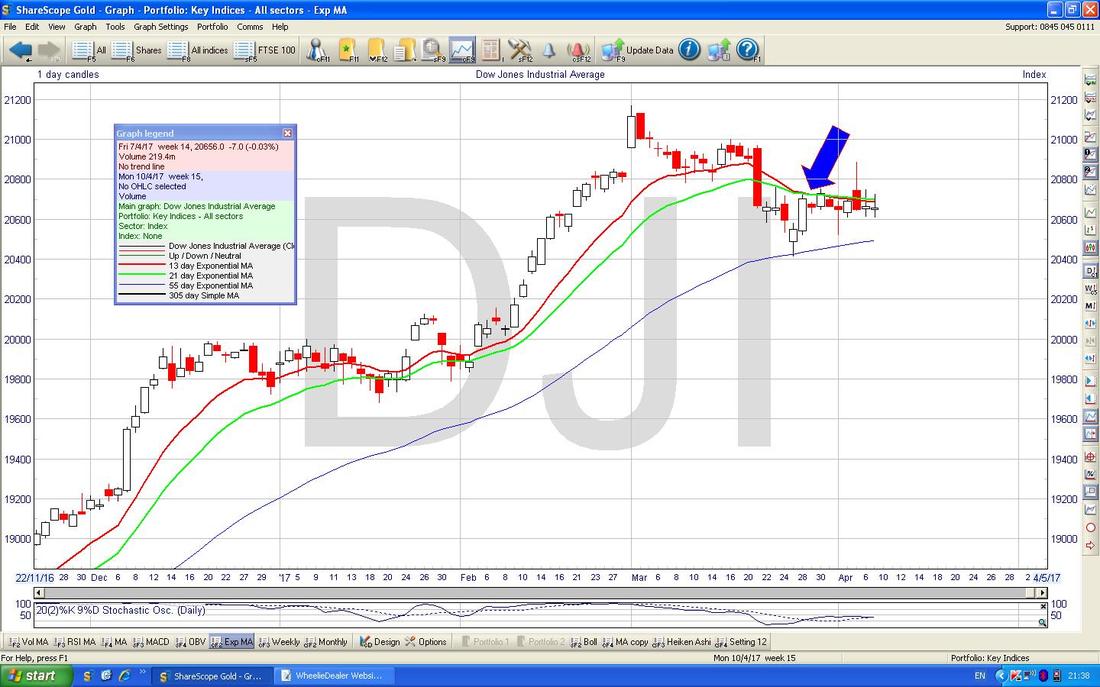
FTSE250
It’s unusual for me to show this one but I know most Readers will have Stocks which sit in the FTSE250 (these are the next 250 Stocks down in terms of Market Capitalisation after the FTSE100) and it looks quite bullish. The Chart below is a Long Termer from back at the 2009 Lows and it is clear there is a sweet Long Term Uptrend Channel marked by my Parallel Black Lines and my Red Arrow is pointing to where we are now at a New All Time High - which is always Bullish behaviour. 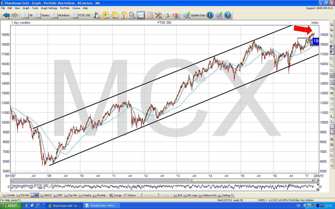
The Chart below has the Daily Candles for the FTSE250 and I have zoomed in to about the last 7 months or so. This is a very interesting chart with a few things going on. The main thing here is the Bullish Breakout on Friday of the All Time High at 19184 - my Green Circle is highlighting this move and suggests more gains to come.
My Green Arrow is pointing at the 50 Day Moving Average Blue Wavy Line and again this should act as Support just below. There is also good Support not far below at 18607 where there was a Previous ATH Breakout. 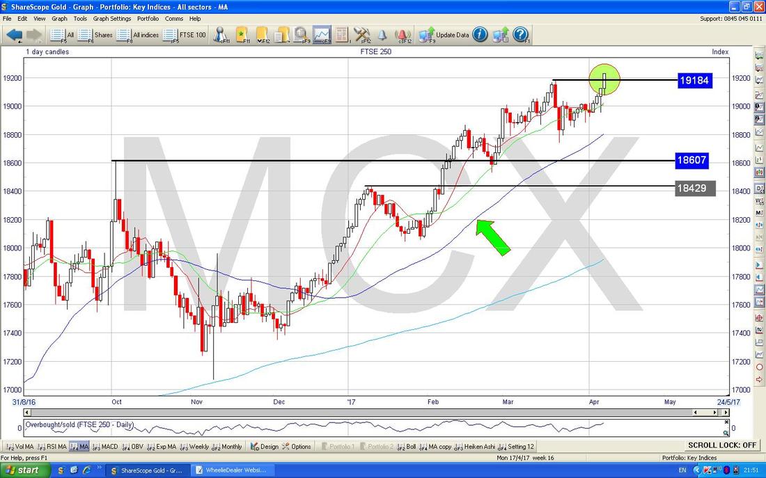
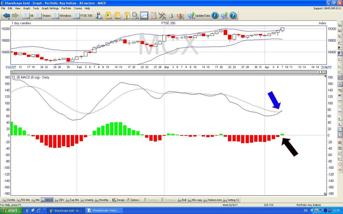
In the bottom window on the SceenShot below we have the MACD for the FTSE250 Daily. Here we have a sweet Bullish MACD Cross which lines up with the Bullish ATH Breakout we had on the Chart above. My Blue Arrow is showing the Bullish MACD Cross in Signal Lines form and my Black Arrow is showing it in the Histogram Bars form.
And if we didn’t have enough evidence of possibly more gains to come on the FTSE250, the Chart below has the Daily Heiken Ashi Candles. My Yellow Circle is highlighting how we now have Big White Up Candles and this is Bullish.
I won’t show them here but the FTSE SmallCap and the FTSE AIM All Share indexes both show similar bullishness. 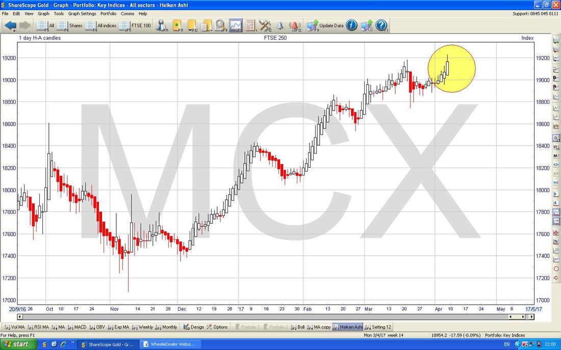
Pound vs. Dollar
We’ll start off with some Context and Big Picture stuff. The Chart below shows the £/$ going back about 10 months and the clear thing here is how we are now in a Sideways Range between the Bottom Horizontal Green Lines at 1.1947 and 1.28. Note there was a period back in July to October 2016 when the Price was in a Higher Range between about 1.28 and 1.35 - if the Pound it going to recover lost ground, then the first big step will be for the Price to get back up above 1.28 and back into that Higher Range. 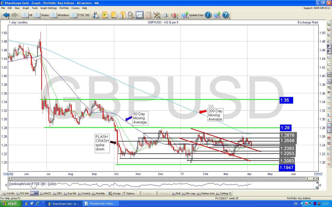
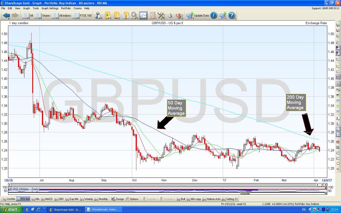
I mentioned this a few weeks back and I am sure I have talked about it in my ‘Technical View’ updates which appear some week nights at the Top of the ‘M3 Manifesto’ page. The Chart below is similar to the one above but this one is a lot ‘cleaner’ and only shows the Daily Candles and the 50 Day Moving Average and the 200 Day Moving Average. The key point here is how the Darker Blue 50 Day Moving Average Line is heading towards the Lighter Blue 200 Day Moving Average and as long as the Pound does not crash in the next few weeks, we will get a Bullish ‘Golden Cross’ - this would be the first step to recovery for the Quid. The 200 Day MA Line here is very faint and hard to see but I have put my Black Arrow for it right next to where the Price is now so you can see they are not far apart - the lines are clearly converging.
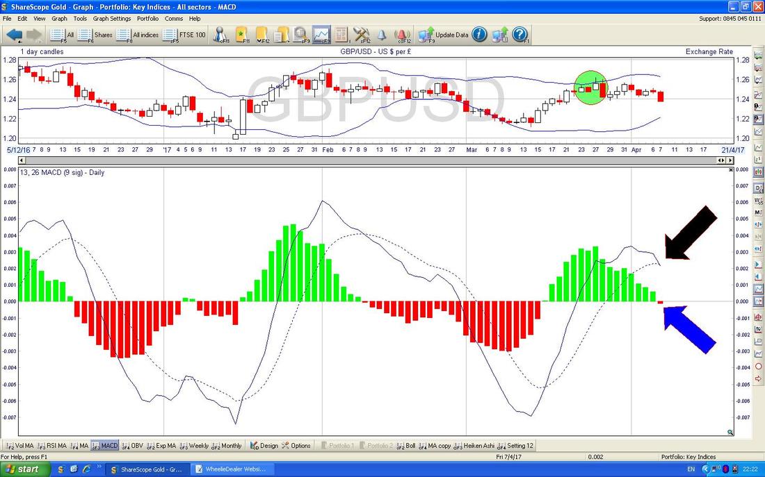
The Chart below has the Daily Candles for the £/$ and my Green Arrow is pointing to a Big Red Down Candle from Friday which suggests more weakness of the Pound to come. This would most likely help the FTSE100.
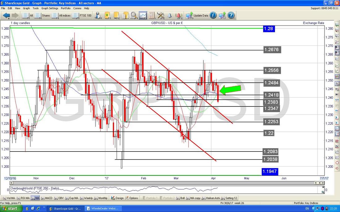
In the bottom window below, we have the MACD for the £/$ Daily - note the Bearish MACD Cross which I have shown with the Black Arrow in the Lines format and the Blue Arrow in the Histogram Bars format. This also suggests more falls in the Pound.
Brent Oil (Spot)
I was quite surprised by this one last week. You may remember me going on about the Horizontal Ranges we had here between about $54 and $57.535 and a Lower Range between $50 and $54 - these are marked with my Green Arrows and Yellow Arrows. The big surprise for me was that the Price had dropped into the Lower Range and I expected it to wiggle around inside that Range for some time but in the event it broke-out and moved back into the Upper Range and that is where it is now. However, my Blue Arrow is pointing to where we have a ‘Shooting Star’ or ‘Inverted Hammer’ type Doji Candle (basically the Price opened on Friday and moved up a lot intraday but it could not hold the highs and fell back at the Close to near where it opened - a classic ‘Reversal‘). After the Strong move up for about 10 days this Doji suggests the move may be over and the Price will now turn down most likely. A falling Oil Price might not be good for the FTSE100 although I suspect the Pound has more influence. 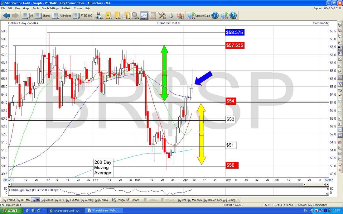
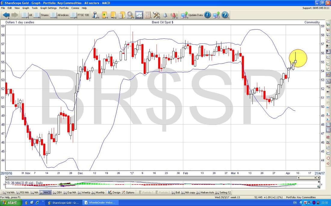
My Chart below has the Daily Candles for Brent Oil (Spot) but it also has the Blue Wavy Line Bollinger Bands above and below. My Yellow Circle has captured the ‘Shooting Star’ and note how the Price moved up above the Upper Bollie Band Intraday on Friday but by the Close it had come back inside the Bands - textbook stuff but it suggests the Price is likely to drop back now or at least go Sideways.
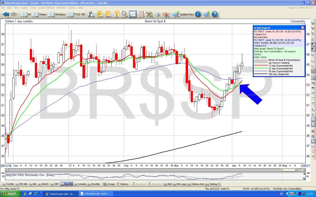
The Chart below has the Daily Candles for Brent Oil (Spot) and my Blue Arrow is pointing to a ‘Golden Cross’ between the Red 13 Day EMA and the Green 21 Day EMA - this suggest more gains to come but we could get a pullback for a few days before moving up again.
Gold (Spot)
Some big picture stuff first because it is so important and casts a shadow over any shorter term moves on Gold. Remember it is a key concept of Technical Analysis (that’s the posh name for ‘Charting’) that Longer Term Trends/Features dominate over the Shorter Term stuff. This Chart goes back about 5 and a half Years and the key thing here is the Red Downtrend Line marked with my Red Arrow - until Gold can get over this Red Line, any talk of Gold Rising is only a temporary thing. The obscured Yellow Circle at the bottom is trying to show where we are now - i.e. just inside the Red Downtrend Line. 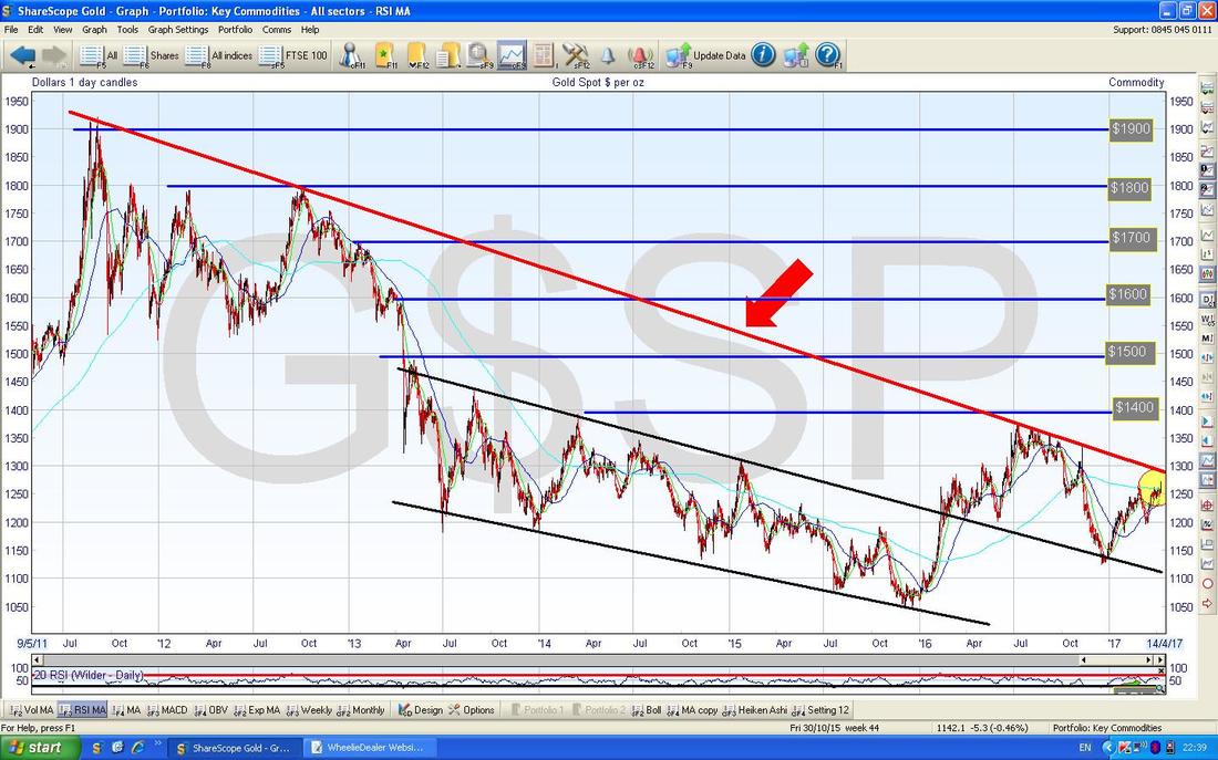
Sadly the Chart below has got a bit ‘busy’ but I will try to guide you through the bits that matter. First off note the Red Line marked with my Red Arrow which is that Long Term Downtrend Line from the previous Chart - this is the one we need to get over.
My Yellow Arrow is pointing to a big Up Candle from Friday and this looks pretty Bullish - particularly because it Broke-out over the Previous Resistance Level at about $1264. The other interesting thing is how the 50 Day Moving Average (marked with my Black Arrow) is moving towards the 200 Day Moving Average (marked with my Blue Arrow) - this suggests a Bullish ‘Golden Cross’ may happen soon. OK, that’s it for this week, Good Luck and all that…….. Cheers, WD. 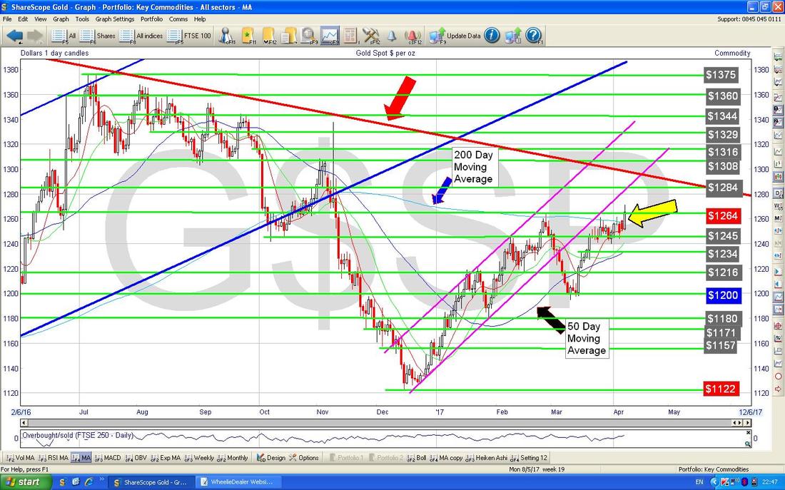
0 Comments
Leave a Reply. |
'Educational' WheelieBlogsWelcome to my Educational Blog Page - I have another 'Stocks & Markets' Blog Page which you can access via a Button on the top of the Homepage. Archives
May 2024
Categories
All
Please see the Full Range of Book Ideas in Wheelie's Bookshop.
|
