|
I’ll look at the Charts more in a bit but from a quick look the astonishing run on the US Markets keeps going and yet more freshly minted All Time Highs were created at the Close on Friday 26th Jan. The UK and European Markets look a lot tamer, and it seems most likely that the strength in the US is a lot to do with Dollar Weakness - I haven’t (and probably won’t !!) looked closely for such an Inverse Correlation but it would certainly seem that way. I find this unnerving. It is not normal.
The worry of course is that as the US Markets get more and more stretched and more ‘Toppy’ the chances of a hefty drop must increase - I would strongly welcome some kind of ‘Consolidation’ move (either a bit of a small drop or simply going Sideways for a couple of weeks perhaps) just to remove some ‘Heat’ and get everyone to calm down a bit and think about what they are doing. Especially on Tech, Valuations must be getting quite a lot above their ‘Normal’ levels. We need a Healthy Consolidation.
I see at the end of the coming Week we have the US Non-Farm Payroll Numbers so this will probably cause some swings on Friday afternoon but apart from that I guess it will be ‘business as usual’. Oh, there is also Trumpy’s ‘State of the Union’ Address on Wednesday which might cause some action on Forex at least.
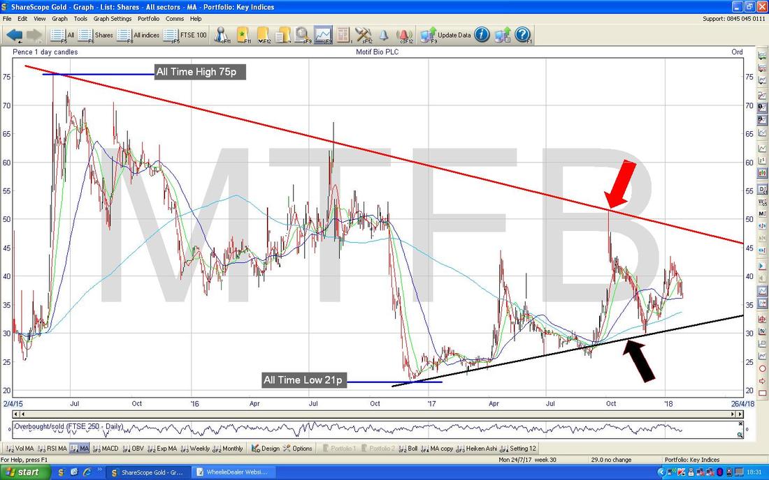
Last Week For me the Week followed the pattern of the 2 previous Weeks whereby my Portfolio limped along with a Downwards slant from Monday to Thursday and then Friday had a good move up and saved the Week. After much tedium and a real “Death by a thousand Cuts” (to quote a certain Mr J. Corbyn) series of Days, I ended up Dead Flat on the Week - seemed like a lot of mucking about for very little !! I guess it could have been worse and without Friday it certainly would have been. January is now pretty much at a close and it has been a decent enough Month for me but most of my gains were achieved in a very strong first Week and for the last 3 I have just added a tiny bit. Hopefully February will bring more Weeks like the one that started 2018 for me !! Shares Mag Growth and Innovation Forum, Islington On Tuesday I am heading into London to attend what I always see as a Tech Show thing that Shares Magazine organises. It tends to have a series of Companies and Fund Managers presenting in one room and then in the sort of larger bit (it is not in the Main Hall at the Islington Business Design Centre but off to one side in some smaller rooms - but it is still quite sizeable), there are loads of Companies with Stands and you can go and chat with them. This latter bit is the most useful I find because it enables me to be much more targeted in which Companies I talk to and there is one in particular that I am very eager to meet. In recent Years I have found this a very good Event to find new Stocks to invest in or to just ensure things are on track with Stocks I already own. I am planning to get there around Midday and no doubt the first task will be to grab some Food and Drink - but if you see an old bald geezer using a Wheelchair then that is probably me - come and say “hi” and I promise not to bite !! Attendance is free and if you are dossing about with nothing to do on Tuesday then it might be worth popping along - if you Google their Website you should find it. Motif Bio MTFB This is not really my kind of Stock but it is one that got discussed during the Week on Twitter and I thought it was quite an interesting Chart which has some key features that are worth noting - I also am aware that a lot of People hold this Stock. As always my Charts are from the fabulous ShareScope Software that I use and if you click on the pics then they should grow larger so you can see some detail. The Chart below has the whole history for MTFB (it is a fairly recent IPO) and the main thing I wanted to point out was the Triangle which is formed between my Red Line at the Top (Red Arrow) and my Black Line at the Bottom (Black Arrow). Triangles on Charts are truly wonderful patterns because sooner or later as the Price moves towards the ‘Point’ of the Triangle, in some way they will ‘Resolve’ and either the Price will breakout of the Triangle to the Upside or it will break down, to the Downside. Obviously Bulls on MTFB want a Breakout of the Red Line and ideally a move above that Spike at about 51p where my Red Arrow is would suggest that a proper move up is underway. There is of course then Resistance just up above at about 67p and then at the All Time High at 75p. A Breakout over 75p would be extremely Bullish and Holders then are likely to make some serious Cash fast. On the downside, if that Black Line fails then it is time to worry and if the Low Point at 21p breaks then it probably is curtains for this Stock.
The Mission Marketing Group TMMG
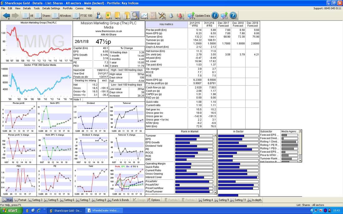
This one had Results during the Week and they seemed pretty good and the Valuation here looks reasonable on a Forward P/E of 6.1 (reasonable? that’s ‘Cheap’ !!) and a Forward Divvy of 3.8%. It’s carrying a fair bit of Debt but it doesn’t look too extreme for a Company that is trading well and with such a low valuation there is ‘Margin of Safety’ I reckon. Anyway, as with all Stocks there is nothing better than when a Decent Trading Statement coincides with an attractive Valuation and the Chart picture backs that up - so let’s check the Charts out. Before I rush into the Charts, here is the ShareScope ‘Details’ Screen - in the Top Right Hand Corner you should be able to see the Forecasts and stuff. I do not hold TMMG but I am just lobbing it in here cos I think it could be an interesting one for Readers (and I know a few who have recently bought into it).
Wow, what a beautiful Chart !!
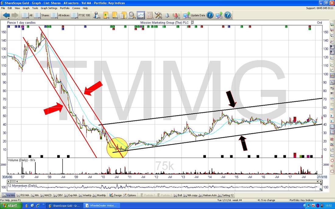
I have shown the Chart for TMMG going back to 2007 ish so it is easy to see how defined and orderly the Trend Channels are - it does make me laugh when people say Technical Analysis is useless and all that sort of thing - it is so clear simply from Charts like this that if you hold Stocks in Downtrend Channels you will lose money and if you hold Stocks in Uptrends you will make money. The clear Story here is a Downtrend around the Credit Crisis in 2008/9 as marked by my Parallel Red Lines (Red Arrows) and then where my Yellow Circle is the Price broke free of the Downtrend Channel and we moved into a shallow Uptrend Channel which has been in place ever since and this is captured within my Black Parallel Lines (Black Arrows).
On the Chart below I have shown my newly discovered Rectangle Skills in their full flow - ok, I can see you are not all that impressed. I am trying, give me a break.
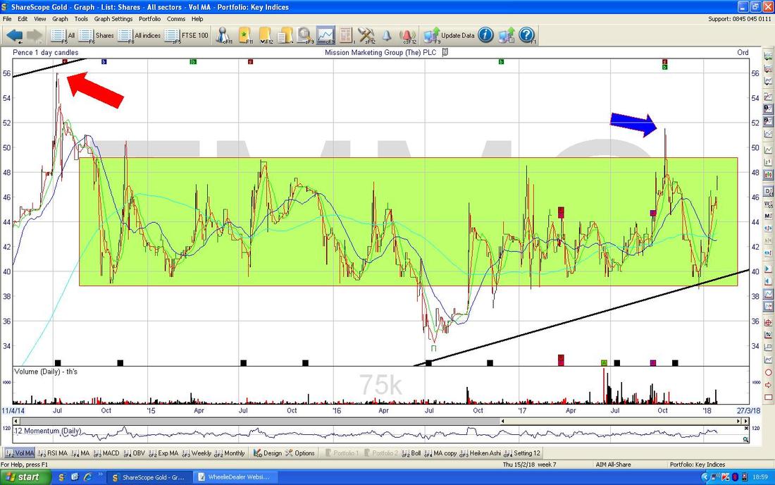
This Chart is the Daily Candlesticks going back about 3 years and the story here is really that of a Sideways Range which I have mostly captured inside my Big Green Rectangle. As you can hopefully see, the Price is now up near the Top of my Green Box and obviously it needs to get up out of this Range and to take on Resistance at just under 52p where my Blue Arrow is and then to crack on to the Resistance at 56p from my Red Arrow - a Breakout over 56p would set up more gains very nicely but it does feel like we are at a critical point now where something needs to happen or this will just stay Range-bound. The Black Lines are the ones from the previous Chart.
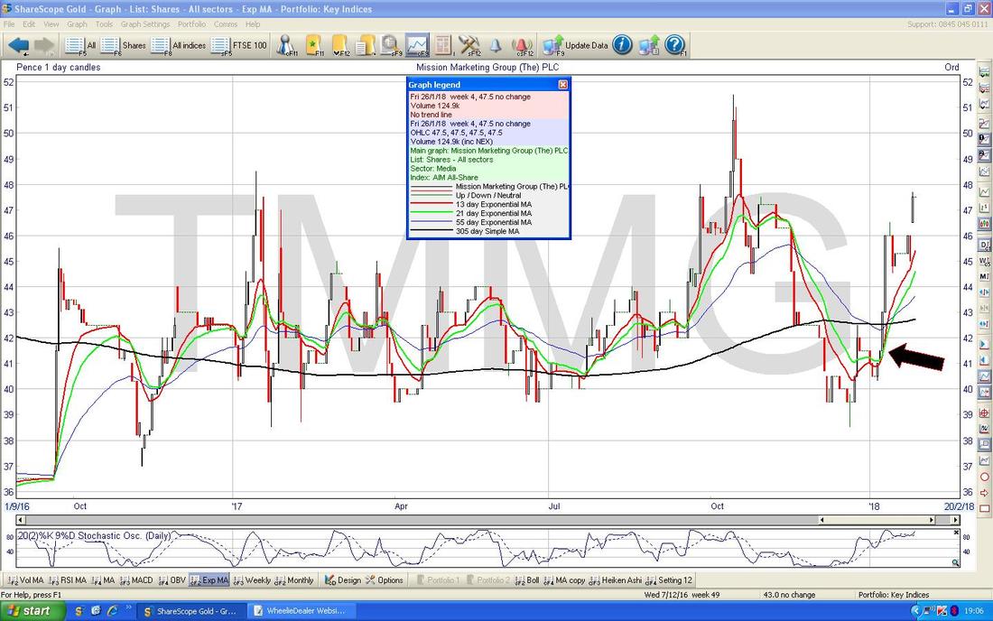
I drone on a lot about this because it is perhaps my favourite Indicator, or certainly in my ‘Top 3 Indicators of All Time Greatest Hits Collection‘. The Chart below has the Daily Candles with an overlay of Moving Averages and the ones I am particularly obsessed by are the Red 13 Day Exponential Moving Average and the Green 21 Day Exponential Moving Average (an Exponential MA is ‘faster’ than a Simple MA because it gives higher weighting to the most recent Price moves in the calculation - although in all honesty you don’t need to know how any of these things are created - what matters is how you interpret them).
Where my Black Arrow is you should be able to see that the Red 13 Day EMA Crossed the Green 21 Day EMA from underneath and gave us a lovely ‘Golden Cross’ - then note how predictive this was and if you had bought at the time of the Golden Cross then you should have gained about 10% or so. But this Chart shows a drawback of these Crosses - they work well on a Stock that ‘Trends’ well but when something is going Sideways and chopping up and down they are not so good. Having said that, on this Chart you might have been able to use the Crosses as a Buy or Sell Signal many times to help you ride the Range up and down if you are of a Range Trader bent (although as TMMG is a fairly small Stock with Costs and Spreads and stuff it might not be practical - but on a more Liquid Large Stock this kind of Range Trading can work well).
Standard Chartered STAN
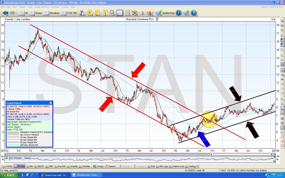
This is one I hold and it has done quite well lately so I wanted to look at the Chart and see how things were shaping up. In terms of ‘Big Picture’ Fundamentals, I suspect STAN is liking the resurgence in Commodity Prices and the consequent recovery in Emerging Markets and a backdrop of gradual but slow tightening of Interest Rates (if it actually happens !!) is a big help to Banks. On a Forward P/E of 17 and 2.2% Forward Dividend it doesn’t scream Value at me but I would not be surprised if there are some Forecast Upgrades here over time which would mean it is a bit cheaper than it appears. Normally this kind of Valuation might get me a bit jittery but in the current Market there are loads of Stocks on crazy Valuations and this actually looks relatively ok. The Chart below has the ‘Big Picture’ on the Technicals and the Story here is almost identical to one we looked at not very long ago on TMMG with a Downtrend Channel as captured by my Parallel Red Lines (Red Arrows) and this then morphing into an Uptrend Channel which is marked by my Parallel Black Lines (Black Arrows). The Breakout occurred where my Yellow Circle is and my Blue Arrow is pointing to a Bullish ‘Golden Cross’ between the 50 and 200 Day Moving Averages which was signalling that the Downtrend Channel Breakout was very possible. This often happens and is something to watch for a when a Stock is in a seemingly never-ending Downtrend Channel.
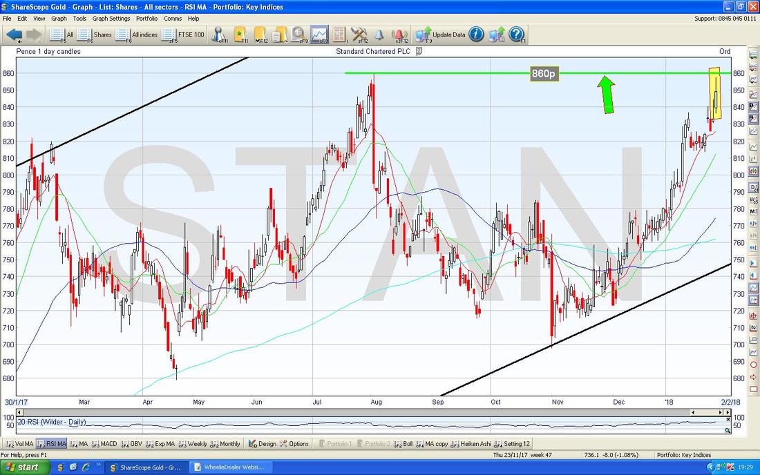
The Chart below captures what I had noticed with regard to STAN looking a bit perky of late. My Yellow Box is capturing the Up Candle from Friday 26th January 2018 and note how it tried but failed to breakout over the Green Line Resistance at 860p - if it can do this, that would be really Bullish. It might need to Consolidate by easing back a bit for a few Days or perhaps just doing Sideways for a bit before another attempt to Breakout.
IQE plc IQE
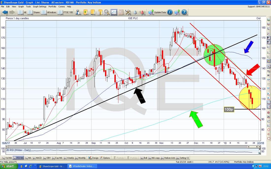
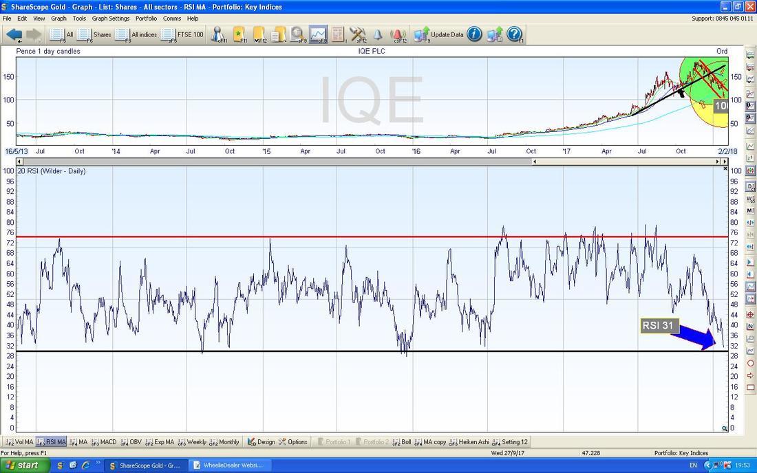
This is one that shot up last year but has since dropped back a lot and I know a lot of Readers who hold it although I don’t myself. I am not all that up to speed on the Fundamentals but I understand a big deal with Apple AAPL is what got everyone excited which of course makes sense when you consider that IQE is not all that large a Company and such a Deal could truly be transformational. I also believe they have some new Chip Products which are making progress. Looking at the Forward P/E it is about 24.8 which doesn’t sound all that silly for a ‘Chip Stock‘, especially when you bear in mind that there are few of these around these days after ARM got bought. It doesn’t pay a Dividend and has a bit of Debt but from a quick look it doesn’t look silly. There’s a lot going on here so you will need to concentrate - perhaps go and have a stretch and visit the er, conveniences, before you tackle this bit. My Chart below shows the Uptrend which was in place for much of last year (and started before that) with the Support Line of that Uptrend Channel marked by my Black Line (Black Arrow). Where my Green Circle is the Price fell out of the Uptrend and since that my Parallel Red Lines capture the Downtrend Channel which has been getting everyone jittery. Note down near the bottom where the 100p Line is and this is important Support - if this fails, then it is very likely to go quite a bit lower - perhaps down to 75p/80p ish. Where my Yellow Circle is note there are a couple of Candles from Last Week which touched the 100p Line and then bounced back up - this is good because it is trying to establish a Base of Support but often when you see lots of attempts it eventually falls through - this is critical in coming Days. My Red Arrow marks the Resistance Line of the Downtrend Channel and Bulls need the Price to Breakout of this Line - until that happens, it is still in ‘Falling Knife’ territory. Note also that the Yellow Circle is around the 200 Day Moving Average Line which my Green Arrow is pointing at - this could be a Zone of Support so that might help things. My Blue Arrow is pointing to the 50 Day Moving Average and look how this is moving down now - if it gets to the 200 Day Moving Average Line and crosses it that would be bad (a ‘Death Cross’) but the 50 Day MA moves relatively ‘fast’ so it wouldn’t take many good days to get that line flattening out and then moving up again. Any drop below 100p would make a Death Cross pretty likely I suspect.
In the Bottom Window on the Screen below we have the RSI (Relative Strength Index - the ‘speed’ if you like or the ‘force‘ of the move) for the IQE Daily Chart and on a Reading of RSI 31 this is pretty low and around the Levels where you would normally get a bounce.
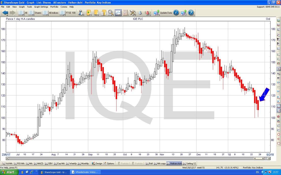
The Screen below has the Daily Heiken Ashi Candlesticks - my Blue Arrow is pointing to where on Friday we got a Big Down Red Candle and this suggests more falls. However, HA Candles are ‘slower’ than normal Candles so a turn up on Monday might save things and that would not show up in the HAs except perhaps as a Narrowing of the Candle Body - they always seem to be about a Day late but they are very clear.
There is no getting around it - that 100p Level must hold. End of.
Pets at Home PETS
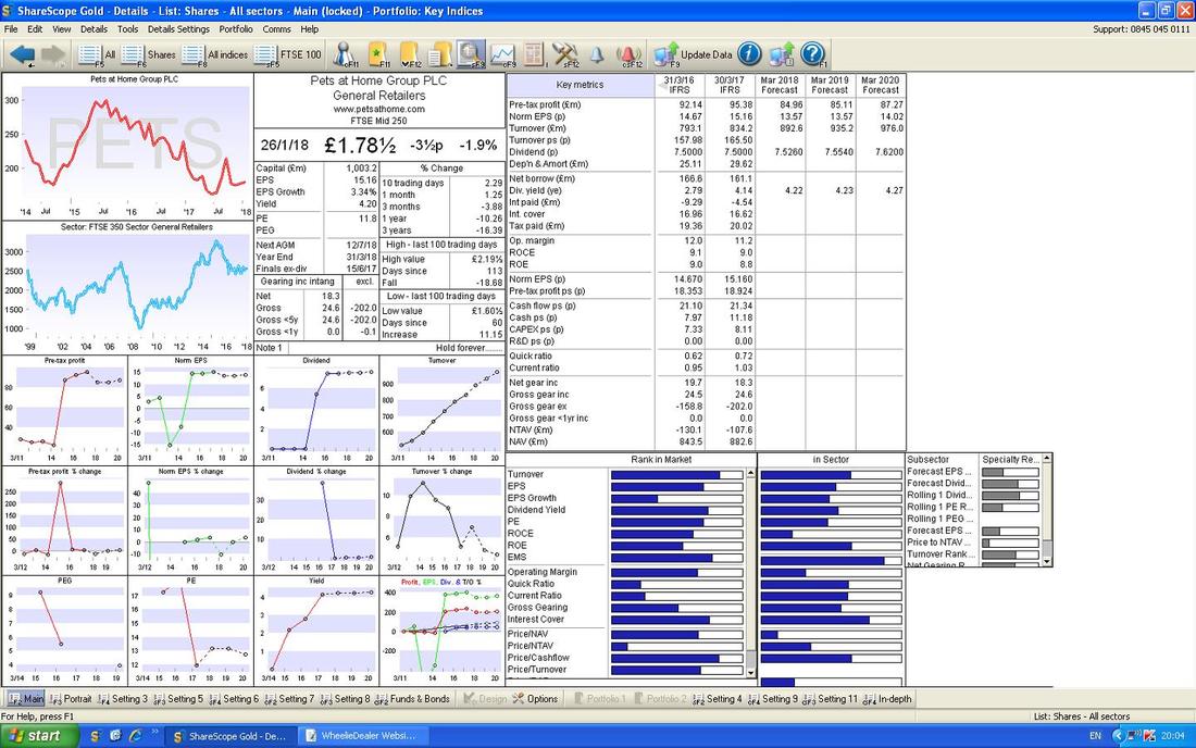
I hold PETS myself and it has been pretty frustrating for a long time but last Week we actually got a surprisingly positive Trading Update and perhaps things are finally turning up. There were a couple of RNS Statements out at the end of the Week with KKR selling out completely but I don’t see this as a big deal because they are a Private Equity business and it is entirely normal for their like to want to get out of ‘old’ Investments once they are Listed and of course someone bought those Shares. The CEO cancelled a ShareSave Scheme for some Options but this is no shock either because he is leaving. In terms of Valuation PETS is on a Forward P/E of 13.1 and a Forward Divvy Yield of 4.2% which is pretty tasty. Just below I have shoved the ‘Details’ Screen and you may well agree with me that no growth in the Earnings Per Share Forecasts could be very wrong - so expect Upgrades (remember, much of PETS’ growth is coming from new Stores and the addition of Vets4Pets and Groomers into existing Stores - this alone is a big source of additional income).
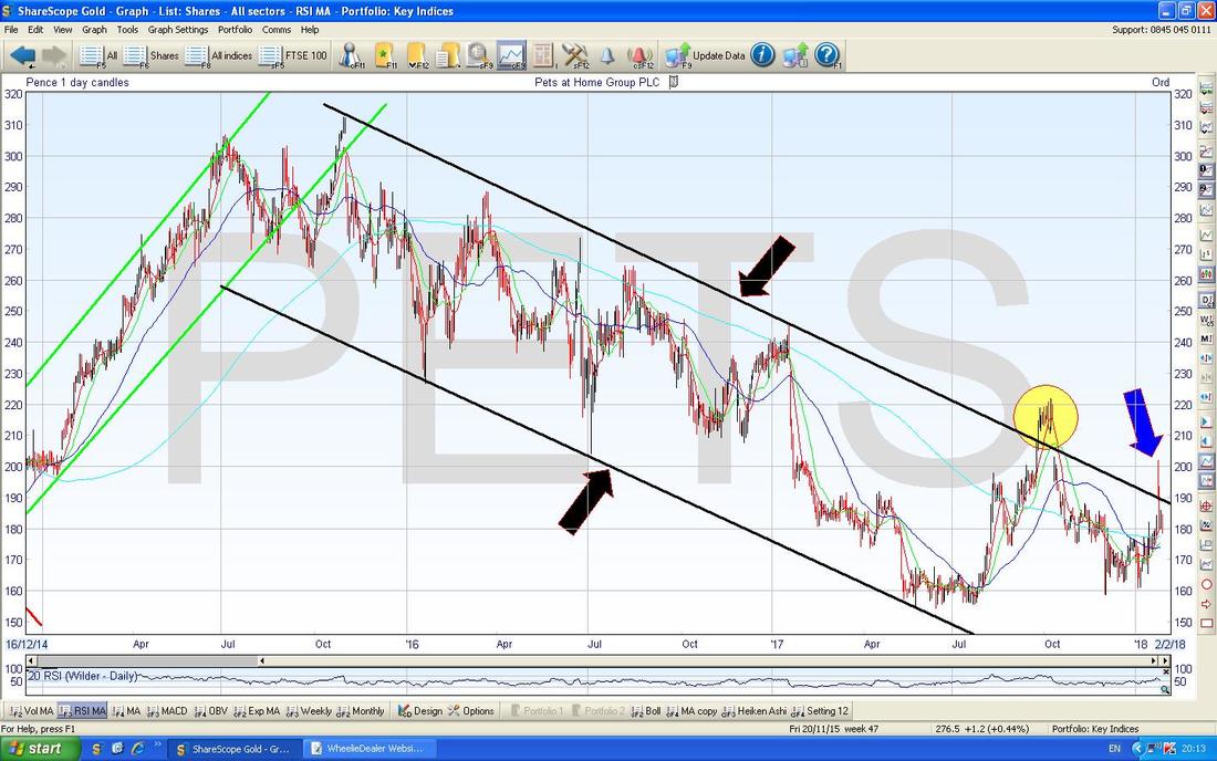
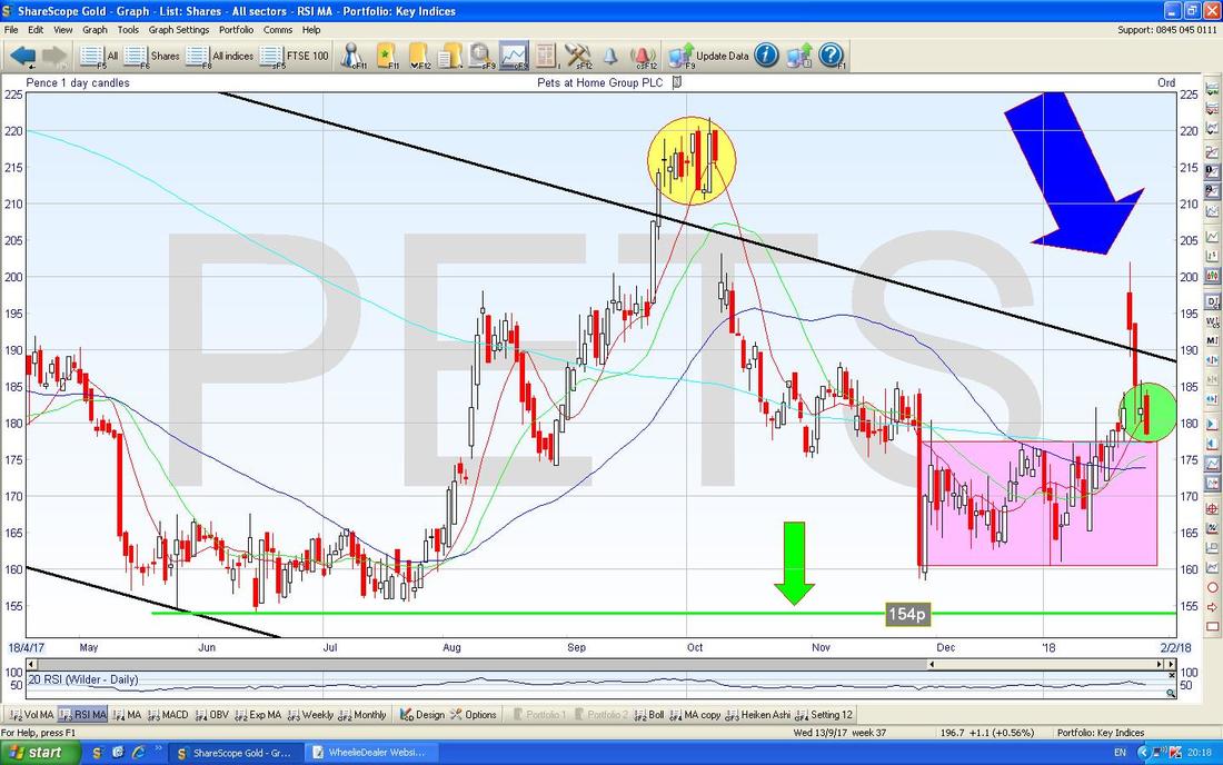
The Chart below is fairly ‘Big Picture’ (remember, with Charts we must always start from the Big Picture and then drill down because the Longer Term, Established, Trends dominate) and the main feature here is the wide Downtrend Channel which is marked by my Black Lines and Black Arrows. My Yellow Circle is highlighting what looks to have been a ‘False Breakout’ where the Price escaped the Downtrend Channel but it couldn’t sustain it and it fell back inside. My worry now is that where my Blue Arrow is, we might have had exactly the same kind of False Breakout again this week.
On the Chart below I have zoomed in and the Yellow Circle and the now enormous Blue Arrow are marking the False Breakouts. The Green Circle is really trying to capture the Big Red Down Candle from Friday which is a negative looking ‘Bearish Engulfing Candle’ which suggests more downside to come in the Short Term. However, my Big Pink Box is trying to show that there is a lot of good Support just below from about 160p to 177p ish so I would expect that to kick in soon.
It strikes me we will need to see more Sideways Grind here before it really breaks free of the Downtrend Channel and to the Downside it is critical we stay above my Green Line (Green Arrow) at 154p.
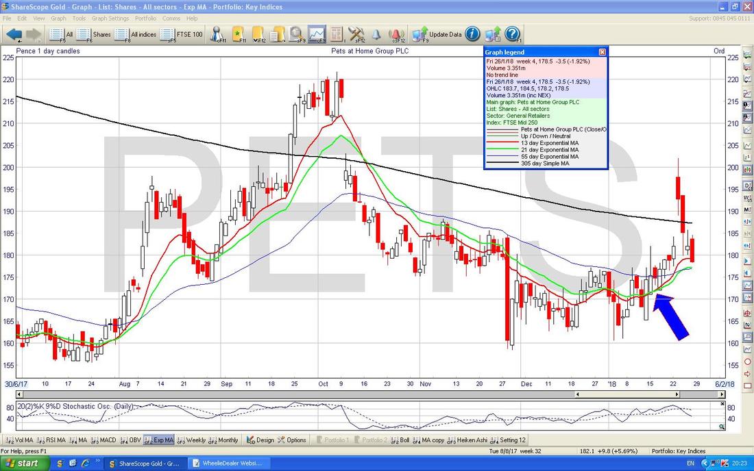
Where my Blue Arrow is on the Chart below we had a ‘Golden Cross’ between the Red 13 Day EMA and the Green 21 Day EMA - note that Golden Cross is still in force (it has not been negated by a ‘Death Cross’) and as long as this stays the case, there is hope for Bulls near term.
Versarien VRS
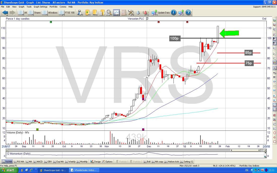
This is not a Stock I hold (I have made it very clear that I really don’t understand the Fundamentals or the Valuation here) but the simple fact is the Chart looks really Bullish following a Breakout of the psychological 100p Level on Friday which is marked below with my Green Arrow. Judging by this Big White Up Candle which even closed at its High of the Day, I suspect this could move a bit higher again before it needs to Consolidate (maybe a Pullback or some Sideways moves). It might be an idea to use a Trailing Stoploss here - I have drawn in 2 Red Lines on the Chart - if you want a wide Stoploss to give it plenty of ‘Wiggle Room’ then 75p might work and for something tighter 85p could be the sort of area to shove your Stop. Personally I would not use a Firm Sell Order with my Broker because it is far too easy for these sorts of Stocks to Stop you out on a Spike down but use it as a ‘Manual End of Day Stoploss Trigger’ if it goes below the Stoploss Level then Close it the next Day. If VRS keeps rising like this, you can move the Trailing Stops up behind it.
OK, enough Stocks, let’s just look at a US Index.
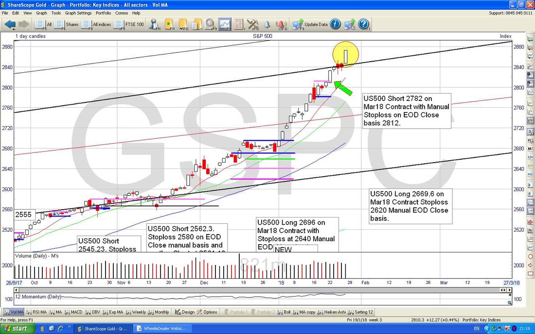
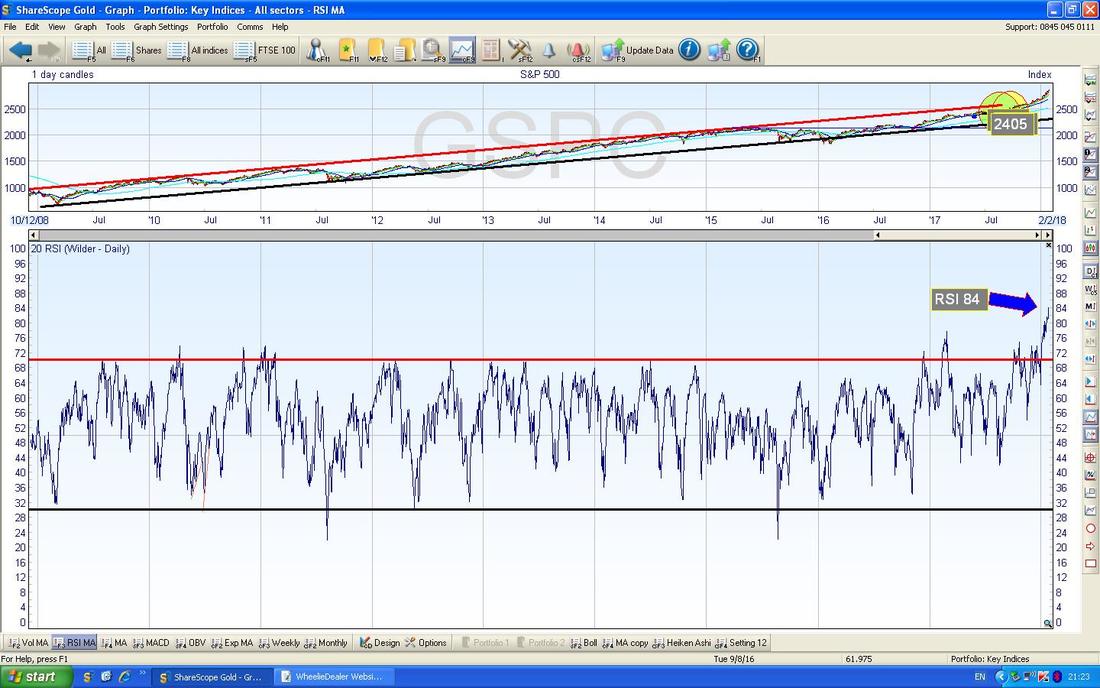
S&P500 This is the widest US main Index - the DOW only has 30 Stocks in it. My Chart below has the recent Daily Candles and this is my actual ‘working’ screen which I have shown quite a few variations of in recent Weeks as I have put on countless Shorts that have been totally fruitless and continually get Stopped out. Luckily I have kept them small and I even had quite a nice Long in there around Xmas. I have no Long or Short Positions on this at the time of writing. My Yellow Circle is showing a Big White Up Candle from Friday and this looks Bullish - it might ease back on Monday cos that often seems to happen (‘Monday reverses Friday’) but after that I would expect more of the same but I am getting twitchy. My Green Arrow is pointing to where I had my Stoploss Level (the Small Pink Line) at 2812 as per the Text Box and this was triggered so I closed the Position for a small Loss (see my ‘Trades’ page). With how it continued moving up afterwards, I am pleased I used a Stop and I am pleased I kept the Position small.
In the bottom window we have the RSI for the S&P500 Daily - I don’t know what to say about this - at RSI 84 it is simply insane………but of course it can get even more crazier…….
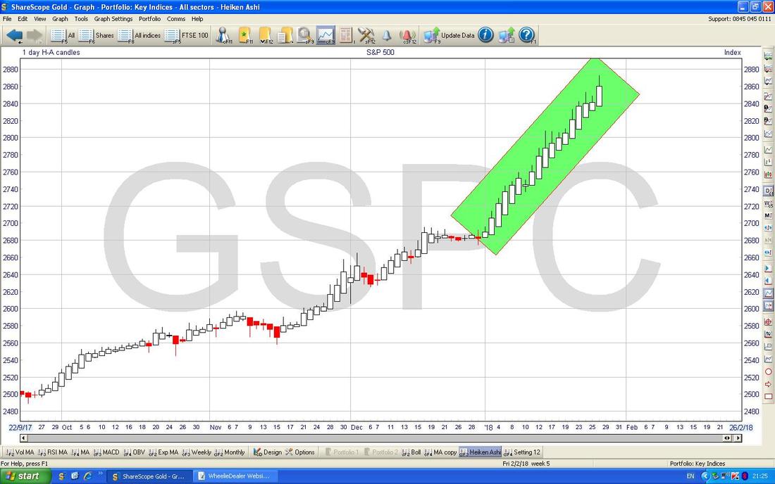
This is quite amazing - the Chart below is the Daily Heiken Ashi Candles for the S&P500 and my Green Box is highlighting a string of Big White Up Candles - it is stunning because it shows how smooth and relentless the move up has been - there are almost no Pullbacks because if we had them they would show as a narrowing of the Candles - it is most unusual.
Anyway, I am timing out so that will do for now. I hope everyone has a strong week of Money making !! Cheers, WD
4 Comments
Jean black
28/1/2018 12:16:39 pm
Thank you very helpfull as i have IQE, MTFB, PETS, it has given me plenty to think about
Reply
WheelieDealer
31/1/2018 11:20:56 pm
Hi Jean - thanks for the feedback - I know a lot of Readers hold IQE and MTFB in particular so they certainly make interesting Stocks to consider the Charts on,
Reply
tony broomfield
29/1/2018 08:50:53 pm
I wheeler dealer just found your website from link on mark carter's blog.
Reply
WheelieDealer
31/1/2018 11:24:04 pm
Hi Tony, thanks for the feedback and so pleased you like the Website. It's been kicking around for about 3 years now and slowly the amount of Information buried away is building up to a pretty comprehensive Archive and hopefully what I write is more grounded in reality that much Financial Writing that is around. Thanks to Mark also for putting a link to my site in his Blog !!
Reply
Leave a Reply. |
'Educational' WheelieBlogsWelcome to my Educational Blog Page - I have another 'Stocks & Markets' Blog Page which you can access via a Button on the top of the Homepage. Archives
May 2024
Categories
All
Please see the Full Range of Book Ideas in Wheelie's Bookshop.
|

