|
It’s hard to believe we have only had 4 Trading Days of the New Year and yet my Portfolio was up 2.5% by the end of it - in the context of a Target of 10% for the Year this is clearly a blistering start and it is probably the best opening to a Year I can ever remember. I always ‘Zero’ my Numbers at the End of each Year and start a fresh Year with my ‘Profit’ at Zero in effect. The usual pattern is that my Profit goes negative for a few Days in early January and gradually it moves back into positive as the Month progresses - it can be quite unnerving so it is nice to already have a bit of a ‘cushion’ of Profit built up. I always like being ‘Ahead of the Game’…….
Webinar Monday 8th January I was invited by Dale Pinkert to appear on his regular Webinar tomorrow at 1pm UK time - I am under the impression that it does get recorded and is available on YouTube later - I will look into this after the Show and put a Link on the Homepage somewhere for people who are unable to listen ‘Live’.
If you are around at 1pm tomorrow then to watch the Webinar you can do it via a Browser on your PC by clicking this link and I think if you enter the ’9-Digit ID’ of 468-781-395 and your Email Address then you should be able to Register for it (I found that I got an Email back from them and I had to click a link within it to get things working):
https://www.gotomeeting.com/en-gb/webinar/join-webinar Alternatively you can access it via a Tablet by going to the Play Store or the Apple Store and looking for the ‘GoToWebinar’ App - again you will need the Code number 468-781-395 to get access and you need to Register. It sounds difficult but in fact it is dead easy - I even managed it eventually !! The Webinar is called ‘F.A.C.E (Forex Analytix Community Experience)’ - this might help you find it. ‘Compare at your Peril’ WheelieBlog I have been thrilled to bits with the response on Twitter and Comments to this Blog which I put out earlier this Week - if you have not read it yet then it might be worth looking down my Blog Page to find it (shouldn’t be too hard as it is the one before the Blog you are reading now !!). It does make me giggle - I cannot tell in advance which of my Blogs will be well liked and get a strong reaction (one way or another !!) and which ones will get no attention whatsoever. I often write something which I think is really top quality and no-one responds at all - other times I bash out something really fast and yet it gets an outstanding reaction - this ‘Compare……’ Blog falls into the latter category. The bit that particularly pleases me is to get some really positive Tweets from a few of the truly Best Investors/Traders that I know on Twitter - that means a lot to me and Thanks to you all yet again. Investors Chronicle ‘Tips of the Year 2018’ Poor old IC had a difficult year with their Tips for 2017 with the overall collection actually producing a negative result - however, to be fair to them a ‘Portfolio’ of 8 random Stock Picks is not really a proper Portfolio as such and of course those of us who have been in the game a while will know there is a lot more to Running a Portfolio than just buying 8 Stocks on the 1st of January and then doing nothing all year. Anyway, Tips from any source should never just be automatically bought with no application of your own Brain (and perhaps some views from other decent Investors you know - it’s really never been easier with such tools as Twitter etc.) and for me any Tip is just a route to an Idea which I can then research further - so we should see IC Tips in this light. Enough gibbering, what you want to see are the Tips so here they are - if you are quick you might still be able to pick up a Paper Copy in your Local Newsagent or WhSmith or something to get the full write up and the rationale for their recommendation - of course if you get a yearly Subscription then you get full access to their Website which holds all their Archive of Articles:
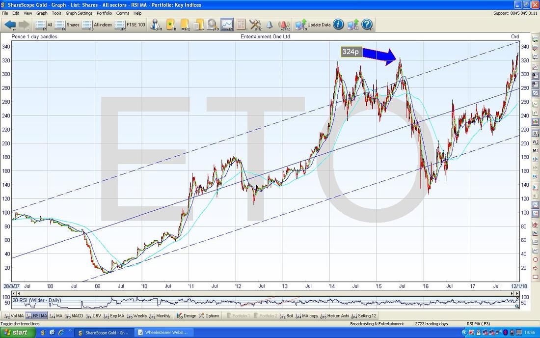
This is an interesting list. I take little notice of the Foreign one (too difficult with all the Forex mucking about etc. - although I will probably read it and see what they have to say at some point), and a couple like MARS and FXPO strike me as pretty high risk. The others, JD., PSDL, REL, ETO, BAB look pretty tempting - although arguably REL is pretty fully valued and you won’t get much fireworks from that one (it was described as “Old Reliable”). I actually hold ETO (ok, I guess most of you had already realised that !!) and it just looks extremely cheap to me even after a superb run up - according to IC the Library Value is now about £1.3bn against a Market Cap of £1.418bn - so buying the Shares now means you are getting them at just a bit more than the Library Value but that is based on the figure from the last set of Results and at the next Announcement it is highly likely that the Library Value will be up again. Of course it is extremely relevant to the Value Case that this pretty much is attributing Zero value to the Business itself - and yet Peppa Pig alone is clearly worth a lot of Dosh. Throw in the growth of PJ Masks which has caught everyone out (it grew 600% in the last Update) and the fact they are addressing the issues in the Film Division and clearly there must be considerable Upside here. I see no reason why the Share Price should not be up around 400p, and 450p to 500p would not be insane with a bit of patience. It’s a nice Chart as well:
As always any Charts I bung in here are from the truly fab ShareScope Software that I use (similar Charts can be created on SharePad if you use it) and on the Long Term Chart of ETO above I have used the ‘Toggle the Trendlines’ Button to put in those Blue Parallel Lines which run from Bottom Left to Top Right - that is of course marking a lovely Uptrend and exactly what we want to be seeing.
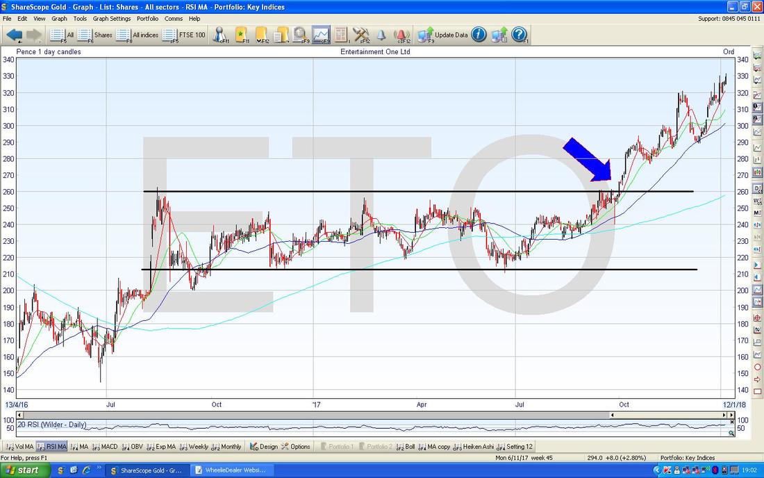
Note my Blue Arrow at 324p - this was the All Time High (ATH) up until very recently when the Price ‘Broke-out’ above this and that is an extremely Bullish bit of Price Action - lush !! I have put the next Chart in because it is a great Lesson in firstly Patience and then in the importance of Breakouts and why we need to be aware of them and how to Trade them. My Parallel Black Lines from about August 2016 show that the Price of ETO was in a really tedious Sideways Up & Down Range for about a Year and a Half - that takes a huge amount of Patience and can be extremely frustrating. Due to my belief in the Value on offer here, I was happy to ride out the boring period and it has paid off big time because ETO is probably in my Top 5 biggest Holdings (and I bought my first load around 60p Years ago !!). I have no problem letting such a Range play out because I hold lots of other Stocks and they can do some work while I wait for a Particular Stock to go through its Sideways phase - remember, we can never know when such a Range starts how long it will last for - I am surprised ETO took so long to Breakout. Where my Blue Arrow is you should be able to discern that the Price ‘Broke-out’ above the Top of the Range Channel and since then it has just continued to move up nicely - and this is precisely what you should expect on such a Breakout and in the current Market most of these types of Breakouts do tend to work. The ‘Trading’ Approach here would be to buy more when it Breaks-out - I didn’t do this because I already had loads of ETO but I was flagging this Breakout on Twitter a lot. As always, if you want to see the Charts in more detail then if you click on them they should get bigger in your Browser jobbie. I shall resist the temptation to mention “Bacon”……
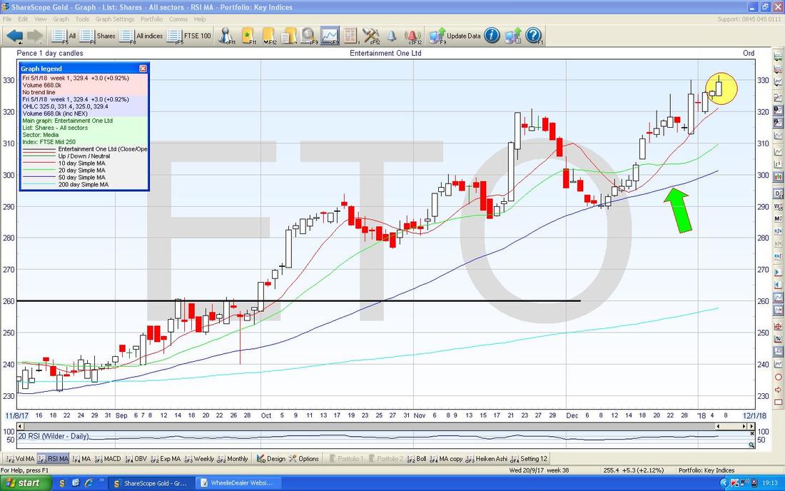
I have zoomed in to the very near term on the Chart below and my Yellow Circle highlights an Up Candle from Friday 5th January 2018 - this looks mildly bullish and with Paper Copies of IC coming out over the Weekend I expect it is quite likely we will see an Upwards effect just from it being in the Tips of the Year - we shall see but I think it is small enough that IC can move the market on it.
My Green Arrow points to the 50 Day Moving Average Line and this should act as good Support if we do get a Pullback in coming Days/Weeks.
Babcock BAB
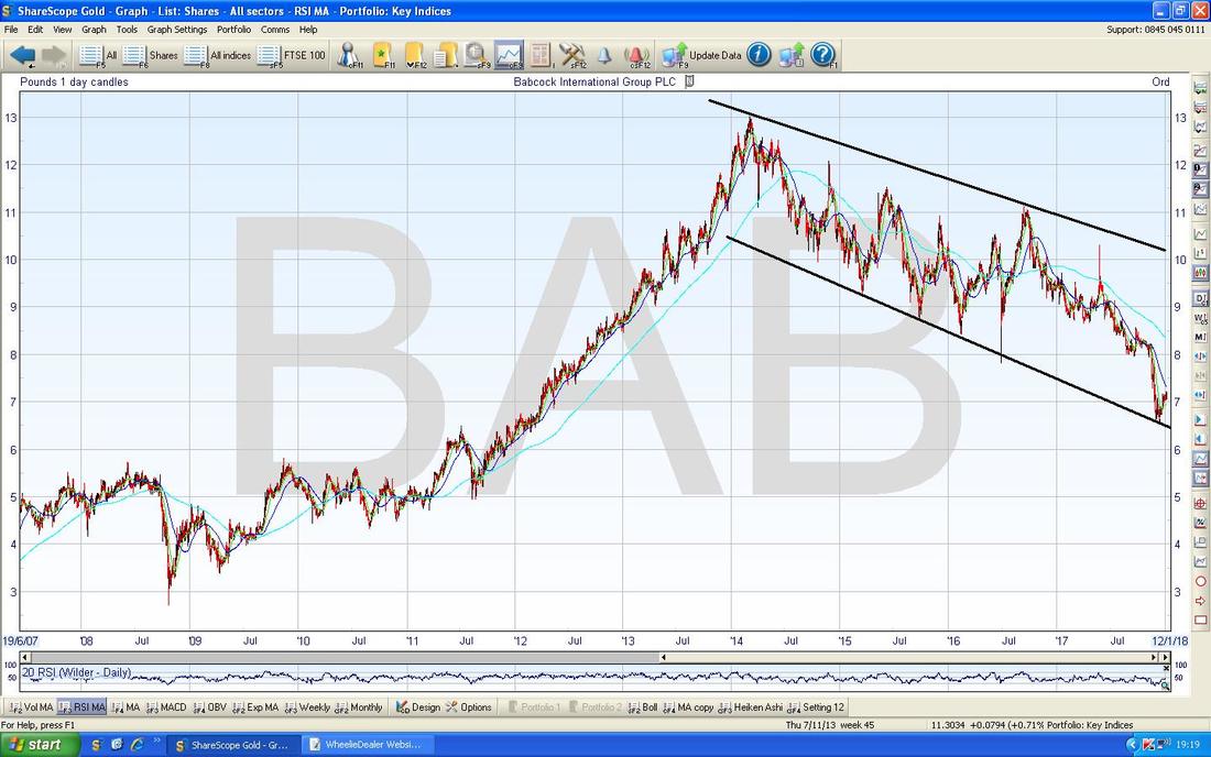
I don’t hold this Stock but fundamentally I quite like it and as an Income Portfolio Stock for the Dividend of over 4% I think it could be quite interesting. It is also on a Forward P/E of 8.5 which looks very attractive, if not downright cheap. It has a huge Order Book and I think it has been unfairly beat up because the likes of other Outsourcers have had ‘issues’ - but this seems like a mistake because BAB is in a fairly unique position with regard to the Defence Work it undertakes. The Chart below has the ‘Big Picture’ and clearly the Story here has been a Long Term Uptrend which then reverted into a Downtrend (marked by my Black Lines) since March 2014 and has been sliding ever since.
On the Chart below I have zoomed in a lot and the Black Lines at the top and bottom are from the previous Chart. My Red Arrow is pointing to a Horizontal Support Line at 650p and it is crucial that this holds and the Price stays above. At the moment I would not buy BAB or if I really wanted some I would buy a small amount to “Get my Foot in the Door” with a view to adding to the Position as the Chart started to look better. The big problem is that the Price is still falling (“Don’t Catch a Falling Knife”) and really the Price needs to calm down and start going Sideways and building a Base of Support before it can then start moving Up again - but we are some way off.
Here is another way of looking at this problem. My Green Arrows are pointing to the Distance between the Lighter Blue 200 Day Moving Average and the Darker Blue 50 Day Moving Average and you should be able to see that the Distance is widening at the moment. If BAB is going to move towards an Uptrend (or even just to stabilise as a start) then we need to see these Moving Averages start moving closer together and we know things are really on the mend when we get a ‘Bullish Golden Cross’ where the 50 Day MA moves up and crosses over the 200 Day MA from underneath - we are a long way from this happening so I see no rush to be buying yet and I would not be at all surprised if the 650p Level fails to hold as Support.
Molins MLIN
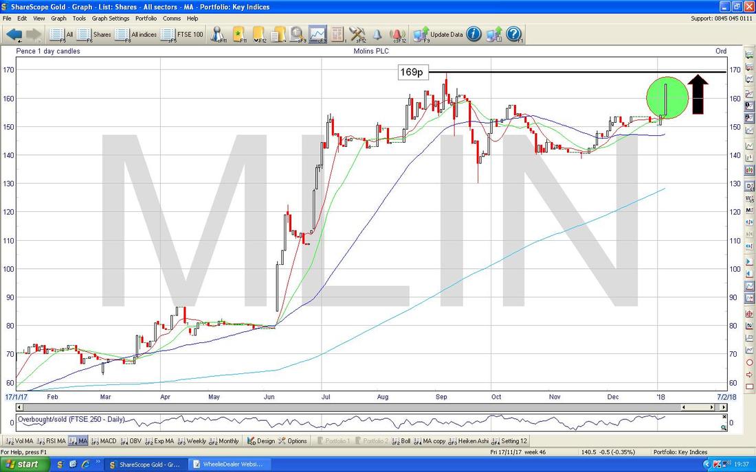
This is one I hold a fair chunk of and I think it is very cheap with a Cash Pile of £22m against a Market Cap of £33m and if you strip the Cash out then it is on a Forward P/E of under 4 !!! There is a chunky Pension Deficit here although with such a big Cash Pile and such a low Valuation there is clearly plenty of room for manoeuvre here - and personally I take little notice of Pension Deficits because the way they are Accounted for is complete garbage. MLIN has been through troubles but much has changed with a new Guvnor and a change of Strategy - I see no reason why this Stock could not be 200% higher than it is !! The Chart below shows the recent Price moves and my Black Arrow is pointing to the Recent High at 169p - clearly if we can Break above this then we should see another Run higher. On Friday (where my Green Circle is) we got a nice Big White Up Candle and this suggests the Bulls are ready to have a go at getting that Breakout.
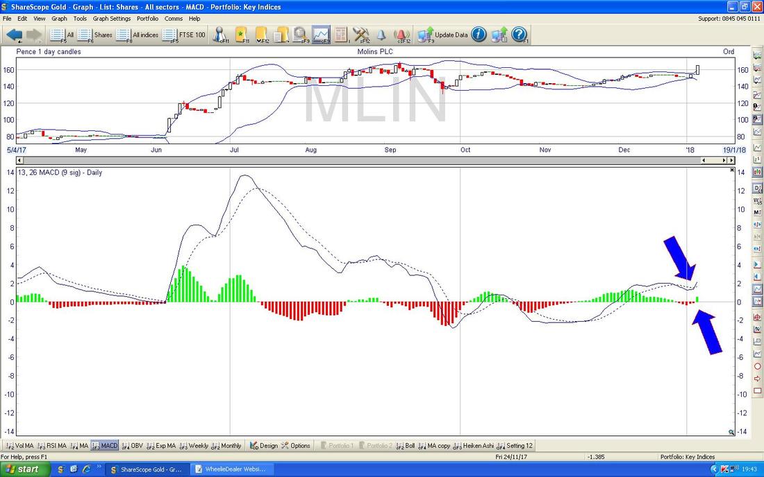
In the bottom window on the Chart below we have the MACD (Moving Average Convergence Divergence) for MLIN - my Blue Arrows are pointing to where we got a ‘Bullish MACD Cross’ and this is shown in both the Signal Lines and Histogram Bar formats.
Plus500 PLUS
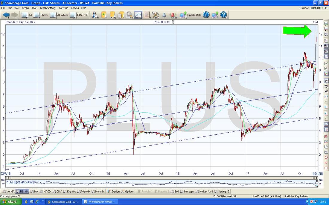
This is a funny one and gets all sorts of opinions going - both in extremes of Love and Hate !! I think it is quite a Risky Share because it has been targeted by a Shorting Attack before and because it put out a very positive Trading Update just a few Days ago but much of its growth in Business recently has come from CryptoCurrencies and the craziness going on there - if that Revenue dries up, then there could easily be a Profit Warning. However, with those caveats in mind and appropriate Risk mitigation like a Small Position and/or use of Stoplosses etc., I think this could be a good Stock to buy - I don’t hold it myself (I have done in the past and made a nice chunk on it) because I hold igIndex IGG in a big way. A big attraction here is the numbers - a Forward Dividend Yield of 6.5% and a Forward P/E of 9 despite the huge jump up this Week looks very cheap - I don’t see why this Stock could not be at least 50% higher if it keeps its nose clean. I also reckon the Forecasts these Numbers are based on have not been revised up yet so they might understate what really happens. My first Chart shows the full history of PLUS and I have added in a Green Arrow to make it clear where the Share Price is now after the jump last week (well done all you Holders out there by the way !!) - there is clearly a Long Term Uptrend and the Momentum is certainly with this Stock.
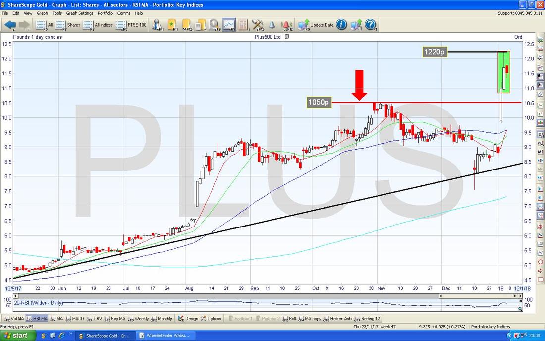
My Chart below zooms in and looks at the recent Candles. My Red Arrow is pointing to 1050p where the Price Broke-out of after the good news on the Trading Update (it is well worth reading this Update by the way) and this Level should now act as Support if the Price does pull back at all.
My Green Rectangle is trying to capture a White Up Candle from Thursday 4th January 2018 but note how it has a bit of a ‘Wick’ or ‘Tail’ up above which touched 1220p Intraday and then dropped back. This tells us that 1220p is a Key Level now and the Price has to break over this to go higher - such a Breakout would be a Buy Signal. The Small Red Down Candle from Friday suggests that Bears have come in here a bit - so we might see the Price drop back a bit before it moves up again. If you want some PLUS, then the Trade would be to buy some soon and then to Buy more if we get the Breakout over 1220p. I have to say this is a superb example of where an Approach based on Fundamentals of a Company can be enhanced/embellished with an Approach bringing in Technical Analysis techniques.
I’d love to cover more Stocks but I need to look at some Indexy stuff now.
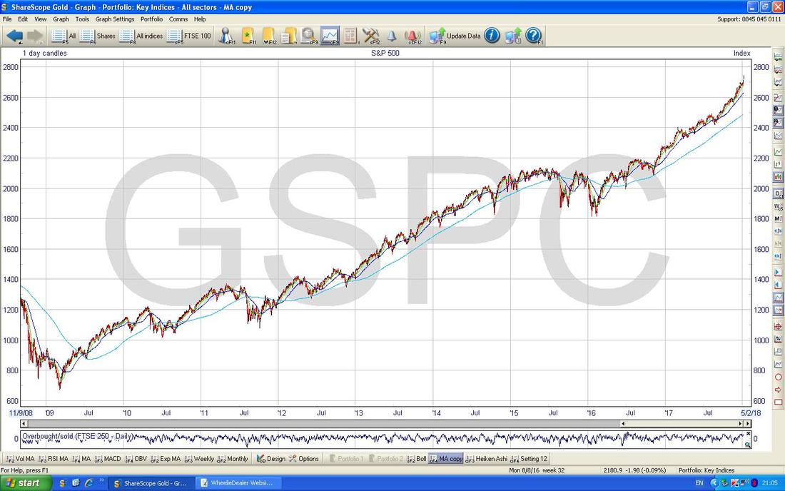
S&P500 I have a small Long Position via a Spreadbet on this Index running at the moment (see my ‘Trades’ page for details) and therefore I am particularly interested in this one. Starting off we have the ‘Big Picture’ view going back to the 2009 Credit Scrunch Lows and I am sure you will agree this is most definitely an Uptrend !!!
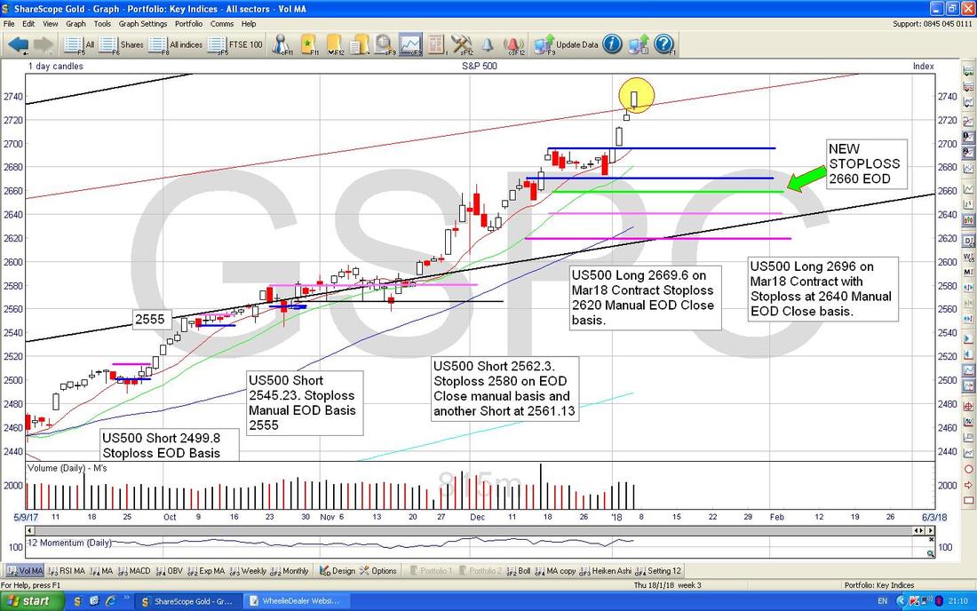
The Chart below is my actual ‘Working’ Screen - I am showing the Short Term View here as that is what I am interested in for the particular Trade I have running. My Yellow Circle is highlighting a White Up Candle from Friday 5th January 2018 and this is showing no Bearish signs yet although it does look a bit over-extended short term.
The Blue Horizontal Lines show where I opened my Long Positions (there are 2 I have running) and the Purple/Mauve/Pink sort of Horizontal Lines were my Original Stoploss Levels but I have now decided to move my Stoplosses up behind the Price Move and the Green Line (marked by my Green Arrow) at 2660 is my New Stoploss Level - this is on an EOD (End of Day) basis so I will only trigger the Stoploss and Close my Long Positions if it is breached at the End of a Full Day of Trading. I am not interested in the ‘Noise’ of Intraday wobbles. Note both my Trades initially had their own Stoploss Levels (it is arguable whether or not this is logical !!) but I have now amalgamated them into one Single Level. If the New Stoploss is triggered then I won’t make any Money on the Trades but I will have reduced the Loss from a Stop Trigger to a miniscule amount - Risk/Reward and all that stuff……
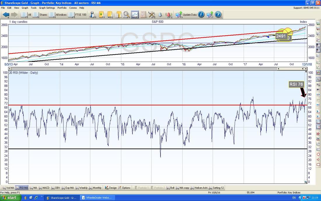
In the bottom window on the Screen below we have the RSI (Relative Strength Index) for the S&P500 Daily. On a current reading of RSI 76 this is pretty much as high as it gets and this means it is very susceptible to a Pullback in the very Short Term - however, this can be a ‘Consolidation’ that is achieved in one of two ways - either the Price can drop back or the Price can just go Sideways and wiggle about - both would effectively unwind this ‘Overbought’ condition on the RSI.
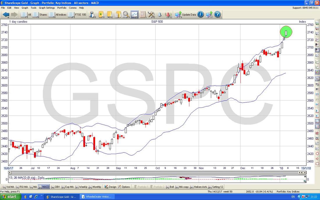
My Chart below has the Daily Candles for the S&P500 with the Blue Squiggly Bollinger Bands above and below this bunch of Candles. My Green Circle is highlighting the White Up Candle from Friday 5th Jan and note how it is above the Upper Bollinger Band - this is an unstable condition and suggests it needs to pullback or go sideways to calm things down a bit. It could of course keep moving up but the Charts are suggesting that some sort of Consolidation is needed for perhaps a few days so that it can then start moving up properly again.
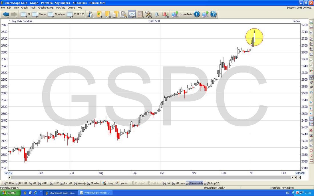
The Chart below has the Daily Heiken Ashi Candles - these are totally different to ‘Normal’ Candlesticks and are based on an Average so they are ‘Slower’ at giving Indications and are better at cutting out the Noise. My Yellow Circle is highlighting some nice Big White Up Candles and this is clearly a bullish formation.
In summary, the S&P500 looks Bullish and I will keep my Long Positions running but there might be a Pullback for a couple of days before it can resume the Upwards action. I will not worry too much about it and let my revised Stoploss do the hard work.
Pound Vs Dollar
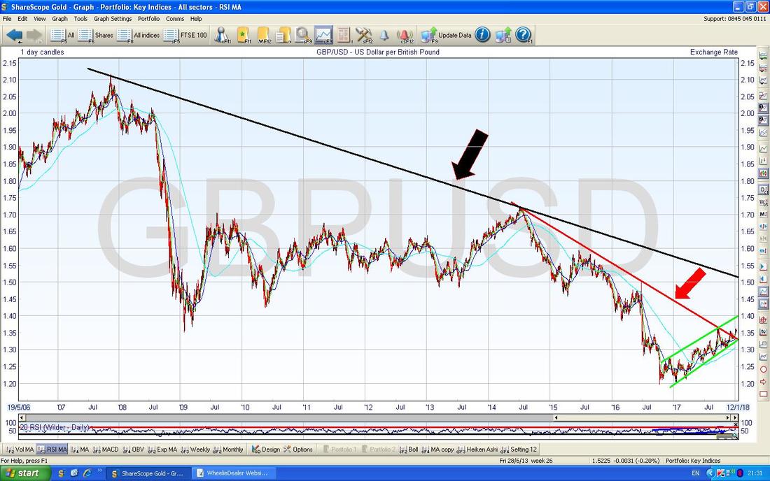
This one is particularly of interest because it is a major cause of a rise in Inflation in the UK which has been impacting Economic Growth since the Brexit Vote - for this to ease the Pound needs to move up and has done so to some extent but there is probably more Recovery to come although 1.50 looks a tough level. My Chart below goes back to the high Point of the Pound back around November 2007 (just before the Credit Crunch) and there are 2 important Downtrend Resistance Lines I want to show here. First off we have the Big Black Line (marked by the Black Arrow) which is where I am getting my 1.50 Level from - this looks difficult to breakout of. Secondly we have the Shorter Timeframe Red Line which is marked by my Red Arrow and we will look at this more in a tad.
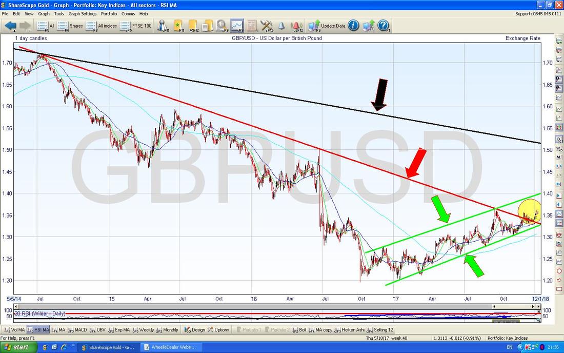
On the Chart below I have reduced the Timeframe (this is dead simple to do with ShareScope because I just use that Grey Bar thing with the little Black Arrows which you can probably see right at the bottom of the Screen - I just drag it with the Mouse), and now we can see the Uptrend Channel which has been in force since the Brexit Low Point and the Price has been very well behaved within this Channel.
My Yellow Circle is highlighting how the Pound has now risen out of the Red Downtrend Line (Red Arrow) but the next big challenge is the Resistance from the Black Downtrend Line (Black Arrow) from the previous Chart. It is worth noting that to some extent if the Pound moves up then the FTSE100 moves down - but that relationship might be true to an extent for Intraday and Short Term movements but in the Bigger Picture it is pretty clear that as the Pound has risen over 2017 so has the FTSE100. I was reading Chris Dillow in the latest Edition of Investors Chronicle on this subject today and he says that over longer periods of time there is ZERO correlation between the FTSE100 and the Pound/Dollar rate, based on date going back to 2000 I think it was.
FTSE100
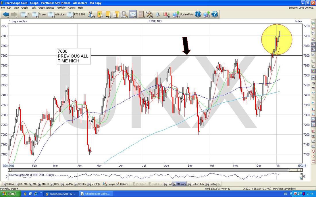
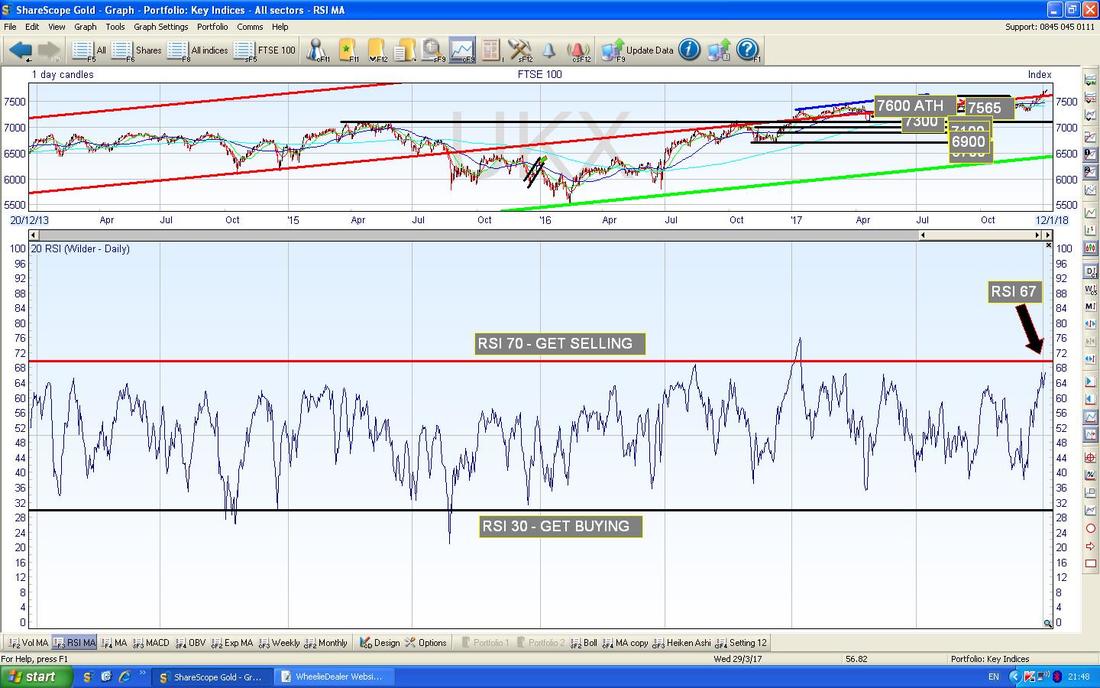
Seeing as we are talking about that old devil we might as well take a quick look at it before I close off the Charts for this Week - the clock is ticking sadly…… This is one of the most simple Charts ever to read - the Story here is that in the dying Days of 2017 the FTSE100 Broke-out over the Previous All Time High at 7600 (marked by my Black Line and Black Arrow below) and such a Breakout can only be seen as Bullish. My Yellow Circle is showing how the Price has since charged up and the most likely course of events now is that either we get a Sideways Consolidation to calm things down a bit or we have a bit of a Pullback and we could ‘Test’ the Breakout Level of 7600 - remember, “Former Resistance becomes Support and Vice Versa”. If we do get such a Test, then I would expect the Price to Bounce back up off 7600 and this would then be called a ‘Confirmation’ in the jargon of the TA bods.
In the bottom window on the Screen below we have the RSI for the FTSE100 Daily. On a Reading of RSI 67 it is very high by the standards of this Index but it clearly has a bit of room to go higher - I would not be Shorting this Index yet (and any such Short could only really make sense to catch a small Pullback - I am not sure it would really be worth it).
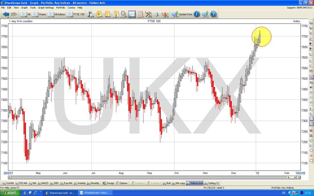
On the Chart below we can see the Daily Heiken Ashi Candles are still looking Bullish - my Yellow Circle is highlighting some Big White Up Candles and no sign of any Narrowing or turning Red (which is a Colour Bulls detest !!).
Right, that’s it for this Week - good luck y’all, Cheers, WD.
2 Comments
Alan
8/1/2018 01:09:58 am
Thanks for your review of some Investors Chronicle tips. Like you I have held ETO a long time (2010 @ 62p). My grandson loves Peppa and I have watched every episode many times! Ben & Holly, also from ETO is even better imo, but I'm not the target audience, obviously.
Reply
Jonathan
8/1/2018 10:40:45 am
Hi Wheelie,
Reply
Leave a Reply. |
'Educational' WheelieBlogsWelcome to my Educational Blog Page - I have another 'Stocks & Markets' Blog Page which you can access via a Button on the top of the Homepage. Archives
May 2024
Categories
All
Please see the Full Range of Book Ideas in Wheelie's Bookshop.
|


