

|
educational blogs |
|
Well, we are now embarking on the final Quarter of 2016 - I really have no idea where the year has evaporated to. It seems like just a few weeks ago we were in the panic around February and of course last week we had the Brexit Vote - it’s really nuts.
Markets still strike me as real toppy and the Macro Risks are just mounting up - latest one is Deutsche Bank (and consequent knock-on for Italian Banks), then we have Trumpy, US Rate Rise in December, Hungarian Refugee Vote today, Italian Referendum soon, Article 50 Trigger by end of March 2017 and of course some pretty fully valued Equities (oh, and a Bond Bubble). Markets are still pushing up against All Time Highs and have managed to survive the often difficult Month of September without a major wobble - but of course we are still in the iffy Autumn Period and October can be a tricky month to get through - will the nonchalant mood of the Markets continue?
On the more positive side, we have the Chancellor’s first Budget in November and it is widely expected he will be pumping Cash into Infrastructure Investments such as Roadbuilding, Housing, etc. - although I did hear today that any anticipated slowdown might limit his room to do much extra Borrowing.
October Track Record According to the UK Stockmarket Almanac 2016, October has a “Reputation for Volatility - since 1984 seven of the ten largest One-Day Falls have occurred in October !!”. Since 1970 the Average Return for the FTSE100 in October has been just 0.3% - making it 9th out of the 12 Months. In the last 22 years however, the Market has only fallen 5 times in October (only December has a better record over this time period). In “Recent Years” (I’m not sure what Time period they mean here) the FTSE100 has returned 0.7% in October on average - making it the 5th best Month with 74% of Octobers being positive. However, note that Volatility is very high and there is a High Standard Deviation for October. In a typical October we rise for the first 2 weeks and then fall back. The Last Trading Day of October is the best Last Day for any month. October has been a weak month for Gold, Silver and Oil. The coming Week (w/c 3rd October 2016) is up on average for 65% of years with an Average Return of Positive 1.0% for the FTSE100 - so the Historical Precedents for next week are pretty favourable. We have the US Non-Farm Payroll Numbers on Friday so this might be a bit of a focus to add some spice for the Traders before the Weekend. FTSE100 Let’s start off with the Monthly Chart and see how things have played out after September. With any Technical Analysis stuff the Longer Time Periods tend to dominate Shorter Time Periods and it is always best to start on a Long Timeframe and then drill down. The Chart below from the super cool ShareScope Softwqre that I use, shows the Monthly Candlesticks for the FTSE100 going back around 3 years or so. My Blue Arrow is pointing to a ‘Long Tails Doji’ Candle that was created for August 2016 and after the run up of 6 Months or so, it was very likely this August Candle could have marked a Reversal and we might have seen September create a Down Candle. In the event, we have a nice Up Candle for September as pointed to with my Black Arrow and it could be argued that this is Bullish Behaviour for the FTSE100 to have shaken off a Negative Looking Setup to keep moving up. The Key now is for the FTSE100 to get over the High of August at 6955 - and if it can crack this, then it needs to march on and take out the All Time High at 7122. If it can breakout over 7122 that is extremely bullish behaviour and should setup more gains - Fundamentally I dread to think how overvalued the Market will be at that point !! 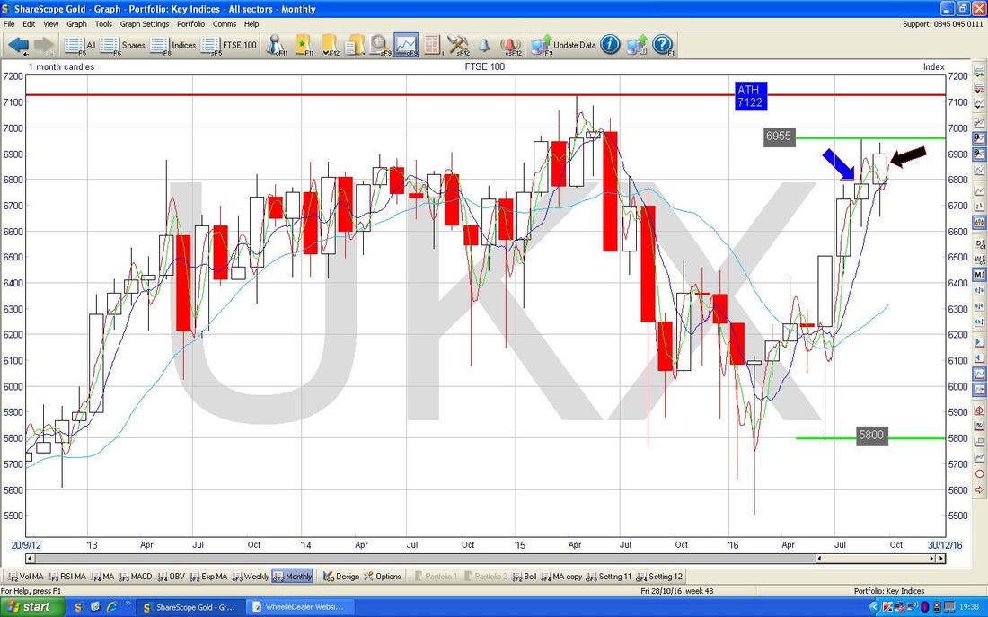
Now we move onto the Weekly Candles for the FTSE100 - the Chart below has these going back about 1.5 years. My Black Arrow is pointing to a Doji Candle that was produced last week - in this context, it probably doesn’t mean a great deal. If we had seen a run up of several Weeks of Up candles and then had a Doji like this, it might indicate that the Trend is about to turn down - however, we have been going Sideways for maybe 8 weeks or so and this Context doesn’t tell us much.
When you get in Sideways Ranges like this it is all about Support and Resistance and where the Price pops out of the Range - does it Break up or does it Break down? As I mentioned on the Monthly, the 6955 Level is key in the Short Term and the FTSE100 needs to breakout over this Level. 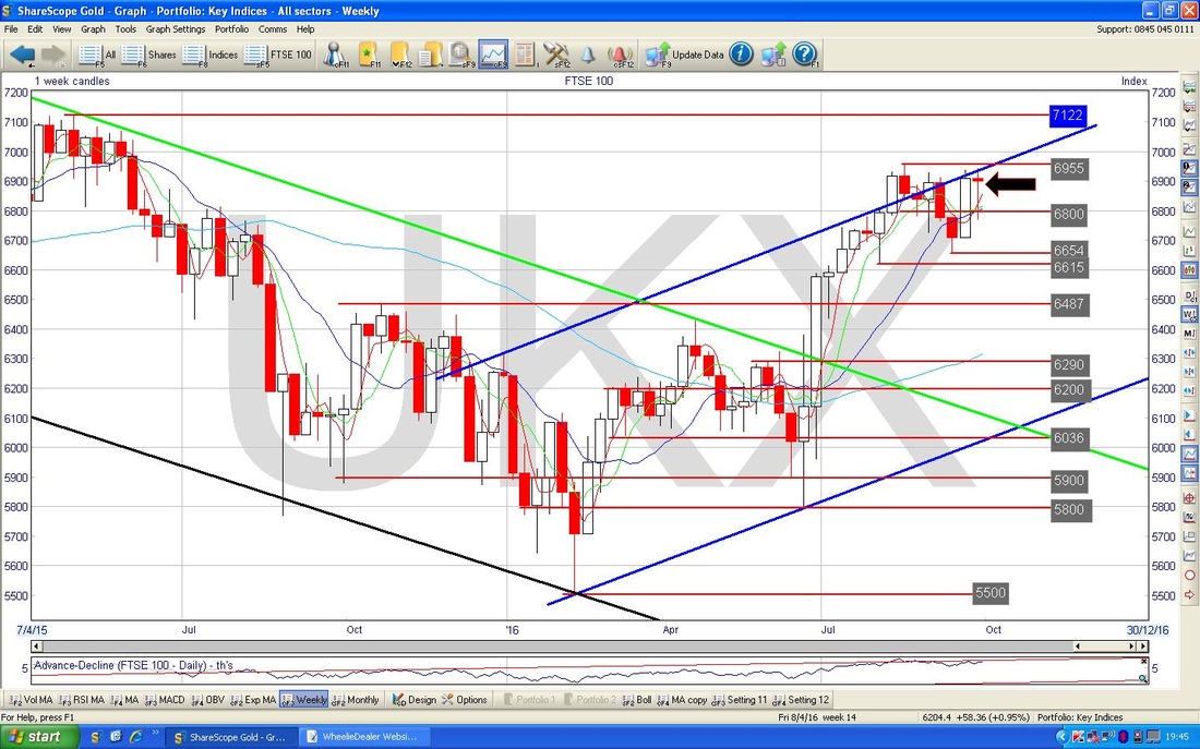
Regular Readers might remember this Chart or a similar one. It is really important and is still telling us quite a lot about what is happening. This shows the Daily Candles going back around 1.5 years - first off note the Red Line (marked with the Red Arrow) which is the Bottom Line of the Uptrend Channel which ran from the Low in 2008 and encapsulated the 6 year Bull Market (if you want to see this, then go back to the Blogs I did on recent Weekends and you should be able to see it I’m sure).
My Green Arrow points to roughly where we are now - note how we are quite a long way away from the Red Line and if anything we are getting further away with the FTSE100 having put in 4 ‘Lower Highs’ over the last 6 Weeks or so. In other words the Red Line which used to be Support for the Major Uptrend Channel has now become Resistance (as it should do according to Textbook Charting Rules) and the Price is struggling to Breakthrough. Note also the Blue Line (marked with the Blue Arrow) which is a Downwards Sloping Resistance Line off of the Peaks in April 2015 - the Price is struggling to Break through this line also. My Black Arrow is marking the Peak at 6955 which was on the previous 2 Charts as well. 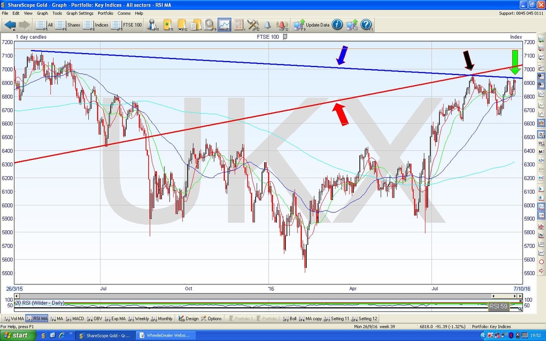
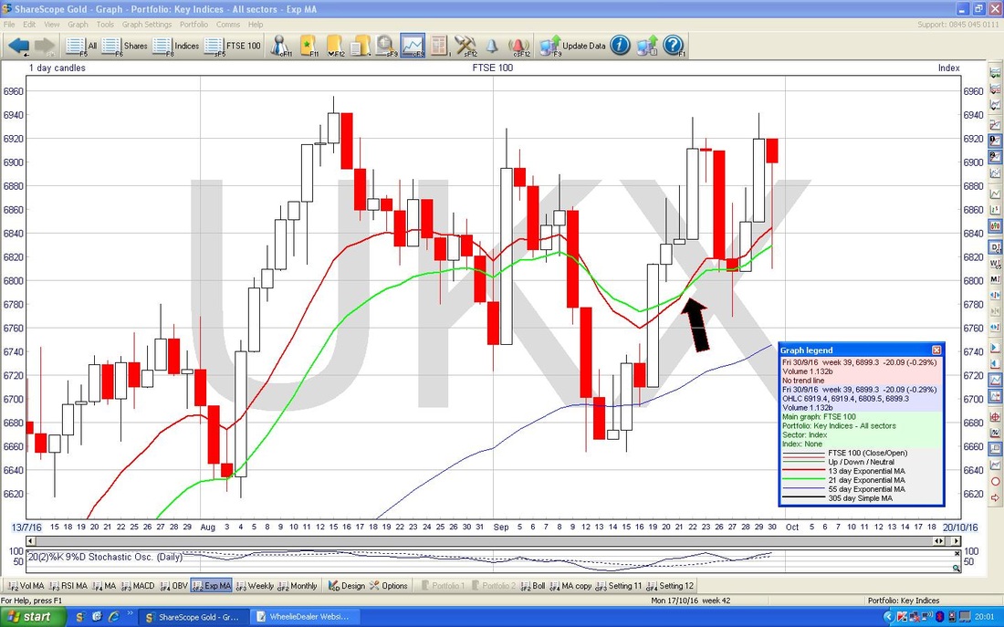
The Chart below has the Daily Candles for the FTSE100 going back just a couple of Months but what I want to show here is the Black Arrow which is pointing to a ‘Golden Cross’ between the 13 Day Exponential Moving Average (the Red Wiggly Line) and the 21 Day EMA (the Green Wiggly) - such crossovers tend to mean we will see the FTSE100 continue to rise for a bit - however, they are not too reliable in Choppy Sideways Markets - i.e. exactly what we have now !!
DAX (German)
I won’t dwell on this Index but I just wanted to shove up the Monthly Candles. This Chart goes back about 2.5 Years and the thing to note here is that my Blue Arrow is pointing to a Doji Candle we got for September and the Black Arrow is pointing to a Doji for August - it shows a lot of indecision and ties in with the Sideways Range on the FTSE100. Note Resistance at 10800 is dominating here. 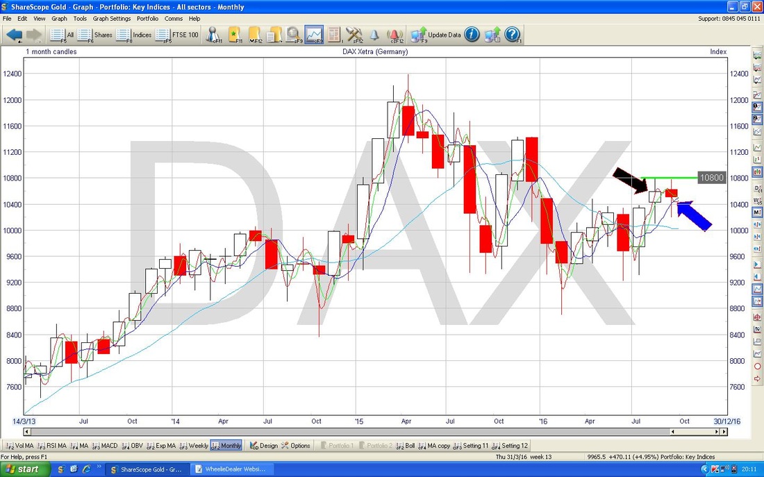
DOW (US)
I’m loving these Monthly Charts so here’s another one !! The Chart below has the Monthly Candles for the Dow Jones Industrials Index going back about 2.5 years. My Blue Arrow is pointing to the Doji Candle which was created for August and note how the ‘Body’ of the Candle was towards the bottom of the Range the Candle ‘Tails’ covered during the Month. Prior to September, it would have been easy to see this as a possible Reversal Signal after the Run up in previous months - as it happens, it seems to be acting in this way as the Dow was down for September as per the Candle my Black Arrow is pointing at. However, there was clearly some indecision because we did not get a big ‘Clean’ down Candle. As with the other Indexes we have looked at so far, there is another Sideways Range going on - this time from 18000 at the bottom to 18668 at the top (the All Time High). 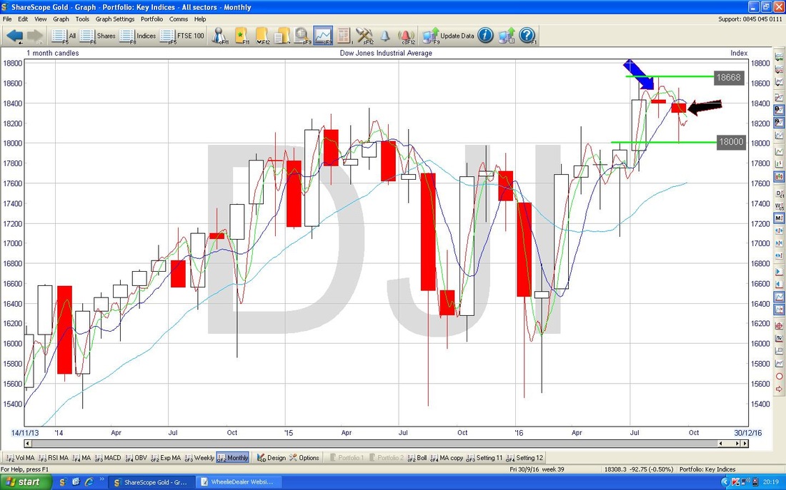
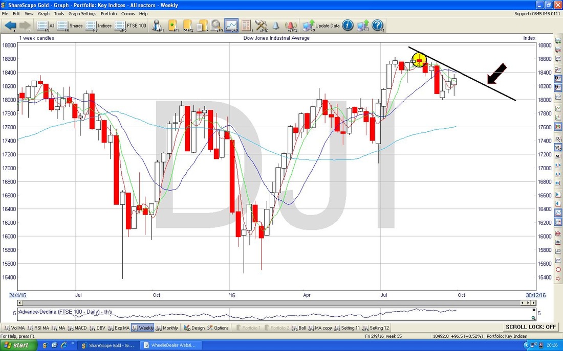
The Chart below has Weekly Candles for the Dow going back about 1.5 years. First off note my Yellow Circle which is pointing out a Doji Candle which seems to have been a Pivot Point from which the recent Candles have dropped. My Black Line (marked with the Black Arrow) are showing a Downwards Sloping Line which the Index is struggling to get over at the moment.
Nasdaq 100
This Chart is of particular interest to me because I have a Short on the Nasdaq 100 as part of my attempts to Hedge my Portfolio of Stocks - Fundamentally the Nasdaq looks very overvalued to me but Technically it is not wanting to play ball at the moment !! The Chart below has the Weekly Candles for the Nasdaq 100 going back just over a year roughly. My Black Arrow is pointing to a White Up Candle which was bashed out last week which seems quite Bullish but note the Resistance at the All Time High at 4895 - this is the Key Level that this Index needs to break through. 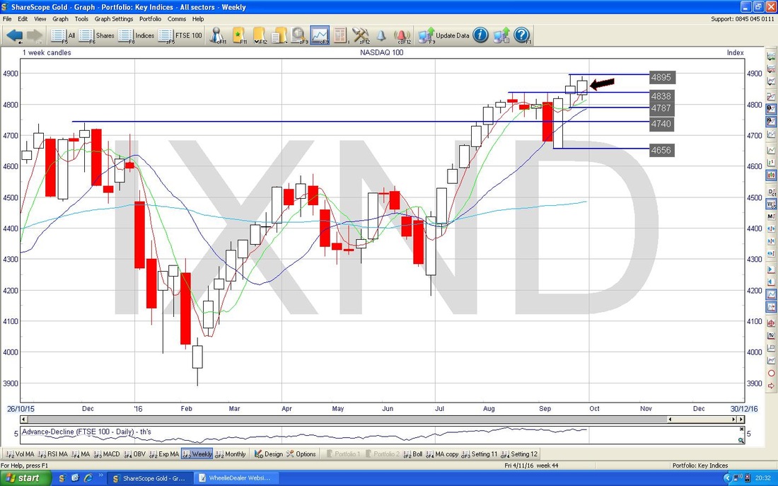
S&P500
The Chart below has the Monthly Candles for the S&P500 going back about 2 years or so. My Yellow Circle is highlighting a ‘Long Tails Doji’ which was created for August and in the context of the moves up in the months prior to this, it really looked like it might be a Reversal Signal - I am sure I mentioned this on previous Blogs. My Blue Arrow is pointing to a Doji which was produced for September and we did turn down a bit off of the August Doji. As with so many of the previous Indexes we have looked at tonight, this one needs to get over the All Time High at 2194 and if it can then this would be very Bullish. Frankly, with a Loon or a Crook about to become the Leader of the Free World it is hard to see how US Indexes can make much headway. 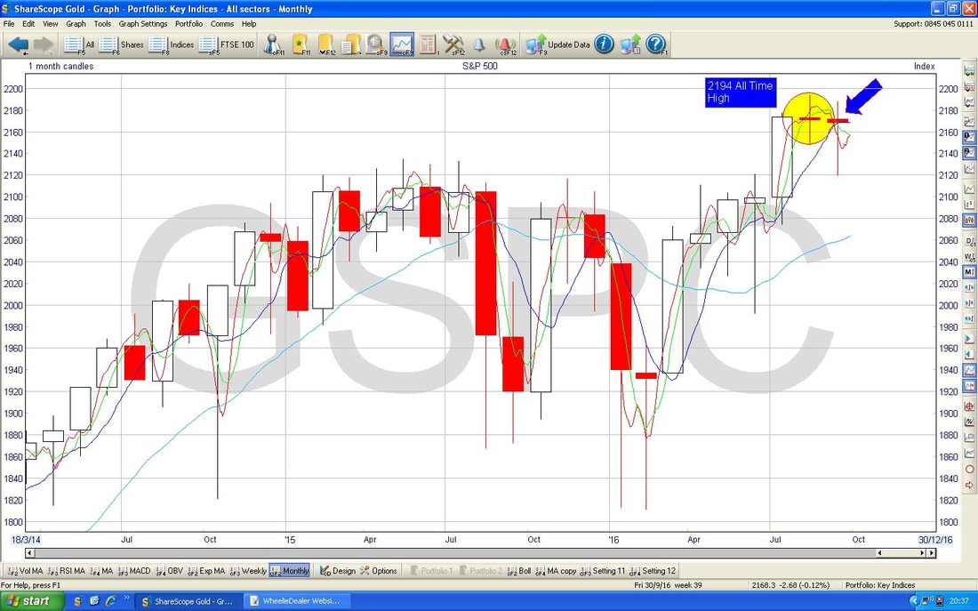
The Chart below of Daily Candles for the S&P500 going back about 3 Months has some interesting things on it. First off look at my Black Arrow which marks a ’Death Cross’ where the Red Wiggly 13 Day EMA crossed down through the Green Wiggly 21 Day EMA - note this Crossover is still prevailing and we need a ‘Golden Cross’ to improve things from this respect.
Next look at the Blue Line which I have marked with the Blue Arrows. These form a Triangle and we are approaching the ‘Point’. Triangles are great on Charts because they are very good at predicting future moves - if the Triangle Breaks to the Upside then expect more Gains and if it breaks to the Downside then we are in trouble. 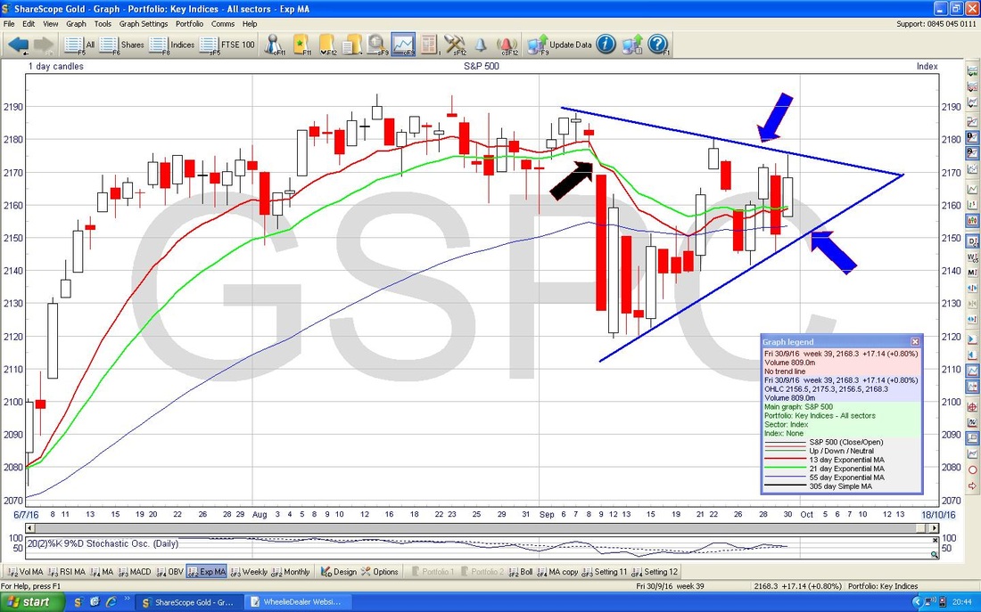
Brent Oil (Spot)
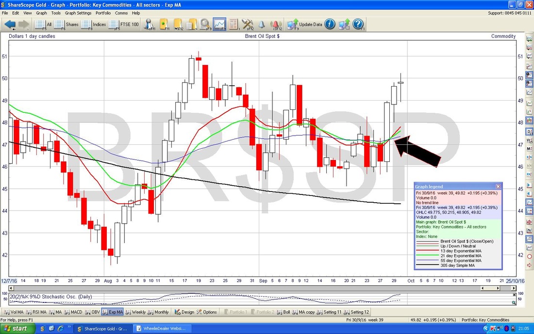
The Chart below has the Daily Candle for Brent Oil (Spot) going back just over 3 months. My Yellow Circle is highlighting a ‘Long Tails Doji’ which was created from Friday and after the big moves up in the 2 Days before this might be telling us that the force of the move up is weakening. Note my Red Line marked by the Red Arrow which could be a Resistance Line for the Price to get through (note this is not the same Red Line as that I showed in last week’s Blog - that one was broken above and for clarity I decided not to include it on this Chart). As ever this is all about Resistance and Support. At the bottom end we seem to have very good Support at $46 and especially at $45 and up at the top we have Resistance around $51 and especially $53. 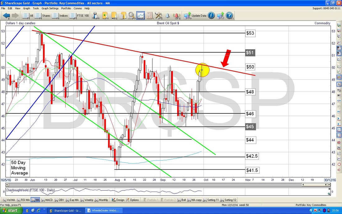
The Screen below has the Daily Candles for Brent Oil (Spot) going back about most of 2016 with the Blue Bollinger Bands above and below the Price Candles. My Black Arrow is pointing out how the Price is now up at the top Bollie Band - this might mean we will go sideways or fall back now.
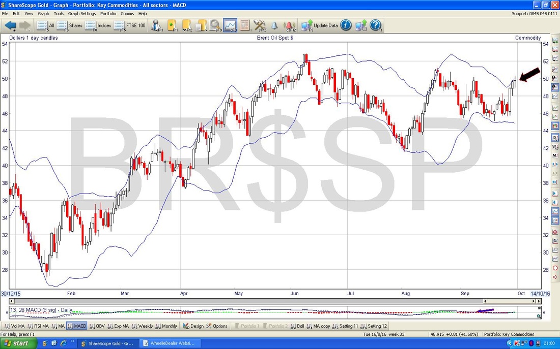
The Chart below has the Daily Candles for Brent going back a few months - the timeframe is not particularly important here - my Black Arrow is pointing to where the 13 Day EMA has done a ‘Golden Cross’ against the 21 Day EMA - this could mean more gains to come in the short term.
Gold (Spot)
This first chart below is just a scene-setter. This is the Daily Candles going back about just over a year - all I want to show here is the Red Arrows marking the Uptrend Channel and how the Price is still within this Channel despite recent weakness. 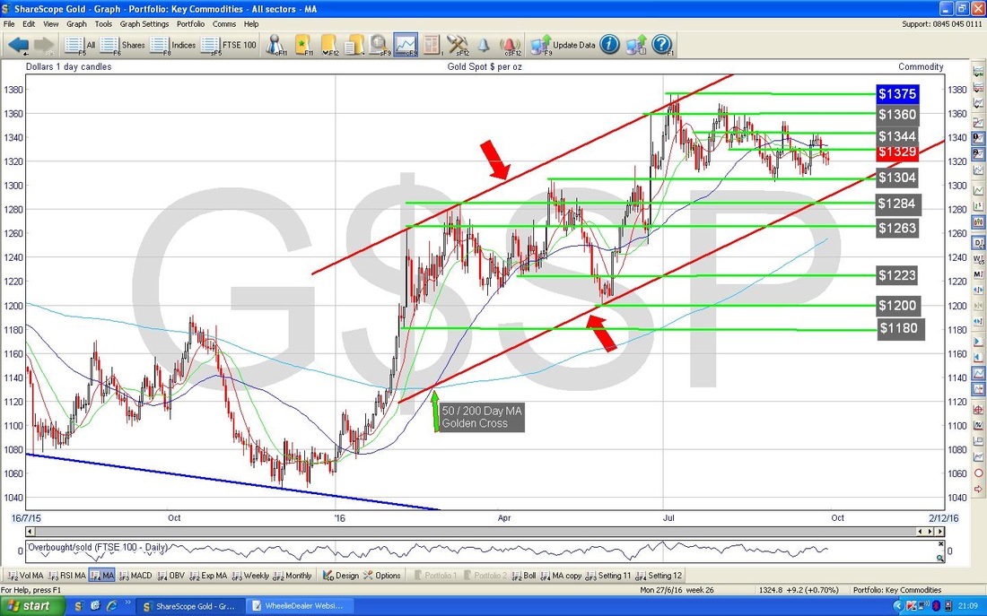
The Chart below for Gold (Spot) zooms in to about the last 3 months and this time I have added the Black Downwards Sloping Line (marked by my Black Arrow) which is acting as Resistance to the Price at the moment - Gold needs to breakout above this Black Line.
The 2 parallel Red Lines from my previous Chart are still shown here and of course it is vital we stay within this Channel - well, at least we don’t want a break to the Downside. My Yellow Circle is highlighting about 3 Doji Candles we have had over the last 3 Days - Support at $1316 is important here in the Short Term and maybe Gold will try to move up off these Dojis. OK, that’s it for this Week, I hope Fortune comes your way !! Cheers, WD. 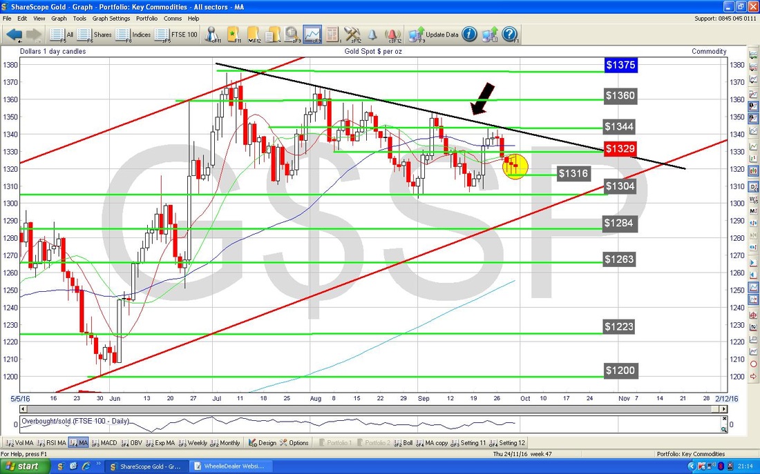
0 Comments
Leave a Reply. |
'Educational' WheelieBlogsWelcome to my Educational Blog Page - I have another 'Stocks & Markets' Blog Page which you can access via a Button on the top of the Homepage. Archives
May 2024
Categories
All
Please see the Full Range of Book Ideas in Wheelie's Bookshop.
|
