|
I am utterly trashed this afternoon as I have had to dig out a collapsed Compost Bin (oooh, that’s sound pleasant !!) and both my arms are aching like crazy, which is rather awkward when your Legs are a bit rubbish. Anyway, I guess shovelling Sh*t in my Garden is very much like dealing with the Stockmarket (Top Tip - if you have one of those sort of upside Plastic Bin things don’t take the door off and then hollow it out - the door is structural and mine just fell over).
Last week was pretty bad for my Portfolio with it losing 3.2% overall including the Overseas bit. Much of that was just the general malaise in Markets and some ExDivs on Thursday (those are not too worrying as obviously I will gain when the Divvys get paid out) but the Criminal of the Week Award has to go to Telit TCM which just fell off a cliff after a Profit Warning and then revelations about a Fraud Indictment for the CEO Oozi Cats from 25 years ago.
In terms of the overall Market, reading last year’s copy of the UK Stockmarket Almanac informs me that a typical August for the FTSE100 is soggy for the first 2 Weeks (which we have just suffered) and then it tends to pick up for the final 2 Weeks. Obviously these kinds of trends are not set in stone but when you consider how quiet the Markets have been and how many City Types etc. will be on Holiday, perhaps the normal trend is quite explainable.
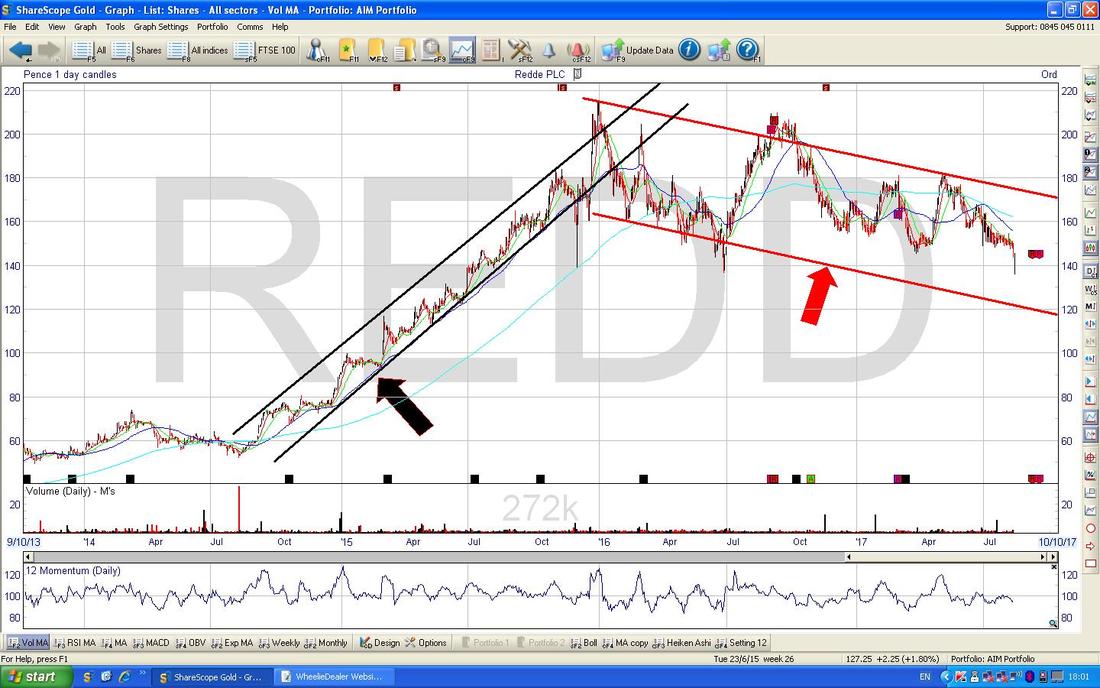
North Korea is of course festering as a major worry for the Markets but I suspect most of this is the usual thing where Markets fall and then the Media has to have a ‘Narrative’ - remember, everything must have an explanation otherwise Bloomberg/CNBC etc. would look a bit silly. North Korea was talking about The Great Leader getting a Plan from his top Generals to launch 4 Missiles against Guam (a US Airbase Island thing) so we might see some problems around that. My concern here is that it is surely very difficult for The Great Leader to come out and say “Well, I’ve carefully considered things and I am going to let the Evil Trump and his Devils in the US off the hook and I won’t attack them this time - but let it be a lesson to you”. It’s just not his style really - so it is hard to see how he backs down. Having said that, I did hear something about him saying the Missiles would be fired into the Sea which of course is pretty pointless but maybe this is his way out cos he can then go on North Korea TV and say he launched the Missiles etc (on CNN ‘Meet the Press‘ tonight they were saying that the 4 Missiles for Guam would be a ‘test‘). All very strange but I am not convinced this is really The Cuban Missile Crisis Redux - I just cannot see China letting North Korea cause trouble as it only rebounds on them. TCM is such a pain in the backside. It has been clear for ages that the Accounting Profits were very dubious as they Capitalise a lot of R&D Expense but whilst the Revenues were growing I was not getting overly stressed - especially as the Shares were in a lovely Uptrend. Anyway, after this Week’s troubles and now Tom Winnifrith writing a big piece on Shareprophets about such things as questionable Revenue from Distributors and dodgy Directors, it has got me concerned that something is very smelly here. It is very possible that there is not too much wrong at TCM - many times in the past people have put out various streams of allegations about various Companies as part of a concerted ‘Bear Raid’ where Short Sellers act as a group to drive the Share Price down and the drip, drip, drip of bad news keeps the Bear Raid going. The record of such Shorters is patchy and although they are very successful on Loss Making AIM Junk with no Revenues etc. (think Mining !!) and successes on Stocks like Globo and QPP, they have also been very wrong on Stocks I have held like PAYS (was Optimal Payments when the Raids happened) and InternetQ INTQ which was subject to a Takeover. Anyway, whilst TCM appeared to have decent Revenues (and growing) I was to an extent prepared to overlook various troubles but now that Tom Winnifrith is questioning the validity of some Distributors this does get me very concerned - and in all honesty I really can’t be doing with the stress and worry of having to think about such irritating Stocks/Situations when as my mate @panic_trader said on Twitter, it might just be easier to dump TCM and put the Cash (and the ‘Slot‘ in the Portfolio) into something else from the ‘Little Black Book’. In truth, there is a lot of sense to this and I have plenty of great Stocks I want to buy more of and also a couple that I want to Buy into that would probably give me a lot less angst and grief than TCM is dolling out at the moment. I haven’t made a final decision to dump TCM but I am clearly heading that way. I don’t see much point in worrying about it now as following Tom’s article today, I expect the Shares will tank tomorrow morning and probably be squidgy all day but it is highly likely that we get a rebound on Tuesday and this would be perhaps a better time to sell. Having said that, it is highly likely that TCM put out some sort of Statement refuting the Claims (whether or not the Company is a Fraud, this is the usual sort of turn of events) and if so then expect a sharp Rally - again this could be a chance to sell. In these kind of Bear Raid situations with a lot of people Short, any bounce tends to be rapid as the Bears have to buy back their Stock to close out and their Stoplosses get triggered etc. Anyway, I am totally bored by it all and it is frustrating that what I hoped would be a great way to play the Internet of Things (IoT) is nothing but agro - particularly after the gains it had sustained up until last Week - just goes to show the importance of TopSlicing but of course it is easy to say that with Hindsight. The bit that really makes no sense is that if TCM is a Fraud and the numbers are all made up and stuff, then how on earth do you get a Profit Warning? It is really quite strange - if I was doing such a Fraud I would never trigger a Profit Warning by saying I was going to miss Revenues - you wouldn’t want to draw attention to yourself. It is so ironic bearing in mind that this Bad News triggered the subsequent events where Oozi Cats had to go on a ‘Leave of Absence’. Enough of that pain, time for Charts. Redde PLC REDD This is one that was flagged to me this Week on Twitter and it is interesting because it has an expected Dividend Yield up around 7.5%. I think it used to be called ‘Helphire’ and does Cars and Legal Services for Insurance Claims customers. I don’t know much about the Business, but lets check out the Charts. As always, the Charts shown here are from the fantabulous ShareScope Software that I subscribe to (along with SharePad) and if you click on them they should grow much bigger in your browser so you might have a chance of actually seeing them. Going back about 3 Years REDD was in a pretty tight but clear Uptrend Channel as marked by my Parallel Black Lines but then it dropped into a much wider and shallower Downtrend Channel as is marked by my Red Lines.
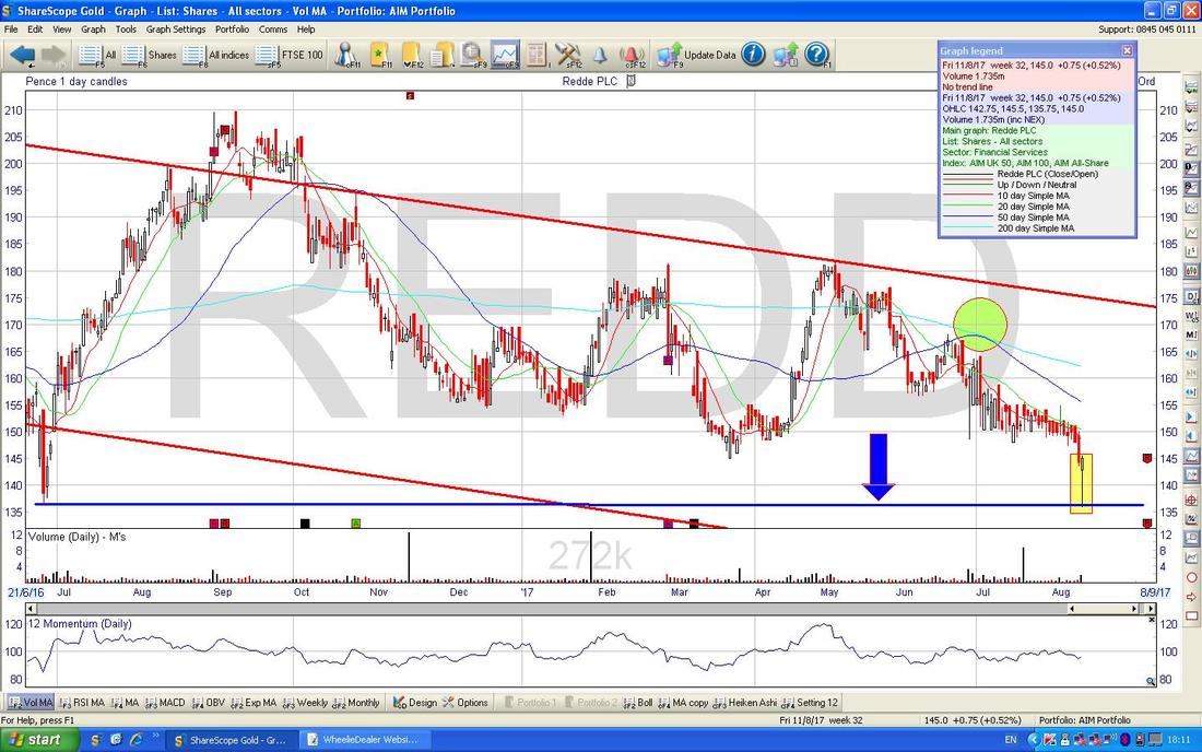
On the Chart below the main thing I wanted to show is the Hammer Candle which was created on Friday which is sitting inside my Yellow Rectangle thing. Note how the Price dipped down intraday on Friday to touch pretty much 135p which is where the Horizontal Blue Line (with Blue Arrow) is and this is Support from back in June 2016. This should be a decent Support Level and Traders would probably go Long here if the Price starts to rise next Week and the place for a Stoploss would be just below the bottom of the Hammer at just under 135p. I suspect the Level of the Divvy is acting as ‘Support’ here also - it will not have gone unnoticed by Investors looking for Small Stocks with Income - but of course no Divvy is guaranteed and the Business must have the financial strength to keep paying them out. There is quite a bit of Resistance up above and the Moving Averages and the Red Line from the Top of the Downtrend Channel on my previous Charts could delay any progress upwards.
My Green Circle is highlighting where the Price narrowly missed a Bullish ‘Golden Cross’ on the 50 and 200 Day Moving Averages (the Darker Blue Wiggly Line and the Faint Blue Line) - this was a big disappointment for Holders no doubt !! ShareScope says REDD might have Results on Friday 15th September but it is marked as ‘unconfirmed’.
Gama Aviation GMAA
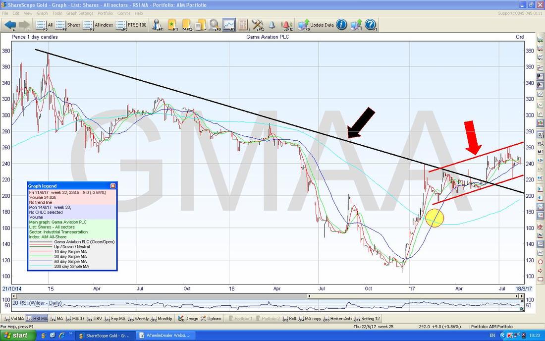
This one was getting a mention on Tweets and I quite like the Business but I have not looked seriously at it because I hold Air Partner AIR and I am happy with that at the mo. Anyway, as ever I had a quick look at the Chart on my tiny Fone Screen and I thought it looked interesting so I have bunged it in here. My Black Line and Black Arrow marks a Downtrend which was in place until Early June this Year when the Price broke-out of that Line and the Price now seems to be in a nice Uptrend Channel as marked by my Parallel Red Lines and Red Arrow. My Yellow Circle is flagging a 50/200 Day MA ‘Golden Cross’ - the predictive power of these Crosses is very good I find.
Quantum Pharma QP.
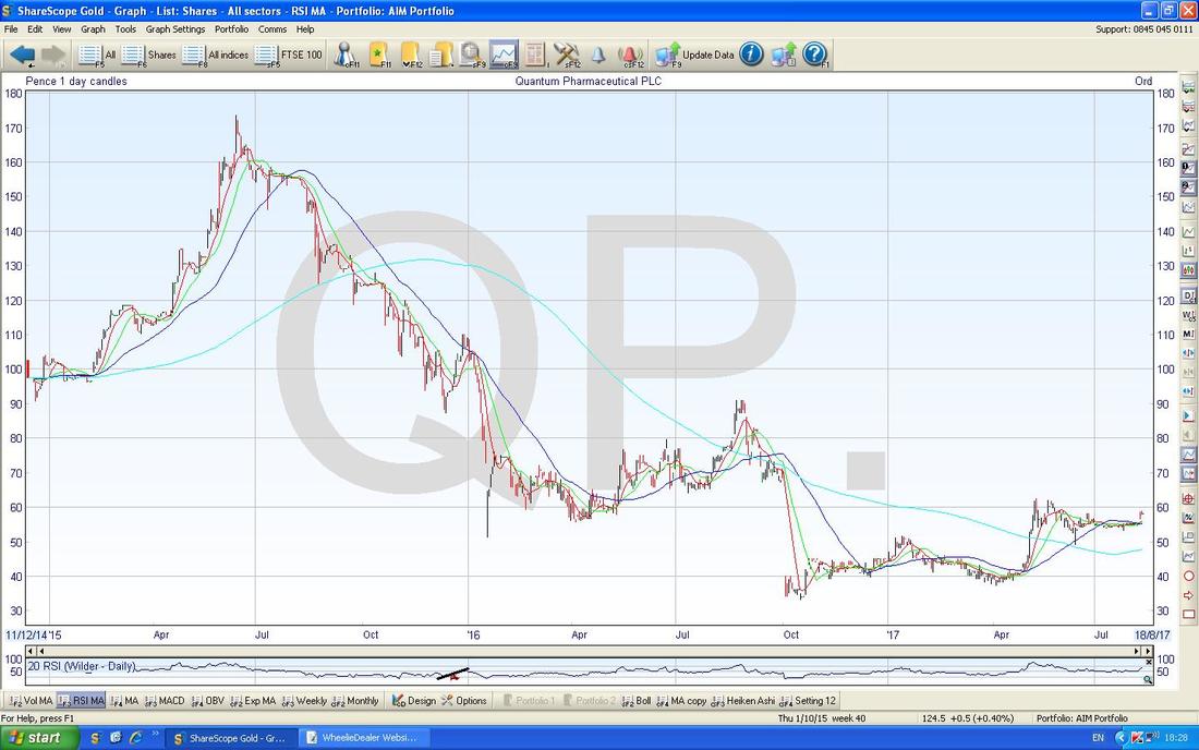
I hold QP. and it has been a pretty painful experience so far but they recently did a Trading Update and it was really positive and I am very happy with how the Recovery is going here. The Chart below shows the full history of the Stock since IPO and it is pretty clear what a difficult Stock it has been so far. However, sharp eyed Readers will see a 50/200 Day MA Golden Cross in there.
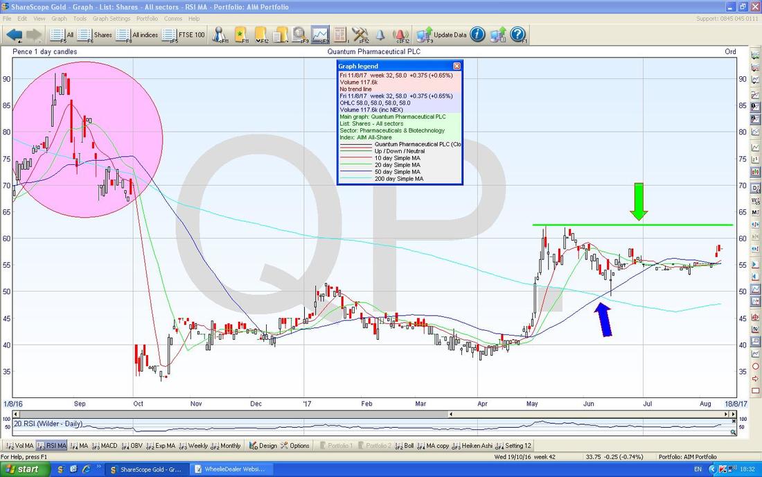
On the Chart below I have zoomed in and my Blue Arrow is pointing to the Golden Cross that I just mentioned. Next important thing is my Green Horizontal Resistance Line (marked with Green Arrow) at about 63p which really must be broken over. However, if you look to the Left there is a huge Pink Circle and what I am doing here is showing how there is a big Zone of Resistance between about 65p to 90p which could prove difficult to wade through. A Breakout of the Green Line would be a Buy Signal though from a Technical Analysis viewpoint.
Huntsworth HNT
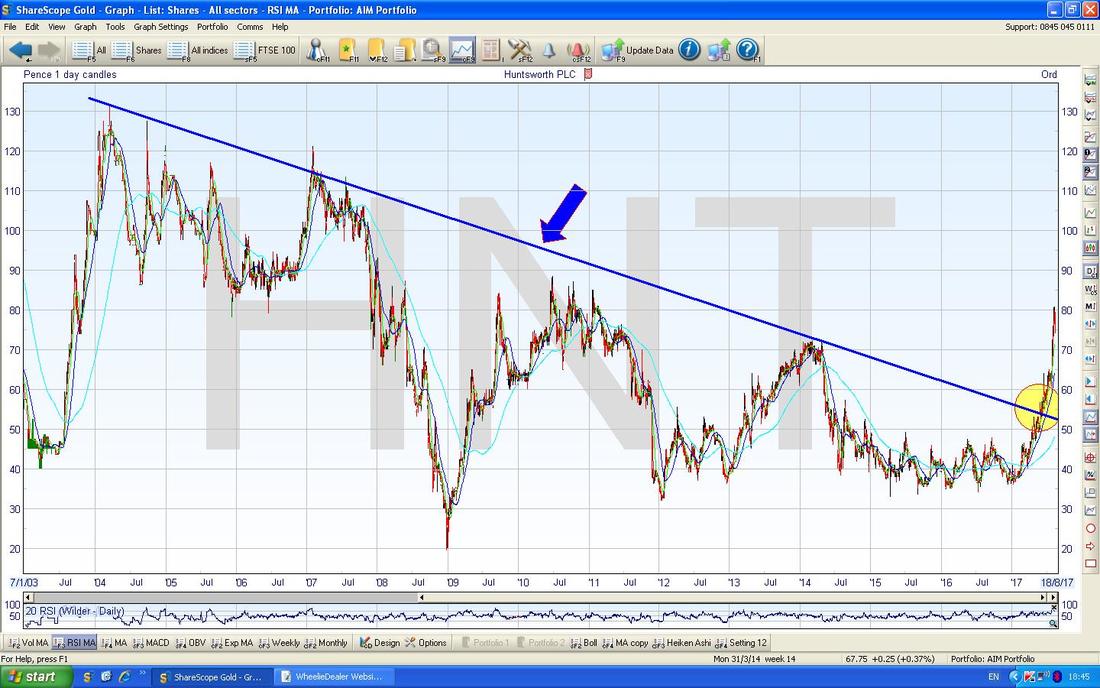
This is one I listed in my ‘Little Black Book’ recently and I thought it might be worth looking at the Charting picture (as with any Stock, you can Buy them on ‘Fundamentals’ but if you combine a good Fundie Story with a good Chart then you are probably weighting the Odds in your favour more). If you haven’t seen it before, my Little Black Book is an exact copy on the Website of a physical Notebook in which I scribble Stocks that I think might interest me for further in-depth Research if I am looking for a New Stock for the WD Portfolio - nip over to the ‘WheelieBin’ page and you will find it there. I found this one difficult to draw Trendlines on etc. - not really sure why but it is a bit all over the place and I found on various Timeframes there were no clear Trend Channels that stood out. So often the whole Charting thing is a series of compromises and there is a lot of judgement and discretion needed - although with some Charts it is very clear cut as I am sure I have shown over the Weeks. The Chart below goes back a seriously long time to about 2003 - and the key thing here is that Blue Downtrend Line as marked by my Blue Arrow which was Broken-out of back in May this year which is captured in my Yellow Circle. It has since then been in a super-powerful Uptrend. Oh, by the way, HNT do Public Relations stuff.
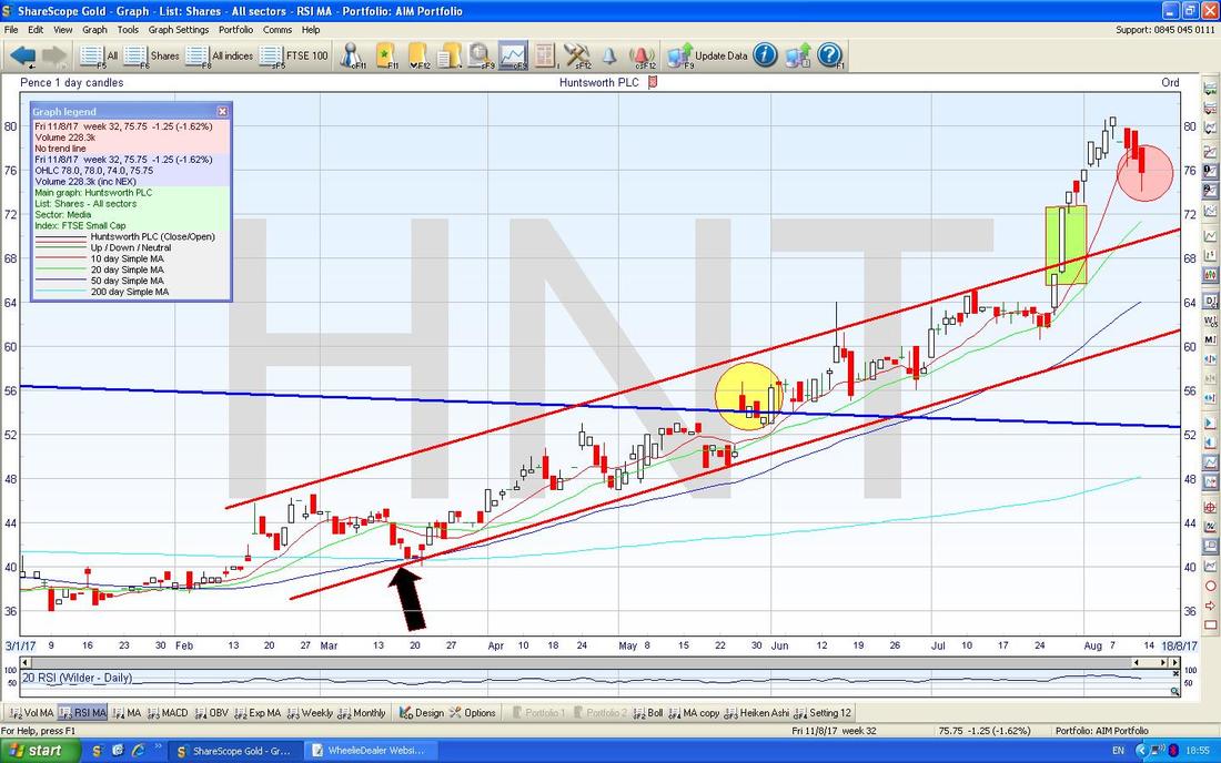
This next one is a seriously busy Chart. I have zoomed in here and the Yellow Circle is the same one that was on the previous Chart and shows the Breakout to the Upside from the Blue Downtrend Line. My Black Arrow below is pointing to a 50/200 Day MA ‘Golden Cross’ which has yet again proved to be highly predictive of more gains.
My Green Rectangle is highlighting a Big White Up Candle where the Price Broke-out from the Uptrend Channel as marked by my Parallel Red Lines - this is really bullish to have such an acceleration to the upside but it does look a bit ‘hot’ and perhaps overdone. Having said that, my Pink Circle is capturing a Candle from Friday where the Price dipped down but recovered quite a bit during the Day which suggests Bulls are still pretty keen here.
Time for some Indexes or I will be at this all night !!
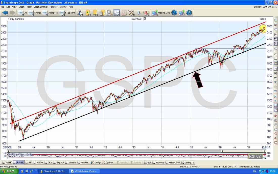
S&P500 (US) As per usual, the US Indexes have immense power over all other Global Indexes so I take a lot of notice with regards to what they are doing. The Chart below has the S&P500 going back to the 2009 Credit Scrunch Lows and there is a pretty clear Uptrend Channel since then which has been a delight for Bulls and a Fur-removing experience for Bears. My Yellow Circle is showing how we are still at the Upper End of the Channel but if we do get a drop, then it is likely we visit the Bottom Line of the Uptrend Channel which is my Black Line (marked with Black Arrow) and we might go down to around 2250 ish.
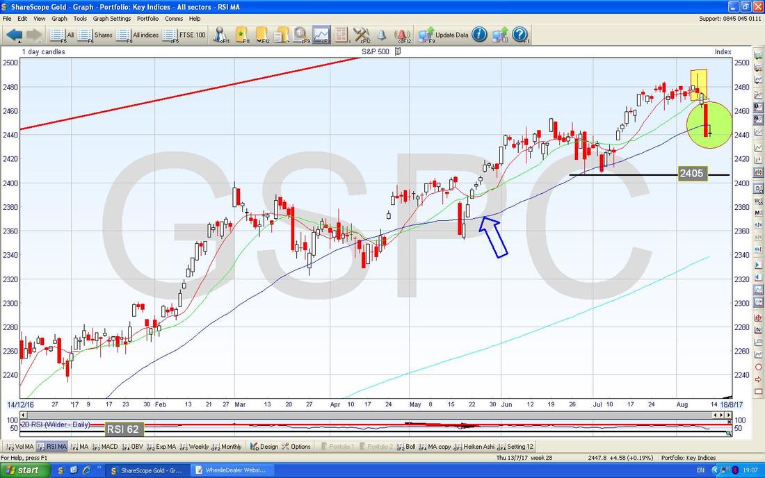
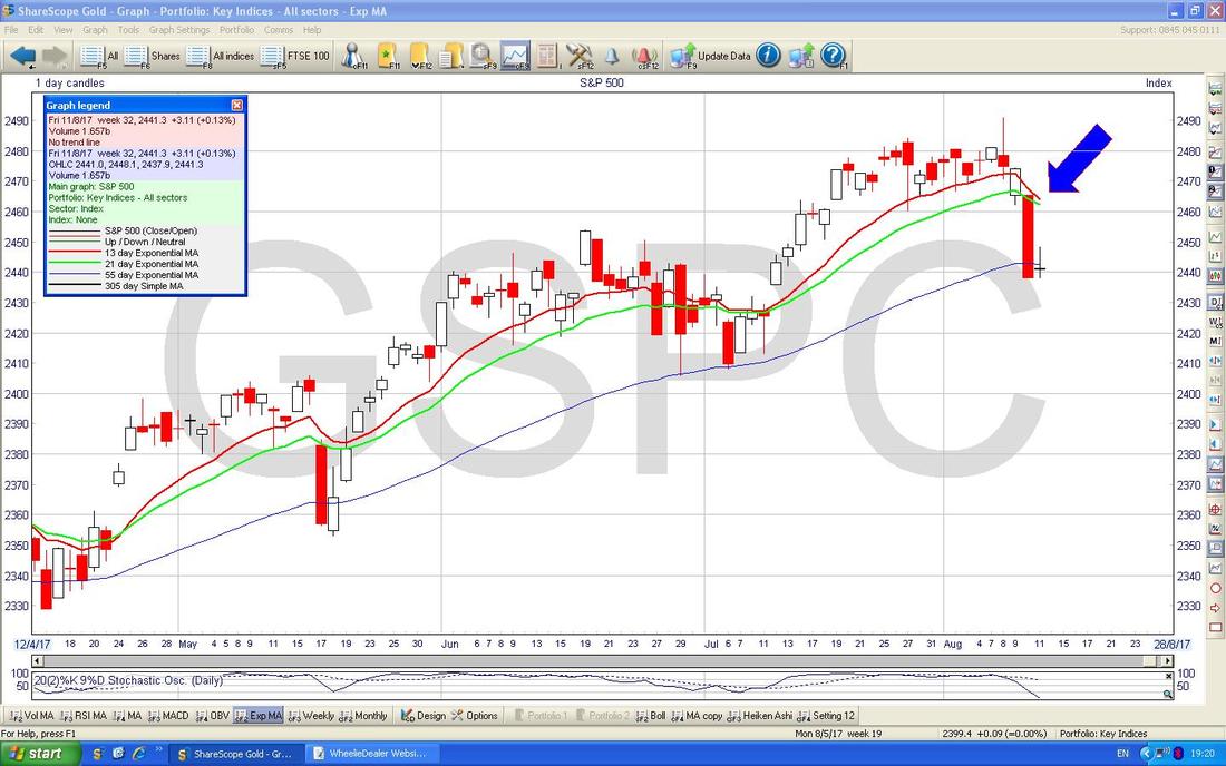
But I am not sure we should be too worried (yet). I have zoomed in on the Chart below and the first thing to notice is the ‘Inverted Hammer’ Candle from Tuesday 8th August which I remember flagging on Twitter that Evening and lo and behold the Price fell after this, as it is supposed to. At that point I seriously thought about putting a Short on (and clearly I should have done !!) but seeing how Bullish the Markets have been all this Year and with the first 2 Weeks of August often being weak, I decided against it. Looking at this Chart, that was probably a reasonable decision but I am still much more concerned about September/October which can be a lot more troublesome.
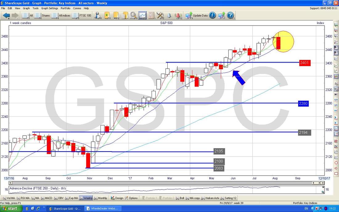
My Blue Arrow is marking the Blue Wiggly 50 Day Moving Average Line - note how the Price has bounced off this for quite some time (if you look at a longer term Chart on whatever Chart Software/Website you use, you can see this behaviour has been in force for a lot longer), and clearly we are now back just below this 50 Day MA which has tended to be a point where we get a move up from. My Green Circle is capturing a Big Down Red Candle from Thursday and then a sort of ‘Star’ Doji Candle from Friday - this could well be the start of a Reversal but it is not clear cut and it would have been far better if we had got a reasonable Up Day on Friday and a ‘Bullish Harami’ had been formed. Anyway, if we do continue to drop, then note there is good Support at 2405 and then from about 2400 down to 2320 - so there are a lot of Levels where Bulls are likely to come in if we do see more falls.
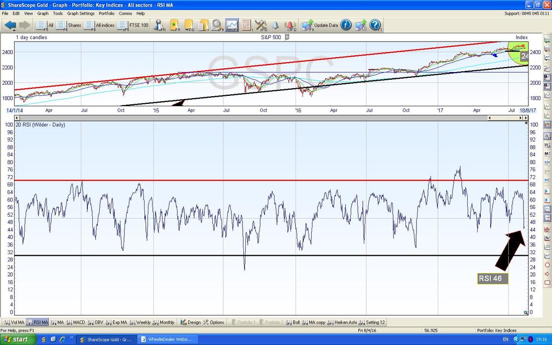
In the bottom Window on the Chart below we have the Relative Strength Index (RSI) for the S&P500 Daily. On a reading of RSI 46 it is at a Level where it could fall a fair bit more but it is worth seeing that in the recent past this has been a Reading from which we can see a further move up.
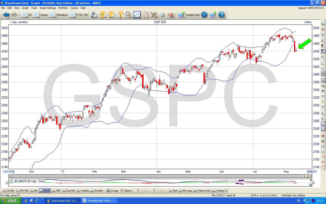
The Chart below has the Daily Candles for the S&P500 with the Blue Wiggly Bollinger Bands above and below. My Green Arrow is pointing to how the Price is now outside the Bottom Band and this is not a sustainable situation normally so we would expect the Price to either start to move up or to go Sideways to get back inside the Bands.
On the Chart below my Blue Arrow is pointing to where we are on the verge of a Bearish ‘Death Cross’ between the Red 13 Day Exponential Moving Average and the Green 21 Day EMA - if we get this Cross, it often is a good predictor of falls in the coming Days/Weeks.
This doesn’t look so great - the Chart below has the Weekly Candles for the S&P500 and my Yellow Circle is just about capturing a Big Red Down Candle from last week but the key thing is how it has ‘swung’ or ‘pivoted’ down off the 2 ‘Narrow Body’ Doji Candles in the Weeks before - this looks quite Bearish really but as I have mentioned earlier there is a lot of Support not far below.
Nasdaq Composite (US Tech)
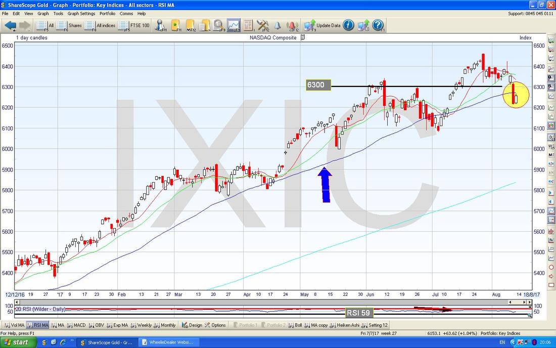
I won’t do much on this but it is worth noting that the Nasdaq Comp is very similar to the S&P500 and it is quite possible that strength in the Tech Index might drag the S&P500 up with it. Note on my Chart below a really nice ‘Bullish Harami’ 2 Day Candle pattern in my Yellow Circle (this is the Pregnant Lady one) - note also the 50 Day Moving Average pointed at with my Blue Arrow. The DOW has similar features but the key thing of difference is how it is so much higher than the 50 Day Moving Average - so ’Mean Reversion’ could drive more weakness on the DOW - I won’t show it here though.
DAX 30 (German)
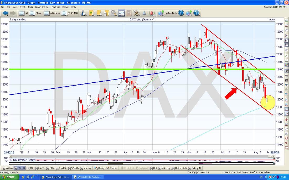
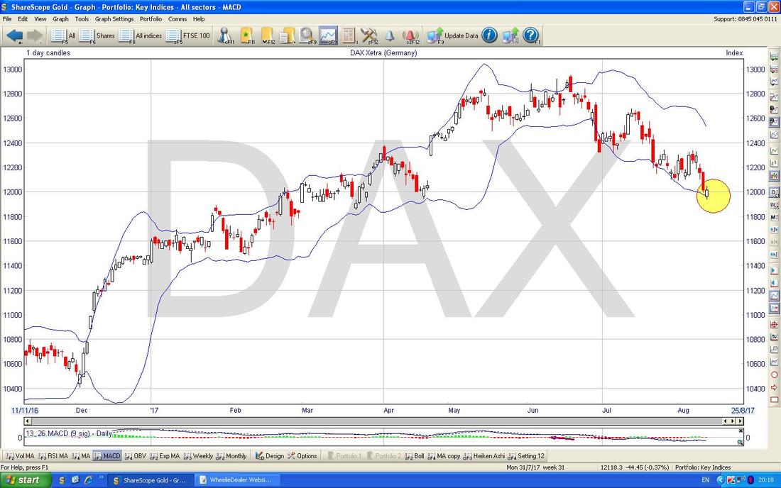
The Downtrend Channel as shown below by my Parallel Red Lines (marked by Red Arrow) is still in force and my Yellow Circle is highlighting a White Up Candle from Friday but in this Context it looks like a Bearish Continuation Pattern to me. However, it is near the 200 Day Moving Average (the Faint Blue Line) at about 11900 so you would expect Support to kick in here soon really. The failure of Support at 12100 and 12000 is not a good thing. I closed my Long Position on the DAX about a week ago and that was probably the right thing to do.
The Chart below has the DAX Daily Candles with the Bollinger Bands above and below. My Yellow Circle is pointing out how we are touching the Bottom BB and this could act as Support - at least for the Short Term anyway. From what I can tell the DAX has been reacting badly to the strength of the Euro against the Dollar (or weakness in the latter) but I won’t show this.
FTSE100
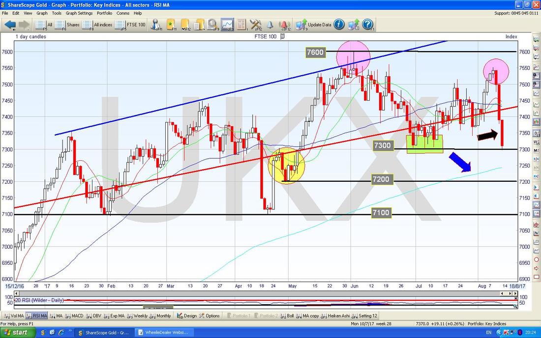
This is a seriously busy Chart. My Black Arrow is showing a Big Red Down Candle from Friday and it is vital that Support at 7300 holds or we will need to test Support below at 7200 and 7100. My Green Box is showing where the Support at 7300 is derived from and my Yellow Circle is showing a Zone of Support down to 7200. It is pretty key that we get a move up now - if not, then the 3 Red Down Candles from last Week could be a ‘3 Black Crows’ pattern which is not good. My Blue Arrow is pointing to the 200 Day Moving Average at about 7250 and this could act as Support. In a bit I will show the FTSE250 which has a slightly worrying ‘Double Top’ possibly and my Pink Circles are trying to show the same thing on the FTSE100 - if this plays out, then it could presage big falls. We don’t have a particularly precise Double Top here but it is probably close enough to count and the one on the FTSE250 is much clearer. As has been the case since the Brexit Vote, if we see strength in the Pound then that could hurt the FTSE100 - with the Chancellor and Liam Fox story about agreeing on a Brexit Transition Period, maybe the Pound will like that.
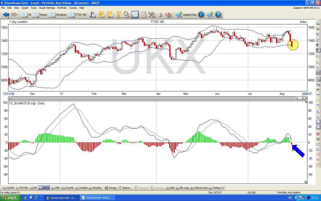
In the Top Window on the ScreenShot below my Yellow Circle is trying to show how the Red Down Candle from Friday is now touching the Bottom Bollinger Band - this might be Support.
In the Bottom Window my Blue Arrow is pointing to a Bearish MACD Cross (Moving Average Convergence Divergence) - this is not so good.
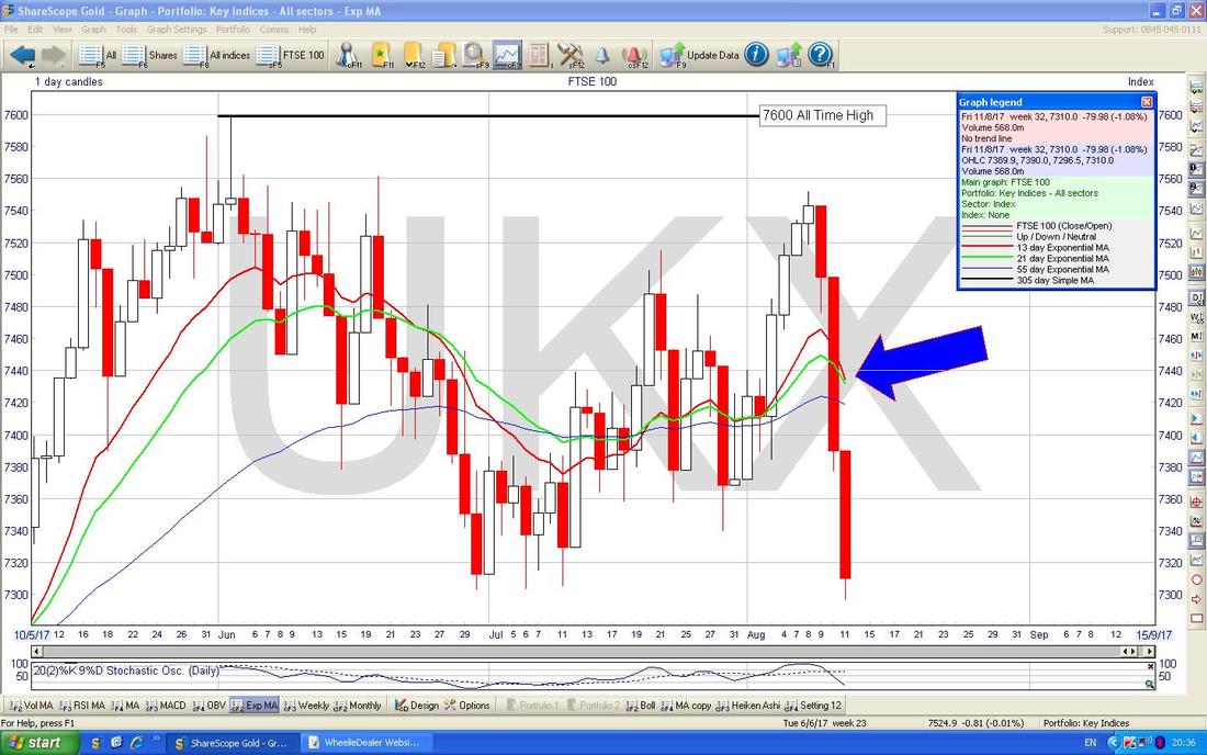
My Blue Arrow on the Chart below is pointing out how we are on the Verge of a Bearish ‘Death Cross’ on the 13/21 Day EMAs.
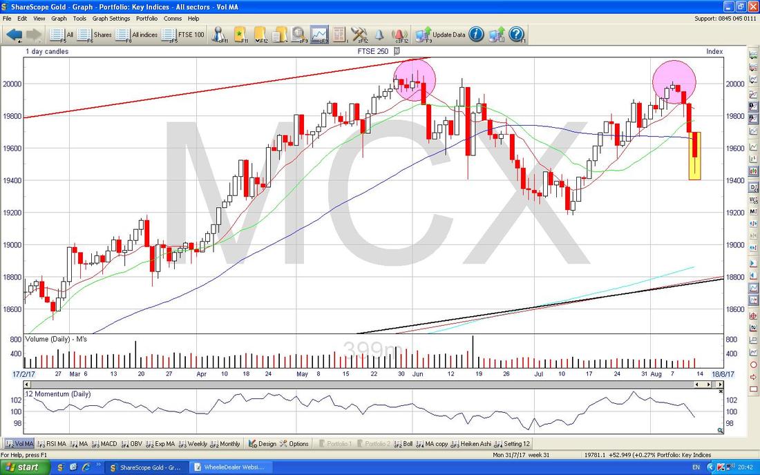
FTSE250
The Chart below is showing that possible ‘Double Top’ that I was on about in the Pink Circles - it is roughly around that 20,000 Level which seems to be capping things. However, in my Yellow Rectangle we got a Down Candle on Friday but look how it closed up off the Lows of the Day - this suggests Support at 19400 ish and there is more Support below at 19200. To avoid the possible Double Top being a bit of a problem, we need the Index to perk up soon and get over 20000 clearly. The MACD and Bollinger Bands on the FTSE250 are almost identical to the ones I showed on the FTSE100.
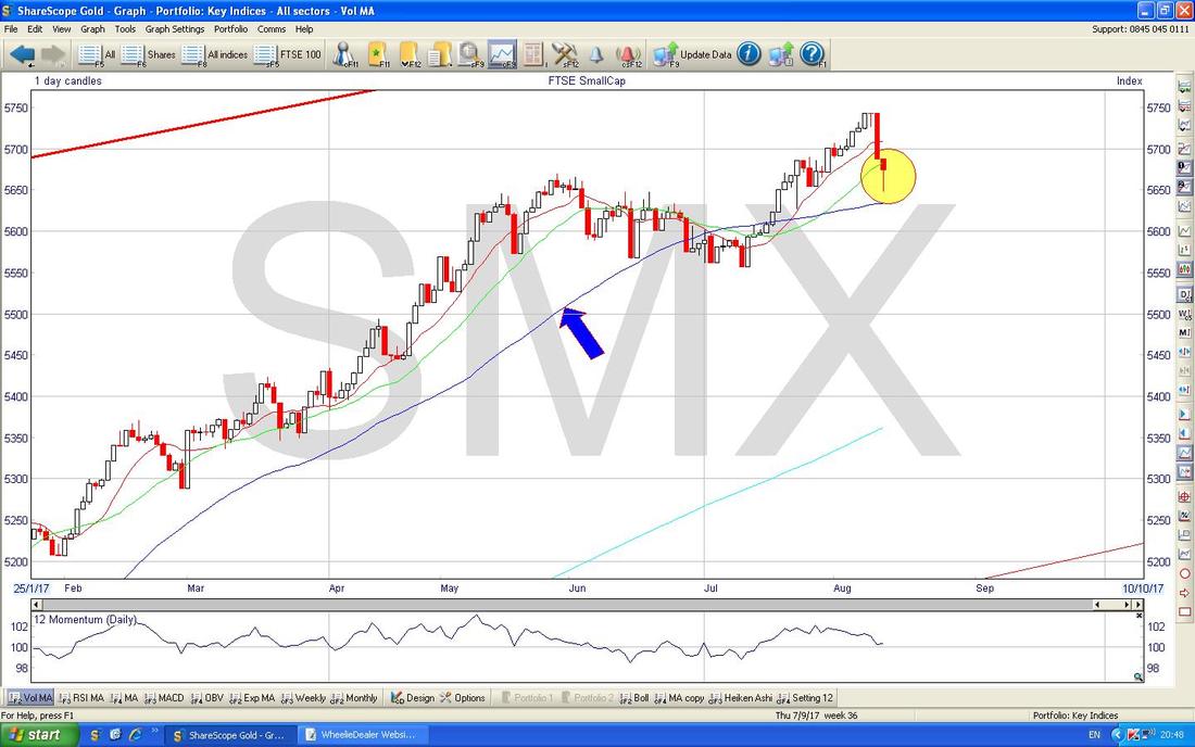
FTSE SmallCap
This Index has done much better than the FTSE100 or even the FTSE250 this year and my Chart below is showing how we don’t have the same ‘Double Top’ situation going on here and my Yellow Circle is capturing a Hammer which shows a really good Intraday Reversal from Friday. Note how it turned up off the Blue Line which is the 50 Day Moving Average as well (marked with Blue Arrow) - it wasn’t an exact touch, but it is probably close enough to show that this Level is a good Support area.
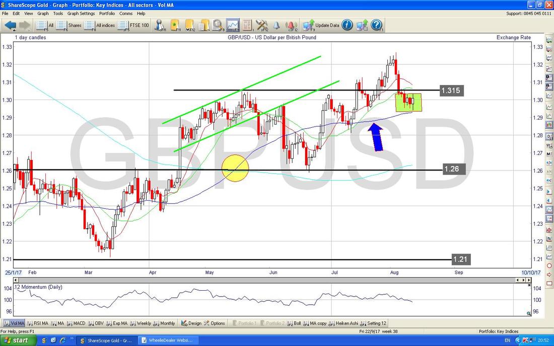
Pound vs. Dollar
My Green Box on the Chart below is showing how the Blue Line 50 Day Moving Average (Blue Arrow) is acting as Support at around 1.29. After weakness in the Pound last week, it seems quite possible that the Pound might recover a bit soon - if so, it might hurt Stocks.
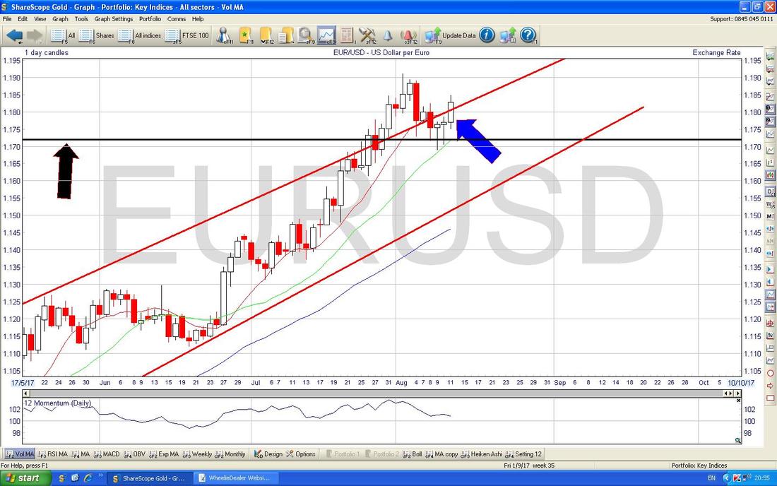
Euro vs. Dollar
I hadn’t intended to show this but there is something interesting here. My Blue Arrow is pointing to a White Up Candle from Friday and after the 2 sort of Hammer Candles from the previous Days, this seems to be pivoting up. Strength in the Euro might hurt the DAX, CAC40 (France) but as with the £/$ above, if we get Dollar Weakness then that could boost Metals and Oil etc. Good for Mining Stocks and perhaps Gold.
Gold (Spot)
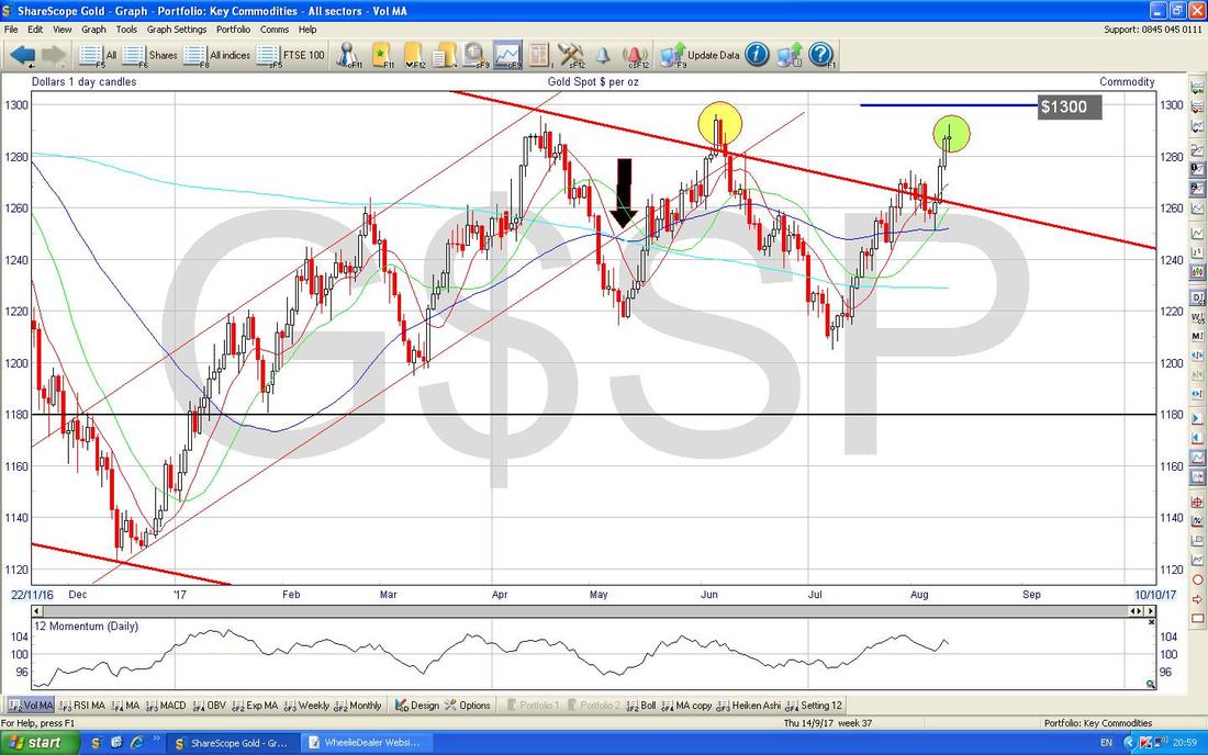
I won’t show Oil this week but here we have Gold. As I have mentioned in previous Weeks, things have perked up here and we are above the Red Downtrend Line which is very good but ideally I want to see Gold up above $1300 soon - that would be very bullish. My Green Circle is capturing a ‘Long Tails Doji’ from Friday and this shows some uncertainty as we approach $1300. As I mentioned above, if the Dollar softens, then this could push Gold through $1300. That’s it for now - good luck y’all. Cheers, WD.
0 Comments
Leave a Reply. |
'Educational' WheelieBlogsWelcome to my Educational Blog Page - I have another 'Stocks & Markets' Blog Page which you can access via a Button on the top of the Homepage. Archives
May 2024
Categories
All
Please see the Full Range of Book Ideas in Wheelie's Bookshop.
|

