|
Hopefully I can keep this Blog reasonably short as I have already bashed one Blog out today and done a load of work on the next parts of that Series. The reasons for me dumping all my Telecity TCY are as follows:
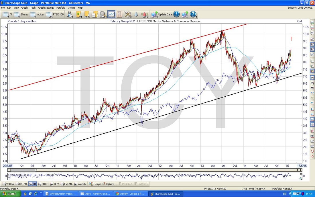
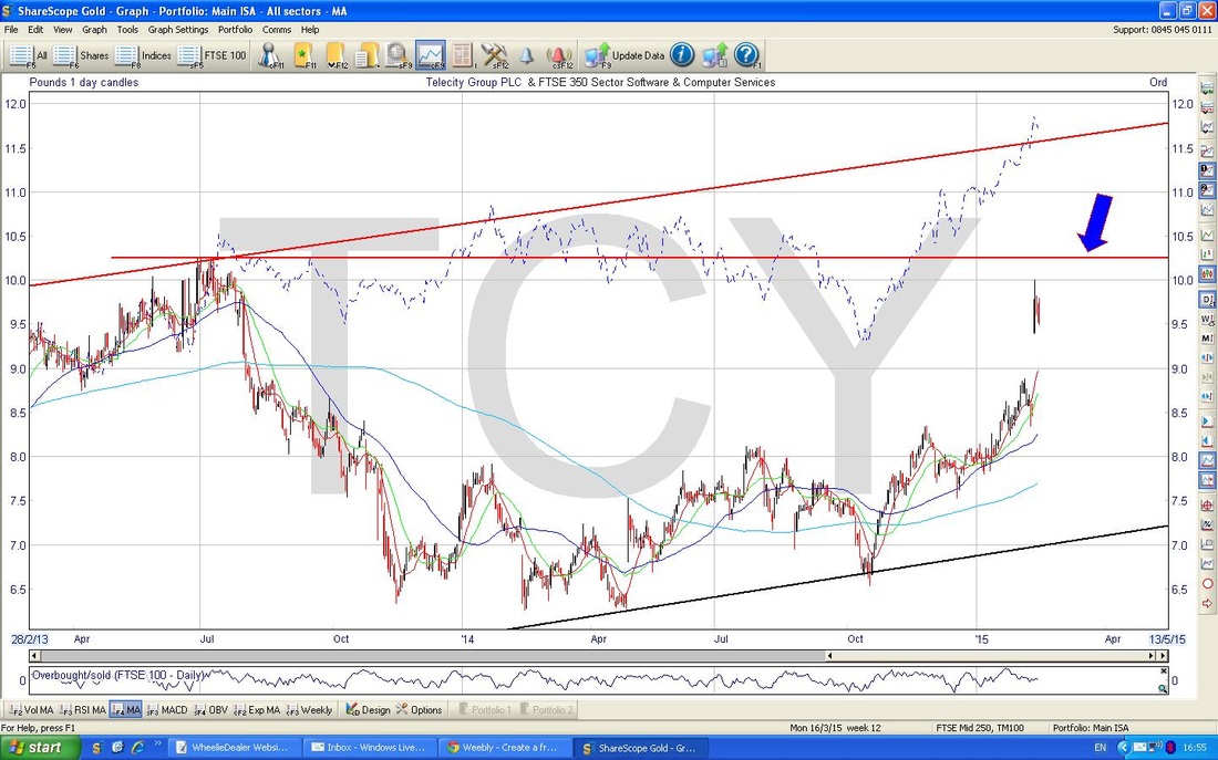
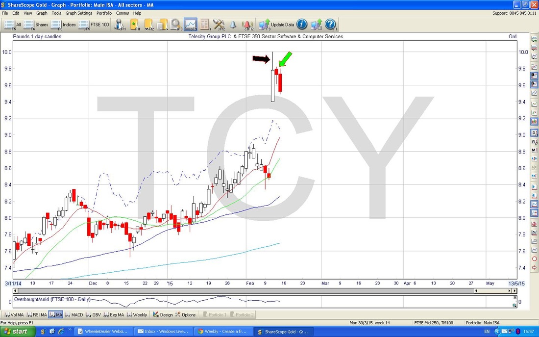
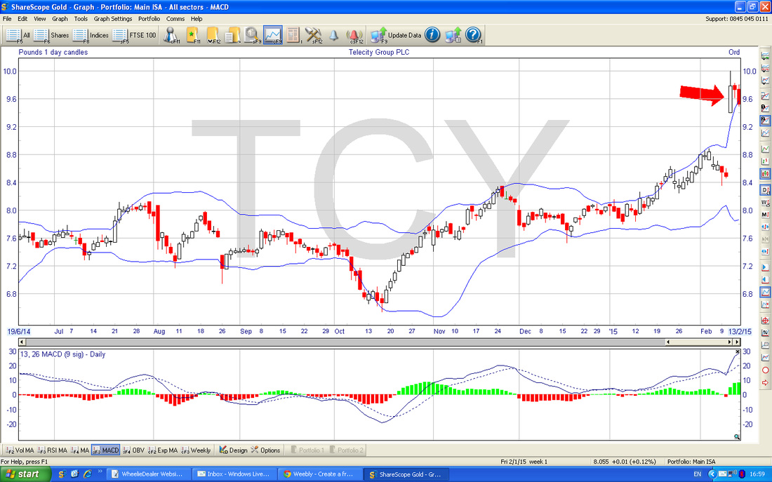
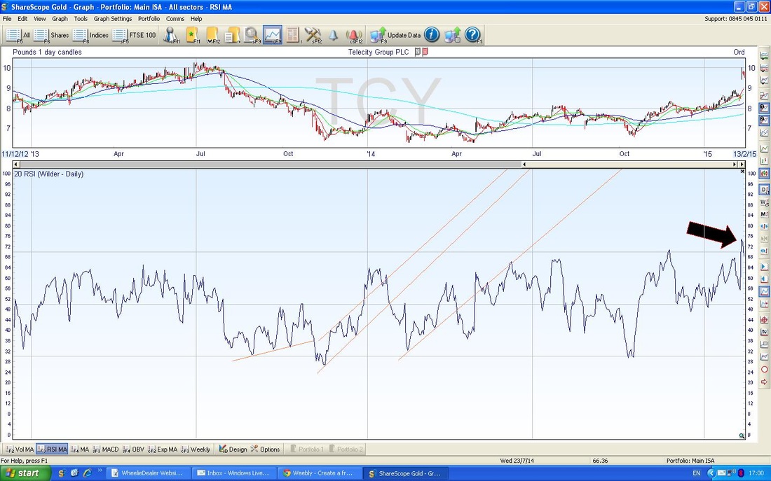
Technical Sell Factors I will whiz through these, using the Charts as usual. Note, these Charts are from Last Night - I have not updated with Monday’s trading - this is because I made my Sell decision last night - as always, I try to make decisions outside of Trading Hours so that my emotions are pretty calm and unaffected by the gyrations prevailing intraday. So these Charts show you the situation prevailing when I looked last night. The Chart below is a Long Term view over about 6 years. You can see a lovely Uptrend and a Peak around July 2013. The price has now moved up to near that Peak again, and this is a sign that we are up against Very Strong Resistance. The Blue really jumpy line is the Sector line, please ignore it. On the Chart below, I have marked with a Blue Arrow a Horizontal Line from the July 2013 Peak - this shows the Resistance pretty well. You can see that the Price has moved up close to this line again - if you wait a second and look at the next Chart, this will become clearer. On this chart, I have zeroed in on the recent Daily Candles from Wednesday, Thursday and Friday last week. Note first how the Big Jump up on Wednesday’s Merger News made a nice White Up Candle but that it pulled back Intraday from the High - this is shown by the long ‘wick’ that I have marked with the Black Arrow. Next look at the Candle from Thursday which is a Doji (I have pointed to it with the Green Arrow) - this indicates that the Trend is probably going to move down. Then on Friday we got the Big Red Down Candle - this was Confirmation that the Doji had predicted the Change of Trend correctly and we were now heading down - this is a lovely 3 Day Candle Pattern, almost Textbook. The Chart below shows the Bollinger Bands in the Upper Window. I have marked with the Red Arrow how the Candles have jumped up outside the Upper Bollinger Band - this is a very bearish sign - they tend to stay within the confines of the Bands. On the Chart below, the Black Arrow marks how high the Relative Strength Index (RSI) has got - up around 70 which is Overbought. As you can see on this graph, the RSI has never been up this high in over 2 years so it is a bit of an anomaly. OK, that’s it short and sweet. If you want to know more about these Technical Indicators, then please look for ‘Buy Rationale’ in the Blog Categories and read my Series of Blogs on ‘OPAY Technical Analysis’, where I go into all the Technical Indicators I use in a lot of depth.
Good luck to all, wd
0 Comments
Leave a Reply. |
'Educational' WheelieBlogsWelcome to my Educational Blog Page - I have another 'Stocks & Markets' Blog Page which you can access via a Button on the top of the Homepage. Archives
May 2024
Categories
All
Please see the Full Range of Book Ideas in Wheelie's Bookshop.
|

