

|
educational blogs |
|
Judging by the typically pants Bank Holiday weather it is hard to believe that we are now heading towards what many in the Financial World see as the Summer period (as opposed to Winter). Following on from this, the enduring Stockmarket adage “Sell in May and go away and don’t come back until St. Ledger day” (or “don’t come back until Halloween” if you are of a ghoulish nature), comes into play and it is something I have been considering as the Summer period is notoriously the weaker half of the Year.
I won’t go into the Stats in depth here for Summer but at a high level Chris Dillow in this Week’s Investors Chronicle on Page 18 covers it quite a bit and specifically points out that “Since 1966, the All-Share Index has on average lost 0.6% in real terms from May Day to Halloween, but gained an average of 8.5% from Halloween to May Day - these numbers include dividends”, so it is fair to conclude that Summer is by far the weaker half of the year on average.
The key point here though is “on average” - Chris Dillow’s article points out that there can be big swings and of course in some years this will mean that gains can be made over the Summer. With the current strength in Stockmarkets and the absence of any obvious stumbling blocks on the near-term horizon, especially now that the French Election has pretty much been decided for a pro-EU Candidate, I see no reason to be selling like mad and I would rather keep plodding on as I am and just keep a close eye on the Market Indexes and if I see something that concerns me then I will probably Hedge via Index Shorts. That’s my Strategy for now, but as ever I am happy to change on a sixpence if I need to - especially because ‘Events’ can hit us out of the blue and invariable they do.
So if we do get the ‘Summertime Blues’, I hope this will mean lots of Blue on my ADVFN App as my Stocks rise as opposed to me feeling all depressed and unhappy. May Stats Well, the simple Stats for May is that she lives in Number 10 Downing Street and will very soon have a thumping great Majority……… Oh, you mean the Month of May - ah, in that case, according to the UK Stockmarket Almanac for 2016 (note, this is last year’s copy, I have not bought a copy this year but for Monthly Stats it won’t be much different), since 1970, for the FTSE100 May is historically the 10th Best Month (in other words it is the 3rd Worst, which is clearly not so good), with an Average Return of Minus 0.2%. For a typical May, the Market starts off fairly flat for the first 2 weeks and then falls away after this - so the backend of May is the worst bit. Note also in relative terms to the S&P500, this is the Worst Month for the FTSE100 - we tend to underperform the US Market in this month. Of course this coming Week is a short one and we have the US Non-Farm Payrolls Numbers on Friday which might spice things up a bit for about 5 minutes. Charts time…….. Moss Bros Group MOSB In recent days we have had a chat about MOSB on the Tweet Machine and the frustration of it going Sideways which it has pretty much done for 2 years. Anyway, I wanted to show a larger Chart on MOSB because there are a few interesting things going on and it strikes me we might get a Breakout soon - and hopefully it will be to the upside as from a Fundamentals viewpoint the Company seems to be making good progress (and paying a Dividend Yield over 6% and backed by Cash while we wait). The Chart below has the Daily Candles for MOSB going back about just over 3 years. As ever, and with all ScreenShots I will show, this is from the essential (for me) ShareScope software that I use on a daily basis (and I am now complementing this with use of SharePad as well but I have only just started with that and I am fumbling around on it at the moment). The first thing to note is the Black Line at the bottom (marked with my Black Arrow) which shows a nice Uptrend Line that is long established. Next look at the top and you should see my Blue Line (marked with the Blue Arrow) which marks a Long Term Downtrend Line - and between the Black and the Blue Lines there is a big Triangle going on - and I suspect this will resolve (Breakout) either upwards or downwards very soon. In addition, note my Green Horizontal Line (marked with my Green Arrow) which is at about 110p and if we are to break to the upside, then this will need to be taken out soon - so this is something to watch. Obviously for people who are not in MOSB, there could be a good opportunity to buy if it does breakout to the Upside of the Blue Downtrend Line. 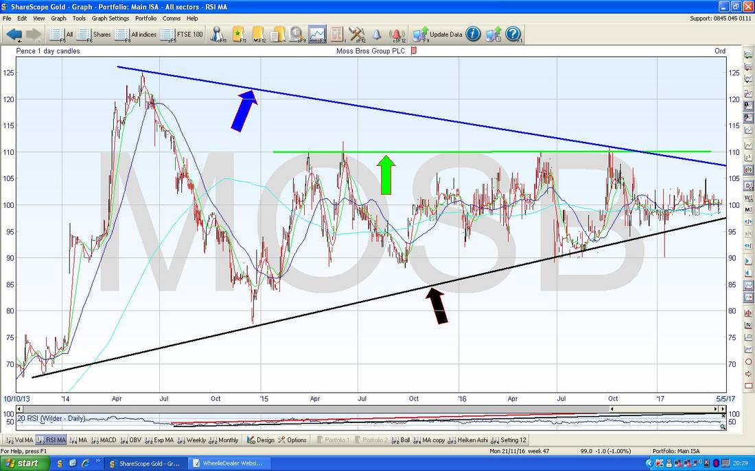
Gold (Spot)
If you read my Updates most weeks, you will probably have seen me gong on about Gold and how there is a Long Term Downtrend Line which is shown in the Chart below by the Red Line marked with the Red Arrow. As we stand now, the Gold Price moved up to the Red Line and has since dropped back in recent Days - if we are to Breakout of the Red Line, it needs to turn up and look a bit more lively. 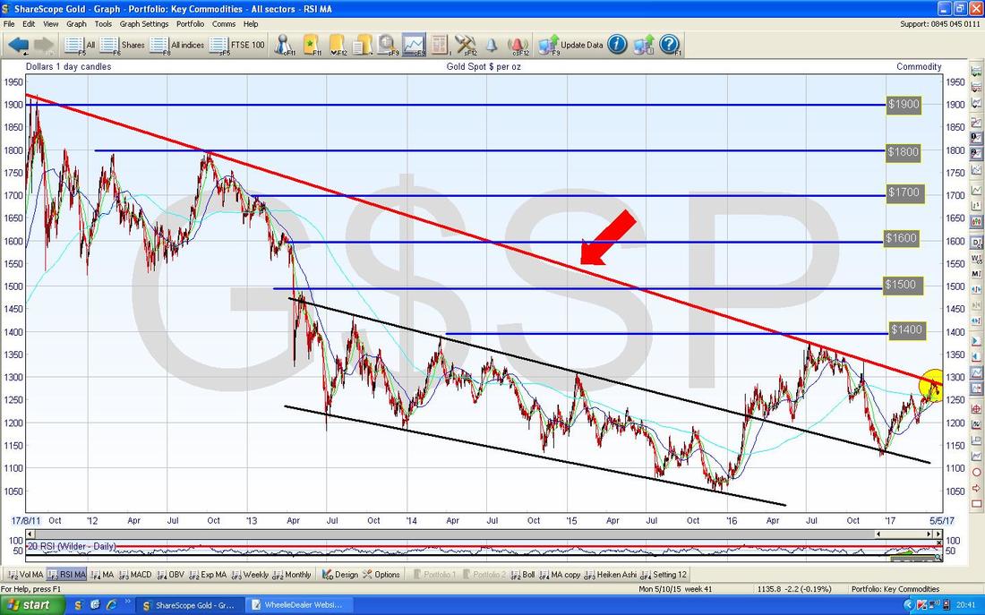
The Chart below zooms in on Gold Spot Daily to about the last 6 months. The Red Line at the top with my Red Arrow is the Long Term Downtrend Line from the Chart above and it is vital that Gold breaks over this soon if it is to keep going up - if it fails at this Key Test, then we will stay in the Long Term Downtrend.
My Small Yellow Circle is highlighting 3 small Doji Candles which we have been treated to in the last 3 days after the Price dropped back from the Red Line. It looks to me like this fall from the Downtrend Line was a pretty normal retracement and I reckon the Price will start to move up again soon and have another go at the Breakout - it looks quite possible. Note just below my Yellow Circle we are very near a Bullish ‘Golden Cross’ between the 50 Day Moving Average and the 200 Day Moving Average - if we get this Cross, it would suggest more gains to come in the weeks/months ahead. Having scribbled that, it does get me slightly concerned from a Fundamentals viewpoint that if Gold is going up, there might be problems elsewhere like with Stock markets - remember Gold is often seen as a ‘Hedge’ or a ‘Safety’ play. 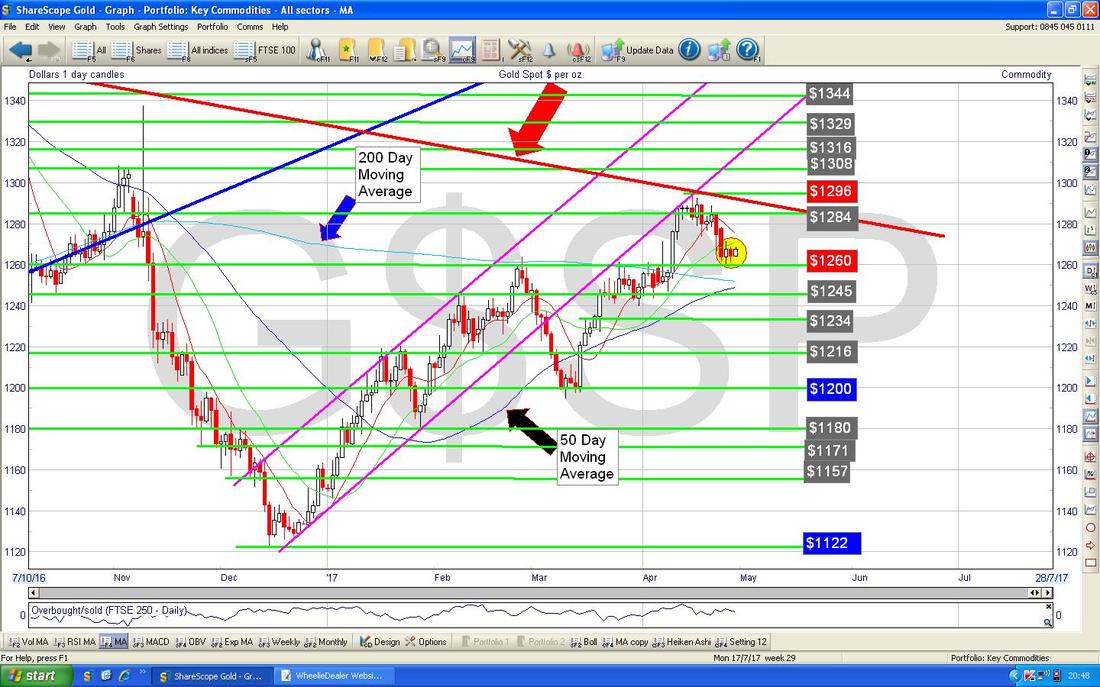
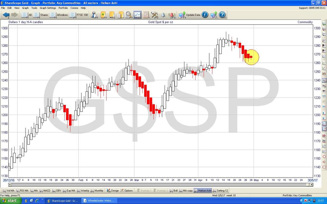
The Chart below has the Daily Heiken Ashi Candles for Gold (Spot) and my Yellow Circle is trying to show the last couple of Candles that are still Red but have started to narrow - chances are they will turn White and start to expand soon. I just love the clarity of these HA jobbies and are a great example of a Charting Technique that “Cuts out Noise”…..
Pound vs. Dollar
Since Theresa May called the surprise General Election, the Pound has soared a lot against the Dollar and this could soon start to drag on the FTSE100 as many constituents have Overseas Earnings and UK Assets will become less appealing to Overseas Investors if the Pound strengthens. This means it is important for us to track what the Pound is doing so let’s check out the Charts. Just for a bit of a giggle, I have first off included a very Long Term Chart for the Pound vs. Dollar going back to about 1970 - my Blue Arrow is showing roughly where we are now - as you can see, it is a continuing story of Pound weakness. 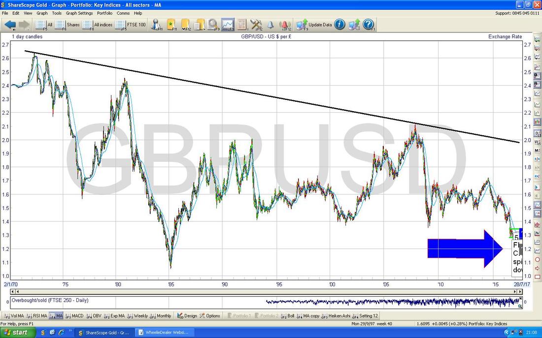
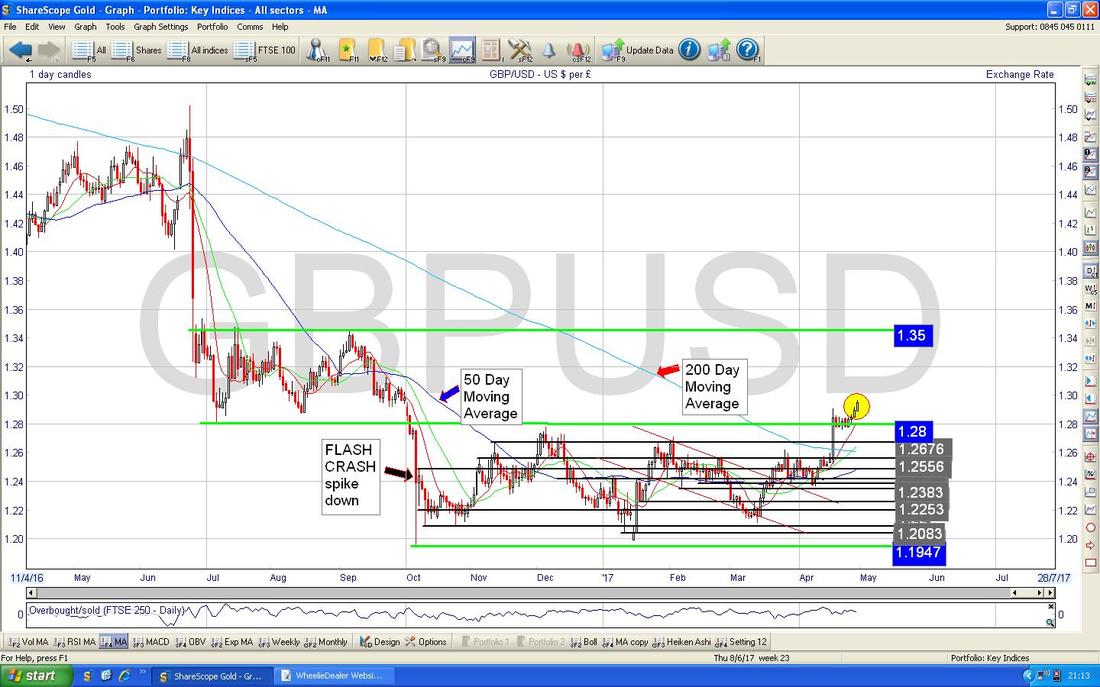
The Chart below shows the Daily Candles for the £/$ going back about a Year. The main thing I wanted to show here is that we had the Spike Down back in October which kicked the Chart into a Lower Range between 1.1947 and 1.28 but with the recent Price Action the £ has recovered back into the Higher Range between 1.28 and 1.35 - and it looks to me like the £ will go higher. Note also how the Dark Blue 50 Day Moving Average and Light Blue 200 Day Moving Averages are very close to doing a Bullish ‘Golden Cross‘.
I’m hoping you can see this one ok - as ever, if you click on the Chart it is like Viagra and makes it grow much bigger in your browser - this is the Daily Candles going back about 8 Months. The key thing here is where my Green Arrow is that shows a White Up Candle from Friday which broke-out over 1.29 which had been the High Point from back on Tuesday 18th April.
I mentioned in recent Weeks that I thought a ‘Bull Flag’ kind of thing might be forming up and it looks like I got that right - this suggests to me that we will see more of a move up - the Theory is that when you have these Bull Flag patterns, if it breaks-out then it should run up to a distance equivalent to the ‘Height’ of the Flagpole - in this case it would be about 0.04 (roughly 1.29 minus 1.25) so it might run up to 1.33. I note there is a lot of Resistance up at 1.30 and above so it might have a tough task. Further on, I think it will struggle at 1.35 which is a Strong Resistance Level. To help you see the Bull Flag pattern sort of thing, I have put a Grey Rectangle Box in there which shows where the Price dropped back after the Tuesday 18th Spike and then consolidated Sideways for a few Days before breaking upwards. 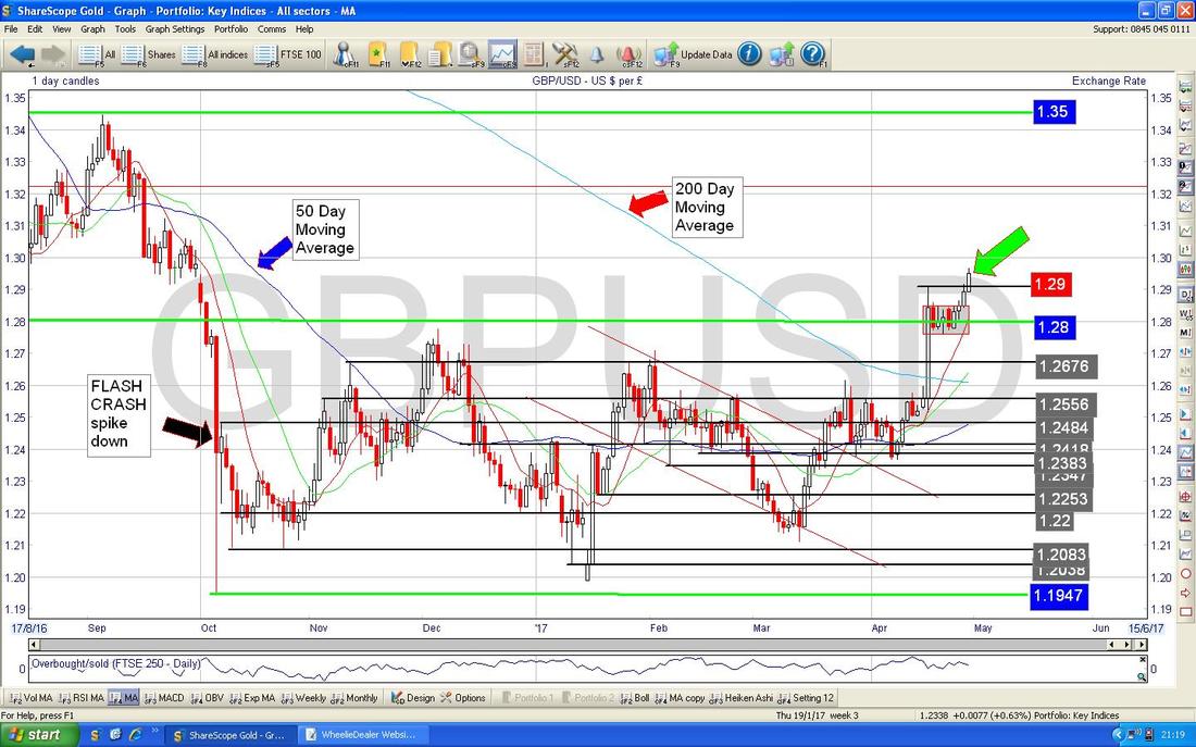
FTSE250
I’m really jumping around tonight (must have been the Chicken Madras) but I noticed last week that the FTSE250 was showing more strength than the FTSE100 and I wanted to highlight this and dig into it in more depth. The FTSE250 is very important because it is very much a proxy for ‘Small Cap’ Stocks and when you buy a Fund that says it invests in “UK Smaller Companies” it often actually means it is mostly invested in the FTSE250 - not in the FTSE Small Cap Index or the AIM All-Share as you might expect. Anyway, the reality is that the FTSE250 does in practice track quite well with the FTSE Small Cap Index and the AIM All-Share and I see this as relevant because I have many Stocks in these Indexes and I suspect most WD Readers do also. As ever, let’s start with the ‘Big Picture’ and here is a Chart of the FTSE250 going back to the 2009 Credit Crunch Depression Lows. You should be able to see a very clear and well-behaved Uptrend Channel and this is very nice from a Bull’s viewpoint. 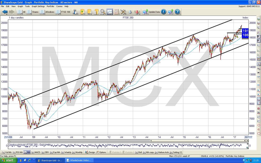
The Chart below has the Daily Candles for the FTSE250 going back about 7 Months. The key thing here is a narrow Uptrend Channel marked by my sort of Parallel Green Lines - however, they do seem to be converging a bit which makes me a little concerned we could have a ‘Rising Wedge’ pattern here - these usually end up with a big drop. For now, I am assuming it is just a normal Uptrend Channel and where my Yellow Circle is we are at the Top Line of the Uptrend Channel and we will most likely go Sideways from here or drop back a bit in what would be a normal Retracement within the Channel.
My Red Arrow is pointing at the 50 Day Moving Average which is clearly rising and has acted as a sort of ‘shadow’ to the Green Line Uptrend Channel for a long time. If the Price falls below this 50 Day Moving Average that might be a cause for concern. 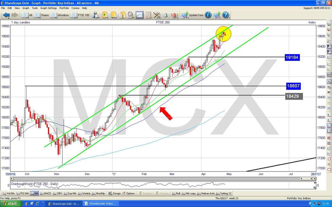
FTSE100
I guess it’s about time I looked at this one - it is slightly important !! First off here is the Long Term Chart from the 2009 Lows - please don’t spend time on this one, all I want to point out here is the Red Arrow which points to the Bottom Line of the Long Term Uptrend Channel - this is key because I will come onto it in the next Chart. Please ignore the other stuff. 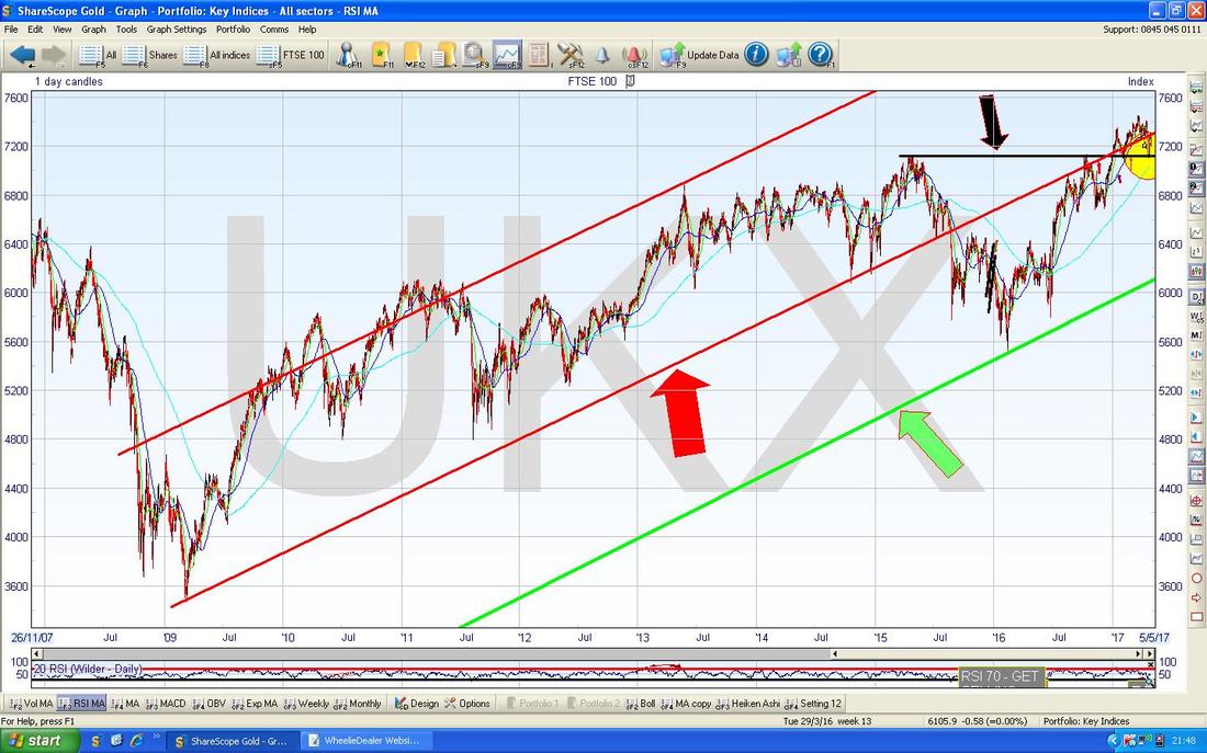
Oh no !! That awful Emily Thornberry (White Van Flag Man) is on the Telly now - if this Blog starts to go downhill you know what has upset me………
The Chart below zooms in now on the FTSE100 Daily to about the last 8 Months. First off look at the Yellow Circle - I showed this last week and what happened here was that the FTSE100 fell back strongly when Theresa May called the Election and it found Support at the Black Line which is around 7100. The Price then moved up again but note where my Green Circle is that it has in effect failed to get back inside the Long Term Uptrend Channel which was bounded by my Red Lines in the previous Chart. The Price moved up to the Bottom Line of the Long Term Uptrend Channel at about 7300 and for the last 2 Days it has fallen away - this does not look good and I suspect the FTSE100 will go on to test the 7100 Level again and then there is Support at 7000, 6900 and below. 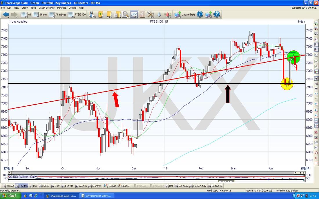
DAX (German)
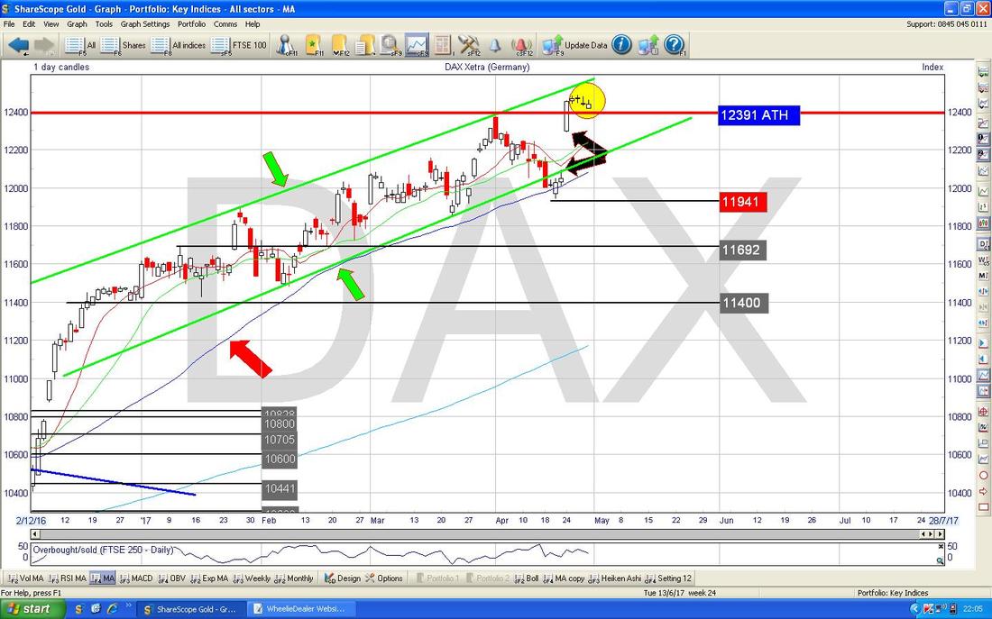
Sorry this Chart is messy but I just want to refer to it quickly and then move on. If you have read my Updates in recent Weeks, you may recall (assuming you were half-awake) I have been looking at the DAX Index because I felt there was a strong likelihood that it would Breakout above the previous All Time High at 12391 and if this happens it could be a good Trade to go long in the expectation of the Price running up a bit. On the Chart below my Red Arrow is marking the 12391 Level and the Price broke above this Last Week but I have not put a Trade on as I will explain in the next Chart. 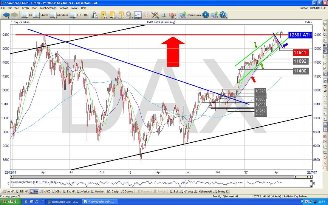
The Chart below zooms in on the Daily Candles for the DAX to about the last 5 months. The Key thing here is marked by my 2 Black Arrows which are pointing to a ‘Gap’ which formed when the DAX Broke-out over the 12391 ATH. This Gap was the reason that I did not put on a Long Trade - my concern is that the Price will drop back to try to “Fill the Gap” because Price Charts tend to hate a vacuum. However, I note that where my Yellow Circle is in recent Days, the Price has dropped back to ‘Test’ the Red Line at 12391 and it could very well do a ‘Confirmation’ of the Breakout and then move up - if it does, I might be tempted to go Long then - I will be watching closely over the next few days.
Dow Jones Industrials (US)
The Screen below zooms in on the DOW Daily Candles to about the last 4 months. The important thing here is where my Black Arrow is pointing to an ‘Inverted Hammer’ which was formed back on Wednesday and the Top of this was at 21071 which is now a Resistance Level to get above. Note we failed to move on to the All Time High at 21169 and this is a negative development. Note that after the Inverted Hammer, the Price has dropped and if it drops below 20900 then there is a ‘Gap’ with no Support until 20800 which must hold or we might drop back quite a bit more - perhaps even to around 20400. 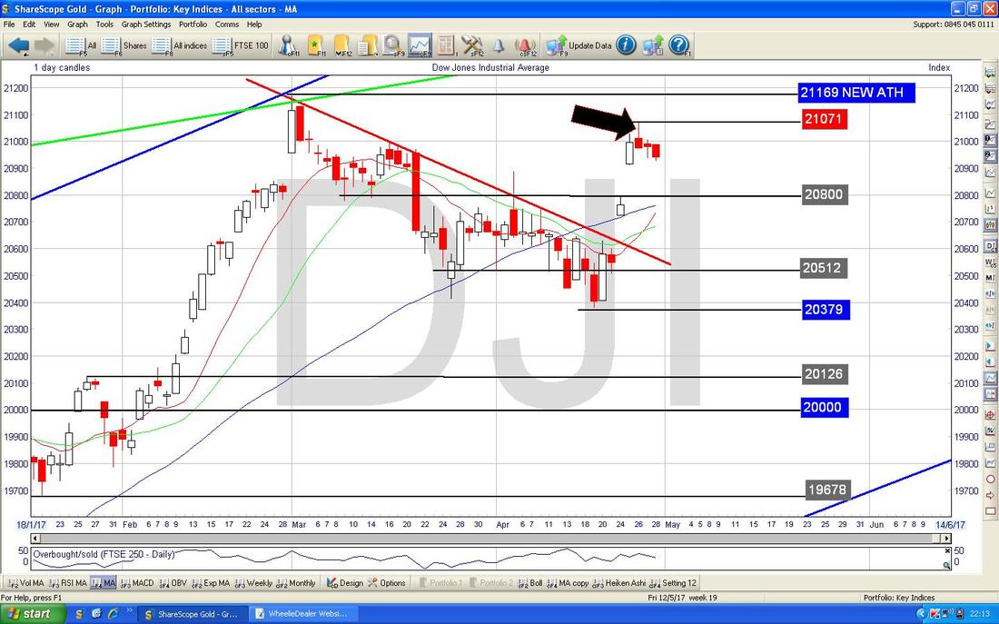
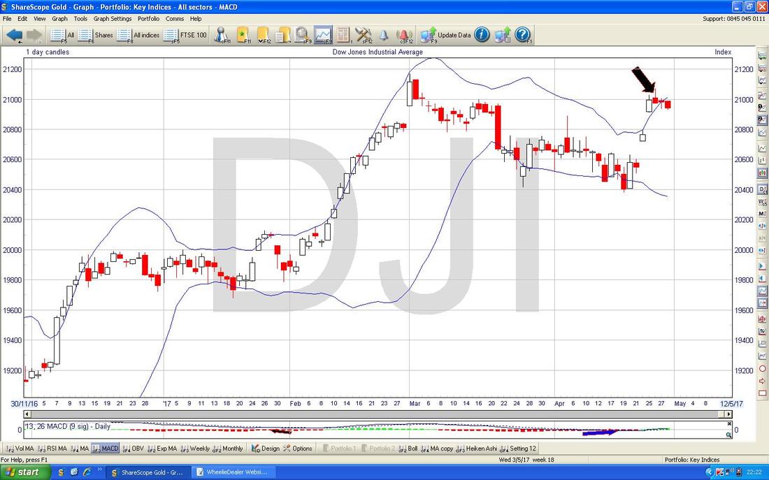
The Chart below has the Daily Candles for the DOW with the Blue Bollinger Bands above and below. My Black Arrow is pointing to the Inverted Hammer from Wednesday and note how it was outside of the Upper BB - so it is no surprise that the DOW has fallen back in the last couple of days to bring the Price back within the Bands.
There’s some good news here - the Chart below has the Daily Candles for the DOW but what I am interested in is the Red Wavy Line which is the 13 Day Exponential Moving Average and the Green Wavy Line which is the 21 Day EMA - note where my Black Arrow is that the Red Line has crossed the Green Line and this usually means more gains to come.
My Blue Arrow points to where we had a similar 13/21 Day EMA ‘Golden Cross’ before. I won’t show them this week but the S&P500 looks very similar to the DOW. The Nasdaq Comp looks more bullish though. 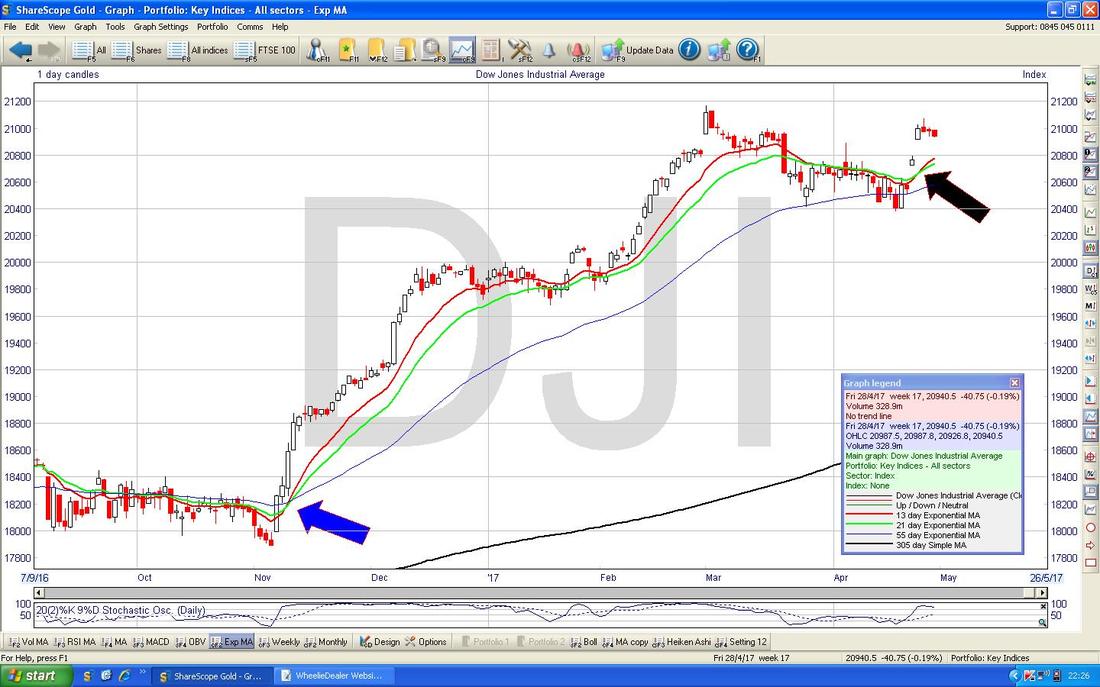
Brent Crude Oil (Spot)
It’s been a while since I looked at the ‘Big Piccie’ for Brent Oil and therefore this Week I decided to lob it in (the simple reality is that I have more time tonight - this being Sunday just before a Bank Holiday Monday, if I don’t finish it tonight there is still time to get the Blog out in time for the Markets to open on Tuesday) and so here is the Chart of Brent Crude Oil (Spot) going back about 3 years. First off note how in early 2016 the Brent Oil Price broke-out of the Downtrend which is marked by my Green Line (with the Green Arrow) and since that the Uptrend Channel marked by my Parallel Black Lines has been in force - however, note where my Yellow Arrow is that we have dropped below the bottom of the Black Lines Uptrend Channel - that’s not good. We are also below my Horizontal Red Line at $55 and my Horizontal Blue Line at $70 (this one gets its own Blue Arrow !!). This failure at $55 and in ability to get anywhere near $70 is not all that good really and suggests a certain weakness in this Chart. 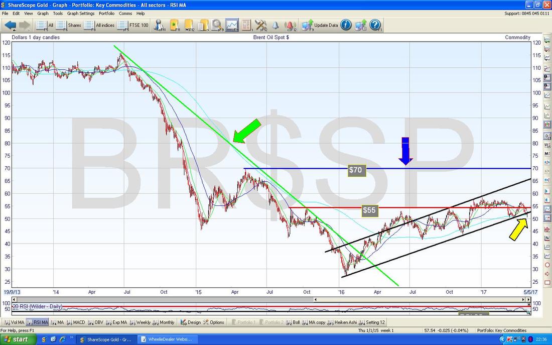
The Chart below zooms in on Brent Oil (Spot) Daily Candles to about the last 6 Months. The Story here is really about 2 Sideways Ranges - one marked by my Green Arrows between $54 to $57.535 and a lower Range marked by my Yellow Arrows between about $50 and $54.
At the moment the Price is around $52 and within the Lower Sideways Range - on this basis, if it drops below $50 that would be a concern and it might drop down to around the $46 area where there is a lot of Price Congestion from before. Obviously if the Oil Price falls the FTSE100 might suffer with it (and it is likely smaller Oil Stocks and Oil Services Companies will suffer as well). Note the Darker Blue Wavy Line which is the 50 Day Moving Average is dropping towards the Lighter Blue Wavy Line which is the 200 Day Moving Average - this is setting up a Bearish ‘Death Cross’ and it is not something that Oil Bulls will like. Right, that’s it for this week, all the Best and I hope the Market Gods look after you !! Cheers, WD. 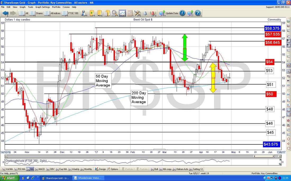
0 Comments
Leave a Reply. |
'Educational' WheelieBlogsWelcome to my Educational Blog Page - I have another 'Stocks & Markets' Blog Page which you can access via a Button on the top of the Homepage. Archives
May 2024
Categories
All
Please see the Full Range of Book Ideas in Wheelie's Bookshop.
|
