

|
educational blogs |
|
I am doing this on Saturday night because I am off to the British Superbikes at Thruxton tomorrow and I doubt I will be back in time (or be in the mood !!) to look at Charts when I normally do. Time is a bit tight so I won’t waffle much and there are quite a few Stock Charts I want to run through.
Last week was a bit of a non-event for me - it started very messily with both UTW and AA. giving me grief but by the end of the Week I was flat and back exactly where I had started. Of course I am pleased to have got away with several problems but I was quite disappointed that a few of my Stocks that reported Results didn’t respond to the upside - in particularly I thought the Aviva AV. Results were good but the Stock did pretty much nothing. This is a shame because AV. has been moving horizontally for many months and I was hoping the Results could trigger a Breakout to the upside - the Stock certainly looks cheap enough and a Dividend Yield around 5% is well worth having.
I finally took the tough decision to dump that DAX Long Position. I learnt the hard way last year that fighting an Index which is really a proxy for a Currency is probably going to cost money and it was clear to me that the DAX was moving very much in response to the Euro/Dollar rate; with the Dollar showing little sign of wanting to strengthen and the Eurozone being most unusually buoyant in terms of Economic Activity, I suspect this trend will continue and the DAX could easily fall more. Another problem with the DAX is that it only has 30 Stocks which are mostly huge and international, so it doesn’t really mirror the wider Eurozone much anyway.
My Strategy remains the same - I might buy the odd thing in an opportunistic way, but in the main I am more biased towards trying to lighten up on a few things particularly with my Long Spreadbet Leverage - I would like to lower this prior to the Autumn and the often nasty months of September and October. Of course, we might not get such a drop this year, but there is no harm in being prepared and I will still be massively ‘Long’ anyway so if Markets continue to rise through the Autumn I will benefit anyway. If we get a Drop, then I will suffer less and I will also have ammunition to buy Bargains once the turmoil ceases. Last week there were a lot of Company Results but looking at the list in Investors Chronicle for this week, there seems to be a fairly quiet week on this front. For me TCM reports on Monday, PETS on Tuesday and then QP. Wednesday and GLEN on Thursday - no doubt others will put out various assorted RNS Statements as well (probably good and bad !!). Let’s get stocking…… Hostelworld HSW This is one that got a mention on Twitter this week. I remember reading Results here recently and thinking they were pretty good - I don’t hold HSW. From memory I think they do a Website for booking Hostels and of course I am interested in anything with an Online flavour because I am sure we are still only at the early days of how Information Technology and all that malarkey is going to affect the lives of humans in the future. From a quick look at the Valuation this looks very interesting - they appear to have a nice Cash Pile and are on a Forward P/E of 15.5 and a 4.8% Forward Divvy Yield - those numbers are right up my street !! The first Chart below shows the full history on HSW since it listed back in October 2015 - as you can see a decent Uptrend but in a very wide channel. Note Results are due on Wednesday 23rd August - so perhaps we can see the Shares run up prior to those. 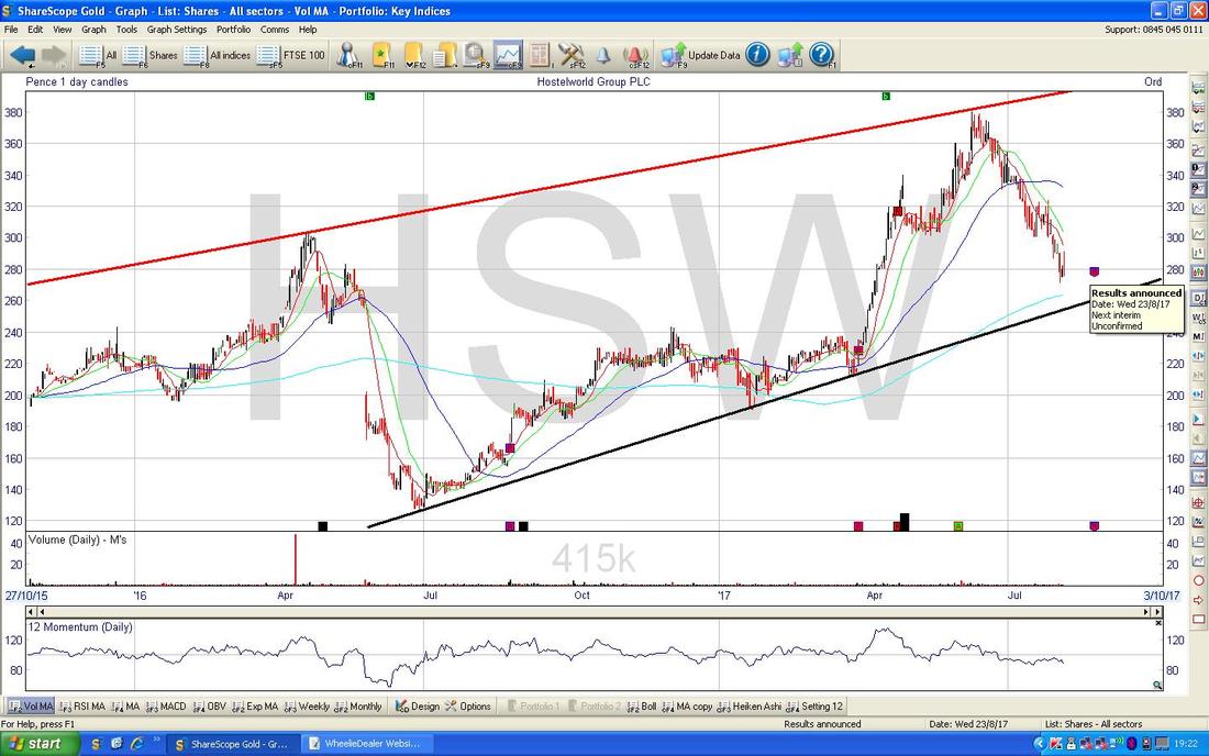
On the Chart below I have reduced the Timeframe down to the last 5 months ish. Note my Blue Arrow which is pointing at the Faint Blue Line which is the 200 Day Moving Average (as always the Charts are from the awesome ShareScope Software that I use) and it is quite likely this will act as Support - as will the Black Line at the Bottom. Note on all these Charts if you click on them they should grow bigger in your Browser thing so you can see them more clearly.
The key thing here though is my Green Line (pointed at with Green Arrow) - really we need to see the Downtrend of the last 2 months to cease and the Share Price to Breakout of this Green Line to the upside - that would be a great Buy Signal. 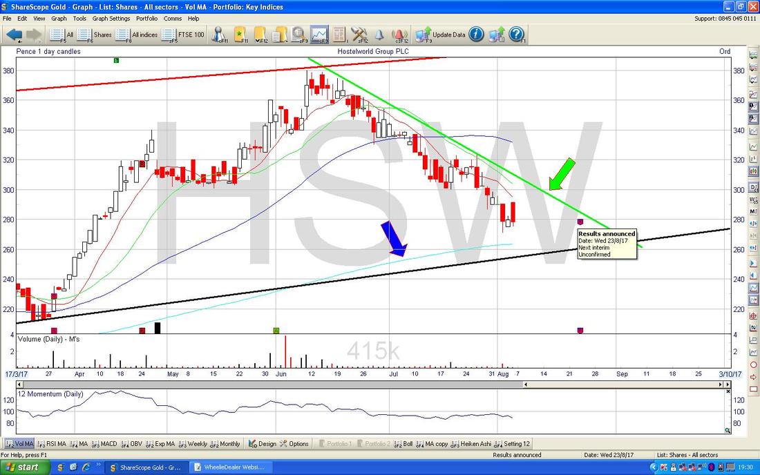
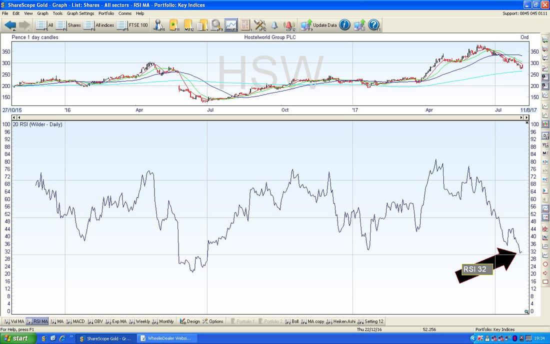
In the bottom window on the Chart below we have the RSI (Relative Strength Index) for HSW Daily. On a current Reading of RSI 32 that looks very low and suggests we should see a bounce in the Share Price soon.
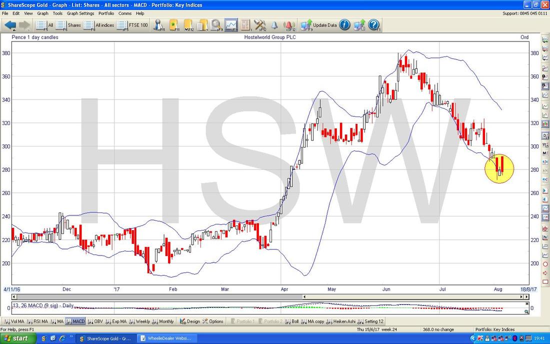
On the Chart below we have the Daily Candles for HSW with the Blue Wiggly Bollinger Bands above and below. My Yellow Circle is attempting to show how the Price is touching the Bottom Band but note the Price can ‘hug’ the Bands sometimes and fall more.
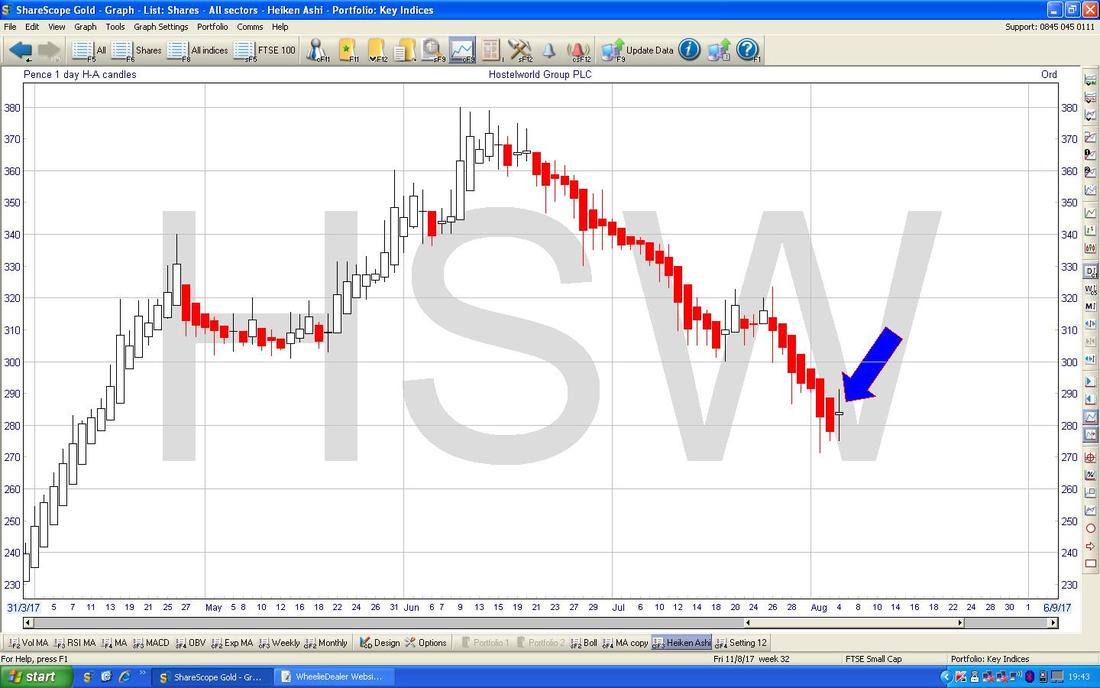
The Chart below has the Daily Heiken Ashi Candlesticks for HSW - there is an interesting development here because where my Blue Arrow is, we have had a narrowing of the Candle Body and it has gone White after a sustained string of Down Red Candles. This is too early to buy now, but it hints that the Trend might be about to change (which actually would be consistent with the other Charts we have looked at) and the way to play this would be to wait for a Big White Up Candle on Monday at the Close as that would be a Buy Signal.
Keywords Studios KWS
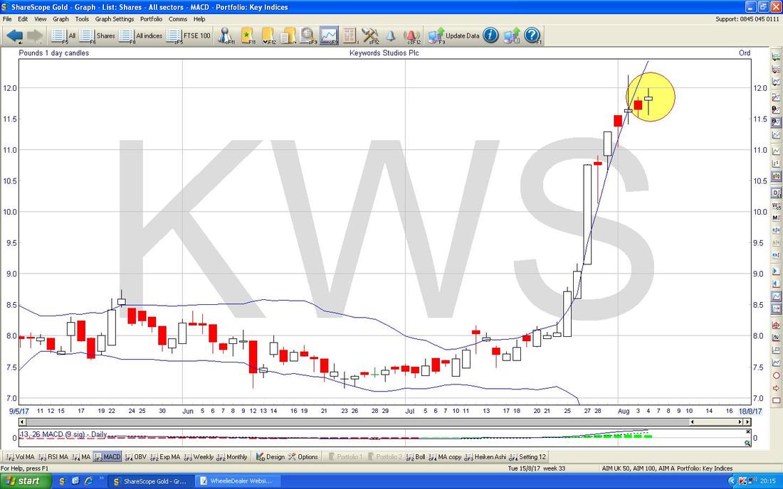
This is another one which I don’ hold (shame clearly !!) but I know a lot of people do and I thought the Chart might be interesting. This is a very high growth Stock with a superb record since IPO in mid 2013 but it is worth noting that it is undertaking continual acquisitions and this in itself introduces a lot of risk as we have seen on Stocks like NCC - it is just something to think about. The Chart below is a belter for Holders of the Stock - well done if you are one of them !! Note where my sort of Pink box is that the Share Price has ‘Gone Vertical’ - this is something to be wary of - it is not always sustainable. 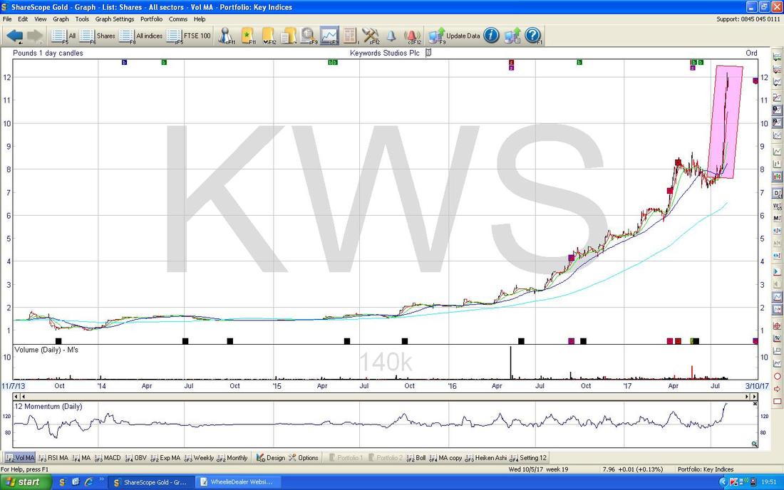
On the Chart below I have zoomed in and the Candles are of the Daily variety. My Yellow Circle is capturing several ‘Doji’ Candles from the last few Days and these are hinting that after the Strong Push up which is encapsulated in my Green Box, the Force of the move up is on the wane. It might drop back soon, or perhaps go sideways, but I suspect only some really good News would get it pushing up from here. Note there are Results due on Friday 29th September.
From a quick look at the numbers, KWS is on a Forward P/E of 37.5 and has a tiny Dividend Yield of 0.12%. These are pretty expensive numbers and it is certainly not something I would buy into at such a Valuation. If I held it and had a strong conviction (its seems a pretty well run business) then I might continue to hold but perhaps would be TopChopping. There is another way of thinking about this - will other Potential Buyers be interested after such a run up and on such a Valuation? To justify such a high P/E, the Growth needs to continue being really strong and they cannot make any false moves - the slightest thing and the Shares would get battered I suspect. A high valuation like this gives no ‘Margin of Safety’. 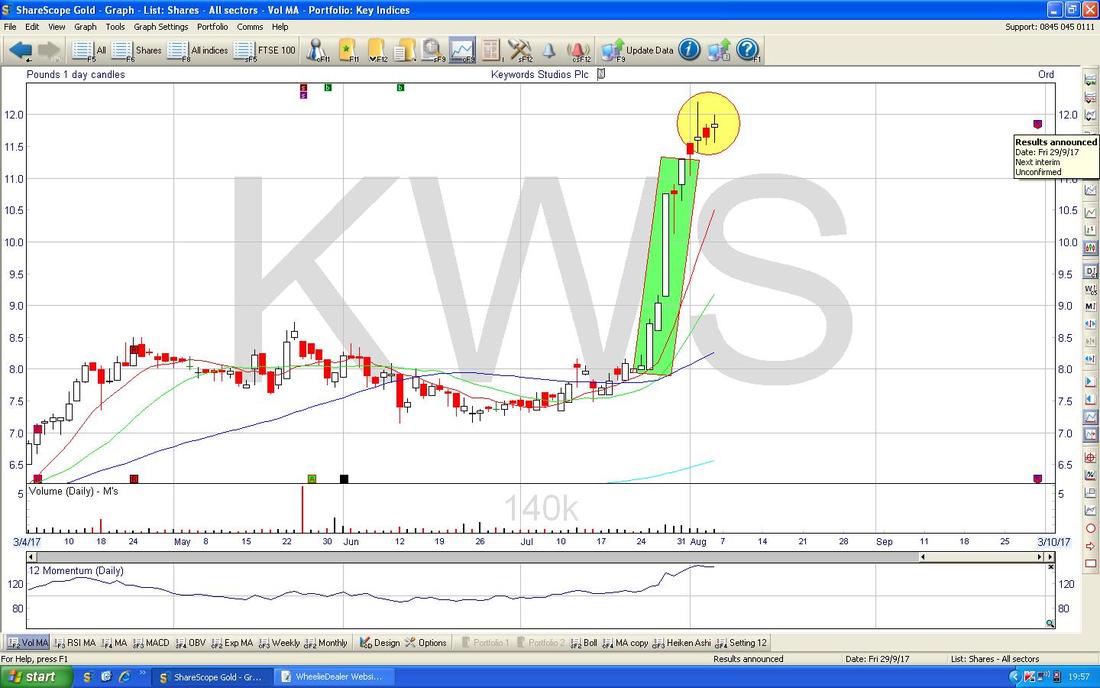
The bottom window below has the RSI for KWS Daily and note it is currently Reading RSI 86. If this was a liquid Asset like an Index, you would be screaming that this is a Sell, but for a more choppy smallcap Stock, such Readings are not unusual and do not necessarily mean it has topped out in the Short Term. If you look to the left, you can see where the RSI was up at elevated levels even higher than this. However, it is yet another hint that this thing is quite Toppy and might be due a pullback short term.
Note also how the RSI has got less Volatile and Choppy in recent Months - as the Value has risen, it has clearly got more liquid. 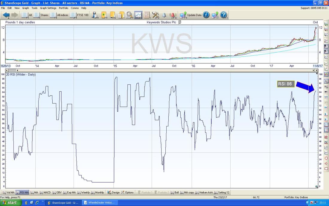
The Chart below has the Daily Candles with the Blue Bollinger Bands above and below. Where my Yellow Circle is look how the Price is now moving away from the Upper Band - this again suggests the force of the recent move up has weakened (no shock after the way it went vertical !!).
Pets at Home PETS
I hold PETS and its recent performance has been really doggish. The Chart below shows its Stockmarket existence since IPO back in March 2014 and what a beautiful example of a Price Chart which has very clear Trend Channels in it - firstly a Red Lines Downtrend Channel, then a Green Lines Uptrend Channel, then the current Black Lines Downtrend Channel. I love Charts like this because I could see straight away where the very clear Channels were and drawing in the Lines was a piece of p*** (cake). As I said above, we are currently in the Black Lines Downtrend Channel (the current Price is where the Yellow Circle is) and even if we get a decent Bounce in the near term, that Upper Black Line of the Downtrend Channel (marked by my Black Arrow) will probably prove tough to breakout over. If it does breakout of that line in the future, then that would be a Buy Signal. 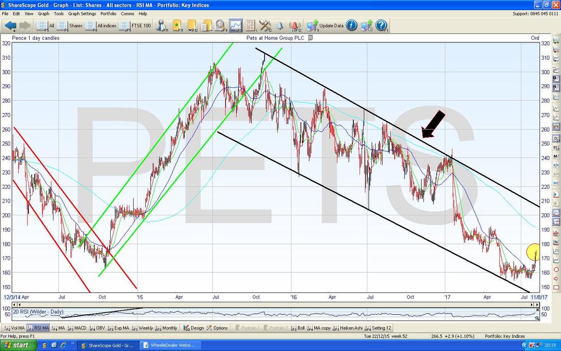
On the Chart below, I have chopped the Timeframe down and first off note how the Price recently Broke-out of the Horizontal Green Resistance Line which is marked by my Green Arrow - that was a bullish thing. My Yellow Circle is marking a small Red Doji Candle which suggests that after the forceful push up in the days before, the Price had little oooomph to it on Friday - no surprise really because Fridays can be funny bug*ers and with Results on Tuesday perhaps people are now going to wait for those. Note my Blue Arrow is pointing to the Light Blue Wiggly 200 Day Moving Average Line - this could be Resistance around 190p and I note that there is a lot of Resistance from back in February to May around this area as shown by my Big Pink Box.
For what its worth, PETS is currently on a Forward P/E of 12 with a Forward Dividend Yield of 4.6% - these numbers are pretty attractive if the Results are decent - Tuesday could be interesting…….(hopefully in a good way !!) 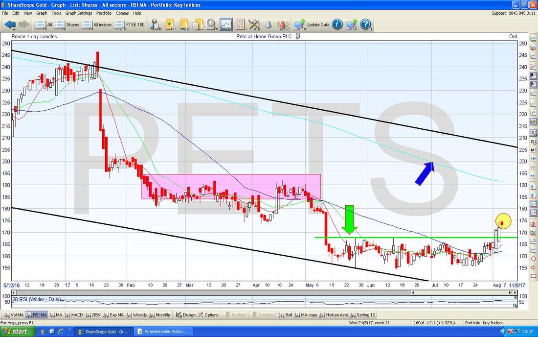
The Chart below has the Daily Price Candles but my Blue Arrow is pointing to where we had a Bullish ‘Golden Cross’ between the 13 Day Exponential Moving Average (Red Wiggly Line) and the 21 Day EMA (the Green Wiggler) - this often predicts gains in coming weeks but obviously the key thing here now is the Results on Tuesday.
Moss Brothers MOSB
I hold Shares in MOSB but just recently it has been a bit frustrating although a Dividend Yield of 7% forecast for next year and backed by a massive Cash Pile keeps me interested - it is also worth noting how the Divvy keeps getting raised as well as the Business is performing pretty well as Brian Brick and his mob sort out many of the Company’s past failings and I suspect there is a lot more scope for improvement - particularly in the Online area. Anyway, whatever, the simple reality is that this one has been trading in a Range between about 90p (Black Line) and 112p (Red Line) for 2.5 years and at the moment we are back down the bottom of the Range where my Pink Circle is. My Yellow Circle shows where the Price broke-out over the Top Red Line but this was not sustained. 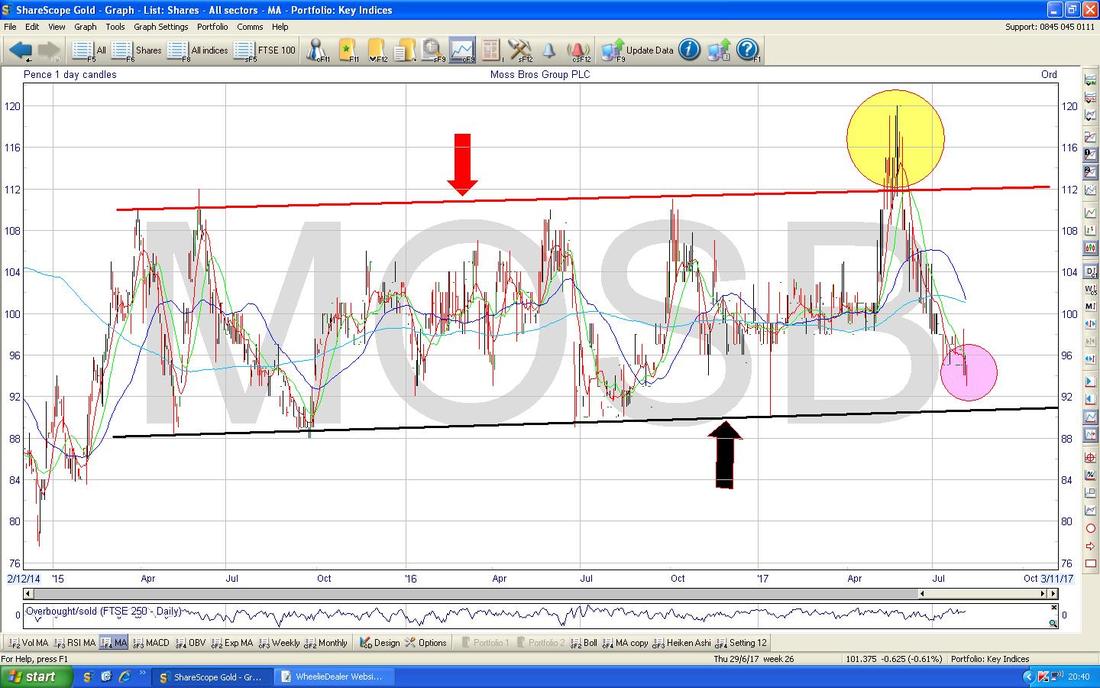
GKN PLC GKN
I tripped over this one the other day and thought it might be worth considering. I don’t hold GKN but I like the Numbers here and note they are putting effort into developing (and are already supplying) Drivetrains for Electric Cars and this is clearly a coming trend. On a Forward P/E of 8.8 and just over 3% Forward Divvy, it cannot be described as expensive (assuming the Business is doing ok - note there is quite a Pension Deficit but I think they just closed the Final Salary Scheme which helps). My guess is that fears over Brexit and its impact on the Car Industry and Aerospace could be causing weakness here - but it is unusual because other Stocks in similar Sectors are not as beaten up. The Chart below goes back to the 2009 Credit Crunch Lows (shocking how many years ago that was now when it seems so fresh in my mind) and the Black Line (marked by Black Arrow) shows an Uptrend which has been in place since then. Up the Top there is a Blue Line (Blue Arrow) which shows Resistance up above that will be difficult to get over I suspect. 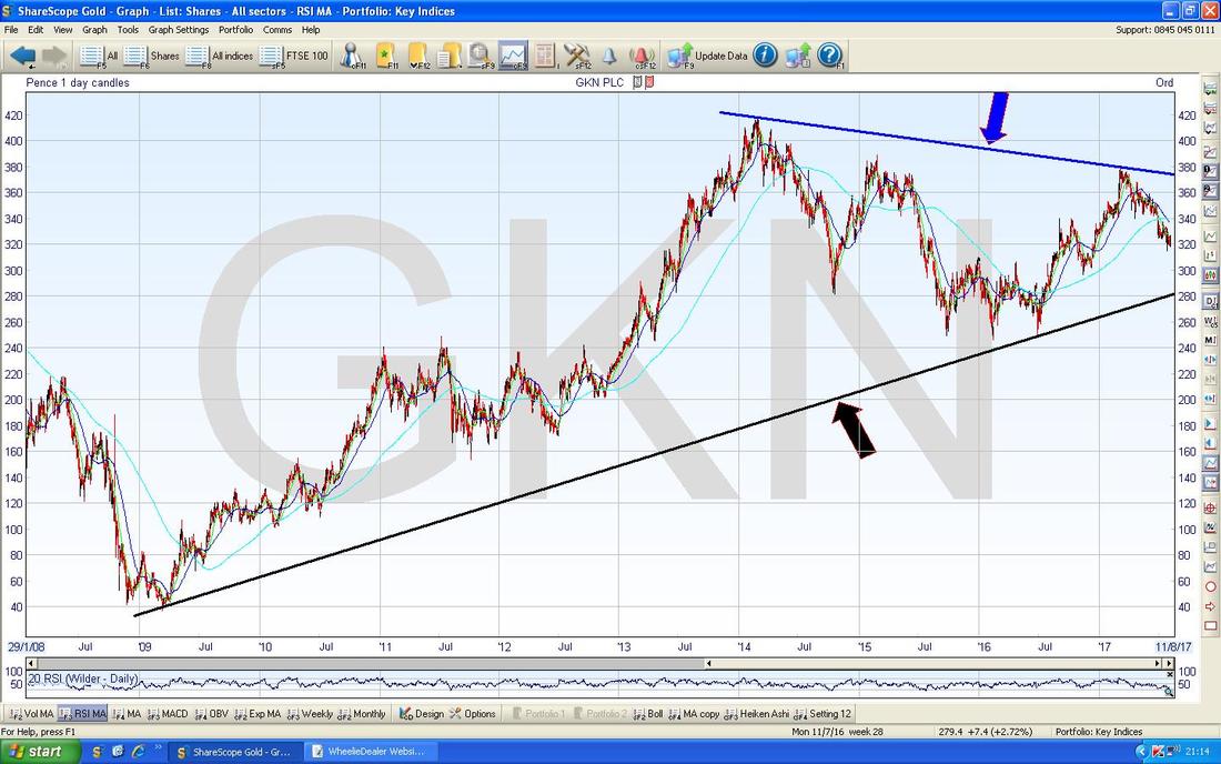
On the Chart below I have zoomed in and the main thing here now is the Downtrend Channel marked by my Parallel Green Lines which is clearly dominating the Price Action at the mo. For things to seriously improve, we need the Price to Breakout over the Upper Green Line (pointed at with my Green Arrow). My Yellow Circle is showing where there was recently a 50/200 Day Moving Average ‘Death Cross’ - this is not good and suggests more falls are likely.
Down below there is a fair chunk of Support around 300p - if you look to where my Pink Box is, this shows how that Level has acted as Support before. This is certainly an interesting Stock but I wouldn’t be buying it heavily yet - however good the Fundamentals look. If I really decided it was a Business I wanted to build a Stake in, then I might look to buy a Small Starter Position quite soon, and then to add if it perks up but particularly if it was to Breakout of that Green Line at the top. By the way, GKN goes ExDiv for 3.1p a Share this Thursday 10th August. 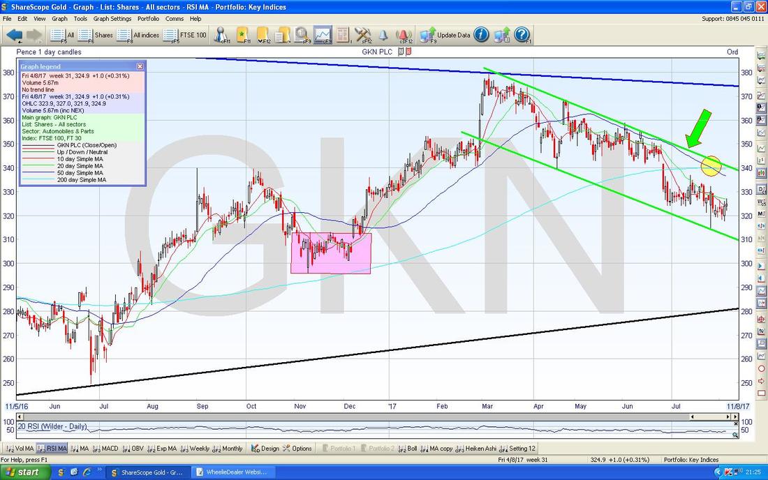
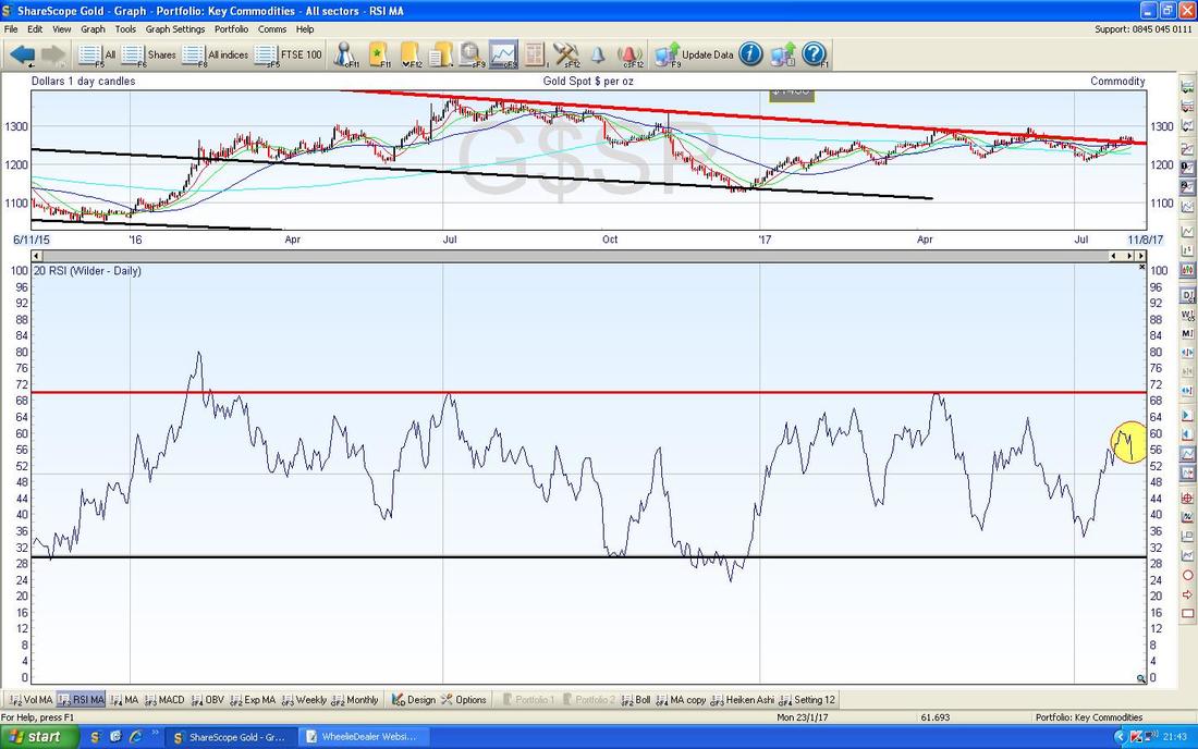
Gold (Spot)
Due to time constraints I might not be able to cover many more Charts tonight so I will just dive into ones that are of particular interest to me. The Chart below is the usual refresher that I show most Weeks which is to remind us that the Key Factor on Gold is that Red Downtrend Line marked by my Red Arrow which has been in force since 2011 and we need to see a Breakout above this if Gold is to make serious progress in coming Weeks/Months. 
I’m a bit disappointed by the Chart below - it makes me concerned that yet again (like where the Yellow Circle is) we might have a ‘False Breakout’. My Green Box is capturing a Big Red Down Candle from Friday and this looks to be turning down from the ‘Narrow Body, Long Tails’ Doji from Tuesday 1st August which I am pointing at with my Blue Arrow - this looks like what I think the proper Technical Analysis Gurus call a ‘Pivot Point’.
My Black Arrow shows where we had a Bullish 50/200 Day MA ‘Golden Cross’ recently which is good and we need to see the Price over $1300 to be really confident the Breakout has happened. As yet, this looks rather doubtful to me. 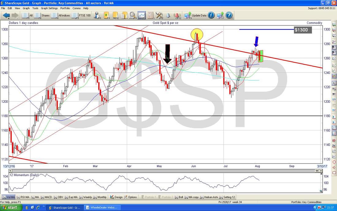
In the bottom window on the Chart below we have the RSI for Gold Spot - where my Yellow Circle is this looks like it has turned down like we have seen a lot in the recent past.
There is more disappointing evidence in the ScreenShot below for Gold Bugs. In the Upper Window, we have the Daily Candles with the Bollinger Bands above and below and my Pink Box is highlighting how we are dropping off the Upper Band.
In the Bottom Window we have the MACD for Gold Spot (Moving Average Convergence Divergence) - my Blue Arrow is pointing to where the Green ‘Hump’ is curving downwards and the same phenomenon is being shown in the ‘Signal Lines’ format. As a general principle with all Chart Indicators and stuff, it doesn’t really matter how they are calculated (I have no idea how most of these are formed) but the key is to look at the history on them and to see what has happened in the past and to learn how they ‘work’. In addition, I suspect if you do searches on YouTube you can find Educational Videos done by extremely helpful people about how most Indicators and stuff work. In fact, this is where I learnt most about Heiken Ashi Candlesticks - there are some superb Videos on those jobbies. Don’t get too worried about Time Periods - if you find an Instructional Video that looks at 15 Minutes Candlesticks or something, it might still be useful even if you only go down to Daily or 4 Hours Candles - these things tend to be ‘Fractals’ so work similar whatever time period is concerned. 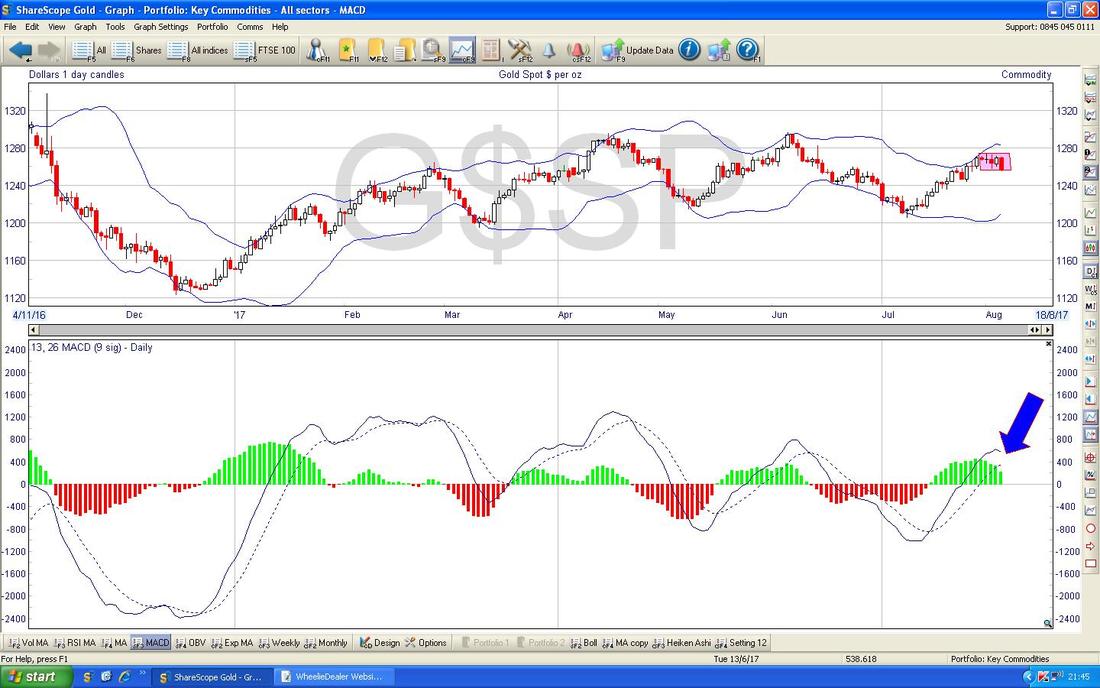
FTSE100
There’s something interesting here. The Chart below has a big Black Arrow pointing to a Bullish ‘Golden Cross’ between the 13 Day and 21 Day EMAs - this suggests more gains in coming Weeks. Note we are not far off the All Time High at 7600 so I wouldn’t be surprised if we see this challenged soon. These Golden Crosses are of course not fool-proof and if a Market is Choppy they can give false Signals - however, they have worked pretty well on the FTSE100 in recent months. 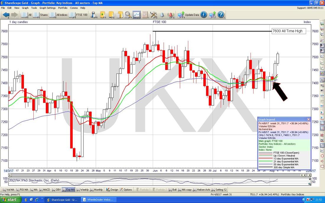
FTSE AIM All-Share
On the Chart below you should be able to see how a nice White Up Candle from Friday (Pink Circle) got the Index pushing up against the recent High at 993/994 - I suspect this will Break higher in coming Days. Note though that this is not the All Time High and there are several Resistance Levels up above to wade through before we get into ‘Clear Blue Water’. 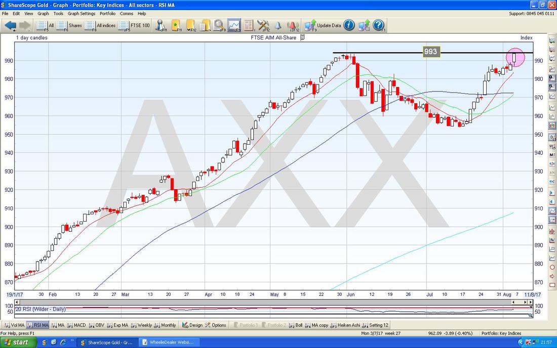
FTSE SmallCap Index
Just to illustrate a point I made in the AIM All-Share Chart comments above, note the FTSE SmallCaps have broken out into ‘Clear Blue Water’ ages ago and this Chart continues to push higher making continual New All Time Highs with no natural and obvious Resistance points above for the Sellers to come in at. 
Dow Jones Industrials Index
This one is interesting because it looks really overstretched in the Short Term and has pretty much ‘Gone Vertical’ which is nuts for an Index. However, this seems to be reacting to Dollar Weakness and this is yet more on the theme of how Indexes are behaving like FOREX recently and it makes life very difficult if you want to Trade the Indexes. My Pink Box is capturing the recent move up and it is clearly looking toppy. Note how far it is from the 50 Day Moving Average now which is the Blue Line marked by my Blue Arrow - just to reiterate, that is the 50 Day MA and not the 200 Day MA which is down at about 20400 and this just stresses how over-stretched this looks. As I said earlier, go back in time and look at how stretched the Price has got in relation to its 50 Day MA before - I suspect we are at historical extremes now and a short term pullback is in order or perhaps to just go sideways for a bit to take the ‘heat’ out. 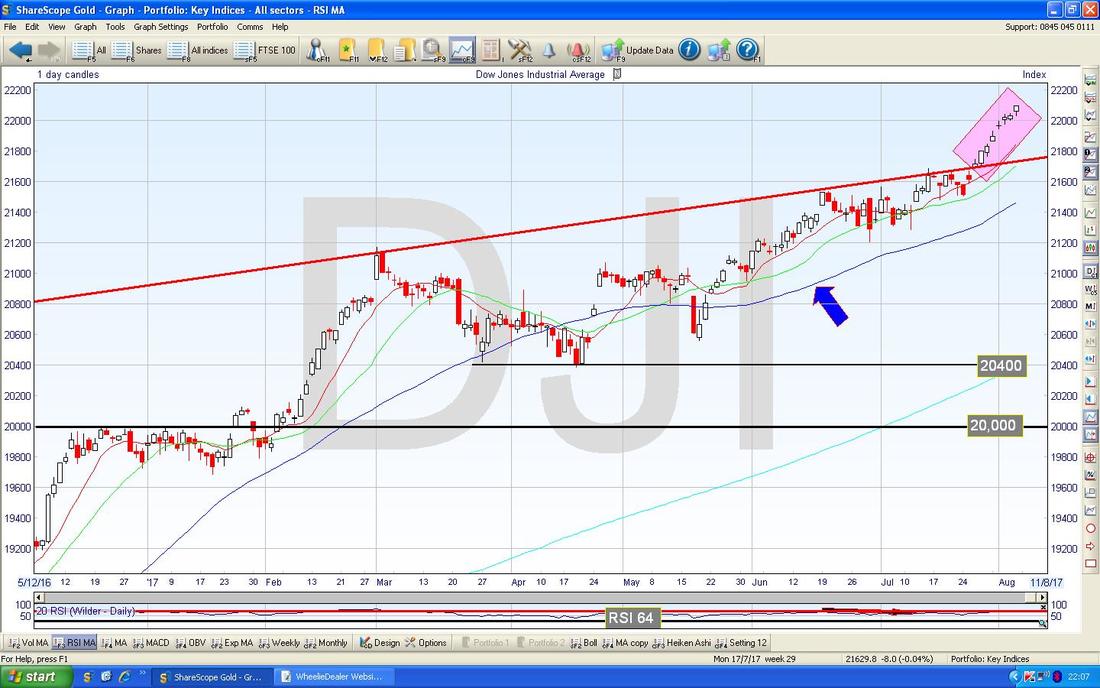
The bottom window on the Chart below has the RSI for the DOW. On a Reading of RSI 73 this is high but note it went even higher quite recently.
Right, the Clock is ticking loudly, I will end it there. I hope everyone has a smooth week and plenty of good decisions are made !! Cheers, WD. 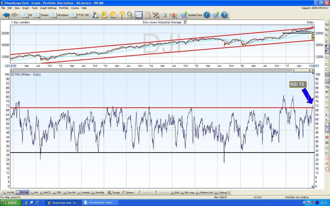
0 Comments
Leave a Reply. |
'Educational' WheelieBlogsWelcome to my Educational Blog Page - I have another 'Stocks & Markets' Blog Page which you can access via a Button on the top of the Homepage. Archives
May 2024
Categories
All
Please see the Full Range of Book Ideas in Wheelie's Bookshop.
|
