

|
educational blogs |
|
I am particularly interested in the Index Charts this week because with Autumn ahead we are entering into probably the most difficult period for the year when big Sell-offs can often happen. September is the worst Month and October has a reputation for nasty falls like the 1987 Crash - so for me Caution is paramount.
Last week the Markets started to dip so I increased my FTSE100 Shorts and Nasdaq100 Shorts, but later in the week we had the Bank of England Stimulus and then a strong US Non-Farm Payrolls Number which pushed the Markets up. The FTSE100 is still well under strong Resistance and I am not too concerned about that one but the Nasdaq 100 broke-out to a New All Time High so I am thinking of reducing the Short - however, it is possible that this is a knee-jerk response to the News and we could fall back this week - so I am making no snap-decisions and I will review the situation on Monday night. My Short Positions are very large and probably a little over-sized really - this is fine if Markets are about to drop, but if they keep going up it will cause me trouble - so I need to monitor carefully. As usual, let’s start off with the History Bit………
Historical Precedents
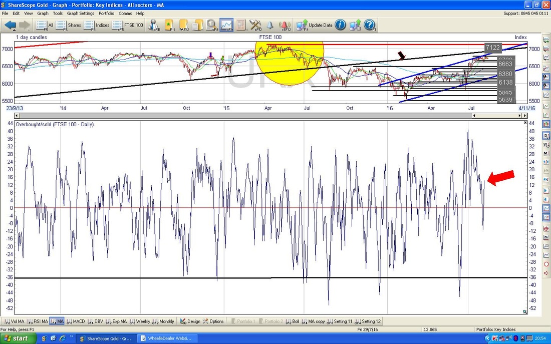
According to the UK Stockmarket Almanac 2016, the coming week (w/c 8th August 2016) is Up for 48% of Years historically and the Average Return is 0.1% - so it tends to be pretty flat. And now the Charts……….. FTSE100 First off a quick bit of ‘Big Picture’ context - the chart below from the unbeatable ShareScope software shows the Uptrend since the Credit Crunch low point and the key thing to take on board here is the Black Bottom Line which I have marked with the Black Arrow. 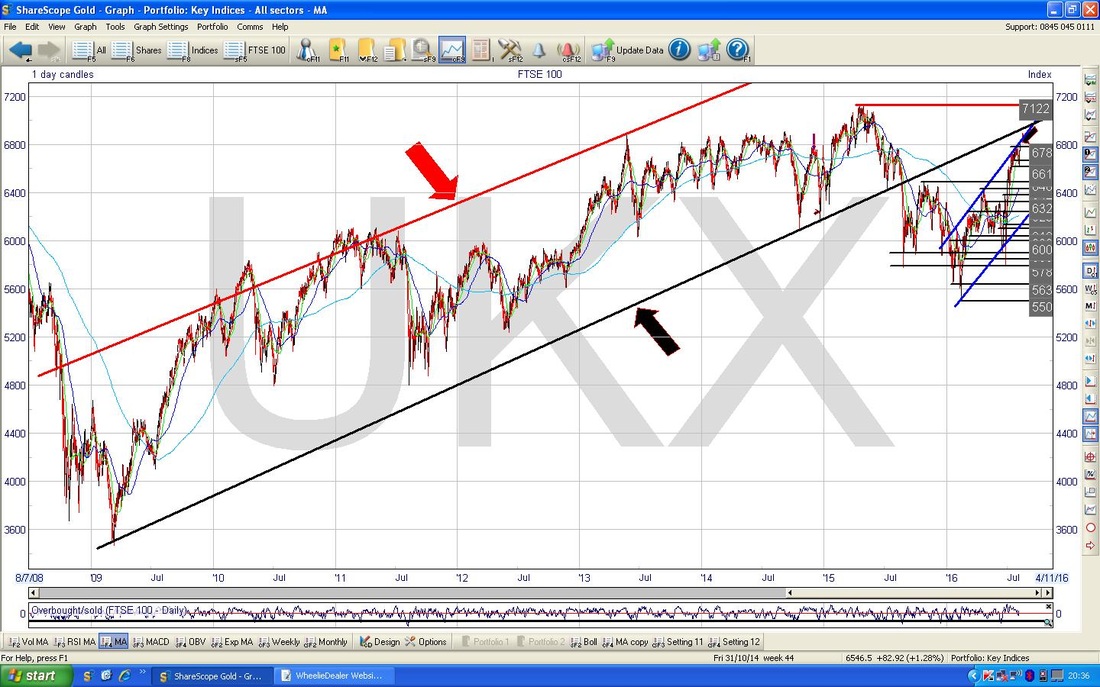
On the Chart below I have zoomed in to about the last year and a few months and you should see the Black Uptrend Line from the previous Chart which I have marked here with the Black Arrow. The important thing to realise here is that old Charting Chestnut “Former Support becomes Resistance” (and Vice Versa) so this Black Line will now most likely act as Resistance to the Price moving up. This level is about 6950 to 7000 ish - it is very possible that the Price will move up to this line and then bounce down off it - something to watch for.
My Green Arrow shows where we closed on Friday 5th August 2016 with a reading of 6793 - falling back intraday from touching 6800. Obviously we are at the top of the Uptrend Channel formed by my Parallel Blue Lines and to add to this Resistance picture we have the All Time High at 7122 (my Red Horizontal Line across the top of the screen) and my Yellow Circle highlights a bit band of Resistance that we need to wade through. I think the Market will find this very difficult with Autumn coming and with Oil looking very weak (although in the short term I think Oil might recover a bit). If the FTSE100 can breakout over 7122, then this would be extremely bullish. 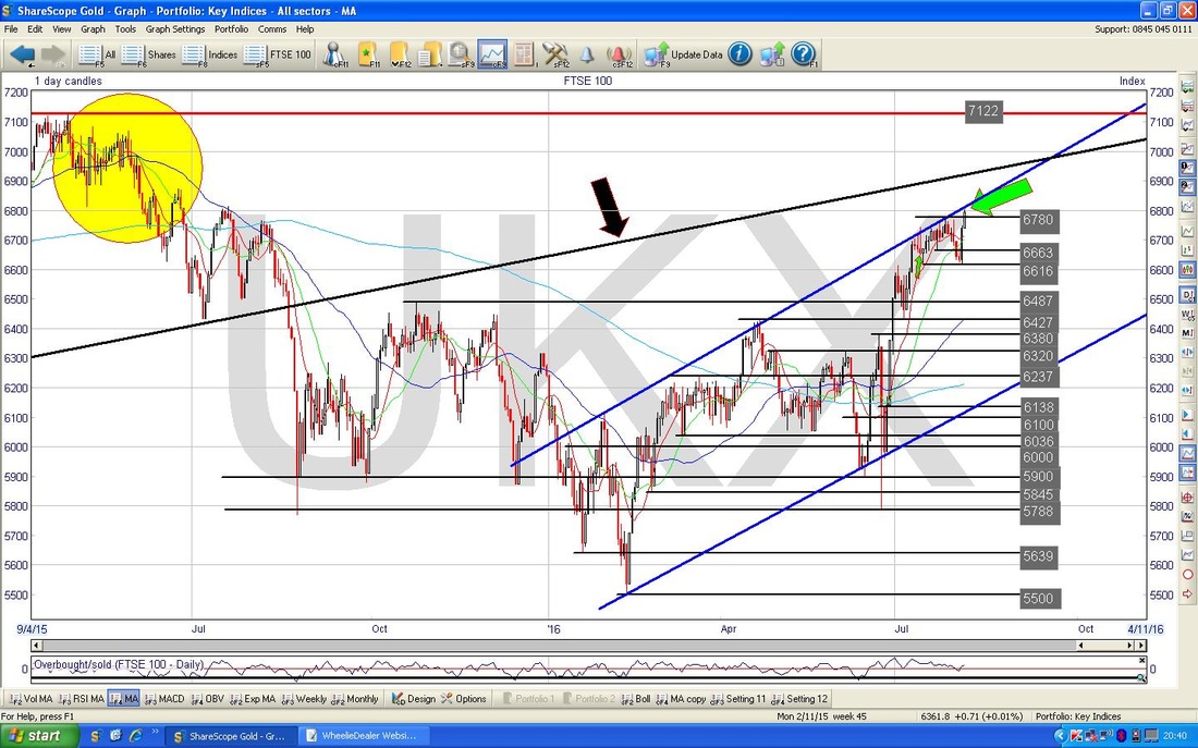
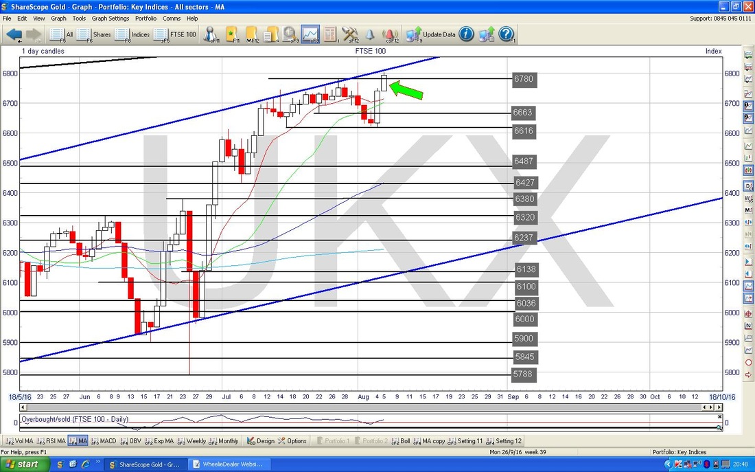
I have zoomed right in close on the next Chart just to show how the Price broke-out over 6780 on Friday and touched 6800 and then fell back a slight bit - obviously 6800 is the key area it needs to get over now, then we come up to 6900 right through to the 7122 All Time High which will be tough to get through I suspect.
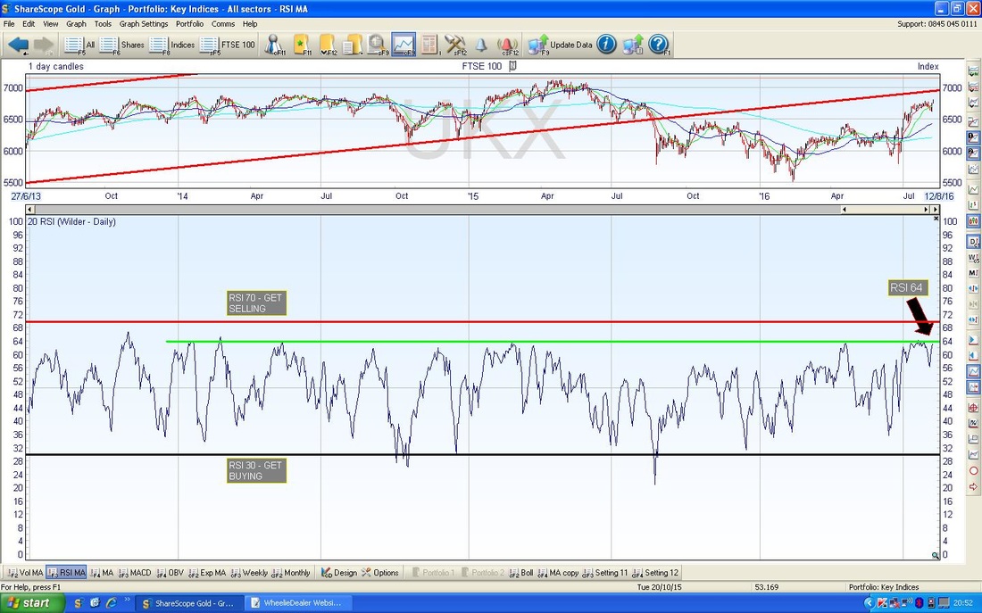
In the bottom window on the screenshot below we have the Relative Strength Index (RSI) for the FTSE100. We are now reading RSI 64 which my Black Arrow is pointing to and note we are back up at the now infamous Green Horizontal Line which has capped gains for the FTSE100 going back for over 2 years now.
The bottom window below has the Overbought/Oversold Oscillator for the FTSE100 - my Red Arrow points to where we are now and we can obviously go a lot higher before getting too extended. However, this thing moves fast so it could even get up to the peaks in 1 day quite easily.
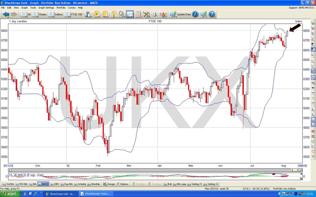
The Screen below shows the Bollinger Bands (the Blue Wiggly Lines) around the Price Line for the FTSE100. My Black Arrow is pointing to where the Price on Friday moved outside of the Upper Bollinger Band - this tends to be an unstable condition and it is very likely that the Price falls soon to come back inside the Bands.
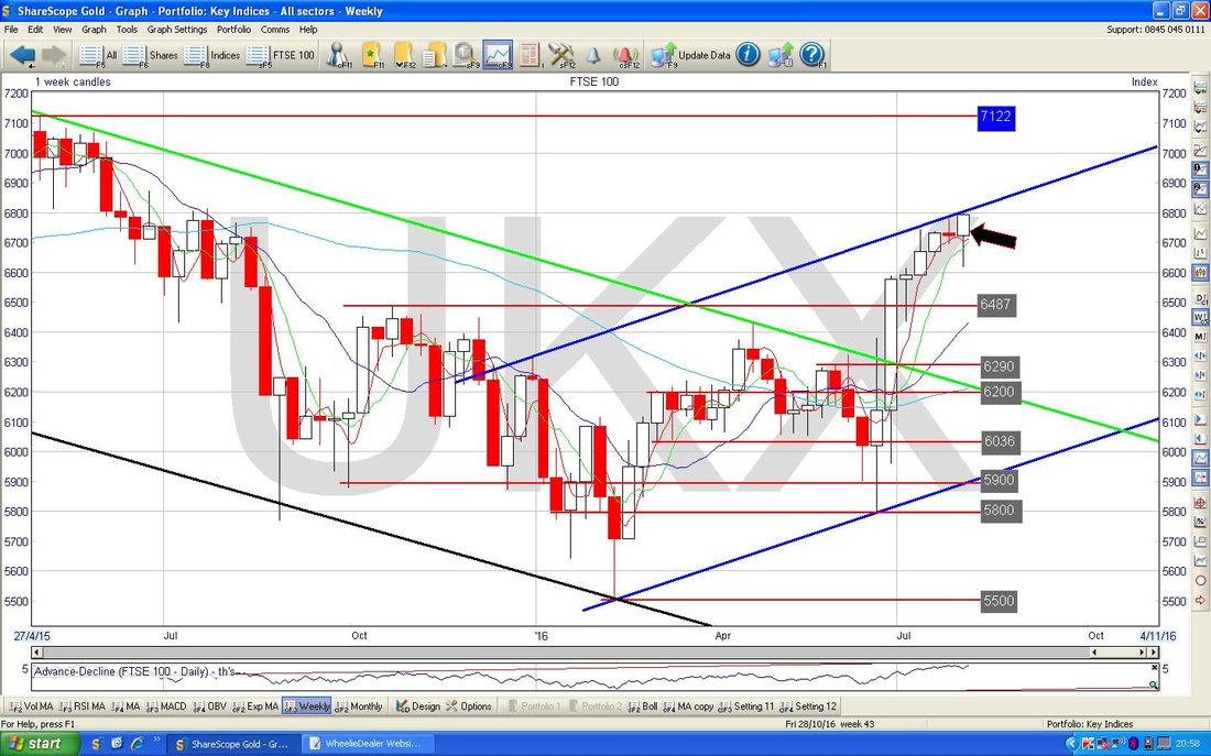
My Chart below has the Weekly Candles for the FTSE100. The Black Arrow is pointing to a Hammer Candle which was produced last week - it is certainly not a Textbook example but in this context of a strong run up (7 weeks of rallying) it might be marking a Top.
DAX (Germany)
The Chart below has the Daily Candles on the DAX going back about a year and a half. This builds on a Chart I probably showed last week - the key things here are the Blue Line (marked with the Blue Arrow) and the Black Line (marked with the Black Arrow) which form a Triangle out of which the Price will pop at some stage - if it pops out of the Blue Line then it should go higher and if it pops down out of the Black Line, then it will probably keep going lower. My Green Arrow points to where we are now - I think we need to see the Price over 10460 to be pretty sure that it has broken out to the Upside. 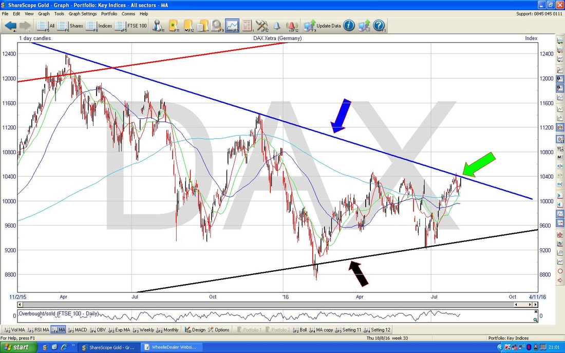
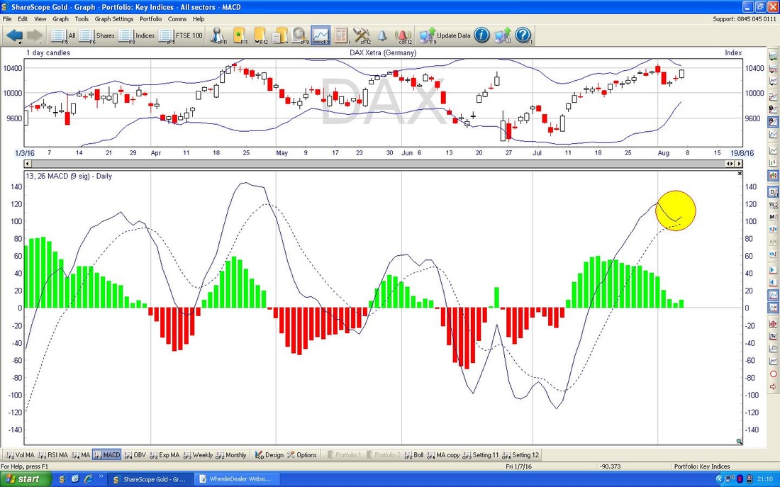
I know I often mention that a MACD (Moving Average Convergence Divergence) can ‘skim-off’ and this is a bullish sign. If you look at the Chart below and the Yellow Circle - this shows exactly what I mean. This is on the DAX Daily by the way and rather than the Signal Lines doing a Bearish MACD Cross, the upper Line has ‘skimmed-off’ the lower Line.
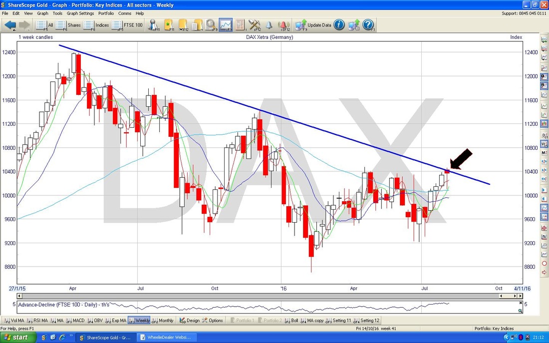
Below we have the Weekly Candles for the DAX - my Black Arrow is pointing to a Hammer that was formed last week - after the recent run up, this could be a Bearish development (this could be a Reversal Signal) and it would coincide with the Blue Resistance Line anyway.
S&P500
The Screen below has the S&P500 (arguably the most important US Index) Daily Candles going back a few months. The key thing here is that the Price broke-out over the previous All Time High of 2178 from a few days before - and a big Up Candle is always a bullish thing. 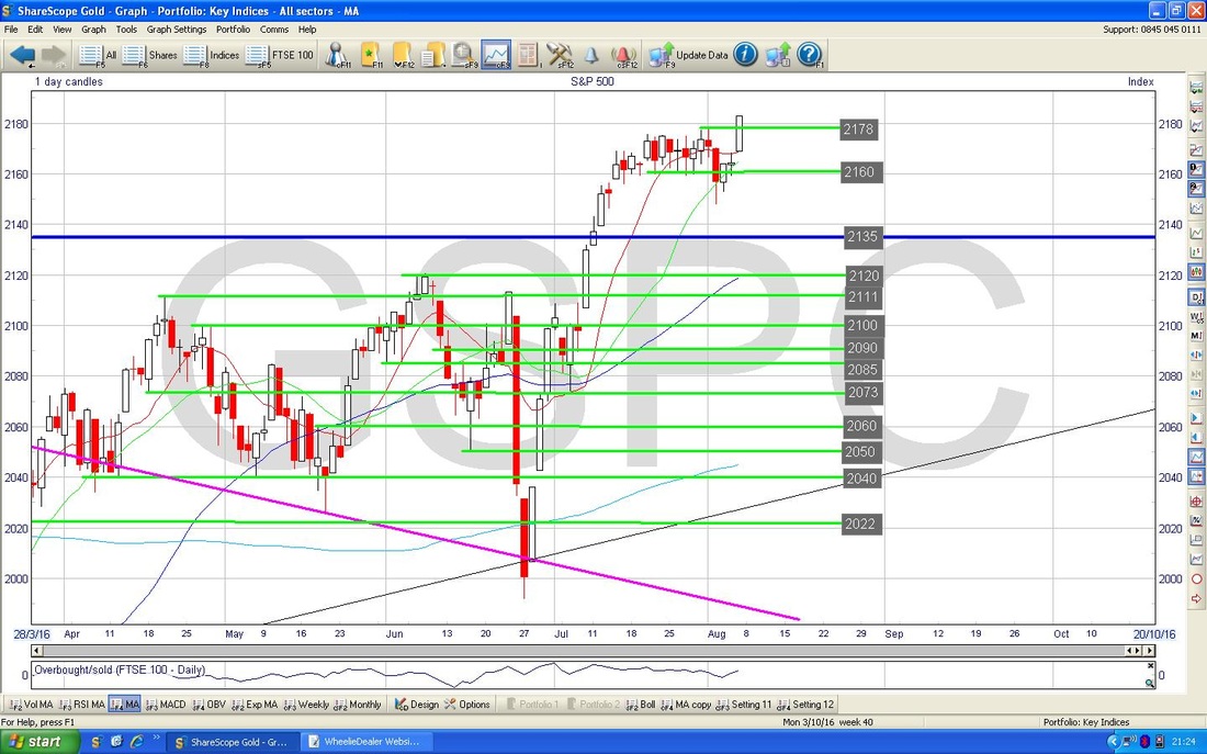
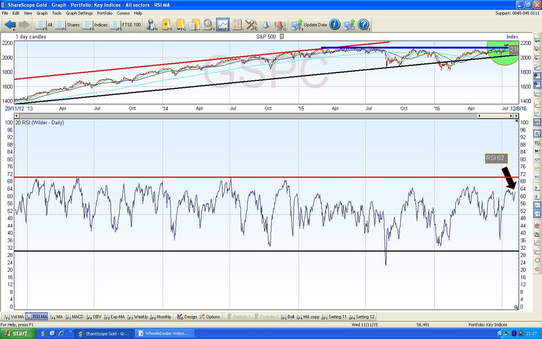
In the bottom window of the Screen below we have the RSI for the S&P500 Daily - with a current reading around RSI 62 it is quite high but can go a lot higher before becoming strongly Overbought.
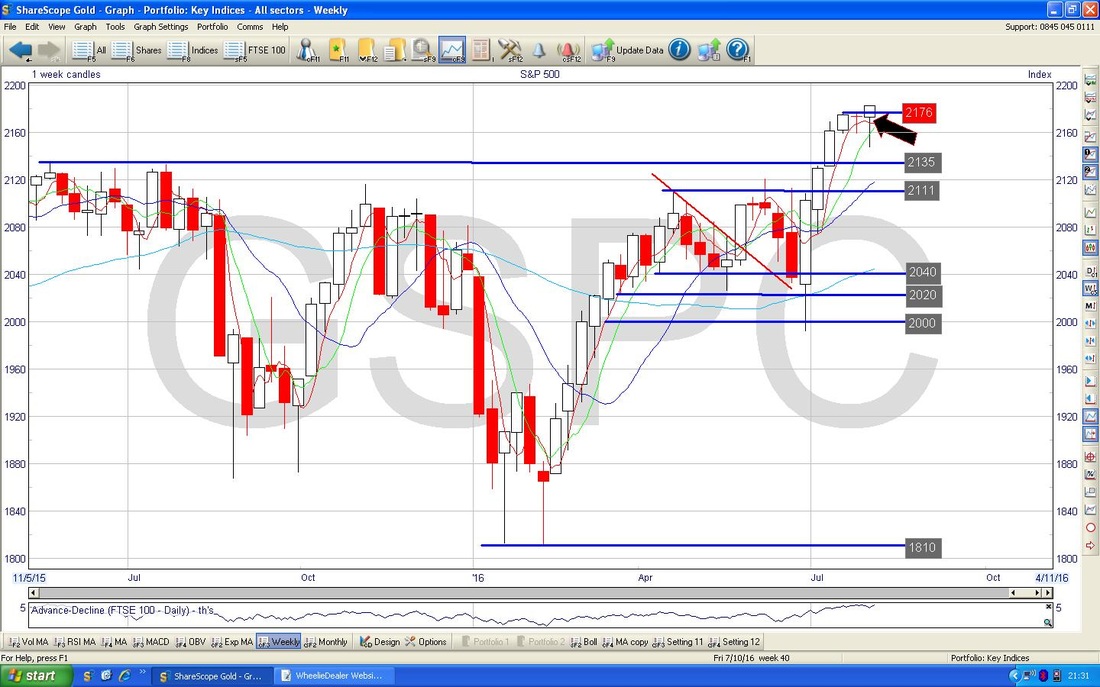
The screen below has the Weekly Candles for the S&P500 - my Black Arrow is pointing to the Hammer Candle that was bashed out last week - this might be a Reversal Signal after the strong moves up lately.
Nasdaq 100
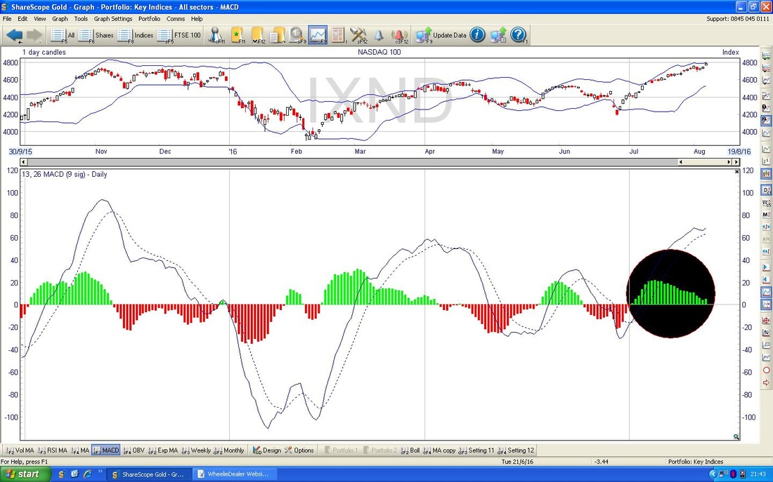
This is a US tech Index - don’t confuse with the Nasdaq Composite which has loads more companies in it. I have a Short Position on this Index so it is of particular interest to me. The Chart below has the Daily Candles going back about 9 months or so. The Key thing here is that my Green Circle is encompassing the White Up Candle that was produced on Friday 5th August 2016 and it ‘gapped up’ and broke out to a new All Time High - this is very bullish behaviour and obviously has me quite concerned with my Short Position !! 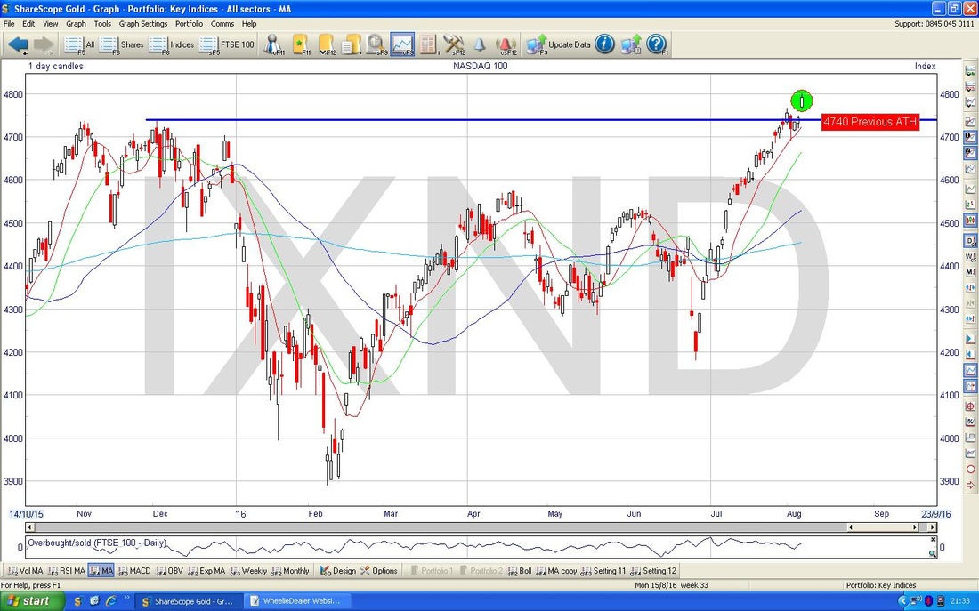
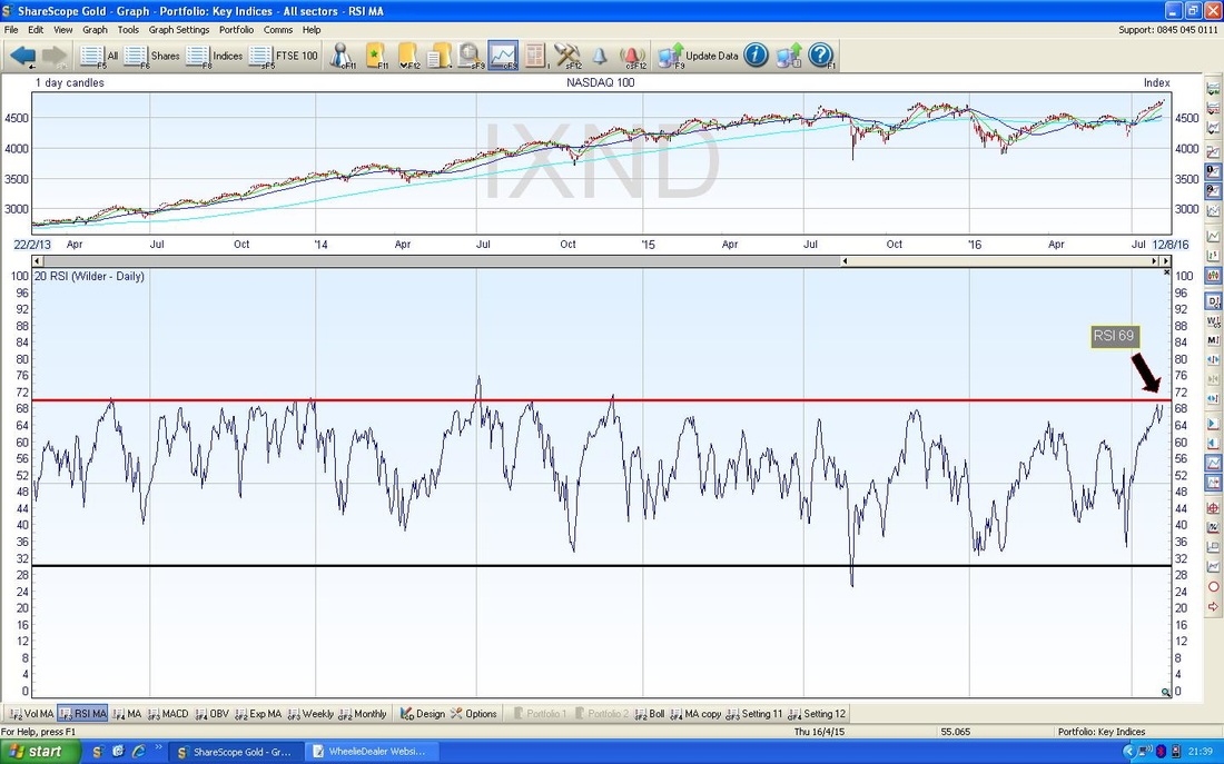
The screen below in the bottom window has the RSI for the Nasdaq 100 Dailies - with a reading of RSI 69 this is very high and the upside from here is probably limited. It is very likely that the Price will need to drop back a bit before it can run higher.
In the screen below we have the Bollinger Bands around the Daily Candles for the Nasdaq 100 - my Yellow Circle is highlighting the Candle from Friday where the Price is right up at the Top Bollinger Band - it can go up from here, but it is more likely to pullback soon.
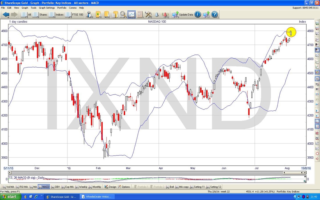
In the bottom window below we have the MACD for the Nasdaq 100 Daily Candles - my Black Circle highlights the Green MACD ‘Hump’ which is rolling over towards the Red Negative scenario - however, it is very possible that it will ‘skim-off’ and avoid a Bearish MACD Cross - you know all about this now cos I explained it earlier !!
Brent Crude Oil
The Chart below goes back about 6 months with the Daily Candles. The Price still looks very weak and note how it moved up off the 200 Day Moving Average which is below and just over the $42 Level. In the short term there is a lot of Resistance up around $46 to be got over. 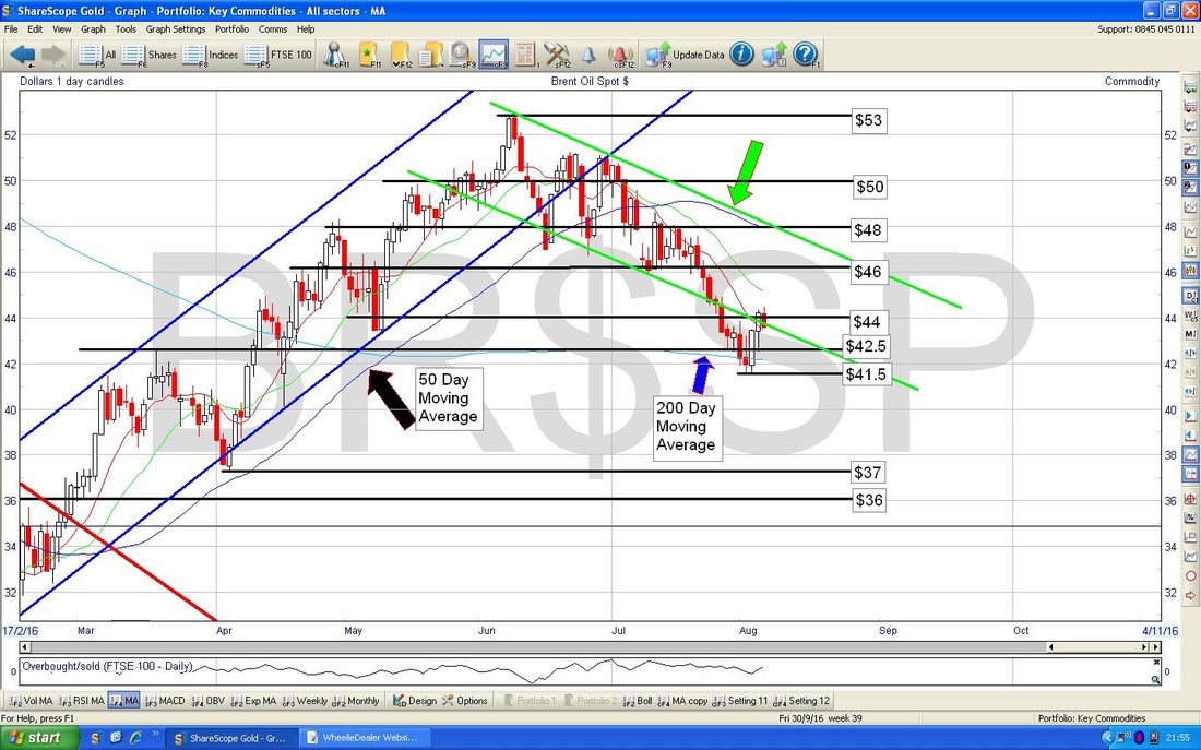
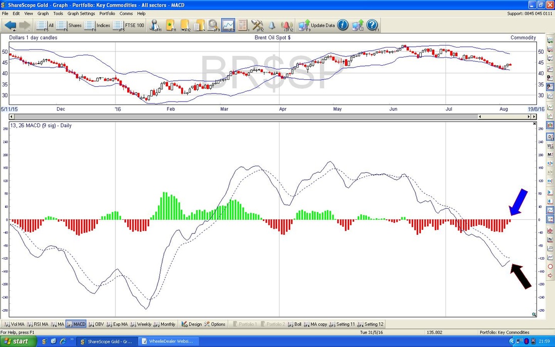
The screen below in the bottom window has the MACD for the Brent Oil Daily - my Blue Arrow and Black Arrow are pointing to where we are about to get a Bullish MACD Cross - it might not happen, but looks very likely.
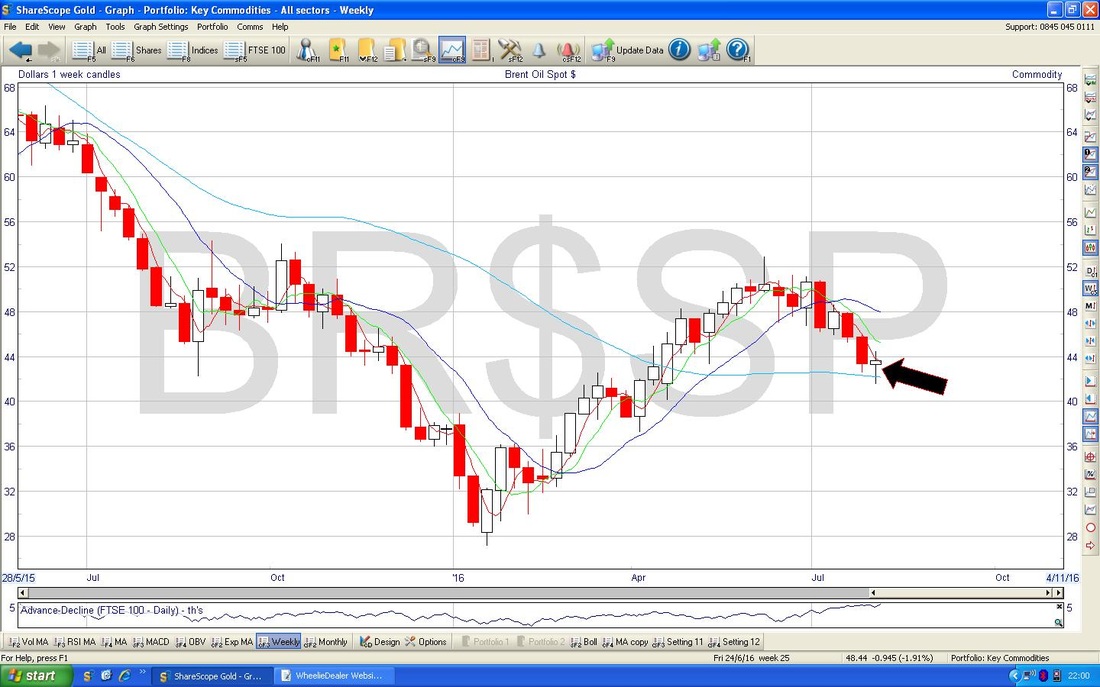
The screen below has the Weekly Candles for Brent Oil - my Black Arrow is pointing to a very nice Hammer Candle sort of thing which most likely will mark a Reversal which means the Price will most likely move up after the recent weakness. How high it can go is unclear though - as I mentioned above, $46 will be a difficult Resistance Level.
Gold
My Screen below has the Daily Candles for Gold Spot going back for most of 2016. My Black Arrow points to a big down Candle that we got on Friday and it looks bearish in the Short Term. There is a lot of Support below particularly around $1310. Obviously we still need to get up over $1375 for things to get really Bullish. That’s it for this week, I hope everyone does well, Cheers, WD. 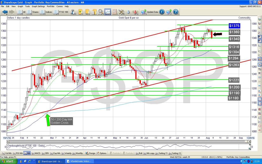
2 Comments
catflap
8/8/2016 11:49:02 am
Cheers mate. Well, I never heard of the MACD ‘skim-off’. Good tip. Good luck for the week too.
WheelieDealer
8/8/2016 09:40:05 pm
Hi catflap - you should now be an Expert in the MACD Skim-off LOL !! I'm sure there must be some clever technical term for it but that was the best I could come up with - and hopefully it is quite descriptive !! Leave a Reply. |
'Educational' WheelieBlogsWelcome to my Educational Blog Page - I have another 'Stocks & Markets' Blog Page which you can access via a Button on the top of the Homepage. Archives
May 2024
Categories
All
Please see the Full Range of Book Ideas in Wheelie's Bookshop.
|
