

|
educational blogs |
|
So far it is fair to say that September has not been horrific but last week was quite difficult and my Portfolio was down about 1% - I am sure it could have been worse and the bid for Quantum Pharma QP. from Clinigen CLIN clearly helped. I managed to lower my Spreadbet Exposure a little bit more by TopChopping GLEN and HSBA but ideally I would like to reduce this a bit more and build my Cash up.
It was notable how the US Markets are still up at their Highs and I will cover this in a bit - but the big story really was the strength of Sterling after Mark Carney talked it up nicely by hinting at a Rate Rise - whether we will actually get one or not is yet to be seen but simply by opening his mouth the Bank of England Governor has achieved a fair bit of Monetary tightening without actually having to do anything. A Strong Pound against the Dollar should help lower the Cost of Imports and reduce the impact of Inflation which has been blamed on causing a Slowdown in recent Months for the UK Economy.
Pound vs. Dollar
I wanted to start with this jobbie because it was the most dramatic of moves last week. Before we get into the nitty-gritty, I am just shoving in this extremely Long Term Chart which goes back to 1970 - clearly the Pound has been weakening against the Dollar all that time. 
On the Chart below (as usual, all Charts are from the Yellow Jersey wearing ShareScope software that I use everyday as my ‘Workbench’), I have zoomed in to the last 3 years or so and the key thing here is that Red Downtrend Line which is pointed at with my Red Arrow. Where my Yellow Circle is, the Price touched that Red Line on Friday and if the Pound is going to make more strides upwards against the Dollar, it will need to Breakout over this Line (it might not manage it immediately but I suspect it is coming - especially if Theresa May’s speech in Florence this coming Friday is seen as the UK being more ‘Soft’ in the approach to Brexit).
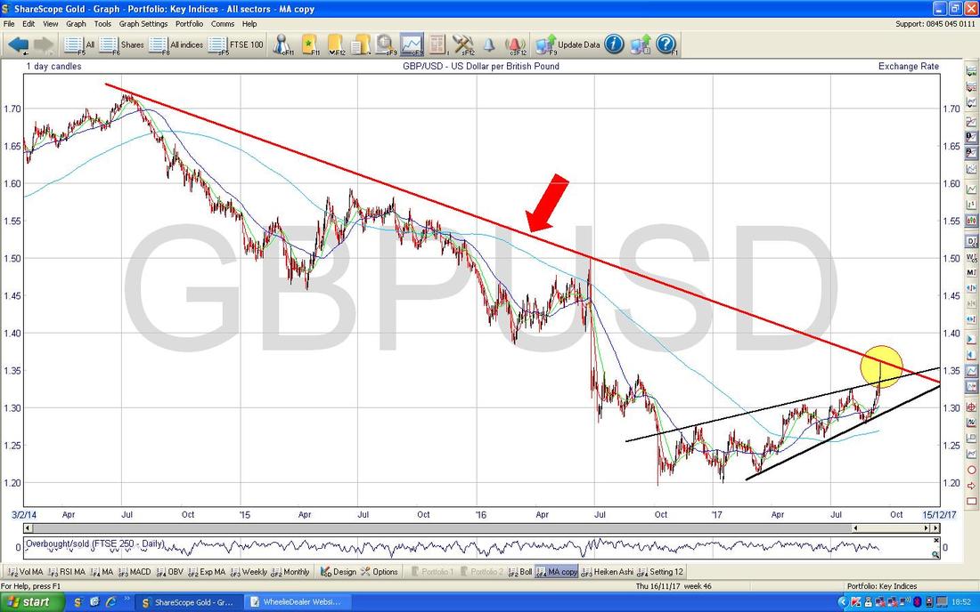
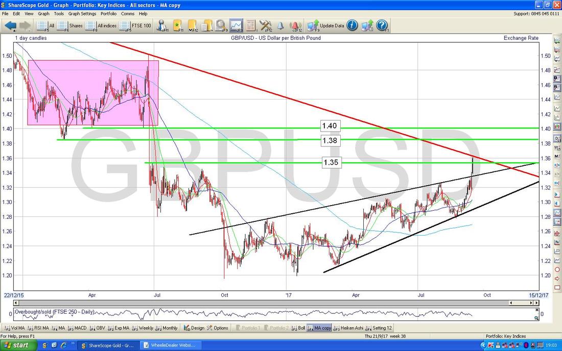
On the Screen below I have zoomed in a bit more and the key thing here is about the Resistance Levels that the Pound now faces if it tries to keep rising. First off note how on Friday we broke-out over the 1.35 Level which was a pretty bullish development and now there is Resistance just up above at 1.38 and 1.40 and then where my Big Pink Box is there is a large Zone of Resistance between about 1.40 to 1.50.
In the Bottom Window on the Screen below we have the RSI (Relative Strength Index) for Pound vs. Dollar and on a Reading of RSI 73 now it looks quite extended. If you look to the left and see previous Readings, it is usually the case that a move up runs out of puff at about RSI 76. On the strength of this evidence, it seems likely that the push up in recent Days might falter quite soon and result in a Pullback (the FTSE100 might like this) although I suspect the Uptrend in the larger picture will dominate.
As always, if you are struggling to see this Chart you can click on it and it should sort of become larger in your Browser thing. 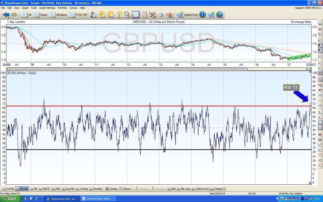
The Chart below has the Daily Candles for £/$ and where my Green Circle is capturing the White Up Candle from Friday, note the Price is now above and outside the Upper Blue Bollinger Band (these are the wavy lines above and below the Price Line). Such moves outside the Bands tend to be unstable and it usually means that the Price will either go Sideways for a bit or drop back so that the Price gets back within the Bands.
This is yet more evidence that the Pound is likely to ease back very soon - so this could help the FTSE100 and the tough going of last week for us Share Shifters might be a bit easier now. 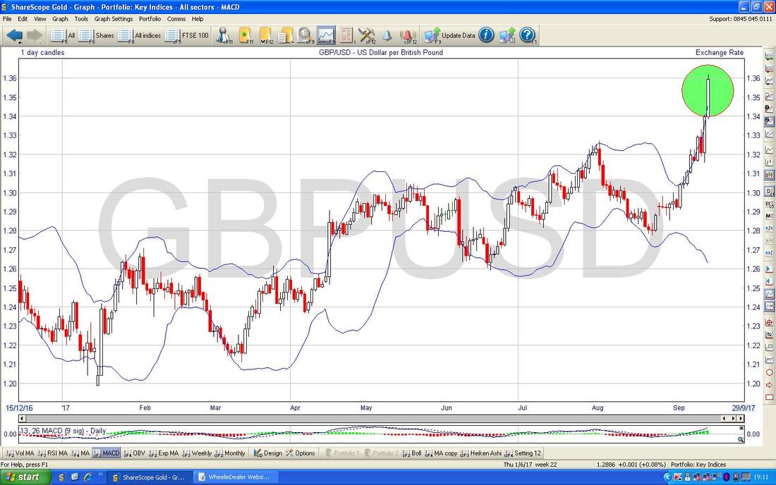
Crossrider CROS
This is a Stock I do not know particularly well - it seems to do some stuff in Apps and Cybersecurity which are both clearly very hot Tech Themes. A couple of things I do know is that Simon Thompson covers CROS in Investors Chronicle and they have a huge Cash Pile which if they use wisely for some decent Acquisitions this could keep driving the Share Price higher. I don’t hold CROS. CROS Listed back in about September 2014 and its History in terms of Price is a falling Downtrend ‘Wedge’ as per my Black Lines (Black Arrows) and then in about Late July 2016 we got a Breakout of that Wedge and the Price has since been in a nice Uptrend which my Red Line is marking. Where my Yellow Circle is there was a Bullish ‘Golden Cross’ between the 50 Day and 200 Day Moving Average (the Darker Blue and Lighter Blue wiggly lines - see the ‘Graph Legend’ in the middle of the Screen at the top). As it should do, this Golden Cross predicted the moves up and note how the 200 Day Moving Average (the Lighter Blue Wiggler) is rising - that’s always good. Note at the top of the Screen there are loads of little ‘b’s in Black Boxes - these are Director Buys and it is worth looking into these as they could be signalling some confidence by the Directors. 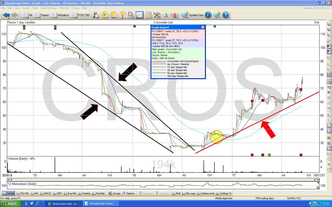
Next PLC NXT
NXT has been dogged by poor Results in recent Months from early 2016 but Last Week they put out a much more positive Update suggesting that they are turning the corner. My view is that on Recovery Plays this is the time to buy them - when the Risk is much lower than it is when you are trying to ‘Pick a Bottom’ which can just keep falling lower on you. I see from the Numbers that the Forward Dividend Yield here is expected to be 3.1% but NXT have a history of extra Special Payments (and Share Buybacks) so this could be a very good Yield play for Punters who are looking for Income. It is on a Forward P/E of 12.6 and if they are truly recovering, it is very possible that Analysts are understating the Earnings in coming Years and there might be some Upgrades. I don’t hold NXT. The Chart below is a great one for people who are new to Charting stuff and are looking to learn - there are some superb elements on this Chart which I will run through. First off note the Long Term Uptrend which is marked by my Black Line (Black Arrow) - this ran for Years but things went a bit off the Rails at the back end of 2015 and my Blue Lines (Blue Arrow) are marking the First Stage of a Downmove which was fairly sharp and then the severity of the Slope eased a bit and the next leg of the Downmove was where my Red Lines are marking a Downtrend Channel (Red Arrows). Then in August this year the Price jumped (gapped) higher and Broke-out of the Downtrend Channel where my Green Box is. Then last week we got the next Gap up after the Trading Update and this is marked by my Yellow Circle. Note like with CROS there are a lot of little ‘b’s in their Black Boxes at the top of the Screen - so there has been quite a bit of Director Buying which might be worth looking into. I’m probably wasting valuable words and hastening the onset of Repetitive Strain Injury and Arthritis in my Fingers by typing this but for the Readers who haven’t realised, NXT is a clothing retailer……. 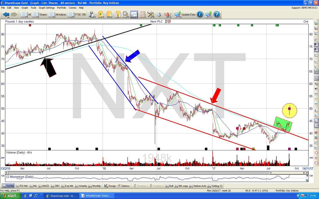
I could have made this point on the previous Chart but there was a lot going on there so I have decided to do another Chart which is ‘cleaner’ and makes my point better.
On the Chart below, my Yellow Circle is trying to show how the 50 Day Moving Average (see the ‘Graph Legend’) is moving up towards the 200 Day Moving Average and if they cross, we get a Bullish ‘Golden Cross’ which would be a very good sign of more Gains to come in the months ahead. My Green Circle is capturing a ‘Shooting Star’ kind of Doji where the Price shot up early in the Day but by the Close on Friday, the Price had dropped back and this suggests we might see a bit of weakness early next week. 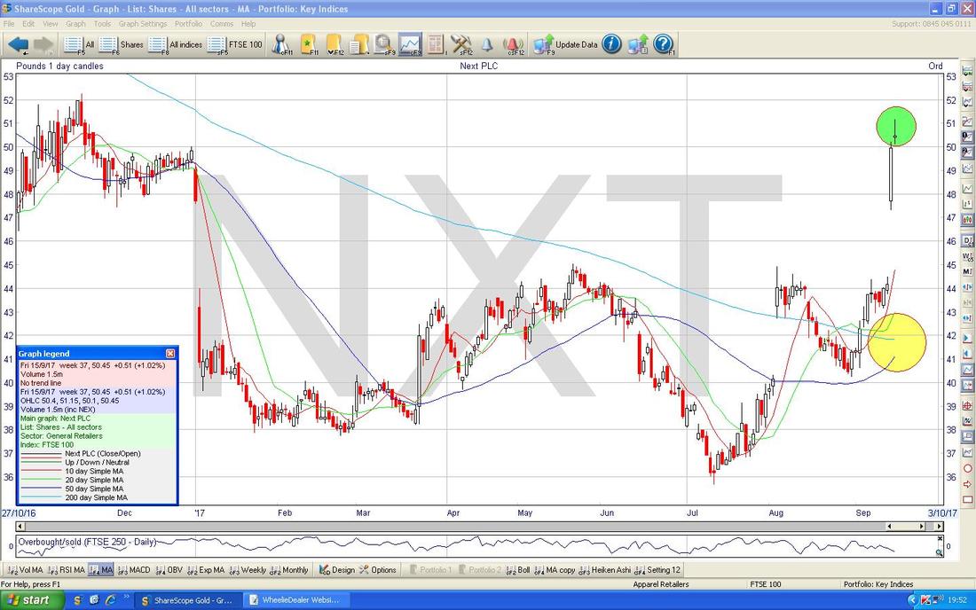
CRH Plc CRH
This is more a Charting Lesson really that I wanted to throw in - although Holders of CRH might do well to take note as this looks like a Chart that is in trouble to me. I don’t hold. I struggle with the Drawing Tools on ShareScope but what I am trying to show on the Chart below with my Green Lines is how it looks like there is a ‘Rolling Top’ kind of Pattern on CRH - if I had the skills, I would have tried to draw a Curve around here but I am sure you can see my point. Also where my Black Arrow is there is a 50/200 Day Moving Average ‘Death Cross’ - this confirms the ‘Rolling Top’ concept of falls to come. 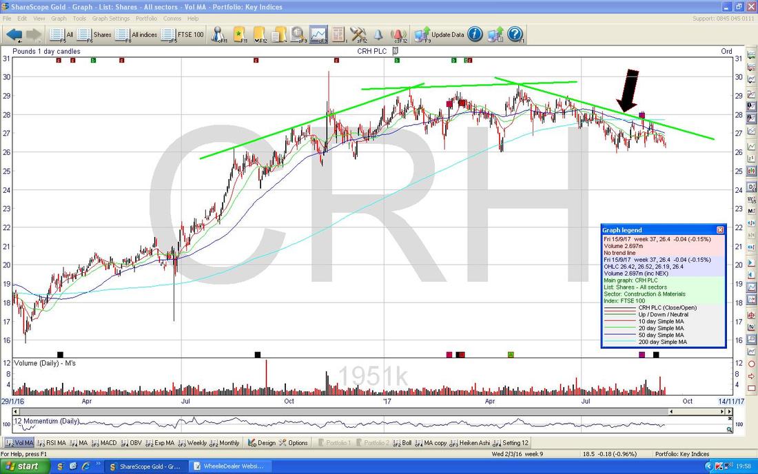
FTSE100
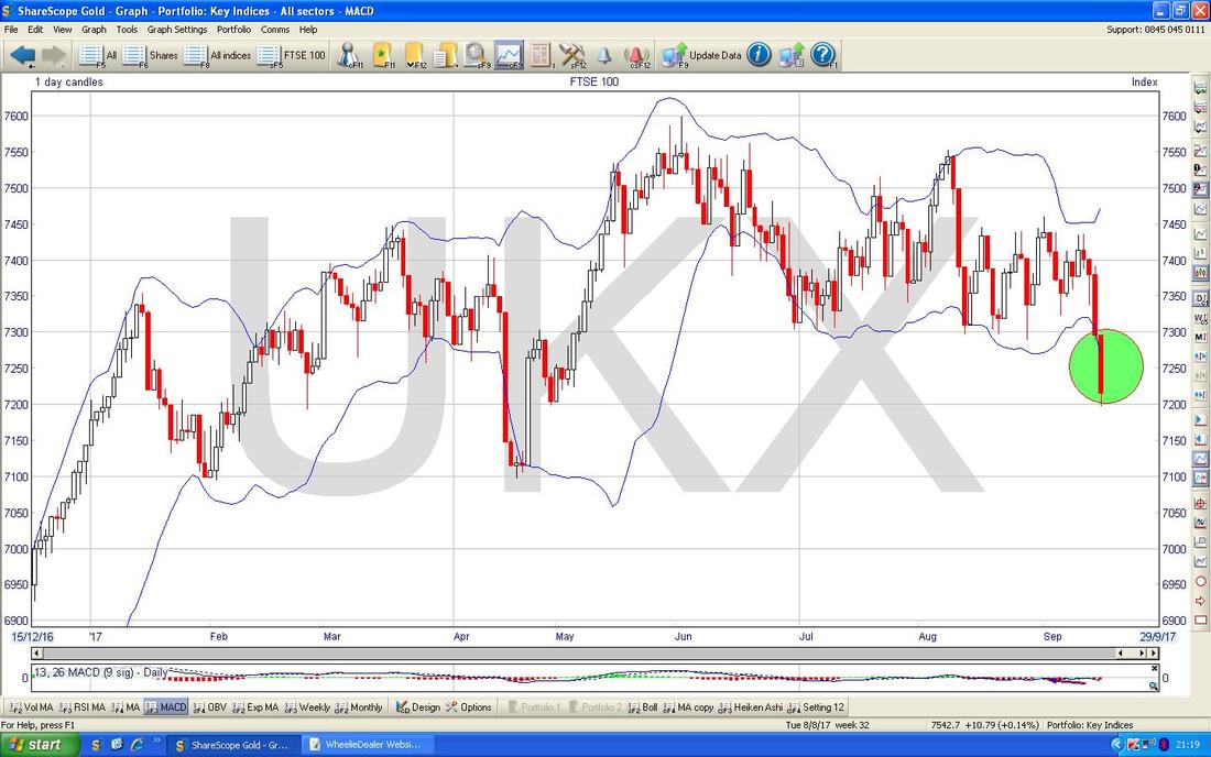
Having looked at the Quid already, it seems sensible to now move onto the Indexes and cover the FTSE100 first. The Chart below really is a picture of a pretty weak looking Chart - the failure of Support at 7300 after so many tests from above can only be seen as a bad development. The thing to focus on here are the Support Levels below which run from 7100 down to 6700 and the Support at 7100 looks particularly strong. The other thing worth considering is that even if the FTSE100 can find its sea-legs again, there is a problem of a mountain of Resistance up above now that will make it quite hard work to be able to get back up to the All Time Highs again at 7600. Note also that the Red Down Candle from Friday which is captured in my Yellow Circle has gone below the 200 Day Moving Average Line which I have pointed at with my Black Arrow - this is another sign of weakness. However, in the short term note that quite often we have a ‘Monday reverses Friday’ effect going on and it is notable that on Friday the FTSE100 managed to Close slightly up off its Low Point. My Blue Arrow is pointing at the 50 Day Moving Average - it looks like this is moving down towards the 200 Day Moving Average and this runs the risk of creating a Bearish ‘Death Cross’ - this might mean further falls ahead if it happens. 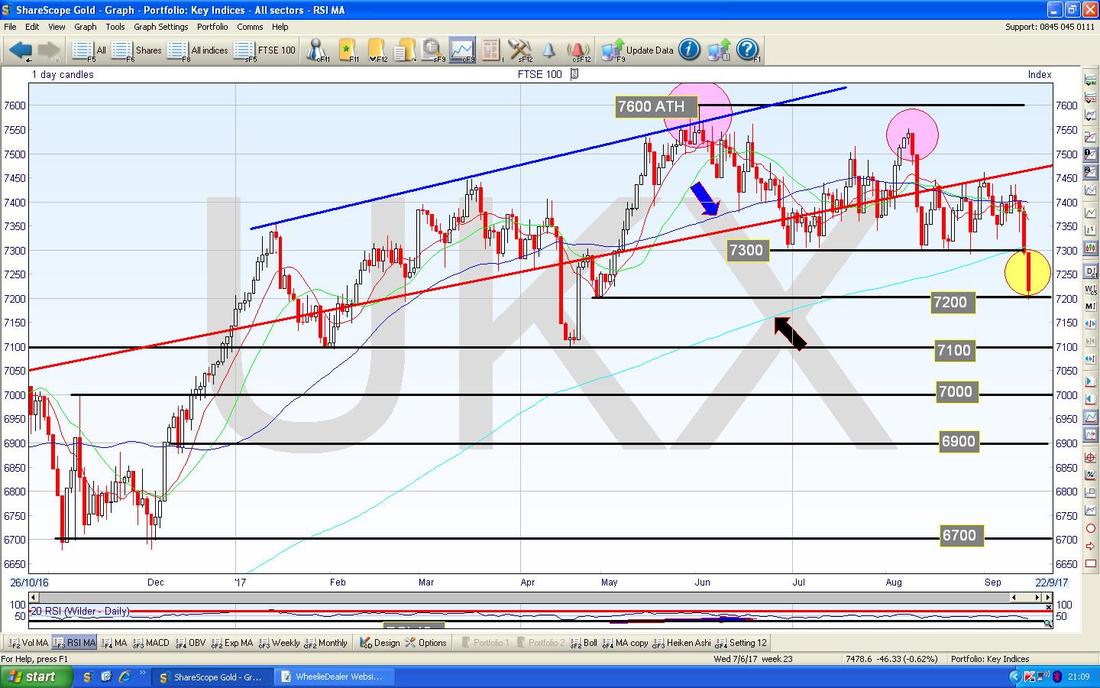
In the bottom window on the picture below we have the RSI for the FTSE100 Daily - on a Reading of RSI 38 this is not all that low and if you look to the left it is clear that it has regularly gone lower - this suggests more falls in the FTSE100 could lie ahead. With us being in September (historically the Worst Month of the Year) I would not be at all surprised to see the FTSE100 drop more. As of tonight I will not be Shorting the FTSE100 but I will be looking closely at the Charts on Monday Night etc. and it is possible that I will put a Small Short on.
The Chart below has the FTSE100 Daily Price Candles with the Blue Squiggly Bollinger Bands above and below. My Green Circle is attempting to demonstrate how the Price is now below the Bottom Bollinger Band and therefore ‘outside’ which suggests we need to bounce a bit or go sideways to unwind this unstable state. Of course it could still drop more but the odds favour a bit of a recovery in the very short term.
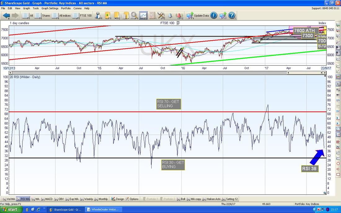
As a general principle on a Daily basis it seems to be that if the Pound rises then the FTSE100 falls and vice versa. However, there is a paradox here that although that seems to hold true for individual moves, particularly when the Pound does a large move, it seems that over a longer timeframe this relationship does not hold at all.
The Chart below should demonstrate what I mean. If you look back at the £/$ Charts which I covered earlier in this Blog (and regular Readers will know I have been saying that the Pound is recovering for Months and Months), you should know that the Pound has been in a nice Uptrend since the Brexit Vote collapse - so the logic should follow that the FTSE100 will have been in a Downtrend Channel over this same period. However, if you look at the Chart below of the FTSE100, my Yellow Skinny Rectangle sort of roughly marks where the Brexit Vote was and then look at the Pink Box which shows that totally opposite to what would make sense, the FTSE100 has actually been in a Uptrend over this timeframe - I find that intriguing. 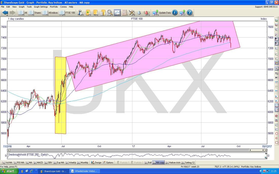
FTSE250
I won’t dwell on this one but the key thing to get your head around is that the FTSE250 is really moving in a similar way to the FTSE100. The Chart below is a bit messy but my little Yellow Box is catching a Red Down Candle from Friday and note how it broke down below Support where my Black Line is (Black Arrow). This is very similar to the FTSE100 and look how the 50 and 200 Day Moving Average Lines are converging. The FTSE SmallCap and FTSE AIM AllShare also look weak in a similar way - it certainly seems like September is very much behaving as it often does even if the falls are not all that dramatic (yet). 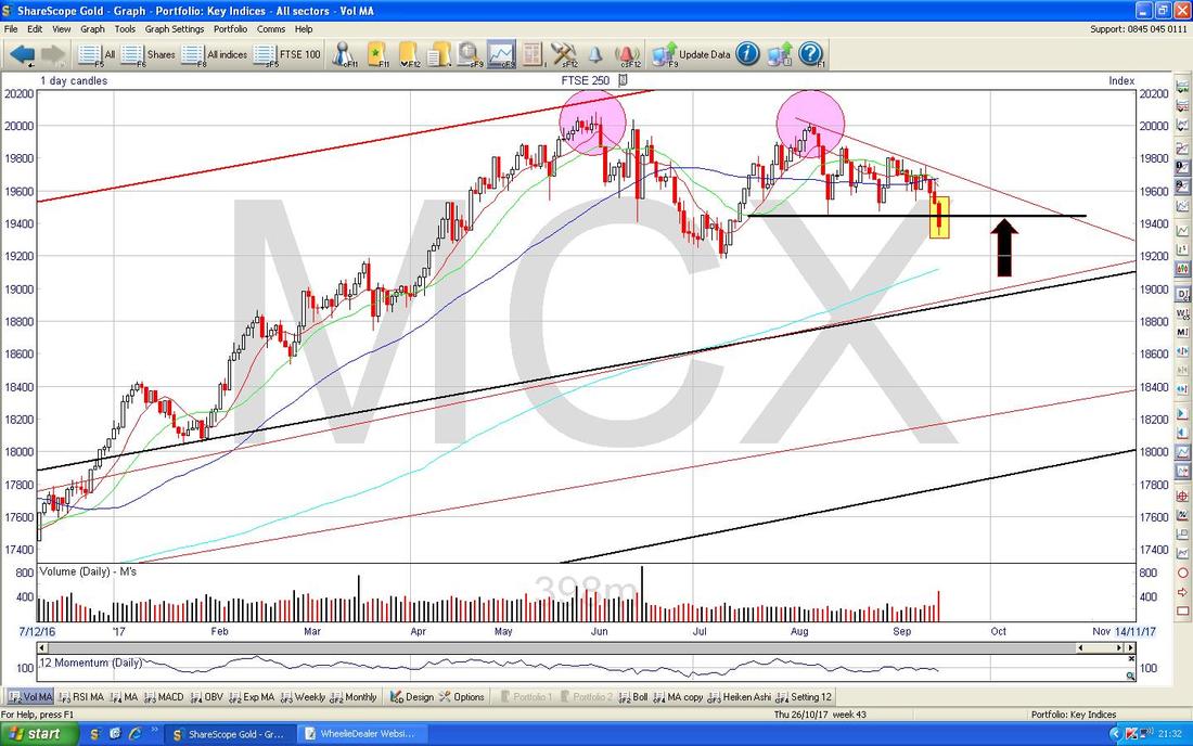
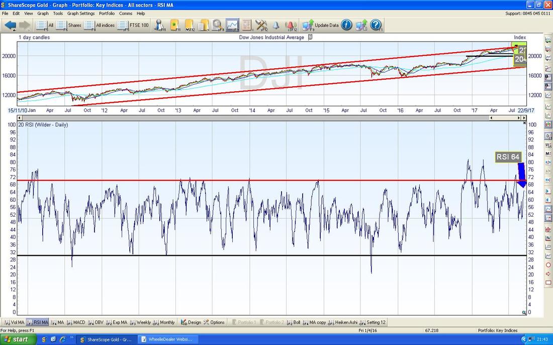
Dow Jones Industrials Index - the DOW
It is quite unusual for the UK and US Markets to disconnect so much but that is exactly what is happening at the moment. The Chart below shows the Daily Candles for the DOW going back just a short time period but the amazing thing is that on Friday it broke-out of the All Time High at 22179 and my Green Circle is highlighting a Hammer (this is a beauty, for Marvel Comics fans this looks just likes Thor’s Hammer !!) from Friday and it is possible that this marks a Short Term Top although the Breakout of the ATH is a bullish phenomenon. 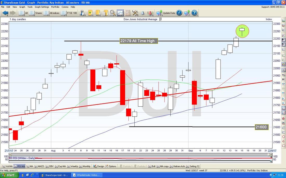
The bottom window on the Screen below has the RSI for the DOW Daily. On a reading of RSI 64 this can go a lot higher.
S&P500
I won’t spend any significant time on this as it is quite similar to the DOW and making new All Time Highs - however, the Screen below from ShareScope (sharp and switched on Readers will perhaps twig that this is the ‘Details’ Screen that I often show for individual Stocks to get the Numbers for Earnings Forecasts and Divvys and stuff - for the Indexes they are obviously blank) is a great way for me to show that the S&P500 is now at 2500 - that is a psychological ‘round number’ which might be tough to make progress from. 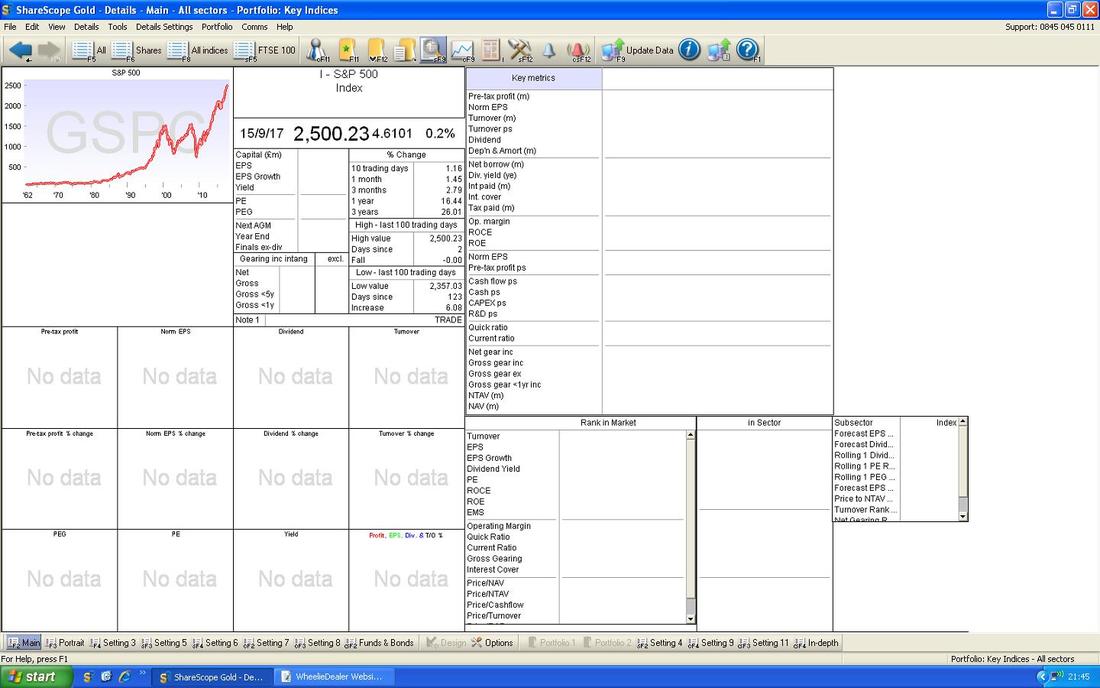
Nasdaq Composite
On the whole the Nasdaq Comp is quite similar to the DOW and the S&P500 but the Chart below shows the Heiken Ashi Candles and my Green Box is catching where the White Up Candles of recent Days have now narrowed and produced the kind of HA Candles which suggest it might turn down and produce Red Down Candles soon. 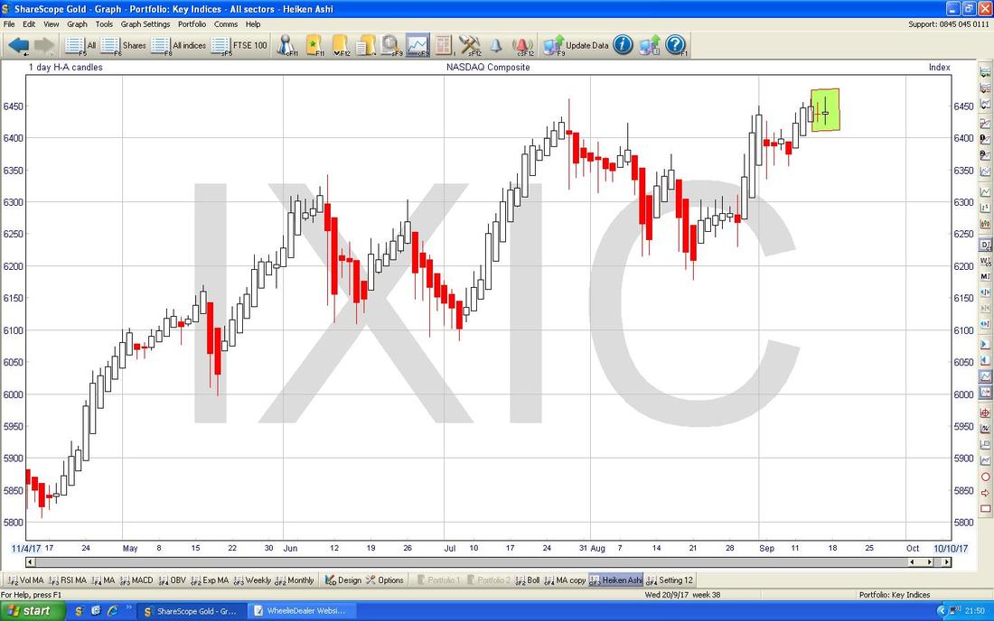
Brent Crude Oil (Spot)
On the Chart below you should be able to see that the Price for Brent Spot broke nicely over $54 and is now hitting Resistance at $56. Overall it still looks bullish but note there is much Resistance above particularly at $58.375. Strength here could help the FTSE100 because BP. and RDSB are such big weightings in the Index (the Stocks in the FTSE100 are not evenly weighted and the Top 10 have something like 40% of the Weight - I might have just made up that figure but it is to provide some context). Note also that the 50 Day Moving Average is still heading towards the 200 Day Moving Average and a Bullish Golden Cross looks pretty likely now. 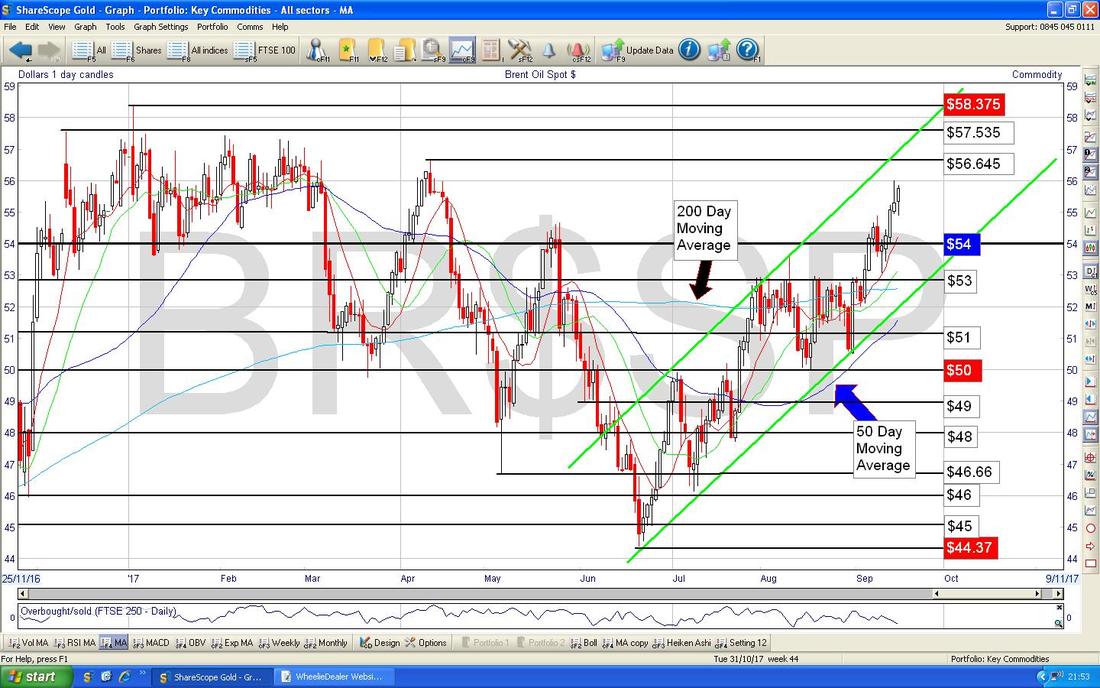
The Chart below has the RSI for Brent Crude Spot Daily in the bottom window - on a Reading of RSI 64 it can go higher - but perhaps not all that much.

Gold (Spot)
On the Chart below you should be able to see how the Doji Candle in my Green Box marked a Peak in the Short Term and the Price has dropped back since. It looks weak still in the Short Term but note the Black Line with the Black Arrow which marks an Uptrend which has been in place for some time now - if this breaks to the downside, it would not be so great. Ok, that’s it for this week, Good Luck in the coming week. Cheers, WD. 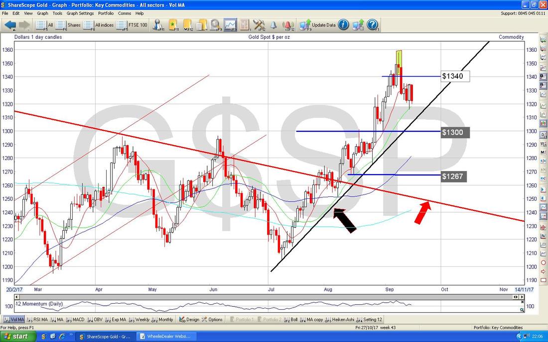
2 Comments
Mr catflap
18/9/2017 12:21:31 pm
Interesting reading as usual. BTW Ive been meaning to ask for a while, is there any reason you use the 20 day period for the RSI. The default on most charts is usually 14 ( thats what i thought anyway ).
WheelieDealer
18/9/2017 09:12:16 pm
Hi Mr catflap, Leave a Reply. |
'Educational' WheelieBlogsWelcome to my Educational Blog Page - I have another 'Stocks & Markets' Blog Page which you can access via a Button on the top of the Homepage. Archives
May 2024
Categories
All
Please see the Full Range of Book Ideas in Wheelie's Bookshop.
|
