|
I have been meaning to get on with writing this Blog for quite some time now but for various reasons (mostly good old-fashioned procrastination and farting about), I have been putting it off but at last I have to bite the bullet and get it done.
My interest here is to look at the Charting (Technical Analysis) factors which surrounded the eventual Bottom when the Markets floored out in 2009 before that monster Rally of 11 years or whatever it was. Of course we will struggle to find Signals and Indicators that point to precisely where the Bottom is (I may use the term ‘Proper Bottom’ for this because I am sure we will have lots of little Bottoms on the way to actually reaching the final one), but I think many Readers will be surprised by what I dig up here and the implication is that we can use some pretty basic Technical Indicators and Tools to help us ascertain the Proper Bottom.
In terms of the current situation and the Coronavirus horrors, it is possible that we have had the Proper Bottom already and that it happened about a week ago but that seems a bit unlikely to me and we will see from 2008/9 that the first Bottom that appeared was merely the start of several which triggered mini-Rallies until we eventually hit the Proper Bottom.
As I have said, my focus here is on the Technical aspects of identifying a Proper Bottom but there are many Fundamental factors to keep an eye open for (or two if you have them). Without doubt I will be Tweeting about these and writing about them in my Weekend Markets Blogs and we are likely to discuss them on the TPI Podcasts, but just to whet your whistle (you can whistle all you like now from the comfort of your own home – assuming your Spouse and Nippers don’t have access to sharp knives), here are some of the Fundamental things to look out for:
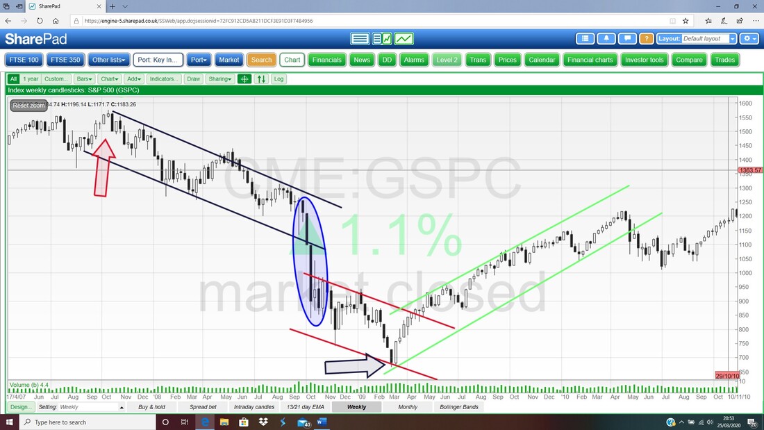
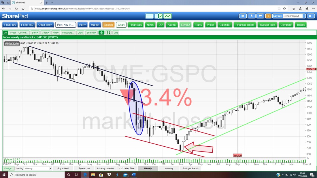
Anyway, there are probably more Fundamental things to look out for but those are the key ones I can think up quickly and this Blog is not about them anyway. Let’s start looking at the Charts from 2008/9 and which Technical Factors pointed the way to a Proper Bottom. I will look at the S&P500 because that is the most significant Index really (“When the US sneezes, the Rest of the World catches a cold”) and I will start with ‘Big Picture’ stuff and then drill down. As always, the images are Screengrabs from the excellent SharePad software that I use. Trend Channels I chose to use the Weekly Candlesticks for this Chart but it might be easier for you to identify the Trend Channels if you use the Daily Candles. Anyway, it is good enough for my purposes and we start on the Left-Hand Side where my Red Arrow is which was the Peak before everything went very smelly in the Credit Crunch. We then had a sort of First Phase which is marked by my Parallel Black Lines and this was a Downtrend Channel which ran for about a year. I don’t remember how this played out when I was actually experiencing it but a year is a long time for such a Downtrend and the fall was roughly 30% or so which means it must have been a painful and unpleasant First Phase. The next bit was probably where things got really scary (I certainly remember being very terrified back in 2008 and it really seemed like the whole Financial System was going to collapse) and that is where my Blue Ellipse is and you can see that in a matter of just 3 weeks the S&P500 shed roughly another 20% or so of the total Drop from the earlier Peak where my Red Arrow is. No doubt those 3 weeks were very nasty but it wasn’t even over then; next we had a more shallow Downtrend Channel which lasted for about 6 months and is where my Red Parallel Lines are. This was the Third and Final Phase if you like. Even in this final bit the S&P500 shed another 10% or a bit more of the Total Drop from the Peak. The S&P500 then Bottomed out with a Proper Bottom (note there were loads of other little Bottoms on the way down and lots of Rallies which would have sucked Investors in only for them to lose yet more money) where my Black Arrow is in March 2009 and then the longest Bull Market in history started and sadly it ended just a few weeks ago as we all know only too well !!
So what we learn from this Chart with simple Trend Channel Lines is that a Fall from a Peak can consist of several individual Phases and they have differing steepness with the fast drops being extremely nasty.
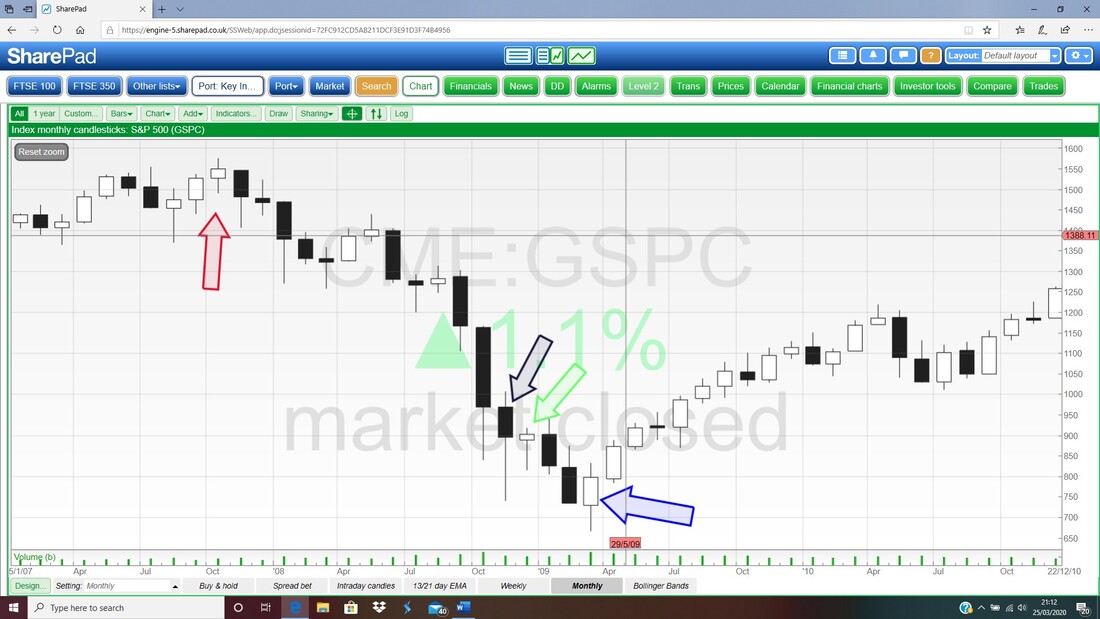
As I write this at the tail end of March 2020, we have had a very sharp and vicious drop in the Markets and my hunch would be that we are not through the problems yet and the evidence from 2008 suggests we could get more Phases of falls yet. At the time of writing I am Short on the S&P500 and the FTSE100 – see my ‘Trades’ page. Monthly Candlesticks When I was thinking about the idea of writing this Blog one of the things I quickly looked at on the Charts from 2008/9 was the Monthly Candlesticks as there is an excellent Signal here of the Proper Bottom although I must point out some pitfalls which could easily have misled before we finally Properly Bottomed out. As before, my Red Arrow points to the Candlestick where the S&P500 Peaked in 2008 and then we had a string of Down Candles with the odd Doji Candle through the following Months. Finally in early 2009 where my Blue Arrow is, we had a bit of a Hammer Candle and note how after this we had a string of Up Candles and if you missed the exact Proper Bottom, you would perhaps have noticed this string of Up Candles and, when combined with other Indicators we will come on to in a bit, I suspect there was some good information here that it was time to get buying. However, before we all get over-excited about how brilliant the Monthly Candlesticks are at flagging the Proper Bottom for us, we must appreciate that there were a couple of False Signals in the form of Hammer Candles where my Blue Arrow and Green Arrow are. BUT, if you know your Candlestick Rules, then you would know that after you saw the Hammer where my Black Arrow is, you would know that the next Candle must Open higher than the Hammer – but it didn’t so you should not have acted on this Hammer where my Black Arrow is by Buying (in ‘Wheelie’s Bookshop’ you should be able to find a copy of ‘Candlestick Charting for Dummies’ and I recommend this as an excellent book for helping you understand and apply Technical Analysis concepts with Candles). In a similar way, the Hammer where the Green Arrow is looks very good but the next Candle did not Open higher so it is a False Signal and with patience you should have noticed this. However, even if you did start buying too early using these Hammers as Signals, you would not have been far off the Proper Bottom and you would have waited out a lot of the Drop from the Peak where my Red Arrow is. The classic error so many people make is to get buying far too early on a big Drop and costing themselves a lot of money. It is ‘Catching a Falling Knife’ and really not a good idea. Be patient, and let the Markets come to you. Note also that there are a few Hammers and Dojis on the way down but these are not much off the Peak and the simple fact that the Banks were about to explode should have told you that these were likely to be False Signals. In a similar way, in the current situation with the Virus, if we get some Buy Signals from the Monthly Candles we need to see them in the wider context of Fundamental News and weigh up how likely they are to be False. If you are patent and wait for the next Candle to Open, then this will give you valuable information as well. Remember, the trick is not to spot the Exact Proper Bottom and to buy there (it would be lovely it you could !!) but to start Buying once we are extremely confident that the Proper Bottom is in and we are Buying at the start of a big Up Move and when we are taking on a lot less Risk.
Fibonacci Retracement Levels
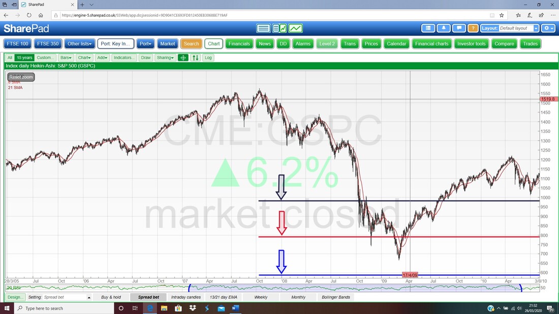
I do not tend to use these much but they can give an idea of where a Price will Bottom out properly (I have used them on Individual Stocks occasionally in the past but generally I don’t use them much). For simplicity here I have just used the Peak Level in October 2007 and then applied the Fibonacci Retracement Levels of 38%, 50%, and 66% to this Peak which was roughly at 1580. The theory behind Fibonacci Retracements is that when a Price falls back after a Move upwards, then the Price will drop back (Retrace) 38%, 50%, or 66%. In practice the Price doesn’t always exactly hit these Levels and in the case of the S&P500 in the way I have applied it this is certainly not the case. However, it does give a guide as to where a Price is likely to fall to.
If we look at where the Proper Bottom was in March 2009, it was quite a bit below the 50% Retracement Level used in the way I have used it. If you jump in your Time Machine (you can choose a Tardis or a DeLorean) and go back to early 2008 when the Markets were falling and you would have been starting to worry about how low it would go; by drawing these Fibonacci Retracement Lines you would have had some sort of clue as to the size of the drop. The obvious Target you would have fixated on would have been the 38% Retracement at 980 where my Black Line is and once that failed and the Price kept falling, you would then have been looking at the 50% Retracement at 790 where my Red Line is. Once the Red Line failed you would be looking at the Blue Line at 537 which is the 66% Retracement – it would have been a big relief that it didn’t go this low !! The point is that these Levels can help you when you are in the thick of it with bullets flying all around and shells bursting over your head, and they give you a sense of where the Proper Bottom might be and this enables you to be on your guard and ready for other Signals which can be better. You might think things like this can be a bit scary but I tend to find that having some sort of idea about how low things can go actually helps my psychology and means I am not caught out emotionally when the Markets do huge falls. If you expect the worst then often you get a pleasant surprise !!
However, I have not necessarily used these Fibonacci Retracements in the correct way and in fact what you should do is to look at the Rally up to the 2007 Peak and from where that Rally actually started. You then use that Starting Point where there was a Proper Bottom as your numerical base and you work out the 38%, 50% and 66% Fibonacci Retracements from the Peak to that Base. I won’t do it because it is not something I am overly interested in myself, but feel free to give it a go anyway. It is highly possible that the Proper Bottom in March 2009 actually lined up very well with one of those Retracements calculated in this way.
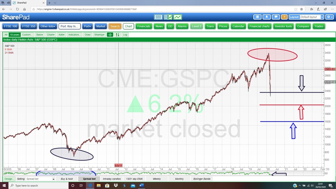
Just to help clarify, if we were looking at Fibonacci Retracements on the current situation in the Markets, instead of using the All Time High of 3393 and with Zero as the Numerical Base, you would use 3393 as the Peak and you would use the Proper Bottom from March 2009 as the Base. This would be at 666. I wasn’t going to show it but I am now in the mood so hang on whilst I run the calculations and knock up the Chart……. Right, on the Chart below of the S&P500 I have done it using the Fibonacci Retracements as I just described and I have calculated them based on the Bull Market which ran from March 2009 at 666 up to the recent Peak at 3393. The Fib Retracements are as follows:
Weekly Candlesticks
I decided to include this one because even though it does not give a definitive Buy Signal which would point out clearly to us that we were at the Proper Bottom, it does give a Buy Signal that tells us we are likely to see a rise in at least the short term. When seeing such a Signal, the thing to do would be to look at other Signals such as the ones I have talked about already, and to see if they help to confirm what is going on. For example, when we saw this Buy Signal on the Weekly back in 2009, we then needed to wait for a possible Buy Signal from the Monthly, which came in due course. OK, we would have missed the initial bounce but it is often better to get in later with lower Risk and more certainty than to take a gamble which might go very nasty on you. It is also psychologically better for you. My Chart below has the Weekly Candles for the S&P500 and it is very like the Chart I showed much earlier with the Downtrend and Uptrend Channels marked on it. Anyway, ignore those, what we are interested in here is where my Big Red Arrow is pointing at the bottom of the Chart and we have a Big White Up Candle (the date on this one showing on SharePad is 13/2/2009 but of course it is a Weekly Candle) which is a ‘Bullish Engulfing’ Candle and ‘engulfs’ the Candle from the week before when the S&P500 Bottomed. As I mentioned in the paragraph above, this does not in itself mark the Proper Bottom but it does tell us an up move is likely and we should then be looking at other Signals for confirmation. I will just mention that as the Price moved out of the Downtrend Channel marked by my Parallel Red Lines, that would have been a Buy Signal also.
13/21 Day EMAs
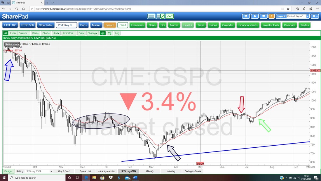
Well, I had to leave the best to last as per the tune, but without doubt this is my favourite Indicator and woe betide anyone who trades against what this Indicator is signalling. On the Chart below we have the Daily Candlesticks for the S&P500 from around the time of the Credit Scrunch but I am not interested in the Candles here – we need to look at what the Black and Red Wiggly Lines did and how they interacted. The Black Wiggly Line is the 13 Day Exponential Moving Average and the Red Wobbly Line is the 21 Day EMA. I have chosen a time period here which merely fits what I am trying to demonstrate and if you have access yourself to a moderately decent Charting Package then you should be able to look at longer time periods and for different specific chunks of time to see how well the 13/21 Day EMAs have worked in the past. I will start in the top left-hand corner and work along the curve in terms of time. First up we get a ‘Bear Cross’ where my Blue Arrow is – this is when the Black 13 Day EMA Line crosses the Red 21 Day EMA Line from above and drops below it. When this is happening, you want to be Short on the Assets and of course when the opposite is the case, you want to be Long. In this case, the Bear Cross was a beauty because if you had Shorted the S&P500 then you would have stayed in the Trade for quite a while and made a lot of money. Next up we have the Black Ellipse and this is very interesting because there are plenty of lessons for us here. The happy times for the Shorters who had followed the Signal from my Blue Arrow now come to an end and people who were on the ball would have Closed their Shorts and held a Champagne Party. Then the Lines sort of wiggle about and do small Bull Crosses and Bear Crosses and not much that is a clear Signal until at the end when there was a clear Bear Cross and the Price falls down to the Proper Bottom. Shorters who followed that Signal would have done very well and note how about half way along the 13 and 21 Day EMA Lines appear to get closer together but they do not Cross over – I see this sort of a thing quite a lot and you need to be closely monitoring the situation but often other Indicators and Signals like the Candlesticks will help you stay in the Trade or Close it if that is the best stance. Oh, I must just add that I use all these Signals on an End of Day (EOD) Close basis. They might work Intraday but I have never tried them. You may think that the Bear Cross at the end of the Ellipse would not have been reliable in real-time Trading. That is a fair comment after the couple of ‘false’ Crosses just before it but if you had combined it with other simple Signals like the fact that a Sideways Move in the Price had ‘broken-down’ through Support, that would have probably been enough to make you go Short. Next we have the Daddy Signal of them all and this is where the 13/21 Day EMA Bull Cross delivers big time and gives a Buy Signal just after what turned out to be the Proper Bottom. Now it is worth noting that even if you had a suspicion from other Indicators that this was the Proper Bottom, you would not know it at the time of the 13/21 Day EMA Bull Cross where my Black Arrow is but that does not matter. The point is to just obey the Signals that the 13/21 Day EMAs give you and this Bull Cross was simply telling you to go Long (if you were quite on the ball, then you might have already seen some of the other Signals we have previously talked about in this blog). That Bull Cross is a beauty and would have kept you in the Long Trade for quite a while and when the Bear Cross which is marked by my Red Arrow is then you would have Closed the Long Trade. However, there would then be a bit of mucking about by the Price and then where my Green Arrow is you get another Bull Cross Buy Signal. If you had gone Long after that, you would have made a stack of Cash. Now you may object that this is no use for a Long-Term Investor and I think that is a fair comment. However, if you had used the other Signals I have already talked about like the Monthly Candlesticks and the Fibonacci Levels and the Newsflow around the time, then you could easily have decided that there had been a massive drop already and that you could start buying some Shares for your Portfolio. You might then have had a wobble where my Red Arrow is but if you had bought for the Long-Term then you would most likely have held onto your Shares and very soon after you get the Bull Cross where my Green Arrow is and you could then have bought more if you had the firepower left. See, what an amazing Signal this is………
OK, that just about covers it. You can look at the FTSE100 and other Indexes and Assets etc. (and individual Stocks) with regards to the Indicators and Signals etc. I have shown and I am sure you would find that a useful exercise. As always with Charting stuff, it is vital to keep it simple and you have probably realised by now that I use the same few basic Indicators over and over again and by doing so I get to be a lot better at using them effectively and learning which ones are more reliable and which ones can give a lot of false signals.
I cannot stress too much how important it is to combine several Signals to get the best outcomes – I love the 13/21 Day EMAs and they are probably the closest thing I have ever seen to resemble ‘The Holy Grail’ (and I don’t mean in the ‘Monty Python’ sense !!) but even that can mislead if you do not understand how to apply it. Anyway, we are clearly in the drop phase at the moment with regards to the Markets and I suspect we will have several difficult months ahead of us. However, you can be very sure I will be Tweeting out what I am seeing on the Charts and I will be doing my Charting Blogs every weekend – so hopefully once we start seeing the Bullish Signals I have highlighted, we should be able to act on them and maximise the Recovery off the Proper Bottom. My Brain is really aching now !! Cheers, WD.
12 Comments
PI_bloke @neverton_29
28/3/2020 09:39:32 am
Excellent! Succinct and clear explanation. Off to look at those EMAs on the FTSE 100 now.
Reply
WheelieDealer
28/3/2020 09:29:04 pm
Hi PI Bloke, thanks for your comments and so pleased you found the Blog simple to understand and with a bit of clarity. As you know I utterly adore those 13/21 Day EMAs and find them extremely useful. It might be worth mucking around with different Time Periods such as 8 days and 13 days or something but the danger is that if you shorten the Period you get earlier Buy or Sell Signals but you will get more 'false' ones. I find for most Assets the 13/21 is a great balance between speed and accuracy.
Reply
Matt
28/3/2020 10:20:59 am
Thanks so much for this, very clear and concise. The charts with annotations really helped too
Reply
WheelieDealer
28/3/2020 09:31:21 pm
Hi Matt, Thanks for your comments. I try hard to make it as simple as possible because I know a lot of Readers are new to Charting techniques and it can be very daunting the way you see it explained sometimes. I am a big believer in keeping it simple and not getting bogged down in too much Technical Analysis stuff - Less is most definitely More !!
Reply
John
2/4/2020 01:55:30 pm
Hi Pete - I've listened to (and enjoyed) the last three TP podcasts and am working through the content on here. It really is excellent so thank you for helping to educate the less experienced and knowledgeable of us.
Reply
WheelieDealer
3/4/2020 10:29:42 pm
Hi John,
Reply
Andy
13/4/2020 10:49:33 pm
Thanks for posting! Food for thought to go and explore this stuff. Thanks :)
Reply
WheelieDealer
18/4/2020 11:40:14 pm
Cheers Andy, I am sure if you keep an eye on the Charts Blogs I put out most weekends then you should see my view on how the story develops. Funnily enough I am typing this on Saturday 18th April 2020 and I have just published my latest 'Stocks & Markets' blog on WD2.
Reply
25/1/2023 05:03:27 pm
Investing online has been a main source of income, that's why knowledge plays a very important role in humanity, you don't need to over work yourself for money.All you need is the right information, and you could build your own wealth from the comfort of your home!Binary trading is dependent on timely signals, assets or controlled strategies which when mastered increases chance of winning up to 90%-100% with trading. It’s possible to earn $10,000 to $20,000 trading weekly-monthly in cryptocurrency(bitcoin) investment,just get in contact with Mr Bernie Doran my broker. I had almost given up on everything and even getting my lost funds back, till i met with him, with his help and guidance now i have my lost funds back to my bank account, gained more profit and I can now trade successfully with his profitable strategies and software!! Reach out to him through Gmail : [email protected] ,Telegram: bernie_fx or WhatsApp +1(424)285-0682 for inquires
Reply
15/5/2024 09:53:36 am
I have read a few of the articles on your website now, and I really like your style of blogging. I added it to my favorites blog site list and will be checking back soon. Please check out my site as well and let me know what you think.
Reply
8/6/2024 10:18:54 am
Continue the great function, We study couple of articles about this web site as well as I believe that the internet weblog is actually actual fascinating and it has obtained groups associated with wonderful info.
Reply
Leave a Reply. |
'Educational' WheelieBlogsWelcome to my Educational Blog Page - I have another 'Stocks & Markets' Blog Page which you can access via a Button on the top of the Homepage. Archives
May 2024
Categories
All
Please see the Full Range of Book Ideas in Wheelie's Bookshop.
|

