|
I was up in Westminster yesterday for the UK Investor Show and had a really enjoyable day meeting up with old friends and with loads of Peeps who are fairly new to Investing and had some really useful discussions. Funnily enough we didn’t seem to discuss individual Stocks so much, although a few came up, and the focus was probably more around Portfolio Management and particular subjects like Spreadbetting and Technical Analysis in particular. It was at the Queen Elizabeth 2 Conference Centre but I have no idea why they named it after a famous Cruise Liner………
Over the last few years since starting the whole WD fiasco I have met up with loads of people who I have met mostly via Twitter and it has massively improved my understanding and knowledge - in fact, at a time when I was feeling like my skills were plateauing to a large extent this ability to meet like-minded and experienced People was like a huge shot in the arm of enthusiasm and interest at a time when I was most definitely feeling a bit jaded with regards to my Investing.
Last Summer we did a small Meet-up of experienced Investors in Windsor and we deliberately kept it to just a small group because we weren’t really sure how it would go. Anyway, it was a huge success (perhaps because the weather was so excellent and the Beer flowed !!) and after some discussions I have decided that this Summer I want to arrange another similar Meet-up in Windsor but this time to throw it totally open to anyone who wants to come. So no matter what stage in your Investing / Trading journey you are at it would be great if you can join us and I am sure you would find such an event really helpful and inspiring - all of the People I expect to be there are just normal people who happen to be quite experienced at playing the Markets and there are few egos or gurus - so as per the whole WD philosophy it will be very much about Real-World Investing.
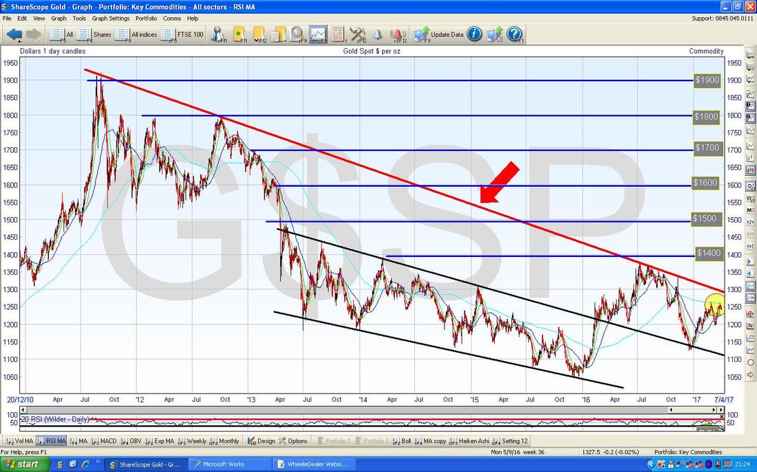
Anyway, that is the current thinking but we need to sort out logistics and stuff. I have a particular Village PUB in mind but we are yet to determine a date for it. I am envisaging the Day starting around Noon ish and pretty much going on as long as people want to be there. There will be no fee to join us or any such nonsense but of course everyone will be perfectly free to buy me a Pint !! I will give more details in coming weeks no doubt once we have figured out more of the important logistical stuff. April Markets After UK Investor and when everyone else had wimped out, Aston Girl (@Reb40) and myself went into some sort of Patisserie type establishment on the way to Trafalgar Square and we were mulling over various aspects of the Markets and AG reminded me of how the April Market is usually a pretty good one. So, with this in mind, I have grabbed my old copy of ‘The UK Stockmarket Almanac’ from last year (this book comes out every year but I am starting to think that the Monthly Data is the most useful bit and that will stay valid for a while so I might just get in the habit of buying a copy every few years), and here is what it says for April. According to my old book, the Average Return for the FTSE100 in April is 1.8% and 71% of Aprils are positive - making it the 2nd best month of the year. Remember this book is one year out of date, but it is interesting that 5 years before my copy, April was the Best Month but December has since overtaken it - so the backdrop is really strong and going Short should only be done with much thought and care I would suggest. It also says the FTSE100 tends to outperform the S&P500 in April and this is the Strongest Month in this sense. A typical April starts with a really strong first day and then the middle 2 weeks are quite flat and then a really strong final week. If we get that again I won’t be complaining !! But as a more sobering thought - April tends to mark the end of the Strong ‘Winter’ 6 months period as Investors perhaps lighten up for the Summer - so don’t expect the same in May. OK, Charts………. Gold (Spot) Bit of a change to the usual order of ceremonies - I am starting with Gold because as you may have noticed I sold most of my Long Spreadbet Position on GPM Golden Prospect last week because I am still concerned about where Gold itself is going. You can read all sorts of highly plausible sounding reasons for Gold to rise or fall but in my view no one has a blo*dy clue and it is all nonsense (Investors Chronicle has a 2 page Sector Analysis bit on Gold this week). What matters is the Chart. Nothing else. So, in that vein, here is the Chart for Gold Spot that really explains in a simple picture why I am having doubts about my Long Gold exposure. This Chart has Gold over about 5 years since the Peak up around $1900 ish and the key thing that concerns me here is the Long Term Downtrend Line which is the Thick Red Line I am pointing at with my Red Arrow. The simple fact is we need Gold to get over this Line before it is really in a Bull Market again - at the moment, where we are in the Yellow Circle, we are still within the Downtrend - and my hunch is that we will not see it breakout and go higher. My main thinking here is that the Global Economy seems to be picking up speed (in fact, Investors Chronicle this week has the usual ‘Next week’s economics…..’ bit on page 12 and this shows expectations of a lot of strong data to come out this week culminating with US Non-Farm Payrolls on Friday) and Downtrend Lines like the one here tend to be quite powerful and it will not be easy for Gold to get over this unless maybe something Shocking and Unexpected occurs - I have no idea what this would be and Gold has not been a great Hedge for Stocks of late anyway. On a wider note, I am really questioning my need for Gold anyway in my Portfolio - simply because I tend to be pretty active with Hedging via Index Shorts so it does seem like a Portfolio Slot wasted to have Gold in there.
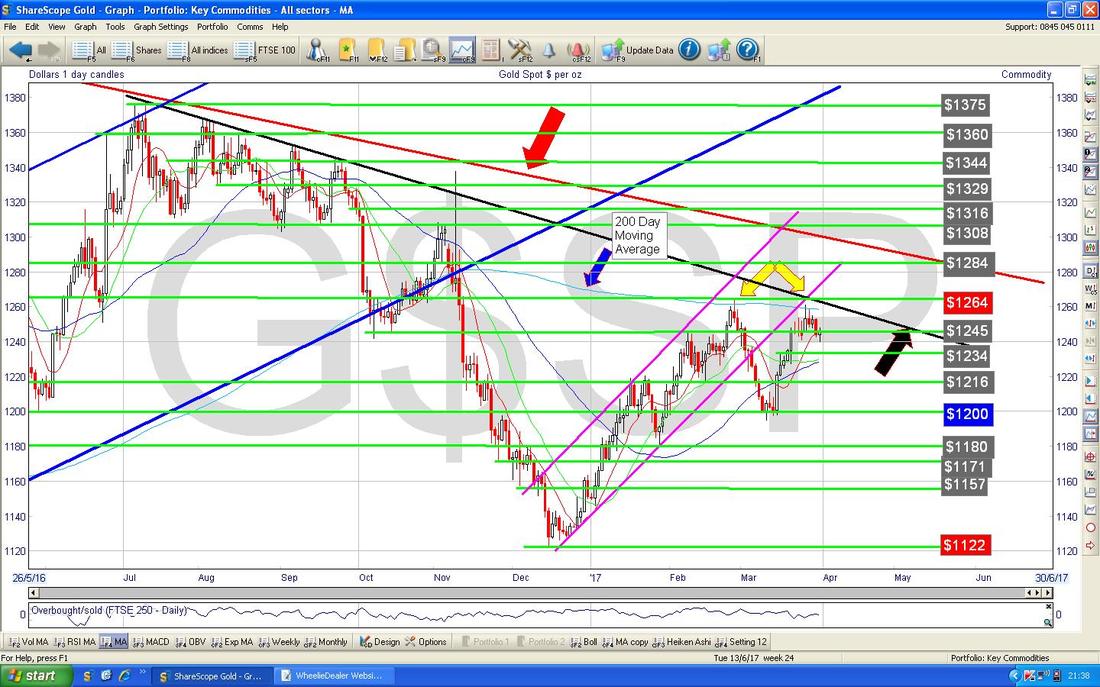
The Gold Chart below is more like the usual one I show. This has the Daily Candles going back nearly a year and the first thing to notice is my Red Line from the previous Chart which is marked with the Red Arrow - note the current Price is some way below this. Next look at my Blue Arrow which is pointing to the Blue Wavy 200 Day Moving Average Line - this is clearly acting as Resistance at the moment and note where my Yellow Arrows are that we have twice hit this Moving Average Line and then dropped back - it certainly looks a bit of a Bearish ‘Double Top’ formation.
Note also my Black Line marked with the Black Arrow - this is another Resistance Line which the Price is struggling at.
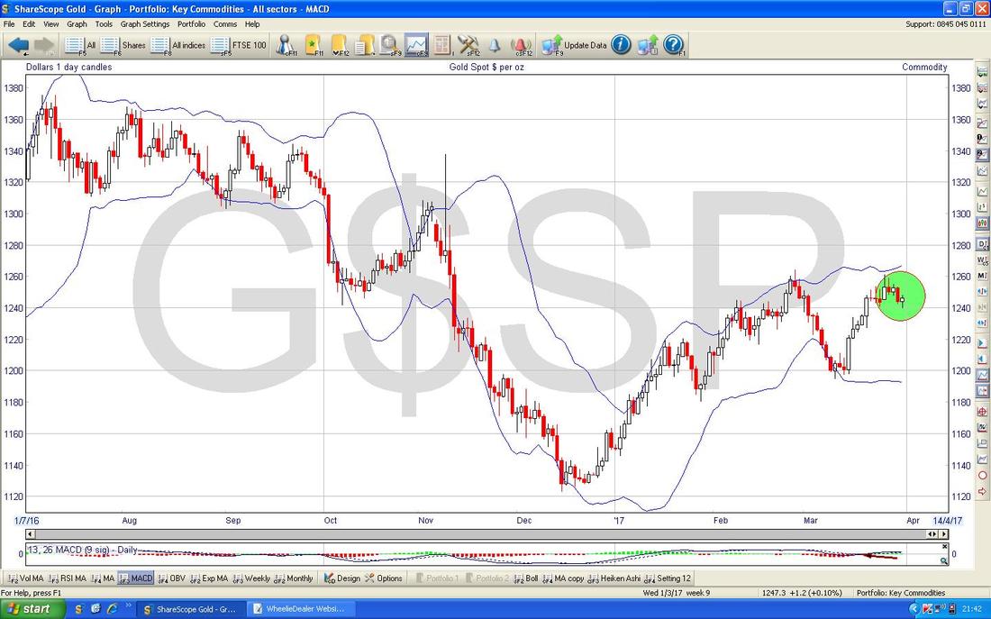
The Chart below has the Gold Price Daily Candlesticks with the Blue Wavy Bollinger Bands above and below. Note where my Green Circle is how the Price has fallen away from the Top Band.
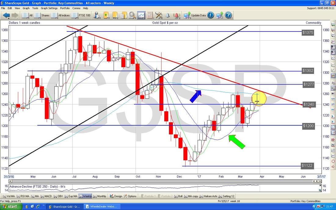
The Chart below has the Weekly Candles for Gold Spot. First off note my Yellow Circle which encapsulates an ‘Inverted Hammer’ Candle - in the context of a bit of a move up before this looks like a Bearish Reversal. My lord this is all depressing but here is something for Gold Bugs to pray for - my Green Arrow is pointing at the Blue Wavy Line 50 Day Moving Average and my Blue Arrow is pointing at the Fainter Blue 200 Day Moving Average what we looked at earlier - the hope is that the 50 Day continues to move up and we get a Bullish ‘Golden Cross’ where the 50 Day crosses over the 200 Day.
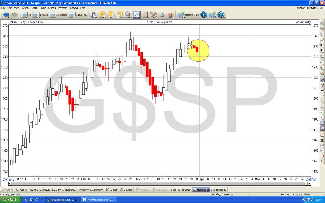
Here are the Heiken Ashi Daily Candles for Gold Spot. This isn’t good either - my Yellow Circle highlights how the Candles have gone Red and are now looking Bearish. Love these things - so clear.
Brent Crude Oil (Spot)
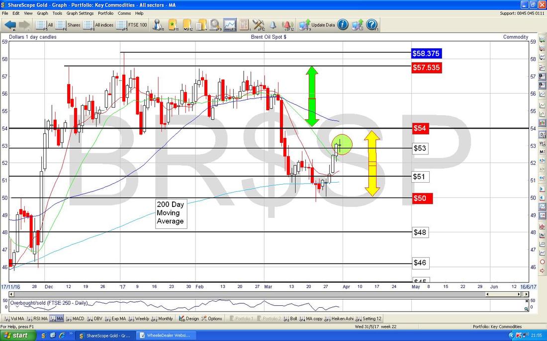
While on Commodities I might as well do Oil next. Not much has changed here since last week - if you look at the chart below of the Daily Candles, we are in the Range that I suggested over recent weeks (marked by the Yellow Arrows) and we will not have a new direction until a breakout either above $54 or below $50. In the short term, my Green Circle is highlighting a ‘Long Tails’ Doji which suggests we might see a Reversal and move down again after the recent push up. This is of course not guaranteed and Prices can often move up a bit more after such a Doji but it is certainly hinting that Bulls are not totally in control here. Again you will see gazillions of Column Inches on why Oil is up or down or whatever but it is all useless and the story is in this Chart. Keep it Simple. Cut the Noise.
FTSE100
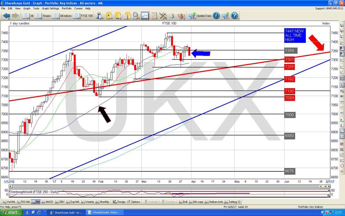
The Chart below has the Daily Candles going back about 4 months. My Blue Arrow is marking a Big Red Down Candle from Friday which was a Reversal Down from the Doji of the day before. This looks bearish in the very Short Term but there is so much Support not far below at the Levels marked with the Red Text Boxes and also at the 50 Day Moving Average around 7270 which I have marked with the Black Arrow. Note the Red Line with the Red Arrow - this is the traditional Long Term Uptrend Channel Bottom Line which I often show on the Blogs - I will skip it this week but we don’t really want to drop below this line for any long period of time - a short, sharp, overshoot would not be too disastrous as long as it gets back above that Line quickly. Support here is around 7225 ish.
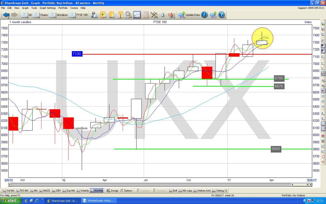
I warned about this one last week. The Chart below has the Monthly Candles for the FTSE100 and as I mentioned back then, we have completed a Bearish looking ‘Inverted Hammer’ at the end of March. In the context of the Run Up it seems like we will see a drop but they do not always work 100% - if you look back to the January Candle you will see another Inverted Hammer (this time a Red Body rather than White) that failed to result in a move down.
CAC40 (France)
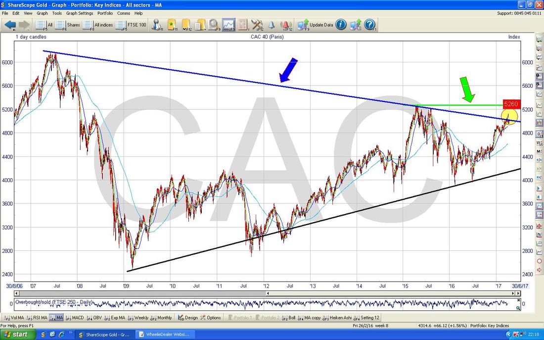
This one is interesting. I showed this Chart a couple of weeks ago I think, and I talked then about the Breakout Levels and stuff - now we have the Breakout as per my Yellow Circle - I will zoom in on the next Chart.
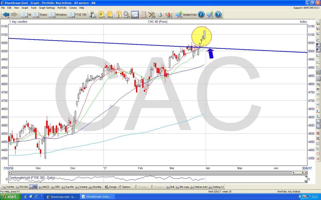
This Chart has the Daily Candles for the CAC40 (as always, my Charts are from La Magnifique ShareLeScope Software) going back about 6 months. The Blue Line marked with the Blue Arrow is the Long Term Downtrend Line from the previous Chart and my Yellow Circle is showing how we have broken out of it and this is Bullish behaviour. 5283 is the next level that needs to be broken over.
DAX30 (German)
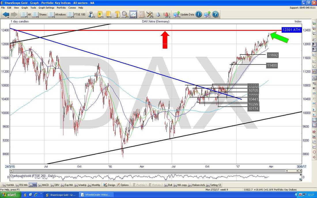
Another interesting Chart. This one has the DAX going back around 2 years and the thing to note here is the All Time High (ATH) which is the Red Line with the Red Arrow right at the top at 12391. My Green Arrow is pointing to where we are now at 12312 which is not all that far below and it is obvious there is a big chance we will see a Bullish ATH Breakout early this week - if it does it, there could be a great opportunity to go Long on this Index (via a Spreadbet or whatever) and make some money. I might go for such a trade.
Dow Jones Industrials Index
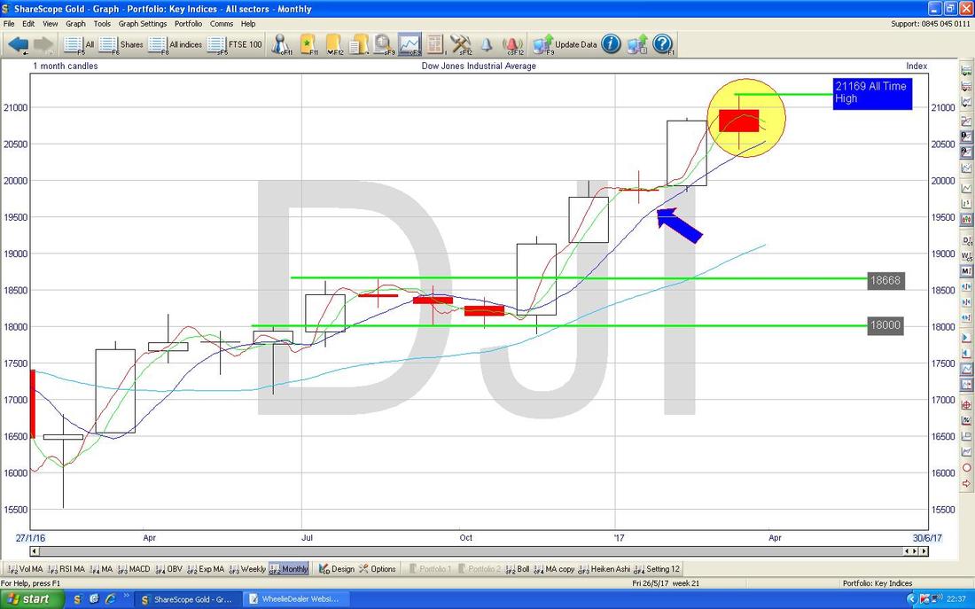
This is the Megacap US Index with just 30 Stocks but it is probably the most widely watched Global Index. The Chart below has the Monthly Candlesticks - my Yellow Circle is highlighting a Doji Candle which suggests neither the Bulls nor the Bears were really in control during March and this might be the start of a Reverse downwards - however, Dojis like this are more of a warning of trouble than a high probability Candle - the more worrying ones are Inverted Hammers or Gravestone Dojis really. My Blue Arrow is pointing at the Blue Wavy Line 50 Day Moving Average - this should kick in as Support around 20500 ish.
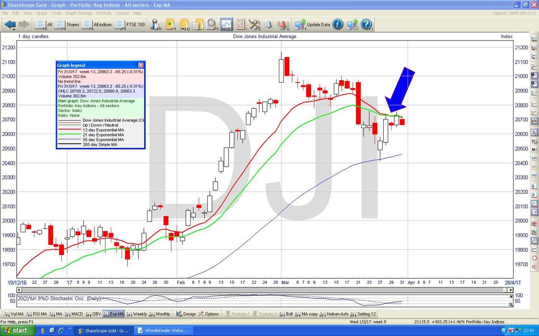
This is not so good. I think I might have mentioned this last week, but my Blue Arrow is marking where we have a Bearish 13/21 Day Exponential Moving Average (EMA) ‘Death Cross’ on the DOW - this is not easy to see even if you click on the Picture so you will have to take my word for it. Anyway, such a negative event can often mean a few weeks of falls.
Pound vs. Dollar
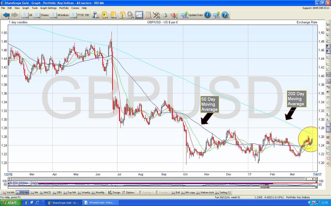
I want to stress this one because I am having constant discussions on Twitter about how “The Pound is going to go lower” and suchlike - I find such pronouncements a bit vacuous as they are based on something that no human is able to understand or predict - so as with the Gold Chart I would rather not make such statements and instead let’s see what the Chart is telling us. The Chart below has the £/$ going back about a Year or so but what matters here is the Moving Averages. My Yellow Circle is highlighting where the 50 Day and the 200 Day are moving together - if the 50 crosses over the 200 it will be a Bullish Golden Cross and that means the £ would be unlikely to fall more and if anything it is going to go Sideways for a bit or start to recover against the Dollar. This is obviously very important because the perceived wisdom is that Pound weakness has driven much of the move up in UK Indexes since the Brexit Vote - we shall see how it plays out.
Nasdaq Composite
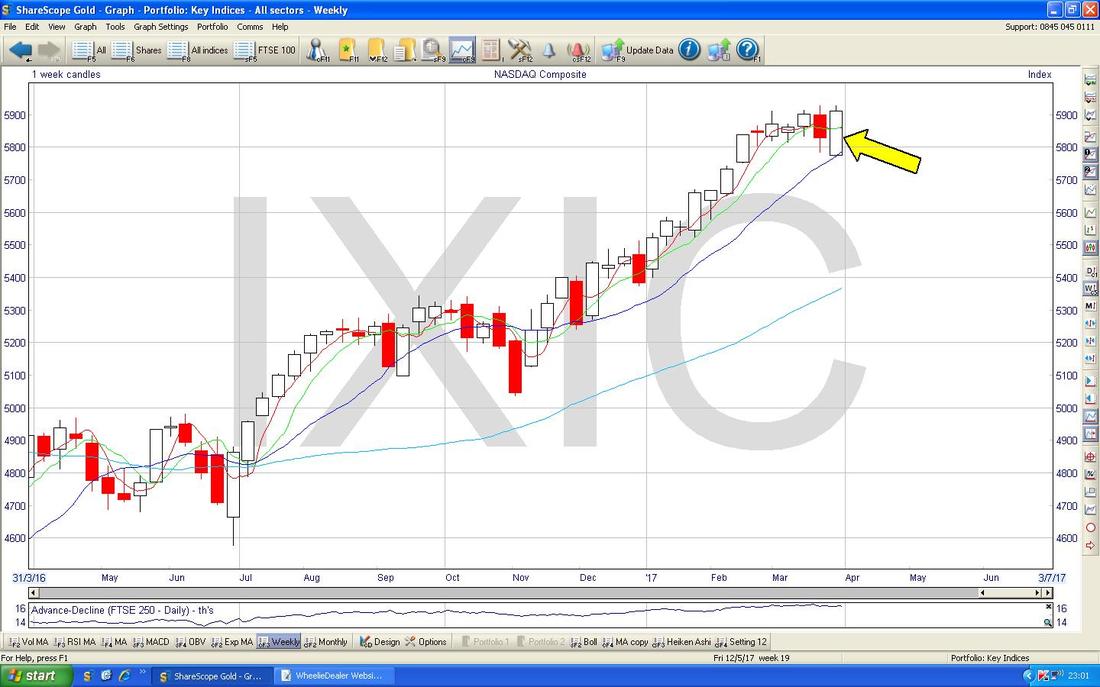
This is the US Tech Index. My Yellow Arrow is pointing to a big White Up Candle on the Weekly Chart - note how it has ‘Engulfed’ the Red Candle of the Week before - this is Bullish behaviour. Note also how the Candle for this Week opened at the Blue Wavy Line 50 Day Moving Average and moved up from this point.
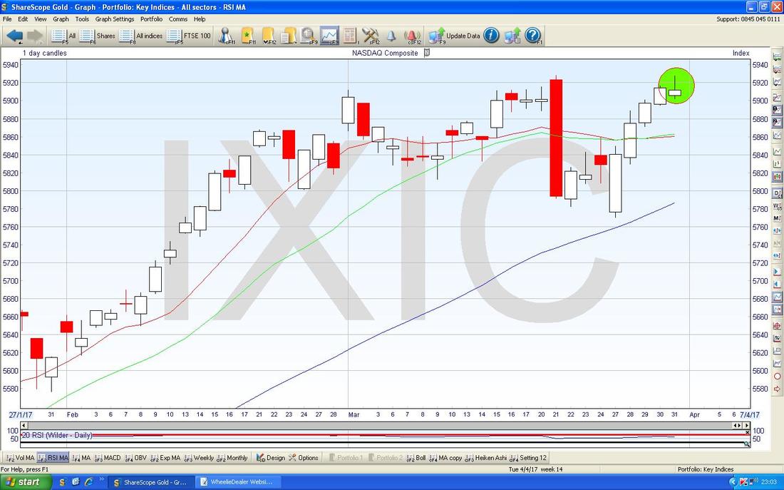
Funny how things are different on various timeframes - but remember Candles are pixels of each other and work on all timeframes. The Chart below has the Daily Candles for the Nasdaq Composite and note the Inverted Hammer in my Green Circle from Friday which looks bearish in the very short term.
OK, it’s getting late, that should give a decent view of where we are heading into the coming week - good luck to all !! Cheers, WD.
0 Comments
Leave a Reply. |
'Educational' WheelieBlogsWelcome to my Educational Blog Page - I have another 'Stocks & Markets' Blog Page which you can access via a Button on the top of the Homepage. Archives
May 2024
Categories
All
Please see the Full Range of Book Ideas in Wheelie's Bookshop.
|

