|
THIS IS NOT A TIP. I AM NOT A TIPSTER. PLEASE DO YOUR OWN RESEARCH. PLEASE READ THE DISCLAIMER ON THE HOME PAGE OF MY WEBSITES. No peace for the wicked is there. I have just finished Part 1 and now I am caressing my keyboard for Part 2. Shouldn’t be too hard as I do not intend to do much detail on the Company - I think most readers will have a sufficient grasp of what Shell do to enable us to cut to the juicy stuff. I will cover Key Fundamentals, Valuation and Target, and the Technical Analysis elements which suggested to me that it was a reasonable time to Buy. I may have mentioned in Part1, but I will repeat myself no doubt, I already have a slug of RDSB in my Income Portfolio and I bought to top this up really. I did it via a Spreadbet so I get a decent bit of Leverage in there as well - the Margin Requirement (that’s an upfront Deposit you have to put down) with igIndex is piddly - something like 5% - so it is very ‘Capital Efficient’. Key Fundamentals This reminds me of my ‘Are you up in your Helicopter or down in the Weeds’ Blog (if you are now utterly confused, nip over to the ‘Categories’ bit and click on ‘November 2014’ and you should find it in there), so, I better shove some AvGas in the WheelieCopter and get her up in the air !! In that vein, rather than digging into the Company in detail, here are the Key Bits for me that make a buy of RDSB seem a reasonable idea:
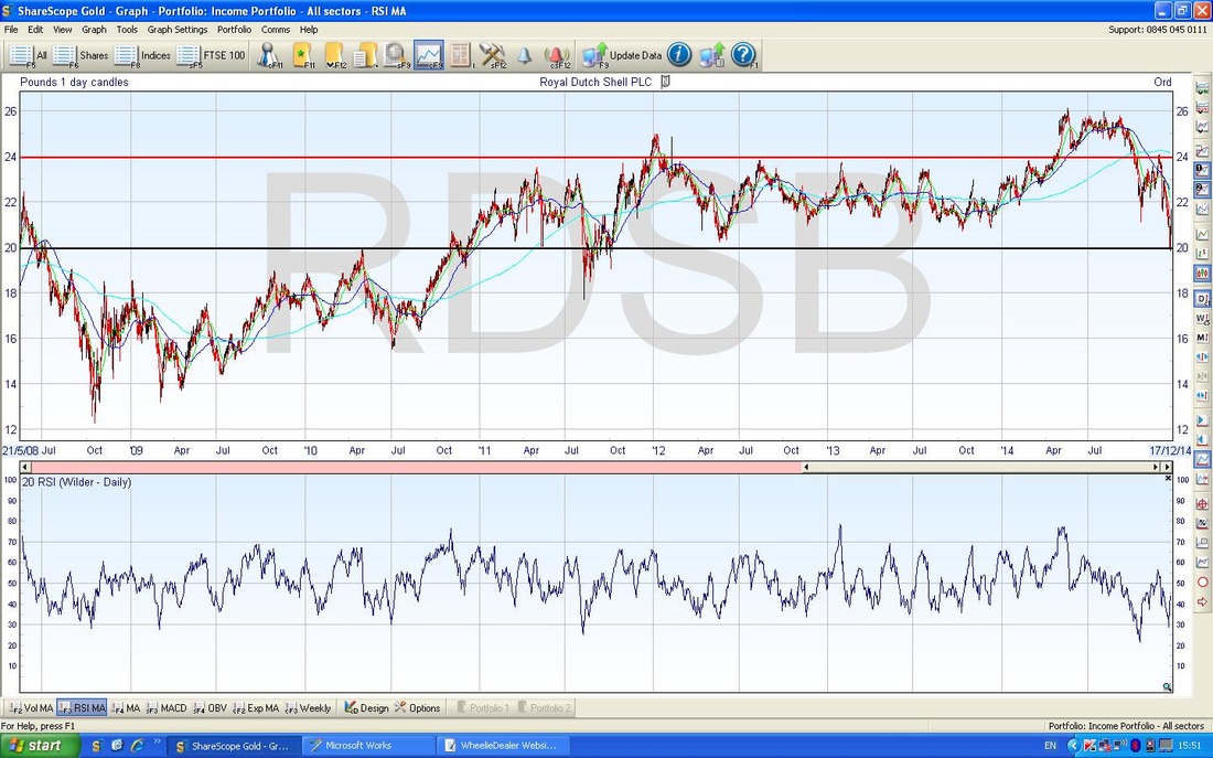
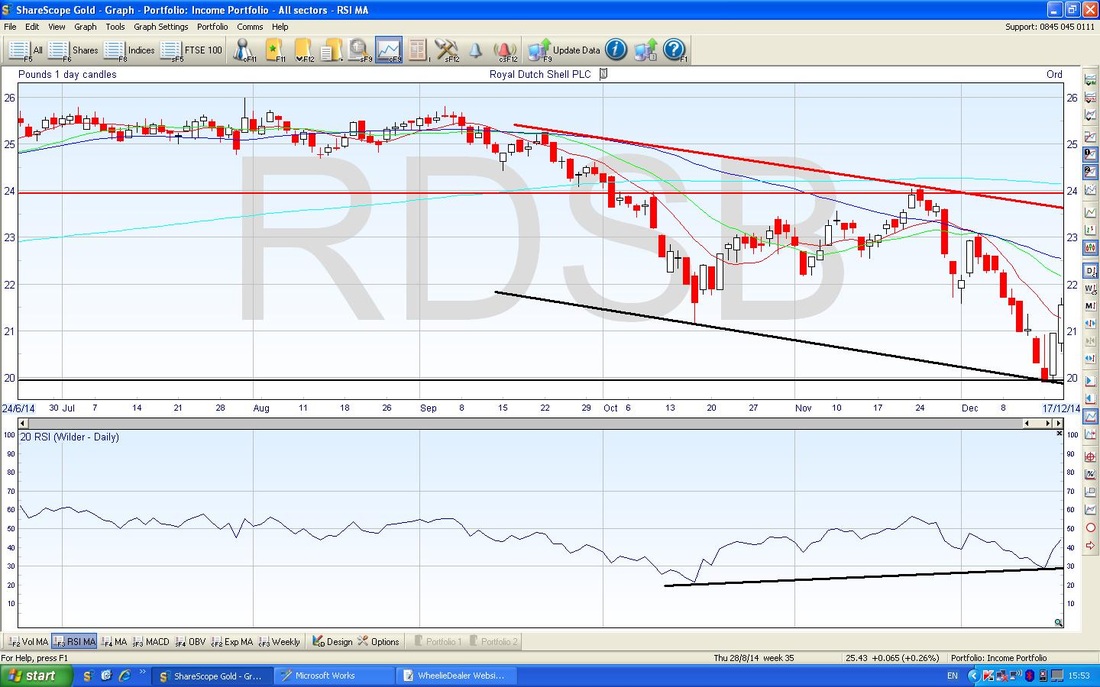
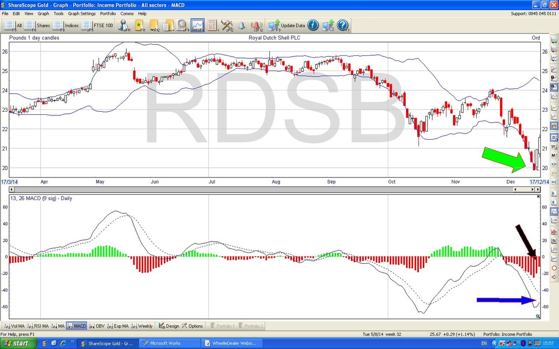
Valuation and Targets According to ShareScope, EPS (Earnings per Share) forecasts for 2014, 2015, 2016 are 235.98p, 201.71p, 252.80p. At my buy price of 2150.6p, this gives p/e ratios (Price per Share divided by Earnings per Share) of 9.1, 10.7 and 8.5. Convention suggests that a p/e of 10 or below is good value, so this looks fine (remember, a good way to think about this is a p/e of 10 means it takes 10 years to get the money you laid out buying a Share back from the earnings generated by that investment - although you don‘t actually get the money back - you get part of it as a Dividend). Again, according to ShareScope, DPS (Dividend per Share) forecasts for 2014, 2015, 2016 are 117.78p, 121.39p, 126.46p. At my buy price of 2150.6p, this gives Dividend Yields of 5.4%, 5.6% and 5.9%. Again, this is pretty attractive (try getting that kind of Interest on your Cash ISA !!) and I particularly like RDSB’s record of steadily rising Dividends over many, many years. A wonderful, bedrock kind of Income Share for any Portfolio. With regards to Targets, it is a bit debatable (isn’t everything regarding the Stockmarket?). For me personally, I intend to hold RDSB pretty much Forever in my Income Portfolio - as long as it continues to provide a nice, growing Dividend Stream. I suppose if it did so well that it got seriously overvalued and the Divvy Yield dropped to say 2.5% or similar, then I might think of selling it - but that would be a marvellous scenario as the Share Price would need to be way over £40 - and I would be happy to nail that one !!! Fat Chance. In just valuation terms, if you gave the stock a p/e of 15 for 2015, then you would get a Target of 3025p (15 x 201.71p) but 15 is arguably a bit on the Generous side and 201.71p might be on the Low side as it is a clear dip compared to 2014 and 2016. You see the problem…… From a Chart Viewpoint, the All Time High (ATH) is about 2600p - this is probably a fair target on a couple of years timeframe - this would be 21% upside on my Buy Price of 2150.6p and of course you would pick up sweet, juicy, succulent Divvys as well. In a Shorter Timeframe, maybe 6 months or less, the Chart suggests to me that there is a Range which has a top level around 2350p to 2400p - on the lower figure, this is 9.3% upside. There is a strong likelihood that if we see 2350p quite soon, then I might sell all my Spreadbet Positions and bank a Profit but keep the Shares in my Long Term Income Portfolio. If we then see a fall again back down to the lower 2000s, I might buy in again. We shall see. I know I should have a ‘plan’ but I am a bit fluid on this - maybe something I need to work on !! Discipline dear boy…… Technical Analysis As usual, I mainly use TA for my timing - I tend to identify stocks I like on their Fundamental attractions and then use TA to time my Entries and Exits, and it definitely helps with fine-tuning of these. Range Trader The first (and arguably the Most Important) Technical aspect that shouts out on the RDSB chart is it’s Range Trading habits. I have been aware for many years that RDSB behaves in this way - in fact, many Large FTSE100 Stocks do and you can take big advantage by trading those Ranges. If you look at the chart below (you may need to use Zoom a bit), you will see that in the Top Window, I have marked in 2 Horizontal Lines - the Bottom one is Black and the Top one is Red. This pretty much shows the Range and you can see how RDSB has wiggled around within this quite a bit for the last 3 years. The Bottom Line is at about 2000p and the Top Line is about 2400p. At the point of my Buy (the Charts are not bang up to date - they do not include Friday as I wanted to show what they were like when I decided to do the Buy Trade), you can see that the Price had moved down to the bottom of the Range and was starting to move back up. I find it is always best to wait for the Price to move down and find Support and start moving up before I buy in. In other words, don’t buy while it is still falling - you might get Knifed as they say. Better to forego a bit of Profit and reduce your Risk of Error by waiting for the Turn and then buying when it is headed back up. It can still go wrong (and it will, I can guarantee you that) but your odds of failure are lowered. I just noticed, as I was about to head off to the Kitchen for yet more tea, that if you were to draw a Horizontal Line at the 1400p level, you would get another Range for prior to 2011. This is a feature I often see on Charts - things that Range Trade tend to always have a similar ‘width’ to the Range. All that changes over time is that the Range moves up or down the scale - if you see what I am getting at. In the Lower Window you will see that the RSI is down at the bottom of its Range - this is a good sign - don’t worry now, move on to the next Chart because it shows this bigger. Shorter Term Trend Now please look at the Chart below. In the top Window, you should see a sort of Downtrend Channel with a Red Line that I have marked for the Top of the Channel and a Black Line for the Bottom (you may remember that I have my own weird personal convention where I use Black for Support and Red for Resistance - god only knows why I do it !!). Anyway, this shows that the Price has been in a Downtrend for about 3 months and you can see how the Price has now started to move up off the Bottom of the Channel. I realise now I should have done another Chart with more detail on the Candles - but let’s live with this for now. If you look at the far Right of the Chart, you will see 2 nice big White Up Candles - this is always a Bullish Sign when you are coming off the Bottom. Now go back to the 3rd Day from the Right - you should now see a sort of Upside Down Hammer Candle - it has a Big Red Lump at the Bottom and a long ‘tail or wick’ pointing up. This is a Classic Reversal Signal after a Down move (it also is a Reversal Signal after an Upmove). This was my first warning that the Downtrend might be weakening and about to turn up - so I was on alert. RSI Right, now look at the Bottom Window in the Chart above. This has an interesting and important concept that I may not have mentioned before - the RSI Bullish Divergence (now you are on the edge of your seat, I know). Look at the Black Line I have drawn under the RSI lines since about mid October. The thing to appreciate here is that the Black Line on the RSI Window is moving up from Left to Right whereas the Lines in the Upper Window are moving down from Left to Right - this is ‘Divergence’ and is a Bullish Sign. When you see the RSI doing this while the Price is in a Downmove, then expect a Rally Soon. This idea can also work when a Chart is in an Upmove - a Bearish Divergence is where the RSI Line Trend starts trending down in opposition to the Price Upmove. The other thing to see here, is that the RSI was at about 30 on the Day that the Upside Down Hammer was created - you may know from my scribblings that RSI 30 is usually Oversold - so the fact that it has started to move up is all very nicely consistent with other Indicators. Bollinger Bands On the Chart below, look at the Wiggly Blue Lines, Top and Bottom, around the Price Line in the Top Window. These Wiggly Blues are the Bollinger Bands - they tend to show the Range to which a Price will wobble about within - and they work pretty well - as ever, please see my ‘OPAY Technical Analysis’ Blogs to figure this out. The thing to see here is that the Price Candles have started to move up away from the Bottom Blue Wiggler - I have pointed to this with a Fluorescent Arrow (sunglasses may be required at this point - you have been warned). MACD No, this is nothing to do with Big Macs…..what are you like? Always thinking of your belly……. MACD is Moving Average Convergence Divergence - please refer to my ‘OPAY Technical Analysis’ Blogs for more details. This time look at the Bottom Window. If you look at the Black Arrow (take your sunglasses off - how on earth do you expect to see it with those on?), you will see that it points to the Red Histogram lines and the ‘Hump’ of those is sort of swinging around to the Upside. To get a better idea, cast your eyes to the Left and look at where a similar Hump was being formed back in mid October - I think there is a strong likelihood that this is being repeated and the Histograms will go Green, and if you look at the Price Line back in mid October, you will see that it moved up. Now look at the Blue Arrow - this indicates that the Continuous Blue Line has started to turn up and it now heading towards the Dotted Blue Line. Look again at mid October - you should see a similar pattern and the Price Line moved up. In reality, the Histograms and the Blue Lines of MACD are representations of the same thing. You don’t really need both of them - but I find that having the 2 really highlights very quickly and clearly to me exactly what is happening. Momentum Indicator
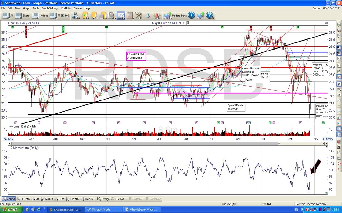
This is similar to the RSI in that it measure the ‘strength’ or ‘speed’ of a Price Move (or Wave - not Elliott - arghhh). This Momentum Indicator is more timely and sensitive than RSI - it is one of the first Indications you get that a Trend is changing - as per my HOT (Hierarchy of Timeliness) invention in my OPAY Technical Analysis Blogs. As you can see in the Bottom Window of the Chart above, the Momentum Indicator is turning up off its Lows as Pointed at with the Black Arrow (Sunglasses…ahem….thank you) - this is a good sign that the Price Line will move up. Don’t look at the Upper Window (I know you are all looking now !!) - this is just my mucking about with Lines and Text Boxes that I use all the time - what a mess !! I just found it easier to crunch this box up and ScreenShot the whole thing to show you the Momentum indicator. That’s enough. I got another one to bash out on Aviva so I need to get a move on. I hope that was enough to give you a feel of why I nibbled at RDSB again. Put those flippin’ sunglasses away……. That’s reminding me of Chrissie Hynde gig last week and ‘Dark Sunglasses…….’ How on earth is that Rock Chick 63? Wow. See ya, wd
1 Comment
|
'Educational' WheelieBlogsWelcome to my Educational Blog Page - I have another 'Stocks & Markets' Blog Page which you can access via a Button on the top of the Homepage. Archives
May 2024
Categories
All
Please see the Full Range of Book Ideas in Wheelie's Bookshop.
|

