

|
educational blogs |
|
THIS IS NOT A TIP. I AM NOT A TIPSTER. PLEASE DO YOUR OWN RESEARCH. PLEASE READ THE DISCLAIMER ON THE HOME PAGE OF MY WEBSITES. Back on Thursday 18th December 2014, I bought a few more Royal Dutch Shell RDSB via a Spreadbet, so I thought a fairly quick Blog to explain this might be appreciated. I would like to know myself why the hell I bought an Oil Stock just as Oil is in Freefall !! Needless to say, probably the biggest driver on the RDSB Share Price is the price of Oil - I have not investigated any correlation but I suspect it is quite close - although I do not think RDSB swings around anything like as wildly as the Oil Price can. RDSB also finds ‘support’ due to the Dividend Yield - I will cover this more in Part2 if I remember - in simple terms, at 2000p, the Dividend Yield for 2014 is nearly 6% - this attracts the Income Buyers like me !! I don’t intend to do an epic, lengthy Blog here - I am sure nearly everyone reading this will have at least heard of Shell and the vast majority of readers will know it is a hugely diversified Major Oil company, and I believe it still retains a slightly strange Corporate Structure with Head Office operations in The Netherlands and in the UK - and 2 share classes - RDSA and RDSB - but the ‘B’ one is the old UK bit (I think there is some Euro / Sterling element to the 2 classes but I am not too concerned to know about it - RDSB is the one I have owned/traded for years). I hold RDSB as one of the 11 Stocks in my Income Portfolio - which is designed as a Boring, Long Term Hold, Low Risk, type of Portfolio where I am really looking for large, sustainable, Dividend streams to provide a nice Income Stream. Full details on this can be found in the ‘Portfolio’ page of my Website. As well as holding in the Income Portfolio, I also have a few in my Normal ISA and I also have a Spreadbet Position. Oil OK, let’s start with Oil. It is probably an utterly daft thing to try to pick the bottom (sounds dodgy) of a tanking Oil Price but there comes a point where the Price Chart has to turn up and it looks to me like we are pretty close - and at $60 ish for Brent Crude Oil, the downside from here is pretty limited in my mind - ok, maybe it goes to $40 - but don’t get fooled into thinking that is a sustainable level - it only got down to $35 in the Credit Crunch - and rebounded very fast - it was $85 within a year. I am reading stuff all over the place even talking about $20 Oil - this COULD happen - impossible to tell, but to my mind this is extremely unlikely and if the price did fall this low, it would be very temporary - judging by how fast it has rebounded in the past. I may be wrong - but it must always be at the forefront of our minds that we are playing a game based on probabilities. We need to put our Cash behind Scenarios that are Most Likely. These Charts are now telling me to a large degree that Oil is very close to a bounce. “Ah,” you may counter, “but the Saudi’s are pumping like crazy and Hugo Chavez is dead and my car does 38mpg.” These are all very valid points, but such discussions of ‘factors for the price fall’ around Oil are, to my mind (you can, and probably will, disagree) great debating points but mostly utterly useless to help us with trading Oil or Oil Stocks which are closely correlated. This is very similar to a point I continually make (backed up by the Great Warren Buffett I might add !!) that Macro stuff is pretty much useless and irrelevant. There are countless theories and justifications for the Demand side and the Supply side of Oil and the ‘experts’ bleat on about it all day long. But if we take a step back and think about it, we can never know, sat in our Armchairs in our nice and toasty Centrally Heated Homes (powered by Gas) what the impact of any of these factors may be. We could do an in-depth analysis of all the Supply side factors and all the Demand side factors and we could still never make a determination of the Oil Price - it is just way, way too big and complex. Imagine you could have an infinite ‘army’ of people who could visit Garage Forecourts to monitor demand and visit Refineries to monitor Supply and visit Oil Rigs to measure Supply pumped out, etc etc. - it would be meaningless. Even with the best Supercomputer Invented by Man (Deep Thought?) you could never process the data to make a prediction. So why do we read this stuff? The other big driver on the Oil Price is the action of Traders - this tends to add in the element of ‘Overshoot’ both on the Upside and the Downside when the Oil Price gets into a Strong Uptrend or Downtrend - it tends to get overdone, and I suspect we are overdone to the Downside now. Again, the actions of Traders are utterly impossible to model into any Fundamental considerations of where the Oil Price should be. Fundamental Oil Analysts really are wasting their time (they get paid though, so I suppose it means their kids can eat). No, the only sensible thing you can do from home, apart from an approach several people have suggested on Twitter to ignore it (that’s not much fun or much use for making Trading Decisions) is use Price Charts which in essence, encompass ALL of the factors in one simple to see format - genius. This is quite a radical thing to say - even I have my doubts. I used to follow David Linton of Updata (I don’t know if he is still with them) and he was one of these Chartists who say that ‘everything is in the price’ and that Fundamentals are useless. As time goes on and I think about this, the more I realise that he may have a point. If you consider a Single Smallcap Stock, it is probably a fairly simple business to understand from a Fundamental point of view. Obviously there are things you could never know about the company - especially if the Directors are consummate Liars (there are a lot of those about !!) - but on the whole, you could get a very good understanding of the company. Price Charts would then come in to play to assist with the timing of Buying and Selling the shares. So Fundamental Analysis clearly has value here. However, as you move up the scale and head towards FTSE100 Companies, things start to get a Shed Load more complicated - some of the largest Companies have multiple divisions, multiple products, multiple geographies, thousands of employees, etc. etc. - is it really realistic to think we can understand these companies sufficiently by Fundamental Analysis techniques? We can then take this further - once we move onto Individual Country Economies and things such as Commodities, how on earth could we ever understand the complexity? So why even bother? I am sure you can recall how when the Coalition first came to power, every Economist (including International Monetary Fund IMF etc.) were saying the UK would have a deep Recession due to the Public Spending Cuts, ‘Austerity’ (sorry, I nearly wet myself while I wrote that because anyone who thinks this is austere really needs to go to Greece) - and that seemed perfectly logical. Anyway, it turns out that all the ‘experts’ were wrong and there was no Recession. Remember, Economists predicted 9 of the last 4 Recessions………… So, if even the wonderful ‘expert’ Economists cannot predict it, what chance have we? So maybe the only Tool we have that could work is that of Technical Analysis for these huge Complex Markets. Right, I am sure you get the point. Now, what are the Oil Price Charts telling us? (before you get stuck into this, it might be an idea to read my ‘OPAY Technical Analysis Blog’ Series, if you have not read it already, as this will make the Technical Indicators more meaningful). 1 year Chart (roughly) This shows just how Oil has dropped like a stone. This is unnatural and not sustainable - prices do not fall this fast and stay down - especially on Oil. If you look at Long Term Charts on Oil (5 years, 10 years), you will see several episodes where the price has spiked down - it is very volatile. As ever, it is a bit small on this chart, but look at the Blue Arrow I have drawn in - this is pointing to about 4 days in succession where Doji Candles have been put in - this shows that the Power of the Downtrend is waning and a Reversal upwards is getting likely. Look just below and you will see a Thick Black Line at about $58.50 - this shows a Strong Support Area that has showed its worth in recent days - it is also a Level that goes back about 5 years ago where it was an area of Support. Interestingly, as I write this on Friday 19th Dec 2014, Oil did a strong up day today which is not shown on the Chart - so it appears a good likelihood that Oil could move up from here. Of course, when I did my RDSB Buy, I did not know this as it had not happened yet - these charts do not show Friday. Arguably, I was jumping the gun a bit - but there are specific RDSB reasons why I did go early - as will become clear in Part2 hopefully. Keep $58.50 at the forefront of your mind, this is an extremely important level. If the Price can stay above this, then I suspect we will get into a Range with $58.50 as the Floor - Oil has traded within Horizontal Ranges for years and years in the past. At a guess (I am sure some Charting Gurus could be much more accurate) I would reckon on a Ceiling near $85 - but that is based on nothing, just a hunch - although I do notice that in the recent falls, the Price did try to find Support around $85 - you can see this in mid October below - although it did a similar thing at $80, so this is pure guesswork. 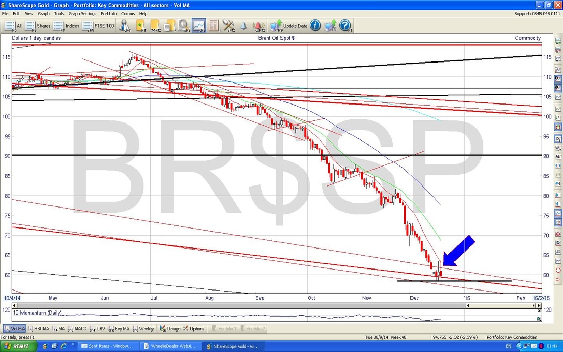 RSI This next Chart below, shows the Relative Strength Index (RSI) in the bottom window. Look at the Black Arrow I have drawn in - this shows that the RSI line is very low on a reading of about 20 - remember, I keep saying here and there that 30 and below is Oversold - so this is very Oversold and suggests a Bounce is due. Also, if you look closely, this Indicator seems to be turning up - but it is a bit early to be sure. A reading of 20 is a very low measure - this suggests to me that we have had very Powerful Downward Acceleration - this is typical at the end of a Trend (you can see this phenomenon in Uptrends as well) and could be good indication that Oil will bounce soon. It is a sort of ‘Capitulation’ where final Bulls throw in the towel. I just whizzed off to the kitchen and now I have returned to my PC, I can see something else related to this Acceleration to the Downside. If you look at the Down Move since Last July - you will see how the Curve of the Candles seems to swing downwards in an Arc that is clearly getting steeper over time - this shows the Acceleration. When the Downmove starts, the Curve is sort of Flat and gentle - then, as time goes on, the Curve steepens and almost goes Vertical - a classic sign of Acceleration and Capitulation (I think I am having a Flashback to do with Calculus back in my School days - yes, I did got to school you cheeky monkey). Think of it as the opposite of when you get a Share Price Chart zooming up in a Bubble - the Chart goes Vertical and you can bet your last quid that it will fall soon (look at the Chart of BIOG to see this now !!). I have said a lot that I think we could see a fast recovery up to maybe $85 ish - this Price Action of the Downtrend is extremely unnatural and I have seen on other Charts where Rebounds after such a move are extremely fast and strong. Think of a Coiled Spring being continually forced down and down - at some point, the Tension within the Spring builds so high that it overcomes the downward forces and leaps upward with violence - I expect something like that on the Oil Price. I could, and probably will be, wrong of course !! 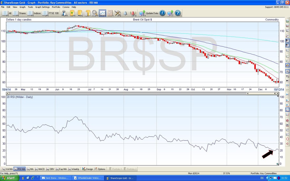 Bollinger Bands If you look at the Chart below, in the Top Window you will see the Price Line with the Bollinger Bands in Blue sort of around it. Look at the Red Arrow I have drawn - as you will see, the Candles have started to move sideways away from the Bottom Bollinger Band - this suggests things are changing - although it is worth noting that we had some sideways action (ooo er, that sounds Dodgy as well) earlier a couple of times, but that failed. There is always that risk - nothing with Charts is certain - you have to go with the most likely outcome. 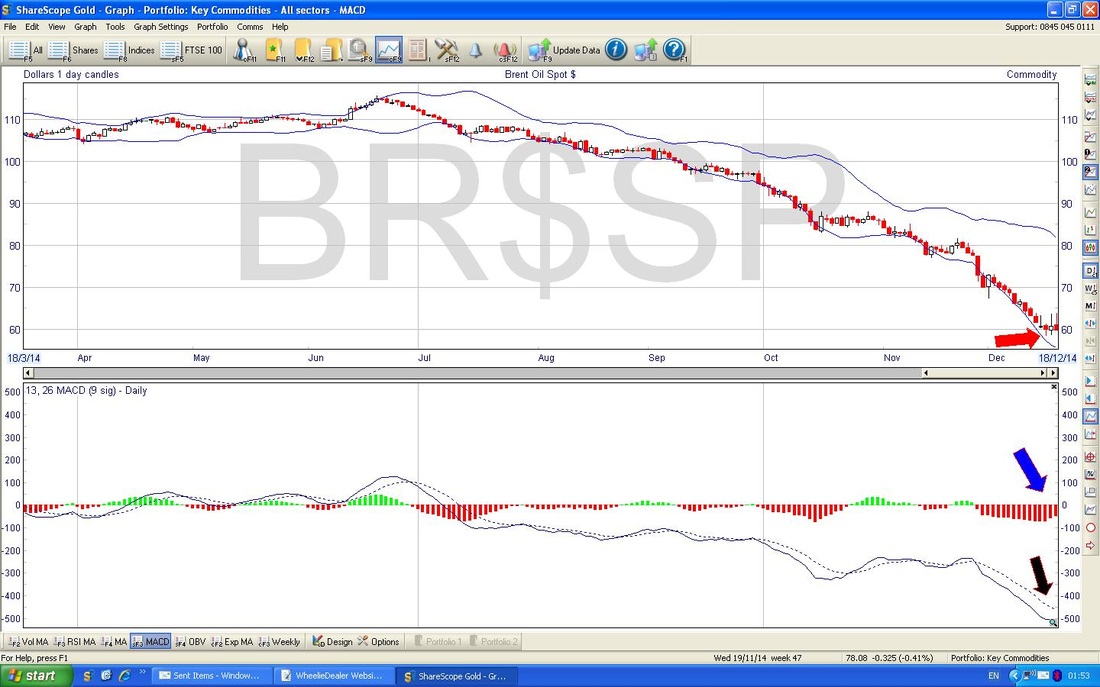 MACD
Look now at the Bottom Window. Firstly, we have the Blue Arrow which marks how the Red sort of Histogram Bars are moving round in an Arc - this hints at a move to the Upside soon - although it is very early. Now look at the Black Arrow - this shows that the Continuous Blue Line is swinging in towards the Dotted Blue Line (you may need to Zoom here) - this suggests a move up is coming - although still a bit early. As I said earlier, I am writing this on Friday but the Chart is from Close of Play on Thursday, so I bet the MACD Indicators have moved to the Upside Argument a lot more today. This plays to the ‘Hierarchy of Timeliness’ (HOT) concept I discussed in my ‘OPAY Technical Analysis Blog’ Series - where certain Indicators give earlier warnings than others - but they all add up to increase Certainty in a given Trade. Right, that’s enough on Oil. The next Part will get stuck into RDSB itself with a quick whizz over Fundamentals and Valuations and a butchers at the Charts. Adios Amigos !! wd
9 Comments
Steve Hollingsworth
20/12/2014 12:43:56 pm
Having read various of yr blogs. The logic and analysis is up to your usual high standard. Agree with all yr TA regarding oil price. Interesting comment re FA vs TA. In my experience, TA becomes more effective as the market gets bigger, ie larger companies, indices and commodities. Possibly due to more buyers and sellers. I agree that your method of combining both TA and FA covers all angles.
WheelieDealer
20/12/2014 12:51:27 pm
Hi Steve, Thanks for your comments - I am totally amazed anyone read this so fast as I thought everyone was in Last Minute Panic Mode down the shops.......
Martin
21/12/2014 04:47:11 am
PS
WheelieDealer
21/12/2014 04:00:32 pm
Hi Martin, seems like we are thinking similarly (Fools seldom differ?). You may have seen from a recent Blog that I have learnt a lesson on Small Resources Stocks and generally avoid them these days. If you look at my Portfolio Page you will get more idea of the stocks I am in at the moment. I lack exposure to EM - keep considering it but not actually acting !! My current view is that First Half of 2015 will be tough due to Election - so I will be pretty cautious perhaps more Opportunitic with Swings....cheers, wd
Martin JG
21/12/2014 04:40:54 am
Wheelie
WheelieDealer
21/12/2014 04:03:06 pm
Hi Martin JG, seems to me that TA works less well on Smaller Caps - as you suggest, probably down to Liquidity and Spikes. On the whole, I do find it helpful though on my Small stuff. I will be posting Part2 on my RDSB Buy Rationale Blogs later on Monday and I am sure you will find the TA interesting. regards, wd
JonH
27/12/2014 02:41:14 am
Very interesting. I like the fact that you explain your analysis before the event. It will be interesting to see where oil is in 2 months. I often find I have the analysis right but the timing wrong (e.g. it does not happen for another 2 years). I have 5.5% bonds in Enquest that I bought at 90p (a bargain), then they went down to 65 (and I bought more at 69) so hoping they will recover with RDSB
WheelieDealer
27/12/2014 09:28:28 am
Hi Jon, I feel like my Alter Ego knows you in Real Life - but I am not sure !! Anyway, I am so pleased you found it interesting - it will certainly be instructive to see how things do actually turn out - almost always different to what I expect (hope?) for. Good luck with those Bonds !! Happy New Year etc, wd Leave a Reply. |
'Educational' WheelieBlogsWelcome to my Educational Blog Page - I have another 'Stocks & Markets' Blog Page which you can access via a Button on the top of the Homepage. Archives
May 2024
Categories
All
Please see the Full Range of Book Ideas in Wheelie's Bookshop.
|
