

|
educational blogs |
|
This blog has come about as a direct result of Wheelie’s Summer Bash which was on Saturday 23rd September when a load of us met up in a Boozer local to me. If you take notice of my Twitter Feed, you may have spotted that at the End of each Day (usually around 5pm to 7pm ish) I do a Report via a Tweet of how my Portfolio Value has changed during the Day and the larger ‘DOWN’ and ‘UP’ movements of that day for the relevant Stocks. On a Friday I report the numbers for the Day but I also show the Weekly Result for my UK Portfolio and Spreadbets.
On a few occasions over the last 3 years I have been asked by a Twitter Follower what the Numbers actually mean and I have given a fairly full response on the whole I think but obviously the 140 Character limitations of Tweets probably leaves many People just as bemused as before I tried to answer !!
If I had actually thought about this it would have been blindingly obvious that I really should produce a Blog which explains my Reporting in detail (and why I do it !!) but I guess it is so habitual for me (I have always done things like this for years and years and I merely am letting TwitterWorld have the Numbers as well), that it never even crossed my mind. This of course throws up a relevant point - if there is anything that I do which you don’t understand and would like more clarity on, then feel free to contact me via Email ([email protected]) or maybe Twitter Direct Message or a Tweet or whatever.
The driver of this Blog was that someone in the gathering at the Summer Bash asked me what my process for Reporting the Daily Numbers is and why I actually do it. There is a school of thought (and there is much sense to this) that if you are a Long Term Investor, then looking at your Portfolio Value and Share Price movements every Day is just ‘Noise’ and that maybe a more appropriate Timeframe for checking is Weekly, Fortnightly or perhaps Monthly. I see the rationale behind this but for me it doesn’t really fit with how I operate - I will give more details on this in a tad but one obvious reason for me to check my Performance every Day is that I use a lot of Leverage via Spreadbets and just ignoring how things are going could easily get me into trouble if I am not looking at least once a Day (and End of Day after the Close makes most sense anyway). The problem arises because if you don’t keep an eye on things, the Spare Cash in your Spreadbet Account (I call it my ‘Free Float’) could easily get soaked up quickly if the Positions in your Account go against you - so you need to stay on the ball. Of course one way you could do this is to check the Daily Statements the Spreadbet Company sends out - igIndex send me an Email every Night with a PDF file with a Full Statement on it - very useful. What I actually Report on As I will cover in more detail in the next Section, the first thing I look at are the significant ‘DOWN’ moves and ‘UP’ moves on the Day. I am of course not too interested in the ‘Noisy’ movements like ‘DOWN 0.5%’ or ‘UP 0.3%’ etc. but I have decided that I will report on any moves DOWN or UP of 1.2% or more. I have to have a cut-off level, and that is the one I have chosen and I think it gives a reasonable representation for Followers/Readers. Arguably I could do a cut-off at 1% DOWN or UP but some Days I suspect that would create stacks of Tweets and I am not sure how valuable it would be. Equally maybe I should just report 1.5% moves but I could go on like this all night !! If you have a look at my ‘Portfolios’ page on this Website then you should get a better picture of the Individual Portfolios I run and this might help to make sense of what I am writing here. Before I send out Tweets of the ‘DOWNs’ and ‘UPs’, I always send out a Tweet that says something like ‘PORTFOLIO down 0.4% on the day’; this does not include my ‘Income Portfolio’ which I rarely report on (apart from Year End when I do the ‘Scores on the Doors’ Blog) or my ‘Overseas Unit Trusts’ which I tend to Report on every few Weeks or so when I do a ‘WEEKLY PERFORMANCE UPDATE’ on the Homepage of this Website which also has a list of the most interesting Stocks I hold and some comments on each. Dive over to the Homepage and scroll down and you should see a recent example to give you an idea of what I am on about. The Stock comments on these are something I strongly recommend you look at and you might find it very helpful but of course they are not ‘Tips’ or anything (see my Disclaimer !!). The ‘PORTFOLIO’ performance every day is made up of the Gain (or Loss) on the day for my UK based Shares (this is referred to as ‘Trading ISA Portfolio’ on the ‘Portfolios’ page - clearly for want of a far better name as I am NOT a Trader !!) added to the Gain (or Loss) on my Spreadbet EXPOSURE for the Day. Remember, my Spreadbets are Leveraged (Geared) and this means that I only have to put down part of the Exposure as ‘Deposit’ or ‘Margin’ and therefore I think Exposure is the appropriate way to measure the Performance - it is as if I just held entirely Normal Shares and no Spreadbets. To help you understand this, if I want say £5000 of Vodafone Shares, I can buy those of course but instead I could use Spreadbets to get the same level of Exposure (in other words, still £5000) but because they are Geared I might only need to put down £250 (5% of the Exposure) to get that level. Clearly you need to know what you are doing with Spreadbets (and any Leveraged/Geared Products like CFDs etc.) but if you know what you are doing they are fantastic. On the Blog page, go to the ‘Category’ ‘Spreadbetting’ and you should find a lot of stuff I have written on these. I then take the £ Figure of the Daily Gain (or Loss) for the Main Trading ISA and the Spreadbet Exposure combined and I express it as a Percentage of the Starting Value of my Main Trading ISA and the Starting Exposure of my Spreabet Account on January 1st each Year. As an example, let’s say that I started the Year with £100k of Normal Shares and Spreadbet Exposure of £50k (not Deposit or Margin - that would be much lower). Then let’s imagine it is a dull and boring Tuesday in mid Summer and when I add all the Value of my Main Trading ISA to the Value of my Spreadbet Exposure and subtract Yesterday’s Value, I am Down £600. I would then express this £600 as a Percentage of the Starting Value for the Year which is £600 divided by (£100k plus £50k) as a Percentage - this is 0.4% Down. Because I always base the Numbers on the Starting Value for the Year, the Figure I end up with at the End of the Year (December 31st) will be the cumulative Figure of all the Ups and Downs of the Individual Days of the Year added together. So hopefully there is some logic to this. At the End of the Year, usually in early January, I will produce a ‘Scores on the Doors’ Blog which gives full details on how my Portfolios have performed for the Year and some other stuff - look at the ‘Scores on the Doors’ Category on the Blog Page to see some examples from the last few years. When I do a ‘WEEKLY PERFORMANCE UPDATE’ on my Homepage I do a similar Calculation but this time it is for the Week for ‘UK & Spreadbets’ (again this is in effect the cumulative Ups and Downs of Monday to Friday added together) and I do a similar thing with my ‘Overseas Unit Trusts’ where I take the Gain or Loss for the Week and express it as a Percentage of the Starting Value for my Overseas Unit Trusts on January 1st. I then combine the two for an ‘Overall Portfolio’ number. What Stocks are in my Daily Tweet Report and the real reason why I do it In addition to reporting the Numbers for my combined Portfolios, I report by Tweets after the Close each day the Stocks that are down 1.2% or more on the Day and Stocks that are up 1.2% or more. I chose 1.2% in the early days of doing the whole WD thing as it seemed an appropriate Percentage to use - it is fairly arbitrary and perhaps I could go as low as 1% but obviously if I was to go too low the moves would become pretty irrelevant - just ‘Noise’. By settling on 1.2% moves I think that highlights significant movers to people who suffer my Tweets and it doesn’t mean that there are loads and loads of Entries - it would be a drag for me to type and a drag for you to read and digest !! I have sort of set the scene in this Blog that this is how I report things at the End of Day but in truth the process which I am going to talk about in this section (with Pictures as well, believe it or not !!) is something that I repeat in a robotic fashion throughout the day whenever I get the urge to see what the Markets are up to. Rather than just going through this process to be able to ‘report’ my movements (I am not sure that sentence sounds quite right !!), there is actually a lot more to it and this is in fact a critical part of how I actually go about my Investing (and occasional Trading) Activities. As I will try to show with the pictures and words below, what I am actually doing is looking at how the Shares have moved and what kind of Candle Patterns they are forming and it is also where I check on any RNS News Announcements that have come out late in the day (I normally check these when I wake up at about 8am), and also I might look at the Bulletin Boards if a large move is inexplicable from the RNS feed. Note the tool I am using here is the utterly brilliant and FREE ADVFN App on my Fone - and this also works on my Tablets (I use a 10 Inch and 7 Inch during the Day but my Fone is probably used for checking my Stocks most of the time). I fully recommend this to Readers and all you need to do is sign up with ADVFN.com to get access and all that. You might have to go through their Website - I am not sure if you can just get the App from your AppStore (PlayStore or whatever it is called) and then create a Free Account using that. Also note that I have a Samsung S5 Fone I think and I am running Android obviously - if you use Apple (‘The Dark Side’ in other words) then it will look a bit different on your iPhone and iPad. Also note that because it is a Free Account, you will get a ‘Pop-up’ Window every now and again which some people find a pain. All you have to do is click the ‘ok’ button or something and it goes away. I don’t even notice it after all these years of using. I think the Numbers on the Screen are pretty much Real Time or at worst they are 15 minutes delayed. The funny thing is that the Intraday Charts which you see on the ‘Quote’ Screen are in Real Time I am pretty sure. When I first Login to the App (I find it remembers my Password and stuff so I don’t have to Login very often), I see the ‘Default Monitor’ List which contains the Major Global Indexes and things like all the Stocks in the FTSE100. I quickly move on from this and look at my own Portfolios - I think there is a picture showing the Dropdown Menu for how you choose the Portfolios somewhere in the Pictures. Using the ADVFN App in Anger (depending on how my Stocks have done - sometimes I am really happy rather than angry or sad….) Once I open the App, I might look quickly at the ‘Default Monitor’ screen to see what the FTSE100, DAX, Nasdaq Composite and DOW have done (the latter 2 I look at after about 3pm UK Time as the US Markets open at 2.30pm and it takes a while for them to settle down in a meaningful way), and sometimes I glance at the £/$ Rate. I then go to my ‘Main ISA’ Portfolio and it looks sort of like this at that point: 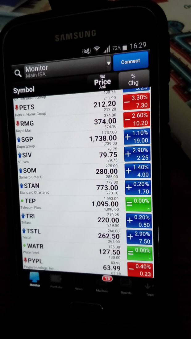
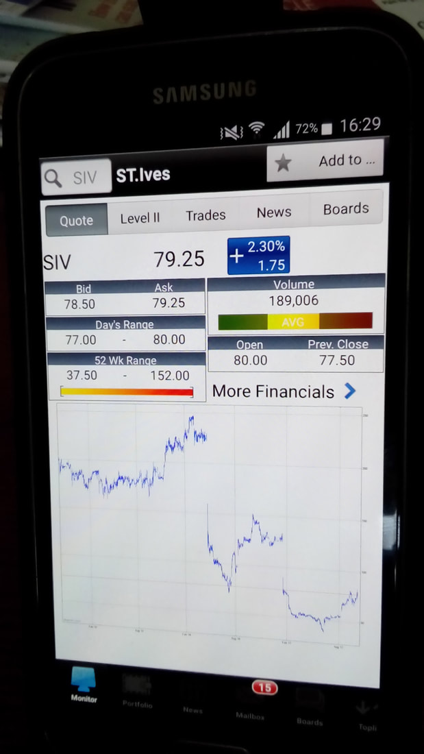
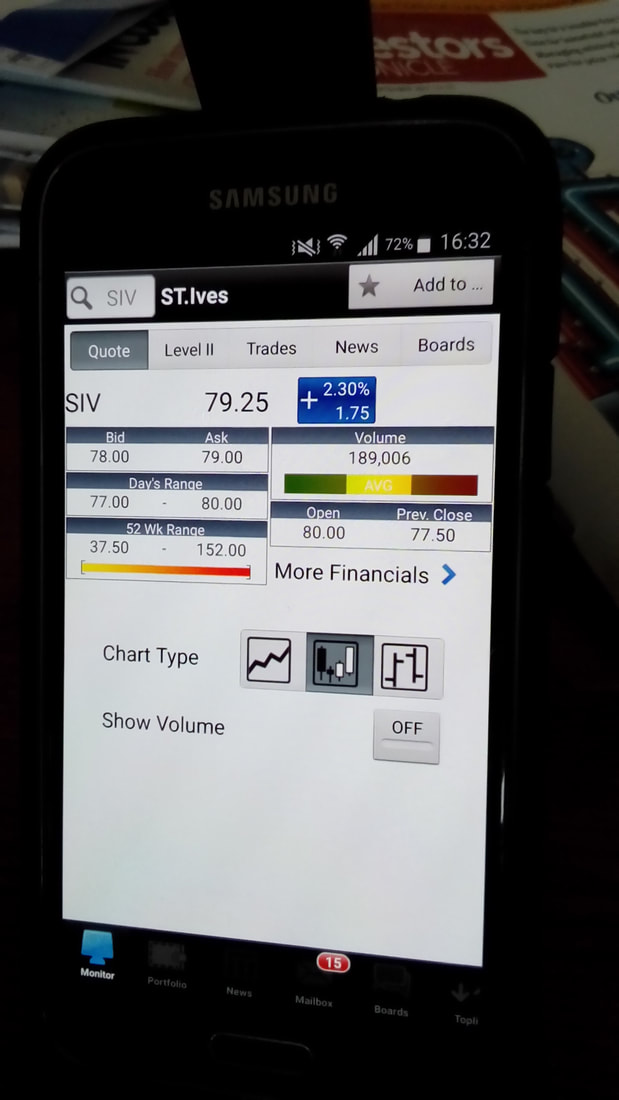
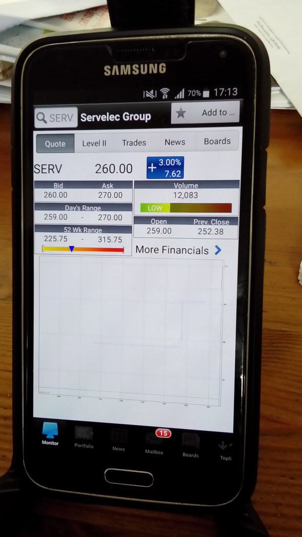
I then look steadily through my Stocks and I am looking for the larger moves (probably 1% or more) and dependent largely upon the sort of Memory in my Brain of how a Price Chart has been moving, I might then poke at the particular Stock ‘Line’ on the Screen and I then get the ‘Quote Screen’ which you can see here:
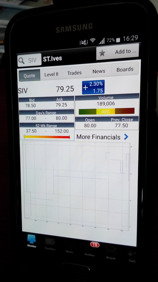
In the bottom part of this Screen you should see a Chart - this is an Intraday Chart and is just a Line - it does not do Candlesticks at any level below the Daily. What you do then is to swipe the Chart with your finger to the Left and it comes up with a 1 Month Chart and I have this set to show Candlesticks (I am sure Readers know my obsession with these little devils by now) and I will most likely be looking at how the Candles are moving and what patterns are forming up.
I find this extremely useful for Topping Up on Stocks I already hold and/or for Topslicing Stocks I hold or for when I am after a completely new Stock and I will use the ‘Search’ Facility to look at these. The Candles help me get a sense of when a Stock has been moving down in a ‘wave’ and it might be starting to turn up or whatever. On the flipside, it also gives me a sense of when a Stock has been moving up nicely but might be starting to Top out. It is perfect for stalking a Stock I find (especially when used with my Deer Stalker plonked on my bonce). The picture below has the 1 Month Chart: 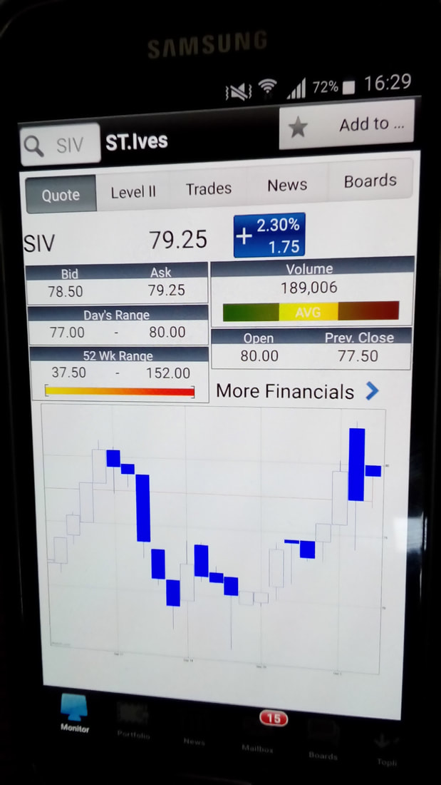
If you swipe it again you get the 3 Months Chart as below - again this all helps you get ‘context’ to understand how the Daily Candles are moving:
I might have missed a 6 Month Chart (I am not even sure there is one !!) but anyway here is a 1 Year Chart:

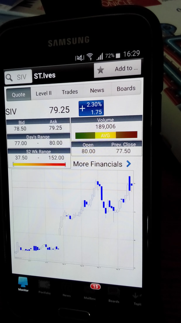
And here is a 3 Year Chart:
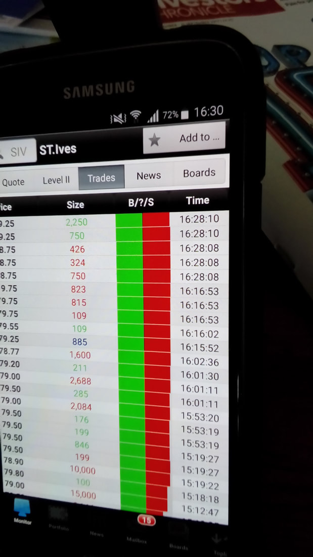
You might have noticed at the Top of the Screen there are some Menus - this is the ‘Trades’ one - to be honest, I pretty much never look at it:
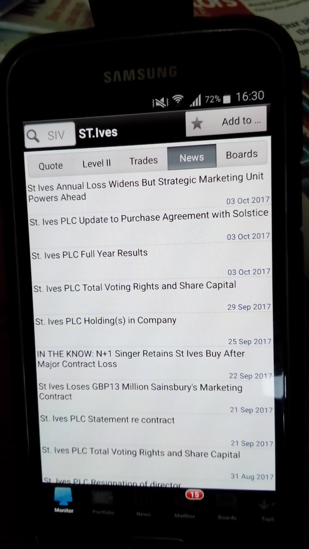
Oh, the ‘Level2’ Menu is for if you are a Subscriber to ADVFN’s Level2 Service - if you are a FREE User and you click on this, you get offered the various Level2 services with their Monthly Charges. A Menu I use loads is the ‘News’ Menu which gives the RNS Announcements for the particular Stock - this is superb and it is clear and easy to read:
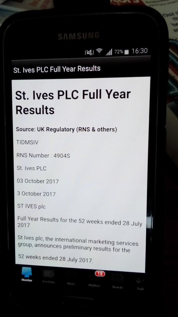
If you shove your Finger on a particular News Item, you get the Full Text on the Screen - just like this:
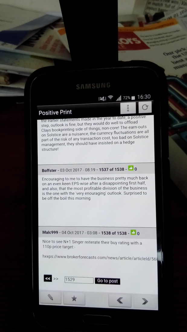
The next Menu I sometimes use is the Bulletin Board one which is strangely called ’Boards’ - you can see that here - this is really handy if the Price moves in a wild manner with no News and you are trying to figure out what is going on:
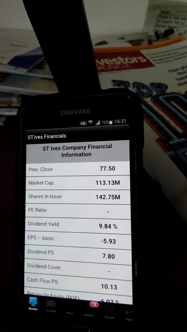
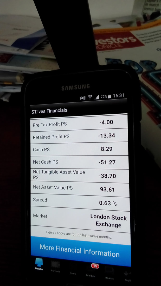
Back on the earlier ‘Quote’ Screen you might have noticed a bit of Text just above the Intraday Chart that says ‘More Financials’ - this used to take you to the ADVFN Website for the full stuff you usually see there but recently they fitted in a sweet little Summary - I find it useful for the Dividend Yield and Historic P/E but to be honest I am more interested in Forecast Numbers and this is where my ADVFN App is pretty much useless and I have to refer to my SharePad setup on my 10 Inch Tablet to get those quickly. Here is the Financials Summary:
If you scroll down that Financials Summary, there is a Blue Highlight at the bottom where it says ‘More Financial Information’ as you can see here:
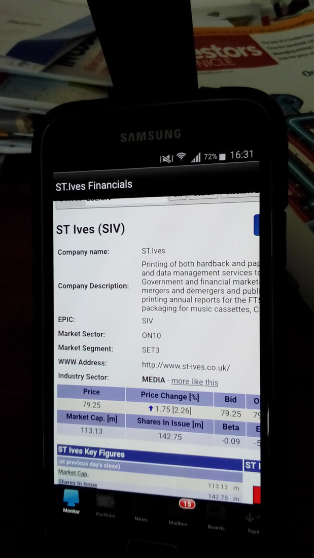
If you poke that with your Finger (or any other part of your body if you fancy it), you get taken to the ADFVN Website with the full Financial stuff you expect to see there for a particular Stock:
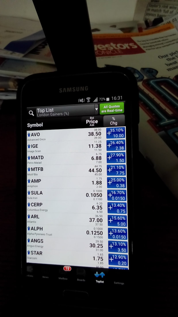
Another useful feature of the App is the ‘Toplists’ that you can choose. These appear along the bottom of the Screen and if you prod it, you can choose things like the Largest % Gainers for the Day as seen here:
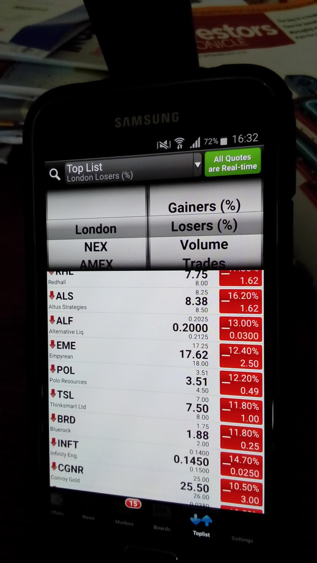
Or you can get the Largest % Losers like these - I know many Readers will be interested in these kinds of Lists:
I mentioned earlier that you could change the Chart Settings - you need to swipe the Intraday Chart from the Quote Screen to the Right to get this Settings Menu - I always have mine on Candlesticks !!
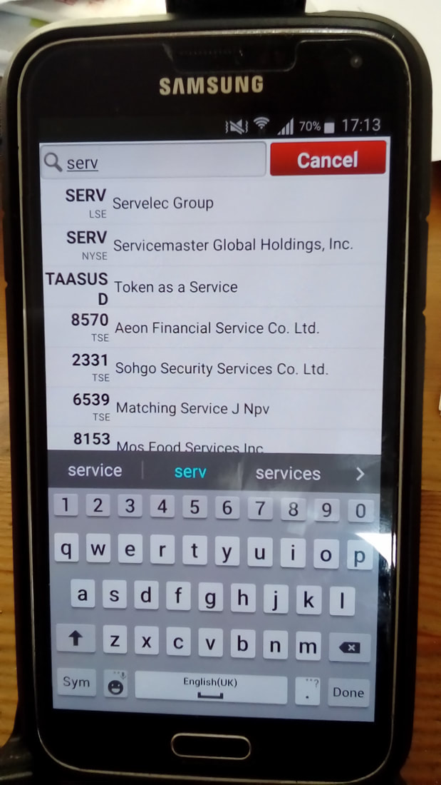
In the Top Left Hand Corner there is a Search Button as you can see in use here - this is to find New Stocks that you don‘t have already setup in your Portfolios and/or Watchlists. Oh, while I think of it, I am not sure if you can create new Portfolios from the App - you might need to do this on the proper ADVFN Website - it is years since I did this !!
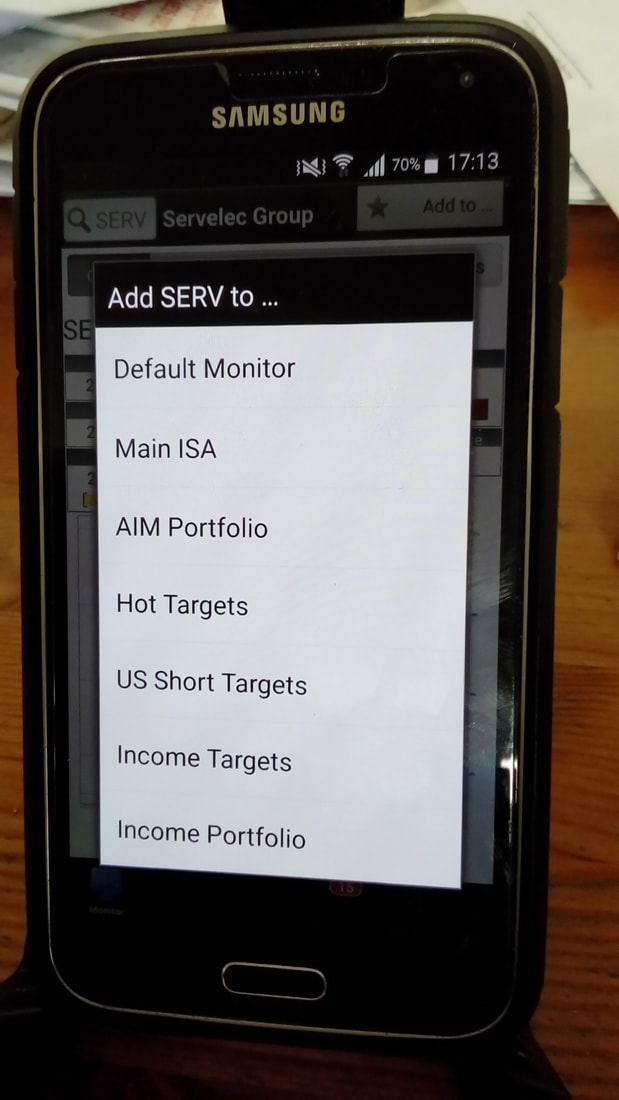
Once you have found a New Stock, if you are really interested in it or whatever (for me it is often a New Stock which I have bought and I want to add to one of my Portfolios) you use the ‘Add to’ Button in the Top Right Hand Corner as below:
And once you click that Button, this is the kind of thing you see and here are the Portfolios I have set up on my Screen - they are very old names !!:
Conclusion
I hope this Blog has given Readers some clarity on exactly what the Numbers are that I report on every Evening and has given a better understanding on why I go through this exercise and how I use the ADVFN App to help with timing of Buys and Sells and suchlike. I fully recommend the App and I would really struggle if I did not have access to it - it is certainly worth giving it a road test if you are after a quick and easy way to review your Stocks during the day. In fact, one of the first things I do when I wake up and turn the Alarm off on my Fone, is to switch to the ADVFN App and see what is moving. Of course, in the modern world with luxuries like 4G I can even use it down the PUB !! Cheers, WD.
0 Comments
Leave a Reply. |
'Educational' WheelieBlogsWelcome to my Educational Blog Page - I have another 'Stocks & Markets' Blog Page which you can access via a Button on the top of the Homepage. Archives
May 2024
Categories
All
Please see the Full Range of Book Ideas in Wheelie's Bookshop.
|
