|
One Week into 2017 and Markets continue to keep charging up - the Bulls seem to be firmly in control and with recent Breakouts to All Time Highs on so many Major Indexes it seems like 2017 is set for a decent Year. In the very Short Term it strikes me that Markets are Toppy both in Valuation terms but also on the Technical side - we have not had a decent Correction for some time and this is pretty unusual. It is not like there are no problems in the World !!
In addition, we need to ask the question “who is left to buy?” - the run up has been so strong for so long that it seems highly likely most Buyers have got their Cash in by now - at some point the Eager Buyers just dry up.
Facing 2017 there are obviously stacks of scary Macro Issues that could cause trouble - things like French Elections, German Elections, Trump Presidency, Brexit Article 50, Italian Banks, etc. etc. - however, at a lower level and perhaps more immediately the following issues are playing on my mind and are a source of intrigue:
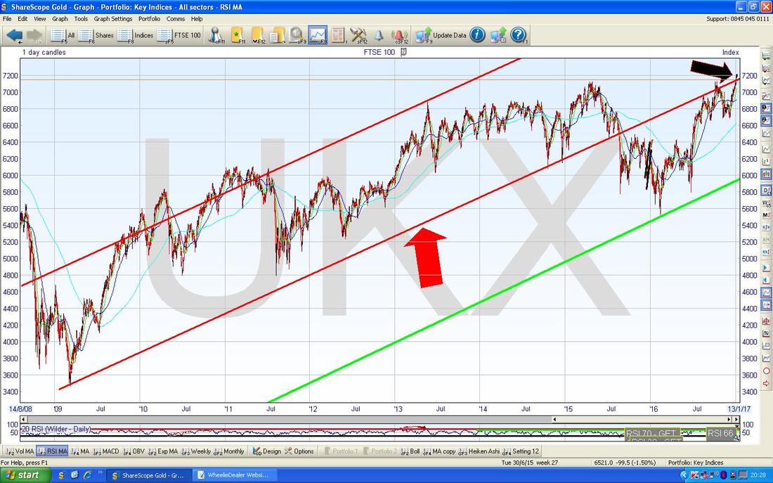
Anyway, these are all Macro type things to be aware of and it will be important to keep tabs on such things as they have major implications for Stocks and Bonds etc. Right, onto the Charts……… FTSE100 A quick recap on the ‘Big Picture’ - the Chart below should be recognisable to regular sufferers of my Charts Blogs and the key thing here is that where my Black Arrow is we have got back inside the Long Term Uptrend Channel marked by my Red Lines and at the same time we have broken out to New All Time Highs - this is bullish behaviour. However, just to bring us all down to earth, it wouldn’t take much moving of my Red Line to make it so that we have not got cleanly above it (drawing of Chart Lines can have a fair bit of subjectivity and my interpretation here could be slightly wrong) - it is very possible that we can fall from here and the Red Line will act as Resistance.
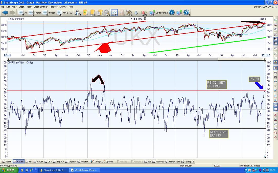
As per normal, all Charts are from the fab ShareScope Software that I use - the Chart below has the Daily RSI (Relative Strength Index) for the FTSE100 in the bottom window - with a reading of RSI 70 as per my Blue Arrow, this is extremely high and very often a Turning Point. It can go higher, as my 2 Black Arrows show, but this is rare and temporary. On this evidence alone it strikes me that the FTSE100 Rally is nearing its end…….(famous last words).
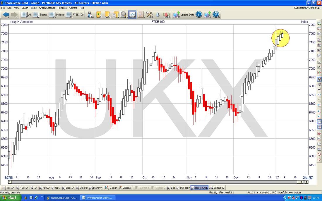
The Chart below has the Heiken Ashi Candles for the FTSE100 Daily. My Yellow Circle is pointing out how we have had several sizeable White Up Candles and these suggest more Gains to come. After such a good run, I would think as soon as we get a Narrow Red Candle we should be wary that a Drop is coming.
DAX (German)
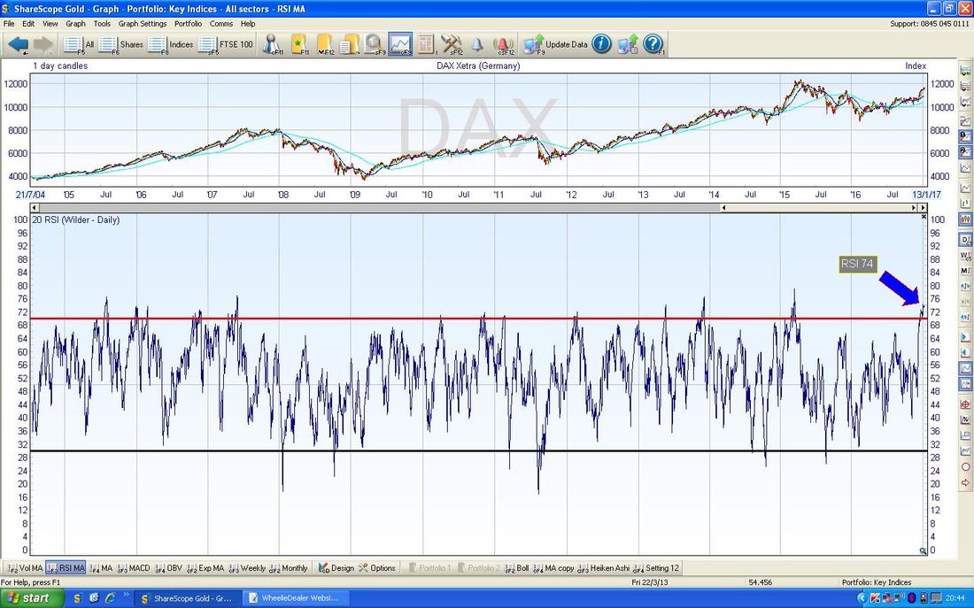
The Chart below in the Bottom Window has the RSI for the DAX Daily. With a Reading of RSI 74 this is extremely high and clearly the DAX is looking toppy. However, it must be appreciated that a high RSI reading does not necessarily mean the Price should fall - it is possible that it could go Sideways for a bit and this would unwind the extremely high RSI readings.
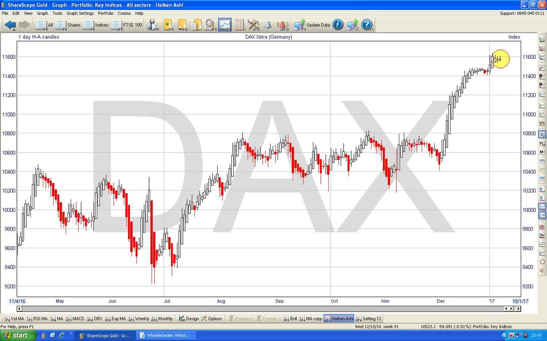
The Chart below has the Heiken Ashi Candles for the DAX Daily. My Yellow Circle is highlighting where the last 3 Candles are still White (Up) but they have narrowed a lot - this might be preceding some Red Candles - something to watch closely.
DOW Jones Industrial Index (US)
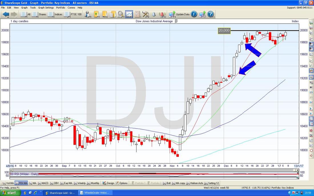
This is probably the most watched US Index but it is only 30 enormous MegaCap Stocks so it is pretty unrepresentative of anything. However, it is getting mucho attention at the moment because it went slightly over 20,000 on Friday - this is a big psychological number and it will be interesting to see if the Bulls can get cleanly above it in coming Days. The Chart below shows the Daily Candles and I’m wondering if we are looking at a potential ‘Bull Flag’ - the principle being that if the Price can breakout over 20,000 then perhaps it will run up a lot more. My Blue Arrows are pointing to the possible ‘Flagpole’ of the Bull Flag and the Price Action of the last 3 weeks or so is the ‘Flag’ bit. The theory is that if it does break higher then it should go up the ‘Height’ of the Flagpole - this would be about 600 Points maybe (19800 minus 19200).
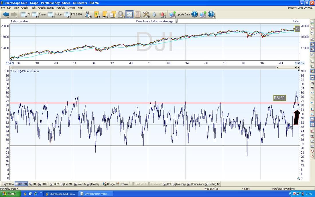
In the bottom window below we have the RSI for the DOW Daily. With a reading of RSI 69 it is still extremely high and has been falling from as high as RSI 80. This suggests either Drops to come or perhaps continue to grind Sideways which would line up with the idea of a Bull Flag as per my previous Chart.
Pound vs. Dollar
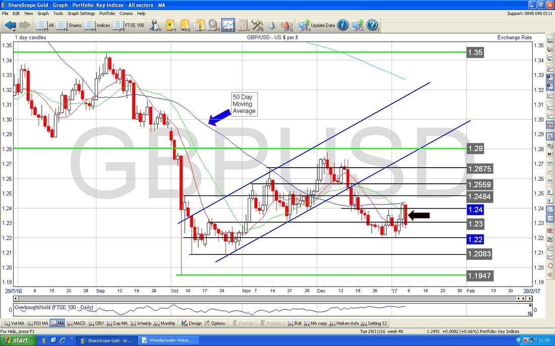
I am sure we are all aware of the importance of this Chart after a sustained period where trying to Trade the FTSE100 has really become a Trade on the Quid vs. the Buck - we are all Currency Traders now……. The main things here are the Support and Resistance Levels - 1.22 at the Bottom is critical Support and must hold for the £ to stay up and for the £ to go higher it must breakout over 1.24 which also just happens to be the 50 Day Moving Average Line (I have marked these 2 with Blue Text Boxes). On Friday 6th January 2017 we got a big Down Candle - this is marked with my Black Arrow - this is obviously a negative sign and it is important 1.22 holds as Support. If this fails, then we could go on to test 1.2083 and then 1.1947. I suspect the most likely outcome is that for some time the Pound will trade between about 1.21 and 1.27 - i.e. a wide range.
Nasdaq 100
This Chart is particularly of interest to Me, Myself, I and I understand Joan Armourplating likes this as well (sounds like I am inviting you to skip this one and move onto the next Chart !! Or maybe to dig out your Joan Armatrading CDs). The Chart shows the Daily Candlesticks for Nasdaq 100 in recent days (note this is not the Nasdaq Composite Index - I use this one because igIndex only allow me to Spreadbet on this one not on the Comp) and I have a Short Position on it which I opened where the Blue Horizontal Line is. I have a Stoploss which will be activated on a Manual Basis (in other words I do not have an Automatic Stoploss set with igIndex - I need to Close the Position myself if the Stoploss is triggered) if the Price Closes above my sort of Aqua coloured Horizontal Line at 5010. My Black Arrow is showing where the Price moved above my Stoploss Level intraday on Friday but it Closed below the level - so my Stoploss has not yet been triggered.
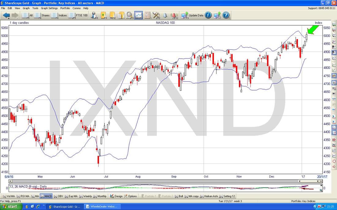
The Chart below has the Daily Candles for the Nasdaq 100 surrounded Top and Bottom by the Blue Wiggly Bollinger Bands. My Green Arrow is pointing to where the Price has closed above the Top Bollie Band on Friday and this is an unstable situation - I would expect the Price to come back within the Bands now - this means a pullback or a bit of Sideways Action (ooh err, missus).
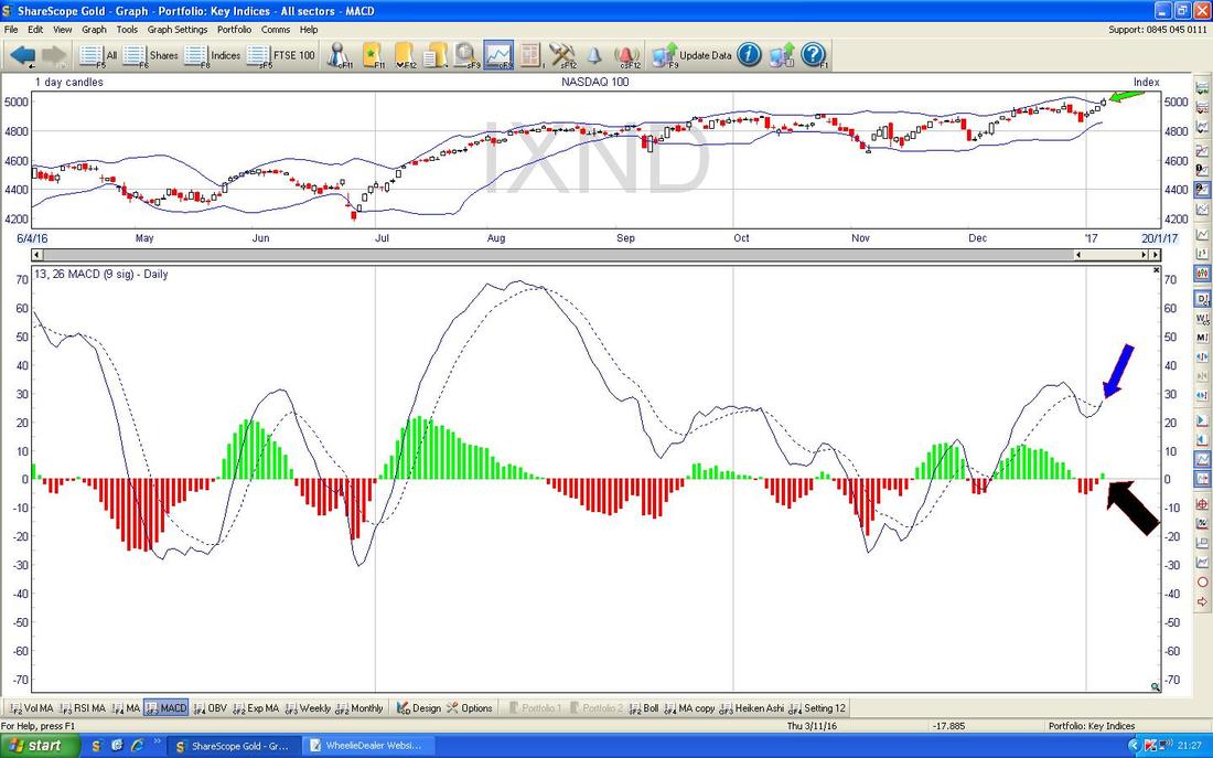
In the bottom window below we have the MACD (Moving Average Convergence Divergence) for the Nasdaq 100 Daily. My Black Arrow is showing in Histogram Bar format how we got a Bullish MACD Cross on Friday and my Blue Arrow is showing the same thing in the Signal Lines format.
Brent Oil (Spot)
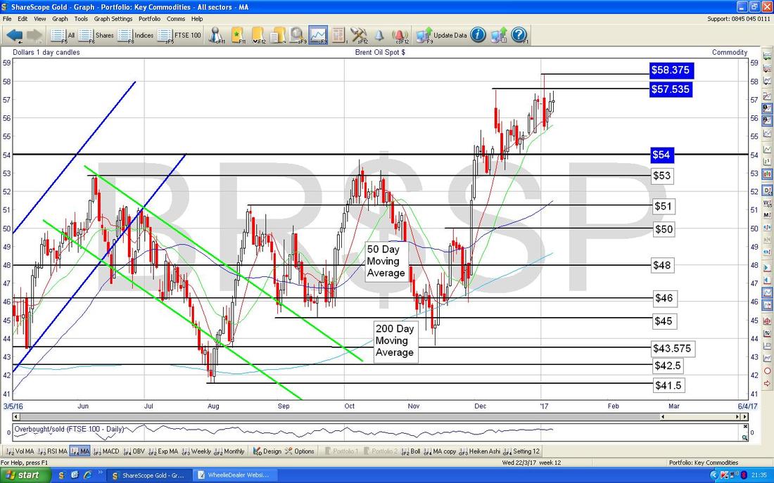
The Chart below has the Daily Candles for Brent Oil (Spot) going back around 10 months. The Key thing here is that the Price needs to get over Resistance at $57.535 and then $58.375. If it can crack these then there is a lot of Resistance between $60 and $70 but it seems likely to me that we will be up among these Numbers soon. On the downside, it looks like Support around $53 and $54 is pretty good and we should bounce from these levels if they are tested.
Gold (Spot)
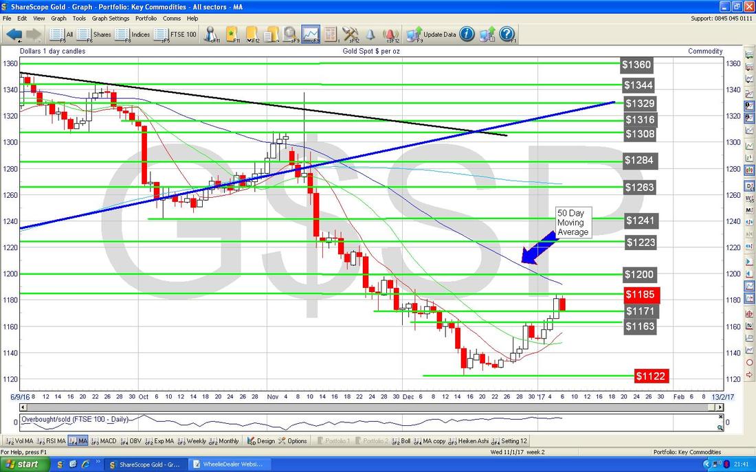
The Chart below has the Daily Candles for Gold Spot - we have had a bit of a recovery in recent Days but I suspect the 50 Day Moving Average which I have highlighted with my Blue Arrow will be difficult Resistance to get over - this is at around $1190. $1122 will now become Important Support and this must hold if we are to avoid heading down towards $1000 or so.
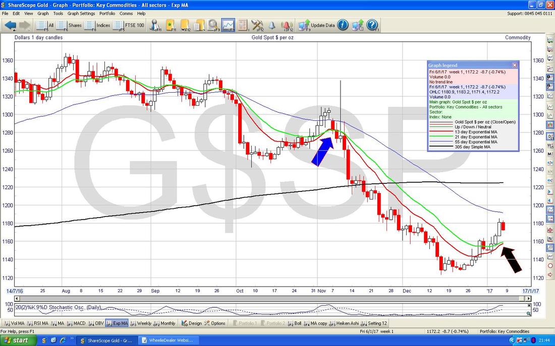
On the Chart below, my Black Arrow is pointing to where we are very near a Bullish ‘Golden Cross’ between the Red 13 Day Exponential Moving Average (EMA) and the Green 21 Day EMA - if this happens, it could mean a few weeks of rises. However, nothing in TA is guaranteed and my Blue Arrow is pointing to where we got a similar Golden Cross but it actually fizzled out in this case and the Gold Price continued to fall.
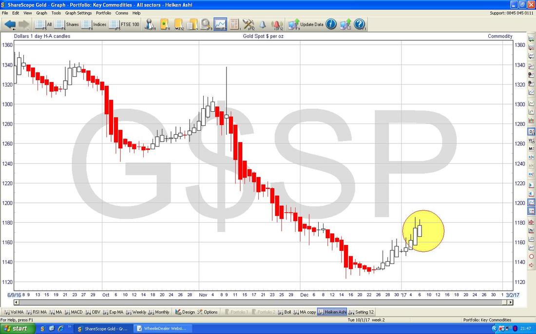
The Chart below has the Heiken Ashi Candles for Gold Spot - my Yellow Circle is trying to draw your attention to some nice big White Candles in recent Days - these suggest more gains to come but note the HA Candles are a bit slower at signalling than some other things like Normal Candlesticks, so this does not guarantee more moves up but it could well happen.
Right, that’s it, Cheers, WD.
0 Comments
Leave a Reply. |
'Educational' WheelieBlogsWelcome to my Educational Blog Page - I have another 'Stocks & Markets' Blog Page which you can access via a Button on the top of the Homepage. Archives
May 2024
Categories
All
Please see the Full Range of Book Ideas in Wheelie's Bookshop.
|

