

|
educational blogs |
|
I’m still finding the Markets a bit hard going at the moment - last week I eeked out a small gain but the significant moves were really on Thursday and Friday when Stocks were pretty weak and choppy - it just seems like usual late Summer Markets where many players are probably on Holiday etc.
The Worst Month of the Year, September, is now not far away - it wouldn’t surprise me if we get more selling next Week in anticipation of this and I will look at the Index Charts in a bit to see if there are any signs of this happening yet - there were definitely some hints that the strength we have seen for all of 2017 so far might be easing. October can be a strange month on average - it usually returns a decent result but its quirk comes from having been the Month when some significant historical Stockmarket Drops have occurred - such as the Wall Street Crash and the 1987 one known as ‘Black Monday’.
If we do get some sort of sizeable Pullback, then my thinking at the moment is that it would be just a Technical / Historic Trends kind of thing - and not necessarily a sign that the Bull Market since 2009 is ending. There are a few fundamental elements supporting this view - firstly there are lots of Stocks in the FTSE100 still expected to provide Dividend Yields of 5% or even 6% plus - when you consider that Cash pays almost nothing in terms of Yield and Government Bonds are as bad or worse and how even Corporate Bonds (of both Investment Grade and ‘High Yield’ status) are pretty awful in terms of Yield, then Stocks look very attractive despite the Run up. There is a simple reason for this - as Stocks have run upwards, they have also been increasing their Dividend Payouts in absolute terms - so the Dividend Yields are at similar levels to where they were a few years back despite the run up.
Secondly, despite all the Negative News around, Economies around the World seem to be improving still - I have been seeing talk of this perhaps ending but it is early days to be making such a judgement, and based on very little evidence. If Major Global Economies keep growing, then this will probably be supportive of Stocks - especially when the ‘Hunt for Yield’ is driving people this way. Thirdly, despite all the gains, most people out in the Big Wide World are totally unaware that Stocks have been booming - it is not always the case but sustained Bull Markets like this tend to end when even your Milkman is giving you Share Tips - we are nowhere near this point yet. Indeed, I was at a Barbie yesterday with around 10 mates from Uni and none of them knew we had been in a Bull Market for 8 years. A big drag could come from disappointment with Trumpy and his inability to push through Tax Reforms and other growth measures for the US Economy. His isolation on so many Political Issues, rightly or wrongly, means he is losing Supporters even among the Republican Party which he is supposed to be the Leader of - it seems likely that his only hope is from the American People themselves - if they back him over ‘The Swamp’ then he might be able to carry out some of his Manifesto. The sad truth is that the US (and the UK seems to be copying) is getting hugely polarised between ‘Far Right’ and ‘Far Left’ - this is a very unhealthy situation and it seems like neither side is prepared to talk to the other or to compromise. I am convinced Social Media is not helping here with ‘Echo Chamber‘ Silos adding to the problem. In terms of other drags, Central Banks ‘unwinding’ their Balance Sheets after Years of QE (Quantitative Easing) and perhaps pushing up Interest Rates a bit might feed an Short Term nerves - it often seems to be the case that the Markets fall and then the Media creates the Narrative to explain it - if we get a drop in the Autumn, then these kinds of reasons could be ‘blamed’. However, from a wider perspective, such Policy by Central Banks could be seen as signalling that Economies are recovering after so many years of sub-par Growth and this would probably be taken as positive for Stocks and negative for Bonds. To add to this, there is much evidence that Stocks tend to rise in the early years of Rate Rises anyway as the positive elements of a Recovering Economy overwhelm the negative aspects of rising Rates. The other big issue that is down the track comes from the German Presidential Elections - although it really looks like a done-deal for Merkel. Wheelie’s Summer Bash Venue If you are intending to come to the Bash on September 23rd, then I have confirmed the venue as The White Hart in Winkfield - if you go to the Homepage you should find more details and a link to the White Hart’s Website. Moving on, here are some Stock Charts……. Utilitywise UTW I’m sure most Readers are aware of the goings-on at UTW and I hold this Stock as I think there is a decent Business here despite a terrible recent History and all the problems with Revenue Recognition and adoption of the new IFRS 15 Accounting Standard. UTW are due to put out a Trading Update on Thursday 24th August - after so many Profit Warnings and streams of Bad News, it seems pretty likely that this Update will be good -and with such a small Free Float (partly because Neil Woodford still holds a huge Stake), I suspect that any Good News will cause the Shares to jump up fast. On the Chart below the Key Level is 81p and we need the Price to Break-out over this. If it can do so, then there is a ‘Gap’ above up to 107p and I expect that Gap will close fast if the Update is taken well by the Market. It is certainly one to be aware of. 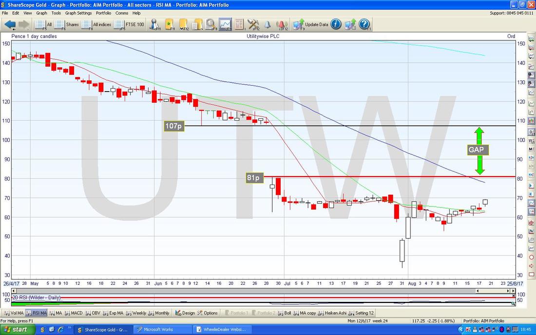
Sprue Aegis SPRP
This is another one I hold and it has been a bit of a Rollercoaster but that is not unusual with Stocks !! Fundamentally it looks like they are recovering after some issues and the Chart seems to be supporting this view. In terms of value if you look at the Forecast P/E for 2018 you get 17.9 but in 2019 this is expected to drop to just 11.7 as Earnings pick up - and SPRP has a lot of Cash as well. In terms of Dividend Yield, it is expected to be 4.85% next year and 5.12% in 2019 - not bad. They do Smoke Alarms and similar items. On the Chart below, the first thing to note is the Red Arrow which shows a Bullish ‘Golden Cross’ between the 50 and 200 Day Moving Averages - these are great predictors of more gains to come. Note also how the 50 and 200 Day MAs are rising now. Next look at the Black Parallel Lines which are marking a nice, shallow, Uptrend Channel - with the Price where my Yellow Circle is around the Blue Wiggly Line which is the 50 Day Moving Average, it is not far from the Bottom Black Line (marked by my Black Arrow) of the Uptrend Channel. As always, if you click on the Picture it should grow much larger in your Browser so you can actually see the blessed thing. 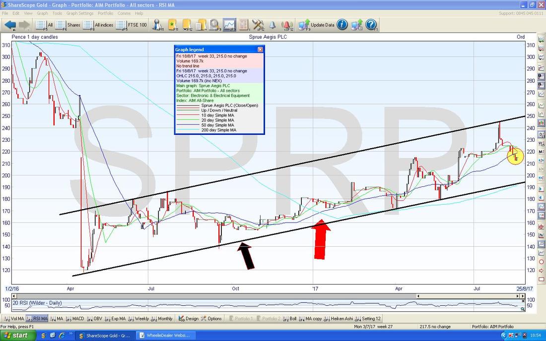
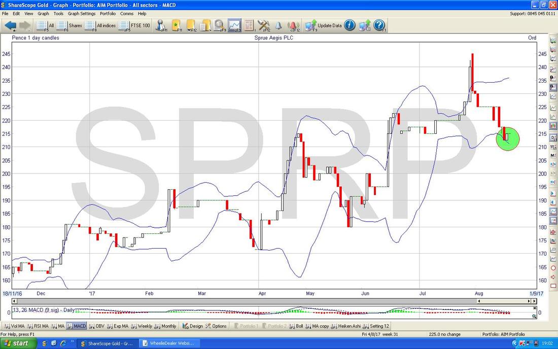
The Chart below has the Daily Candlesticks for SPRP with the Blue Wavy Bollinger Bands above and below - my Green Circle is hopefully showing how the Price is now down near the Bottom BB.
The Chart below has Daily Heiken Ashi Candles for SPRP - remember these things are totally different to normal Japanese Candlesticks but I find them superb due to their clarity. Where my Blue Arrow is you should be able to see a very Narrow HA Candle from Friday - this suggests the move Down might be weakening but we need to wait for a nice White Up Candle before being pretty confident the turn up has happened.
If you want to know more about HA Candles then do a Search on YouTube because there are some excellent Videos on there to show their use in anger in the Real World. 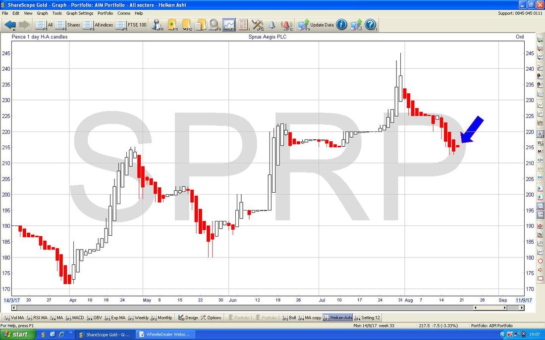
William Hill WMH
This is not a Stock I hold although I am sure many Readers probably do and many people will have been considering it no doubt for the forecast 5.4% Dividend Yield. On the Chart below, I have just taken a ‘Big Picture’ shot and used the ShareScope ‘Toggle the Trendlines’ button to show the Parallel ‘Pitchfork’ Blue Lines which are clearly showing a Downtrend over that time period. As always, all Charts I show are from the Top Quality ShareScope Software that I use. 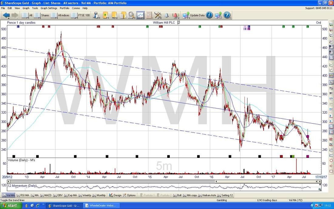
On the Screen below I have zoomed in a bit to just over the last Year and the main thing here now is the Red Horizontal Line at the bottom at 235p which is marked by my Red Arrow. This Line must hold as Support or the Price is likely to drop a fair bit lower. My Green Arrow is pointing to a Bearish ‘Death Cross’ between the 50 and 200 Day Moving Averages - this is clearly not good. Note how a slightly earlier ‘Golden Cross’ was negated - just showing that these things are not perfect and should never be relied on as an Indicator on their own without other supporting factors (both in terms of Chart Signals and Fundamentals in my view).
Note the fairly big Director Buy of £235k at the Top Right Hand Corner of the Chart. 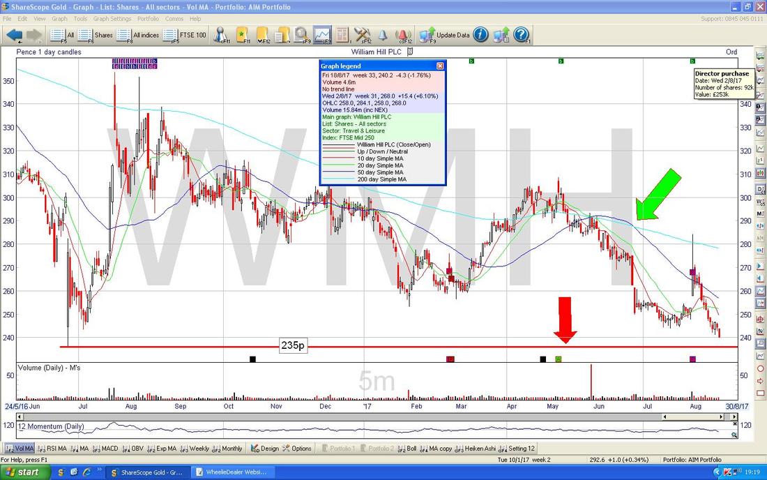
Ricardo RCDO
I’m a big fan of RCDO and held this Company up until about a Year ago when luckily I managed to sell out much higher up than it is now. This one was being discussed on Twitter this Week and it struck me as interesting so I thought I would lob it in here for Readers to think about. RCDO do Specialist Consultancy work in Engines and Environmental stuff as well as building the Engines for the McLaren Supercars. On a Forward P/E of 12 and 2.9% Divvy the value looks pretty attractive - assuming of course that the Forecasts can be met - but they don’t look particularly onerous. With RCDO so beat up it would not surprise me if they got a Takeover Bid as their Specialist Knowledge would be pretty desirable to many Car Industry players I suspect. On the Chart below, the key thing is the Red Horizontal Line (Red Arrow) at 645p and if this fails as Support then expect it to go lower. Chances are the Price could bounce soon at or just above this Level. My Black Arrow is showing where there was a 50/200 Day Moving Average ‘Death Cross’ - not good as it turned out. 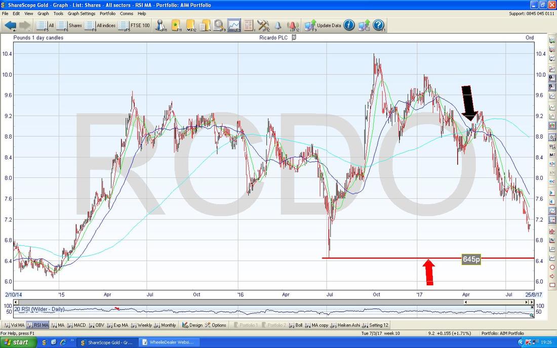
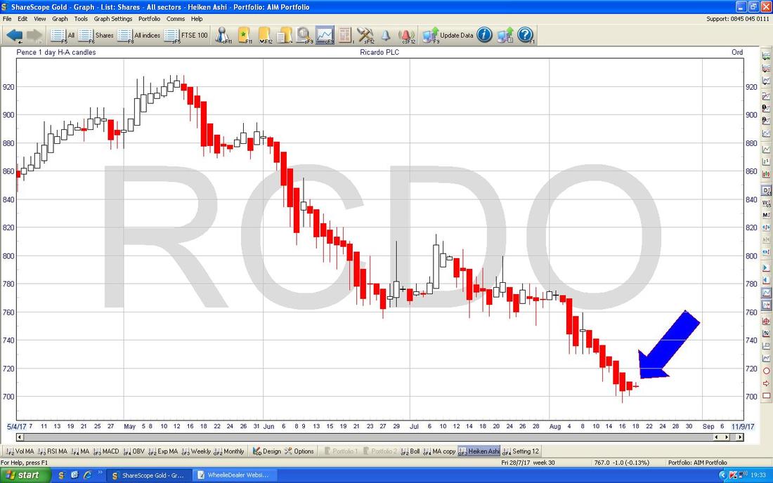
The Heiken Ashis on RCDO are interesting - my Blue Arrow is showing where we got a very Narrow Red HA Candle on Friday - look for a nice plump White Up one.
Manx Telecom MANX
This is another Stock that is useful for the Dividend - at the moment on ShareScope there are no Forecasts but this year it paid out 5.4% Dividend Yield. It has been in the News recently and got beat up because the CFO was charged with growing Cannabis !!! To be honest I am not surprised, I have visited some People on the Island several times and it was pretty clear that a Drug Culture was always not far away - even amongst the professional level workers where Cocaine is apparently quite common. I guess it is an ‘Island’ thing…….. The Chart below has all of MANX Price History to date - as you can see the Black Lines show an Uptrend Channel which ended around May 2016 and then we got into a Downtrend Channel which is currently in force as per my Red Lines. 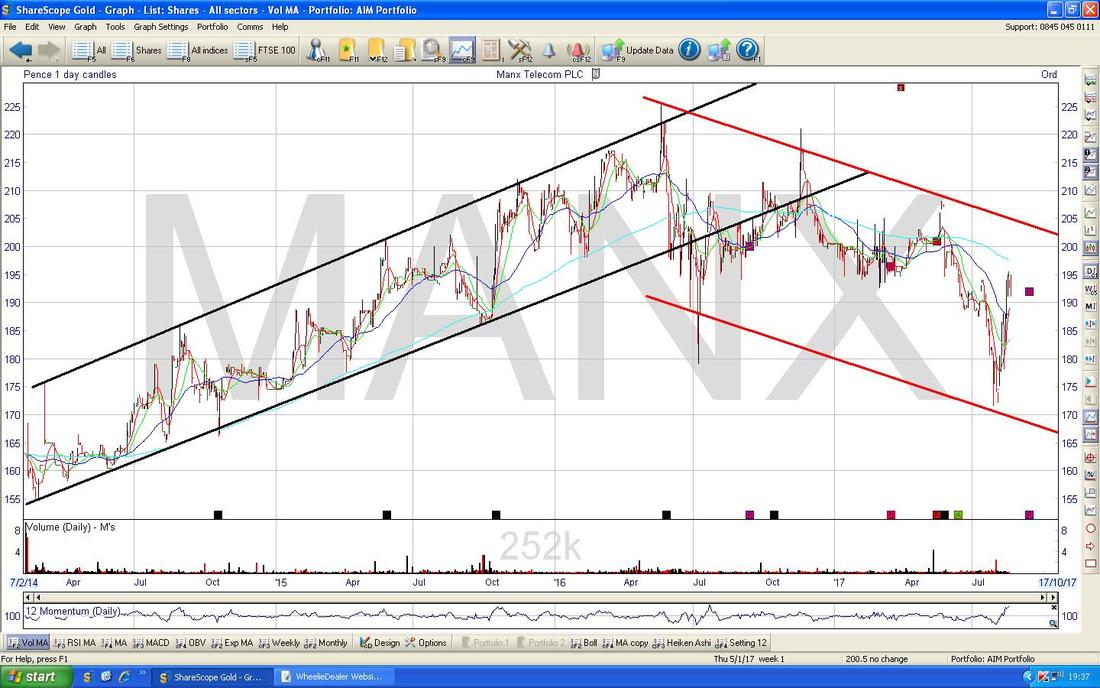
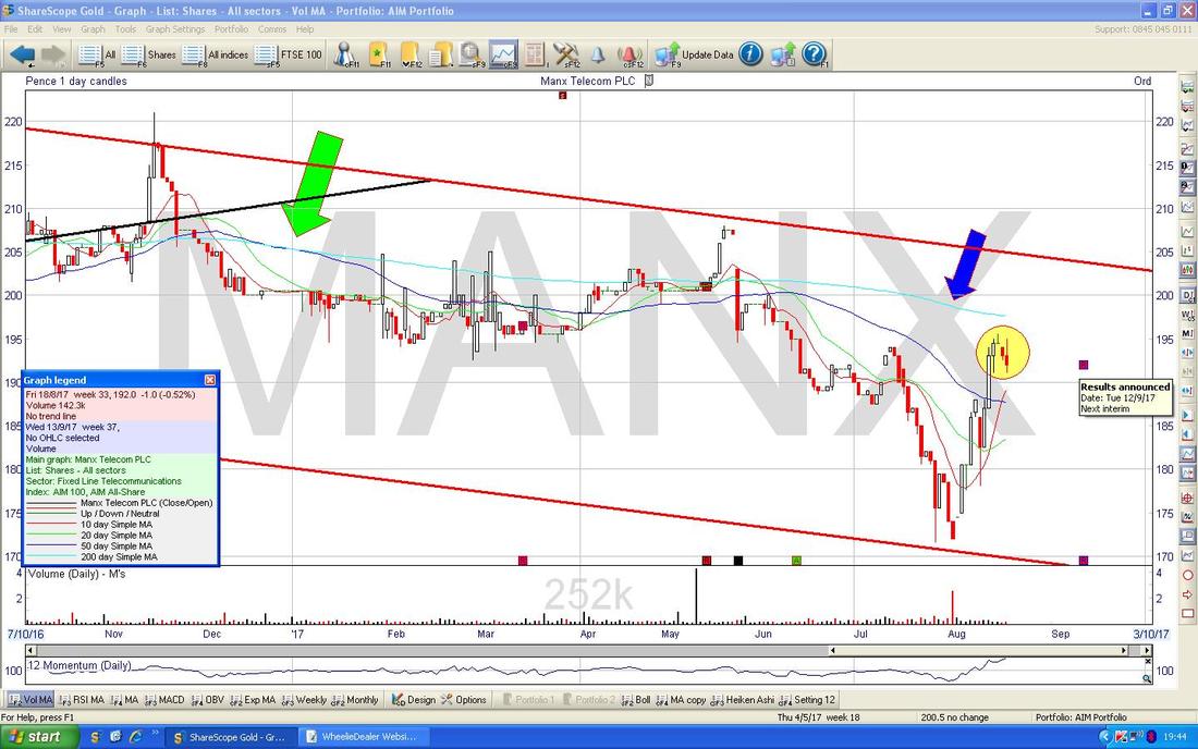
I have zoomed in on the Chart below to show the more recent action within the Red Lines Downtrend Channel from the Chart above. My Green Arrow is showing where there was a 50/200 Day MA Bearish ‘Death Cross’. My Yellow Circle is highlighting how the Price rebounded fast after the CFO Drug News but a Small ‘Gravestone Doji’ Candle on Wednesday marked the Turning Point and the Price has dropped back for the last 2 Days. Note it got up near the 200 Day Moving Average (where my Blue Arrow is) but then dropped back. Overall this still looks a bit bearish to me.
S&P500
This is the big US Index that I take most notice of - the DOW gets all the headlines but with only 30 Stocks it is not hugely representative. First off, here is the Long Term Uptrend Channel which has been in force since the 2009 Credit Crunch Lows - in other words, here is the Bull Market in pictorial form. This is just to set the scene and give the context for any moves in shorter timeframes - remember, Longer Term Trends dominate over Shorter Term moves. 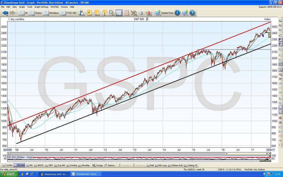
On the Chart below I have zoomed right in on the Daily Candles on the S&P500. First off note the Blue Arrow which is pointing to the 50 Day Moving Average - at the moment the Price is a fair bit below this and simple ‘Mean Reversion’ could drag it back towards the 50 Day MA.
My Green Circle is catching a Doji Candle from Friday where the Price rose early on but by the Close of the Day was unable to hold the Highs and dropped right back. On the one hand this shows weakness, but after the Big Red Down Candle from Thursday (and also because Monday often reverses what happened on Friday these days), there is a fair chance that Friday’s Doji will mark a Turning Point from which the Price moves up. Note where my Green Arrow is that a similar thing happened last Week - so there is a clear precedent. Note the Low on Friday was 2420 and this now becomes a Key Support Level which needs to hold - if not, we will probably drop down and test the next Support Level at 2405 and of course 2400 is a Round Number and therefore an element of ‘Psychological Support’ will kick in. Note last week how the Price moved up after the rebound on Monday but where my Black Arrow is there was another Doji Candle which marked a Turning Point and the Price fell on Thursday in a big way. The next critically important thing about this Doji is that it failed to get up to the All Time High which had been set at 2491 back on Tuesday 8th August which is captured in my Yellow Rectangle. In other words we are making ‘Lower Highs’ which is not a good sign. It is quite faint but the Blue Line down at about 2350 is the 200 Day Moving Average - I suspect this will be an important Support Zone if we do get more of a Sell-off. 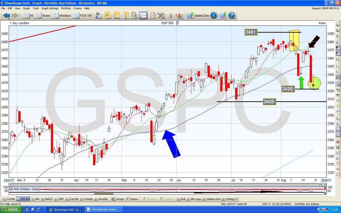
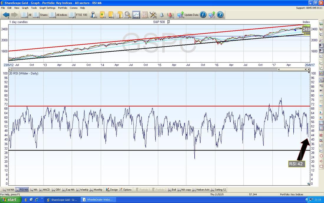
In the bottom window on the Screen below we have the RSI (Relative Strength Index) for the S&P500. On a reading of RSI 42 it is getting lower but can obviously go down more - if you look to the left you can see plenty of examples in recent times where the Markets sold off more and the RSI tanked. RSI is best thought of as the ‘Speed’ of a move down or up or perhaps as the Force.
The screen below has the Daily Candles with the Blue Wiggling Bollinger Bands above and below. Where my Green Arrow is pointing you should be able to see that the Candle has dropped outside of the Bottom BB and this tends to be an unstable condition and the Price will most likely move upwards now or sideways to relieve this unhappy situation. Of course, nothing is guaranteed in Technical Analysis though and it is all about probabilities - What is most Likely to happen?
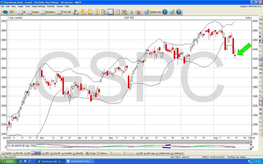
Oh no, this is a Bad Sign. The Graph below has the Red 13 Day Exponential Moving Average crossing down under the Green 21 Day EMA - this is a ‘Death Cross’ and suggests more weakness in coming Days/Weeks - however, it is possible that the Market can turn up again and negate this signal but with September nearly on us, this looks a pretty Bad Sign to me - especially when you remember we have made that ‘Lower High’ that I was talking about earlier.

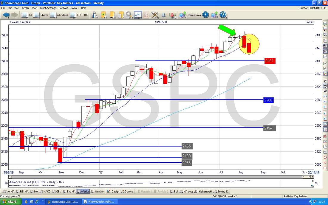
Here are the Weekly Candles for the S&P500. My Yellow Circle is catching 2 Ugly Red Down Candles and they seem to have pivoted down off the 2 Doji Candles which are near my Green Arrow - this looks like a Market that is dropping to me - needless to say I am thinking about putting a Short on here but I will not do anything until Monday Evening at the earliest, but with September coming I want to get a bit of Hedge in place and the S&P500 is probably the best Index for me to do it on as the others like the FTSE100 and the DAX are so affected by Forex these days. In theory I could put a Short on tonight (Sunday) but I find the Sunday Market is pretty choppy and can throw up some extreme moves so it is best to wait I find.
The Screen below has the Heiken Ashi jobbies for the S&P500 Daily - my Yellow Circle is catching 2 Big Red Down Candles which looks bearish.
Note the Nasdaq Composite is very similar to the S&P500 but I won’t show it this week. 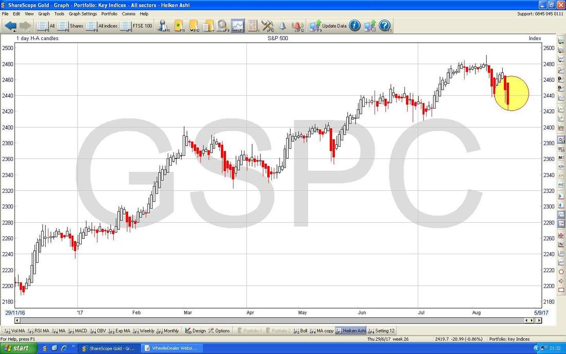
FTSE100
The Chart below has the Daily Candles for the FTSE100 with a Big Ugly Red Down Candle on Friday - Key Support is now at 7300 and if this fails then expect Support at 7200 and 7100 to be tested. If these fail, then Support at 7000 and 6900 will kick in to play. The most important thing here though is under my Black Arrow where there is a 13/21 Day EMA Death Cross - this suggests more falls ahead. 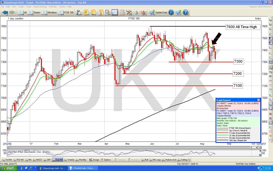
There is perhaps a small grain of hope here for the Bulls on the FTSE100 Weekly Candles - my Green Arrow is showing a sort of Inverted Hammer Candle where the Price couldn’t hold the Highs of the Week but in the context of big Falls in the Week before, this might mark a Turning Point back up - somehow I doubt it though with September around the corner. Of course the FTSE100 might react to any further Pound weakness - this is very hard to predict though.
I won’t show them for time reasons, but the FTSE250 and the Smaller UK Indexes all look rather bearish as well. 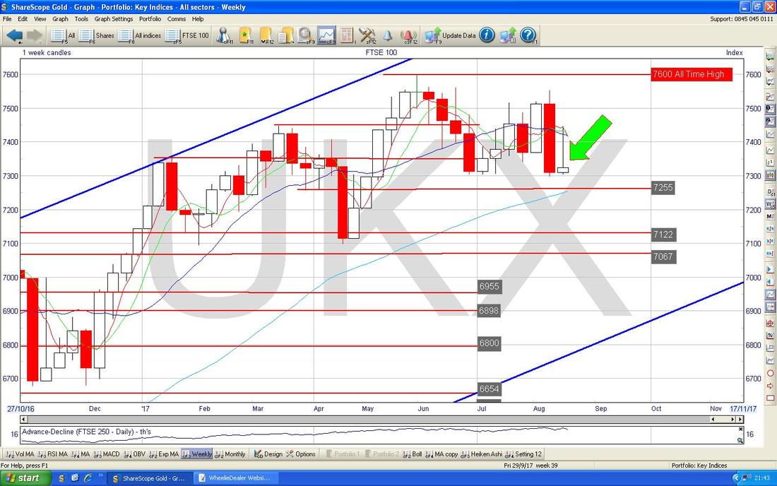
Pound Vs US Dollar
This one is quite interesting because a recent Recovery in the £ has run out of puff and the Price dropped back from above 1.315 and back into the Previous Range. My Green Box is showing how it has moved Sideways for the last 3 Days but it is hard to know if this is a move before a turn back up or if it is just a ‘Ledge’ type move before further falls. The 1.28 Level is now important Support and if this fails then expect the Pound to go much lower. Note my Blue Arrow which is pointing at the 50 Day Moving Average and this should be an area of Support - so maybe the Pound can find some stability here. The Yellow Circle is catching the 50/200 Day MA Golden Cross from a few weeks back - this is still in force and as such is still a positive factor. 
Brent Oil (Spot)
Yes, I know this is unusual, but for once I don’t have a great deal to say here !! (ok, you better get the smelling salts !!). My Yellow Circle is highlighting the 50/200 Day MA ‘Death Cross’ which is still in force but note how the 50 Day Moving Average has flattened and is turning up so maybe the tide is turning but it is a long way off a Golden Cross yet. All that can safely be said here is that $50 is a Key Support Level and $54 is tough to get over - it is all a bit ‘Sideways’. 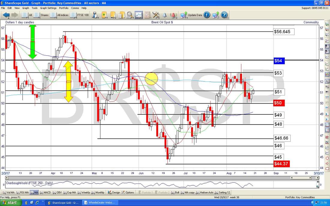
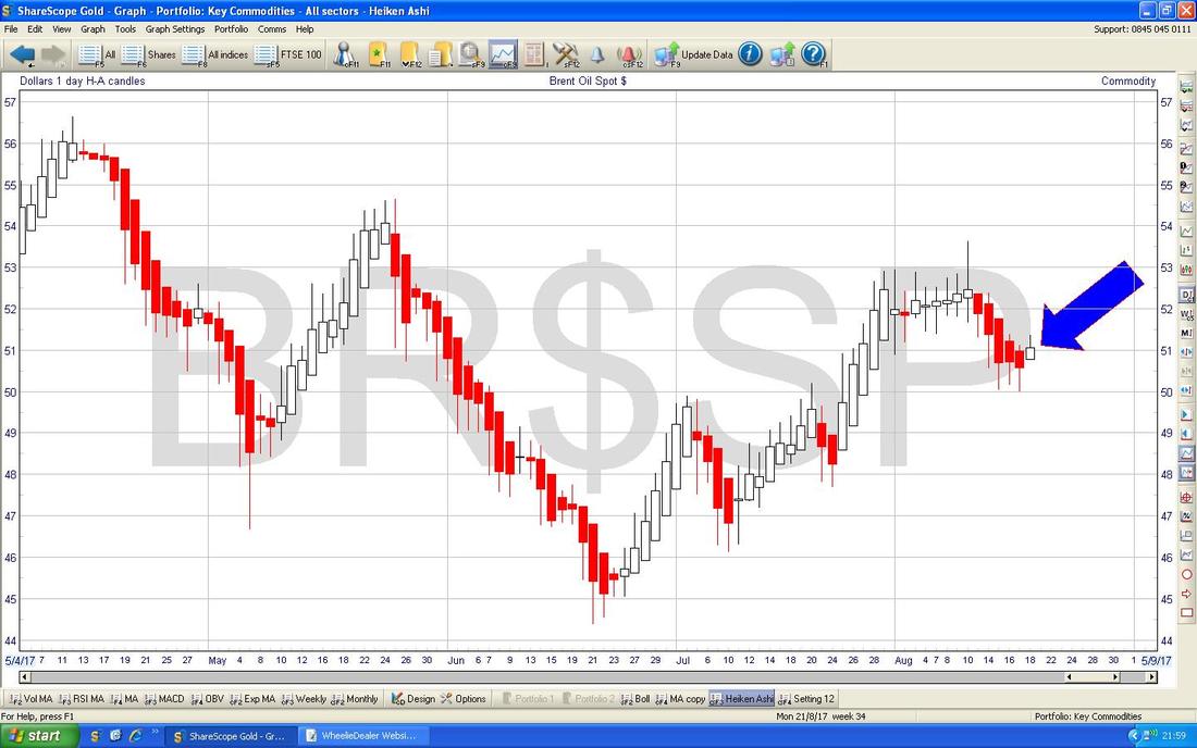
The Chart below has the Heiken Ashi Candles for Brent Oil (Spot) - my Blue Arrow is showing where the Candles have turned White from Red but really Bulls need another White Up Candle here to get excited.
Gold (Spot)
Of course strength in the Gold Price might make sense if Stock Indexes are getting a bit weak ahead of September - my Chart below is showing how Gold (Spot) has nicely broken-out of the Long Term Downtrend Red Line (marked by my Red Arrow) and on Friday it got over $1300 as per my Green Box but note it was unable to hold those Highs and we got a bit of a ‘Shooting Star’/Inverted Hammer Candle - this suggests $1300 will still prove difficult to get firmly over but I think there is clear intent here. To the Near Term Downside, $1267 is a level that needs to hold as Support. That’s it for this Week - Good luck in the coming Week and think carefully about any Trades you decide to put on. Cheers, WD. 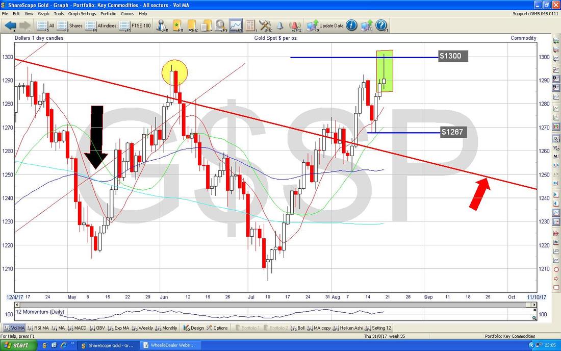
0 Comments
Leave a Reply. |
'Educational' WheelieBlogsWelcome to my Educational Blog Page - I have another 'Stocks & Markets' Blog Page which you can access via a Button on the top of the Homepage. Archives
May 2024
Categories
All
Please see the Full Range of Book Ideas in Wheelie's Bookshop.
|
