

|
educational blogs |
|
Blimey, we have finally got near the Finish Line - one last push and we will get our Medal……with luck it will be a chocolate one. I am sure you readers are just as fed up with this as I am - it seemed like such a great idea when we all merrily set off into the Sunlit Uplands…. Today we are doing a Long Term Exponential Moving Average (EMA), some shorter EMAs and Weekly Candlesticks (calm down, calm down, it’s not that exciting….. In addition, I have bashed out a Conclusion section tying all the stuff we have covered in this Award-Breaking series. 10 Month Exponential Moving Average (EMA) For this one, we need to look at the Graph below. You will see on the Text Box I have put on the Right Hand Side that it is a 305 day Moving Average - this is because I wanted 10 Months but ShareScope only allows me to do it in terms of ‘Days’ (there are other ‘Periods’ like Hours, weeks etc.) I can’t remember if I explained what Exponential means in this context, so I will explain quickly anyway. With a ‘Simple’ Moving Average it is just a case of all the Numbers being added together and divided by the Amount of them. With an ‘Exponential’ Moving Average, Numbers that are generated more recently are given a Higher Weighting - so, in theory, it picks up changes in a more timely manner than a Simple MA does. I don’t think we need to get hung up on these definitions - it is how they Predict likely future Price moves that we are interested in. I stole this Indicator from Dominic Picarda when he was the Charting chap in Investor’s Chronicle. He wrote a page about it and it seemed potentially useful, so I set it up in ShareScope and back tested it against various Assets (sounds like a detailed analysis, it wasn’t !!) and it seemed pretty good at predicting moves. It is very much a Long Term Indicator and the simple rules are:
The context Dominic used it in was to do with Indexes really - but it seems to have validity with Individual Stocks to a large degree. Might be something to watch closely during the current turmoil we see in the FTSE100, Dow, Dax etc. 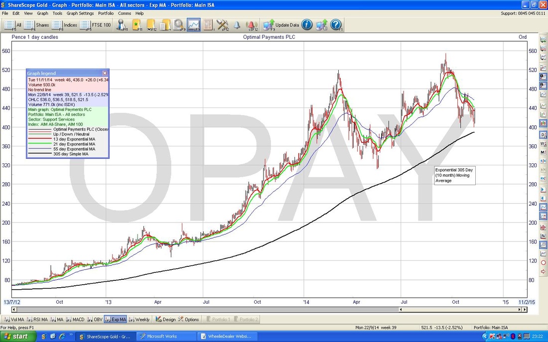 You can see from the Chart above that the Price Line for OPAY has dipped down towards the 10 Month EMA a couple of times before in the last couple of years, but it is nicely staying well above the 10 Month EMA. 13 day and 21 day EMAs Look also at the Red and Green lines. The Red line is a 13 day EMA and the Green line is a 21 day EMA. They are shown clearly on the ‘Graph Legend’ box if you can enlarge or own a Microscope. They work similar to other Moving Averages we have seen in this Series - when the ‘Faster’ one (13 day EMA) crosses up and over the ‘Slower’ one (21 day EMA) from below, this gives a Buy Signal. When the Faster one drops down through the Slower one, this gives a Sell Signal. Simples…. (no they’re not, they are Exponentials !!) Weekly Candlesticks One of the great things about Candlesticks is that they are ‘fractal’ - this is a posh way of saying that the patterns work on all sorts of timeframes - you can use them from 5 minutes, to 1 hour, to Daily Candles through to Weeks and Months if you like. Amazing really. So, in the Chart below, we have the Weekly Candles for OPAY for most of 2014. I have circled in Black the last Weekly Candle before I bought in (remember these Charts are from a few weeks back now) and it suggests to some extent that the Price Line is likely to rebound after a move down for several weeks. The Long Tail at the bottom of the Candle looks like it has tested Support at 400p and the Price has then recovered. This is a good sign. 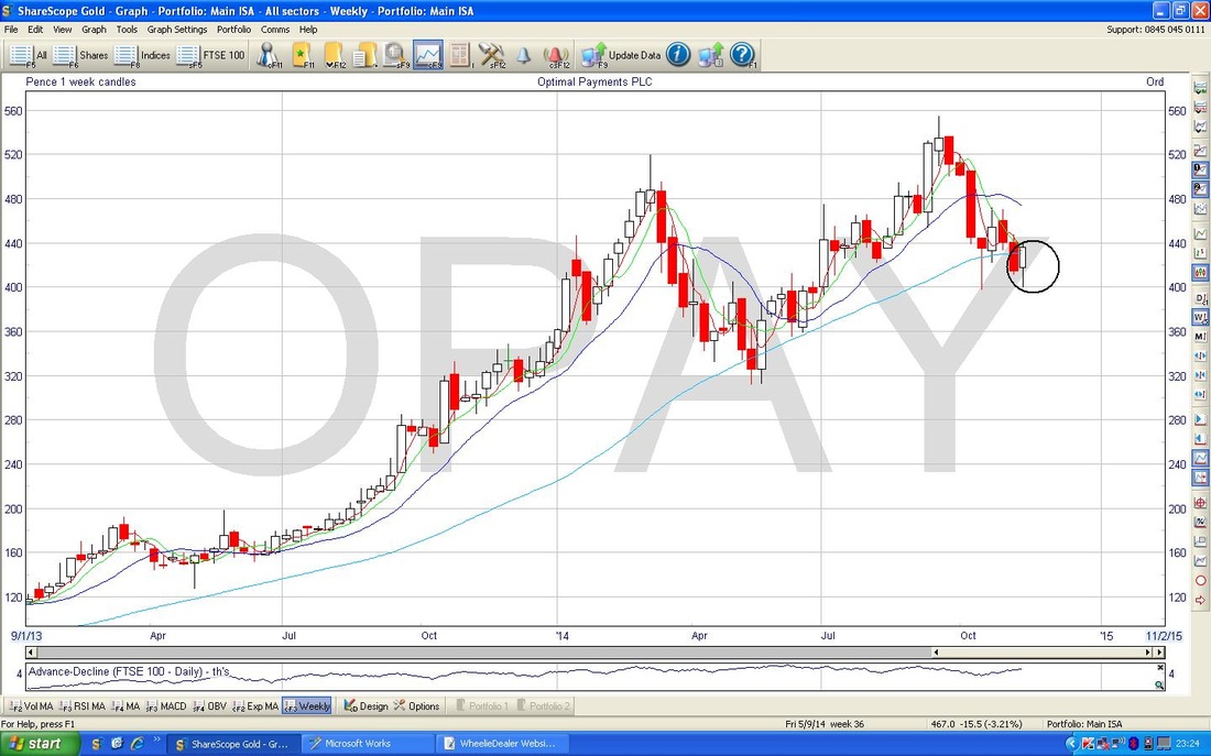 HOT
If you have read the previous Parts of this series (I can‘t believe you have stuck with it !!), you will have already seen me mention my Patented Copyright invention the Hierarchy of Timeliness (HOT). So how do these Indicators fit into the HOT? The 10 Month EMA and Weekly Candlesticks are pretty slow really - they are not good at giving you an early warning !! More than anything, they help to confirm more timely signals from other Indicators. However, the 13 day and 21 day EMAs are pretty earlier - very useful I find. Here is the Hierarchy of Timeliness (HOT) updated with the 3 Indicators covered today:
Series Conclusion That’s it, we have finally all made it to the End of My Technical Analysis coverage of my OPAY Buy. I hope this has given you a really good insight with regard to the Technical Methods and Indicators I use to try and get my Timing good with regards to Buying and Selling. Clearly in the case of OPAY it was about as much use as a Choccie Fireguard…. Let me stress again that I use Fundamental Analysis (as per my Buy Rationales on Blogs) to select Stocks and to decide when to Sell, and I use these Technical Indicators and Trend Lines to identify when to Buy, Sell, Topup, Topslice etc. I do not trade merely on Technical Analysis factors - ok, maybe a little with my FTSE100 Shorts for Hedging purposes - I don’t think it is possible for anyone to determine the direction of the FTSE100 by Fundamental Factors - there are just too many and way, way too complex. This is why I make the comments that ‘Macro’ is largely a waste of time. As Warren Buffett says (yes, I know I keep saying this, but I love it), “I spend an hour a year on Macro Economics - and it’s an hour wasted”. Every Evening after the Markets are closed, I look at all these Indicators on Indexes, Commodities, and on each of my Stocks and Unit Trusts (oh, and my Mum’s Portfolio - she only holds 2 stocks but she is the most successful Investor I know !!). It is very easy to do with ShareScope and probably takes me about 30 minutes - but it is time well spent. I have found that these Indicators work well across most Assets - that is a useful feature. I understand some much more complex Indicators are almost ‘Asset specific’ which makes things a lot harder. With experience I find I can ‘read’ the Market and Price Charts most of the time and get a good sense of the most likely near term direction. I sort of get into the ‘Rhythm’ of the moves (the Rhythm Method?) and after a while you will realise that Price Charts consist of Little Waves (not Elliott !!) within Uptrends, Downtrends, or Sideways, larger moves. None of this stuff works all the time and quite often it is plain wrong - but it is maybe 70% correct or perhaps a tad more - OPAY an obvious example of where it was no help at all !! Hopefully my use of the ‘Hierarchy of Timeliness’ (HOT) idea will help you appreciate the timescales within which each of these Indicators work best. I think a good grip of Candlestick Patterns (mainly Reversal ones - i.e. to help you identify when a Downmove or Upmove is likely to turn) is very useful - I suggest you pick up ‘Candlestick Charting for Dummies’ from Wheelie’s Bookshop on WD2 (www.wheeliedealer2.weebly.com). If you have been quite taken with all this Technical Analysis stuff, then the other ‘For Dummies’ book in my Bookshop on TA is worth buying. I am not 100% sure which is best to buy first - probably the Candlestick one will impress you the most and inspire you to buy the TA one afterwards. As with all these yellow books, they are very simply written and a great introduction - with I had thought of the concept !! The ability to draw in Trend Channels is also vital - if you cannot manage this, then ShareScope has a ‘Draw Trendlines’ feature where it puts them in for you - if you are a ShareScope user, maybe try and draw them in yourself and then use the ‘Draw Trendlines’ button to check if you are on the right lines - other packages / websites may or may not have a similar tool. ShareScope has probably hundreds of similar Indicator Tools and I imagine lots of people have their own favourites - I guess it is important to get a good selection and use them consistently and stick with them. However as much as it is a good thing to keep eyes open for New Indicators and Methods, we all need to avoid the risk of getting too many Indicators and getting confused and bogged down - time is limited. Oh, and Keep It Simple Stupid (KISS)……knock it off you soppy old sod. Well done on surviving this epic……… wd
0 Comments
Leave a Reply. |
'Educational' WheelieBlogsWelcome to my Educational Blog Page - I have another 'Stocks & Markets' Blog Page which you can access via a Button on the top of the Homepage. Archives
May 2024
Categories
All
Please see the Full Range of Book Ideas in Wheelie's Bookshop.
|
