

|
educational blogs |
|
Last week was pretty soggy but it looks like we will get a bounce over the next few days and all the Major Indexes are suggesting this will happen. However, May is notoriously a weak month and with the Brexit Vote coming into view (June 23rd), I doubt we can make strong headway and the best scenario is probably a Sideways Range for a bit.
If you listened to the Podcast I recorded with Justin last week (if you have not had the pain but are truly into masochism, there is a link at the top of the Homepage), I talked about how I saw the Brexit Vote playing out with regard to the Markets - in essence, I see weakness in the weeks running up to the Vote and then a small bounce if we vote to leave the tyranny of the EU and a huge powerful Rally if we vote to stay in - sadly I suspect the latter will happen. However, any Rally will probably falter around the Autumn as September and October are often difficult Months.
According to the UK Stockmarket Almanac 2016, the coming Week (w/c 9th May 2016) is Up for 50% of Years and the Average Return is MINUS 0.1% - so the historic backdrop is pretty flat.
FTSE100 Shown below is a ShareScope Screenshot of the FTSE100 Daily Candles for about 6 months. The whole basis of my current thinking is that we are going to get a Rebound early in the coming week - and this is why I closed a small FTSE100 Short Position that I had placed a couple of weeks ago (see my ‘Trades’ page for details). The key part of this reasoning is in the Blue Circle below which surrounds a ‘Hammer Candle’ that was created on Friday 6th May 2016. In the context of around 2 weeks of down moves, this is a very Bullish Reversal signal and to be honest this is a beauty. Of course, nothing is guaranteed and all Charting stuff is ‘probabilistic’ but the probability of this Hammer giving an accurate Signal is very high. There are other Signals to support this thesis and I will show them in coming Charts. Although I closed the most recent Short Position, I still have a Big Short FTSE100 Hedge equivalent to about 65% of the Value of my Long Portfolio of Stocks. If the Markets rally as I expect, I will be looking to put another small Short on again. My Green Arrow points to where a 50/200 Day Moving Average ‘Golden Cross’ is taking place - the 50 Day MA is the Darker Wiggly Line and the 200 Day MA is the Lighter Blue Wiggly Line. This is at an interesting juncture - if we get a ‘clean’ Golden Cross, then it could signify that in coming Weeks/Months the FTSE100 Index is likely to rise, however, the coming Brexit Vote and the fact that we are now in the usually lacklustre Summer period, makes me suspect that we will get a ‘false’ Signal where a Golden Cross is very soon followed by a ‘Death Cross’. I am purely guessing here and putting in my own Psychological Biases - however, we just need to watch it and see how things play out. In support of my mental delusions, the 200 Day MA is still clearly falling and this denotes a Major Downtrend is still in place. This Index is really now a game of Support and Resistance Levels - how these hold or get broken will give a good steer on the future direction. If I am right about a Reversal Upwards in the next few Days, then 6054 which is the Intraday Low from Friday (the bottom of the Hammer’s ‘Tail’), may become the Floor of a Sideways Range for coming Weeks. The Top of such a Range will need to play out, but from looking at the Resistance up above, it is likely that one of 6237, 6320, 6427, 6487 will be where any Top occurs. A quick look at the Bollinger Bands suggests that the Upper Level of a Range could be around 6450 - my own hunch is that the Resistance before this will kick in - especially around 6200 - 6237 which looks very strong. Note the Moving Averages are both around 6200 and may act as Resistance. 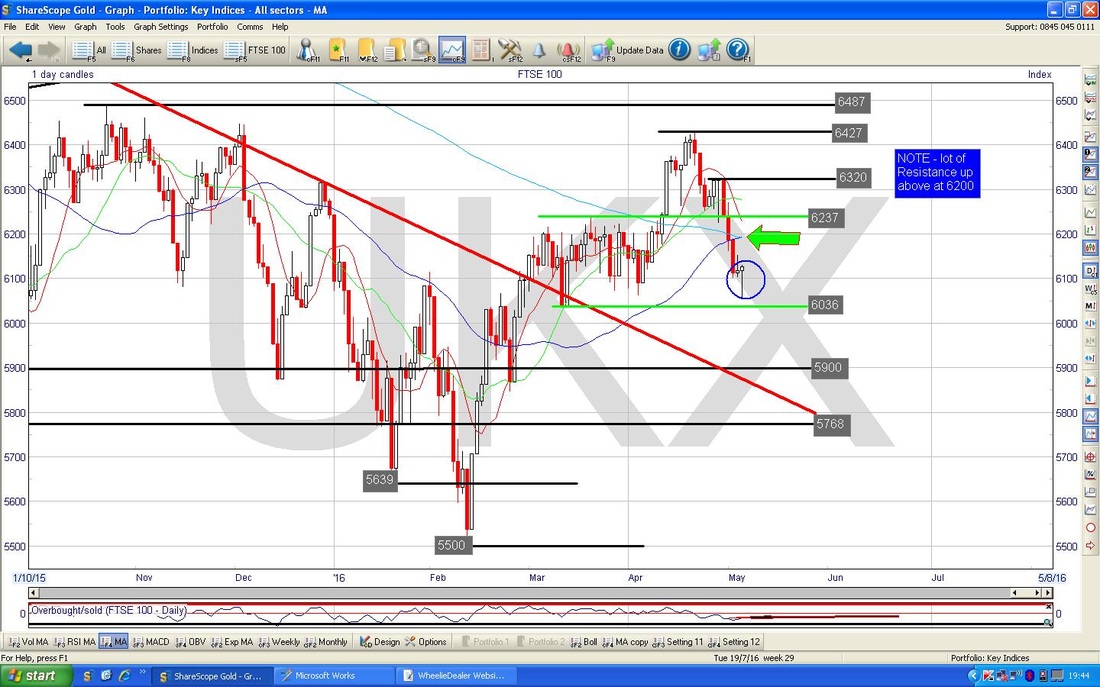
The Screen below in the Bottom Window has the RSI (Relative Strength Index) for the FTSE100 Daily - it is currently reading about RSI 45 but the thing here is that it has turned up in the last couple of days.
The Screen below shows the Bollinger Bands (the Blue Wavy Lines above and below the Price Line) for the FTSE100 Daily going back nearly a Year. My Black Arrow is pointing to where the Hammer Candle from Friday pierces the Bottom Bollinger Band but then reverses up Intraday and Closes nicely up off the Bottom Bollinger Band - that’s a good sign.
Note where the Upper Bollie Band is at around 6450 ish as I mentioned earlier. 
The Screen below in the Bottom Window has the ‘Overbought/Oversold’ Oscillator - my Blue Arrow is pointing to where it is now, obviously it is very low which suggests the Price Line will move up in coming Days - this is a very Short Term Indicator but is surprisingly predictive at its extremes - i.e. at extreme Highs or Lows.
The Screen below shows the Daily Candles for the FTSE100 going back about a year - to be honest the timeframe is not overly important - I just chose a Chart size that showed what I wanted to make fairly clear.
My Blue Arrow is pointing to a 13/21 Day Exponential Moving Average (EMA) ‘Death Cross’ - the 13 Day EMA is the Red Wiggly Line and the Green Wiggly Line marks the 21 Day EMA. If you look to the left, you can see my Red Arrows which point out where similar Death Crosses have happened in the recent past - it tends to mean a few down Weeks are coming our way although it is not hugely reliable I find. In case you were worried, an Exponential Moving Average weights most recent Numbers in the Series heavier - so they tend to give a better view of what is happening in the recent past rather than some time ago. I guess you would say EMAs are more ‘timely’ than Simple Moving Averages. 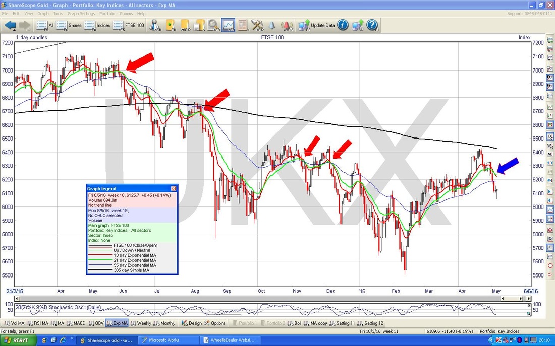
S&P500
The Screen below has the S&P500 (the main US Index as far as I am concerned - the Dow Jones Industrials only has 30 Mega Stocks and it is a bit unrepresentative, although it tends to track the S&P500 nonetheless) Daily Candles for about 6 Months ish. My Black Arrow is pointing to an Up Candle which was generated on Friday 6th May 2016 and arguably this is a ‘Bullish Engulfing’ Candle because it has totally covered the Red Doji Candle which was produced the day before (Thursday 5th May obviously). Note the Candle from Friday also closed well up off its Low Point of the Day - this is shown by the fairly long ‘Tail’ below the White Candle Body. My Red Arrow points to a Bullish 50/200 Day Moving Average ‘Golden Cross’ - the 50 Day MA is the Darker Blue Wavy Line and the 200 Day MA is the Lighter Blue Wavy Line. This is a positive sign and could mean that the Bearishness is coming to an end, however, these signals can of course get reversed as happened back at the end of 2016 when a ‘Golden Cross’ was quickly followed by a ‘Death Cross’. It is good that the 200 Day MA is levelling out and we really need this to turn up to show and Uptrend is back in place. Quite frankly though, the Fundamentals of the Global Economy do not really seem to support such bullishness - we shall see. Note how the Candle from Friday reversed up from a Support Level (at around 2040) very close to the 50 Day Moving Average - so this MA could be providing some Support. In a similar way to the FTSE100, we are now in a game of Levels - where Support and Resistance kick in over coming Days / Weeks will tell us a lot about where the S&P500 is most likely to go in coming Months. If you look at the Chart, there is a lot of Resistance up above now and my Hunch (and that is all it is, no basis in fact) is that the Green Lines I have shown will mark the Upper and Lower Levels of a Sideways Range for a bit - these are 2040 to 2111 (but maybe the Upper Level will be 2100). If Resistance at 2088 holds sway and the Index turns back down from this Level, then that would be a pretty bad sign as it would mean we would have successive ‘Lower Highs’ - from 2111 to 2100 to 2088 ish. Note, the Bollinger Bands suggest 2111 will be the Upper Level for a Sideways Range - we shall see no doubt (this is shown on the next Chart). 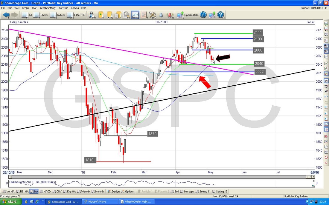
As with the FTSE100, the Bollinger Bands for the S&P500 below show how the Bottom Band has acted as Support - I expect it to turn up from here.
Brent Crude Oil
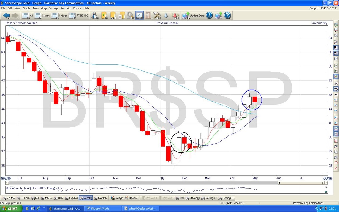
The Screen below shows Brent Oil Daily Candles going back around 7 Months. My Green Arrow points to a Bullish looking Hammer which was produced on Friday 6th May 2016 which looks very similar to the one on the S&P500 above - it is a clear Intraday Reversal up from the $44 Level. Something I love about this Chart is that my Blue Parallel Lines Uptrend Channel which regular Readers may recall I put in Weeks ago has actually proved surprisingly accurate - the Channel has contained the Price Action nicely. So much so in fact, that a Breakout below or above this Channel would tell us a lot (with the power and steepness of the Uptrend Channel, I would bet that any Breakout is to the Downside). My Red Circle shows how the 50 and 200 Day Moving Averages are getting close to one another and we are very near a ‘Golden Cross’. The only not so good thing here is that the 200 Day Moving Average is still clearly falling - thus denoting a Major Downtrend. There is obviously a fair bit of Resistance up above the Price now, particularly at $46, $47, $48 or around those Levels. My Big Black Circle in the Top Left Hand Corner shows more Levels of Resistance not far up above. As I have mentioned before, I think $54 will be very difficult to get through and it will be interesting to see how this plays out. 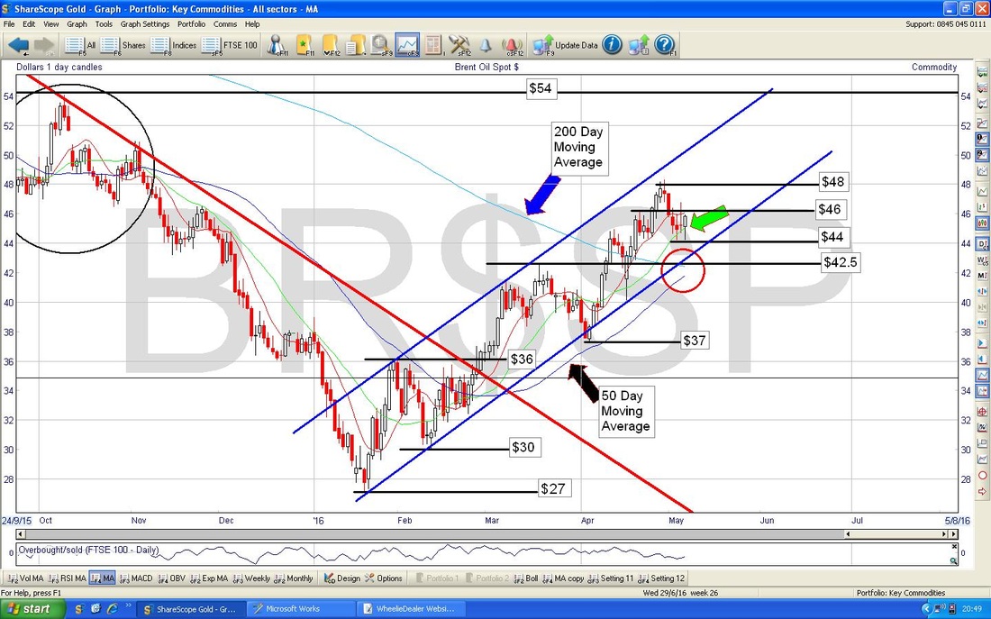
Here’s something to watch out for that I just spotted as I flicked through my Indicator Charts - on the Screen below we have the Weekly Candles for Brent Oil. My Blue Circle is encompassing the Candles from the last 2 Weeks and this could be a Bearish Reversal Signal - if you look back to around February, I have put in a Black Circle which shows the same 2 Week Pattern - and look how it dropped on the following Week.
Gold
Below we have the Gold Daily Candles going back for all of 2016. My Blue Arrow is pointing to a nice Bullish looking White Up Candle that was knocked out on Friday 6th May 2016 and the beauty is that this followed a Red Hammer Candle from the Day before (Thursday 5th May). This is all very nice Candle behaviour and a classic ‘Down Wave’ of 3 days after the Inverted Hammer Candle from Monday and now it looks like it will turn up. As ever, we need it to get cleanly above the Resistance at $1304 but I can’t see this being too difficult. 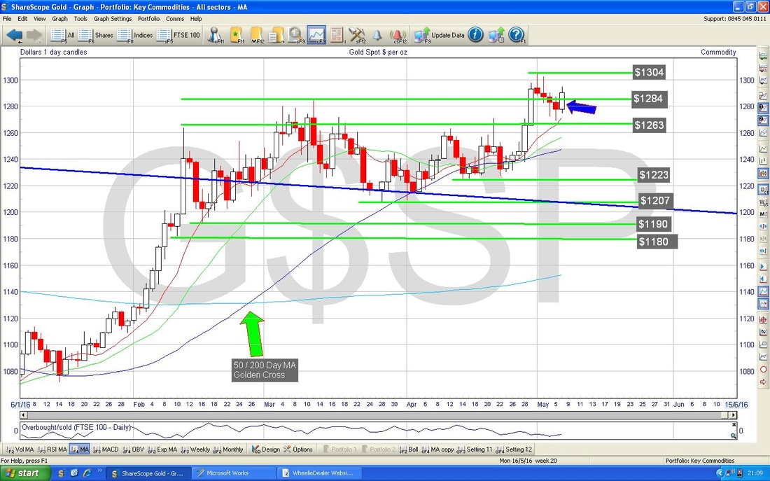
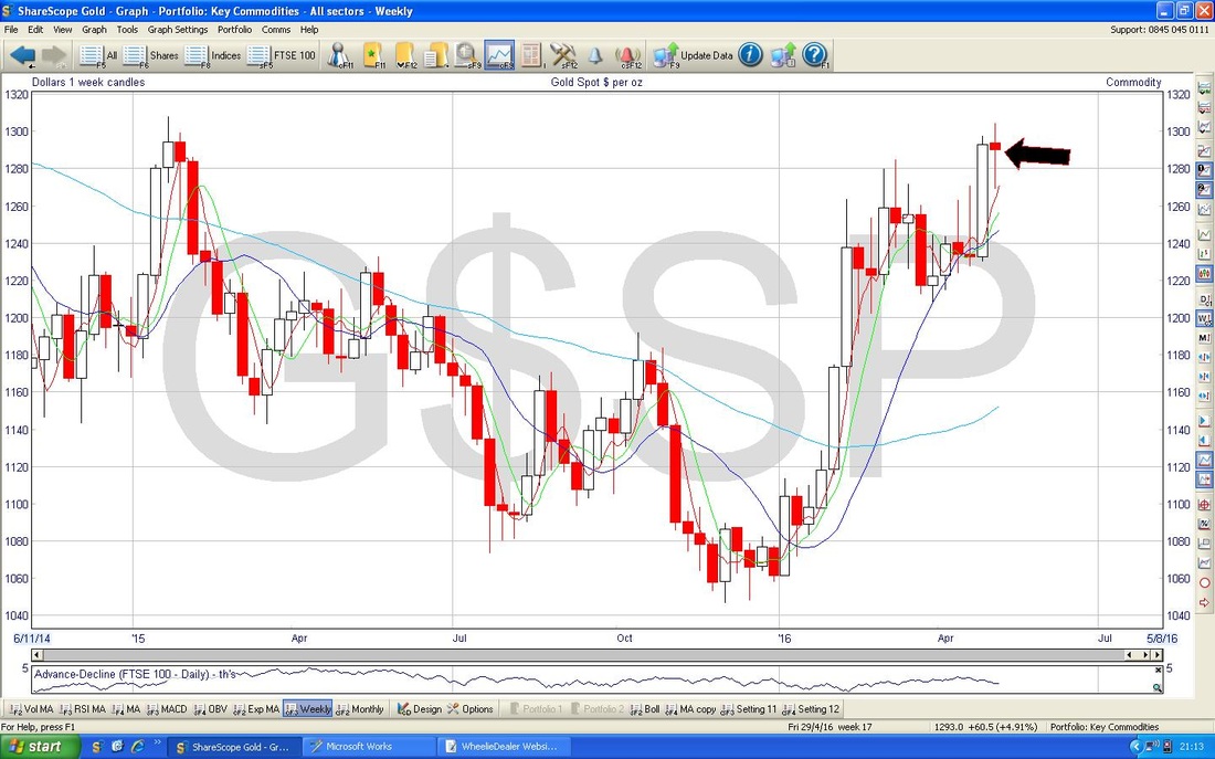
However, there is a catch here. The Chart below has the Weekly Candles for Gold and my Black Arrow points to a worrying looking ‘Long Tails Doji’ - in the context of the strong recent Run Up, this could be a Reversal Signal or if not, it might be telling us that the power of the Up Move is waning. Again, it is something to watch. Maybe we will get some short term weakness where the Price goes back down to Support around $1240 or something before it turns up again. If you look at the first Chart I showed on Gold, the 50 / 200 Day Moving Average ‘Golden Cross’ is still a dominant and positive factor here as are the rising Moving Averages.
Tesla TSLA
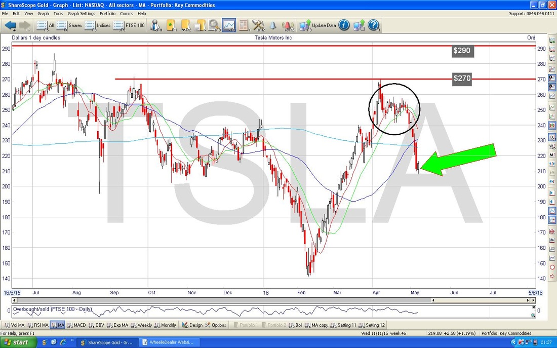
If you follow me on Twitter, then you might have seen me going on about how I want to Short TSLA - basically because it is the most ridiculously overvalued thing I have seen for years and years - a Market Cap of over $19 BILLION or something like that and ZERO Profit - in fact, stacks of Losses and they lose about $4000 on every Car they sell. As far as I can tell it is all based on a Cult around Elon Musk - classic ‘Halo Effect’ herding behaviour. Anyway, the Chart below shows the Daily Candles for TSLA going back nearly 3 years - the Key things I wanted to show here are the Resistance Levels up around $270 and $290 and if I do Short it, I would probably put a Stoploss up above these - maybe just over $300 would give plenty of ‘wiggle room’. My Green Arrow is pointing to a 50 / 200 Day MA Golden Cross which is not what I would ideally want if I am going Short but the Price seems to be in a bit of a Sideways Range now so I won’t be surprised if we get a ‘Death Cross’ again like we did back in 2015 a couple of times. 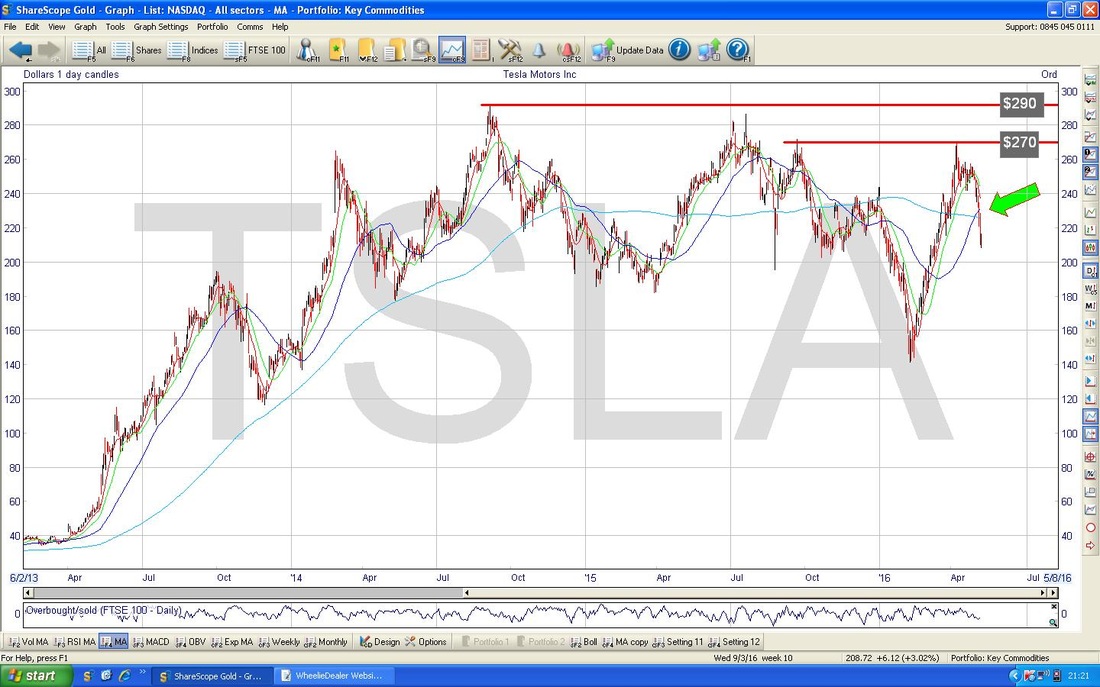
My Chart below has the Daily Candles for TSLA going back about a Year. My Green Arrow is pointing to the White Up Candle that was produced on Friday 6th May 2016 and when you combine this as a 2 Day Pattern with the Down Candle from Thursday we get a ‘Bullish Harami’ - this is that pregnant Lady thing - it suggests the Price will move up in coming Days. My Black Circle encompasses an Area of Resistance between about $240 and $260 and this might be a good place to put a Short Position on if it gets up here.
The bottom Window of the Screen below has the RSI for TSLA - with a reading of RSI 40 it is very low and looks to be turning up already.
OK, that’s it for tonight, hope you all have a superb Week battling the Stockmarket Monsters !! Cheers, WD. 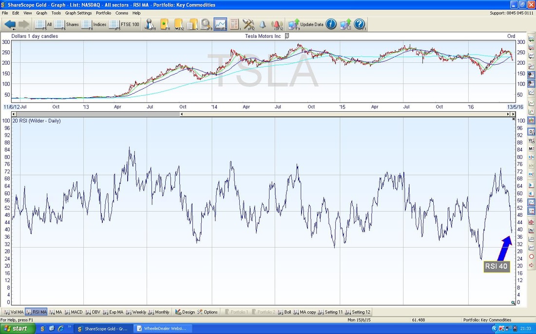
0 Comments
Leave a Reply. |
'Educational' WheelieBlogsWelcome to my Educational Blog Page - I have another 'Stocks & Markets' Blog Page which you can access via a Button on the top of the Homepage. Archives
January 2021
Categories
All
Please see the Full Range of Book Ideas in Wheelie's Bookshop.
|
