

|
educational blogs |
|
What an unbelievable Heat Wave we are having - it’s just so nice being able to get out and about and enjoy it and having now finished my Compost Bin Project (it is such a relief to see the mess all straightened out after many Weeks) I am about to start on a New Project of tarting up my BMW Z3 which has got a few bits of dodgy Paint and I went to Halfords HFD last Week to pick up various essential items like Wet & Dry Paper, Primer, BMW Black Sapphire Metallic Topcoat, Lacquer and T-Cut Metallic etc. It must have caused a mini-boom in HFDs Revenues and Profits because I spent 50 Squids !!
Doing this kind of thing with Spray Paints out in the open air is really not easy and it is extremely difficult to get a decent Finish but I am not after ‘Concours’ condition and really it is more a case of doing a good enough job and the main driver is to stop Rust dead in its tracks and to keep the Car looking half-decent when looked at from a distance !!
I had a go at a few bits on the Car a couple of years ago and I found that the Finish I got varied quite a lot and ironically the first Panel I did actually came out really good (perhaps 8/10) but the weird thing was that most of the other bits I did were only a 6/10. The key is to be extremely careful and patient and to take each bit in progressive steps and to only move onto the next step once the last step is really good. It is all about preparation of the area to be painted and you need to get the Bare Metal like a mirror finish and then when the Primer goes on that needs to be sanded using very fine Wet & Dry to get that super smooth. Anyway, something that caused me problems a few Years back was that when Planes fly over my House they create quite a bit of Wind - enough to muck up any Spray Painting. Of course, it took me a while to realise this and the art is either to do it at a time when Flights are less frequent or to time it very well between the Planes !!
Of course after watching copious Episodes of ‘Wheeler Dealers’ I am an expert on painting Bodywork……..and I could pay someone to do it but where is the fun and challenge in that? Last Week Well I think I speak for probably 99% of Readers when I say that Last Week really wasn’t a bundle of fun on the Markets. It all started badly on Monday when I was having a fun Day out at Duxford Aerodrome with a small group of People who had come along and we discussed a lot about Stocks and Portfolio Management and all that and we had a laugh going round the Museum and it really was a great Day. It was a shame we didn’t have more people but I think the idea of having such ‘Meet-up’ Days is sound but it would be better perhaps on a Friday and maybe even at a Weekend - although the catch with the latter is that the Places where we meet are likely to be very over-run. We are doing the ‘WheelieBash’ again on September 15th near Windsor (pop over to the Homepage and there are some more details there - but I have yet to confirm the Venue although I am 99% sure it will be The White Hart at Winkfield like last year) and I intend to do a ‘Meet-up’ in the Midlands area next year - I am checking out a potential Venue for that one soon. Anyway, let me know your thoughts if you would perhaps find a Weekend Meet-up more useful. Anyway, so Monday was flippin’ ropey and then the Week didn’t get much better (that is coded-language for ‘it got worse’ !!) and it was only Diversified Gas & Oil DGOC returning to trading and jumping 25% that saved me from severe damage and meant that my Portfolio overall fell 1.5%. It is yet more in a frustrating and difficult Year and I feel a bit like I am hanging from a Cliff-edge by my Fingertips and every time I manage to haul myself up a bit to try to get over the Edge, Mr Market comes along and pushes me back down or stamps on my Fingers - it is not nice (hurts the old digits as well !!). I was mulling this over last Week and it occurred to me that despite all the Fears and Worries maybe what is happening is that a Market that has run up really strongly in recent Years is now doing a Sideways Consolidation sort of thing - we see this kind of move all the time on Individual Stocks where something jumps up but then has to Consolidate Sideways to shake out Weaker Holders and to let New Buyers come in (the logic behind a Bull Flag). It could be we are entering that stage in the Markets in general. Who knows? But as I mentioned Last Week, many People seem to be moving into Cash and getting worried and all that but I really am not convinced as the Long Term Charts do not indicate this and despite some slowdown in various Economies around the World there is no clear sign that we are going into Recession or anything. Predicting Recessions is something that is pretty much impossible but of course we can see when things are slowing down or whatever. As always, we need to keep monitoring things but I don’t think we should be panicking - careful yes, panicking no. On the ‘Big Picture’ stuff in the coming Week the main thing is probably that Government Cabinet Brexit ‘Away Day’ where they are supposed to be coming to a collective agreement on what the UK’s stance is on the future Brexit Deal - it is at the end of the Week I think so the chances are that the Markets will have Closed for the Week by then but any Outcome might impact things at the start of the Following Week. I am not sure that much will come out though and it is the ongoing Discussions with the EU that are really more important - chances are they will run and run and it won’t be until much later in 2018 that we get more clarity. With the World Cup ongoing and then Wimbledon a lot of People will be very distracted from bothering with Stockmarkets. So with all that in mind my ongoing Strategy remains the same - do as little as I can get away with and look for opportunities to lower my Spreadbet Leverage a little - but I am in no rush. I will keep a close eye on the Markets and be looking for Signals which suggest I should Short to Hedge my Portfolio against Market Risk and indeed as we will see in a bit I put a Small Short on the S&P500 last Week - I might look to add to it. July Market Incredibly we are now into the Second Half of 2018 and from consultation with my bit Out of Date copy of the UK Stockmarket Almanac (it will be close enough though) it says that July is the 4th Best Month and the Average Return for the FTSE100 has been 1.0% over the Month - so that is not bad at all and after the dire June maybe there is some hope……. A typical July tends to drift for the first few Weeks (that doesn’t sound much fun !!) but the Final Week tends to be a good one. Note also that in relative terms the FTSE100 historically does well against the S&P500 this Month. DGOC I mentioned ’Nodding Donkey’ Stock DGOC earlier but I just want to make a few comments around a chat I had with my mate @LordGnome100 on Twitter earlier today. He has run the Numbers on the back of his Fag Packet and using a Valuation of $5 per Barrel for the Oil and Gas in the ground (seems very plausible), he comes up with a Valuation for DGOC of 300p a Share. I think his logic is very sound although of course the numbers could be tweaked up and down - on the downside you could argue that the majority of DGOC’s reserves are Gas and therefore perhaps using $4 a Barrel is appropriate - this would still give a Valuation of 240p per Share. Going the other way, I think you could argue that DGOC’s reserves should be valued at a higher figure like $6 per Barrel because they have an extremely low Cost of Production and there are probably synergies to be got from the latest big Acquisition. If you use $6 it drives the Valuation number up to 360p per Share. It is worth considering as well that DGOC will probably do more Acquisitions and it has already stated that they might go wider than just the Appalachian Basin. I want to see some Analyst Forecasts regarding likely Dividends and Earnings and all that and that should give another steer on the likely Target for the Shares - but however you cut it, the upside here looks significant and I am very happy holding on to my Position (which has already grown very nicely) at the current 119p. The Stock also has very strong Momentum. You can read the Blog I did on DGOC a while back here, but bear in mind they have done a few huge Acquisitions since this time: http://wheeliedealer.weebly.com/blog/diversified-gas-oil-dgoc-buy-rationale Blog Slate Last Week I published the first Part of the Blogs on Patience and the reception that one has got has been very pleasing - as I say in the Blog, it is definitely an area where most Investors could improve and it is well worth thinking about whether or not you apply Patience to your Investing and considering any benefits this might bring if you could stop tinkering !! The second Part is in a pretty good state and it shouldn’t take me too long to finish it so I expect to Publish that later in the Week. I made a start on the Blog about Robbie Burn’s ‘Trade like a Shark’ Book and from my first efforts I suspect that this one will be fairly lengthy so I will chop it into easily digestible chunks. By the nature of how I am extracting dollops of Text from the Book and putting my own comments around this Text, I think Readers will find it very thought-provoking and useful. I found this a truly outstanding Book and I can say without doubt that it is the best Book Robbie has written for someone who is a bit more experienced (the usual Naked Trader Books are brilliant for Newbies but there are big bits that more experience Investors will find less useful and I always felt that there were some ‘gaps‘ in how Robbie explains his Approach in those earlier Books but ’Trade like a Shark’ helps fill in these holes). That should keep me busy for a few Weeks and I have gazillions of Ideas for other Blogs so don’t worry, the stream will continue however lazy I get over the remains of Summer !! From the Archives I continually get asked about the ADVFN App that I use and I also get Readers wanting clarity on what the Numbers I put out every day for my Portfolio actually mean - this Blog kills both those stones: http://wheeliedealer.weebly.com/blog/reporting-end-of-day-numbers-and-the-advfn-app And with all these Sporting Events (on that subject, make sure you catch the Replay of the Assen MotoGP which is usually on Channel 5 Monday Night - arguably one of the best ever Races and right from the Start it is just chaos with lots of Riders coming together and getting in one another’s way - more like a Race in the Smaller Classes with the Rookie Riders), I thought it was appropriate to revisit these rather surreal Blogs where many Readers suggested I needed to see a Shrink………(this is Part 2 but it contains a Link to Part 1): http://wheeliedealer.weebly.com/blog/horsing-around-this-weeks-sporting-coverage-comes-from-epsom-part-2-of-2 I suppose we ought to do some Charts then…….. S&P500 As I mentioned earlier, I put a Small Short Spreadbet on the S&P500 on Wednesday Night Last Week and I still have that running. The Chart below is my actual ‘Working’ Chart that I use to manage my Short Trade and the Blue Arrow is pointing to the Level at which I Opened my Short Spreadbet (you should be able to see the Text Box with a summary of my Position on it). A bit higher up we have a sort of Pinky Horizontal Line and this indicates my Stoploss Level at 2752 - if the S&P500 Closes over this Level on an End of Day basis, then I will manually Close out the Position and take a Loss. My Green Arrow is pointing to a Green Downtrend Line which is running at the moment and of course the S&P500 needs to Breakout of this Downtrend Line if it is going to stop falling and make some positive headway. Please ignore the other Green Line. My small Yellow Rectangle is capturing the Candlestick from Friday and this shows a Reversal during the Day where the S&P500 was going well early on but then it fell away towards the Close - this shows weakness and it got very near to my Stoploss Level but then fell away (remember, I do not have a ‘Hard-Coded’ Stoploss with my Broker because it is very easy to get spiked out and I only execute the Stop manually if the Stoploss Level is breached on an End of Day Close basis). It is interesting because the 2 Candles before Friday’s which were produced on Wednesday and Thursday suggested a possible Bullish Harami 2-Day Pattern - but it is notable that the S&P500 failed to build on this on Friday and that is another sign of weakness. Note that if we do drop more there is a lot of Support in a Zone between about 2680 down to 2580. As always the Charts I show are from the excellent ShareScope Software that I subscribe to and if you click on them then they should grow bigger for you to see more detail. If you are a SharePad subscriber then I think you can set the Charts up to be similar to these. 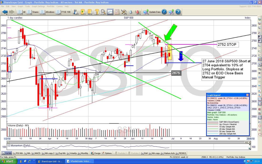
The Chart below is the essence of why I shorted the S&P500. This is rapidly becoming one of my favourite Indicators and it tends to be pretty reliable across many Assets - the only times that it is not so good are if the particular ‘thing’ you are trying to Chart is Volatile and Choppy - but for things like Indexes especially that tend to be more ‘Trendy’, this Crossover is an excellent Predictor of the Future (Crystal Balls LOL).
My Blue Arrow is pointing to a Bearish ‘Death Cross’ between the Black Wavy Line which is the 13 Day Exponential Moving Average and the Green Line which is the 21 Day EMA. If you look back you can see what has happened when these kinds of Crosses have happened in the recent past and where my Black Arrow is there is a particularly good example. I find that these Crosses work really well both ways - if we get a Bullish ‘Golden Cross’ then that is a good Signal to Buy and if a particular Cross is still ‘in force’ then it is often not a good idea to be Trading in the opposite Direction to the Crossover (i.e. if a Death Cross is in force it is not advisable to put on Long Trades). 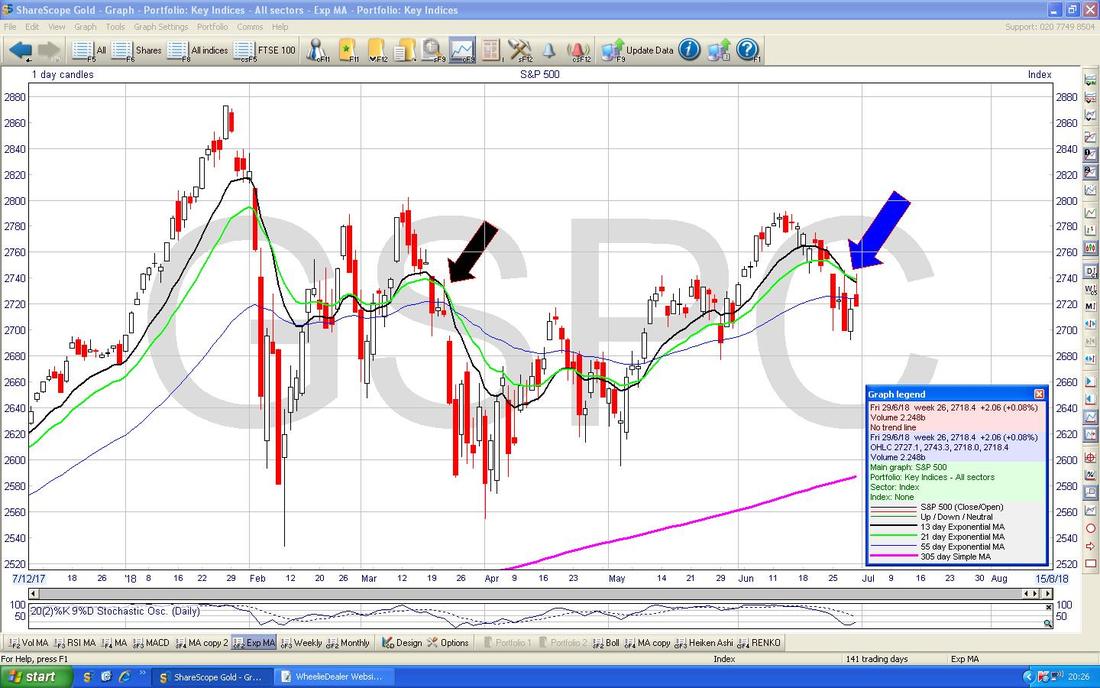
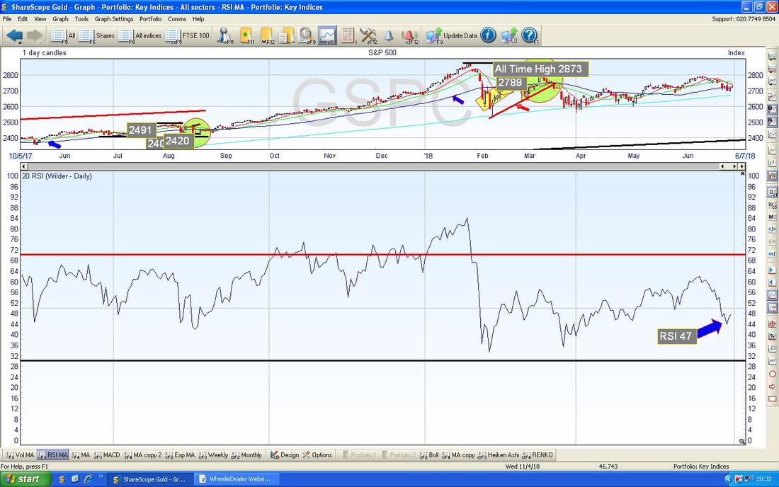
In the bottom window on the ScreenShot below, we have the Relative Strength Index (RSI) for the S&P500 Daily. On a Reading of RSI 47 it is pretty ‘neutral’ and note it has ‘flicked up’ which might be the start of a move up but it is hard to tell at this point. What we can say with confidence is that the S&P500 is neither ‘Overbought’ nor ‘Oversold’ - which means that if it starts to go in a particular direction (Up or Down) then it could go quite a long way before having to turn again.
The Chart below has the Daily Candles for the S&P500 with the Blue Wiggly Bollinger Bands above and below the Price Line. My Yellow Circle is highlighting how we are near the Bottom Band and even tried to move up off it on Thursday but of course the move up struggled on Friday. If the S&P500 is going to move up, it needs to get over the nearby Resistance at 2746 (note this is why I placed my Stoploss at just above this Level at 2752).

Next we have the Weekly Candles for the S&P500. My Blue Arrow is pointing to a Down Candle from Last Week but note how it managed to Close up off the Low Point of the Week (that’s why it has a ‘Tail’ pointing down from the Candle Body). This is not really a Reversal Candle but it hints that there is good Support not far below.
My Black Arrow is pointing to the Star Doji we got 3 Weeks ago - look how this predicted the Move Down. Amazing. Note also that if we get in a bit of bother, then there is very Strong Support at about 2600 and then 2550 and a bit lower. The really important Support is 2532 - if this fails then we should all get very worried. 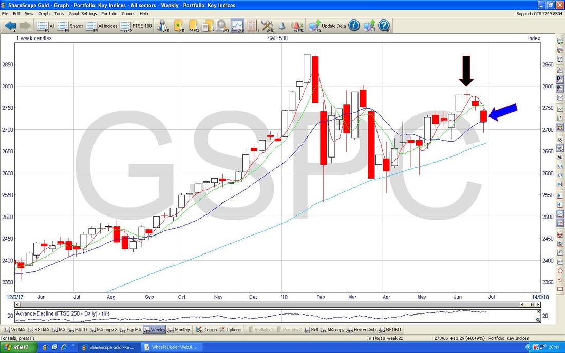
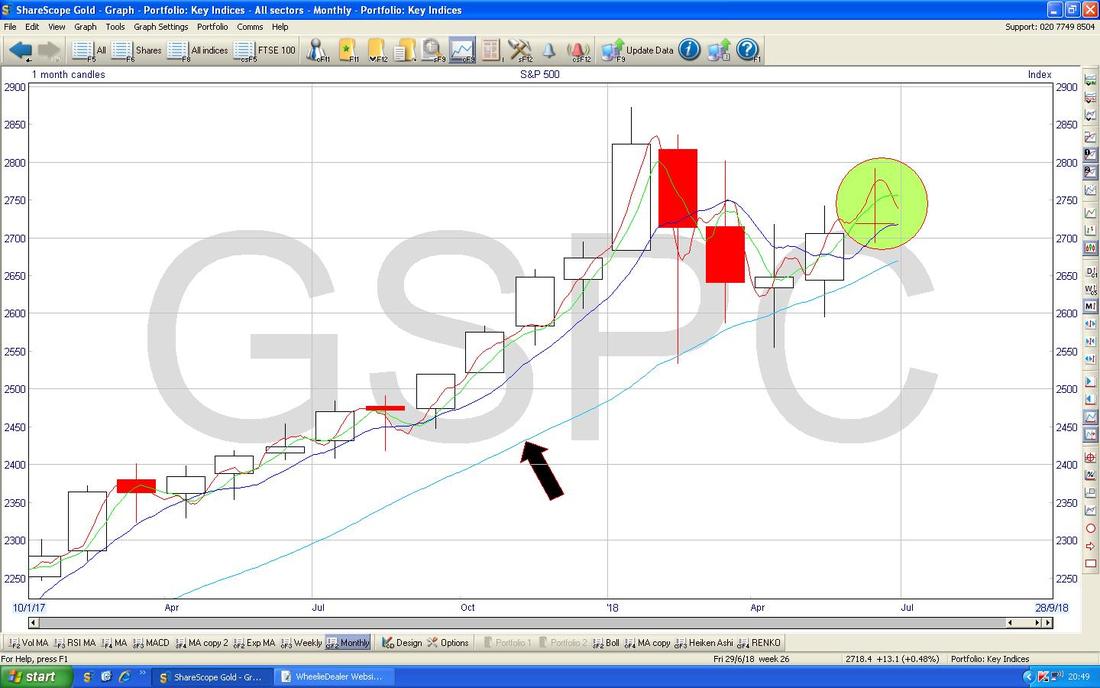
Of course we have had another complete Month so we might as well look at the Monthly Chart for the S&P500. This is actually quite useful - for the Month of June we got a pretty dodgy looking Star Doji but with the ‘Body’ of the Doji towards the bottom so it is sort of a bit of a ‘Shooting Star’ which is not too pretty (my Green Circle is capturing this). The Key Resistance Level from June is 2800 and that looks a difficult Level to get over. My Black Arrow is pointing to the 200 Day Moving Average and that has been important Support for a long time.
This is interesting and a bit more positive and contradictory than much of the stuff I have seen on the S&P500 so far (although that 13/21 Day EMA ‘Death Cross’ is the Indicator I pay most attention to) and my Chart below has the Daily Heiken Ashi Candlesticks for the S&P500 and my Black Arrow is pointing to where they have just turned White which is a Bullish Sign. However, despite the HA Candles being really good they can give false Signals so it is not guaranteed by any means that we will get a move up now - let’s see what happens in the next few Days.
Remember, the HA Candles work very differently to ‘Normal’ Japanese Candlesticks so don’t try to ‘read’ HA Candles using the techniques of ‘Normal’ Candles. 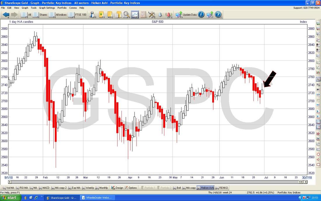
The Dow Jones Industrials Index DOW is pretty much the same as the S&P500 so I won’t go through it this Week.
Nasdaq Composite (US Tech) I won’t show too much on this one because again it is largely similar to the S&P500 but this one is important. On the Chart below I am showing the 13 and 21 Day EMA Lines and where my Black Arrow is you should be able to see that they have not done a ‘Death Cross’ (yet !!) - if they can avoid this Bearish Cross then that would be a positive development - this is something to watch in coming Days and if we get the Death Cross I suspect the Nasdaq could drop off a lot. 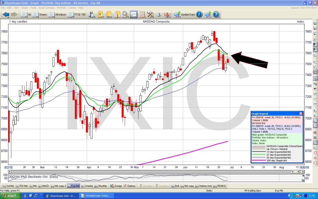
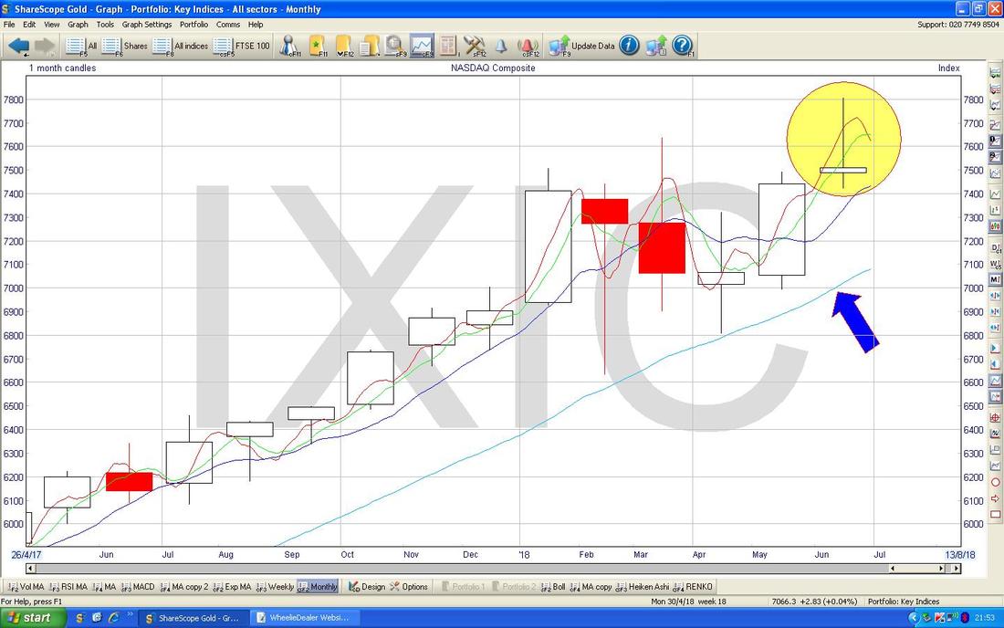
This next Chart is really instructive - my Yellow Circle is spotlighting an Inverted Hammer kind of thing for June on the Monthly Candles for the Nasdaq Comp and in the context of a sustained and strong run up, this looks a very Bearish Reversal Signal - if it falls, then I would expect the 200 Day Moving Average to be tested - I have pointed at this Line with my Blue Arrow.
FTSE100
My Chart below is largely the same as what I have shown in recent Weeks and note the Green Rectangle which is capturing the Candle from Friday which like the US did a big Intraday Reversal and this is a sign of weakness. If you read my Blog last Weekend you might recall me doing some ‘Line Fitting’ with my Parallel Green Lines (I have pointed at the Top Line with my Green Arrow) and it is looking like my guess that we were entering a Downtrend Channel is looking about right. Note on Friday the Market turned down at 7707 and this is now Strong Resistance nearby. If we do continue to fall, then there is Support around 7500 and then 7450 where the 200 Day Moving Average is and then we are down to the Range between 7326 and 7062 which was in force a short while ago. To the utmost Downside, Support at 6866 is critical and if this fails we are in the Doggy Doo (otherwise known as the Brexsh*t) My Yellow Circle is highlighting a Golden Cross between the 50 and 200 Day Moving Averages - this is a bit of a contradiction to the Bearish features on this Chart as it implies Bullishness. However, such a Golden Cross is more of a Weeks and Months thing whereas some of these Bearish developments might reverse in just a short period of time - perhaps a couple of Weeks or something. However, at some point any contradiction here will get sorted out one way or another. Probably the most Bullish Development we could get in the Short Term is for the Price to Breakout over the Upper Green Line (the one with the Green Arrow) on my Downtrend Channel. 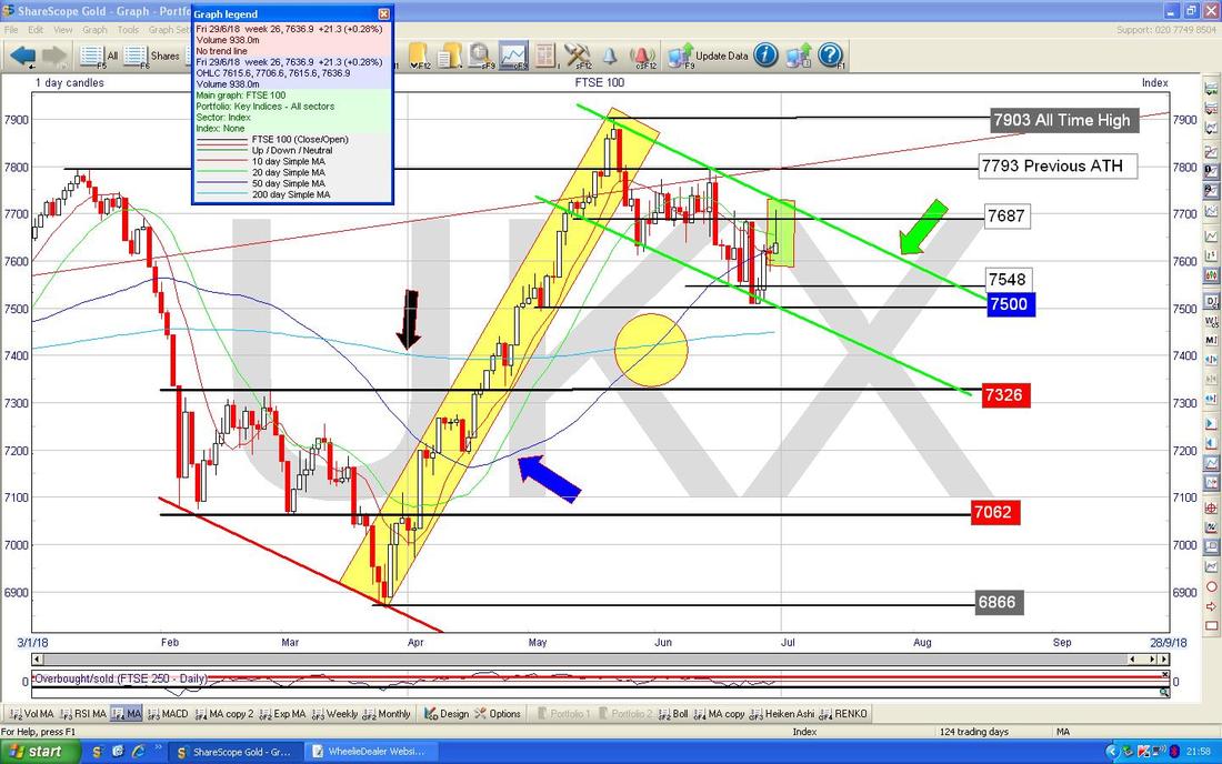
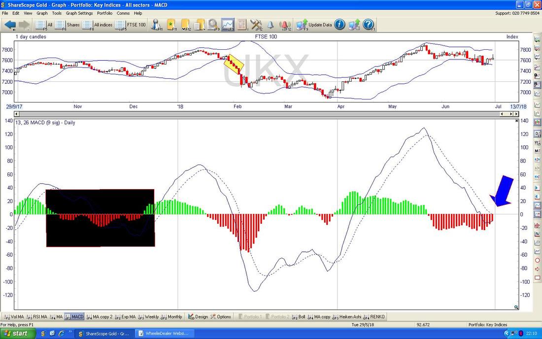
In the Bottom Window on the Screen below we have the MACD for the FTSE100 Daily (Moving Average Convergence Divergence). Where my Blue Arrow is pointing we are very near a Bullish MACD Cross in both the ‘Signal Lines’ and the ‘Humps’ formats - however, if you look back where my Big Black Box is, we had a succession of near misses on similar Bullish MACD Cross setups.
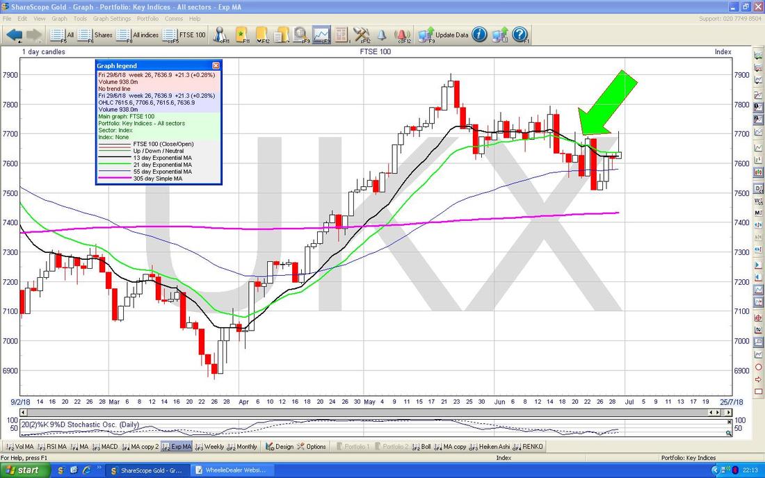
My Screen below has the Price Candles with the 13 and 21 Day EMAs. Where my big Green Arrow is we had a Bearish ‘Death Cross’ on the EMAs and this suggests weakness. This is still ‘in force’ and until we get a Bullish Crossover, it looks likely that the FTSE100 will stay weak. However, it can turn up a few Days in advance of the 13/21 Day EMA Golden Cross - it is a ‘slow’ Indicator in that sense but it is one where we trade Speed of Signal off against Reliability of Signal.
Next we have the Monthly Candles for the FTSE100. My Black Arrow is pointing to a very good example of a ‘Long Tails Doji’ or what I call a ‘Spinning Top’ Doji - this suggests a Turning Point and after the strong run up (we are near All Time Highs after all !!) it is highly likely that we turn down. Note that the Candle from May is a bit of an ‘inverted Hammer’ with the FTSE100 unable to hold the Highs of May (it is not a pretty Inverted Hammer though from the Textbook Purist‘s point of view).
Note also that any such turn down away from the All Time Highs is not necessarily indicating that the Bull Market is over. In any Bull Run it is totally normal and healthy to get sizeable ‘Pullbacks’ which enable some over excitement and ‘heat’ to come out of the Market so that it can start the next push upwards. Having said that, even these Healthy Pullbacks can feel quite unpleasant and frustrating at times !! Focus on the Big Picture and keep your nerve. 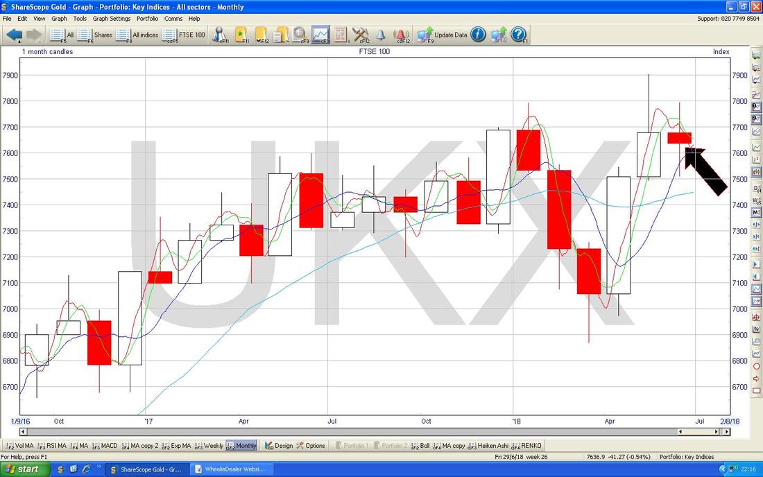
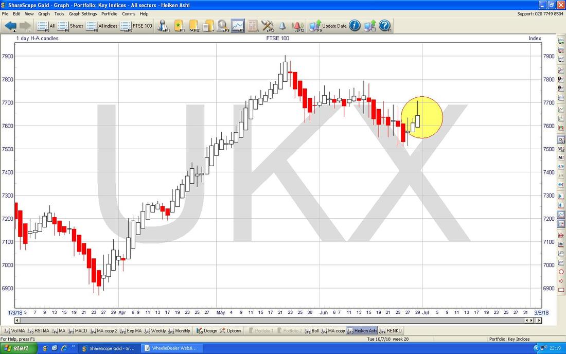
Now we have the Daily Heiken Ashi Candles for the FTSE100. My Yellow Circle is highlighting Big White Up Candles and this is a Bullish Sign. However, remember these are a ‘slow’ Indicator so the Reversal from Friday, if it leads to falls on Monday, will not be picked up in this Chart yet.
FTSE250
I need to finish this Blog now so I won’t show much on the FTSE250 but the Chart below is showing a 13/21 Day EMA ‘Death Cross’ where my Black Arrow is - as we know this is perhaps not a good sign (there is of course a clue in the name !!). 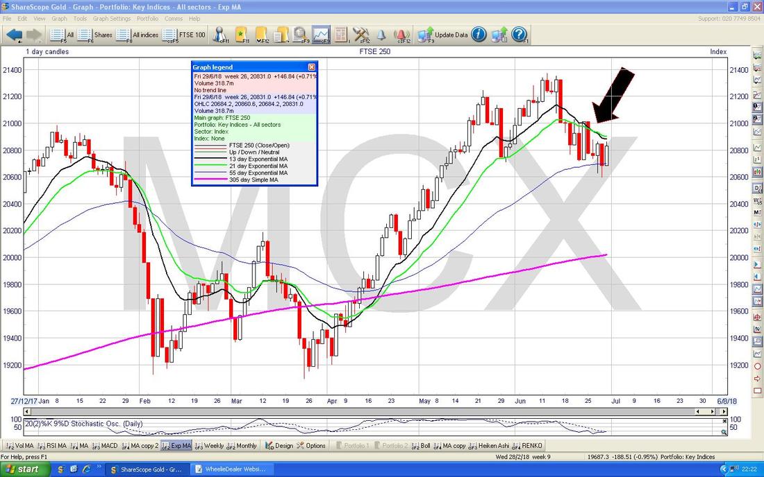
My next Chart has the Monthlies for the FTSE250 - my Yellow Box is catching the Candle from June and again we have a ‘Shooting Star’ sort of thing with looks like a Bearish Reversal Signal. Oh dear.
Right, that’s it for this Week - Good Luck everyone and remember to think coolly and carefully about any course of action you are considering - this is no time for heroics !! Cheers, WD. 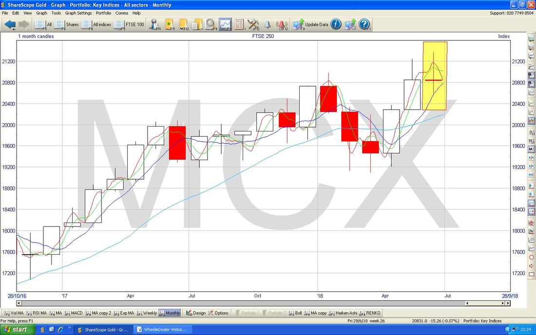
2 Comments
Vim
2/7/2018 10:12:26 am
You might get better prices at Euro-CarParts. Im pretty sure thats where Mike Brewer and Edd shop. There is a good deal on a dent repair kit currently.
WheelieDealer
3/7/2018 11:17:45 pm
Hi Vim, Thanks for that - I have used Euro Carparts in the past but didn't think of them the other day when I decided I needed some 'stuff'. On the Indexes I find the FTSE100 a pig because it is very skewed due to uneven Weightings based on Market Cap (the Top 10 megacap Stocks have a disproportionate impact on the Index), gets heavily influenced by Oil / Mining and it also gets thrown about by the Pound. I find the S&P500 just that bit more stable and the DOW is pretty useless because only 30 Stocks. Usually all the Indexes tend to move as a group so when we get a big scary Drop, the S&P500 should be a reasonable Proxy even though my Stocks are mainly UK focused. In many ways the FTSE250 would be the ideal Index but it only Trades during Market Hours and it has very large Margin Requirements for a Spreadbet. Leave a Reply. |
'Educational' WheelieBlogsWelcome to my Educational Blog Page - I have another 'Stocks & Markets' Blog Page which you can access via a Button on the top of the Homepage. Archives
May 2024
Categories
All
Please see the Full Range of Book Ideas in Wheelie's Bookshop.
|
