

|
educational blogs |
|
As usual I like to see how the Indexes are shaping up to set the background to my Stocks for the coming week. I am still hugely hedged with FTSE100 Short Positions and this is quite uncomfortable with the Indexes going so well - but with Summer not far off now and the Brexit Vote in late June, I see no need to take the Shorts off yet - I will get loads of chances to unwind them in coming months and they give me protection against a still pretty nervous Market.
According to the UK Stockmarket Almanac 2016, the coming week is historically pretty flat - on average it is down for 48% of Years and gives on average a positive return of 0.1%. I noted in my ‘Weekly Performance Update’ last week that the historical averages for March show that the last week is one of the worst weeks of the Year - which makes sense really as people muck about with their Portfolios just before the end of the Tax Year - so expect some weakness soon.
FTSE100
Big bullish developments last week - as you can see, the Red Downtrend Line (marked with the Red Arrow) was breached which is good news for Bulls. My Yellow Arrow points to the Candle created on Friday 4th March 2016 which was a nice big bullish one and suggests some strength still in the Rally. My Green Arrow is pointing to the falling 200 day Moving Average which is not good at all and is a big negative feature hanging over the FTSE100 Chart. It also represents possible Resistance at about 6300 which may be a sticky spot to get over. Note that just above at around 6400 to 6500 nearly there is a strong Band of Resistance that will be tough to crack. My gut feeling now is that maybe we have escaped the worst scenarios with drops to 5200 or 4800 for the time being - perhaps we are now more likely to be looking at some sort of Sideways Range with maybe a Ceiling around that 6400 Resistance and a Floor perhaps at 5600 or 5500. The only big problem with such a theory is that it would be a rather wide Range - not normal. 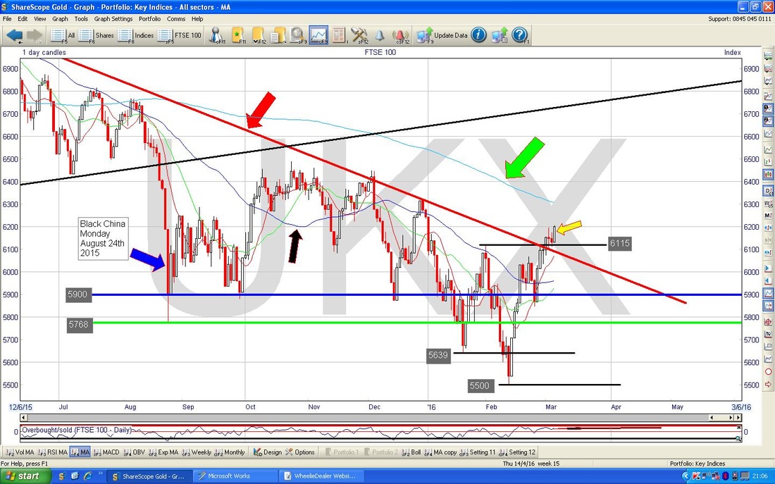
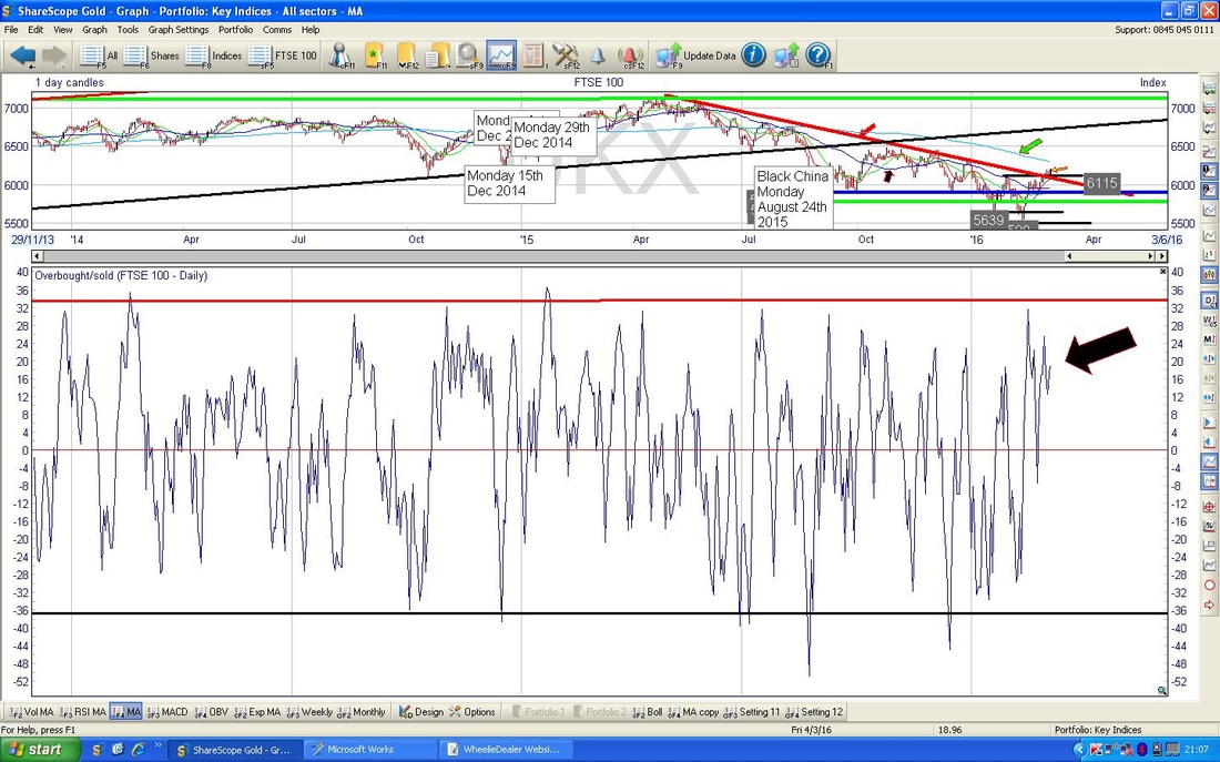
My ScreenShot from the marvellous ShareScope Software below in the Bottom Window shows the Overbought/Oversold Indicator for the FTSE100 Daily Chart - my Black Arrow is pointing to where it is now and you can see it is at a very elevated level - this might cap gains now. OB/OS is a very Short Term Indicator (or Oscillator really) but it’s pretty good at showing when things are ‘Too Hot’ or indeed, ‘Too Cold’.
On the Chart below, the Bottom Window shows the Relative Strength Index (RSI) for the FTSE100 Daily Chart - my Black Arrow is pointing to where it is now at around a reading of RSI 57. This is not a very high reading at all and you can see there are plenty of instances going back over a year ago where the RSI went quite a bit higher - so there is really room for the FTSE100 to go up quite a bit more.
Note also that the Blue Horizontal Line around RSI 56 which had capped gains for nearly a Year actually has now been broken to the upside - this is good for Bulls. 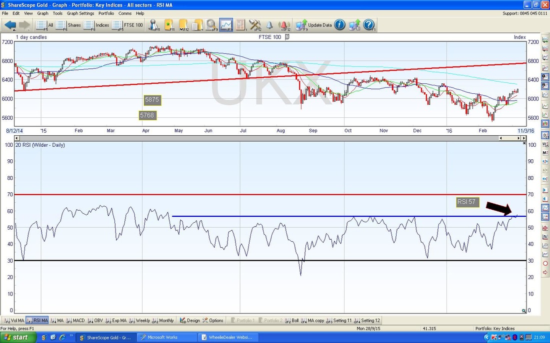
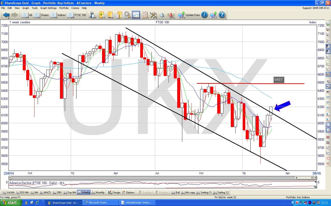
The Screen below has the Weekly Candles for the FTSE100 - my Blue Arrow points to a nice Up Candle from last week and this is Bullish looking. Note also the breakout of the Downtrend Line (in Black). Note the 6487 Level I have drawn in with my Red Crayon - this could cap gains in the near term.
S&P500
My ScreenShot below shows the Daily Candles for the S&P500 for the last 6 months or so. My Blue Circle is pointing out a ‘Doji’ Candle which was produced on Friday which might suggest that the move up is losing puff in the Short Term. Dojis like this are not strictly ‘Reversal Signals’ but they do hint that the move up has lost some force - they can of course be Reversal Signals and it would be no surprise if the Market turned down on Monday. My Green Arrow is pointing to the 200 Day Moving Average which is falling and could be Resistance at about 2020. My Pinky/Mauvey Arrow and Line are showing a Downtrend that could be Resistance around 2040 and both these Resistance Levels are important for the Index to break over. Note however, that if this is achieved, then there is very strong Horizontal Resistance around 2080 - 2120. 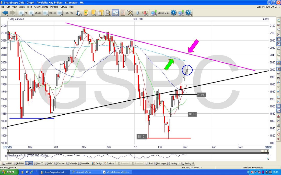
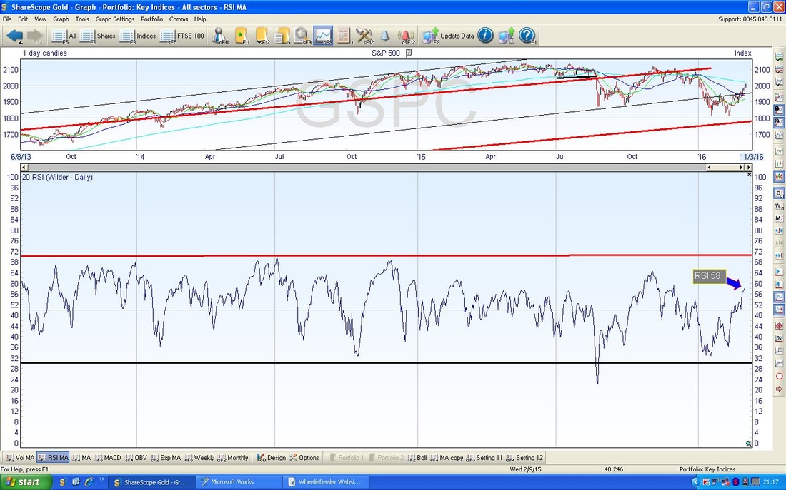
My Chart below has the RSI for the S&P500 in the Bottom Window - note it is at about RSI 58 so clearly it can go quite a bit higher yet before the Index gets over-heated. Note in the recent past the RSI quite often has got up near 70 BUT NO HIGHER.
The Screen below has the Weekly Candles for the S&P500. My Black Arrow is pointing to a lovely Bullish Candle from last week - this is great for Bulls. Note also that the possible ‘Double Bottom’ we have talked about recently at 1810 is looking pretty good as a lower Support Level.

Nasdaq Composite
The Chart below has the Daily Candlesticks for the Nasdaq Comp going back about 4 months ish. The only really crucial thing here I have marked with the Black Circle - that is a very clear Doji with a thin ‘Body’ - it might be a Reversal Signal - one to watch closely. Interestingly, there is plenty of Support below now. Otherwise the Nasdaq Comp is remarkably similar to the S&P500. 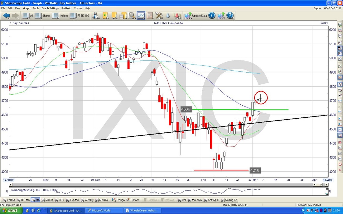
VIX
I won’t dwell on this one, but just something to be aware of. The VIX is the US Volatility Index (the ‘Fear Gauge’) and tends to move inversely to the S&P500. My Blue Arrow points out where it is now on a Chart over the last year or so - note it is heading down to the low points. This is not necessarily a bad thing as it can stay low for long periods of time - however, it is worth appreciating that a Low VIX tends to lead to a High VIX over time. 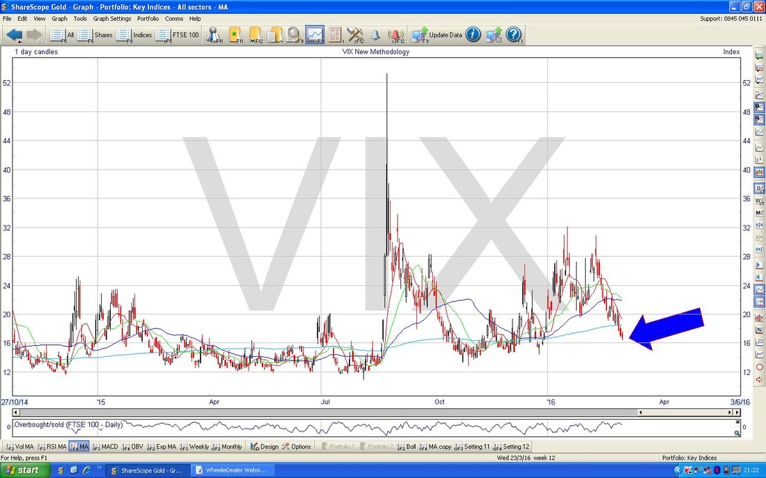
Brent Oil
The Chart below has the Daily Candles for Brent Crude Oil going back about 4 months. My Black Arrow points out a lovely Up Candle from Friday and suggests more gains to come. Note also the clean Breakout now of the Red Downtrend Line marked with my Red Arrow. I have drawn in a new Blue Line at the bottom of the Candles over the last 6 weeks and maybe this will act as a new Support Line and form the floor of an Uptrend Line - it is early days and something to watch for. My Blue Arrow at the top marks the 200 Day Moving Average - note this is still falling nastily so the Bulls are by no means home and dry yet, although things are clearly improving. This represents Resistance up around the $46 level. In an ideal scenario, the Bulls need a 50 Day / 200 Day Moving Average ‘Golden cross’ - this looks a long way off (the Darker Blue Wiggly Line is the 50 day MA). 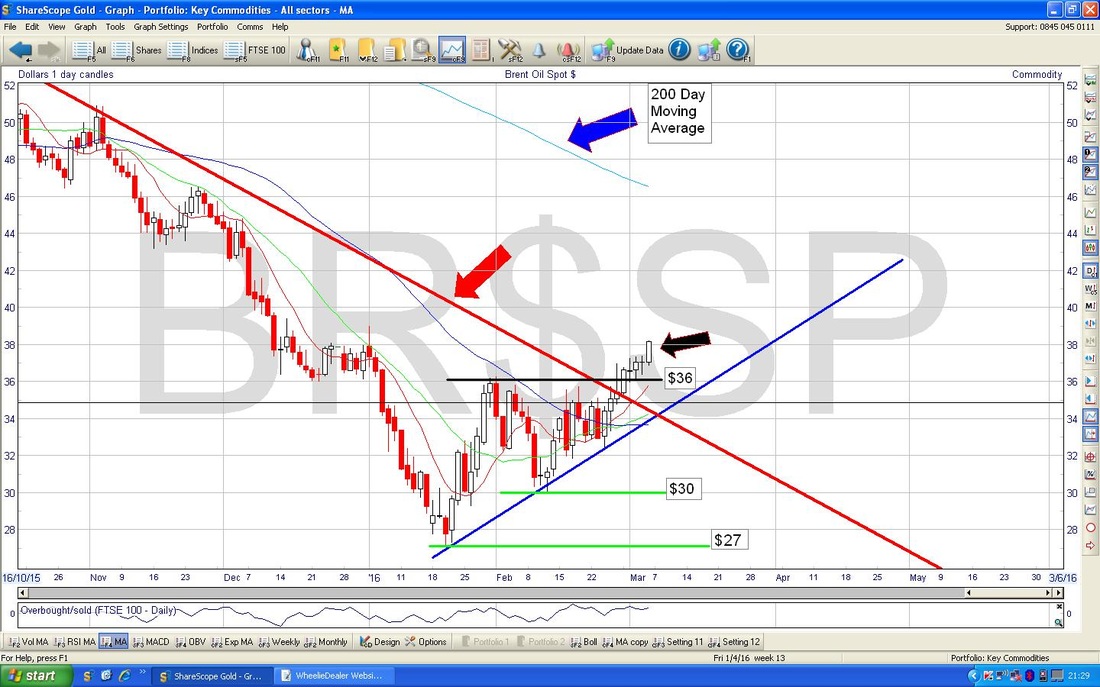
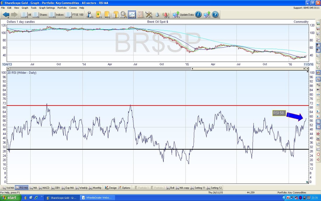
The Screen below in the Bottom Window has the RSI for Brent Oil daily - my Blue Arrow is pointing to the current reading at about RSI 58 - this can clearly go a lot higher but it is getting a tad toppy now.
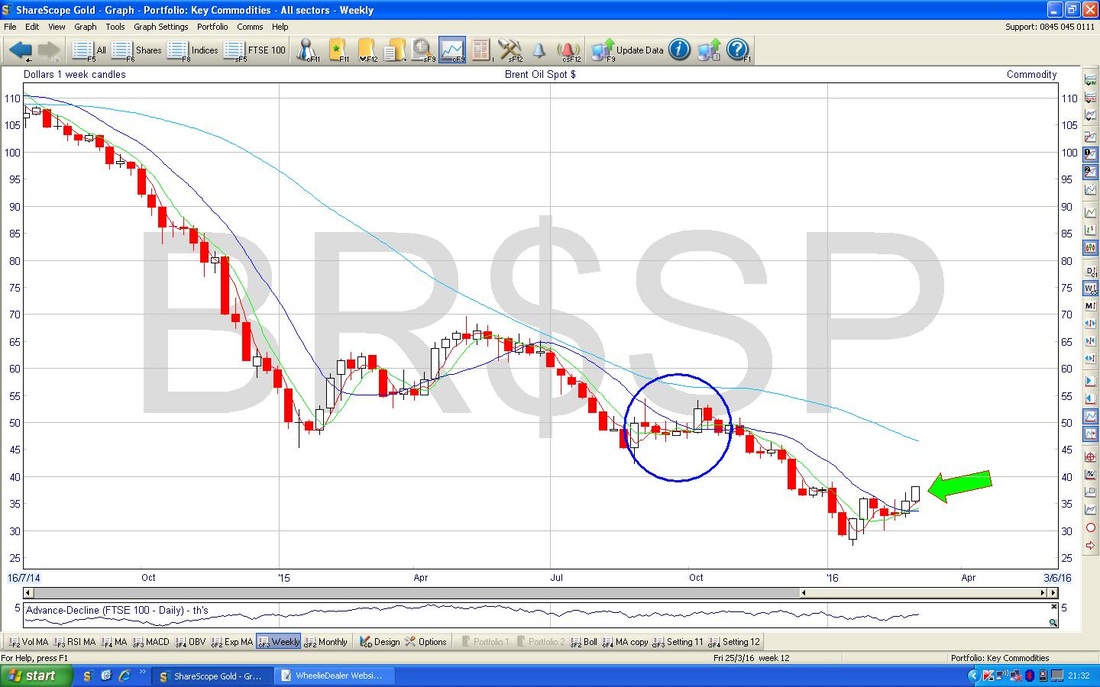
The Chart below has the Weekly Candles for Brent Oil. My Green Arrow points to a lovely Up Candle from last week - this is Bullish. My Big Blue Circle is highlighting an Area of Strong Resistance around $50 ish that could be a tough area to crack.
Gold
Very interesting developments here last week - we had a sort of ‘Pennant’ Bull Flag formation (marked with my Black Lines over the last 3 weeks ish) and the Price Broke-out of the Top of the Pennant at $1263. It is likely now that it will move up quite swiftly - maybe more than $100 I would guess. Of course, the big complication by Gold doing so well is that it hints at problems for Stocks etc. 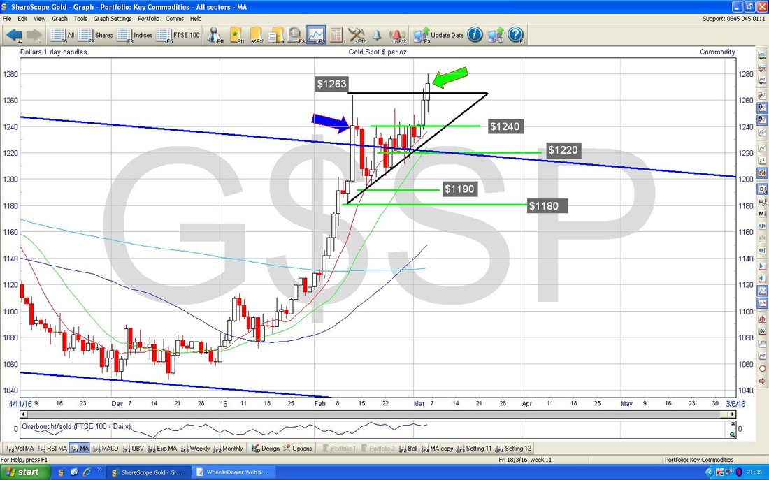
Utilitywise UTW
I just wanted to chuck this Chart in as well. If you follow me on the Tweets, you may have seen me bleating on about a “Triangle on the UTW Chart” - my Blue Lines below mark out exactly what I mean by that. The theory is that whenever you get a Triangle Pattern, the Price tends to wiggle around inside the Triangle and gradually make its way to the ‘Point’ of the Triangle - but at some point it will break out of the Triangle Pattern to the upside or the downside. If it breaks up then expect it to go higher quickly, if it breaks down, then expect it to fall a lot. One to watch. That’s it for now, WD 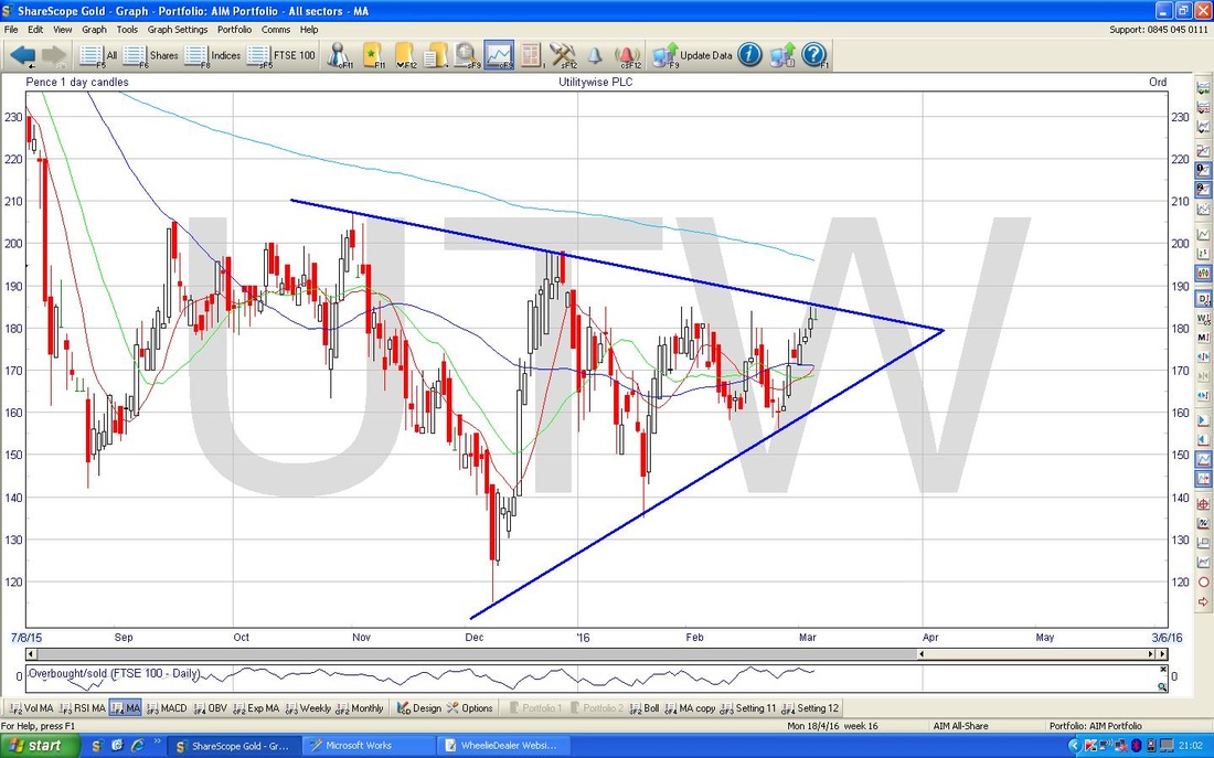
2 Comments
catflap
7/3/2016 08:13:17 am
Thanks for charts and your views. Starting to feel like the danger is over......
WheelieDealer
7/3/2016 05:10:11 pm
Hi catflap, yes, like you I am starting to feel that things are perhaps not quite as bad as they appeared at the start of the year - hence my thinking that maybe we can get in some sort of Range and avoid a big plunge for a while - obviously that 5500 level on the FTSE100 is critical along with 1810 on the S&P500. Leave a Reply. |
'Educational' WheelieBlogsWelcome to my Educational Blog Page - I have another 'Stocks & Markets' Blog Page which you can access via a Button on the top of the Homepage. Archives
May 2024
Categories
All
Please see the Full Range of Book Ideas in Wheelie's Bookshop.
|
