

|
educational blogs |
|
I am listening to the Foo Fighters* ‘Wasting Light’ as I work on this, so it might be a bit Rockier and Punchier than normal…..
As I keep saying, we are fast approaching the Autumn and particularly the month of September which has historically been the worst performing month of the year for the FTSE100 (and by extension most Global Major Indexes as correlations are significant). With this in mind, the Price Action last week was quite interesting and I was watching with particular focus the Weekly Candles and the Monthly Candles on all Major Indexes - and it seems to me that they are all giving Reversal Signals - so a Sell-off could be on the way. I will dig into these Charts in a bit and I will look at the History around September. In addition, the VIX Index has had a particular fascination for me and this could be a big help in understanding the likely direction for US Markets in coming weeks.
We are in a funny period really - last week was a run-up to the Bank Holiday tomorrow (Monday 29th August) and of course the coming week is a 4 day jobbie - so this will probably mean low trading volumes and plenty of weird Price Action and Choppiness.
Historical Returns for the Coming Week According to the UK Stockmarket Almanac 2016, the coming Week (W/C 29th August 2016) is Up for 52% of Years with an Average Return of Positive 0.3% - so the backdrop is slightly positive and it tends to be a pretty flat week. Obviously the UK Market is closed tomorrow and I heard somewhere that the US Market is closed on Tuesday but don’t quote me on that !! September Historical Returns The Almanac says that September is Positive for 45% of Years with an Average Return of a 1.0% Loss for the FTSE All-Share Index since 1982 - it is the WORST month of the year. In addition, things are getting worse - since 2000 the Average Return has been a Loss of 1.9% (I suspect this is because the Reputation of September is becoming a Self-Fulfilling Prophecy). A typical September sees the Market drift down for the first 3 weeks and then it rebounds a bit in the last week. It also says that the FTSE250 tends to be particularly weak when compared with the FTSE100 this month and this pattern continues in October. It also adds that Gold and Silver tend to do well. If we do get some weakness, no doubt the Media will have to concoct a ‘Story’ to explain why the markets are falling (“they always do in September” is not exciting enough for your average Bloomberg and CNBC viewer) - I would guess that possible US Interest Rate rises and fears over a Trump victory could be in the frame - it’s worth noting that Trump has very much changed his electoral pitch and now that he has solidly banked the Far Right vote he is now moving onto the Centre Ground which is a big problem for Hillary - she is dogged by Corruption and firmly cemented towards the Far Left (in US terms certainly, although nowhere near as Far Left as our beloved Jezza). A recent Poll I saw had 48% to 42% in favour of Clinton - but that gap has been closing. I would expect Wall Street to dislike a Trump victory because Hillary is hugely funded by them and they certainly are very happy with the Status Quo of Easy Monetary Policy and their easy access to Washington. Remember how the Media and Pollsters got Brexit wrong - we might see the same thing again. OK, on with the Charts………. FTSE100 We start with the following Weekly Candles chart generated as a ScreenShot from the wicked ShareScope software that I use as my ‘workbench’. If you read my Charts BLog from last week, you might remember I had the Yellow Circle around 2 Candles as below which I suggested could be a ‘Reversal Signal’ - I think it is a ‘Dark Cloud Cover’ pattern. My Black Arrow here points to the Candle from last week and that in fact ‘Confirms’ the Reversal Signal in the Yellow Circle - so we might be at the start of a move down (in all seriousness, Markets do not go up forever in a straight line and we are certainly due a proper Pullback - Valuations are stretched and we need to consider “who is left to Buy?” - the Smart Money was in ages ago and has just been riding the up wave as more and more Johnny come latelys have bought in at higher and higher levels.) This Bearish Confirmation is clearly not so good for the Bulls but there is a bit of hope in that the Candle from last week was a bit of a Doji and it closed out the week well up off the Lows at 6779 - if this Support can hold, then there is a chance we can avoid a Sell-off. The Doji implies some uncertainty - the Bears were unable to take the Market down significantly but the Bulls weren’t able to take it higher. This coming week should tell us a lot about who will win as we head into September - my own view is clearly that the Bears will capitalise on the Self-Fulfilling Prophecy of September being the weakest month. 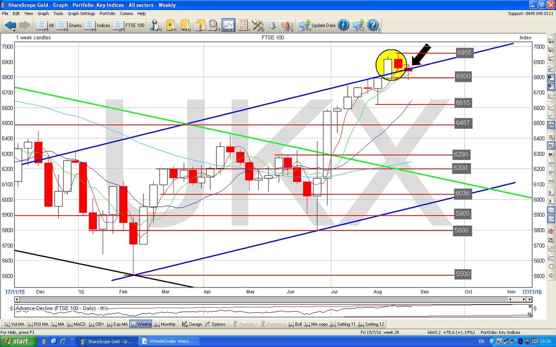
Below we have the Monthly Candles for the FTSE100. An obvious first thing to appreciate is just how close we are the to the All Time High (ATH) at 7122 - it really cannot be too surprising if People are tempted to Sell when we get up to such a high level and this is particularly likely around Autumn. Only if the Price can breakout over 7122 can the Bulls really be Partying like abattoirs have just been abolished - this could well happen, but I suspect any such momentous Breakout will have to wait for later in the year after a Pullback to calm things down a bit.
My Blue Arrow is pointing to a ‘Long Tails Doji’ which was generated over August - in the context of the run upwards in previous months, this might be a Reversal Signal (i.e. the Market may drop in coming months) but a Doji like this is not really an ideal Reversal Signal - it might simply be telling us that the Rally is long in the tooth and tired and that a Reversal is coming but perhaps not quite yet. 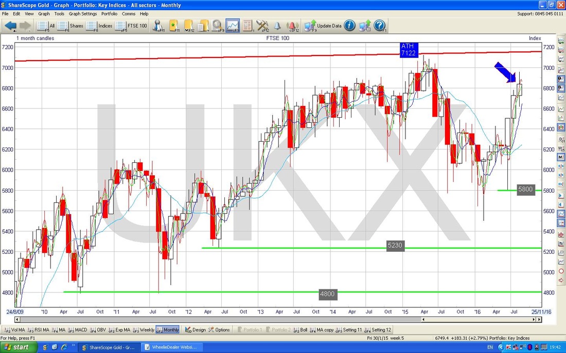
I have included the Chart below because I had some request for it on Twitter but because I use the Fone for accessing Twitterville, I am unable to post Charts out easily. This is a repeat pretty much of a Chart I showed last week of the Daily Candles on the FTSE100 going back about a year and a half - the key thing here is how the Price moved up to the Bottom Uptrend Channel Line from the 2009 Lows but then bounced down off it (as marked with the Huge Green Arrow). For more clarity, look back at the Charts blog I did a week ago. Obviously the Price needs to get up over this Black Line and over 6955 for the Bulls to be firmly in control.
The Huge Yellow Circle in the top left hand corner highlights an area of Strong Resistance. 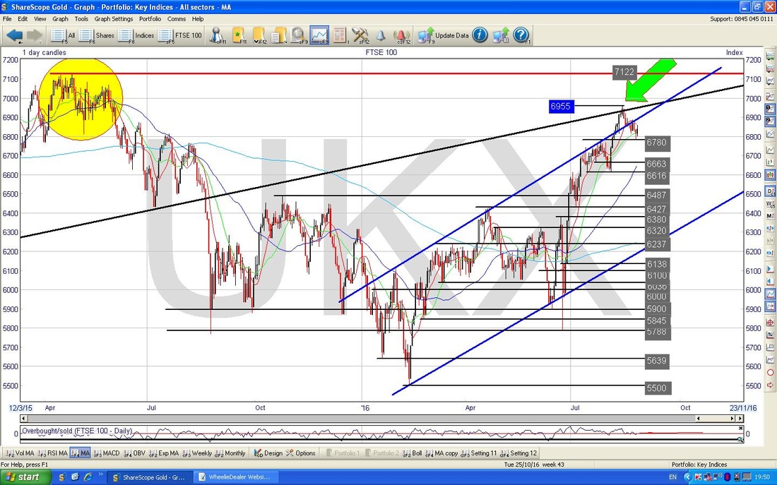
The Chart below has the Daily Candles like on the Chart above but I have zoomed in to about the last 4 months. The interesting bit here is the Thick Red Line I have drawn (it is pointed at aggressively by that Red Arrow) and it will be instructive to see if the Price can get above this Downtrend Line in coming Days.
My Small Yellow Circle highlights the Doji Candle which was created on Friday - something to note here is that I think the US Market fell away later in the day after the FTSE100 had closed - this might mean Downwards pressure when we eventually open again on Tuesday as the FTSE100 plays catch-up (although of course if the US Markets are up tomorrow, then it may all just balance out). A Doji just shows uncertainty - this is no surprise with it being the Friday before a Bank Holiday Weekend and with Janet Yellen speaking at Jackson Hole (she upset the US Markets by suggesting the US Economy was strong enough to support a Rate Rise). 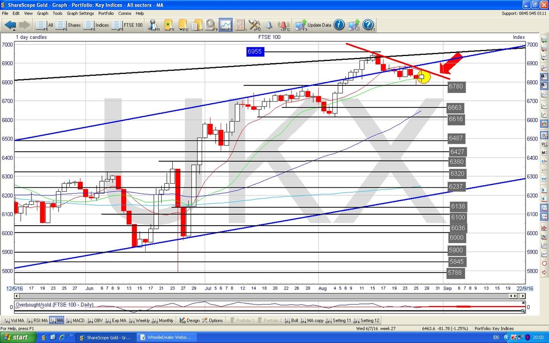
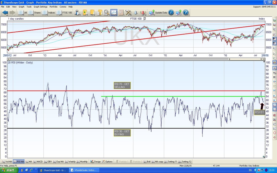
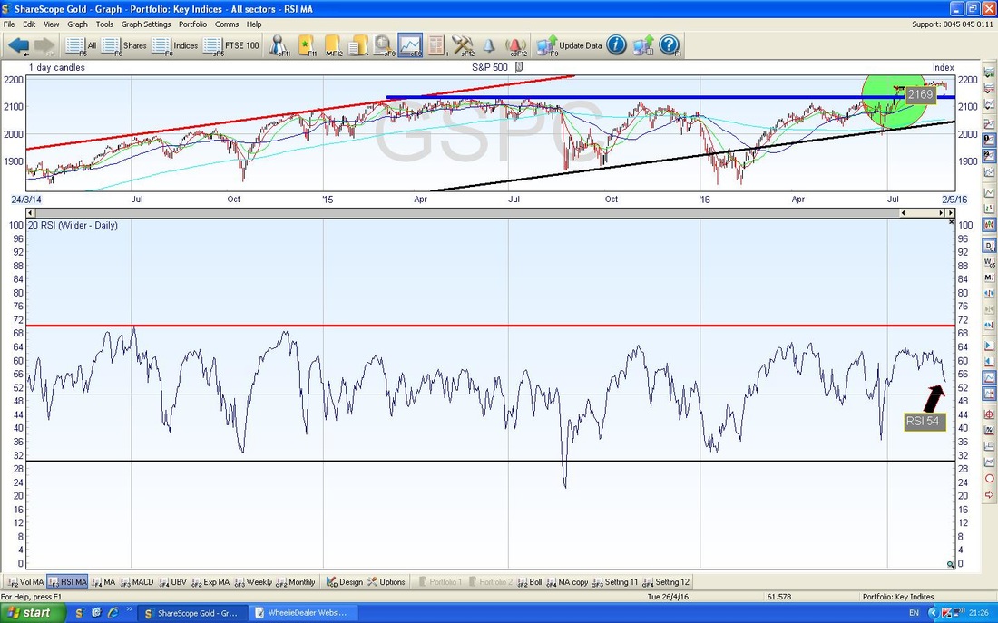
In the bottom window on the Chart below we have the RSI (Relative Strength Index) for the FTSE100 Daily. With a reading of RSI 61 and clearly dropping, this looks more Bearish than Bullish. However, RSI 61 is by no means an extreme high but it is quite high by the standards of the FTSE100 - if you look to the left, you can see countless situations where the RSI fell from a Peak down through RSI 61 and a lot lower - and obviously this tends to take the Price Line with it.
None of the other Indicators are telling me much, so let’s move on to the S&P500.
S&P500 The Chart below has the Weekly Candles for the S&P500 - the most critical US Index in my view - the Dow only has 30 Stocks of enormous size so it is a bit of a false guide - although the Dow and S&P500 do tend to track one another quite well. My Blue Arrow is pointing to a Doji that was created last week and it is noticeable it has quite a Thick Body so there was quite a drop although it closed higher than the Lows of the Week and lower than the Highs of the Week. The interesting bit here is that this Doji means the Price turned down off of the Sort of Hammer Candle which was produced the week before - I have marked this with the Black Arrow. Note there was a very similar sort of Hammer Candle the week just before. 2160 is clearly an important level now - if the Price drops below this, then expect more falls. 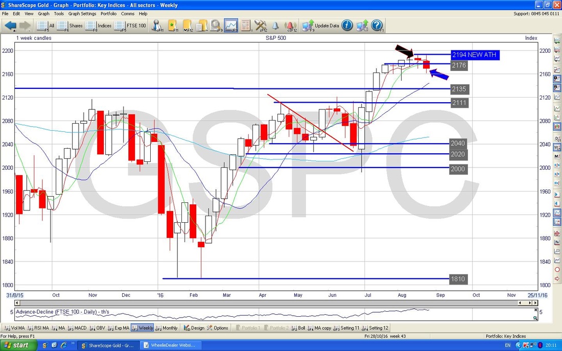
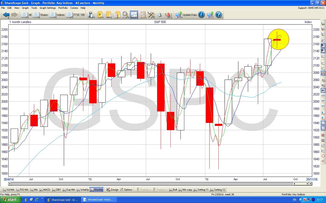
The Chart below is the Monthly Candles for the S&P500 going back a couple of years. My Yellow Circle is highlighting a beautiful Doji Candle which was produced through August - in the context of the Rally, this could be a Reversal Signal or as a bare minimum it is telling us the Rally is tired and a Drop in on the way.
The Screen below has the Daily Candles going back about 4 months on the S&P500. The key thing I want to point out here is a possible ‘Double Top’ which is marked by my Blue Arrows and shows that the Price touched the 2194 All Time High twice and has then dropped back.
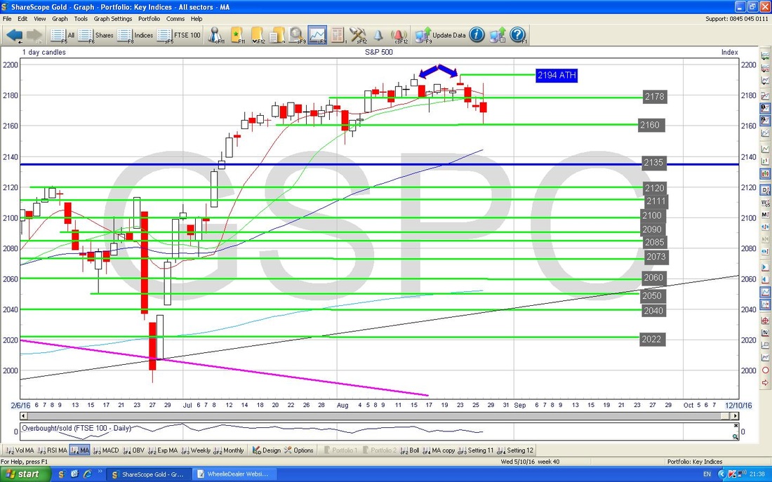
The screen below has the Bollinger Bands around the Daily Price Candles for the S&P500, going back about a year or so. My Black Arrow is pointing to the Lower BB at about 2160 - the Price touched this on Friday Intraday and it could be a Support level going forwards. It is early days but look how the Bands have tightened in recent weeks - this is something to watch as such tightening usually leads to an Explosive move at some point - however, it can explode Up or Down !!
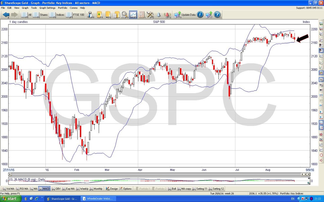
In the bottom window below we have the RSI (Relative Strength Index) for the S&P500 Daily - with a reading of RSI 54 it is not high at all and if anything is around the Neutral 50 level - however it has clearly been falling and this may continue a bit before it turns up again. Usually a move through the Neutral 50 level is a bad sign.
Nasdaq 100
The Screen below has the Weekly Candles for the Nasdaq 100 (this tends to move very closely with the Nasdaq Composite - I have a Short on the Nasdaq 100) going back just under a year. The Yellow Circle highlights the Candle from 2 Weeks ago and I showed this in the last charts Blog - in that Blog I said it might hint a Reversal was coming, and the following Candle marked with the Black Arrow shows that the Price Line did indeed fall. Clearly there is Support at 4740 and if this fails, then we are probably going lower. 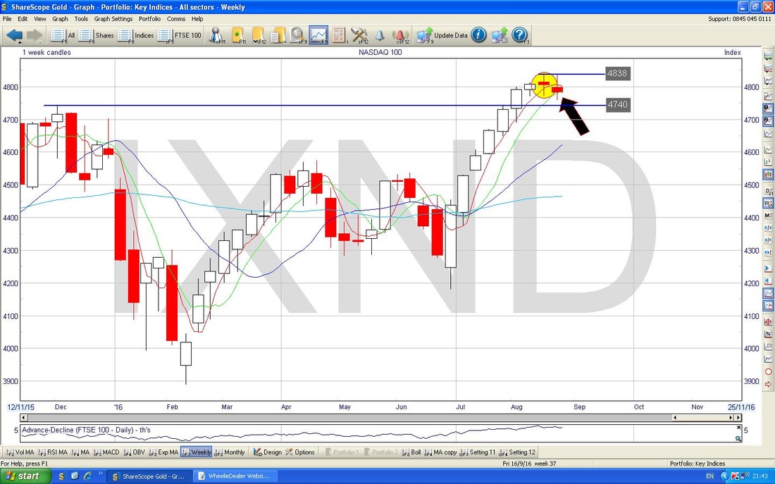
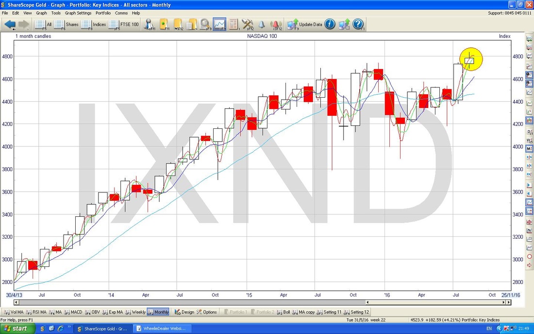
The screen below has the Monthly Candles for the Nasdaq 100 - my Yellow Circle is highlighting a sort of ‘Spinning Top’ Doji Candle for August and it is very possible that this could signal that a Reversal is coming. However, we need a Confirmation with a Down Candle next month - so at this stage all we can firmly say is that the Rally is tired and a Pullback is possible soon - but it could go a little bit higher before any drop.
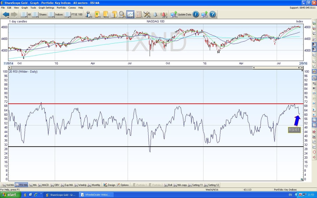
On the screen below in the bottom window we have the RSI for the Nasdaq 100 Daily - with a current reading of RSI 61, this is not over-high but is clearly falling - it could drop a fair bit more.
VIX
The Chart below has the Daily Candles for the VIX Volatility Index (the ‘Fear Gauge’ - this moves inversely to the US Indexes - as it rises, the S&P500 tends to fall and vice versa) and the thing I wish to point out here is that the Red 13 day EMA (Exponential Moving Average) looks like it is about to cross the Green 21 day EMA from underneath - giving a ‘Golden Cross’. However, something to realise with this chart is that for some weird reason (unknown to me), the ShareScope Chart is always 1 day behind - so this only goes up to Thursday 25th August and does not include Friday. However, on Friday there was another Long Tails Doji and it closed just fractionally higher than on Thursday (I worked this out from looking at the VIX on the Bloomberg website on my fone) - so we haven’t quite got the Golden Cross but it is something to watch for next week. If the cross occurs, then we can expect maybe at least several days of rising VIX - this would obviously be bad for the S&P500 and a sustained rise over weeks would be painful - but of course it is September………. 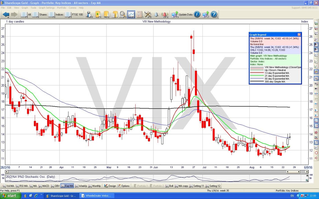
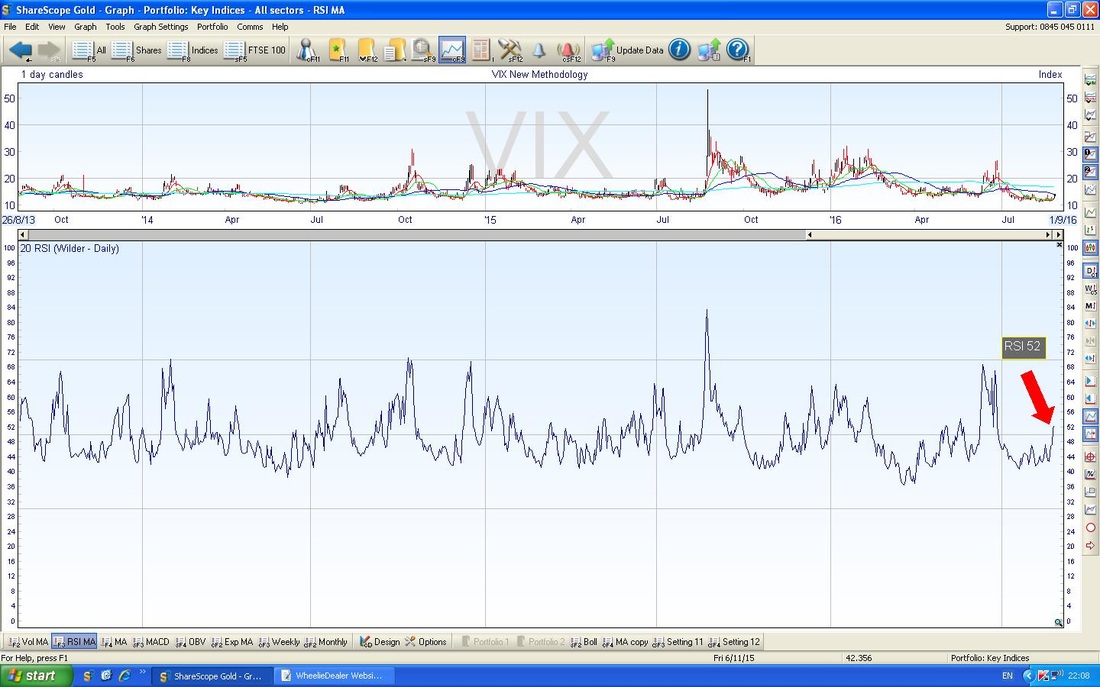
In the bottom window on the Screen below we have the RSI for the VIX. Note how at RSI 52 it has got over the Neutral 50 level and it is clearly rising - as we know, this would be bad news for the S&P500.
Brent Oil (Spot)
The Chart below has the Daily Candles for Brent Oil going back about 6 months. A week ago it topped out at $51.215 and dropped back but then turned up again and on Friday 26th August we were treated to a ‘Long Tails Doji’ (my Red Arrow is pointing at this) which topped out at $50.745. Obviously these 2 numbers are now very near term Resistance Levels that need to be taken out. The next Resistance Level after this is $53. 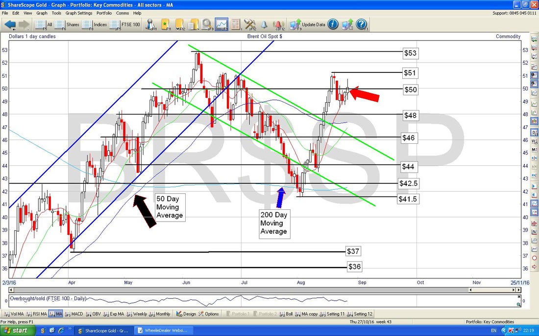
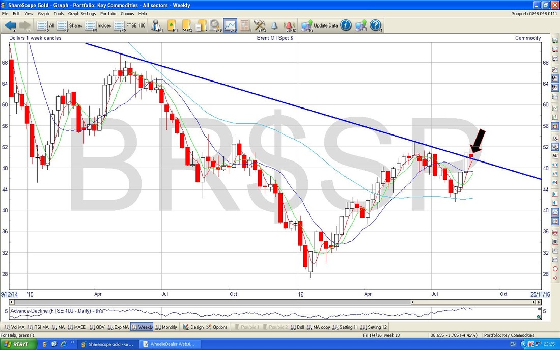
The Chart below has the Weekly Candles for Brent Oil Spot - note the Blue Downtrend Line which might be causing trouble for the Price at the moment. My Black Arrow is pointing to a Hammer Candle which was generated last week - in the context of recent gains, this could mark a Bearish Reversal - we will find out this week no doubt.
Gold (Spot)
I have zoomed in big time on the Gold Spot Daily Candles below - this is so I can show the detailed action. The first thing to notice is that the Price fell out of the Bottom of my Black Lines Triangle from last week’s Blog and after a few days we got a Small Hammer Candle which I have marked with my Blue Arrow. As you would expect, the Price then moved up on Friday (marked with the Black Arrow) but it shot up intraday and then fell back. All this action is very messy and all we can say with confidence is that Nearby Support is at about $1316 and Nearby Resistance is up around $1343. 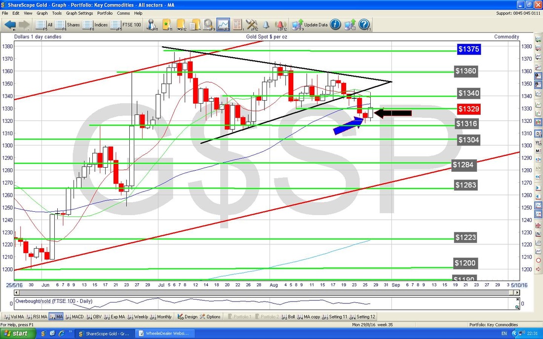
The Chart below has the Daily Candles going back about 10 months or so. The thing I want to point out here is that even though Gold seems weak in the short term, we are still well within the Red Parallel Lines Uptrend Channel and we could drop a lot more and still be within the Uptrend - so there is no need for Bulls to panic.
That’s enough for now, I hope everyone has an enjoyable and profitable Bank Holiday Week, Regards, WD. * I heard the other day, I think on some Discovery Channel Documentary. that ‘Foo Fighters’ was a term used by Allied Pilots flying over German in WW2 who kept seeing mysterious (and still unexplained) Circles of Light which some suggested were the Nazis testing a new weapon. 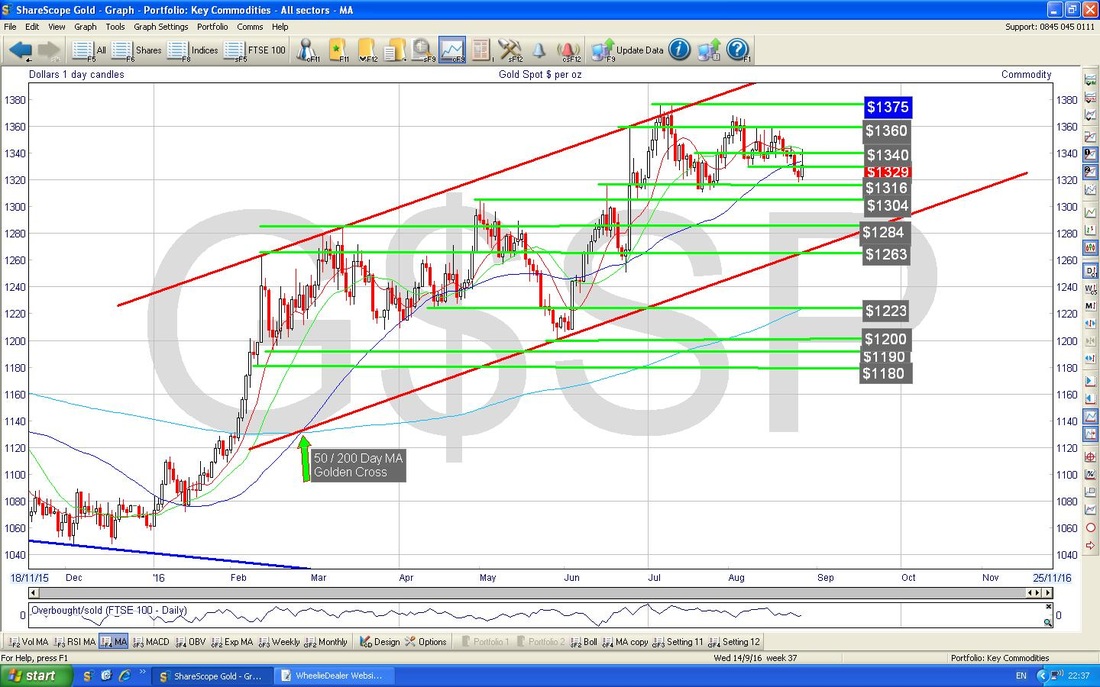
0 Comments
Leave a Reply. |
'Educational' WheelieBlogsWelcome to my Educational Blog Page - I have another 'Stocks & Markets' Blog Page which you can access via a Button on the top of the Homepage. Archives
May 2024
Categories
All
Please see the Full Range of Book Ideas in Wheelie's Bookshop.
|
