|
Finally 2016 is over - I am so glad to see the rump of that one disappear into the mist of history. The Markets are closed tomorrow for a Bank Holiday in the UK but I wanted to have a look at the Charts to see how they shape up as we move into 2017 - my hunch is that Markets are rolling over and this certainly seems to be the case in the US and for the European Indexes. The FTSE100 looks a bit better but it is probably over-extended in the Short Term and with the Pound perhaps about to recover a bit and Oil going sideways maybe, the FTSE100 might come under some pressure.
Fundamentally we have the US Non-Farm Payrolls numbers on Friday which usually gives some excitement for Friday Lunchtime and from a slightly larger timeframe we have President Trump’s Inauguration on the 20th January which could cause some wobbles.
I can’t believe I am such a plonker - every Night around 9.30pm ish I put my small 7inch Tablet on charge ready for the Morning RNS splurge which I read lying in Bed around 8am when I wake up, anyway, I have just twigged that the Market is shut tomorrow so why have I put the darned thing on charge tonight? Muppet.
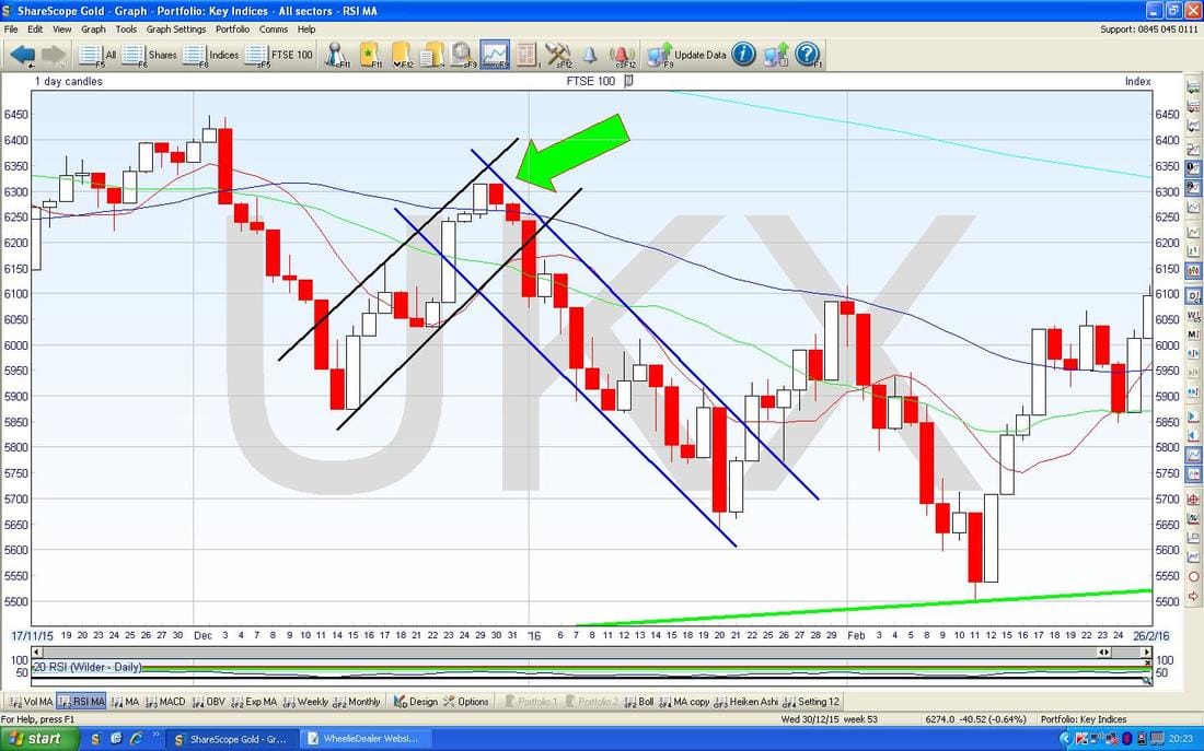
FTSE100 Starting off I wanted to look at what happened last year - from memory I am pretty sure the Markets did well in December 2015 but we fell off the cliff almost straightaway as we got into January 2016. As usual, all Charts are from ShareScope and the one below has the FTSE100 Daily Candles going back to the end of December 2015 and into 2016. Note my huge Green Arrow which is pointing to where the FTSE100 started to tail off exactly as I remembered in the final days of 2016 and then it dropped like a stone. You should be able to see the short Uptrend Channel marked by my Black Parallel Lines and this quickly changed into a Downtrend Channel as marked by my Blue Parallel Lines. The drop from the peak was about 800 Points in total - 6300 to 5500 - a drop of just over 12% in a few weeks - it was scary !! Obviously an exact repeat of what happened in January 2016 is pretty unlikely but we have had a good rise in December (and for a good while before since the Trump Win) and simple ‘Mean Reversion’ in itself makes some sort of Pullback very likely soon. It is worth bearing in mind that any Short Term Pullback does not negate the chance we go higher over the next few months though - I think this is very likely as Markets are behaving in a very Bullish way with new All Time Highs being made all over the place. It seems likely to me we can do well for a few months and then drop away as we head into Summer - this is a pretty well established Seasonal Pattern. Of course we have the Triggering of Brexit Article 50 by the end of March and this might cause some weird Market behaviour around that time - it is likely the Pound will weaken and the FTSE100 move up (however, I suspect the Pound will recover some lost ground before that happens.)
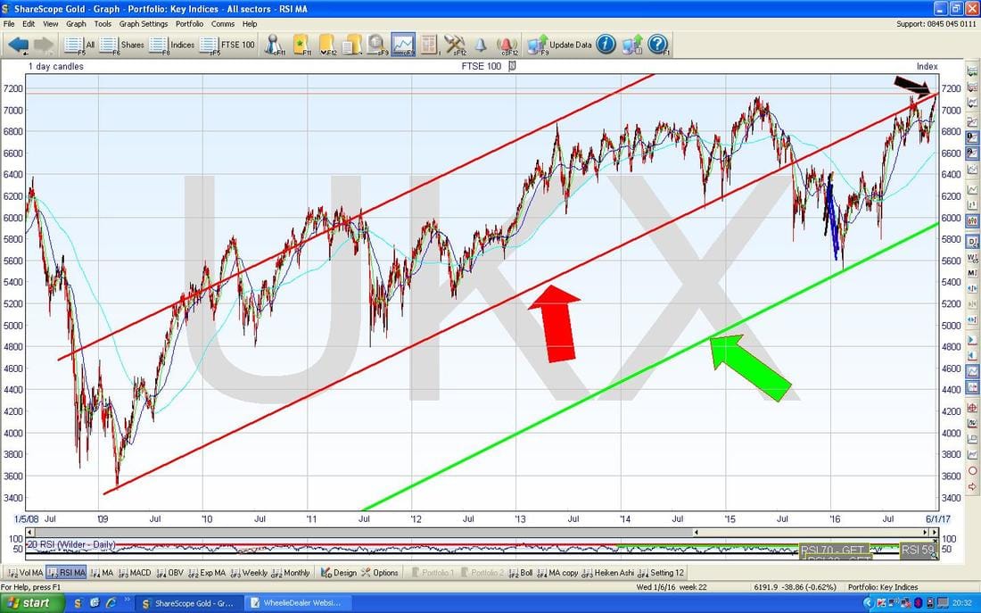
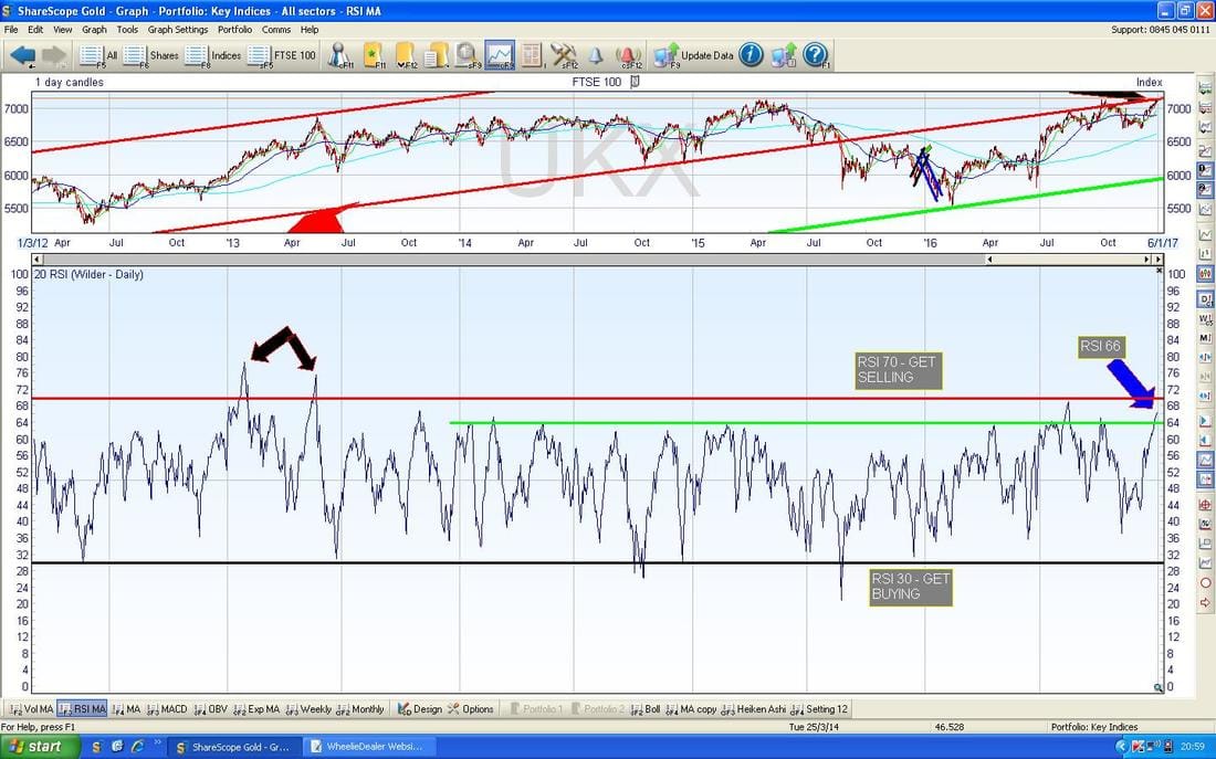
Next I will show the ‘Big Picture’ to set the scene also because something very important is happening here. Regular masochists of my Charts Blogs will recognise this Chart and the key thing here is my Red Line which is marked with the Red Arrow which is the Bottom Line of the Long Term Uptrend Channel which ran off of the 2009 Lows. Note where my Black Arrow is that we are now right on this Bottom Line - so despite the fact we are making new Closing Highs on the FTSE100 in recent Days, we are still pretty much on the Bottom Uptrend Channel Line and it is critical we break above this Line and get back into the Uptrend Channel - personally I have my doubts we will get back in here without a Pullback first. Please ignore the Green Arrow and Green Line.
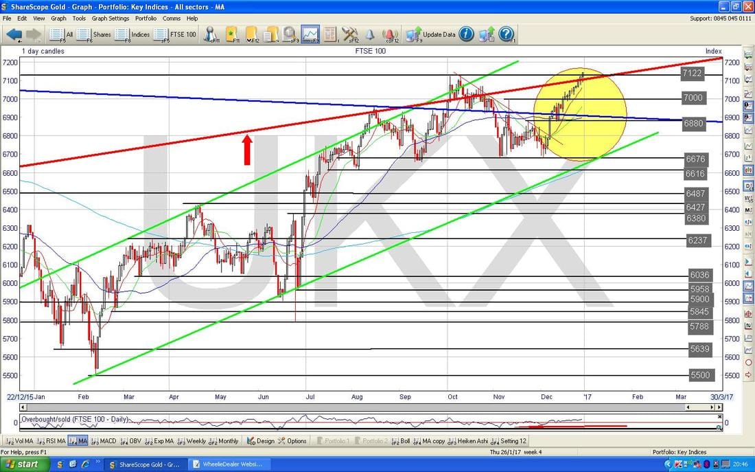
The Chart below is for the FTSE100 Daily Candles going back for all of 2016. Note my Green Parallel Lines which show an Uptrend Channel which has been running all this time - it is vital we stay in this Uptrend as we go well into 2017. The Red Line with the small Red Arrow is the Red Line from the previous Chart - you can see here how at the current Price we are pretty much on this Line.
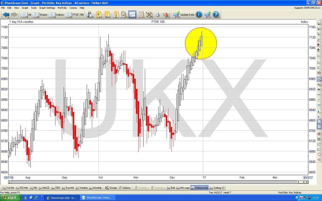
My Yellow Circle should encapsulate a strong rise in the Price which has taken place through December - I am highlighting this because such strong Rallies are never sustainable - at some point it will crack. Just simply standing back and looking at this run it is easy to see it is over done and toppy. Note the 7122 Line at the Top is the previous All Time High that was touched Intraday - so we are up around All Time Highs now and need to do a clear Breakout higher - if that happens, it is a Bullish Development. A new High was made on Friday 30th December 2016 touching 7143 so a small Breakout has happened but it is unclear if it can be sustained.
In the bottom window on the Chart below we have the RSI (Relative Strength Index) for the FTSE100 Daily - note with a reading of RSI 66 this is getting very high but if you look back to my Black Arrows, it is possible for the RSI to go higher but in reality it is very rare this occurs. It is worth considering that for Individual Stocks (in particular on Smaller Companies) it is possible for the RSI to go to some silly high readings - but this tends not to happen on Indexes or Big Stocks.
In the bottom window below we have the ‘Overbought/Oversold’ Oscillator - this is a very Short Term Indicator and moves rapidly. My Red Arrow shows where we are now and you should be able to discern that we can go a bit higher but we are getting very near the extremes.
The Chart below has the Heiken Ashi Daily Candlesticks - my Yellow Circle is attempting to point out how over recent Days (remember, each Candle is a Day) we have had nice big White Up Candles and these suggest more Gains to come. If you look at previous Runs up on this Chart, you can see that the Runs tend to finish with a narrow, small, Candle - no sign of that yet but of course that will be an early signal of a Short Term peak.
DAX (German)
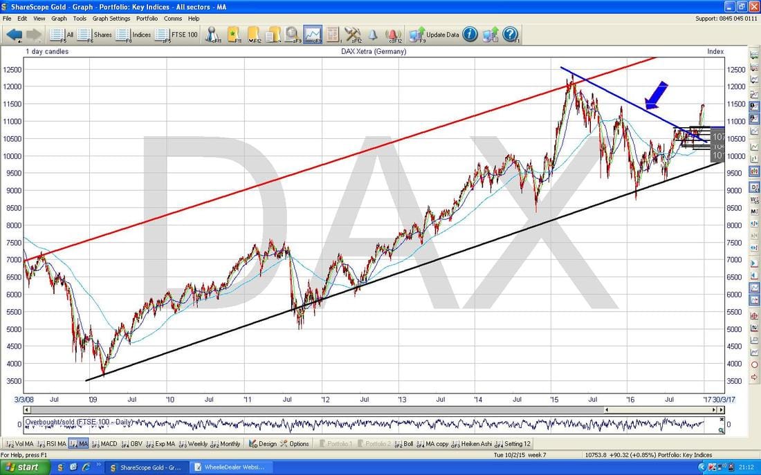
The Chart below has the DAX going back to the 2009 Lows. Note the clear Uptrend Channel and that we are still nicely within it. Please ignore the other scribbling on this Chart.
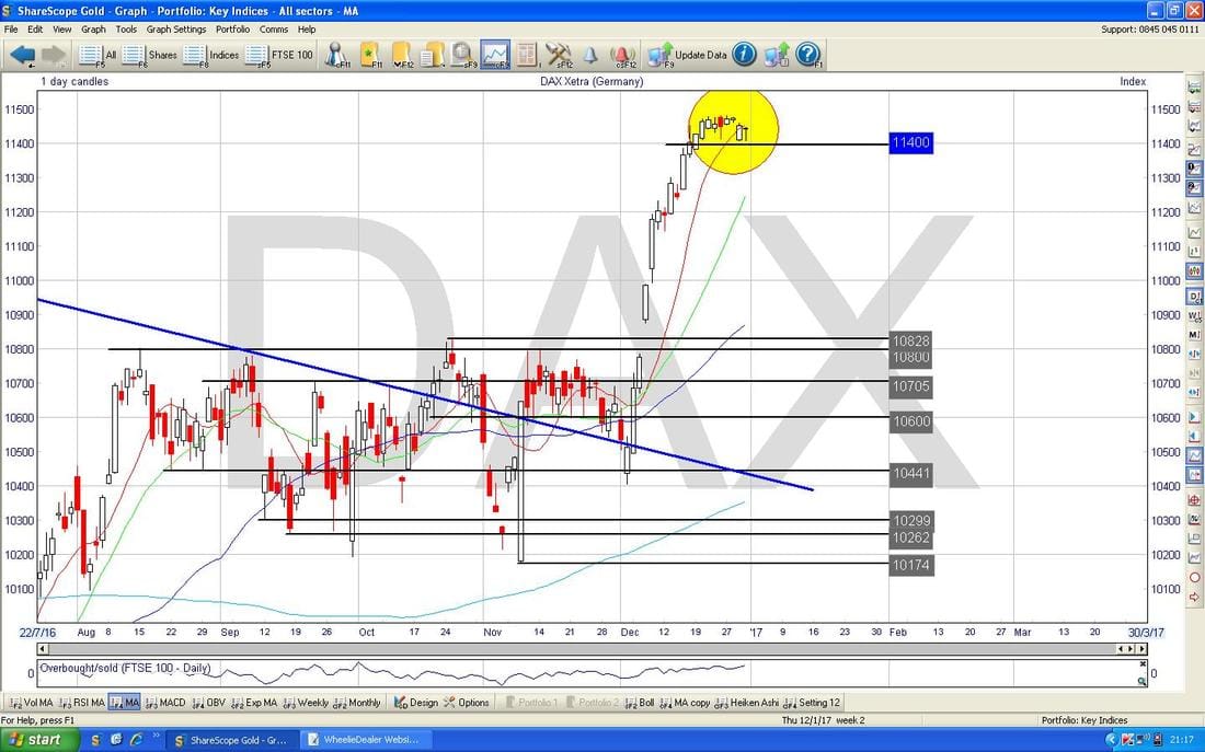
The Chart below has the Daily Candles for the DAX going back about 4 months. My Yellow Circle should be showing where the Price seems to be ‘Rolling Over’ after a rapid (and therefore unlikely to be sustained) run upwards. 11400 is clearly an important Support Level here. One possible scenario is that we might be seeing a ‘Bull Flag’ developing - the strong Run Up would be the ‘Flagpole’ and where my Circle is could be the start of a ‘Flag’ being built - we shall see.
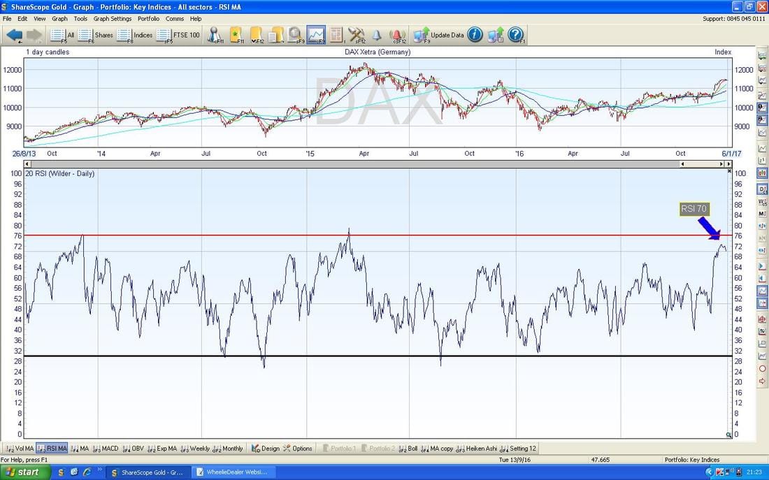
The bottom window below has the RSI for the DAX Daily - note how it is ‘Rolling Over’ and with a current reading of RSI 70 it is extremely High and Overbought.
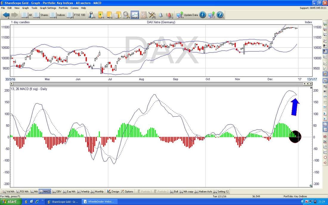
In the bottom window on the Chart below we have the MACD (Moving Average Convergence Divergence) for the DAX Daily - my Black Circle is showing how we are nearly at a Bearish MACD Cross via the ‘Histogram’ Bars and my Blue Arrow is showing the same thing via the ‘Signal’ Lines. This does not mean the DAX will drop - it could mean that the DAX goes sideways as a possible ‘Flag’ is played out as I mentioned. Personally I would think a drop most likely though. Note the CAC40 (the main French Index) which moves very closely with the DAX has already done a Bearish MACD Cross - I will let you peeps check that Chart out yourselves.
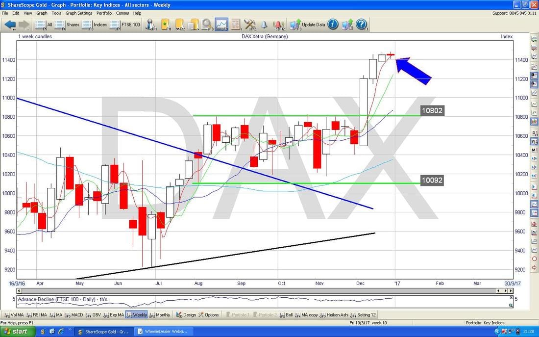
The Chart below has the Weekly Candles for the DAX. My Blue Arrow is pointing to a beautiful ‘Spinning Top’ Doji that was banged out last Week - after the strong run up in previous Weeks, this could be signalling that a move Down is about to come soon and maybe it could last a couple of Weeks.
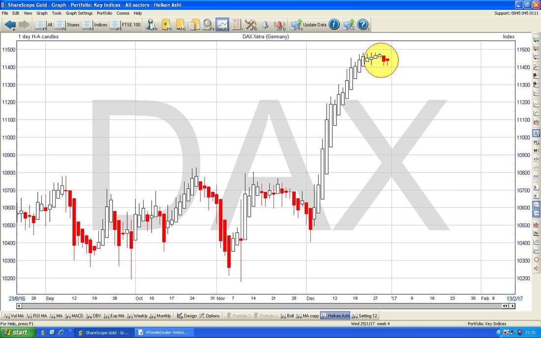
The Chart below has the Daily Heiken Ashi Candles for the DAX. My Circle points out exactly what I was talking about on the chart I Showed earlier for the FTSE100 - note how the Candles were big and clear in their Up direction before my Circle but then the Candles started to close up and become smaller and now they have even turned Red - so the odds are favouring a drop here. Could be a good Short here maybe.
Pound Vs Dollar
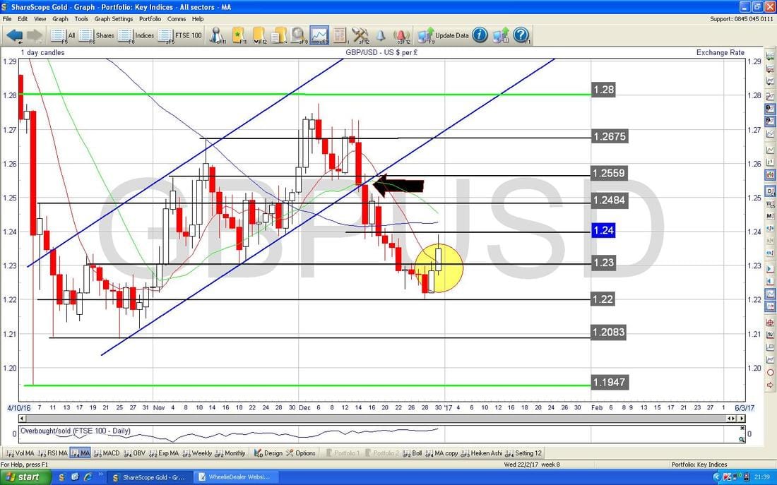
My Chart below zooms in on the £/$ Daily Candles to about the last 3 months. Note the Uptrend Channel marked by the Parallel Blue Lines which was in force for much of this period but where my Black Arrow is the Uptrend failed and the Price fell out. We then had many Down Days until where my Yellow Circle is where the Pound started a fightback - the challenge for the Pound now is to try to sustain this and move back up. Remember, the Pound has had significant impact on the FTSE100 over 2016 and if we see the Pound strengthen this will most likely put downwards pressure on the FTSE100. 1.24 is clearly the key Resistance to get over in the Short Term and Support at 1.22 is important to hold.
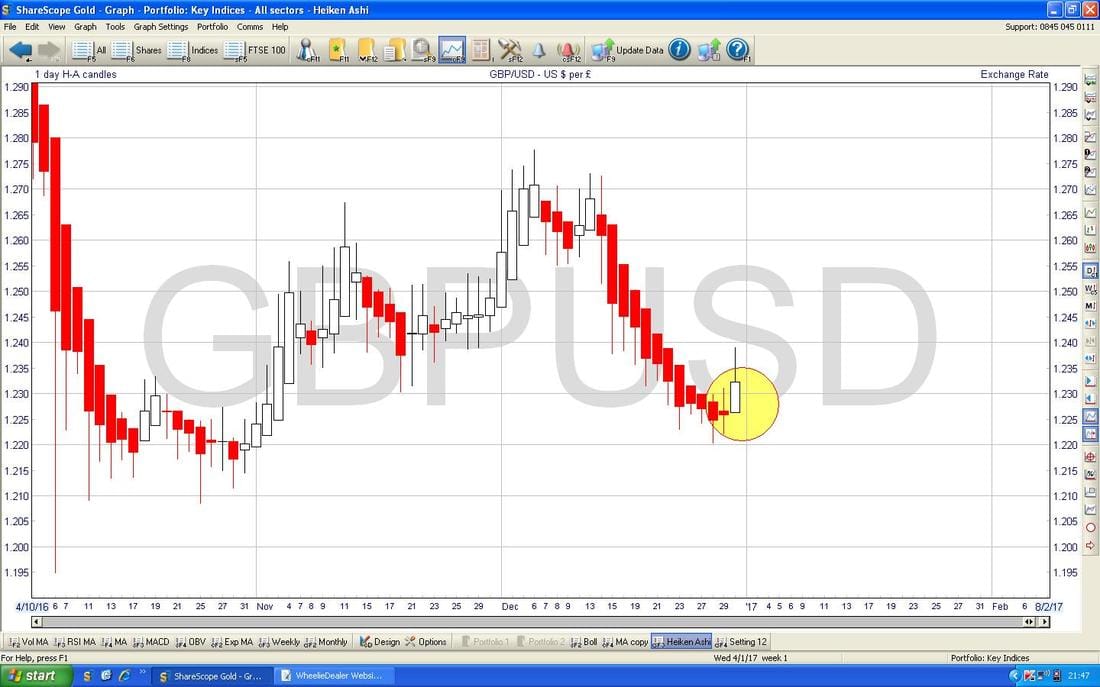
The Screen below has the Daily Heiken Ashi Candles going back a few months. My Yellow Circle is pointing out how the string of Red Down Candles started to tighten up with smaller Candles and then we got an up Candle. If we get another Up Candle from the next Day of trading, then this would be a Buy Signal for a rising Pound.
Nasdaq 100
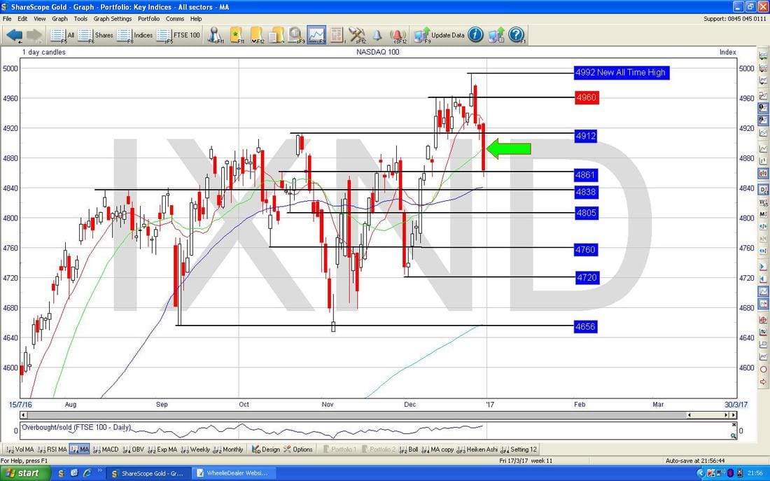
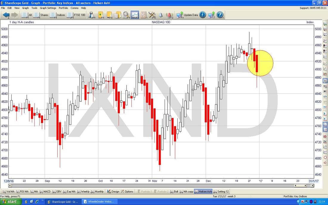
I am particularly interested in this one because I have a small Short Position on it which I opened a few days ago - see my ‘Trades’ page for details. This is the Top 100 Companies by Market Cap in the US Tech Nasdaq Stock Market and is very similar to the Nasdaq Composite Index which has loads more Companies in it. I am focused on the Nasdaq 100 because this is the Index which igIndex lets me do a Spreadbet on (they call it the ‘US Tech 100’). My Chart below has the Daily Candles for the Nasdaq 100. My Green Arrow is pointing to an ugly Big Red Down Candle which was created on Friday 30th December 2016 - this looks pretty bad. Note 4 Days ago we had a lovely example of an ‘Inverted Hammer’ - it was this that drove my Decision to get a Short on. I have highlighted the 4960 level with a Red Textbox and I think this could be an interesting level. Although we broke above it for a couple of Days, it is likely that 4960 is now a very difficult level to get back over - we shall see. Down below the current Price Level at 4863 there is a lot of Support and this might mean we don’t fall all that far - again only time will tell.
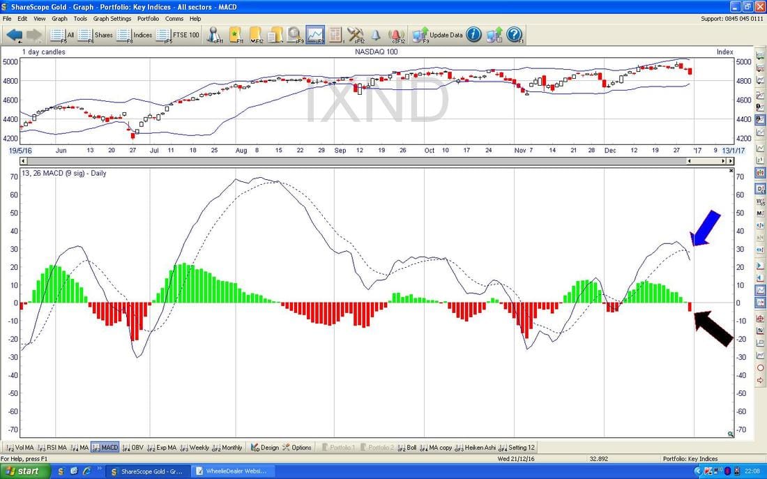
In the bottom window on the Chart below we have the MACD for the Nasdaq 100 Daily - my Blue Arrow is showing a Bearish MACD Cross in the Signal Lines format and my Black Arrow is showing the same thing on the Histograms.
The Screen below has the Daily Candles for the Nasdaq 100 with the Blue Wavy Bollinger Bands above and below. Note how the Price has been falling from the Upper BB and my Green Arrow is pointing to where the Bottom BB is now sat at around 4750. It is very likely that the Price will fall to this level and find Support.
The Chart below has the Heiken Ashi Candles for the Nasdaq 100. My Yellow Circle is pointing out 2 Red Down Candles which have followed a very Narrow Candle after a big Run Up. These 2 Red Down Candles suggest more falls to come.
S&P500
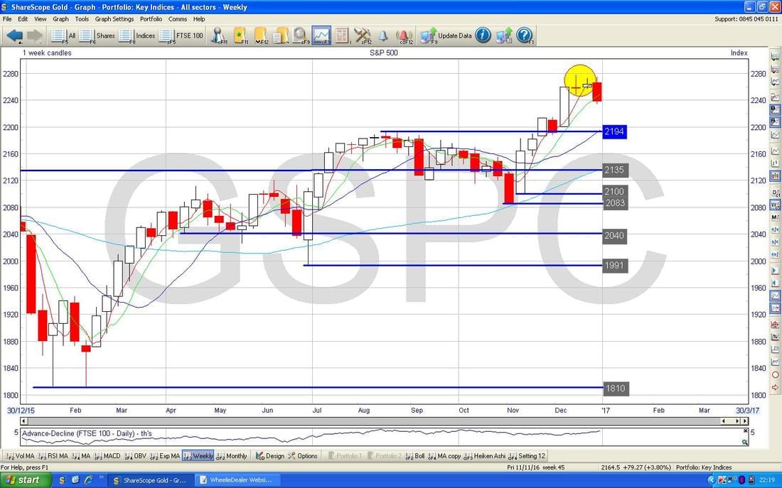
I won’t go into this much or the Dow - in reality they are doing very similar things to the Nasdaq 100 and look to be rolling over. The Chart below has the Weekly Candles for the S&P500 and my Yellow Circle is pointing out 2 Doji Candles after the strong moves up in prior Weeks and we have now had a Big Red Down Candle last Week which confirms the Reversal Downwards that the Dojis were signalling.
Brent Crude Oil (Spot)
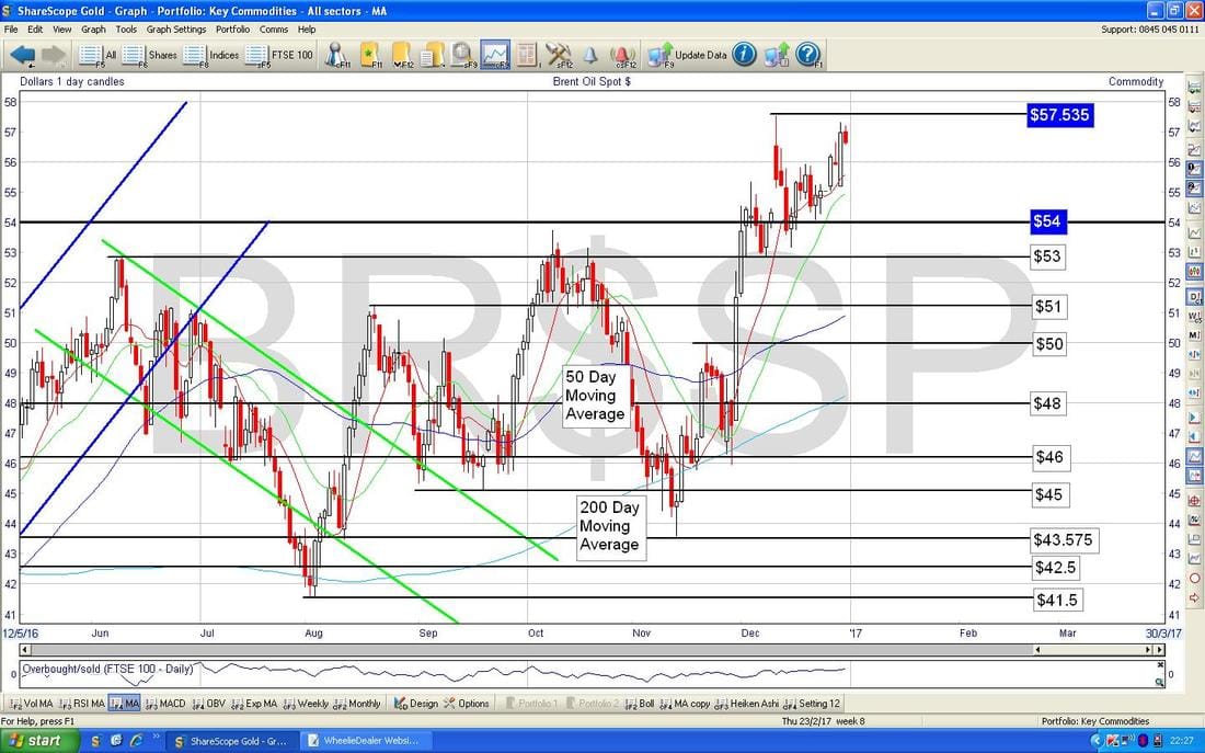
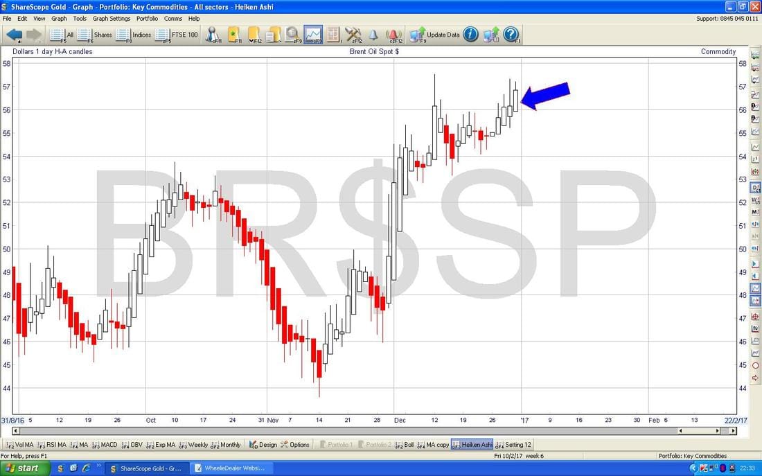
This is another one I am particularly interested in because Oil has also been a bit of a driver for the FTSE100 over recent times and I have a Short on the FTSE100 so I would love it if we get a drop. The Chart below has the Daily Candles for Brent Oil - the main thing to note here is how Resistance at $57.535 could be difficult to get over for a while and also how there is good Support at about $54 and just below at $53.
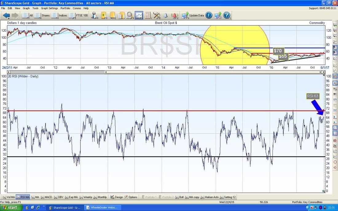
In the bottom window on the Chart below we have the RSI for Brent Oil Spot Daily - with a Reading of RSI 63 it is pretty high.
The Chart below has the Heiken Ashi Candles for Brent - my Blue Arrow is pointing to a nice bunch of big Up Candles and this suggests more Gains to come. One of the beauties I find with these HA Candles is that they give very clear signals and are a big help in keeping me in a Trade where other Shorter Term Signals would shake me out. In this case the HA Candles are telling us to stay long on Brent Oil for now (assuming we had a Long Position on Brent Oil of course, which I personally don’t have).
Gold (Spot)
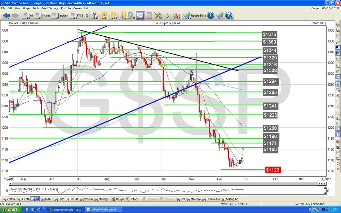
The Chart below has the Daily Candles for Gold going back about 8 months or so. After we fell out of the Uptrend Channel which was marked by my Parallel Blue Lines, the Price utterly tanked like the proverbial brick but at last we have a sign that we might be near a Bottom for the Short Term - $1122 is now critical Support which must hold or we go lower.
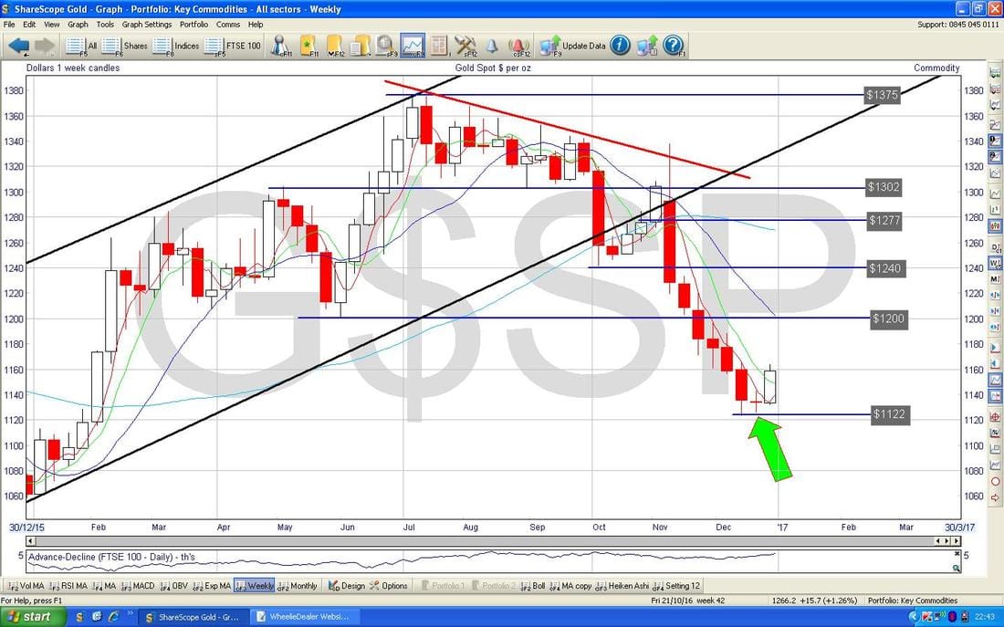
The Chart below has the Weekly Candles for Gold (Spot) - my Green Arrow is pointing to a textbook example of how a Narrow Body Doji has signalled a Change in Direction after the long run of Down Red Candles and now we have a White Up Candle to confirm the turn.
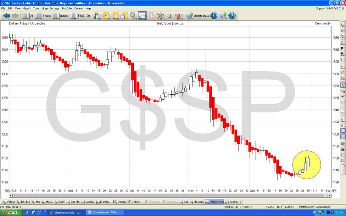
The Chart below has the Heiken Ashi Candles for Gold Spot - my Yellow Circle is highlighting some nice Big Up White Candles and these suggest more Gains to come. Note here how the Long Run of Down Red Candles ended with a narrowing of the Candles and they then changed to small White Up Candles and then have grown as we turned the corner. This is a great example of how HA Candles give Signals.
Right, that’s it - the first WheelieBlog of 2017 - A Collector’s Item if ever there was one. A Trash Collector probably. Happy New 2017 y’all, cheers, WD.
4 Comments
Andy
2/1/2017 01:30:58 am
Il start by saying happy new year wd and hope you had a good time.
Reply
WheelieDealer
2/1/2017 11:14:56 pm
Hi Andy, Happy New 2017 to you and yes I did have a very good festive break although it seems to have gone on forever - I am really keen to get on with 2017's Market Craziness !!
Reply
Ed
2/1/2017 11:59:47 am
I have to say it, this is your best 2017 blog so far.
Reply
WheelieDealer
2/1/2017 11:19:29 pm
Hi Ed, got to agree with you - I felt it was the best Blog I have done this year so far !! Like you I can't help thinking that the US Markets are rising on the hope of a Trump pump but in reality once his Budget Plans get in front of Congress I am not so sure he will be able to splash the cash like he wants to.
Reply
Leave a Reply. |
'Educational' WheelieBlogsWelcome to my Educational Blog Page - I have another 'Stocks & Markets' Blog Page which you can access via a Button on the top of the Homepage. Archives
May 2024
Categories
All
Please see the Full Range of Book Ideas in Wheelie's Bookshop.
|

