|
I ended up writing most of this on Saturday Night due to the ‘MotoGP of The Americas’ taking place in Texas and of course with the time difference it was broadcast fairly late (you can usually catch the Highlights at 7pm on Channel 5 on Monday Evening - it is not the best race ever but critical for the Championship with Marc Marquez never having been beaten in the US by anyone for 8 years - an incredible record).
Of course the big issue for the Markets now is the result of the First Round of the French Presidential Election where the Leader in the Polls, Macron, has taken the first place and Marine Le Pen has got through just behind him. It is conventional wisdom that Macron will win now in the Second Round and the Markets will probably like this because it removes a risk of Le Pen pushing for France to leave the Euro and for the Schengen Border Area to be replaced by National Borders.
A Macron win will be seen as good for the EU and it is likely the Euro will rally which might hurt the Pound and this could in turn help the FTSE100.
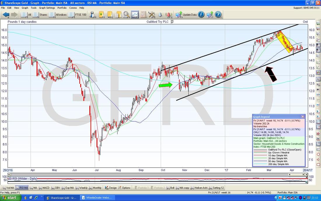
I did the Charting stuff here before knowing the outcome of the First Round of the French Election Vote - I have tried to just be objective and say what I see on the Charts - I did most of it on Saturday Night so this probably helped me be as unbiased as possible. Galliford Try GFRD During a lengthy PUB session on Friday, this was one Stock which came up in our discussions and I mentioned how I liked the look of the Chart. The Screen below has the Daily Price Candles for GFRD going back about a year or so. The main thing I want to show is the Uptrend Channel which I have drawn from about October 2016 and I am pointing at the Bottom Line with my Black Arrow. Now, I have something really exciting to show you, and you may be seeing more of this in the future………wait for it……..drum roll……… Yes, it’s the Yellow Rectangle which I am using to show how the Price fell back for about 3 weeks or so from the Top Line of the Uptrend Channel and note how it started to turn up off the Bottom Uptrend Line. I have wanted to use a Rectangle like this for ages but never actually got around to looking in the ‘Tools’ - ‘Customise toolbars’ menu of ShareScope to see if there was one. Anyway, I now have a Rectangle Button (this is visible on the Far Right of the ScreenShot down near the bottom of the ‘Graph Legend’ box), so it is highly likely I will be using this feature again (ok, you can calm down now, the excitement is over). The other notable thing here is where my Green Arrow is which is marking a 50/200 Day Moving Average ‘Golden Cross’ - as ever, note how it predicted a considerable move up in the Price. This is where the Darker Blue Wavy Line crosses the Lighter Blue Wavy Line from underneath (sorry, the Lighter Blue Line is not easy to see).
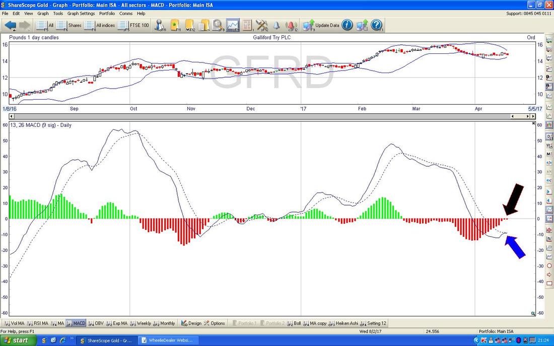
The bottom window on the ScreenShot below has the MACD (Moving Average Convergence Divergence) for GFRD on the Daily and my Black Arrow is pointing to how we are very near a Bullish MACD Cross on the Histogram Bars format and the Blue Arrow is showing the same thing with the Lines format. However, it is not easy to see here but there is a danger this will ‘glance off’ or ‘skim-off’ to the downside - it looks very possible and would be bad news for Bulls.
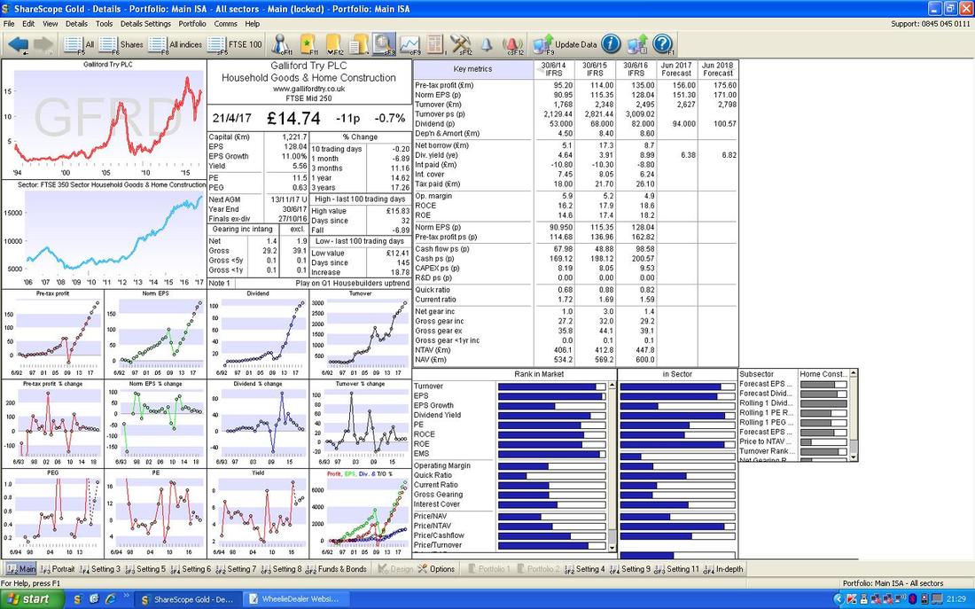
On the whole my Weekend Charts Blogs tend to be mainly about the Charts, but I feel it relevant to throw in a tiny bit of Fundamentals here on GFRD - the Image below has the ‘Details Screen’ from ShareScope for GFRD and it you look in the Top Right Hand Corner you should see ‘Norm EPS (p)’ for ‘Jun 2018 Forecast’ of 171.00. On a Current Price of 1474p, this gives a Forward P/E of 8.6 (1473 divided by 171) which looks pretty reasonable although it is worth bearing in mind that Housebuilders have traditionally been on pretty low P/Es - but it is certainly not expensive on that basis.
If you look further down, the ‘Div. yield (ye)’ is 6.82% for ‘Jun 2018 Forecast’ which again looks very attractive. In other words, the Fundamentals in Valuation terms are certainly supportive of the Technicals which suggest we might see more gains.
FTSE100
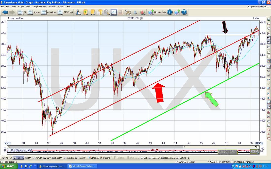
As usual I will start with the ‘Big Picture’ and here it is going back to the 2009 Lows. If you look in the Top Right Hand Corner the Price is currently sat on the Black Line which I have pointed at with the Black Arrow. This is important because this Line marked the Previous All Time High Resistance which lasted pretty much forever and was finally broken over in Early January 2017. The point is that “Former Resistance should become Support” so we should expect this 7100 sort of level to hold as solid Support - if the Price falls down through this, that would be pretty bad. Note we have fallen out of the Long Term Uptrend Channel which is marked with my Red Parallel Lines and the Bottom Line is pointed at with my Red Arrow. This is a pretty bad development and a hint that the FTSE100 is not as strong as Bulls would wish. Bulls now need the Price to get back inside that Uptrend Channel ASAP. As usual, please ignore the Green Line and Green Arrow.
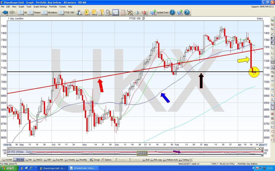
The Screen below zooms in from the Chart above (as ever, all ScreenShots are from the divine ShareScope software that I use) to the last 8 months or so. My Yellow Arrow is pointing to the ugly Big Red Down Candle from Tuesday 18th April when Theresa May announced the latest General Election which caused a strong Rally in the Pound and a corresponding drop for the FTSE100. Note how this Big Red Down Candle smashed through the Red Line which is the Bottom Line of the Long Term Uptrend Channel from my previous Chart.
My Yellow Circle is highlighting the last 3 days - Wednesday to Friday - and note how we got a White Doji Candle on Thursday which had a Low of the Day at 7100 and this is now a really important Support Level which must hold. If 7100 fails as Support, then the next Levels down are 7000 (note, this corresponds with the Light Blue Wavy Line 200 Day Moving Average as well) then 6900, 6800, 6700, 6650 and 6600. To the Upside, there is now a lot of Resistance which will be tough to get over - this is from 7200 through to the 7447 New All Time High.
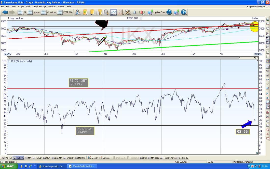
This is a nice sign for Bulls - in the bottom window on the Screen below we have the RSI for the FTSE100 Daily (Relative Strength Index) and with a current Reading of RSI 35 this is a very low level and the FTSE100 could rally from here.
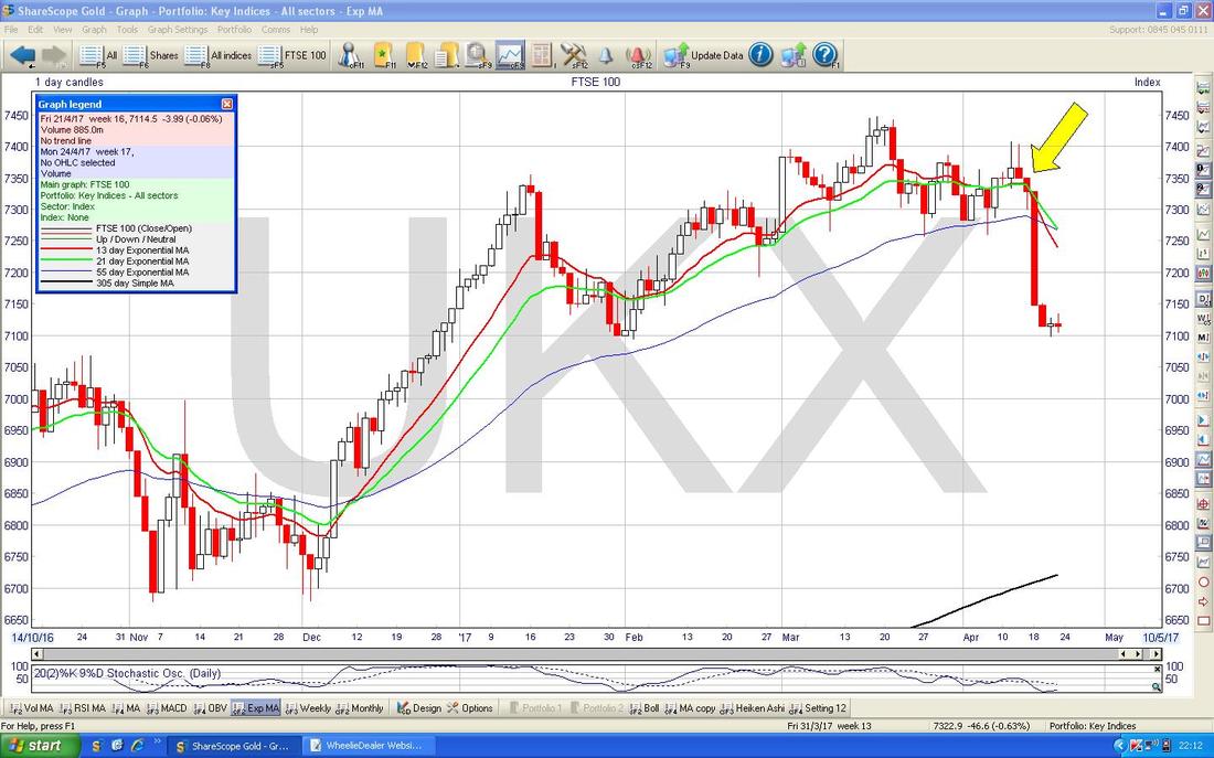
The Chart below has the Daily Candles for the FTSE100 but my Yellow Arrow is pointing to a 13/21 Day Exponential Moving Average ‘Death Cross’ - the Red Wavy Line is the 13 Day EMA and the Green Wavy Line is the 21 Day EMA. This suggests we could see more falls in the weeks ahead.
DAX 30 (German)
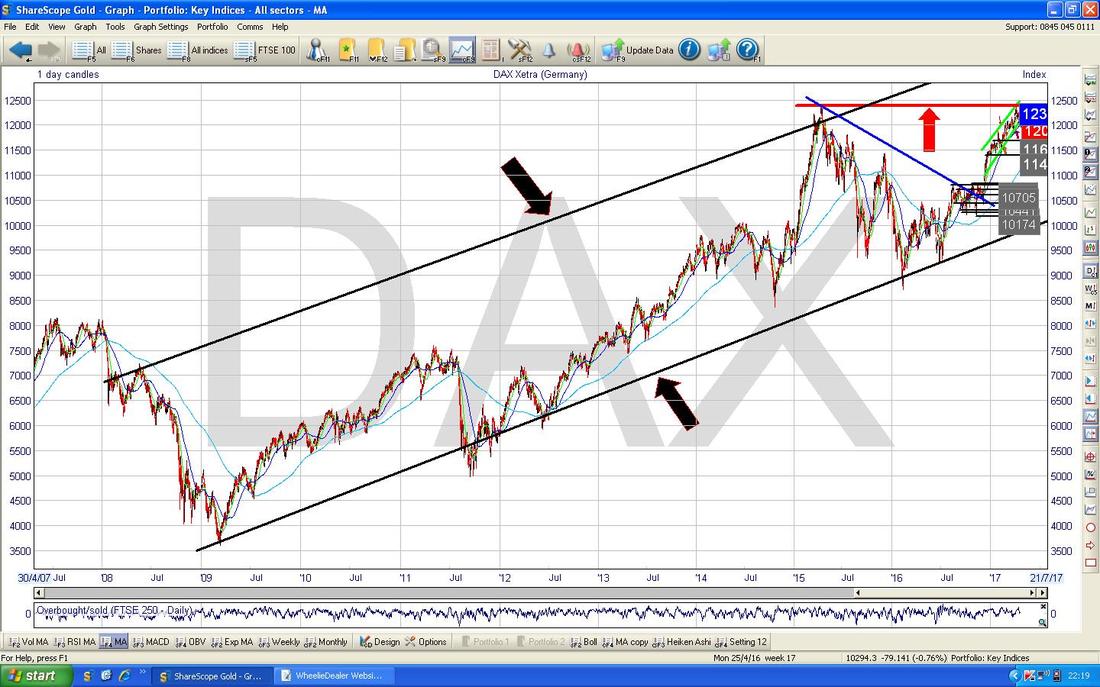
If you check out my Charts Blogs most Weekends you may have noticed I have a bit of an obsession with the DAX at the moment - this is because I reckon there might be a chance to do a Long Breakout Trade if the DAX can break over its All Time High at 12391 and there could be some relatively ‘easy’ (I am not sure there is any such thing as ‘easy’ when it comes to the Markets) £s to be made via a Spreadbet. The Chart below has the Long Term Uptrend Channel for the DAX going back to the 2009 Lows as shown by my Parallel Black Lines marked with the Black Arrows. Note also the Red Horizontal Line at the top marked with my Red Arrow - this is the 12391 All Time High level.
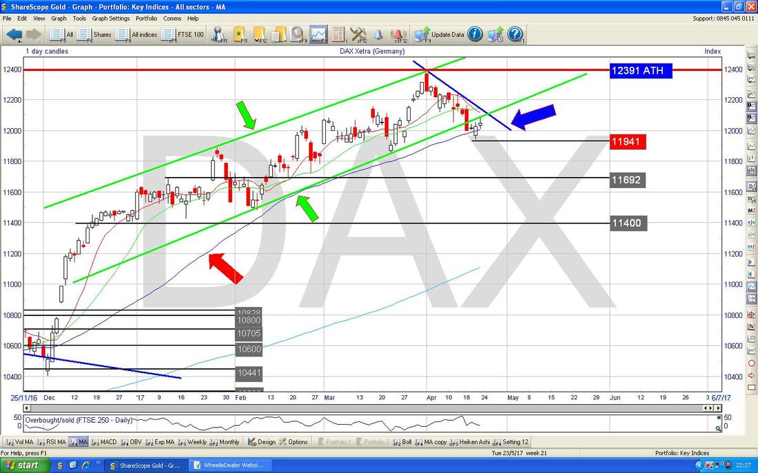
The Screen below has the Daily Candles for the DAX going back to the end of 2016. Note the Green Uptrend Channel marked with my Green Lines and Green Arrows and see how the Price dropped out of the bottom of this in recent days - but it has found Support around 11941 which is also roughly where the 50 Day Moving Average Line is (the Blue Wavy Line pointed at with the Red Arrow).
I have drawn in the Blue Line (marked with the Blue Arrow) which is now a very Short Term Downtrend Line which needs to be broken above in coming days if we are to have any chance of the DAX heading higher and getting that All Time High Breakout of 12391 which I am hoping for.
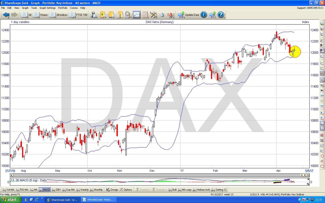
The Screen below has the Daily Candles for the DAX with the Blue Wavy Line Bollinger Bands above and below. My Yellow Circle is hopefully demonstrating how the Price of the DAX fell and touched the Bottom Bollie Band and then turned up - this is good behaviour from a Technical viewpoint for Bulls.
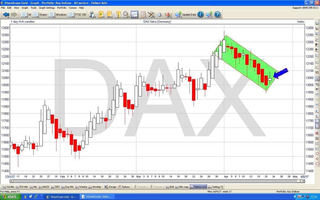
The Chart below has the Daily Heiken Ashi Candles for the DAX and my Green Rectangle (see, I promised I would use the Rectangle Tool again !!) is pointing out all the Red Down Candles and now where my Blue Arrow is pointing, we have a White Narrow Candle which hints at a change of direction but it is too early at the moment - we need a Big White Up Candle now.
You gotta admit, that Rectangle is super cool……….unless of course you are a Square....
Dow Jones Industrials Index - US
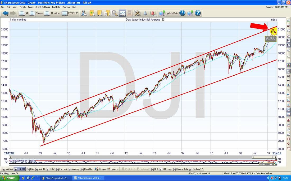
Yet again we start with the Big Picture view. The Chart below for the DOW goes back to the 2009 Lows and shows a clear Uptrend Channel marked with my Red Lines. Note where my Red Arrow is at the top how the Price moved up to the Upper Line of the Channel and then dropped back from it - but most importantly going forwards, we are still nicely within the confines of this Uptrend Channel and it would only take a breach to the Downside at around 17500 for us to get worried Long Term - as it stands, this suggests plenty more upside to come in the Months ahead.
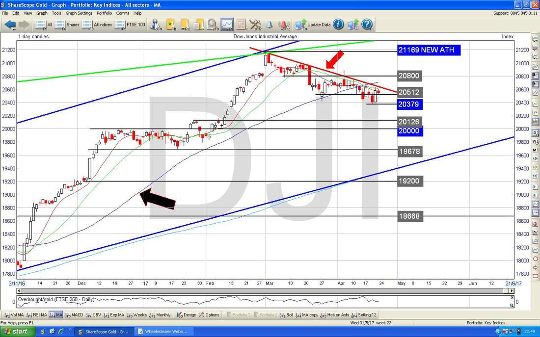
The Screen below zooms in on the DOW Daily Candles back to the tail end of 2016. Since hitting the Peak at 21169 in March, the Price has dropped back for many weeks in quite a sell-off and my Red Downtrend Line marked with my Red Arrow needs to be broken out of if we are to go back up again.
Note there is immediate Support at 20379 and if that fails then 20200, 20126 and most critically 20000 come into play as important Support Levels. My Black Arrow is pointing to the Blue Wavy Line 50 Day Moving Average and the Price is currently below this - however, it is worth remembering that “Reversion to the Mean” is a powerful force in Stock Charts so the Price is naturally attracted to these Moving Average lines.
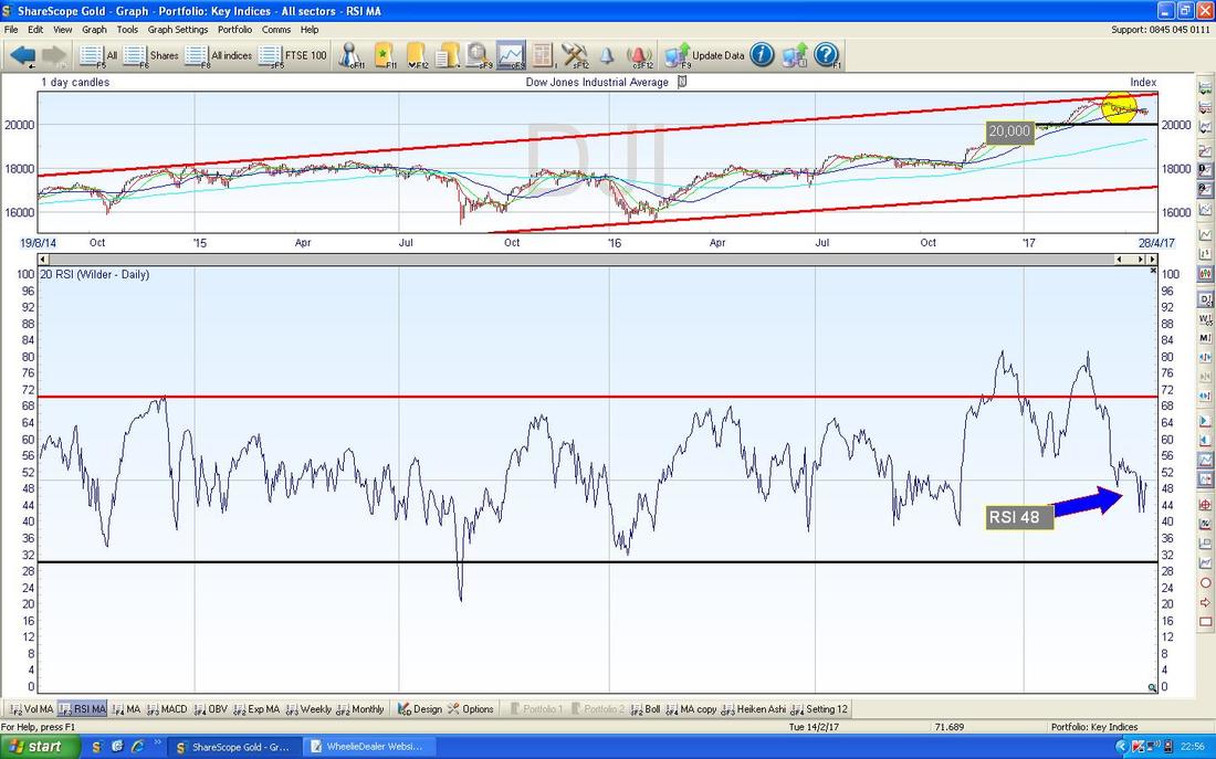
In the bottom window on the Screen below we have the RSI for the DOW Daily. On a Reading of RSI 48 this is not low at all and suggests we could see the DOW go a lot lower before it turns up properly.
In the bottom window on the Screen below we have the MACD for the DOW Daily. My Blue Arrow is pointing to how we are nearing a Bullish MACD Cross and this would be a very good thing for Bulls to see - but it could easily ‘skim-off’ and go lower - just like it did a bit before where my Black Arrow is.
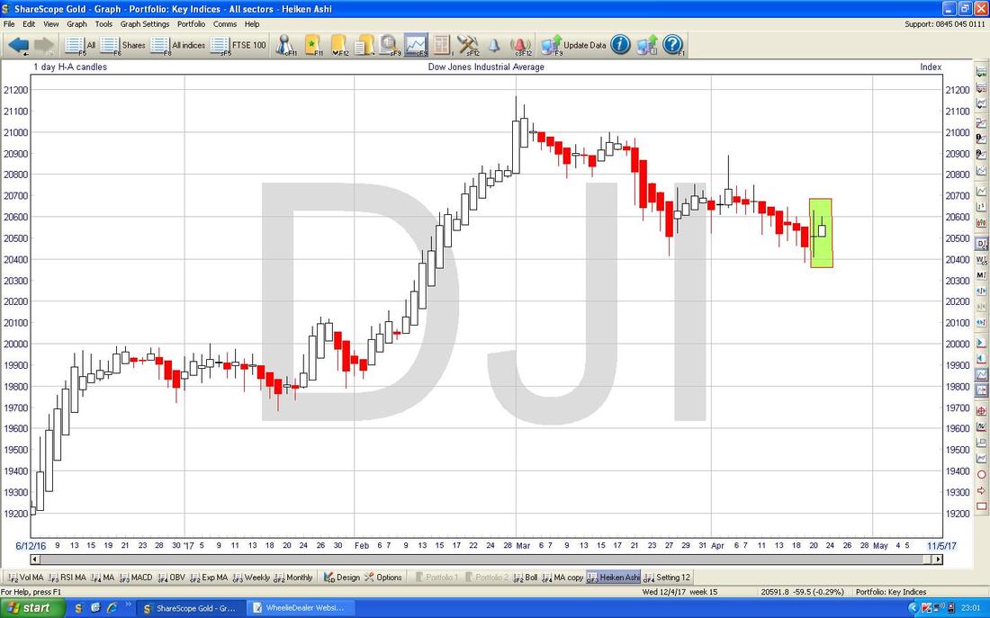
At last something which looks quite promising for Bulls. The Chart below has the Daily Heiken Ashi Candles and my Green Rectangle is capturing a Narrow Body Candle from Thursday and a White Up Candle from Friday - after all the Red Down Candles, this suggests a turn could be happening.
S&P500 looks very similar to the DOW and if anything slightly more bullish.
Nasdaq Composite
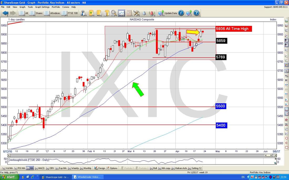
The Nasdaq looks almost the best Index anywhere. I won’t show it here but we are still cleanly within a very defined Uptrend Channel from the 2009 Lows and just last week on Thursday (pointed at with my Yellow Arrow on the Chart below) we were pushing for a new All Time High above 5936 and I get the feeling it wouldn’t take a lot for another breakout. The Chart below has the Daily Candles for the Nasdaq Comp and note my big Grey Rectangle which sort of shows that after a strong move up since Mid February we have been pretty much in a Sideways Range (from 5769 at the bottom to 5936 at the top). This is probably good news - it is very normal for a Chart Price to move upwards and then to go Sideways and consolidate before being able to Breakout and push higher again - it is very likely we are seeing this here and if we do get a clean Breakout over 5936 then it could be an opportunity to go Long for a Short Term Trade to ride the push up that normally occurs. My Green Arrow is pointing at the Blue Wavy 50 Day Moving Average Line - note how the Price in recent Days has dropped down to this Line and then turned back up again with the 50 Day MA acting as Support.
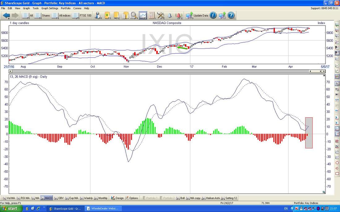
In the bottom window on the ScreenGrab below we have the MACD for the Nasdaq Comp - note where my Grey Rectangle is that we are on the verge of a Bullish MACD Cross - it might not happen, but if it does we will probably see the Index Breakout over 5936 as well.
Pound Vs US Dollar
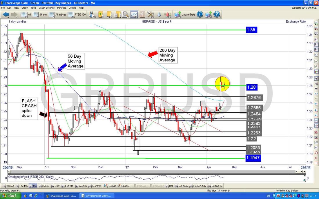
A lot happened here last week with Theresa May calling the surprise General Election which caused a big jump up in the £ and a large drop in the FTSE100. In addition, from a Technical, Charting, viewpoint this has resulted in a significant change in that the £ had been moving in a Range between 1.1947 at the bottom and 1.28 at the top - but it broke out into a Higher Range between 1.28 at the bottom and 1.35 at the top. This should be visible on my Chart below which has the £/$ Daily Candles going back for the last 9 months or so. If the Pound can stay in this Higher Range then that is a very positive development for the Pound. Note also that the 50 Day Moving Average (marked with my Blue Arrow) is moving towards the 200 Day Moving Average (marked with my Red Arrow) and this is setting up a Bullish ‘Golden Cross’ soon. Remember, strength in the Pound could hurt the FTSE100. My Yellow Circle is showing the moves on the Daily Candles for the last 4 days - after the strong move Up on Tuesday, we might be seeing a ‘Bull Flag’ play out here which suggests another jump up could be possible soon. I would expect some more Sideways movement in coming Days and we need to look for a Breakout over 1.29 which would suggest more gains to come and quickly.
Brent Crude Oil (Spot)
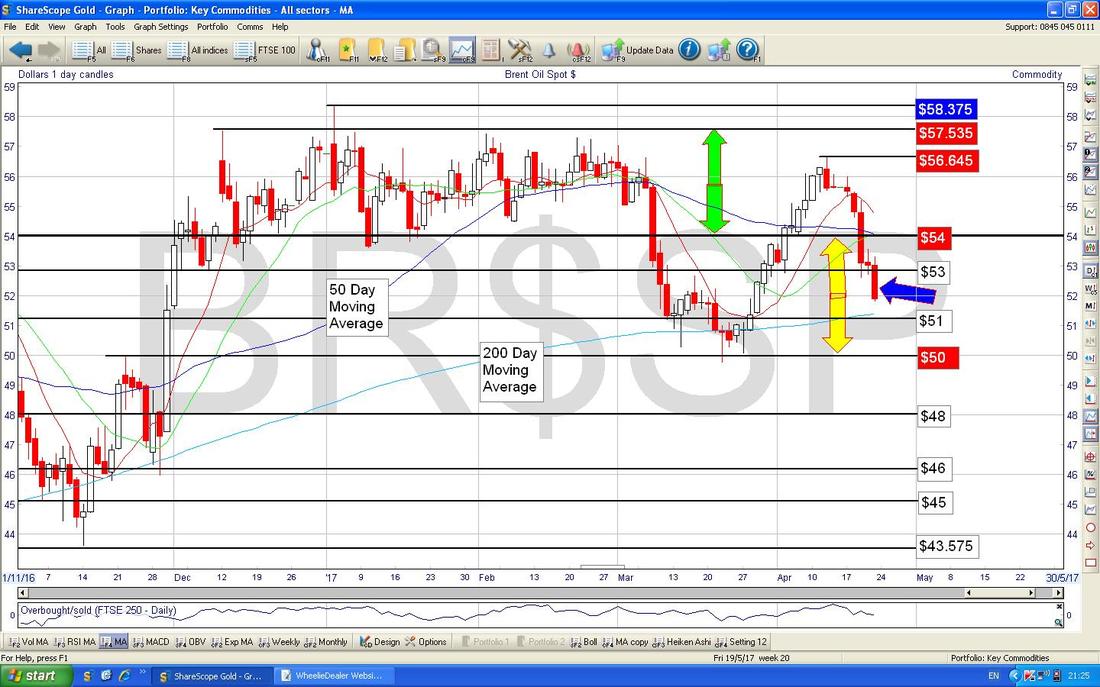
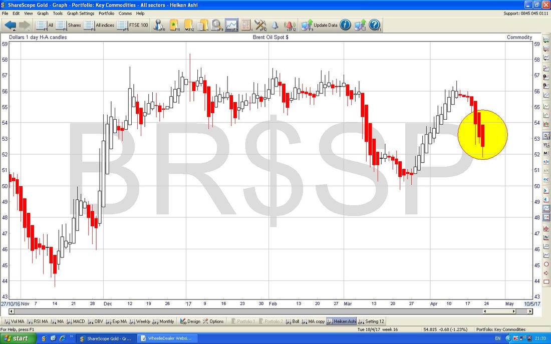
The Chart below has the Daily Candles for Brent Oil (Spot) going back about 5 months. The main thing here is that we seem to have 2 Sideways Ranges - one between $54 and $57.535 (marked by my Green Arrows) and a lower Range between $50 and $54 (marked with my Yellow Arrows). For now it looks like we will be stuck in the lower $50 to $54 Range for a while. My Blue Arrow is pointing to a Big Red Down Candle from Friday and these are never good to see so we might get more downside (this might be negative for the FTSE100). Note also on the Chart how the Darker Blue Wavy Line 50 Day Moving Average is heading down towards the Lighter Blue Wavy Line 200 Day Moving Average - there is a real risk we might get a ‘Death Cross’ between the two which is Bearish as it sounds. If $50 fails as Support, then we could see falls down to maybe the $45/$46 area.
The Chart below has the Daily Heiken Ashi Candles for Brent Oil (Spot) - my Yellow Circle is highlighting how we have Big Red Down Candles (and no signs of them narrowing) which means more falls are likely.
Gold (Spot)
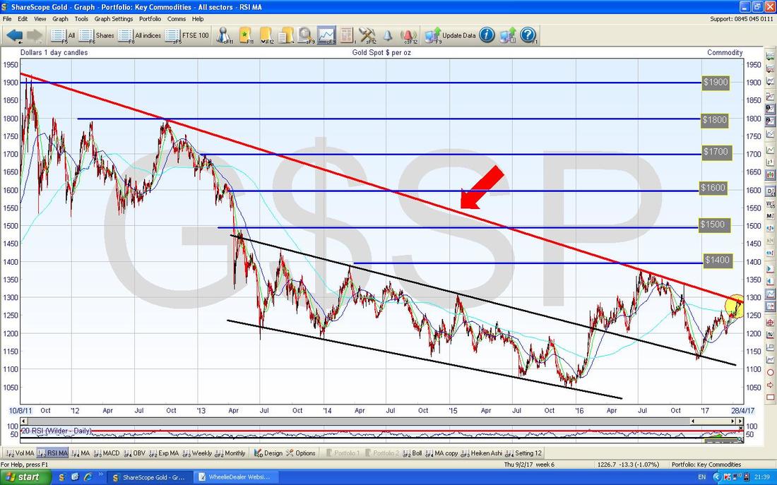
As per many of my recent Weekend Charts Blogs, Gold (Spot) is all about the Long Term Downtrend Line which is marked by my Red Arrow in the Chart below - last Week we had a go at Breaking-out over it but that has not yet happened.
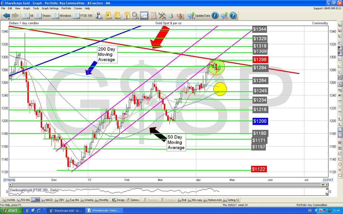
The Chart below has the Daily Candles for Gold (Spot) going back around 6 Months. The first thing to notice is the Big Red Arrow pointing to the Red Long Term Downtrend Line from my previous Chart and as you should be able to see (as ever, if you click on the Chart it should grow bigger in your Browser) the recent Price Action is encapsulated in my Green Circle. To Breakout of the Downtrend Line we need to see a move over $1300 and probably over $1320 to be sure it is going to stick.
My Yellow Circle should show how the Blue Wavy Line 50 Day Moving Average is moving towards the Lighter Blue Wavy Line which is the 200 Day Moving Average and it looks like a Bullish ‘Golden Cross’ is a nailed on certainty so a Breakout of the Red Downtrend Line is highly likely. In the very short term we might pull back a bit before getting a Breakout but I doubt it will fall back much. Right, that’s it for this week, I hope the Market Gods look after you, Cheers, WD.
0 Comments
Leave a Reply. |
'Educational' WheelieBlogsWelcome to my Educational Blog Page - I have another 'Stocks & Markets' Blog Page which you can access via a Button on the top of the Homepage. Archives
May 2024
Categories
All
Please see the Full Range of Book Ideas in Wheelie's Bookshop.
|

