

|
educational blogs |
Fizzling Fireworks and French Fancies - A look at Indexes, Oil, Gold and the Quid (and a few Stocks)16/4/2017
The heat has really been ramping up on the Macro Issues with North Korea doing a remake of David and Goliath and probably of more importance, the French Election process starts next Sunday 23rd April - and with the recent record of Polling organisations any predictions are pretty unreliable. Of course the big danger from the French Vote is that an anti-EU candidate like Marine Le Pen or that far Left chap become President - the danger here is pretty obvious as a collapsing EU would cause a big Economic Shock.
Markets seem to have been a bit soggy for a while, in a bit I’ll dig into the Charts on them but before that I want to look at a few Stocks that have done interesting things last week.
Patisserie Holdings CAKE
After doing a fairly detailed Blog on CAKE many weeks ago, I had been waiting for an opportunity to buy in when I thought it was pretty likely that they were going to rise. That moment arrived late last week and I finally initiated a Position, buying around 2% of my Portfolio Value in them (see the ‘Trades’ page on this website). The ScreenShot below is as always from the wicked ShareScope software that I use (I have just started messing about with SharePad as well but that is another story for another blog probably…….) and shows the Daily Candlesticks on CAKE going back about a year or so. If we start on the Left Hand Side of the Chart, the Price was in a Downtrend Channel as bounded by my Parallel Green Lines and where my Yellow Circle is the Price broke-out of the Downtrend and that was where the Uptrend Channel that we are now within started. The next really important feature is where my huge Green Arrow is that marks a ‘Golden Cross’ between the 50 Day Moving Average and the 200 Day Moving Average - this is very Bullish and tends to mean we will be treated to many months of gains. My Blue Arrow is pointing down at the Darker Blue Wavy Line which is the 50 Day Moving Average and note how back on Wednesday just gone we got a big White Up Candle and the Price broke over this 50 Day MA and over the 325p Level which had been Resistance for a few days. This is my actual ‘live’ working chart and the Horizontal Green and Blue Lines mark the levels where I bought - the Green Line is the Normal Shares in my iDealing Account and the Blue Line is the Spreadbet Long Position. Note in the bottom Right Hand Corner there is a Text Box saying “Results announced…….” - the RNS that backs up this Results Date of Wednesday 17th May came out on Wednesday and helps to explain why the Shares jumped up on that day. 
Supergroup SGP
This one did some interesting stuff last week after a long period of sogginess. As with all Charting ‘Best Practice’ I will start with a Big Picture on SGP but in truth this is really where the exciting Technical ‘Information’ is held. The Chart below goes back about 4 years or so and the first thing to look at is the Blue Horizontal Line at the top which roughly marks the All Time Highs up around the 1800p mark (I am pointing at this line with my Blue Arrow). The key thing here is that if the Price can ‘Break-out’ over this Blue Line, then it should run up strongly (this is a normal fact of life with Charting and something that is well worth learning as many opportunities come up to trade these kind of Break-outs). The next thing to look at is the Green Line marked with my Green Arrow which marks the Bottom Uptrend Line which has been acting as Support to the price for about 2 years or so. The key thing to appreciate here is that we have a big ‘Upwards Pointing Triangle’ or what I like to call a ‘Flat Top Triangle’ - the key point being that the bottom Green Line is squeezing the Blue Line and very soon the Price should ‘pop’ out of the Top. This is not guaranteed of course but in practice the vast majority of these kind of Triangle Set-ups do break upwards. 
The next Screen zooms in on the Daily Chart to about the last 9 months ish. Note how the Daily Candlesticks have moved down back in Early 2017 but then gradually curved around and have now started to move up off the Green Uptrend Line which I showed in the previous Chart. My Red Arrow is pointing to a big White Up Candle from Thursday where the Price broke-out over the 1552p Level which is marked by the Purple/Pink Line and pointed at with a similar Barbie-style coloured Arrow. Break-out over Resistance like this is bullish behaviour.
My Black Arrow is something to contradict this picture - here we have a ‘Death Cross’ between the Darker Blue 50 Day Moving Average and the Lighter Blue 200 Day Moving Average - these are the opposite of a ‘Golden Cross’ and usually are bad news - although in this case I suspect its predictive powers will be weak. We shall see but it is something to be aware of. 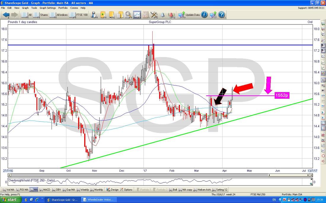
Safestyle SFE
This looks like another All Time High Break-out and therefore nice and bullish (I hold all the Stocks I am writing about here so obviously I will be very happy if the predictions from these Charts do play out as I expect). Again I am starting with the ‘Big Picture’ and here is the Chart of SFE going back to its IPO back in Early 2015. As you can see, there is a very clear Uptrend Channel (despite it actually being quite a choppy chart on a day to day basis). 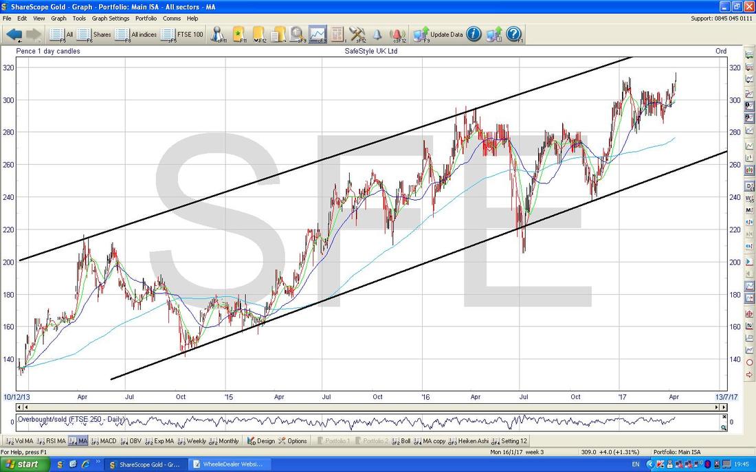
As I mentioned above, SFE can be a choppy little devil and this next Chart possibly demonstrates that. I have zoomed in here to the last 7 months or so and the key thing here is how the Price Broke-out over the previous All Time High at 314p on Thursday which should be pretty bullish although there is a caveat here. My Yellow Circle is highlighting the Candlestick from Thursday which is an ‘Inverted Hammer’ (it has a long ‘Wick’ or ‘Tail’ pointing up) and in the context of the recent run up, this suggests we might struggle to build on this Breakout straightaway next week. However, as I mentioned, SFE is right choppy and it could be that this is just a demonstration of that and I would take a move above 320p as a Buy Signal.
OK, onto the Indexes…… 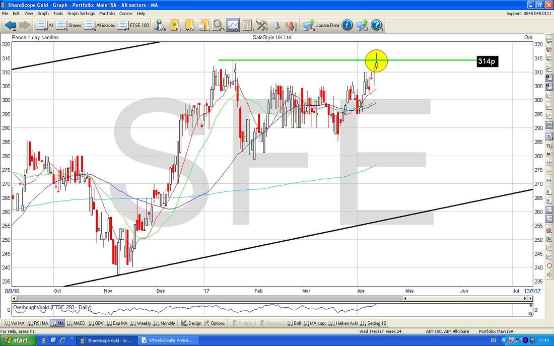
Dow Jones Industrials Index (DOW)
Big Picture first as usual - here is the DOW since the 2009 Lows with a clear Uptrend Channel. Note the smaller Uptrend Channel marked with the Parallel Blue Lines which is higher up - we will look at this closer in a bit. 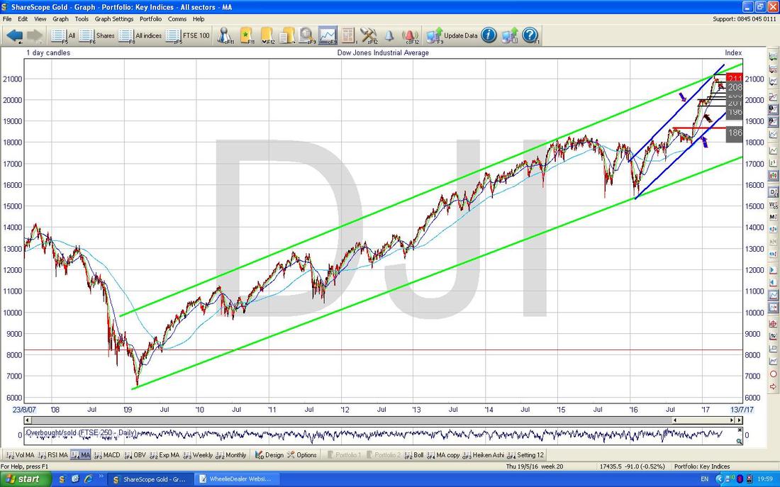
The Chart below zooms in on the DOW Daily Candles to about the last 6 months. Note first off how we are within the Uptrend Channel I pointed out on the previous Chart which is bounded by my Parallel Blue Lines (marked with Blue Arrows). Next look at the Red Line marked with the Red Arrow which is marking a Downtrend Line which has been in force for about 6 weeks or so - note it is important we breakout above this line if things are going to start going up again.
My Yellow Circle is highlighting a Red Down Candle from Thursday and this looks pretty weak. Note it nearly touched the Support Level of 20412 which comes from the sort of Hammer Candle marked in my Green Circle from a few weeks back. This 20412 Level is clearly very important Support and if this fails in the coming days, then that would not be good. If it does fail, then we next have Support around 20200, 20126 and 20000. Note also how the Price is now below the 50 Day Moving Average which is the Darker Blue Wavy Line pointed at by my Black Arrow - this is not so great. 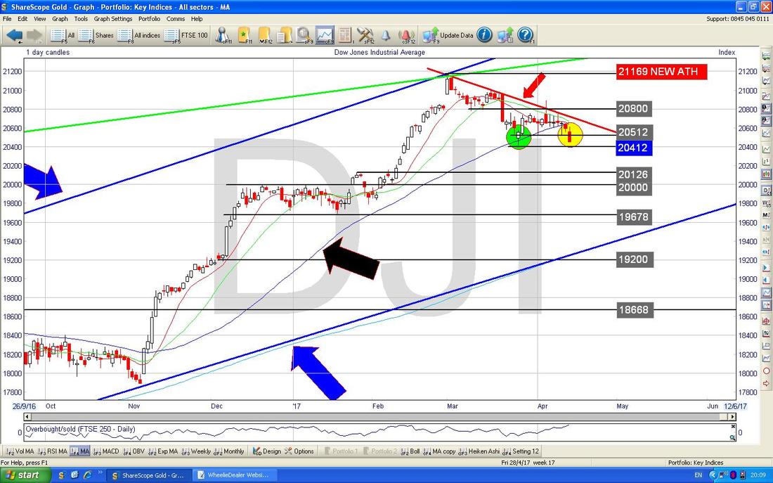
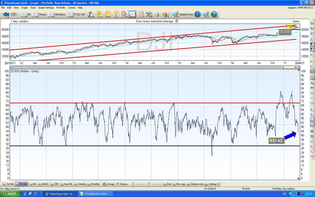
The bottom window on the chart below has the RSI (Relative Strength Index) for the DOW Daily. On a reading of RSI 42 this is quite low as you should be able to discern - this suggests that we could see more weakness but probably not too much.
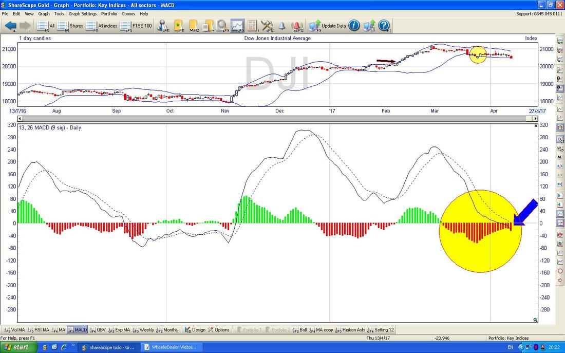
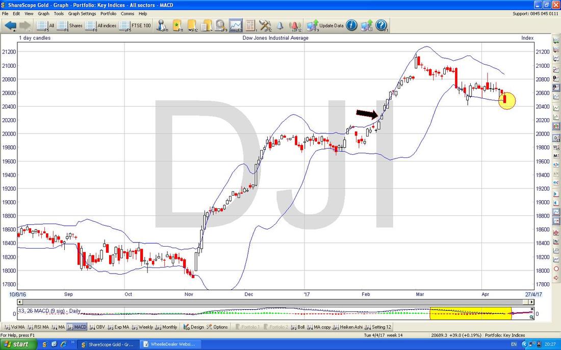
This is quite interesting. The bottom window on the Screen below has the MACD (Moving Average Convergence Divergence) for the DOW Daily. What is notable here is that if you look where my Yellow Circle is and sort of stand back, it looked like the Red Histogram Bars were about to turn Green and do a ‘Bullish MACD Cross’ - however, where my Blue Arrow is pointing, on Thursday it actually looks like it has ‘Skimmed off’ to the Downside or ‘Glanced off’ if you prefer - but the point is that it looked like a nice Bullish MACD Cross was set-up but it might have failed and this is a sign of weakness. To avoid such a scenario, we need to see a move up now.
The chart below has the Daily Candles bounded above and below with the Blue Wiggly Bollinger Bands. My Yellow Circle is capturing the Down Red Candle from Thursday and note how this is pretty much sat on the Bottom Bollinger Band. It is very possible that this acts as Support and the Price moves up now and that would probably be most likely. Of course the alternative is that it could keep dropping and ‘hug’ the lower band on the way down.
The Chart below has the Daily Heiken Ashi Candles - my Green Arrow is capturing the one from Thursday and this is Big Down and Red which looks bad.
On balance, I would say the various Indicators and stuff above show more Bearish signs than Bullish signs and I would expect the DOW to go lower from here. Note there is a lot of Support not far below though. Note - the S&P500 is very similar to the DOW and so is the Nasdaq Composite. 
DAX (German)
The Chart below is a Big Picture thing for the DAX. My Red Arrow is pointing to a Horizontal Red Line at the top which marks the All Time High at 12391 and I have been waiting for the Price to Break-out over this and this would be a Signal to do a Long Trade on it as it should keep running up for a bit. 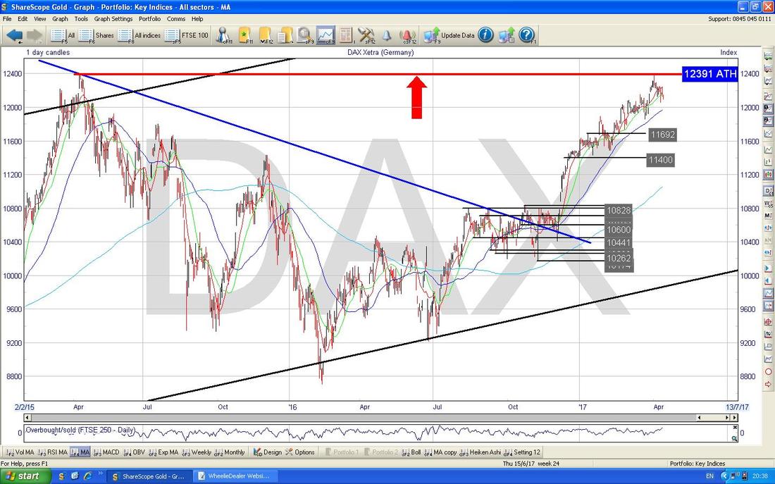
On the chart below I have zoomed in on the Daily Candles on the DAX and the first thing to notice is the Parallel Green Lines Uptrend Channel which is marked by the Green Arrows - at the moment the Price is still within this channel.
Next, look at my Blue Arrow which is pointing to the Blue Wavy Line 50 Day Moving Average at a bit under 12000. This should be Support. Note the Red Text Box with 12050 in it - this is the Horizontal Support from a ‘Long Tails Doji’ which was formed on Tuesday last week. If this 12050 fails as Support, then expect the DAX to go lower. 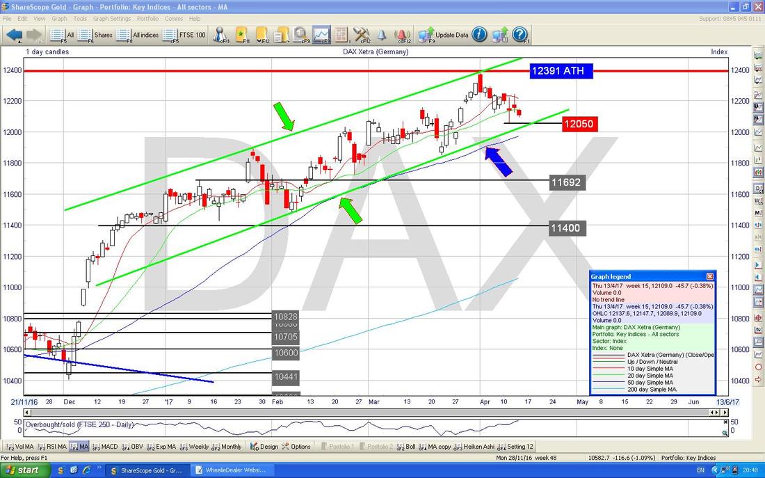
The Chart below has the Daily Candles with the Blue Wavy Bollinger Bands above and below - my Green Arrow is showing that after Thursday’s efforts, we are still a long way off the Bottom Bollinger Band so there is plenty of room for the DAX to drop.
Overall there are signs of weakness in the DAX really. 
FTSE100
The Chart below has the Big Picture on the FTSE100 since the Credit Crunch Lows in 2009. Note the Uptrend Channel marked by my Parallel Red Lines and also the Horizontal Black Support Line at 7263 (my Black Arrow points at this). My Yellow Circle shows that the current Price is above the 7263 Support Line and still within the Uptrend Channel of the Red Lines. Please ignore the Green Line and the Green Arrow !! (these are merely for Kermit when he reads the blog - loves a bit of green that chap) 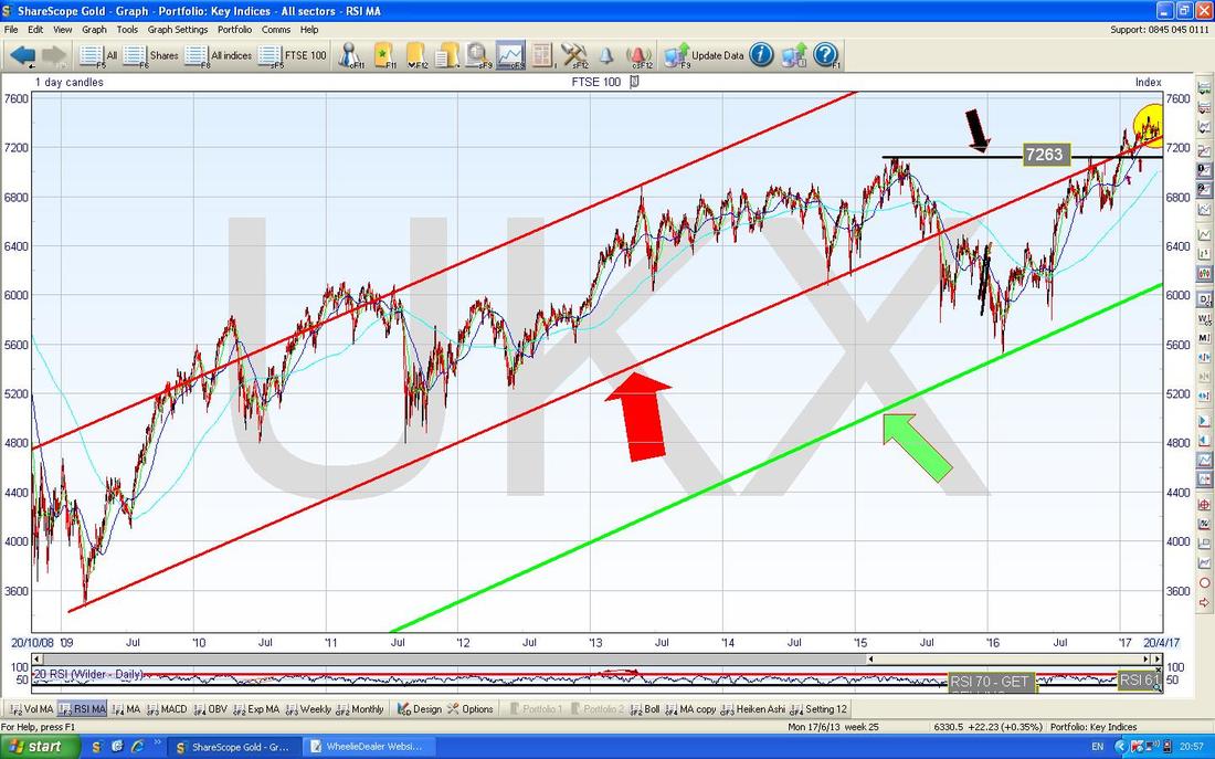
The Chart below zooms in on the FTSE100 Daily Candles to about the last 7 months ish. My Yellow Circle highlights a Down Red Candle from Thursday but note how it is a bit of a ‘Hammer’ in that it has a long ‘Tail’ or ‘Wick’ pointing down and it recovered up off this Intraday. This shows good Support at 7298 and just below we have Support at 7255 and then 7192, 7130, 7100 etc. So there is a lot of good Support not far below.
Note my Blue Arrow which is pointing to the Wavy Dark Blue 50 Day Moving Average - see how the current Price is around this level at the moment. 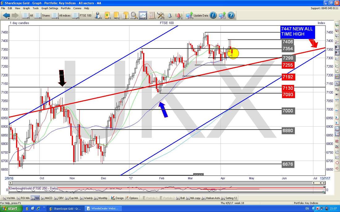
In the bottom window on the Screen below we have the MACD for the FTSE100 Daily. Note how it has done a very similar thing to the DOW and it looks like we might ‘Skim-off’ to the Downside.
Overall the FTSE100 is quite mixed - the key thing is that if there is any weakness, at least there is a lot of Strong Support not far below which should save us from anything really nasty. It is also worth noting that the Pound and Oil seem pretty flat really so they might not impact the FTSE100 much. 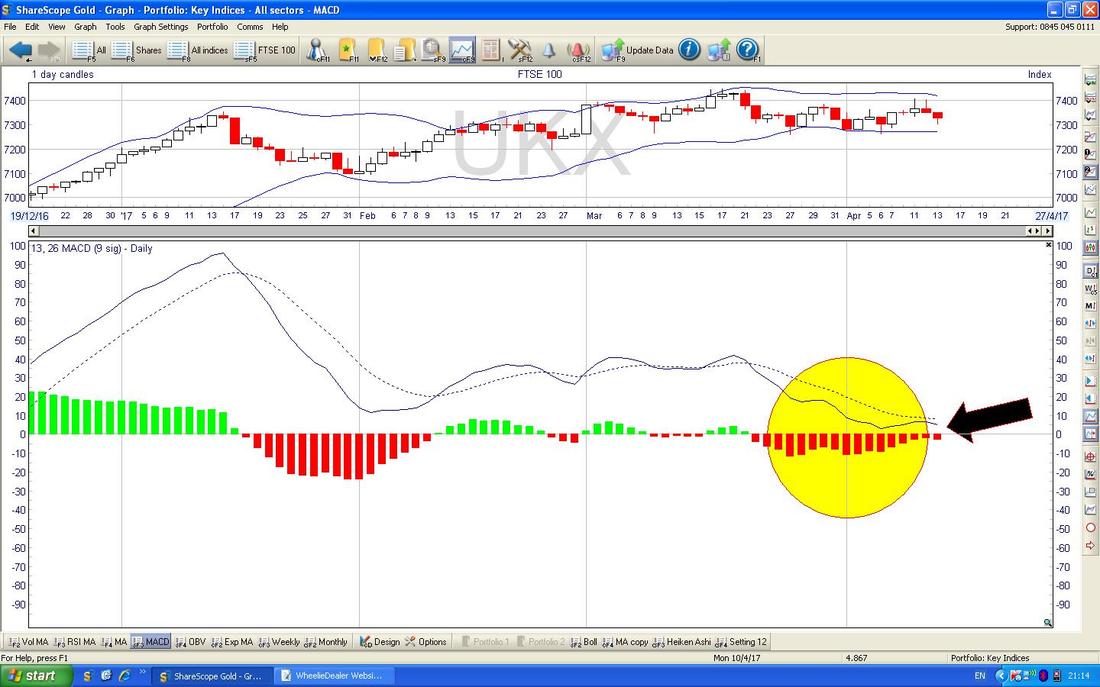
FTSE250
Still looking bullish as the Chart below shows. 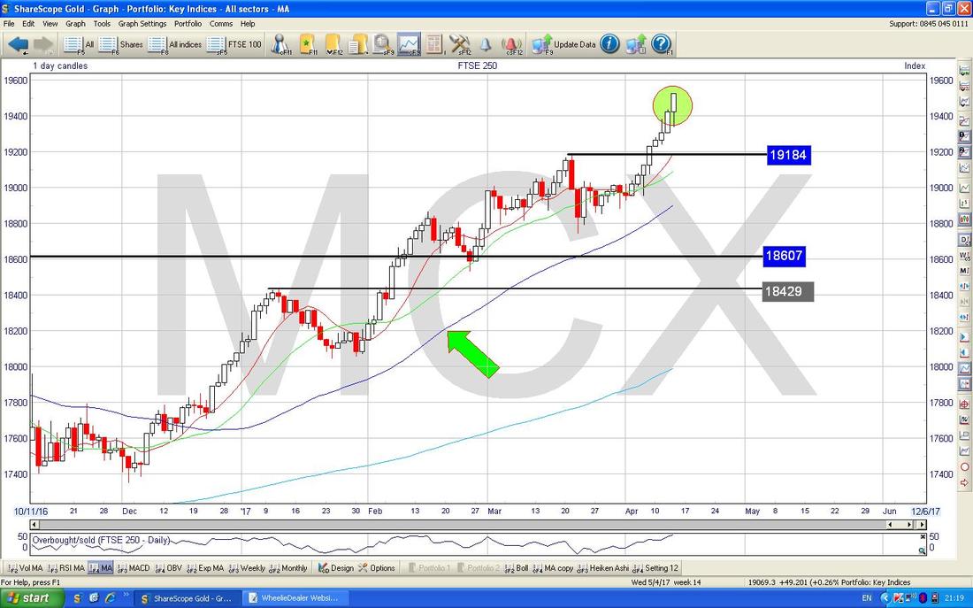
AIM All-Share
This still looks Bullish like the FTSE250. 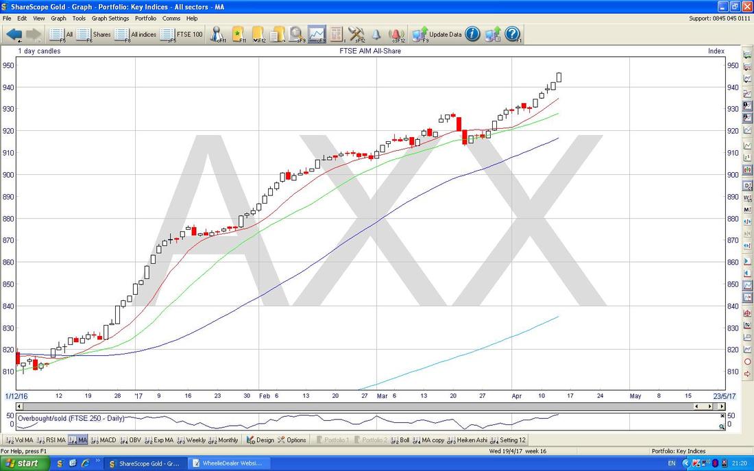
FTSE SmallCap
This one does have a sign that is not so great though. My Yellow Circle is catching a ‘Long Tails Doji’ which was formed on Thursday - this is not necessarily a Reversal Signal but it hints that the move up is waning. However, I see no great issue with this - the SmallCap Index has clearly had a strong run up and it doesn’t hurt to let some ‘heat’ come out of the move and let things calm down a bit so that in effect the Price can ‘regroup’ and then move higher again. Such Retracements are perfectly normal and healthy and we should not fear them. 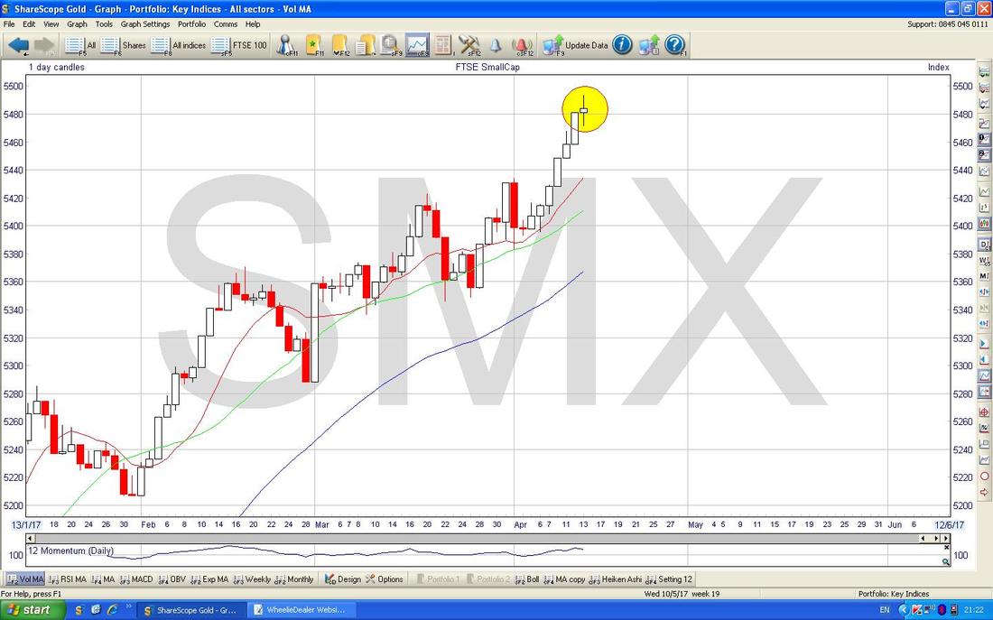
Pound vs. Dollar
There’s not much to say here - it looks pretty sideways really. There is a lot of Resistance up above around 1.26 to 1.28 and below there is Support at 1.21 to 1.24 ish. Note the 50 and 200 Day Blue Wavy Moving Averages are heading towards one another and I expect we will soon see a Bullish ‘Golden Cross’ which would be bullish for the Pound. At the moment I am seeing little excitement here and therefore I can’t see the Pound affecting the FTSE100 much. Normally the FTSE100 likes a Weaker Pound. 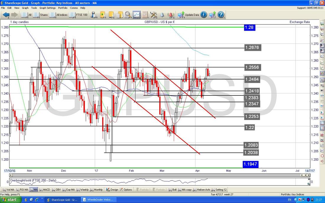
VIX Volatility Index ‘The Fear Gauge’
This is something which has been confusing me all week. The VIX has spiked (as my Green Circle shows) but the US Indexes are not exactly tanking. It is weird because usually if the VIX spikes like this you would expect the US Stock Indexes to be really ugly and that horrible panicky feeling to be in the Markets - I am seeing and sensing none of this. I don’t get it. 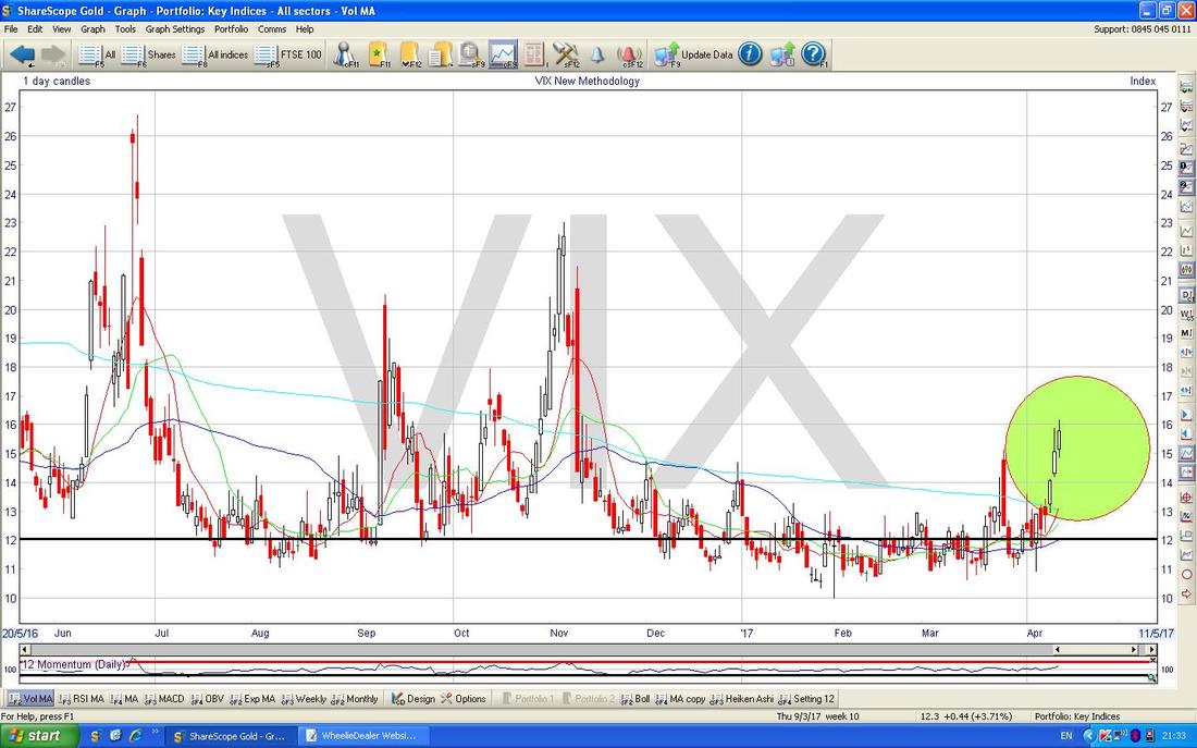
Brent Crude Oil (Spot)
This one is quite interesting. We seem to have 2 Sideways Ranges which are marked by my Green Arrows and my Yellow Arrows. What surprised me was how we dropped back into the lower Range but soon after the Oil Price got back up into the Higher Range. At the moment, it looks like we have topped out at around $57 ish and there is good Support below at about $54. Overall it is pretty Sideways I think and this will therefore most likely have little impact on the FTSE100. 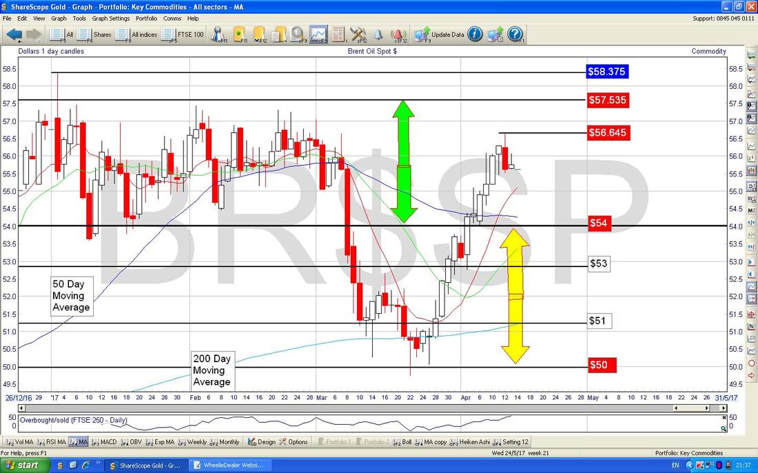
Gold (Spot)
As ever, Big Picture first. Regular Readers will remember this Chart from the last few weeks, and the key thing here is that Long Term Downtrend Line in Red marked with my Red Arrow. In order for the Gold Price to go higher, it needs to break above this Red Line and as we will see on the next Chart, the Price is right on this line now. 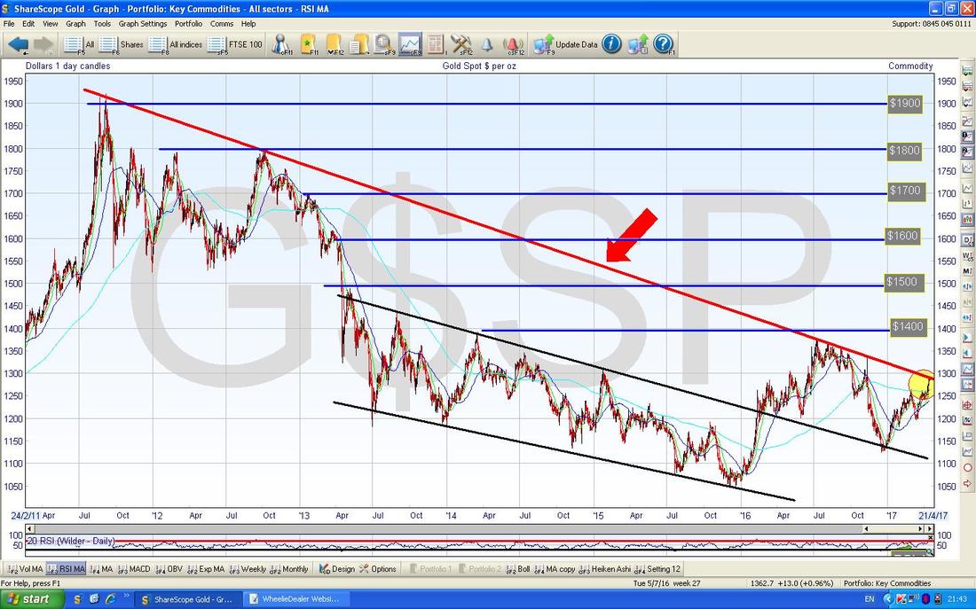
The chart below zooms in on the Gold (Spot) Daily Candles and my Green Circle is showing where we are now which is roughly on that Red Long Term Downtrend Line as marked by my Red Arrow. A Break-out over this is what is needed now and I guess a move over about $1310 would show this is clearly broken (and not just a ‘False Breakout’).
My Yellow Circle is hopefully showing how the 50 Day and 200 Day Moving Averages are converging and we could be very near a Bullish ‘Golden Cross’ soon - if we get this, then it will probably confirm a Breakout over that Red Downtrend Line. An interesting Chart this. That’s it for this week, I hope the Markets swing your way !! Cheers, WD. 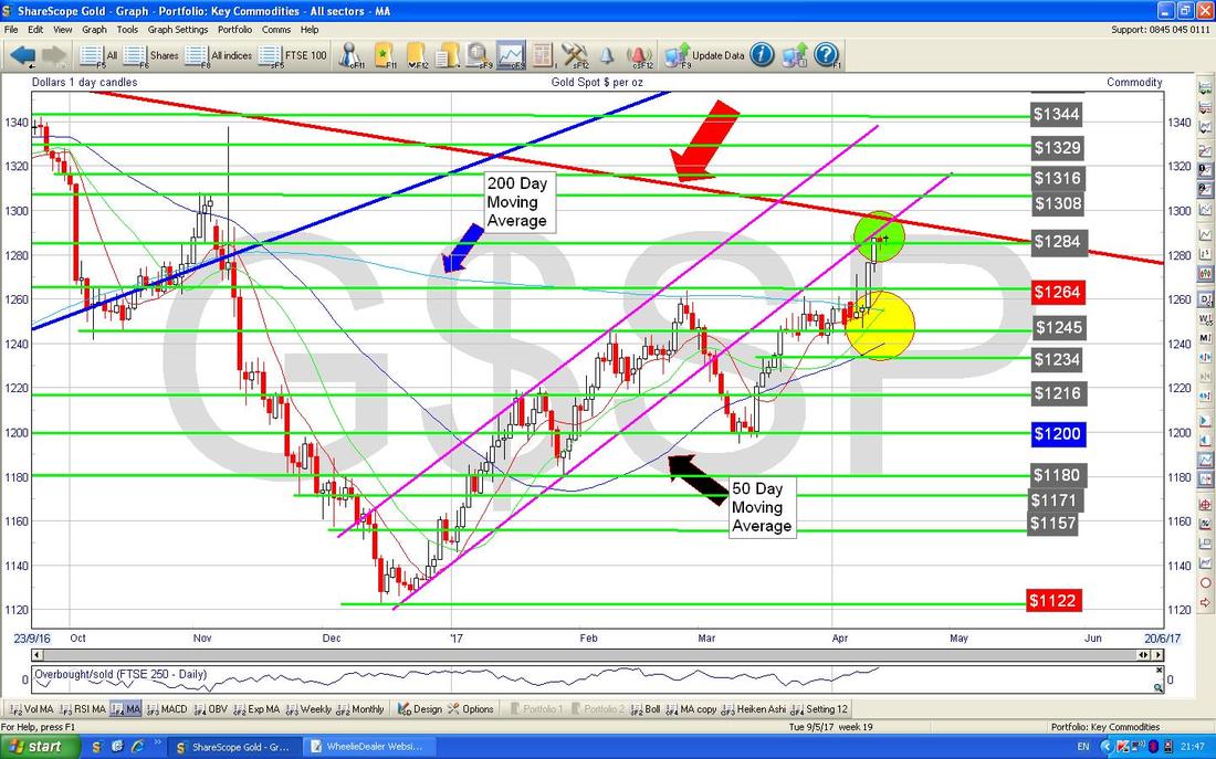
0 Comments
Leave a Reply. |
'Educational' WheelieBlogsWelcome to my Educational Blog Page - I have another 'Stocks & Markets' Blog Page which you can access via a Button on the top of the Homepage. Archives
May 2024
Categories
All
Please see the Full Range of Book Ideas in Wheelie's Bookshop.
|
