

|
educational blogs |
|
It’s been a lovely break from the Markets although bit of a shame about the typical UK Easter weather !! We have another short week ahead of us and I doubt much will happen - but as usual I wanted to check out the Indexes and get a view of where things are most likely to go.
After a very good run following the awful start to 2016, Market in general look a lot weaker now although maybe the US looks stronger - in a way this is not a surprise as historically last week has been one of the worst for the Year for the FTSE100 and this may simply be an effect of the April 5th End to the Tax Year.
According to the UK Stockmarket Almanac 2016, this coming Week for the FTSE100 is Up for 48% of Years and the Average Return has been 0.1% - so it’s pretty soggy.
April is historically the 2nd Best Month of the Year and is beaten only by December. The FTSE100 is up in April historically for 71% of Years with an Average Return of 1.8% - so we could have a good month to come although of course this year the Brexit Vote might be a factor - sooner or later this will come firmly within the Market’s vision I expect. FTSE100 First off, I want to show this Chart which is similar to one I showed last week (I think) - this is the FTSE100 Daily Candlesticks over the last 4 months ish - the key thing here is that I had drawn in the Black Lines forming a Triangle over the last 3 weeks or so - the point is that this Triangle seems to have broken to the downside with the Big Red Down Candle from Thursday 24th March 2016. 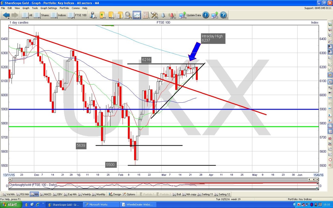
The Screenshot below from the totally excellent ShareScope software shows the Daily Candles on the FTSE100 going back nearly a year. First thing to note is that my Green Arrow is pointing to the 200 Day Moving Average which is still falling - this denotes a Downtrend.
My Black Arrow is pointing to the 50 Day Moving Average - note how this is sort of curving up a bit now - we need it to curve up a lot more and to pass over the 200 Day Moving Average to give us a ‘Golden Cross’ - that would be a significant development in favour of the Bulls. It is something to watch but the way these things work is that if we get some weakness in coming weeks, then the 50 Day MA could easily turn downwards again. In an Ideal World, the 200 Day MA would be rising or at least flat when the 50 Day MA crosses it. The other thing to spot is my Red Line (marked with the Red Arrow) which is a Downtrend Line from right back in Summer 2015 - we are above this and it would not be too much of a problem if the Price retraced back down to this line and then turned up again - it is possible. 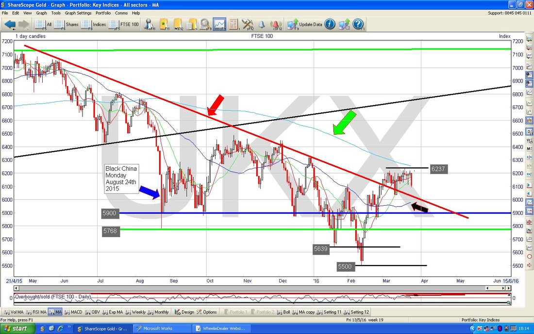
My Chart below zooms in to about all of 2016 so far and I have removed that horrible Black Triangle !!
My Green Arrow is pointing to a Big Down Candle from Thursday 24th March 2016 and this is obviously a bearish thing. My Blue Circle is enclosing an ‘Inverted Hammer’ Candle from Friday 18th March 2016 and it looks like this feature could be dominating this Chart at the moment - Thursday’s Down Candle is effectively swinging down off this Inverted Hammer. Note the Intraday Resistance here at 6237 and then we have more Resistance up around 6250 where the 200 Day Moving Average is sitting. The next significant Support is at about 6036 as I have marked. 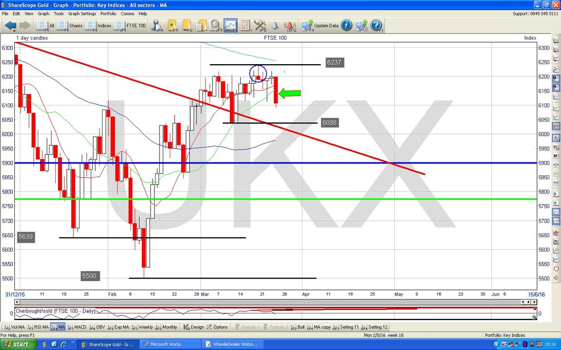
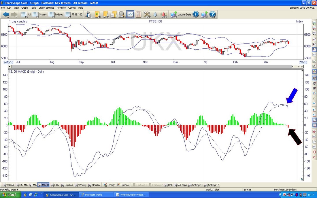
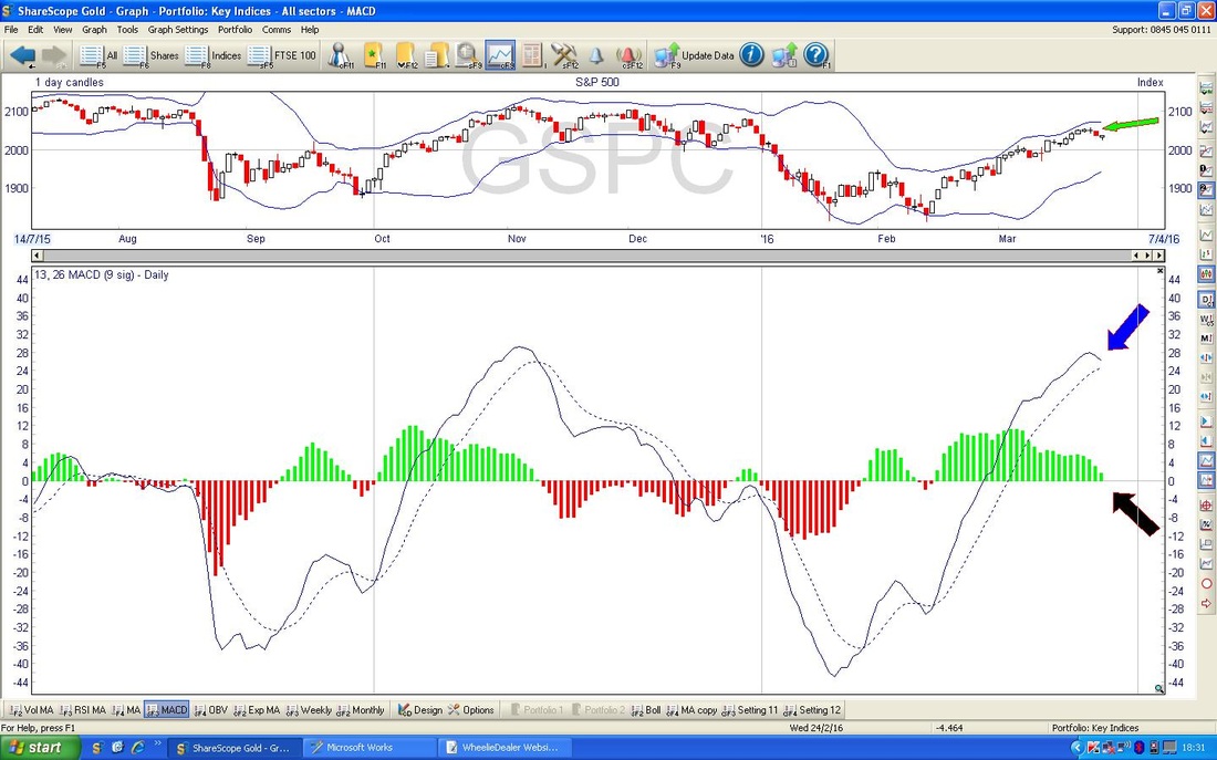
In the bottom window below we have the MACD (Moving Average Convergence Divergence) for the FTSE100 Daily and my Blue Arrow and Black Arrows are marking a Bearish Cross - they just do it in a slightly different way - where the Blue Arrow uses ‘Signal lines’ and the Black Arrow has ‘MACD Histograms’.
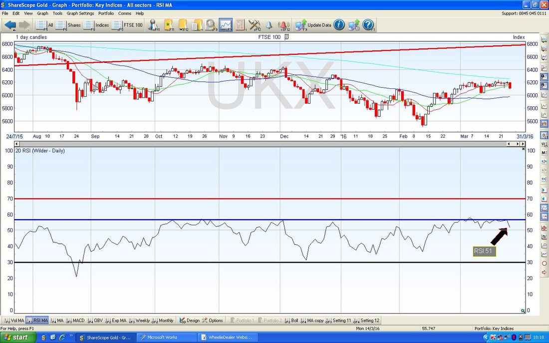
In the bottom window of the screenshot below, my Black Arrow is pointing to the current level of the RSI (Relative Strength Index) at around 51. This is not a high reading but if it falls below 50 then that is usually taken as a negative thing. Note how it has fallen back from my Blue Horizontal Line at about RSI 57 - this has capped gains for about a Year although it is not a particularly high RSI reading - RSI 70 would be classified as ‘High’ really. I guess it demonstrates the Bearish tone of the FTSE100 over the last Year.
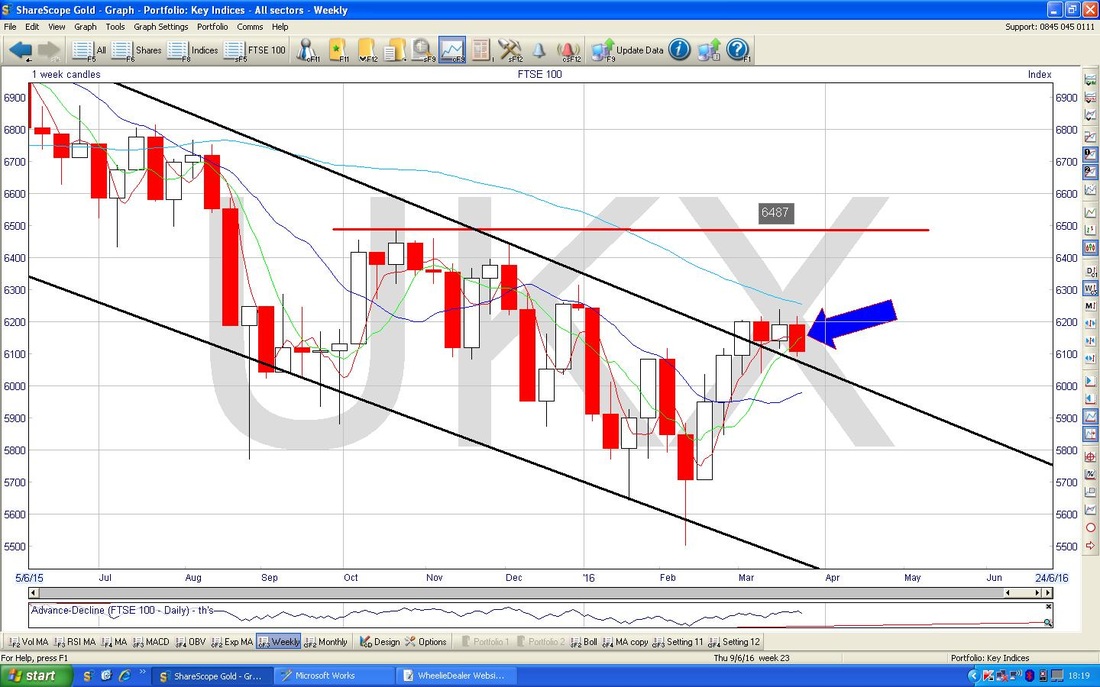
The Screen below has the Weekly Candles for the FTSE100. My Blue Arrow is pointing to a Red Down Candle we got last week and this has swung down off the ‘Doji’ Candle from the Week before. Looks bearish.
S&P500
I wanted to show the ‘Big Picture’ for the S&P500 first off - this is the most important US Index in my view as the Dow Jones only has 30 Stocks and it is pretty silly really. The thing I want to emphasise here is that even though the Index violated the lower Black Lower Line (marked with my Black Arrow) of the well-established Uptrend Channel from 6 Years or so, the Price got back up inside that Channel and that is where we are now. If it can stay within the Channel, then that would be nice. 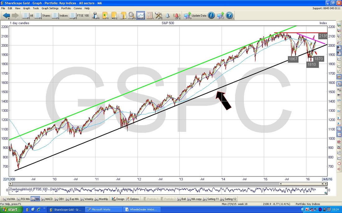
There are a few things I want to point out on the Chart of the S&P500 below which goes back about a Year. The most interesting thing to me here is my Pink/Mauve Line (marked with a similarly disgusting coloured Arrow) which looks like it could be a Downtrend Line and represent Strong Resistance to the Price. This is something to watch closely.
My Green Arrow is pointing to the 200 Day Moving Average - it is still falling but the rate of decline has slowed and maybe it can start to level out - we need the 50 Day Moving Average (marked with my Red Arrow) to turn up and do a ‘Golden Cross’ similar to what I mentioned earlier on the FTSE100. However, there is still a big distance between the 2 Moving Averages and a lot can happen in the time needed to get a Golden Cross !! It is worth noting that back at the end of December 2015 we had a Golden Cross but it failed in this case as the Markets went into ‘Free-Fall’ mode. 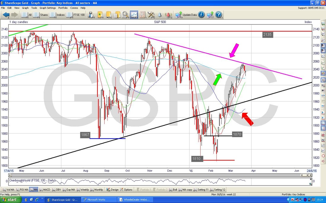
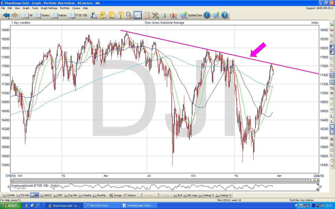
Just for completeness I have included below a Chart of the Daily Candles for the Dow Jones Industrials Index going back a couple of Years - note the Mauve/Pink Line and Arrow - this is similar to the S&P500 and could be an important and critical Resistance Line.
On the Screen below which shows the S&P500 Daily Candles over 6 months or so, I have marked with a Blue Circle a ‘Hammer’ Candle that was produced on Thursday 24th March 2016. After the Down Candle from the day before, this was a very impressive Intraday Turnaround and perhaps it shows some underlying strength - it is notable that it found Support at 2022, which is just above the 200 Day Moving Average.
The Market is open and trading today (Monday 28th March 2016) but these ScreenShots do not include today’s Price Action - I wanted to get this Blog done and published !! 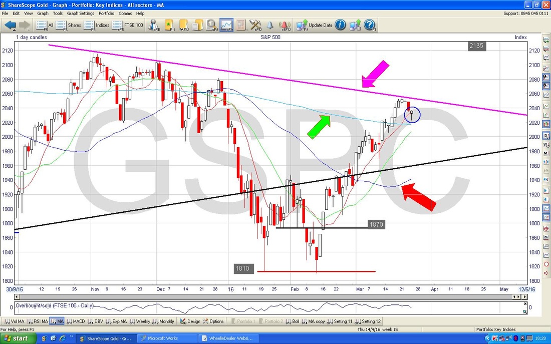
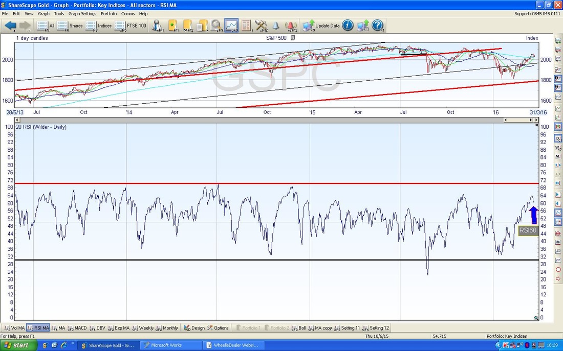
The bottom Window on the Screen below shows the RSI for the S&P500. My Blue Arrow points to where it is now on an RSI reading of 60 - this is not particularly high but has turned down from 64 and it is worth noting that the Index has turned down from these kind of levels a lot over the last year or so. It could fall quite a bit more and the upside from here is limited really.
On the screen below we have the Bollinger Bands for the S&P500 Daily Candles - my Green Arrow points to how the Price has fallen away from the Upper Bollinger Band - this might fall down to the Lower Band which is at about 1940.
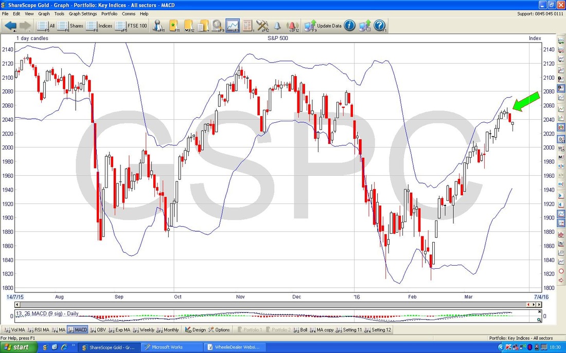
The bottom window on the Chart below has the MACD for the S&P500 - in this case my Black and Blue arrows are pointing to how we are on the verge of a Bearish MACD Cross.
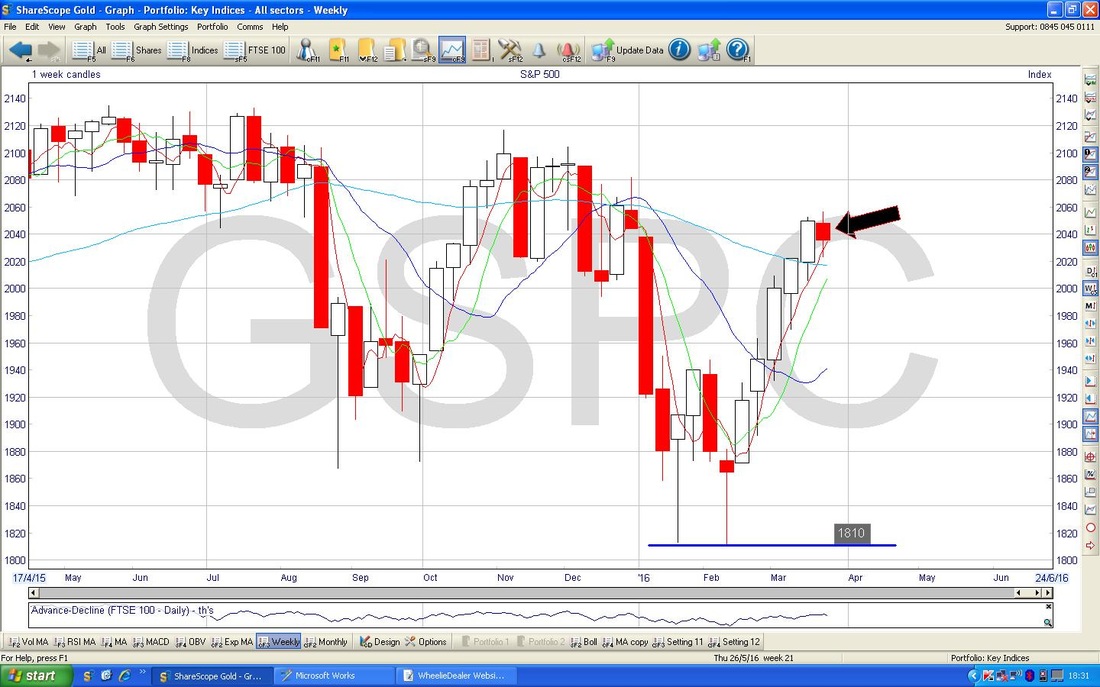
The ScreenShot below has the Weekly Candles for the S&P500. My Black Arrow is pointing to a ‘Doji’ Candle which in the context of 5 Up Weeks before, might signify that the Trend is about to turn down.
Brent Oil
On the Chart below, my Blue Arrow is marking a ‘Hammer’ Candle which was produced on Thursday 24th March 2016. After a Down Candle the day before, this might show a Reversal and the Price could move up now. It is worth noting that the Price Reversed Intraday at $39 so this could be an area of Support for the Price. My Blue Arrow is pointing to the 200 Day Moving Average which is still falling strongly - so this is still very much a Major Downtrend. My Black Arrow shows the 50 Day Moving Average and it is good to see this has curved upwards - ideally we need a ‘Golden Cross’ here as I have mentioned on previous Indexes. Note the Resistance at about $42.5 - this looks a tough area to get over and just above that we have more Resistance at the 200 Day Moving Average at about $44. My big Black Circle in the top left shows a lot of Resistance in a Zone from about $46 to $54. 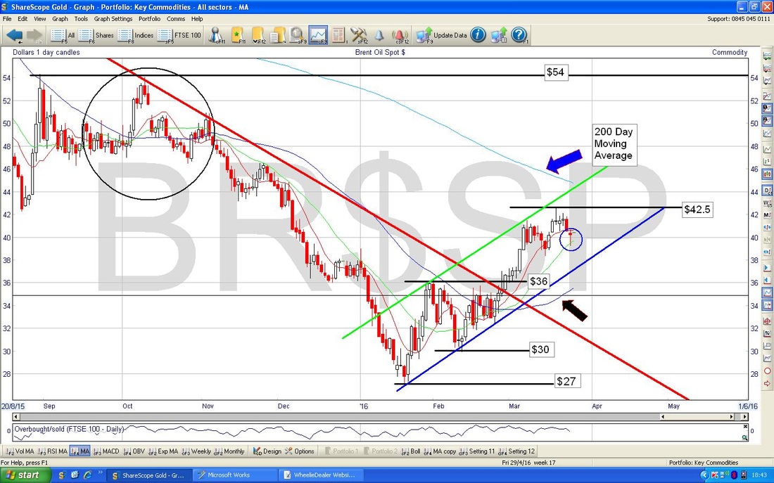
In the bottom window below, my Black Arrow and Blue Arrow both show a Bearish MACD Cross.
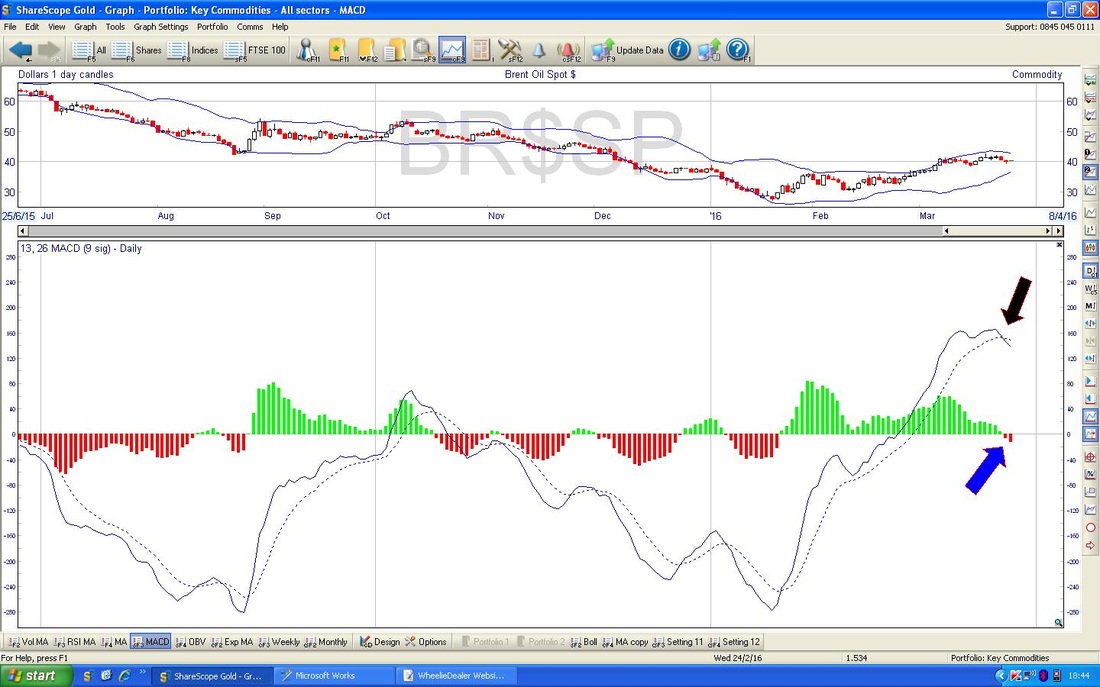
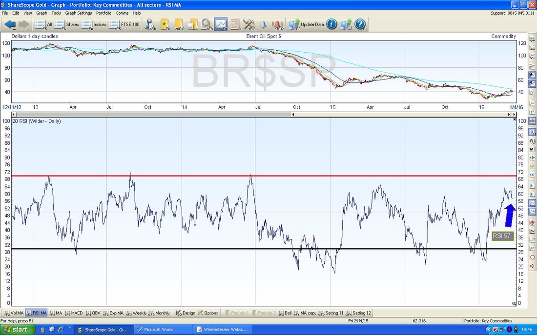
The bottom window on the ScreenShot below has the RSI for Brent Oil Daily - RSI 57 is not all that high but note it has turned down from a recent Peak and could continue falling for a bit.
Gold
I wanted to get some context on Gold. The Screen below shows the Daily Candles for about 2.5 Years and I have drawn in a Downtrend Channel which was clearly a feature here for some time. My Blue Circle shows how the Price got out of this Downtrend Channel but it is possible that this is just an ‘overshoot’ and it could fall back within the Channel. On the positive side we got a Bullish ‘Golden Cross’ on the 50 and 200 Day Moving Averages but we really need to see the Price stay up above this Channel. I guess $1200 is a Key Level and we really need the Price to find Strong Support here and to move up from it and avoid plunging back into the Channel. 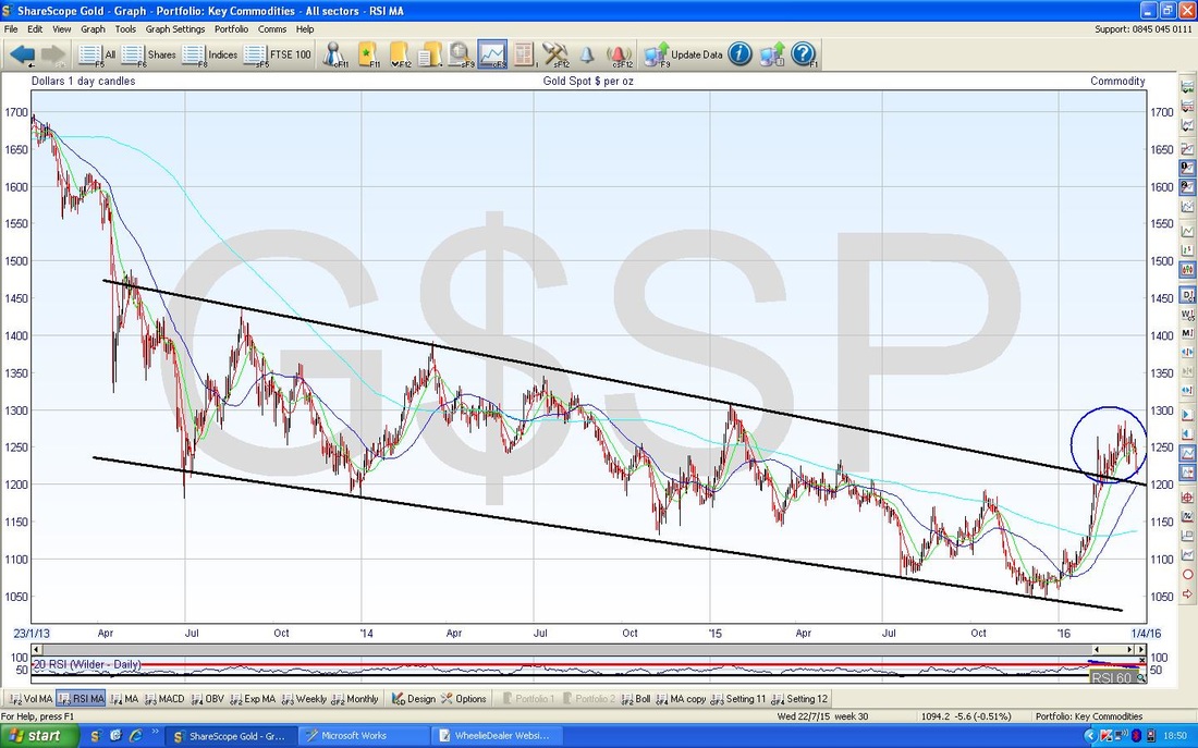
On the Chart below we have the Gold Daily Candles going back about just over 3 months. My Black Circle shows a ‘Hammer’ Candle from Thursday 24th March 2016 and maybe the Price can move up from here as it is likely in the context of a Market that had been falling prior to the Hammer. Support is at $1212 and this must hold.
Note how my Black Triangle broke down in a bad way. My Green Arrow shows the 50 / 200 Day MA Golden Cross. It is clear the Price needs to get over $1284 to really give the Bulls confidence. 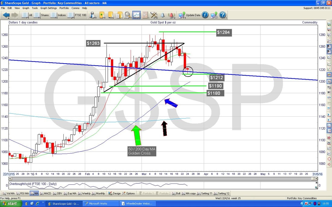
This is interesting - the screen below has the Bollinger Bands for Gold and my Black Arrow shows how the Price is sat on the Lower Band - it could easily move up from here.
The Screen below may need you to Zoom in for a clear look. In theory, if you click on the Graph it has that ‘Lightbox’ function turned on so you should be able to get a nice big image (that’s the theory !!).
My Blue Arrow is pointing to where the Red 13 Day Exponential Moving Average (EMA) is on the verge of crossing the Green 21 Day EMA in a ‘Bearish Cross’. The Black Arrows point to similar instances of this happening and in nearly all cases it turned out badly - we might escape this development, but it looks quite likely to happen. 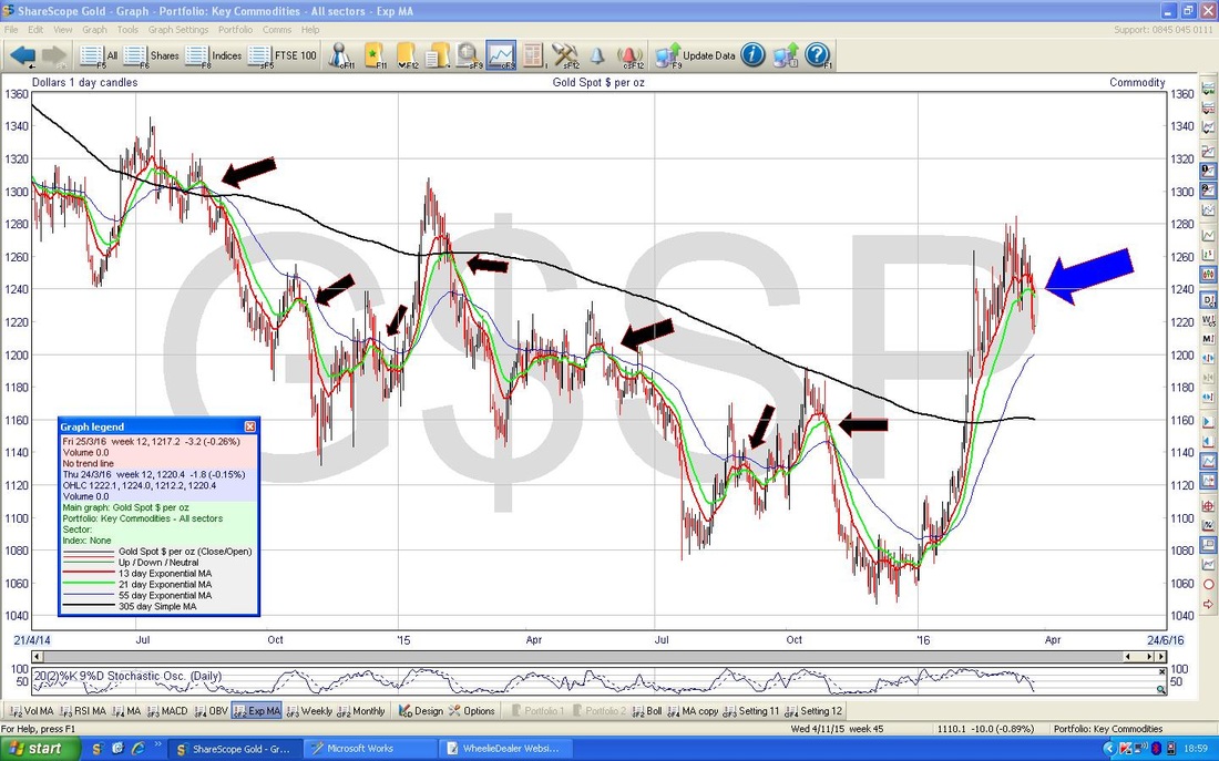
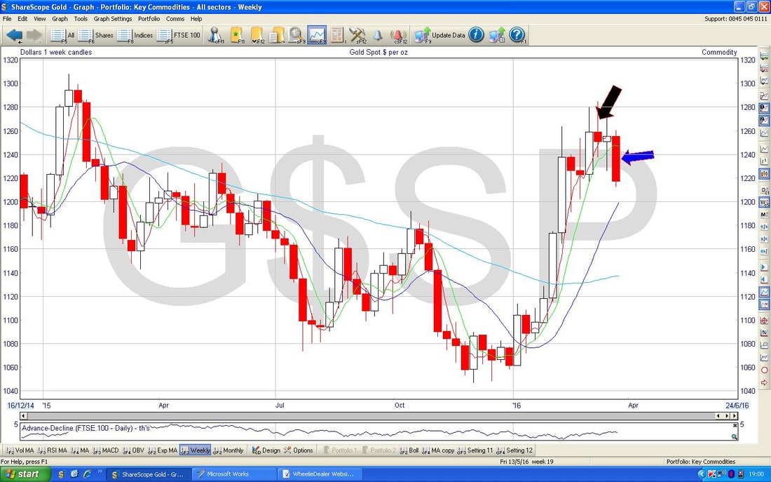
The Chart below has the Weekly Candles for Gold. My Blue Arrow is pointing to a Big Down Candle from last week which is clearly not good. This seems to be swinging down from the Doji Candle from a couple of weeks back which I have marked with my Black Arrow.
On the Chart below I am cheating a bit. This shows the Monthly Candles for Gold but of course the Month of March is not quite up - but we have only a few Days left and as things stand, the Blue Circle I have drawn shows an ‘Inverted Hammer’ which would not be good - we need some strong Up moves on Gold this Week to improve this negative looking picture.
Right, that’s it, have a great week, WD. 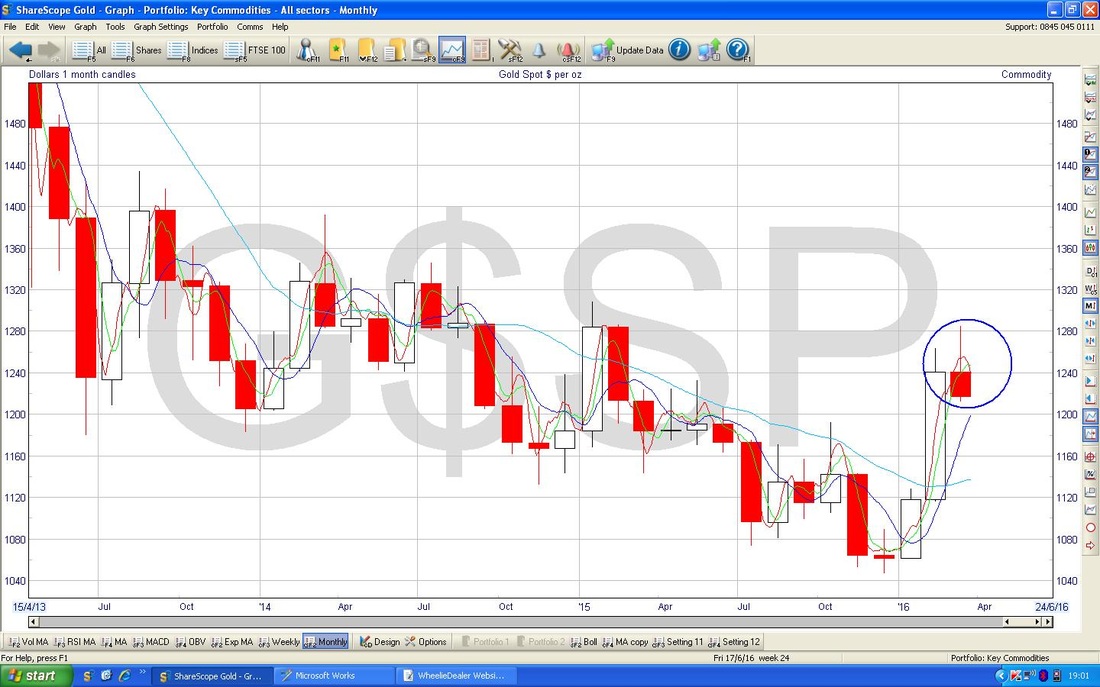
2 Comments
Ed
29/3/2016 11:43:00 am
Lightbox thing works a treat. I would think that hedge funds and other shirt term traders could really increase volatility as they jump from one sector to another. Difficult to know how much of the markets movements lately have been down to short closing rather than straight forward buying.
WheelieDealer
29/3/2016 11:39:34 pm
Hi Ed, thanks for the comments - great to hear the Lightbox actually works for other people as well as when I test it myself !! Leave a Reply. |
'Educational' WheelieBlogsWelcome to my Educational Blog Page - I have another 'Stocks & Markets' Blog Page which you can access via a Button on the top of the Homepage. Archives
May 2024
Categories
All
Please see the Full Range of Book Ideas in Wheelie's Bookshop.
|
