

|
educational blogs |
|
I do worry that people are beginning to get the impression this is a Technical Analysis website - I assure you this is not the case, I purely use TA as an aid to my far more crucial Fundamental Analysis !!
Anyway, the point of this Blog is that there was some chit chat on Twitter recently about investing in Miners and the Mining Sector. I am no fan of the AIM Tiddlers as you probably know by now (if you want to waste Money, give it to me please - I might even say “thank you very much” which is more than an AIM Exploration Stock will offer), however, I don’t have much Mining Exposure apart from a small Glencore GLEN position and a load of Golden Prospect GPM which is sort of a bit different as it is really a Hedging Play on Gold.
For me there are 2 decisions involved here - firstly, should I get more invested in the Mining Sector and secondly, if I decide to go with the first proposition, which Vehicle should I use to get that exposure?
In order to answer both of these, it strikes me that the first step is to take a view on what the Metals themselves are doing. If Metals Prices are dropping, then it is pointless investing in Mining Companies to my view. In addition, if some Metals are going up but some are going down, I want to be in Mining Companies that have exposure to the rising Metals and to try and avoid the Miners involved with rubbish Metals. Therefore, to try and get to the root of these Questions, I thought it would make an intriguing Blog to run through the Metals Charts as they stand now. As yet I haven’t made any conclusions from these Charts, but I am putting them out there for Readers to browse at your leisure. Please note on many of the Charts I have used ETF proxies - this is because the timeframes available on ShareScope for the pure Metals are only a few years - using the ETFs gives far longer timeframes. They track extremely closely - the Chart below has the COPA ETF as the Red Line and this is overlayed on the Copper Chart to show exactly this: 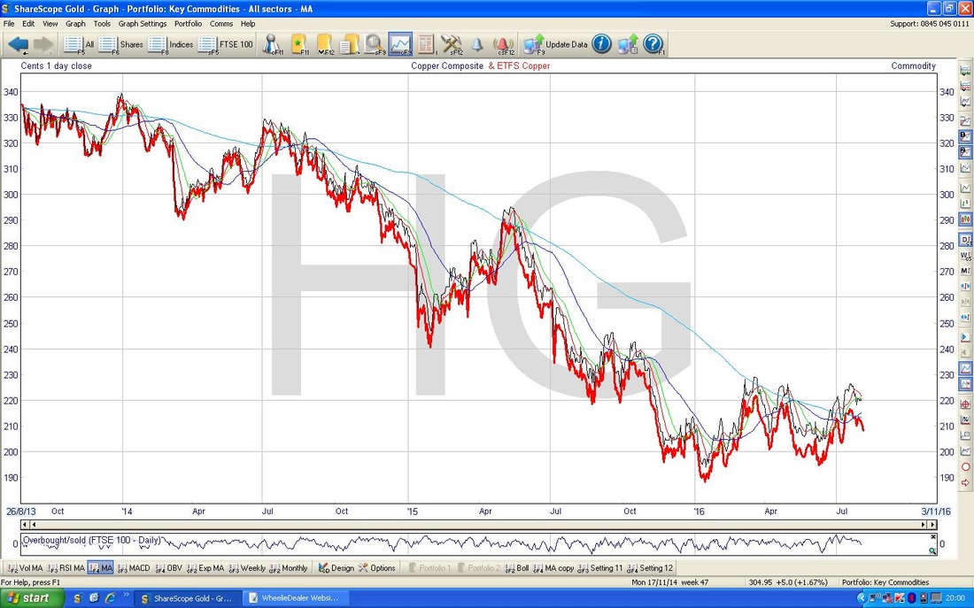
Copper
We’ll start with Doctor Copper - this is probably the Key Industrial Metal as it has numerous uses from Piping in Houses to all the Electronic stuff. If is often seen as an Indicator for the health of the Global Economy although judging by the Charts I am not convinced its predictive power has been all that good lately. The Chart below has the Daily Candles going back nearly 10 years - so I guess we can call this the ‘Big Picture’. The obvious thing of note here is that Copper has been in a very distinct Downtrend Channel since early 2011 and despite some positivity recently, it is still within the confines of that Channel. This would not really be a Long Term Buy until it breaks out of the Upper Blue Parallel Line. My Red Arrow points to the Credit Crunch Lows in 2009 and we are currently some way above this. There is no reason we must revisit those Lows, but equally why shouldn’t we revisit them and what is to stop it going even lower? 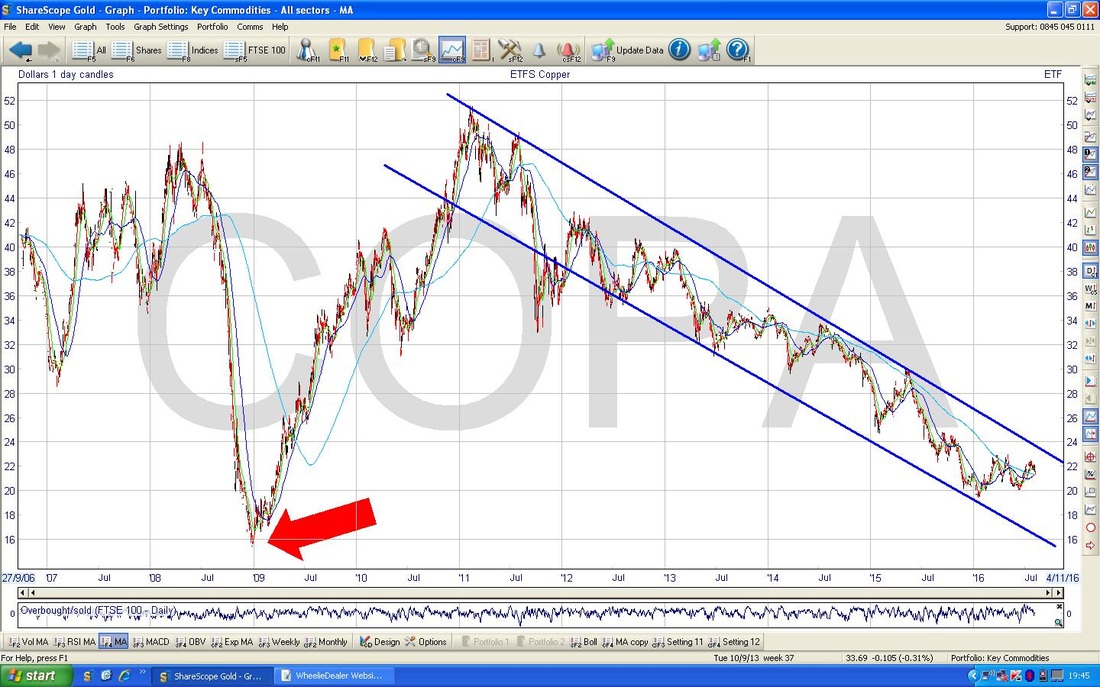
On the Chart below, I have zoomed in to about the last couple of years and the Parallel Blue Lines are still in place from the Chart above. The Red Line at the bottom could be a possible Support Line and maybe that will be an important factor in coming weeks/months - but whatever happens, the Price needs to breakout of the Upper Blue Parallel Line to really give hope of a proper move up in Copper.
Note my Green Line which is sort of forming a downwards pointing Triangle with the Red Line - how this Triangle resolves could tell us a lot about where Copper is going. If it breaks down below the Red Line, it is bad news; if it breaks out above the Green Line, then it is good for Copper Bulls. My Black Arrow is pointing to where we nearly have a Bullish Golden Cross between the 50 Day Moving Average (the Darker Blue Wiggly Line) and the 200 Day Moving Average (the Lighter Blue Wiggly) - this should be good, however, note earlier in the Chart where I have put the Yellow Arrow where we had a similar Golden Cross but it didn’t last long before we had a ‘Death Cross’ and it went down again. 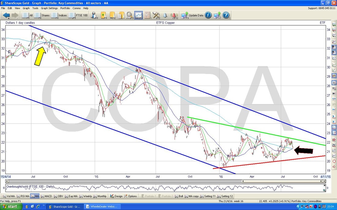
Aluminium (or Aluminum as Yanks would have it)
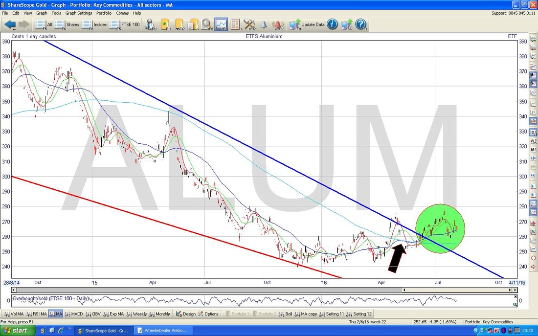
The Chart below gives the Big Piccy for Aluminium - again we are going back 9 years or so and this is based on Daily Candles. The key thing here is the Blue Line which marks a Downtrend that was in place for about 5 years but recently it looks like the Price has started to walk out of this Downtrend - that is a very positive development. I will look closer at this in a mo. My Red Line is marking the Bottom Line of a ‘Wedge’ which was squeezing the Price along with the Blue Line. If you look where the Yellow Circle is, I am putting the Spotlight on a pretty tasty set of ‘Batman Ears’ - I just love these cos they remind me of my childhood watching Adam West….……(if you’re a fussy so and so, and you want a really pretty set of Batman’s Lugholes, then look at the QPP Chart at its peak). 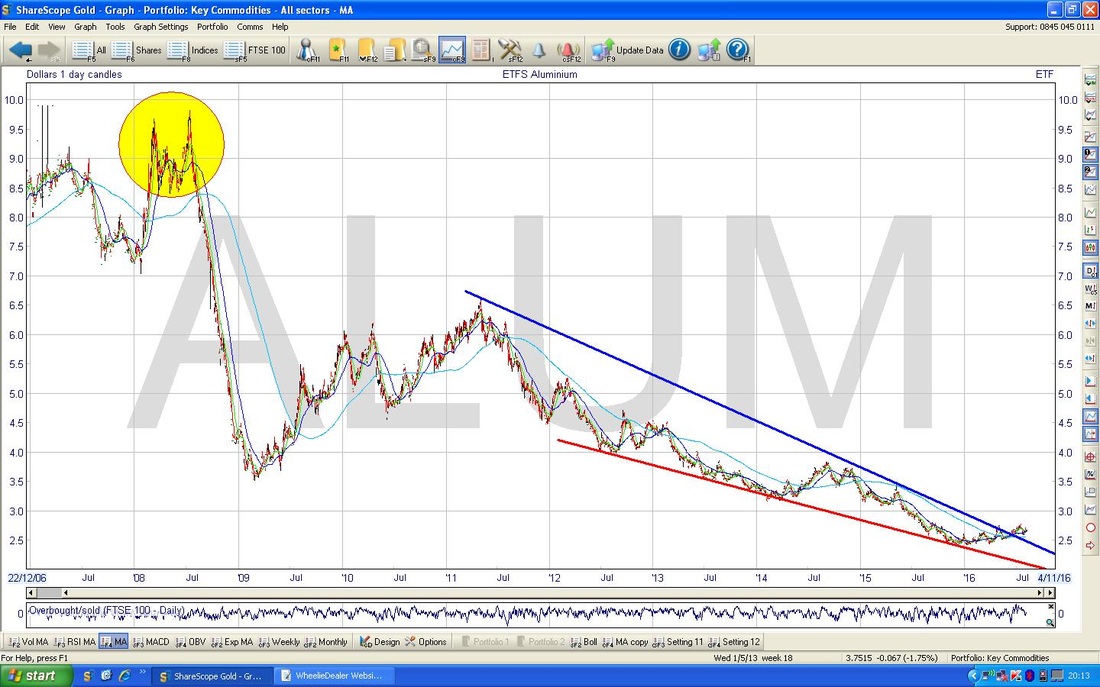
The Chart below zooms in a lot to just the last couple of years and my Green Circle encapsulates where the Price has broken out a treat from the Blue Downtrend Line. To add to the Bullish flavour (hmmm, Bovril, bit Summery for that though) my Black Arrow is pointing to a 50 / 200 Day MA Golden Cross.
Industrial Metals
I’m not sure what is really included in this ‘basket’ of Metals - according to a quick Google Search, it seems to be stuff like Copper, Nickel, Tin and Aluminium. Anyway, the Chart below goes back around 8 years or something and again is for the Daily Candles. Note how my Blue and Red Lines form a sort of Channel within which the Price has been moving - we cannot get all Bullish until the Price breaks out of the Blue Line to the upside. An interesting thing on this Chart is how we have recently revisited the Credit Crunch Lows and this suggests that a lot of the Downside has already been had. My Green Arrow and Black Arrow point to where these similar Lows were hit. 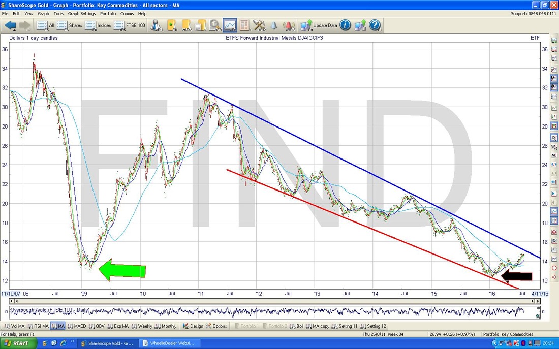
The Chart below goes back about 3 years or something like that. Note my Parallel Black Lines which seem to be marking out an Uptrend Channel that has been running for just about most of 2016 - however, we still need the Price to Breakout of the Blue Line to the upside.
My Green Arrow points to a Bullish 50 / 200 MA Golden Cross which we got recently but note the Yellow Arrow points to where we had a similar Golden Cross a couple of years ago, but sadly this one failed shortly afterwards. 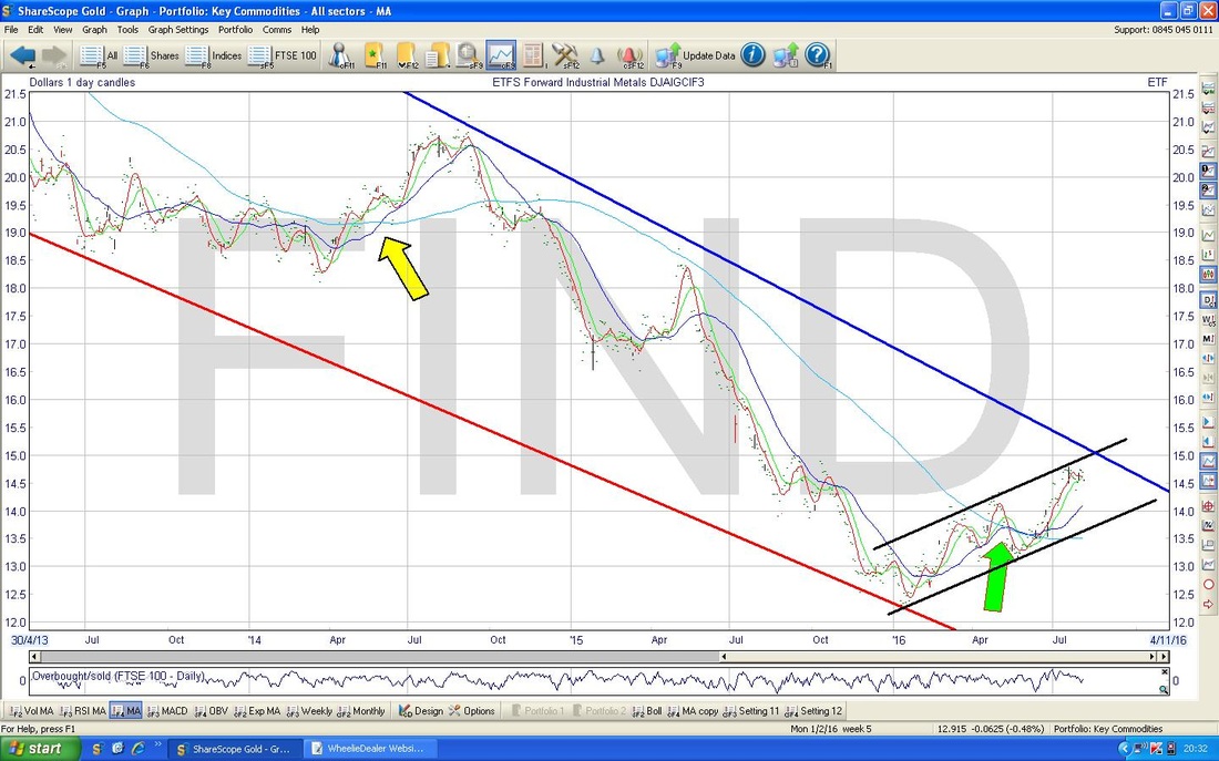
Iron Ore
I couldn’t find an ETF Chart for Iron Ore but I found this one which goes back around 3 years. This is not ideal as on a Bigger Picture it might not look as good - so anyone interested in Investing in Iron Ore ought to look at a Longer Term Chart if they can find one. As before, this is based on a Daily Chart and my Parallel Blue Lines show a Downtrend Channel which was in place for a couple of years but the Price managed to Breakout early in 2016 and my Parallel Red Lines give a Channel for what the Price might be doing now. I have deliberately phrased it this way because I think it is legitimate to draw in the Bottom Red Line as I have, but for the Upper Red Line I have used quite a lot of ‘Poetic Charting Licence’ when drawing it in - the truth is there are few ‘touch points‘. Any road up, it looks good. My Black Arrow is pointing to a recent Bullish 50 / 200 Day MA Golden Cross - that’s great for the bulls. Having seen how good this Chart looks, it makes me think that a Stock that plays heavily in Iron Ore could be worth thinking about - the obvious one is Rio Tinto (RIO) - but bear in mind what I said earlier about looking at a longer term chart. 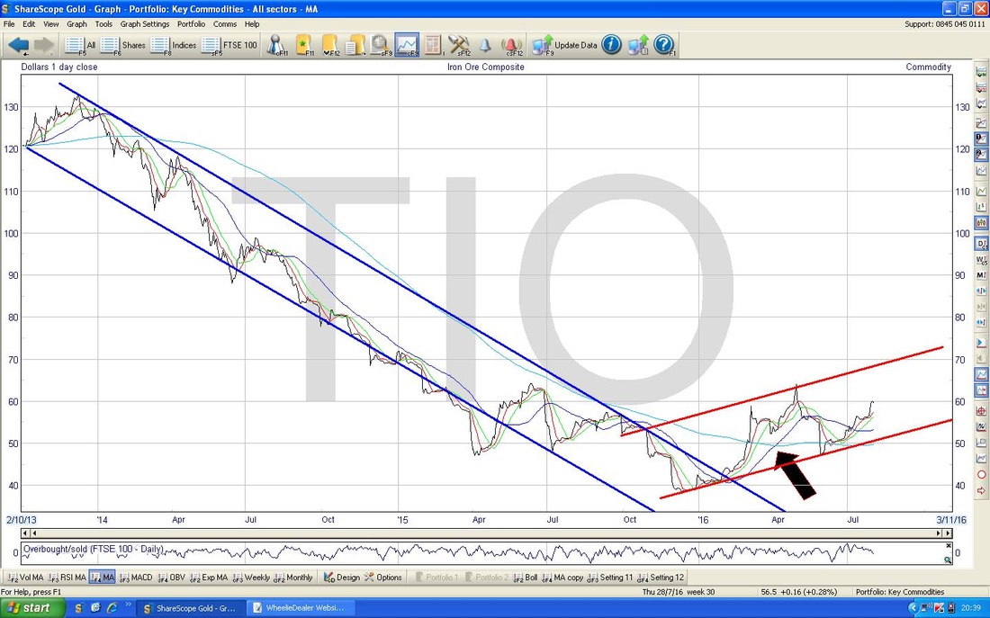
Platinum
The Chart below does Platinum going back about 10 Years and this is the Daily Candles again. My Blue Line marks a Downtrend Line which will probably be very dominant on this Chart because it has been established for so long (remember, with Charting, the Longer Trends lord it over the Shorter Term Trends). The Price needs to breakout of this Blue Line to really be Bullish for the Longer Term. My Green Arrow points to how we touched a similar Low point earlier in 2016 as we did back in the Credit Crunch (as per my Red Arrow). 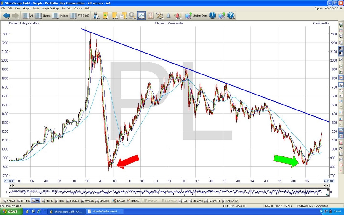
The Chart below zooms in to the last couple of years on Platinum. Note the Blue Downtrend Line at the top from the previous Chart and my Red Parallel Lines which are marking an Uptrend Channel which has been in place for most of 2016. My Green Arrow points to how the Price is now up at the Top Red Line of the Uptrend Channel and this suggests to me that we might fall back a bit now or perhaps go Sideways so that the Price stays within the confines of the Uptrend Channel.
My Black Arrow is pointing to a 50 / 200 Day MA Golden Cross - Bullish as you know. 
Sugar
OK, time for a ‘Soft’ rather than another Metal. My Chart below is for the Daily Candles on Sugar going back about 8 years. The thing that stands out to me here is the Downtrend Channel marked by my Blue Parallel Lines which was in force until earlier in 2016 when the Price broke out as per my Green Arrow. My Red Arrow points to a 50 / 200 Day Golden Cross - Bullish. Sugar is obviously relevant to Associated British Foods ABF (the Primark people) but strangely Tate & Lyle TATE has no Sugar involvement these days. 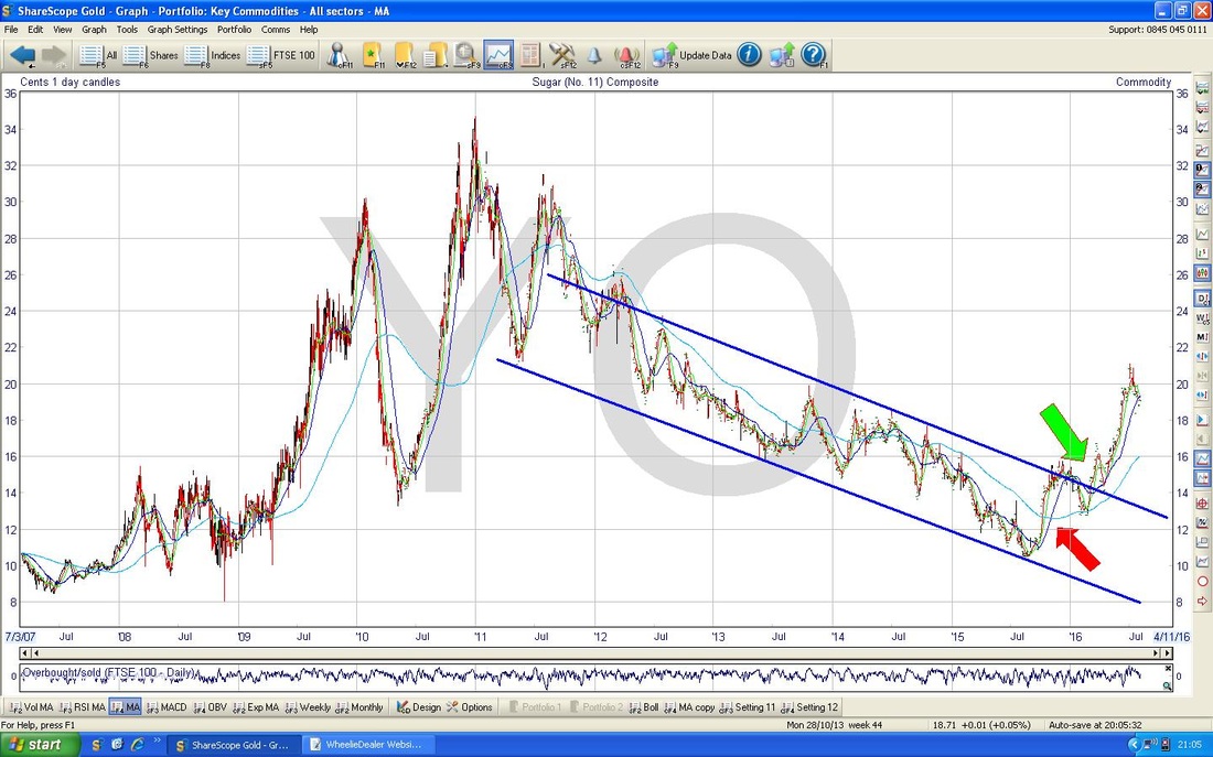
Silver
Back to the Hard Stuff. I wasn’t going to show this as it is pretty similar to Gold I think (and I tend to cover Gold a lot anyway). However, I was looking through ShareScope and there it was so I thought I would sling it in. The Chart below goes back about 5 years and involved 3 distinct Phases. It starts off with the Downtrend Channel which is marked by my Blue Parallel Lines and then we move to a Shallower and more ‘Wedgy’ Downtrend Channel marked with my Red Lines and then we have Broken Out and are in a Uptrend which has Support from my Black Line. This looks very bullish to me. Right, that’s enough Charts, I hope it helps your thinking on all things Mining related and gives you something to waste your Thursday Night / Friday on. Cheers, WD. 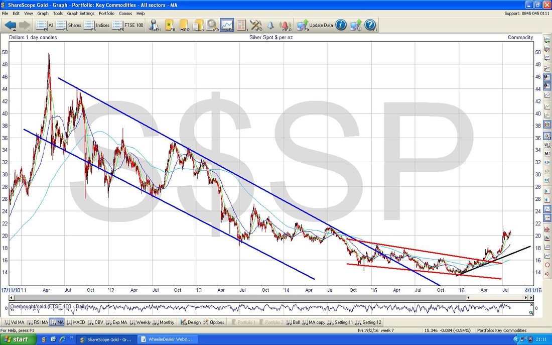
4 Comments
catflap
4/8/2016 11:03:35 pm
You are turning into a bit of a metal head mate.
WheelieDealer
8/8/2016 09:29:12 pm
Hi catflap, thanks for the Comments. I found doing this Blog quite insightful because although the Mining Majors (BLT, RIO, GLEN, AAL etc.) have been rallying strongly this year, the Metals don't necessarily support that rebound - I guess a lot of it could be a Forex effect.
Ben
7/8/2016 01:31:21 pm
Great stuff WD - Interesting to put the various metal prices in a longer timeframe and see how they are performing. Much of the bull market last time round was due to China - Can India replicate this I wonder? I would like to understand the dynamics of supply and demand for each a bit more before investing more money. I hold some Mining Investment Trusts, which I feel are much safer than individual companies. Cheers and thanks!
WheelieDealer
8/8/2016 09:37:31 pm
Hi Ben, thanks for the Comments and for the original Inspiration for this Blog !! Leave a Reply. |
'Educational' WheelieBlogsWelcome to my Educational Blog Page - I have another 'Stocks & Markets' Blog Page which you can access via a Button on the top of the Homepage. Archives
May 2024
Categories
All
Please see the Full Range of Book Ideas in Wheelie's Bookshop.
|
