

|
educational blogs |
|
For a variety of reasons I have got a real nervousness about the Markets, with probably the main factor being the Seasonal Trend of September and the Autumn often being historically the worst period of the Year for Stocks. I just re-read my slightly old copy of the ‘UK Stockmarket Almanac’ (2016 edition) for its comments on the ‘September Market’. I am sure we all know by now that September is historically the worst Month but it also makes a few other points:
Of course these are just historic trends and could easily not occur this Year but after such a strong run and with Valuations on many Stocks at elevated levels, it seems pretty likely to me that this Year we will get a Pullback. The severity of course is pretty much impossible to know but with such a Strong Bull Trend Channel on so many Global Indexes, I would contend that we could have quite a drop (10% ish) and yet still keep within those Major Uptrends. It might be nowhere near that bad of course.
In the current Week obviously in the UK we have a Sunny Bank Holiday today (yippee !!) but the US is open and trading, but this means it is a pretty ‘interrupted’ Week and I would guess a lot of Market Participants are still on Holiday or whatever - but Volumes may well stay soggy. On Friday it is US Non-Farm Payroll Jobs Numbers (‘Napalm’) which could cause some gyrations around 1.30pm our time and this will be exacerbated probably because the US is closed next Monday for ‘Labor Day’ - so next Week will be yet another interrupted Week.
Anyway, last week I started taking action to lower my Long Leverage on Spreadbets by TopChopping a few Positions and I will probably do a bit more of this in the coming Week (more details are on the ‘Trades‘ page). In the main I am less eager to lower my Normal Shares exposure - they tend to bounce back anyway, but I might add a small S&P500 Short Spreadbet soon to ‘Hedge’ my Longs a bit. Doing things in this way I don’t feel like I am dramatically lowering my Long Exposure but at least I will be taking some action to mitigate any damage - if the Markets keep on rising I will still be mainly ‘Long’ so I will gain anyway. After last Year’s struggles I will be using a Stoploss on any S&P500 Short !! I managed to eke out a tiny gain on the Portfolio last week so I guess I am reasonably happy - having said that, Summer has been pretty rubbish for me and I have made no real progress since May which is frustrating. Keeping on the positives, I am pleased that I have started taking action ahead of Autumn and I think it is wise to start building the Defences. Due to the US Markets being open and me being unable to update ShareScope until 10pm, I will make this Blog fairly short and it won’t include the US stuff, Commodities or Forex - I am sure I will be tweeting about them in coming Days though. At the time of writing the DOW and Nasdaq Comp are about to Close and it has been a choppy but sideways ‘Doji’ kind of day. House Prices Chris Dillow in Investors Chronicle this Week (page 16) did a piece which I have read many times before by him over the Years which was talking about Selling Housebuilder Shares when the Price drops below the 10 Month Simple Moving Average (or the 200 Day Moving Average apparently), and Buying Housebuilders when the Price is above the MA. The theory is that Chris has back tested this and it would have kept Investors out of the 2008 Crunch etc. but when I look at the Results over time it only just beats ‘Buy & Hold’ for the bunch of 5 Major Housebuilders that Chris looked at - and this doesn’t include Dividends so it doesn’t strike me as all that useful. Whatever, the bit I wanted to really mention was this: “Note also that this basket has been only lightly correlated with House Prices. One reason for this is that Housebuilding Shares are quick to respond to bad news while House Prices tend to be slow and sticky; what happens in housing downturns is that properties take even longer to sell, not that prices slump quickly”. This was definitely evident back in 2008 when Prices really didn’t fall anything like as much as the ‘Experts’ were predicting and I suspect a similar thing will happen in the next Downturn as clearly Demand for Homes is very strong and Supply is nowhere even close to meeting it. St. Ives SIV Sorry to bang on about this one (I hold some) - but it really does look very undervalued and the Chart seems to be turning up again as I will show in two ticks. Sharp Readers may recall that SIV has been through some problems and is very much a Recovery Play and is carrying a fair Chunk of Debt. However, the recent Trading Update was very strong and on a Forward P/E of 5.6 on what could be very light EPS Forecasts, this looks really mis-priced. There is also expected to be a 2.8% Divvy which ain’t too shabby. On the Chart of the Daily Candles below I have highlighted with my Black Arrows the ‘Gap’ which was caused by the Price jumping up on the Day of the Trading Update and since then it has continued rising - in this case it looks like the Gap was a positive signal rather than an ‘Exhaustion Gap’ which occurs after a strong run up and suggests a move up is ending. After this the Price continued up but then it started to ease back which is captured in my Green Loping Rectangle Box Thingy - note how it has now turned up again and if it can Breakout over roughly 70p then I think it can keep charging on up. 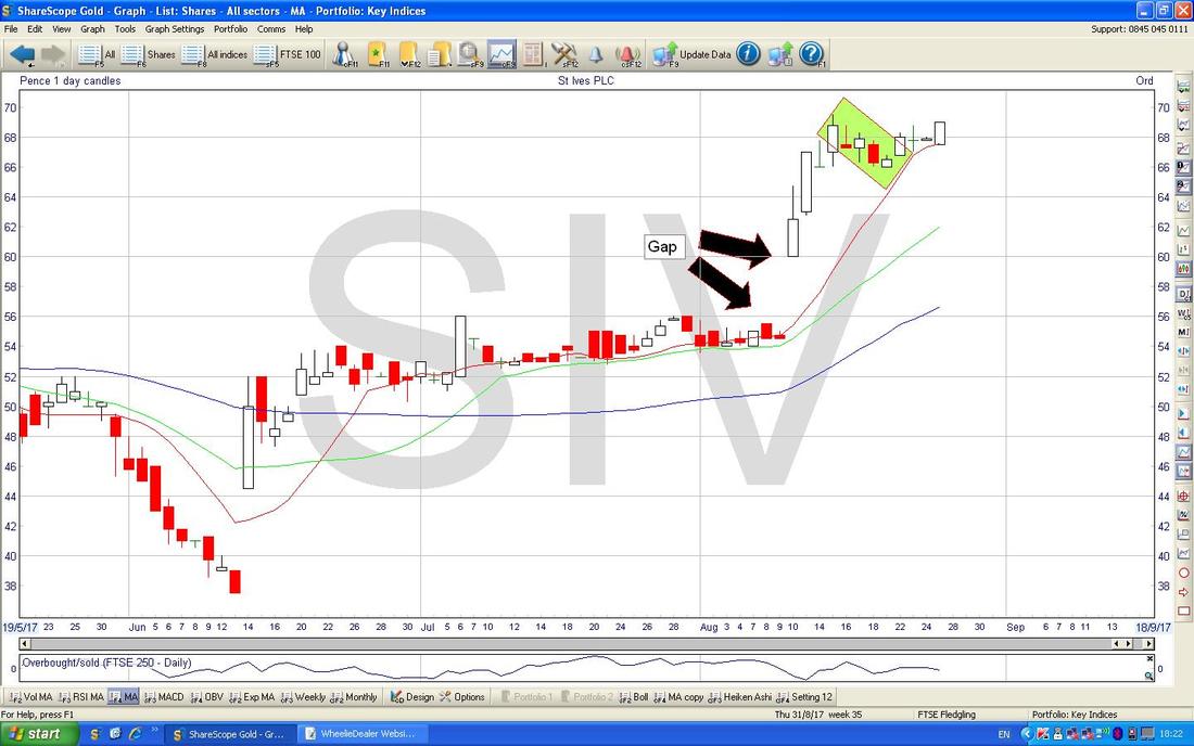
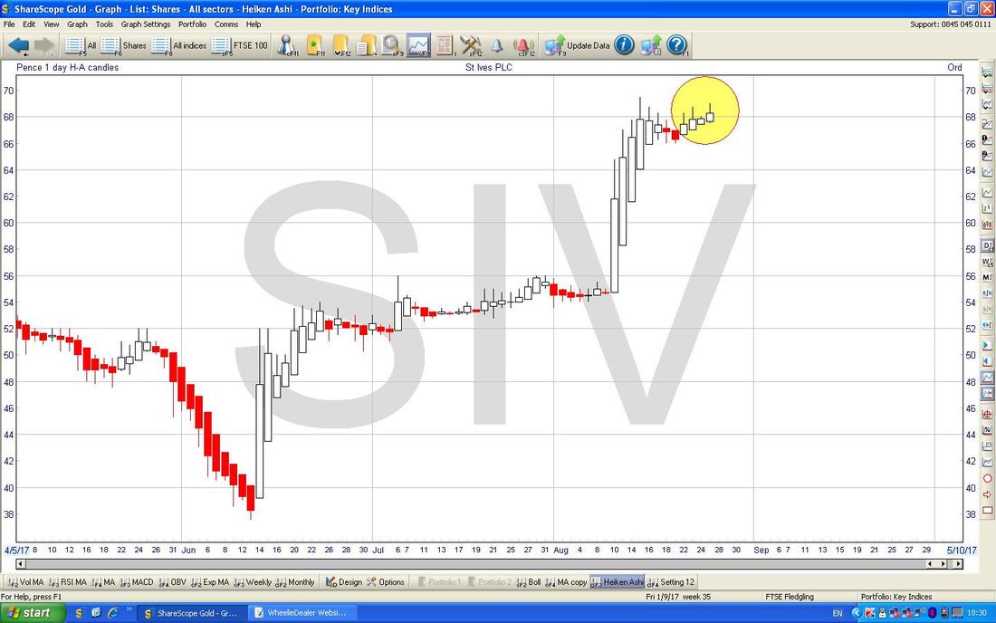
Just for more colour I have thrown in the Chart below with the Daily Heiken Ashi Candles - my Yellow Circle is capturing where we have some White Bullish Candles and this suggests the Price is moving up - as I said above though, the key thing here now is a Breakout over 70p and that would be a clear Buy Signal (some People may react Intraday but personally I would rather wait until the end of the Day when we have a complete Candle to make a Buy Decision for the next Day.)
PurpleBricks PURP
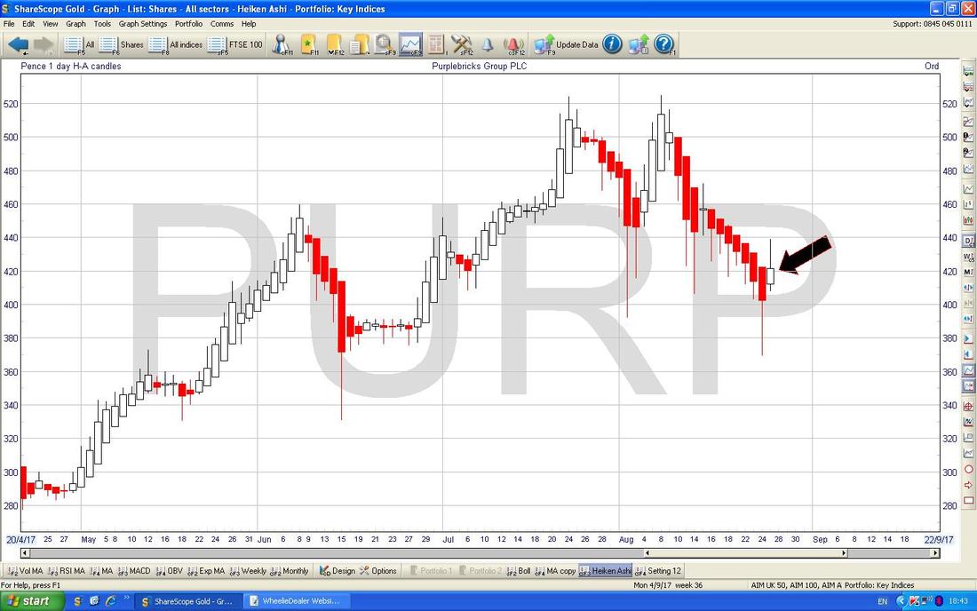
I don’t hold this Stock but I know a lot of Readers do and I thought it was an interesting Chart. First thing to see is how the Uptrend Line which I have drawn in Black (pointed at with Black Arrow) has been very disciplined and rigid for about 8 Months but where my Yellow Box is there is a Hammer Candle which violated this Uptrend Line. Many Chartists would say this violation (break) of the Uptrend Line is Bearish and the Uptrend is over but I am not totally sure that will be the case. The interesting thing is that we got the Hammer which is an Intraday Reversal and there was quite a Spike in Volume which suggests some sort of ‘Capitulation’ (I won’t show it here, but I have the Volume on another Chart). Note after this Hammer we then got quite a nice White Up Candle (Blue Arrow) which ‘confirms’ the Buy Signal from the Hammer - so to say the Uptrend is over might be premature (it is not unusual for Charting stuff to ’Overshoot’). The Key now is that 440p Level - if the Price cannot get over that, then clearly there is trouble ahead and if it drops and the Black Line becomes Resistance, then that would be bad. Having said all that, from a Fundamentals perspective PURP could be a difficult Stock to justify a Buy on as the Valuation is pretty meaty - although they really could be the Disruptor of the Estate Agency Market that Bulls expect. Before I forget, all the Charts shown here come from the SuperSunny ShareScope Software that I use on a Daily Basis (or, more accurately, Nightly). 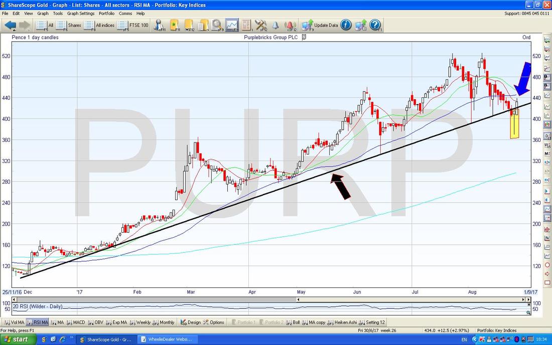
This is quite a nice confirming Signal - the Chart below has the Daily Candles for PURP with the Blue Squiggly Bollinger Bands above and below - note how the Price dropped down to the Lower BB and then reversed up where my Green Circle is. Note that intraday the Price fell below the Bottom BB quite a lot - this is an unstable turn of events and it tends to be that the Price wants to get back inside the Bands pronto.
Of course you can’t beat a bit of ‘Confirmation Bias’……… 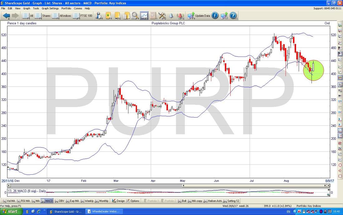
Just to feed that Confirmation Bias, here is another Bullish looking Chart. This has the Daily Heiken Ashi Candles (remember, these things are totally different to the usual Japanese Candlesticks and a shed load simpler) and my Black Arrow is pointing to where we had a White Up Candle on Friday after Red Down Candles for a long time before. I think the strict rule is that we would Buy after another White Up Candle but this does suggest that things could be turning more positive. I find that HA Candles give a more delayed Signal than normal Candlesticks etc.
888 Casino 888
This is not one I hold but it came up in a discussion on the Tweets recently and I thought it might be worthwhile seeing how the Chart is shaping up. On the face of it, things look quite promising here with a cracking Uptrend since back in 2011 as shown with the Black Lines below - I just love the discipline of this Price Channel and how it is so defined. Note the little box saying that Results are due on Tuesday 5th September - this is a new ShareScope Feature and I have not checked the accuracy of that date. Again I have done nothing in detail, but from a very quick look at the ShareScope ‘Details’ Screen, it looks like 888 is on a Forward P/E of 15.3 and should pay 5.9% Dividend Next Year - that looks pretty good value to me especially with that beautiful Uptrend. It looks like 888 might have Cash as well. 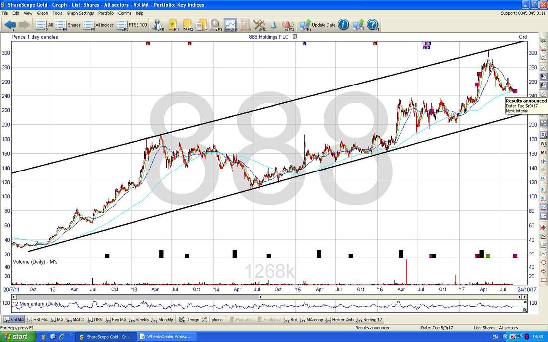
The Chart below is obsessed with Moving Averages. First of all look at my Blue Arrow which is pointing out how the Darker Blue Wiggling 50 Day Moving Average is falling down towards the Light Blue 200 Day Moving Average (marked by the Green Arrow). It looks highly likely that we will get a Bearish ‘Death Cross’ here but note where my Yellow Circle is that we got a similar thing back then but it quickly reversed and gave a ‘Golden Cross’ and the Uptrend continued.
This is a good example of how important it is for Fundamentals and Technicals to line up. The Technicals here are warning of possible Danger ahead and if the Trading Update is bad (or some other negative News comes out), then it could be that the Chart was getting it right. A ‘Death Cross’ combined with weakening Fundamentals would clearly not be a good combination. 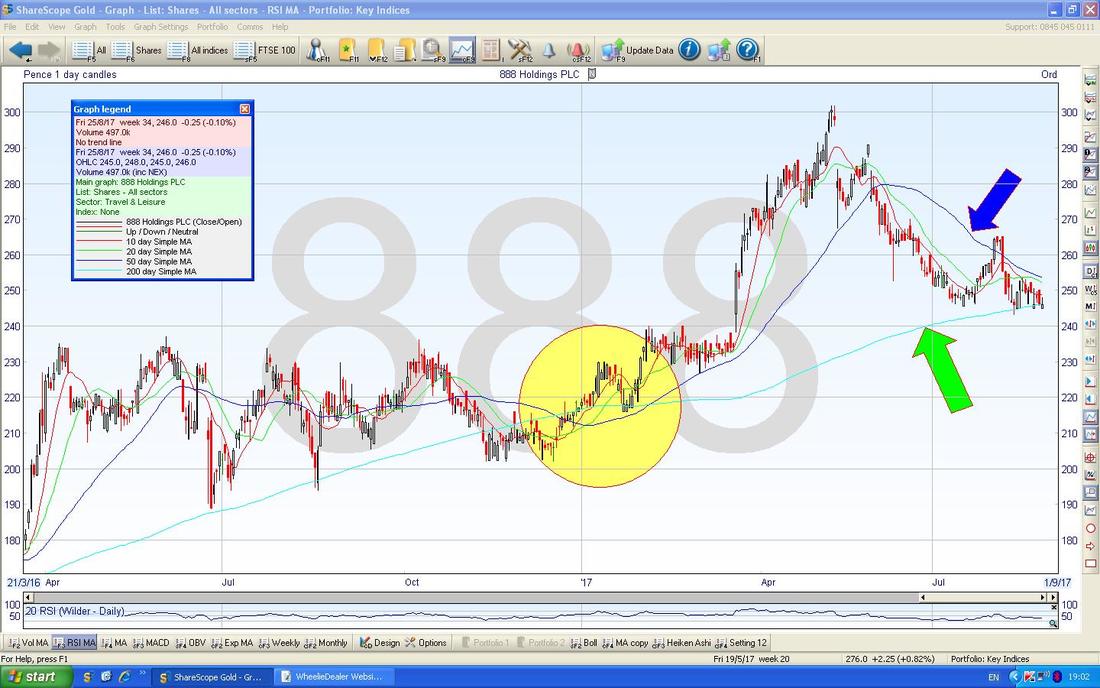
I am a big fan of the 13/21 Day Exponential Moving Average Crosses as good Buy and Sell Signals and my Blue Arrow on the Chart below is showing where there was a 13/21 Day EMA ‘Death Cross’ which then led to more falls (the Red Line is the 13 Day EMA and the Green Line is the 21).
Where my horrible Black Circle is you might be able to just about make out where we had a 13/21 Day EMA ‘Golden Cross’ but this failed quickly and put in a ‘Death Cross’ - I am showing this merely to point out how the Signals are far from perfect. Anyway, the point is that Buyers of 888 might want to wait for a nice 13/21 Day EMA Golden Cross - this could be a good time to buy. 243p looks an important Support Level and if that fails in the very near term, then expect the Price to drop more. Time for some Indexes. 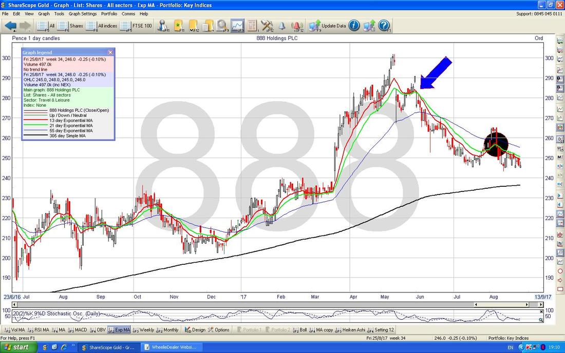
FTSE100
Sorry about the messy Screen but I just want to bang in the usual ‘Context’ Chart so that Readers are focusing their Minds on that Red Uptrend Channel Bottom Line which is marked by my Red Arrow. The point is that the FTSE100 managed to get up above this Line and back into the Uptrend Channel recently but as you will see on the coming Charts it is now below that line and Outside the Channel which is not a great sign. 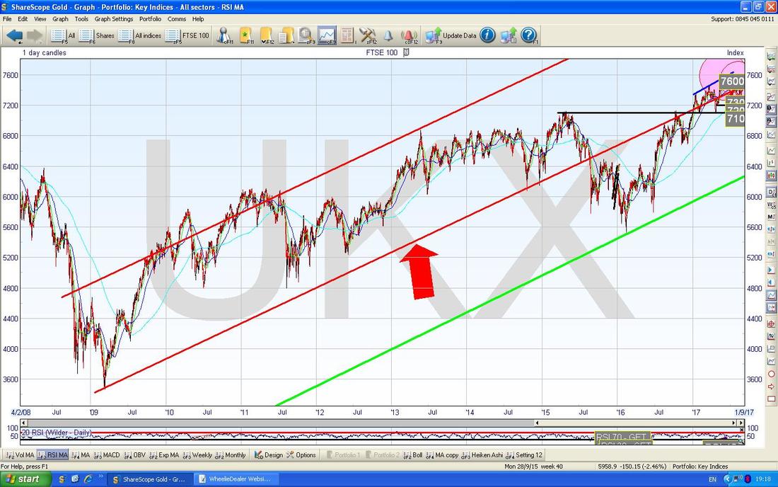
As always you can click on the Charts and they should grow huger in your Browser thingamajig (I am shocked that ‘word’ is actually in the Microsoft Spelling Library, let alone ‘huger‘).
My Yellow Circle on the Chart below is highlighting how the Price of the FTSE100 hit the Red Line from the previous Chart and then fell back - twice. It looks like 7450 ish is quite a strong bit of Resistance. To the Downside, my Green Boxes are pointing out groups of Daily Candles where 7300 was tested as Support and obviously a failure here would lead to more Falls with 7200, 7100, 7000, 6900 being Support Levels. I guess it is possible that we can stay Range Bound between 7300 to 7450 for a bit but this is a very tight Range so it seems unlikely really. I can’t help thinking there is a certain Bearishness going on here. 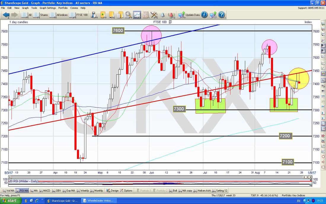
In the bottom screen below we have the MACD (Moving Average Convergence Divergence) for the FTSE100 Daily. My Blue Arrow is pointing to where we are very near a Bullish MACD Cross - this suggests some gains in the very Short Term but it is not the World’s most reliable Indicator.
While we are doing Acronyms - I have a Mnemonic I invented today. I was reading Investors Chronicle and they were going on about Options and Puts and Calls. I can never remember which is which, so I made up a Mnemonic to help me - it might not be strictly true but I think it will help me: Calls Are Leverage LongS (So it goes quite logically that PUTS must be Sells/Shorts). What a funkin’ Genius I am…….. 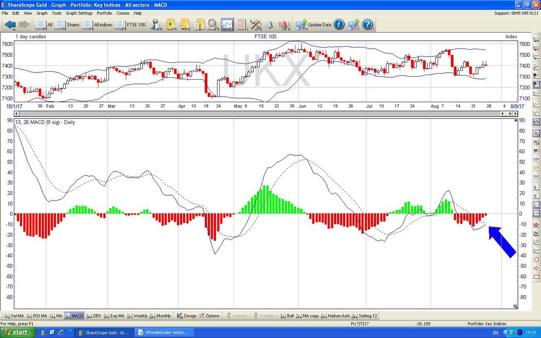
FTSE250
On the Chart below we have the 13/21 Day EMAs as I have shown earlier. Where my Blue Arrow is we are skirting with a Bearish Death Cross - I don’t think it has quite triggered yet but it looks very close - something to watch for. Note also that 19800 looks like Resistance in the very Short Term. 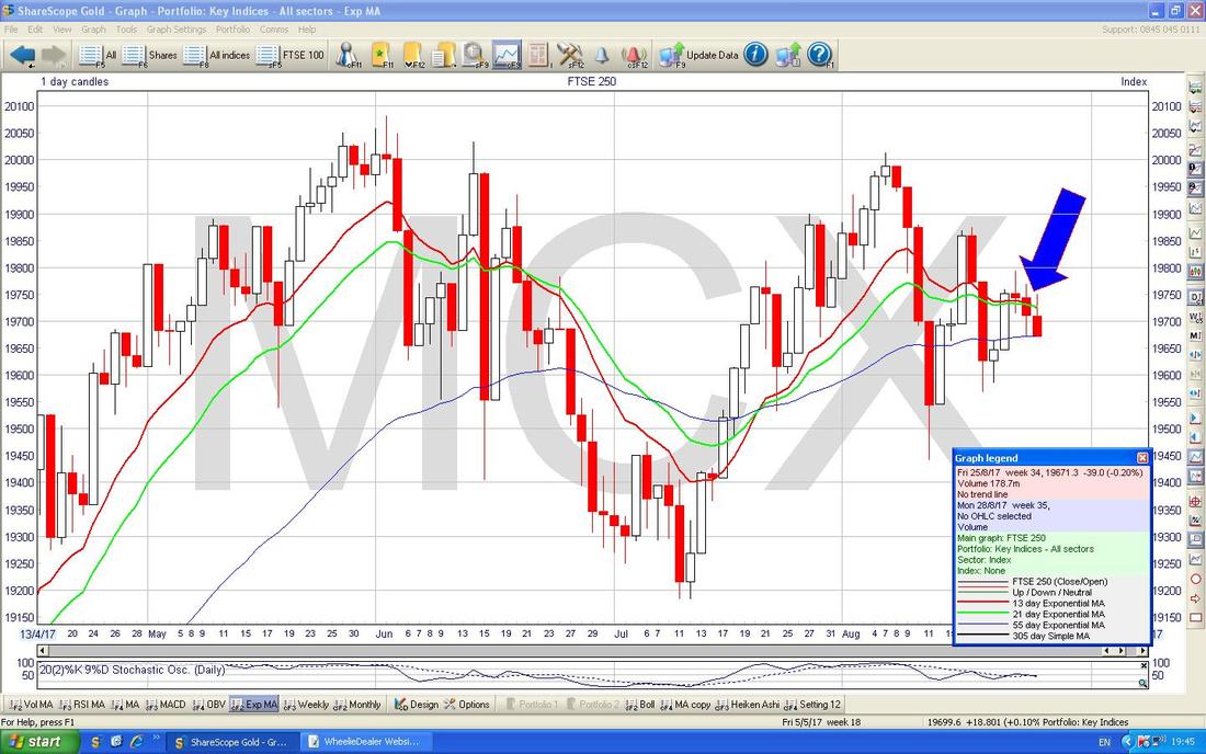
I wanted to bung the Chart below in to show the Advance/Decline Line and how we are supposed to use it. From what I understand, we need to look out for a ‘Divergence’ between the Price Line and the A/D Line - in this case for the FTSE250 at the moment, in the Upper Window we have the Weekly Candles and clearly the Trend is up as per my Black Line (Black Arrow) and note how in the Bottom Window, the A/D Line is doing a similar Uptrend and there is no Divergence between the 2 Black Lines.
If the Black Line on the A/D was falling while the FTSE250 Price was rising, that would be a Bearish Divergence and imply trouble ahead. It follows also that if the Price Line is falling but the A/D Line is rising, then that would be a Bullish Divergence. 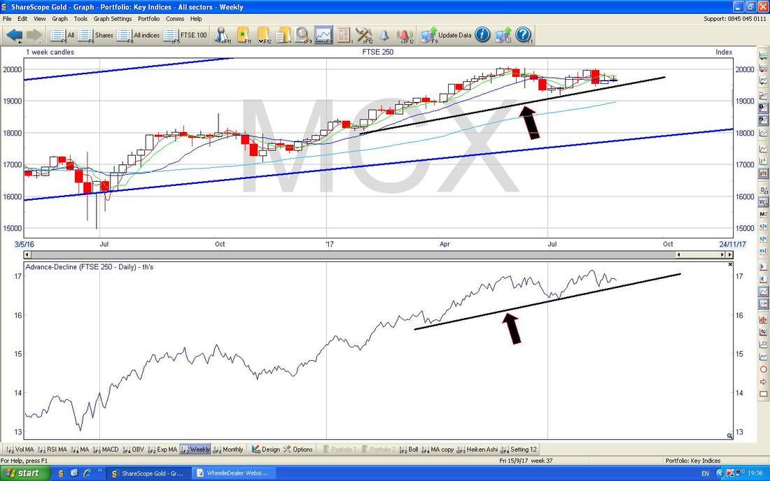
DAX30 (German)
The thing that stands out here is how we seem to be stuck in a Downtrend Channel as marked by my Red Lines since the Peak back in June. Where my Yellow Circle is I am showing a succession of Red Down Doji Candles which are all struggling to get over the Upper Red Line of the Channel - as pointed at by my Red Arrow. It is critical for Bulls that the DAX breaks-out of this Downtrend to the Upside. There is clearly a lot of Resistance just above at about 12330 to 12340 ish and down below there is Support at about 12000 from the 200 Day Moving Average as per my Black Arrow. If things get serious, then there is pretty solid looking Support down at 11400. 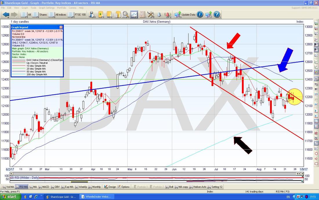
I showed this in another Chart Update recently - but it still holds true. My Black Arrow is showing a Bearish ‘Death Cross’ on the Green and Red 13/21 Day EMAs and until we get a ‘Golden Cross’, this looks weak.
My Bread Maker has miraculously created a Loaf so I will knock it on the head here and focus my efforts on Food Consumption. Good luck to one and all and keep an eye out for those Grizzlies……… Cheers, WD. 
2 Comments
Mr catflap
29/8/2017 04:14:54 pm
Thanks for the charts. Handy "CALL" mnemonic there. You are not alone in struggling to remember which one is which. If someone says they are writing CALLS on the September VIX my mind usually melts......
WheelieDealer
29/8/2017 09:14:28 pm
Hi Mr catflap, Leave a Reply. |
'Educational' WheelieBlogsWelcome to my Educational Blog Page - I have another 'Stocks & Markets' Blog Page which you can access via a Button on the top of the Homepage. Archives
May 2024
Categories
All
Please see the Full Range of Book Ideas in Wheelie's Bookshop.
|
