

|
educational blogs |
|
The French Election is a ‘done deal’ and I suspect the Market has forgotten it already - we might get a small ‘Relief Rally‘ but I suspect a Macron Win has already been priced-in and all Major Indexes look pretty Bullish as you will see on the Charts further down. We now seem to be moving on to the next big ‘Event’ which for the UK is probably the General Election - although after the results of the Local Elections it looks like a question of just how big the Tory Landslide will be.
The most interesting aspect of this is its impact on the Pound - I note that the £/$ made a new Relative High at the back end of last week and the momentum certainly seems to be with the Pound recovering. The other interesting event is around Oil Prices (and Resources in general) which have been pretty weak lately.
Both these occurrences are very relevant to the UK Economy because the recent narrative has been that there will be a marked Slowdown because the Consumer is being squeezed by Inflation and low Pay Rises. With the Pound rising and with Oil falling these Inflation pressures abate and this is something to watch.
The other things of note are around strength in the European Economy which seems to be really picking up and the US Economy might have done a bit of a hiccup although the Jobs numbers from Friday were pretty strong - the upshot being that The Fed will continue to raise Interest Rates but it will be at a steady and slow pace. Also in the US, Trump managed to get a Health Bill past Congress and it now goes to the Senate to be hacked to pieces - however, this is a rare victory for the Orange One and suggests that he might be able to make progress on his Tax Cutting and Tax Repatriation Agenda - both of these would be positive for the US Economy and most likely for US Stockmarkets. On the Indexes, we had a small Pullback in recent Days but it looks like they are turning up again - the FTSE100 might be less strong than others but it is clear that Bulls are in control still. EasyJet EZJ @MarkHowitt flagged this one to me recently and I know many People hold this Stock - it is an interesting Chart and I guess the falling Oil Price is helping Airlines in general. As always, the ScreenShots I will show here are from the superb ShareScope Software and the Screen below shows the EZJ Daily Candles going back about 4 years or so. The main thing I want to flag is how we were in an Uptrend Channel until around the Start of 2016 and since then the Price has been falling and my Green Line (pointed at with Green Arrow) has marked a Downtrend Line. Note how the Price has now Broken out of this Green Line. The next important thing on this Chart is pointed at by my Blue Arrow - here we have a 50/200 Day Moving Average ‘Golden Cross’ (where the 2 Blue Wavy Lines intersect) and this suggests more gains in coming Months. 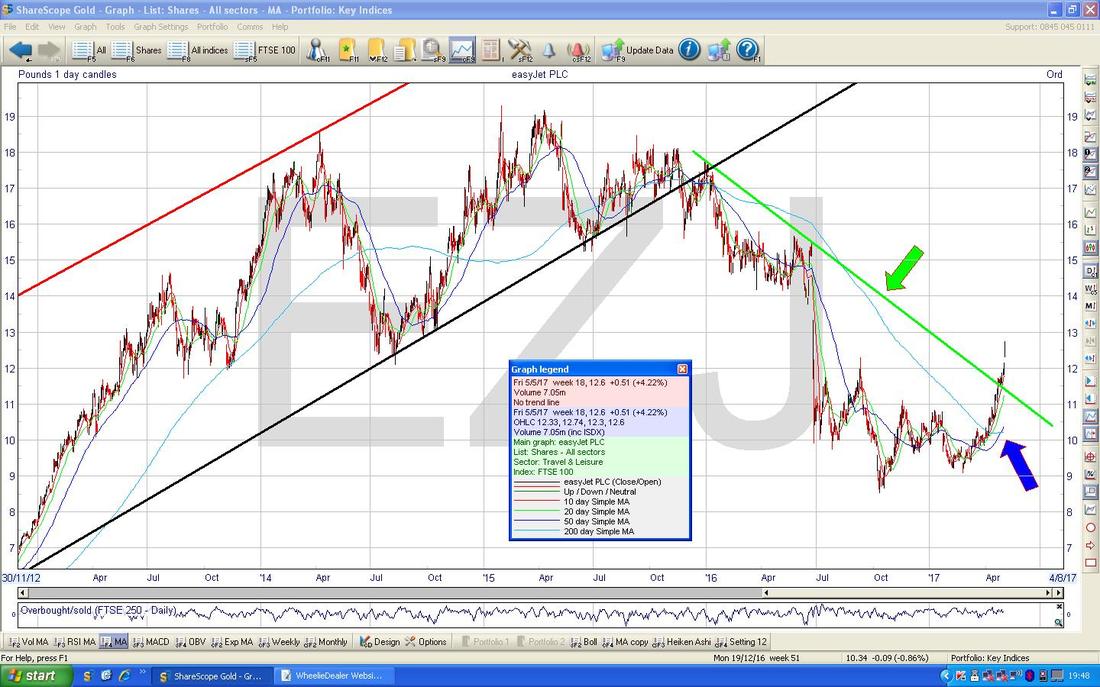
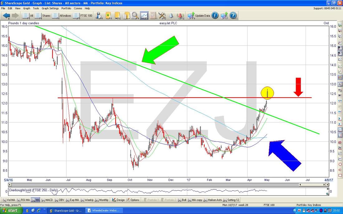
On the Chart below I have zoomed in on the Daily Candles to about the last year or so and you should be able to see the Green Arrow and Green Line from my previous Chart and also the Blue Arrow marking the 50/200 Day MA ‘Golden Cross’. I have now added another Horizontal Line which is the Red Line marked with my Red Arrow - my Yellow Circle is highlighting how the Price Broke-out of the Horizontal Resistance Line which is very Bullish behaviour. It is possible that the Price is a bit over hot in the Short term but I expect this to rise up to around the 1400p-1450p Level given a bit of time.
Brent Crude Oil (Spot)
Following on from the EZJ chart and my comments on UK Inflation etc. we might as well look at Oil next. If you read my Weekend chart Updates regularly then you will have seen a similar Chart to the one below in recent Weeks. This is the Daily Candles for Brent Crude Oil (Spot) going back about 5 Months and the first things to notice are my Sideways Ranges that are marked firstly with the Green Arrows between $54 - $57.535 and then a Lower Range marked with Yellow Arrows between $50 - $54. It is worth noting how Oil has been so weak that it has been unable to stay inside these Ranges - it is not a very positive sign and even if we get a Bounce in the very Short Term I suspect we could easily see more falls. Note my sort of Purple/Pink/Mauve Arrows that are pointing at the Darker Blue Wavy Line which is the 50 Day Moving Average and the Lighter Blue Wavy Line which is the 200 Day Moving Average - the problem here is that it looks like they are about to do a ‘Death Cross’ (the nasty opposite of a ‘Golden Cross’ like I mentioned earlier on EZJ) - this suggests more falls could come in the Months ahead, which of course could be painful for Oil Stocks and Oil Services Companies. My Black Arrow is pointing at a pretty sweet sort of Hammer Candle which we got on Friday - the key thing here is that the Price dropped a lot Intraday down to around the $46.6 Level but then rebounded strongly with a good Intraday Reversal - this suggests we could see Oil rise in the coming days but I suspect the overall Bearishness will dominate and limit any Bounce to perhaps around the $51 to $53 levels at best. Of course any weakness in Oil over coming Weeks could hurt the FTSE100 - and this would be even more troublesome if the Pound strengthens as well. 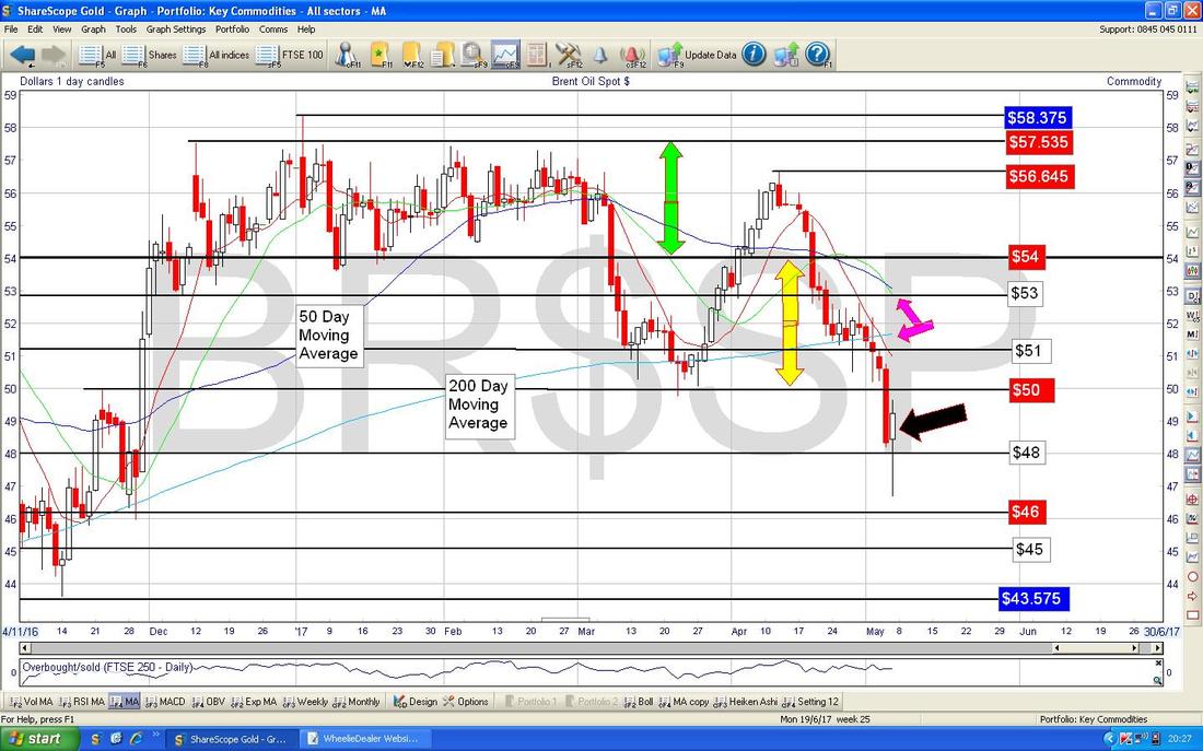
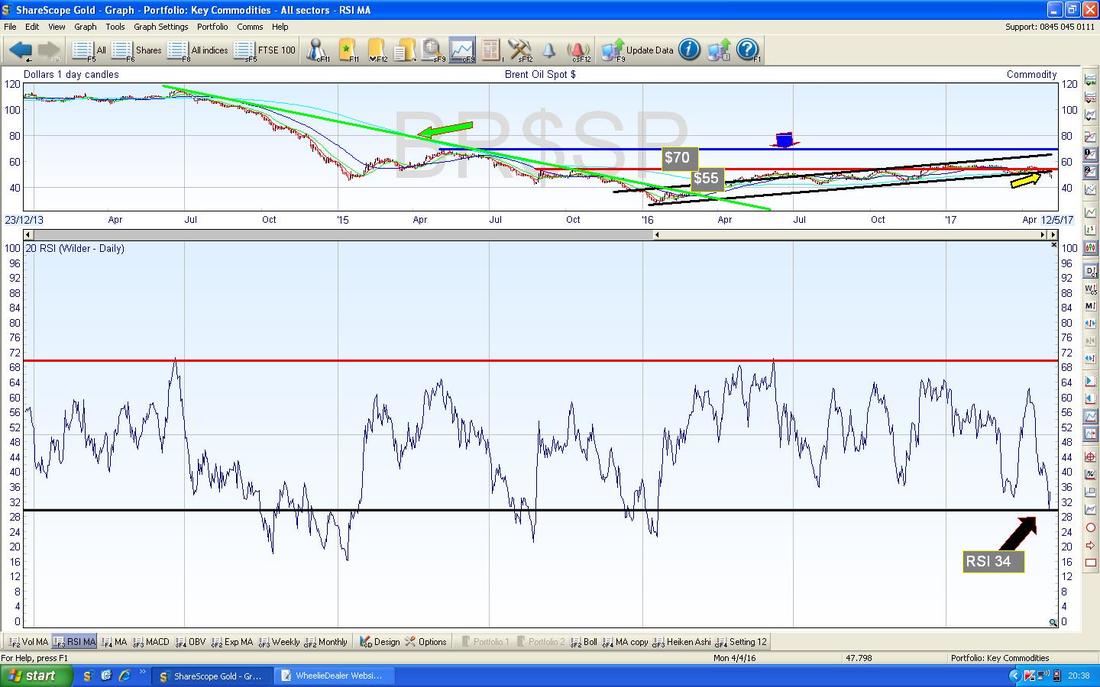
In the bottom window on the ScreenShot below we have the RSI (Relative Strength Index) for Brent Oil (Spot) Daily - on a Reading of RSI 34 and having turned up from RSI 30 this supports the idea of a Short Term bounce - we shall see of course and I won’t be surprised if the RSI struggles to get up over the RSI 50 halfway line.
Pound Vs Dollar
I keep referring to the Quid so I might as well show it next. The Screen below has the Daily Candles for the £/$ going back about 8 months - the first thing to notice is the 2 big Sideways Ranges that we have between about 1.1947 - 1.28 and then a Higher Range between 1.28 - 1.35 - and note how the Pound has escaped the Lower Range and is now firmly inside the Higher Range - the obvious Target here is the top of the Range at 1.35 in time. Readers who can manage to think back about 7 Days (no room for Goldfish here !!) may recall the Grey Rectangle I drew which was Broken-out of to the Upside - well, we have a repeat performance where a similar Grey Rectangle has been Broken-out of again - this continual making of New Recent Highs is very Bullish behaviour and suggests we will see the Pound rise more. So much for all the ‘Experts’ talking about Pound weakness…….. Note also how the Blue Wavy Lines which are the 50 and 200 Day Moving Averages are steadily moving together - if they can keep this up, we will soon get the mythical ‘Golden Cross’ which will imply more Pound strength against the Dollar to come. I guess from these Charts it is pretty clear to deduce that the Pound got oversold - it is also likely that the Market sees the likelihood of a Conservative Landslide in the upcoming General Election as very positive for the Pound. Conversely, a Win for Jezza Corbyn would imply a big drop in the Pound - this tells you all you need to know about his Economic Policies…… 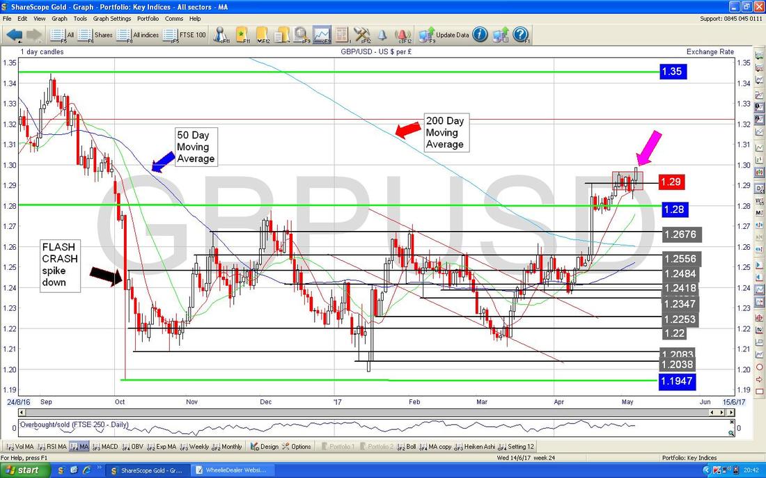
Gold (Spot)
While we’re on Currencies and Minerals I guess it is appropriate to lob Gold in now. The Long Term view is so important here that I will start with it as is always good Charting practice anyway. The Chart below has Gold Daily Candles going back about nearly 4 Years but the key thing to note here is that Big Ugly Red Downtrend Line (marked with my Red Arrow) which has dominated the Price Action for all that time. Note where my Green Arrow is that the Price made a recent attempt to Breakout over the Red Downtrend Line but it failed - this does not mean another attempt is not possible or that it might not Breakout, but it does show some weakness. From a Trading/Investing Viewpoint, I would suggest there is no point buying into Gold heavily until that Red Downtrend Line is broken. 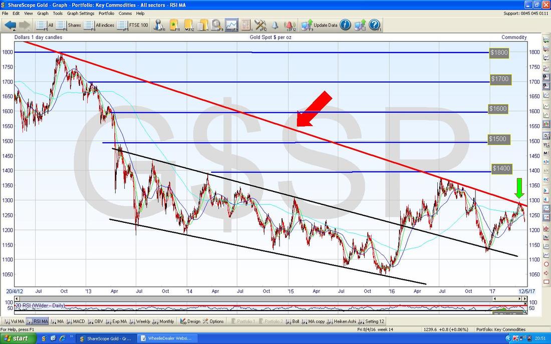
As ever, sorry for the messy chart below - I really should take the time to clean it up a bit but the priority on a Sunday Night is to get the Blog written and out of the WheelieDoor - so please bear with……..
The Chart below has the Daily Candles for Gold going back about 6 months - the first thing to note is the Red Line with the Red Arrow at the top of the Chart which is that horrible ugly Red Downtrend Line from the previous Chart. On this scale you can see more clearly how the Gold Price moved up to the Long Term Downtrend Line but then fell back when it failed to Break-out. Where my Yellow Circle is note how the Blue Wavy Lines which are the 50 and 200 Day Moving Averages were getting extremely close to doing a ‘Golden Cross’ but it actually looks likely that if we get any more immediate weakness in Gold then that Golden Cross might not happen - this would be pretty bad. However, where my Yellow Arrow is we put in a bit of an Upside Down Hammer Candle on Friday and in the context of the Moves down beforehand, it is possible that the Price drives to Reverse up off of this - we shall see. 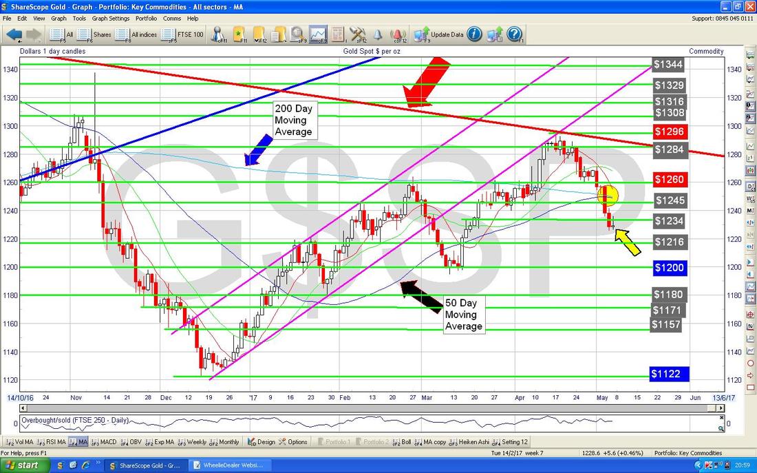
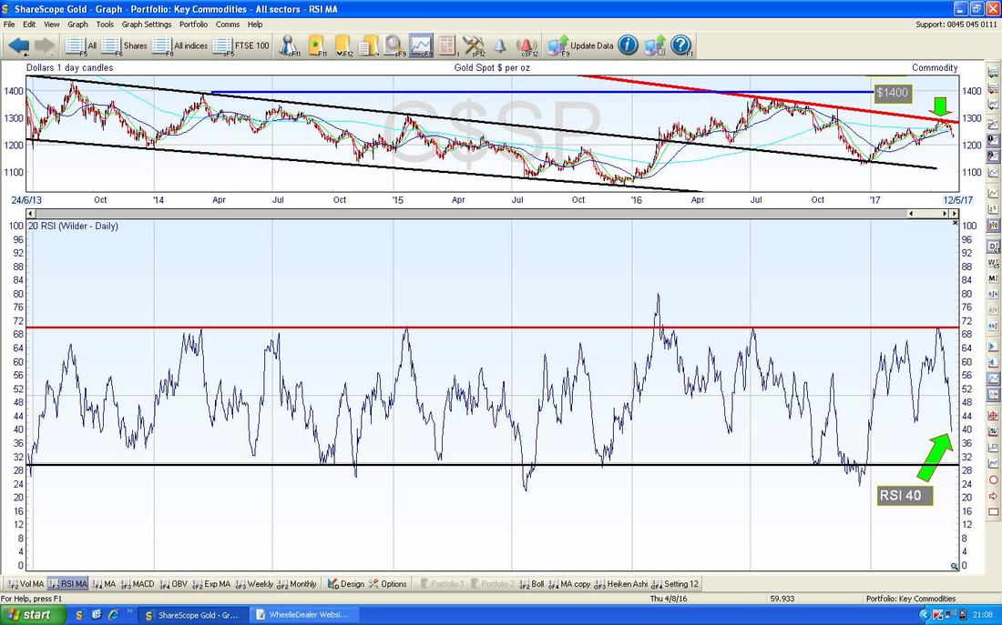
In the bottom window on the Screen below we have the RSI for Gold (Spot) Daily. On a current reading of RSI 40 it is quite low but can go a lot lower - there is not much for the Bulls to get excited about here yet.
On the Chart below we have the Daily Candles for Gold with the Blue Wavy Bollinger Bands above and below the Price Line. My Green Circle is attempting to highlight how the Gold Price has dropped down to the Lower Bollie Band in recent Days and this could be a mildly positive development for Gold Bugs - however, if you look to the Left you can see many occasions where the Gold Price has ‘hugged’ the Bottom Bollinger Band lower and this is a failing of the Bollie Bands that they can be somewhat unreliable as a predictor of Turning Points.
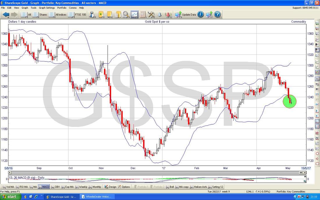
I am really going to town on Gold this week - simply put there are several interesting Technical Events which I am showing you and here is another one. The Screen below has the Daily Candles going back about 8 months or so but the key thing here is the interaction of the Red Wobbly Line which is the 13 Day Exponential Moving Average (EMA) and the Green Wiggly Line which is the 21 Day EMA.
Note where my Black Arrow is that we have just been ‘treated’ to a 13/21 Day EMA ‘Death Cross’ and this suggests we could see more falls in coming Weeks. However, note where my Huge Yellow Circle is that we got a similar ‘Death Cross’ but on that occasion the Price soon recovered - so Gold Bulls have got to keep their Midas Fingers crossed tightly and pray with considerable theological commitment that we get a repeat performance. However, note back where my Blue Arrow is that we got a ‘Death Cross’ of a similar persuasion and it certainly lived up to it’s Horror Show billing on that occasion. My hunch would be that if we are to avoid a full-on Bearish scenario then we need to see a Reversal Upwards ASAP with little delay. 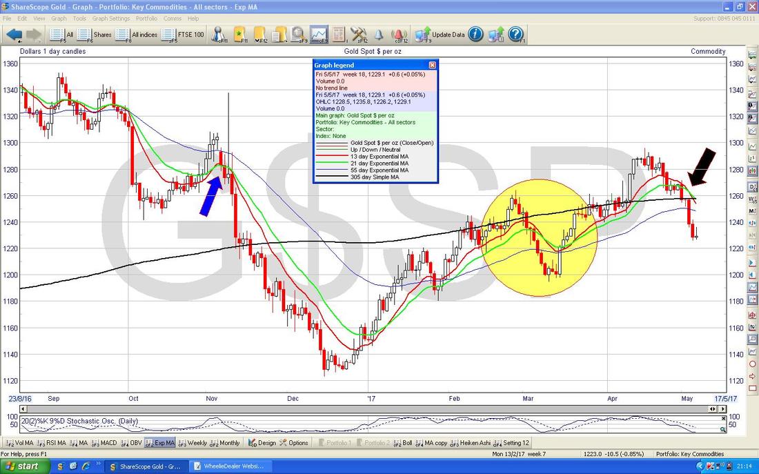
FTSE100
As always, this Index needs the following Long Term Chart to set the context and to make any sense of what is really going on. As with other weeks, please just look at this quickly and note the Red Lines which mark the Long Term Uptrend Channel from the Credit Scrunch Lows back in 2009. 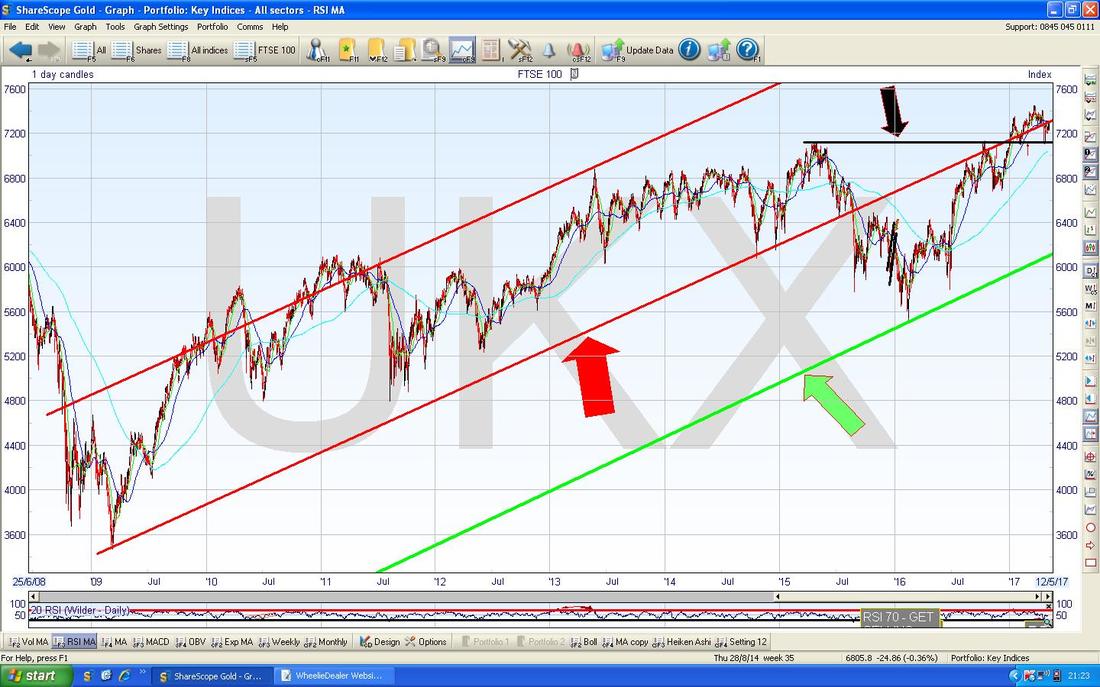
On the Screen below I have zoomed in to about the last 5 months. Where my Blue Arrow is note we got a nice Big White Up Candle on Friday and that this is pretty much bang on the Red Line (marked by the Red Arrow) which is the Bottom Line of the Long Term Uptrend Channel which I keep bleating on about. We really now need to see the Price keep going up and to get back properly inside that Uptrend Channel - although with a weak Oil Price and a Stronger Pound that might be a big ask. Just looking purely at this Chart, I would suggest we will see the FTSE100 go higher. Note also how we are now up at the Blue Wavy Line which is the 50 Day Moving Average - this could act as Resistance and be a challenge to get over.
Note how in the last couple of Weeks the Price dipped down to the 7100 Level where my Black Line is and then moved up again - it looks like 7100 is very Strong Support and if this fails, then there is Support at 7000 and 6900 below. 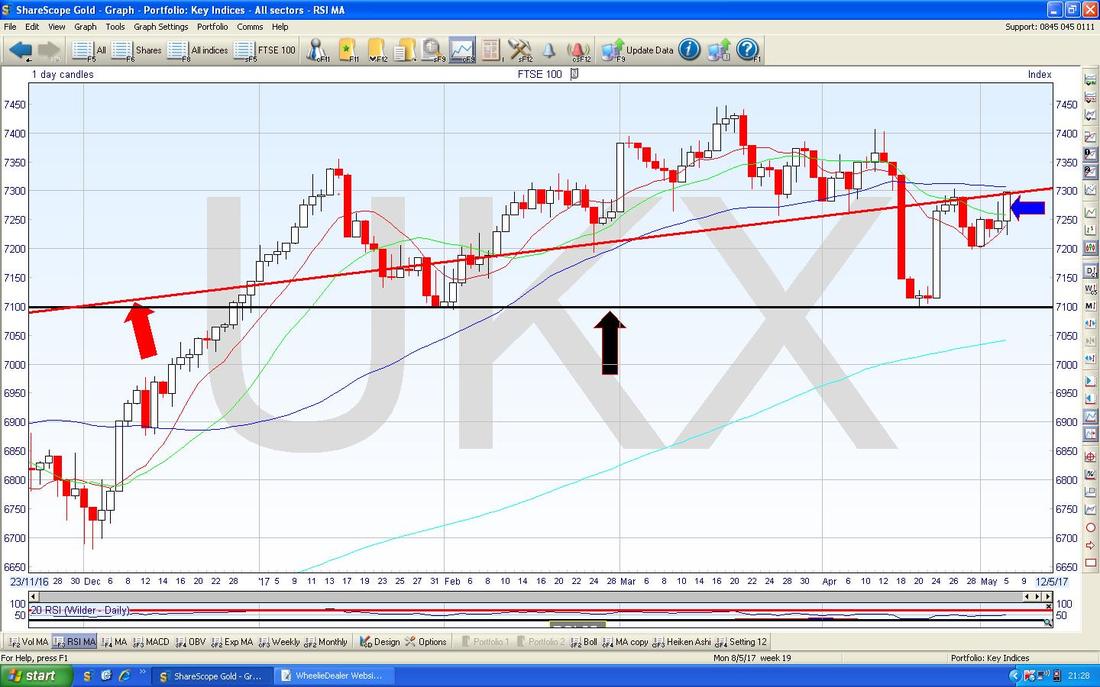
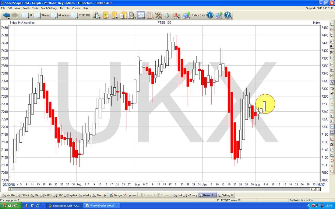
About time I lobbed in some Heiken Ashi’s !! The Chart below has the Daily HA Candlesticks for the FTSE100 going back about 4 months. My Yellow Circle is highlighting a nice big White Up Candle from Friday which suggests more Gains to come and note how in the 2 Days before the Candles had narrowed and turned from Red to White which indicated that a Change in Trend was coming. I love these things - they are so clear and reliable.
DAX (German)
It is hard for me to write about this Chart as I am struggling to see it with all the tears in my Eyes. No, it is not because I hold BooHoo, but because if you have read my Updates recently you might remember I was on about doing a Long Trade on the DAX if it broke-out of the previous All Time High at 12391 - but in the event, we got the Breakout but I did not do the Trade because I was not happy with the Gap as marked by my Black Arrows - this turned out to be an expensive mistake and cost me many £000s. Gutted. Anyway, all is not lost. The most likely scenario now is that the DAX might move up a bit more in the very Short Term but I then reckon we will see some sort of Pullback which will move down towards the Previous All Time High at 12391 and this should do a ‘Confirmation’ where it touches the 12391 Level or quite close to it and then moves up again. Such a Confirmation Touch would be a chance to go Long on the DAX again. 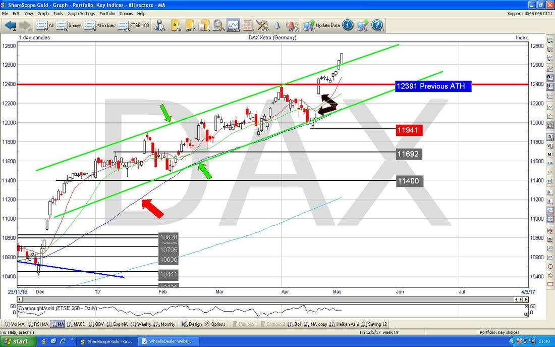
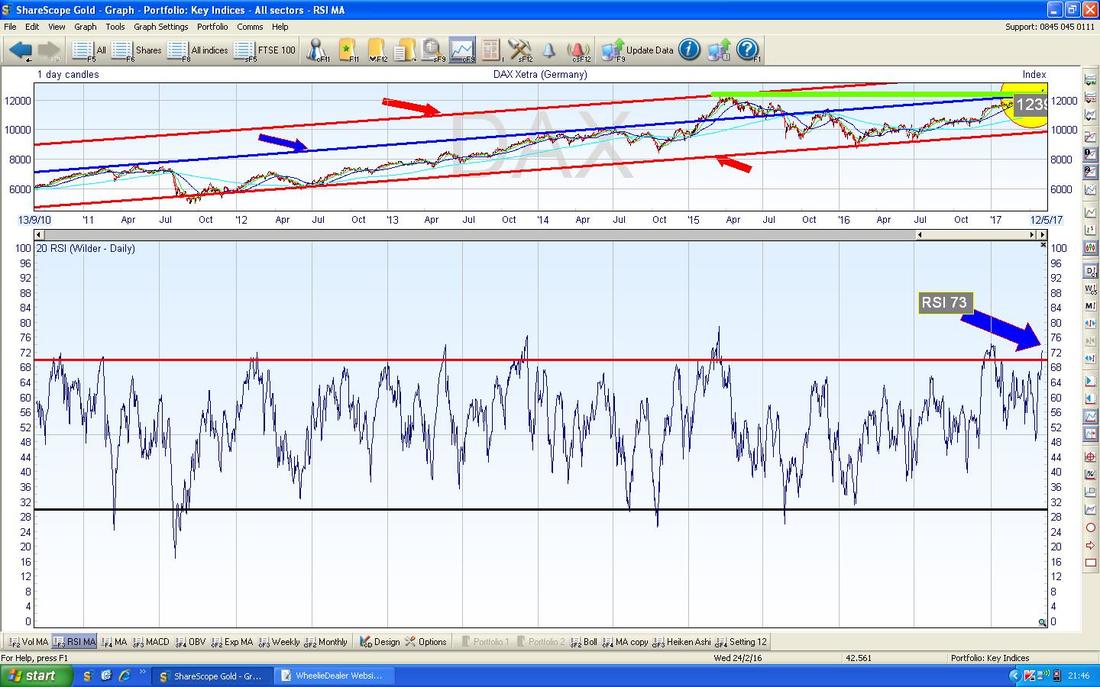
The bottom window on the Screen below supports my idea that we might get a bit of a Pullback and a chance to go Long on the DAX again. This shows the RSI for the DAX Daily and on a Reading of RSI 73 it is very high and a drop is highly likely very soon.
Dow Jones Industrials Index (Trumplandia)
The Chart below has the Daily Candles on the DOW going back just for most of 2017 so far. My Yellow Arrow is pointing to a Big White Up ‘Bullish Engulfing’ Candle from Friday - this looks pretty good for the Bulls. The next key Resistance Level to take out is 21071 and then I would expect an assault on the All Time High at 21169. Don’t be fooled by all the Bearish Chatter about - this is a Bullish Chart as are those on most Major Indexes. 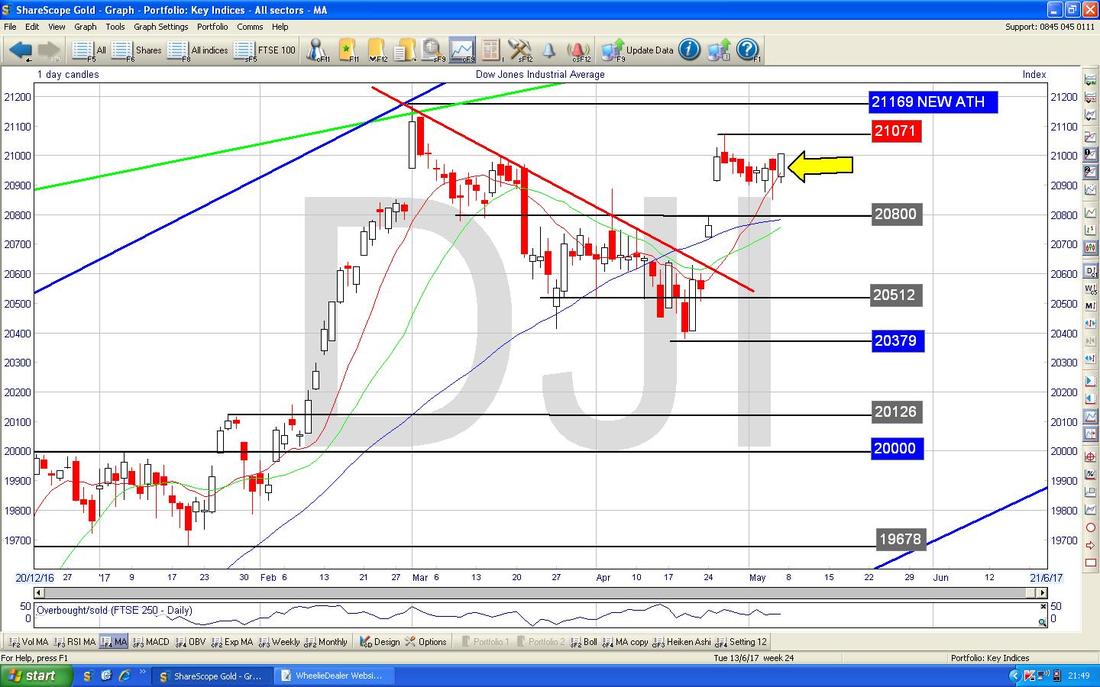
S&P500 (OrangeManWithFunnyHairLand)
It is unusual for me to show both the S&P500 and the DOW on my Weekly Updates because they are so often very similar. However, in this case, the S&P500 looks a bit more Bullish and I thought it deserved a special mention. The Chart below has the Daily Candles for the S&P500 going back about most of 2017 so far. The key thing here is that where my Green Arrow is we got a big White Up Candle for Friday similar to that on the DOW but in this case we are so near the All Time High at 2401 and I reckon it is extremely likely that we will see another New ATH this week. Note in the very Short Term there is good Support at 2380. I won’t show it here, but the Nasdaq looks good as well. Right, that’s it for this Week’s Update - I hope the Market Gods are bountiful and generous to all WD Readers in the coming week (and I wouldn’t mind a bit of it myself !!). Cheers Ears, WD. 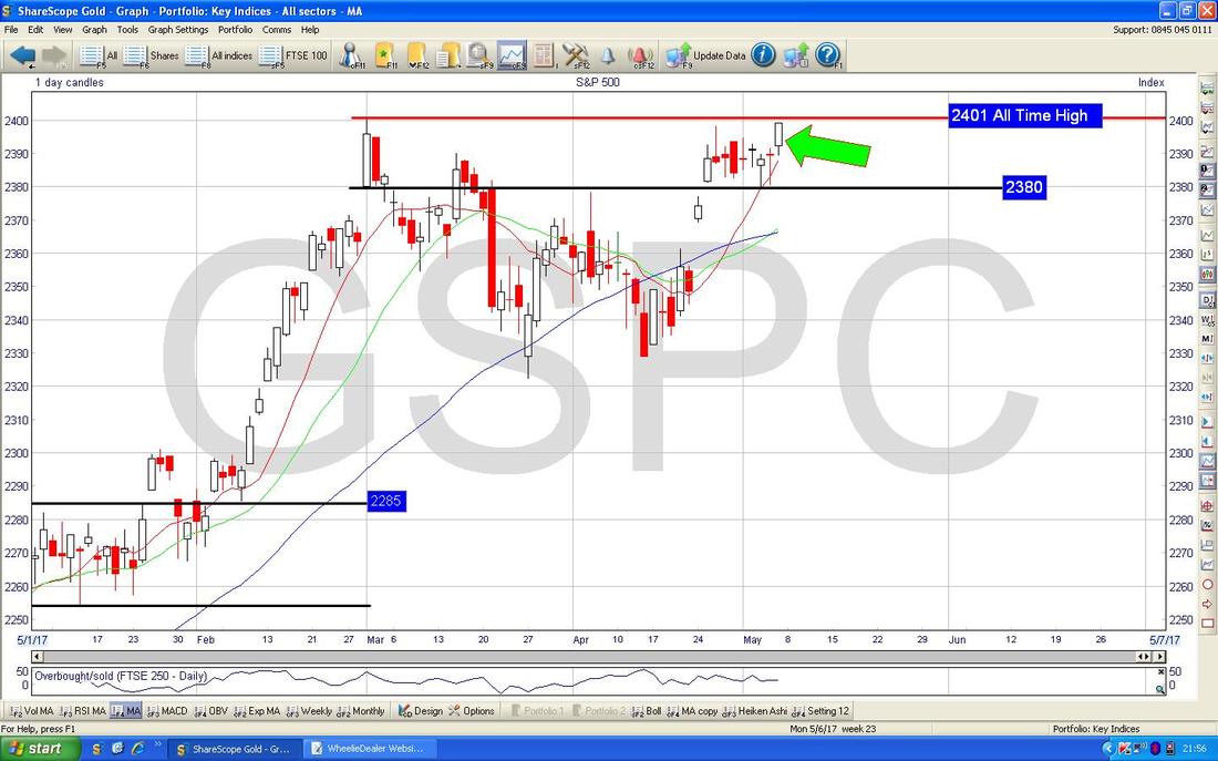
0 Comments
Leave a Reply. |
'Educational' WheelieBlogsWelcome to my Educational Blog Page - I have another 'Stocks & Markets' Blog Page which you can access via a Button on the top of the Homepage. Archives
May 2024
Categories
All
Please see the Full Range of Book Ideas in Wheelie's Bookshop.
|
