|
Last week was another good one for many holders of Stocks and Indexes all around the Globe are making new All Time Highs again which clearly shows how the Bulls are in control. This is clearly a difficult time for The Bears and our thoughts should be with them and perhaps we should start an Appeal Fund because they will be struggling to feed their families…….
On a serious note, with Markets in such a Bullish mood it is very dangerous to Short Stocks and I find it hard to see why it is worth the bother - the pressure is clearly to the upside and it is just so much easier to run with the Bulls. Having said that, we are now into the Summer Period (the weather might not support that fact !!) and Markets are likely to be less Bull friendly than they have been so far in 2017 - although it would probably be a big mistake to think they are going to fall a lot now.
June history
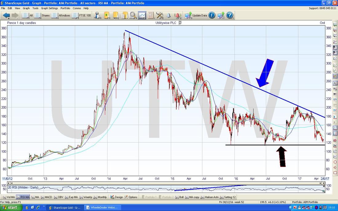
May is historically a difficult month for Stockmarkets but we seem to have nearly got away with it so far this year - just 2 more Trading Days to go. Moving on to June, according to my slightly Out of Date copy of the UK Stockmarket Almanac (I am using the one from 2016), this Month is historically worse than May and is the 2nd Worst Month of the Year with an Average Return of MINUS 1.0% for the FTSE100 since 1984, and the chance of a Positive Month is only 38%. Since 2000 things have been worse - with June on average delivering MINUS 2.0% for the FTSE100 and something to note is that Big Falls of 3% or more are quite common (8 Years since 1982). A typical June tends to start very strongly but has peaked as early as the 2nd or 3rd Day and then things fall away - if this pattern is followed in 2017, then the coming Week might be ok but coming Weeks would be iffy. With such a backdrop, I will be watching the Charts closely and I am unlikely to add to Long Positions unless something really stands out and I will be on alert for any need to Short the Indexes to Hedge my Portfolio. Of course this year we have the General Election, but despite the Cons having a wobble and the Terrorist Party doing better in the Polls than earlier, it still looks like a big win for the Tories is most likely and Stockmarkets will probably move forward on this assumption. There are quite a few interesting Stock charts kicking around so I will start off with a few of these this Week. Utilitywise UTW This one has to qualify as my most frustrating Holding and is one of my largest Positions but so far it has needed immense patience. We all know the ongoing Accounting issues here etc. but the Chart is looking interesting for a Short Term bounce. As always, we should start with the Long Term picture so here is UTW over all of its Stockmarket history. My Sloping Blue Line with the Blue Arrow marks a Downtrend and the best signal we will get that things are Recovering in a sustainable way will be when the Price breaks-out over this Blue Line - I suspect we will need a good Trading Update for this to occur. My Black Arrow is pointing at a Horizontal Support Level at about 115p and it is clear from the Chart that we are back down near this Line again. If the Price falls below this Black Line that would be very worrying and would imply more falls but I suspect that is unlikely because at the current price of 126p the Stock is giving a Forward Dividend Yield of 5.7% and this should provide a good reason for Buyers to come in (it is also on a Forward P/E of 5.9 !!).
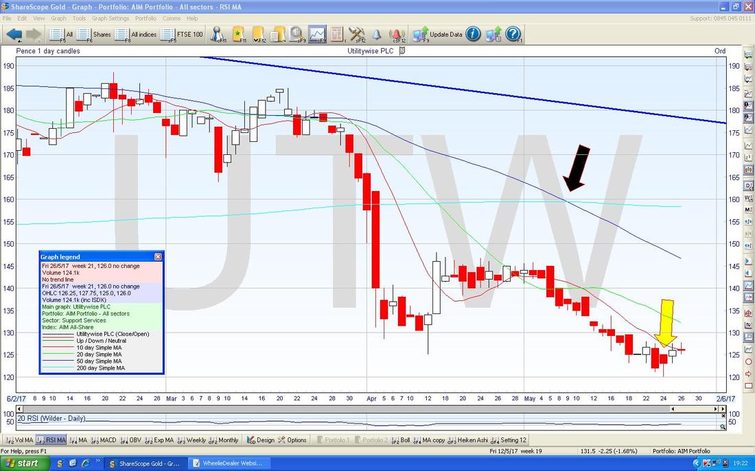
The Chart below zooms in big time on the UTW Daily Candlesticks Chart (as always, the magnificent ShareScope software is the source of all my Pictures) and my Yellow Arrow is pointing to a ‘Hammer’ Candle from Wednesday 24th May 2017 which could mark the point where we got an Intraday Reversal off the Low at 120p and the Price appears to be rising off of this.
Note also my Black Arrow which is marking a 50 / 200 Day Moving Average ‘Death Cross’ (the Faint Blue Wavy Line is the 200 Day MA and the 50 Day MA is the Darker Blue Wavy Line) which is not a good sign.
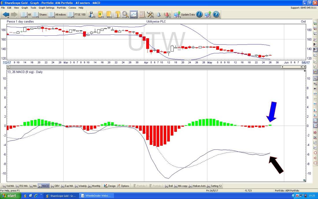
In the bottom window on the Screenshot below we have the MACD (Moving Average Convergence Divergence) for UTW and my Blue Arrow is showing a Bullish MACD Cross in the Histogram format and my Black Arrow is showing the same in the Signal Lines format.
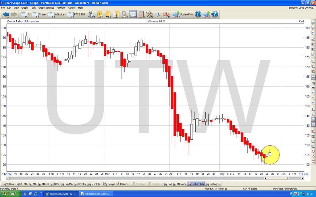
The Chart below has the Daily Heiken Ashi Candles for UTW - my Yellow Circle is highlighting how a long run of Red Down Candles has now changed to White Up Candles and this implies more gains to come.
The Restaurant Group RTN
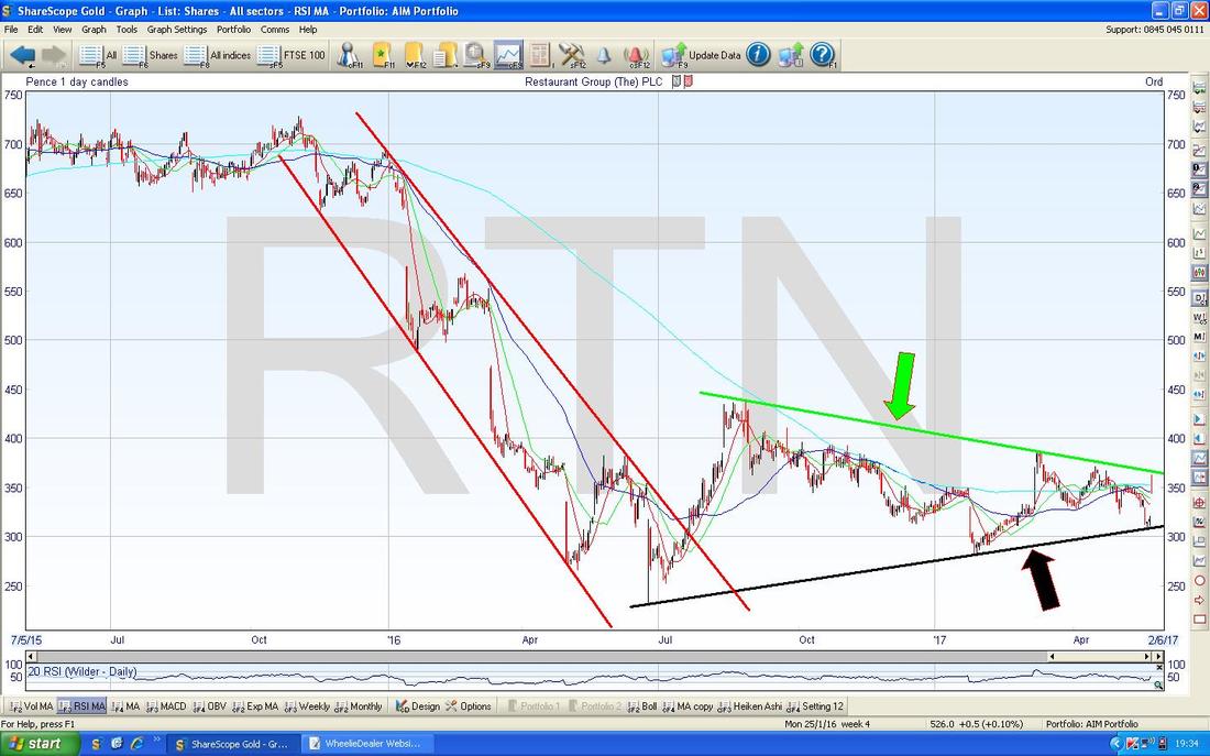
The Screen below has the Daily Candles for RTN over about 2 years or so. Firstly note the Downtrend Channel on the Left which is marked by my Parallel (ish) Red Lines and how the Price walked out of this Downtrend in July 2016. The interesting thing now is that we seem to have a Triangle (Toblerone) formed between my Green Line at the top (marked by my Green Arrow) and my Black Line at the bottom (marked with my Black Arrow). How this Triangle is broken out of will determine the direction for coming Months - if it breaks upwards out of the Green Line then Bulls will be chuffed but it is Bad News if the Price breaks down below the Black Line.
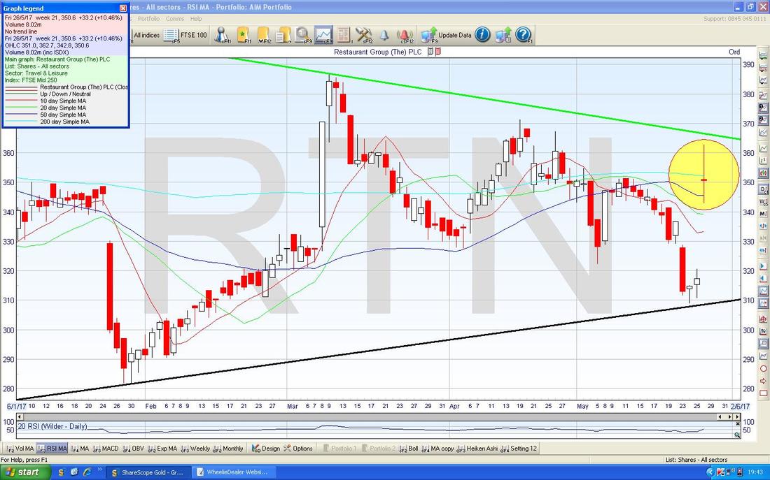
On the Chart below I have zoomed in to show the ‘Long Tails Doji’ Candle which we got on Friday 26th May which is captured in my Yellow Circle. Note how it got very close to the Green Line from my previous Chart during the Day but did not Break-out and the Price fell back to close at 350p. The other thing of note here is that the Darker Blue 50 Day MA is below the 200 Day MA still - Bulls on the Stock should be looking for a Golden Cross when the 50 crosses over the 200 - that would be a Buy Signal for more gains in the months ahead. I do not hold RTN.
Devro DVO
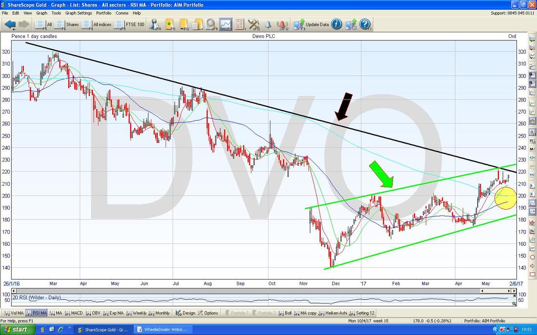
This is a Stock I hold and I recently bought more - at a current Price of 217p with a Forward P/E of 12.5 and 4% Divvy I reckon this is a great Recovery Play with plenty of upside. The Chart below has DVO Daily Candles going back about 1.5 years and the first thing to note is how the Price is in a nice Uptrend Channel as marked by my sort of parallel Green Lines. Next look at the Black Downtrend Line marked by my Black Arrow - we need the Price to break-out of this Line to be sure the Recovery is going to yield nice Share Price Gains in coming Months. To back this up, where my Yellow Circle is we are very near a 50/200 Day ‘Golden Cross’ - this would be good to see. Note also my Green Arrow on the Upper Green Line of the Uptrend Channel - if the Price breaks-out over this then we should see a strong move up.
Petrofac PFC
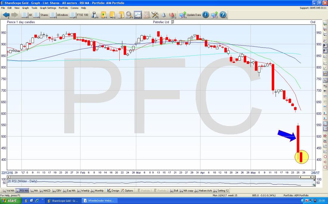
This one is a total no-go zone from me as Fraud always keeps me well away from a Stock - and in this case it looks really serious and seems to involve the Senior Directors - this could be a total wipeout for Shareholders so I see no need to be involved here on a Long Term basis, however, there might be Short Term Trades available for people of that persuasion and of course strict Risk Management such as a Stoploss is vital. I thought it might be worth a look at the Chart though. There isn’t much to go on but there is enough to tell me that we are likely to see more falls here before a proper Bounce. My Yellow Circle is highlighting a Big Down Red Candle from Friday 26th May and note how this closed at its Low Point of the Day - that is rarely a good thing. This is particularly bad because on the Day before (Thursday 25th) as marked by my Blue Arrow, we got a Big Red Down Day but note how it managed to close slightly up off the Lows at 400p - this showed there was some buying interest but sadly this was all wiped out by the further drop on Friday. For things to improve here and suggest a Bounce is on the way, I would like to see a Reversal of some sort - ideally a nice Hammer Candle with a long Tail would be such a signal.
Revolution Bars Group RBG
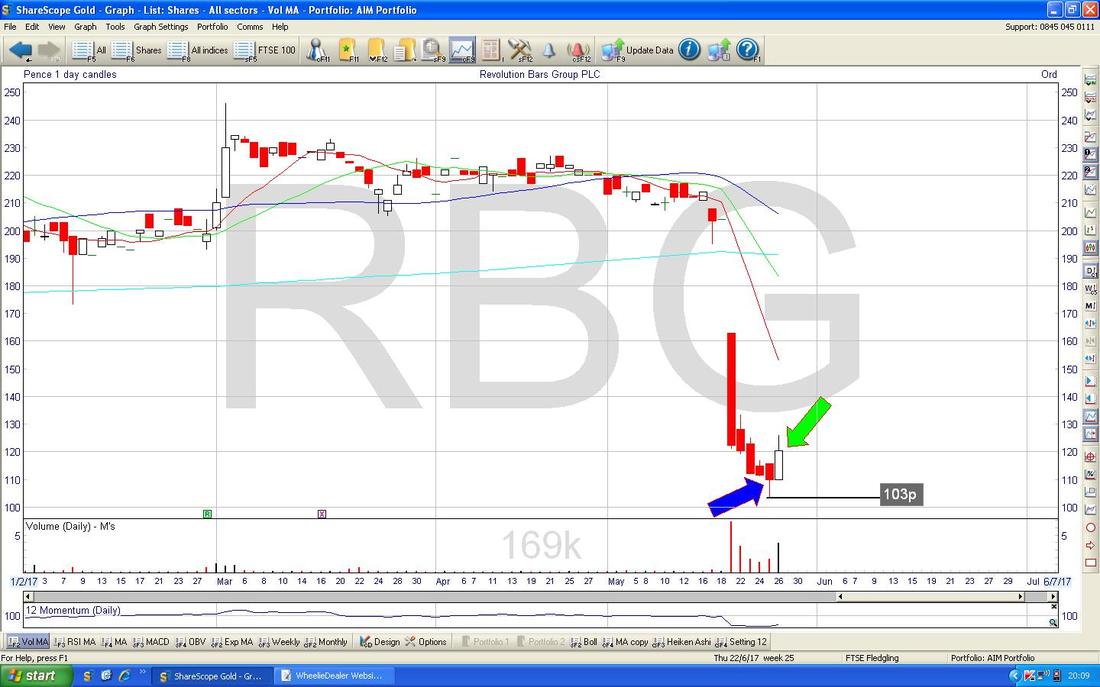
This is quite an interesting one because even though I dislike the Sector (Bars and stuff are notoriously cyclical and easily go out of fashion) the Chart suggests a bounce is likely and it looks pretty cheap at 120p on a Forward P/E of 8.4 and a Forward Divvy of 4.6%. They have been struggling to keep Financial Directors and if they can appoint one soon that would probably help the Share Price a lot. My Chart below is focused on the recent Price action and my Blue Arrow is marking a small Hammer Candle which in the context of the big drop suggests a Reversal which happened Intraday off of the 103p level. My Green Arrow is pointing to a White Up Candle from Friday 26th May which ‘Confirms’ the Hammer and suggests more upside here in the short term. Note also in the little box below that the Daily Volume was strong on the Friday as well - a good sign.
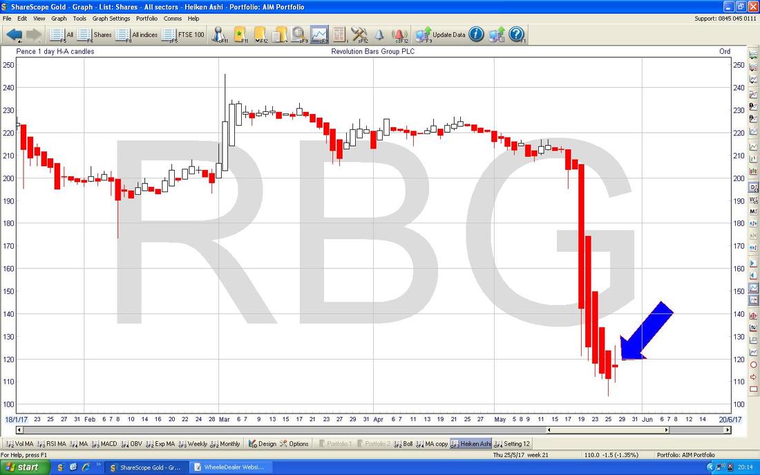
The Chart below has the Daily Heiken Ashi jobbies for RBG - my Blue Arrow is pointing to where the Red Down Candles have narrowed but are still Red. If the Price rises on Tuesday 30th May, then we should get a White Up Candle which would confirm the change of trend and predict more gains in the Short Term.
I hope Readers found those Stock Charts interesting - I have had some feedback that this is a popular addition to my Weekend Charts blogs and time permitting I will try to include some every time I do one. Let’s look at the Indexes now……..
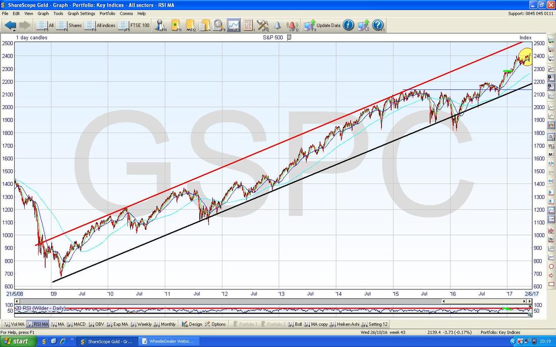
S&P500 This has the 500 largest Stocks in the US and is clearly an important Index. The Chart below goes back to the 2009 Lows and there is a very clear Uptrend Channel and my Yellow Circle shows where we are now.
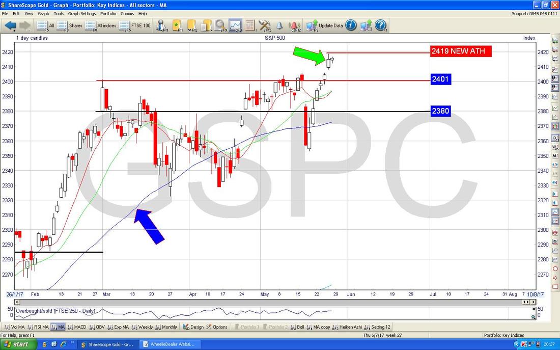
My Chart below zooms in on the Daily Candles for the S&P500 to about the last 4 Months. First off note how the Previous All Time High at 2401 was taken out last week and my Green Arrow is pointing to an Up Candle which was unable to hold the Intraday High at 2419 - this is the New All Time High and Bulls need to take the Price up over this new level. Note there is a lot of Support not far below if we do get a Sell-off and my Blue Arrow is pointing to the 50 Day Moving Average which could provide Support at about 2375.
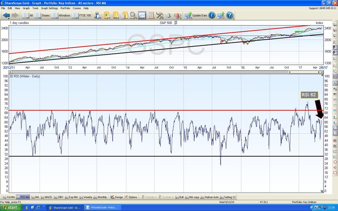
In the bottom window on the Screen below we have the RSI Relative Strength Index for the S&P500 - on a reading of RSI 62 this can clearly go higher.
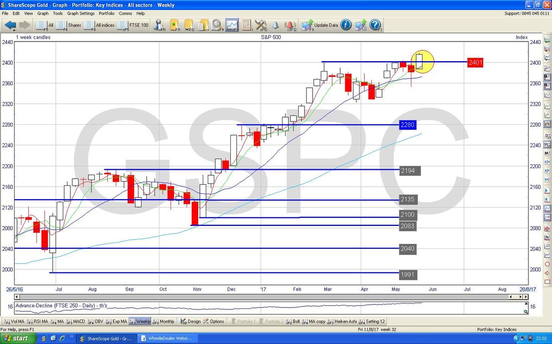
The Screen below has the Weekly Candles. My Yellow Circle is capturing a Big White Up Candle from last week and note how it has swung up off a Hammer Candle from the week before - this looks bullish.
FTSE100
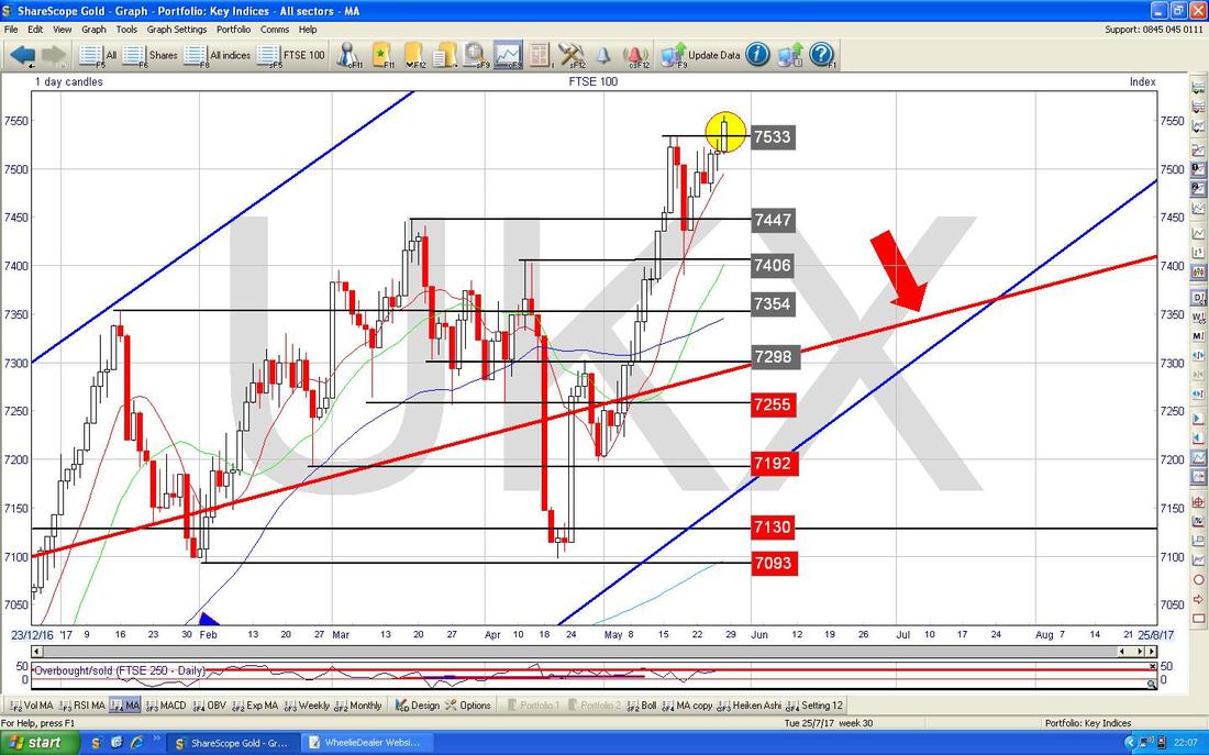
The Chart below zooms in on the Daily Candles for the FTSE100. My Yellow Circle highlights an Big White Up Candle from Friday and this suggests more gains to come - in particular note how the FTSE100 is continually breaking out to new All Time Highs and this is super bullish behaviour. As I have said in recent weeks, there is a lot of Support not far below so if we do get a Pullback, there are lots of natural levels where the Bulls will be buying.
DAX (Germany)
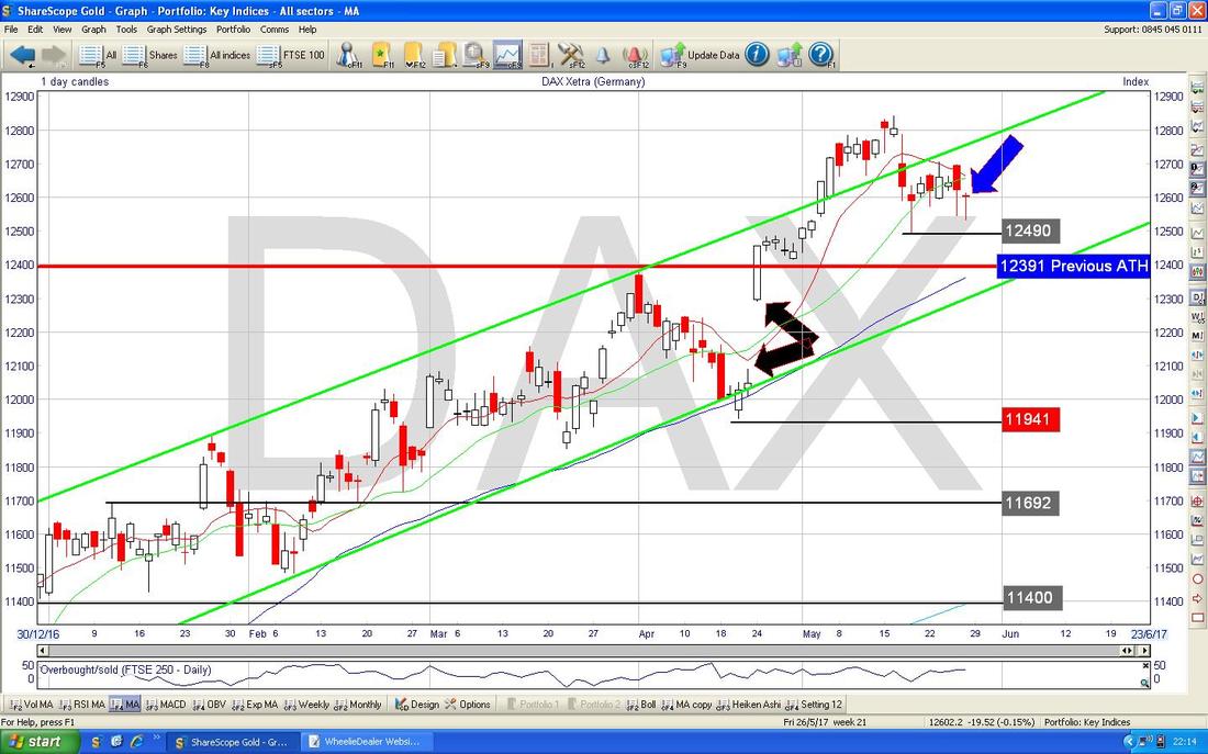
My Screen below shows the Daily Candles for the DAX going back for most of 2017. Regular Readers will have seen my previous comments on the DAX about how a Breakout over the Previous All Time High of 12391 could set up an opportunity to do a Long Trade. In the event I was not happy to place such a Long Trade but I am now stalking one again and my Blue Arrow is pointing to a Hammer Candle (arguably it is a bit of a ‘Dragonfly Doji’ which is rare) from Friday 26th May which shows an Intraday Reversal off the Low of the Day at 12529. After recent falls, this Hammer looks like it could be a Turning Point and I will be looking for an Up Day on Tuesday 30th May which would ‘confirm’ the Hammer and signal a good time to put a Long Trade on. A Stoploss below 12490 would be a good place.
Pound vs. Dollar
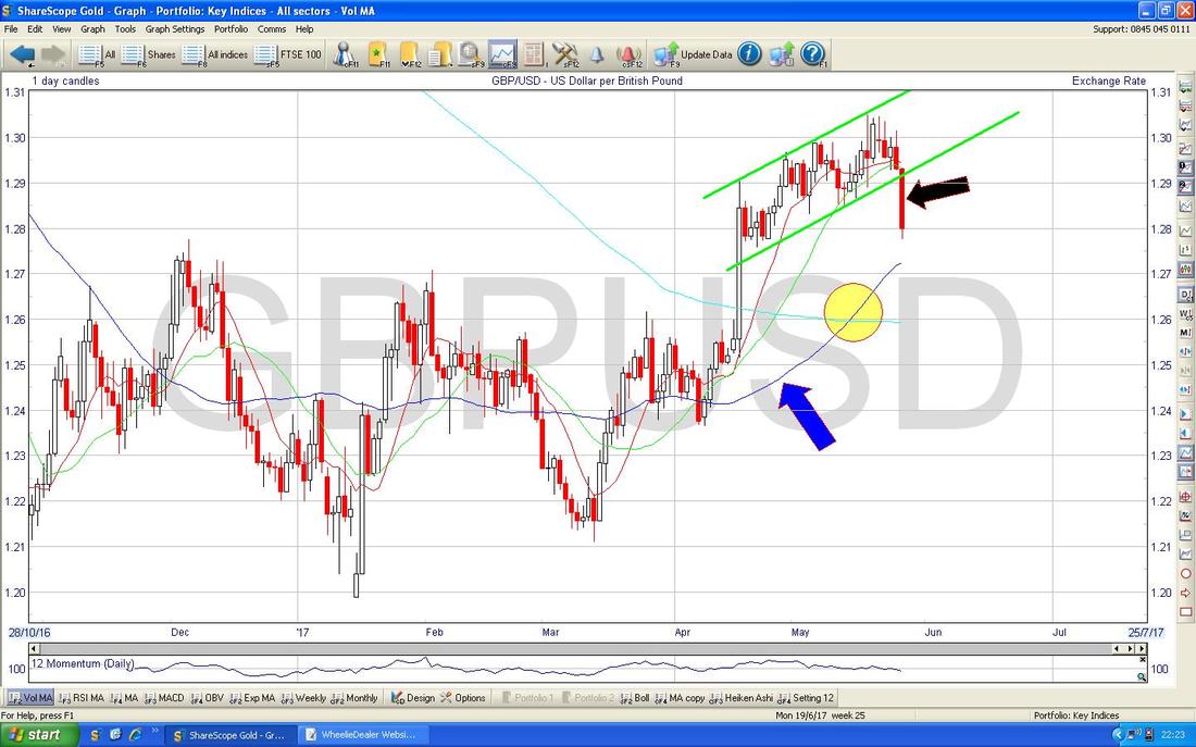
My Chart below has the Daily Candles for the £/$ and my Black Arrow is pointing to a Big Red Down Candle from Friday which was a bad development for the Pound because it fell out of an Uptrend Channel as marked by my Parallel Green Lines. However, note there is Support just below from the 50 Day Moving Average which is marked by my Blue Arrow at just over 1.27. Note also the Bullish Golden Cross between the 50 and 200 Day Moving Averages where my Yellow Circle is which is very positive for the Pound. It seems likely we could see more drops in the Pound in the very short term which would probably help the FTSE100.
Brent Oil (Spot)
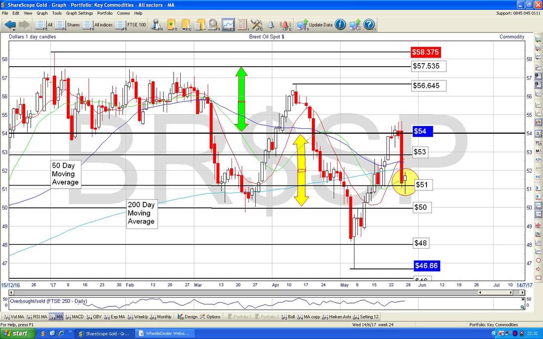
It strikes me that Brent Oil is just oscillating around the $52 price level which happens to be the 200 Day Moving Average. My Yellow Circle below is highlighting a Hammer Candle from Friday and after the Big Drop on Thursday it seems likely that there is good Support here. I don’t expect much to happen here but if anything we will probably see small gains - but it is likely that the Range between $50 and $54 will hold (as per my Yellow Arrows). Note how the Darker Blue Wavy Line 50 Day Moving Average was dropping down towards the Lighter Blue Wavy Line 200 Day MA but that rather than doing a ‘Death Cross’ by dropping through the 200, its seems to be narrowly avoiding this. It would be positive for Bulls if the Death Cross can be avoided.
Gold (Spot)
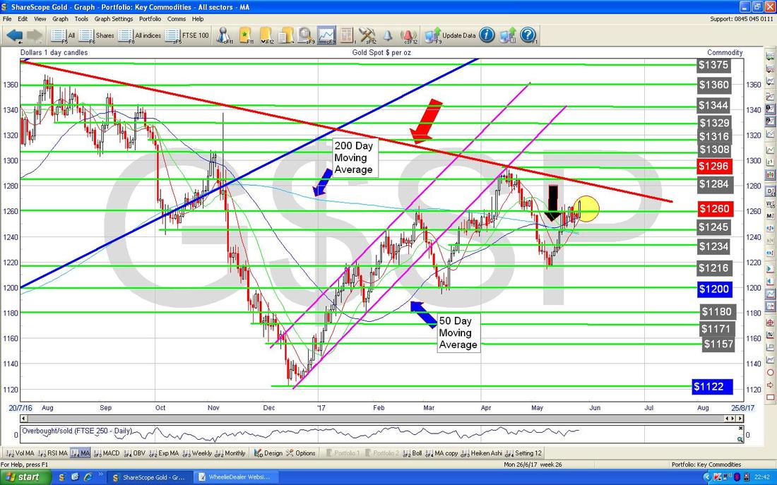
The Chart below has the Gold (Spot) Daily Candles going back about 9 months ish. The Key thing as usual is that Red Line at the top marked by my Red Arrow which is the Long Term Downtrend Line. For Bulls to make serious headway, the Gold Price must break-out over this line - so we need to see the Price back over $1300 ideally. My Yellow Circle is highlighting a Big White Up Candle from Friday 26th May - this looks bullish short term particularly because it broke over the High from the previous 6 Days or so. Note my Black Arrow which shows the 50/200 Day Moving Average ‘Golden Cross’ - this suggests Gold (Spot) can gain in coming Weeks/Months.
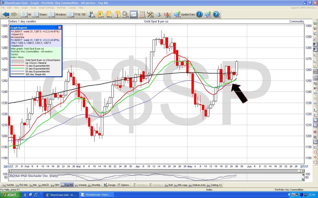
The Chart below has the Price Daily Candles with the Red 13 Day Exponential Moving Average and the Green 21 Day EMA - note the ‘Golden Cross’ where my Black Arrow is and this suggests more gains for Gold (Spot) in coming weeks.
OK, that’s it for this week - I hope everyone has some profitable days ahead, Cheers, WD.
0 Comments
Leave a Reply. |
'Educational' WheelieBlogsWelcome to my Educational Blog Page - I have another 'Stocks & Markets' Blog Page which you can access via a Button on the top of the Homepage. Archives
May 2024
Categories
All
Please see the Full Range of Book Ideas in Wheelie's Bookshop.
|

