|
I am totally frazzled today - my brain took an onslaught yesterday during a superb day with ‘Wheelie’s Summer Bash’ in full swing. I got a bit worried during the week with a few people dropping out and I had visions of me and a couple of mates and no one else there - as it happens the turnout was plentiful and easily 30 people turned up and maybe more because there were comings and goings all day and we even had 2 really interesting people turn up after 6pm which gave the day a second wind and a few of us diehards stayed until about 11pm when the Landlord shocked us all by saying we had to leave !!
After leaving the pub and dropping Mike @village_idoit off at Stirrups Hotel (as you can see it is a horsey, country kind of part of the UK and amazing it is just a few miles from my house) I ended up discussing Spreadbet DFB and Quarterly Funding Charges with my old buddy from college @InvestingMartin until about 1.30am as he was staying in my spare room. The scary thing is how it dawned on me that I have wasted £thousands and £thousands on using DFBs when Quarterlies are hugely cheaper - it was quite infuriating and didn’t exactly help my buzzing WheelieBrain calm down so I could actually sleep !!
I am so chuffed with how it went and the feedback I have had has been so positive and I think everyone found it enjoyable and sort of educational/useful at the same time - I suspect we all get the chance to meet at Conferences and Presentations and things but sometimes I reckon people just want to be able to relax in a very serene Country Pub with like minded people and just to socialise and laugh and explore various investing related topics with no judgment and a really enthusiastic and encouraging atmosphere for both experienced players and newbies alike. This was another thing that really pleased me to see - several new Investors come along and it is an inspiration to me and what I do to hear how they are progressing on their journeys and what they find of use and what is something they can do without !!
This has got me thinking about next year already and I expect to be organising a similar kind of thing (I say “organising” but that is a bit hilarious because all I do is wait for Aston Girl @Reb40 to tell me the date she can get down South and then I just put a few sentences on the Homepage and send out the odd tweet !!) and I now have a much better idea of how many people can attend realistically and I will therefore probably put in more effort to get a higher attendance but without going silly. This year I got a bit panicked fairly soon after I announced the event because the initial response was unreal and I quickly got around 30 Names of people wanting to come and then I got worried that I couldn’t fit many more in so I stopped shouting about it and ‘advertising’ the event - I am sure next year if I jump up and down a bit and wave my arms (damned impressive for a Wheelchair user) then a lot more people will be aware and want to come along. I had quite a chat with the Landlord and Landlady later on and they were very happy with how things had gone and I thanked them for the job they had done - clearly they would be happy to provide the venue in future and from some of their comments they thought it was a great group of people and they couldn’t believe people had travelled from Scotland, Frankfurt, Budapest etc. to attend - I guess the whole Social Media / Internet / Investing/Trading thing just totally bemuses most ‘normal’ people. Anyway, of course without such a great group of people making the effort to drag themselves out to the Countryside near Windsor the Event would have been utterly hopeless - so a big THANK YOU to all of you who came and also I appreciate the positivity and the contributions you all made - such a spirit of comradeship which I suspect has been built over many hours/days/weeks/months/years etc. of us all tweeting and communicating in such ways and it is obviously so fulfilling to actually meet up with all those Twitter Pics and Handles we all see every day !! Here are some pics for those of you who were unable to attend and also for those who did attend !! As you can see we were blessed by the weather and that is 2 years out of 2 that the Summer Bash (despite being in Autumn !!) has actually delivered on the Sunshine front.
I don’t know how long this Blog will be because time is running really late and I will be under pressure to get it all done - anyway, I will crack on and try to focus on the bits that will affect our Investing/Trading immediately for the week ahead.
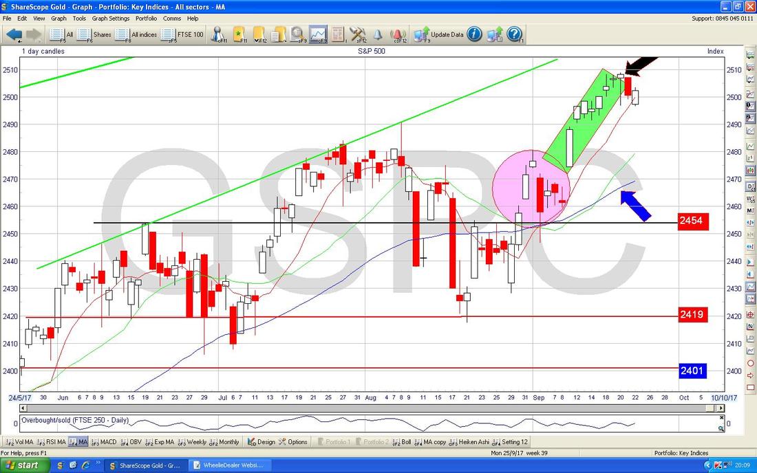
I will also try to shorten my sentences and punctuate them a bit better !! October Record Despite September hardly being the most exciting month we have ever had, so far, with really just 1 week left, it hasn’t been too bad although the FTSE100 has dropped quite a bit and the day to day volatility seems really high at the moment and I find my own Portfolio has no clear direction and the Stocks are up and down like yo yos. In many ways I would prefer days when there is some direction with the majority of my Stocks falling or preferably rising - but lately they are all over the place. Last week I had a strange one with my Portfolio dropping each day for Monday through to Thursday inclusive and I was getting pretty fed up with it all by the time Friday came around - but then there was some sort of unexpected miracle on my Stocks and I ended the week dead flat on where I started - very surreal I tell you but sums up how crazy the Market is. In terms of trading I didn’t really do much - I guess the ‘highlight’ was putting a very small Short on the S&P500 on Thursday Night (as always, please see my ‘Trades’ page for a full list of what I am up to) after seeing in particular the DOW have a strong run up of White Up Candles which just looked precarious and when I saw an ‘Inverted Hammer’ Candle I thought it would be rude not to short the little beauty - I will cover more on the Chart in a mo. Other than that I think I might have topsliced some stuff again as I am trying to lower my Spreadbet exposure and to build my Cash up - it is no big panic but Autumn can be such a funny period and I am reluctant to be so over-exposed on the Long Side. I am still working on a Stock Blog for a Company I am very interested in but I am in no rush to actually pull the trigger on buying the Stock and/or actually getting my backside in gear and finishing the Blog. I also made a start on an Epic Blog Series about Income Portfolios - that is a work in progress but I made a cracking start on it and I think it is something Readers will be very interested in - much of it will be quite an eye-opener to many people I think. Another great side effect of the Summer Bash is that the many discussions yesterday also threw up some Blog ideas and in addition there may be a possibility of another Video thing in time but that is merely a foetus of an idea at the moment. I am supposed to be talking about October in this segment - clear evidence of my burnt out Brain tonight !! Right, October in recent years (according to my slightly Out of Date UK Stockmarket Almanac) has given a positive Return of 0.7% on Average and this means it is the 5th Best Month - not bad despite the horror stories that often surround Autumn and October in particular. The reason for the Bad Repute is because apparently since 1984, 7 of the 10 largest one-day Falls have happened in October - that’s some record !! On the flipside, in the last 22 years (remember my Almanac is for 2016) the Market has only fallen in October 5 times - so it has quite a good recent history (so say only December beats this and we all know that is a stonkingly brilliant month). In a typical October the Market tends to rise for the first 2 weeks but then fall back but ends with a strong upwards surge in the last few days - in fact, the Last Trading Day is the strongest of the year. The Almanac explains this late surge by saying that this marks the end of the 6 Month weak Summer Period for Markets and Buyers are trying to get in and position their Portfolios for the stronger Winter Months. Maybe this makes some sense. Of course we have just had the German Election taking place but the Result is not known to me at the time of writing this Blog (although an Exit Poll seems to say a Merkel Win and the Far Right getting some Seats) - however, my hunch is that the Markets are already pricing in a Merkel win and I cannot see this turning out any different - there have been many political shocks of late but that one is way out of bounds. Therefore I cannot see this having much if any impact on the Markets. S&P500 We’ll kick off with this one because I shorted it last Thursday and I want to get a clear fix in my mind on how things are shaping up - remember, one of the beauties of the garbage I write is that it is very much based in reality (“WheelieDealer - Investing in the Real World” as it says on some versions of my Business Cards - collector’s items you know - bit like pagani stickers but without the fun) and when I am doing these Charts I am actually just pointing out exactly what I am looking at and this is just the process I have to go through whether or not I produce a Charts Blog. I won’t go into loads of back history because we all know the S&P500 has been making New All Time Highs and is undoubtedly extremely Bullish - so of course putting a Short on is quite a counter-trend thing to do and there is some risk which results from this. I have zoomed in on the Chart below to just recent Days and the key thing here is how where my Green Box is the S&P500 (along with the DOW which was even more pronounced but I don’t like Shorting that one because it is only 30 Stocks and quite a weird Index in many ways) had a run up of about 8 Days on the trot - pretty amazing when you think how cr*ppy September’s reputations is. This run up then suggested a Peak with the Inverted Hammer Candle which I have marked with my Black Arrow - the next Day we got a Down Red Candle and this was the ‘confirmation’ I needed that the Inverted Hammer probably marked a Pivot Point and I decided to go for a Small Short. On Friday we got an Up White Day but note it is lower than the Red Candle from Thursday and I suspect this is a ‘Continuation’ Candle and so I am happy to leave my Short running. Down below where my Blue Arrow is the 50 Day Moving Average might act as Support around 2470 and the Pink Circle is marking a Zone of Support which might kick in if the Market does drop back - but I am happy to run the Short until I see a clear signal it is turning up again. 2490 could also be Support which is where there was a Red Inverted Hammer/Shooting Star on Tuesday 8th August - I’ll let you spot that one (remember, previous Resistance becomes Support).
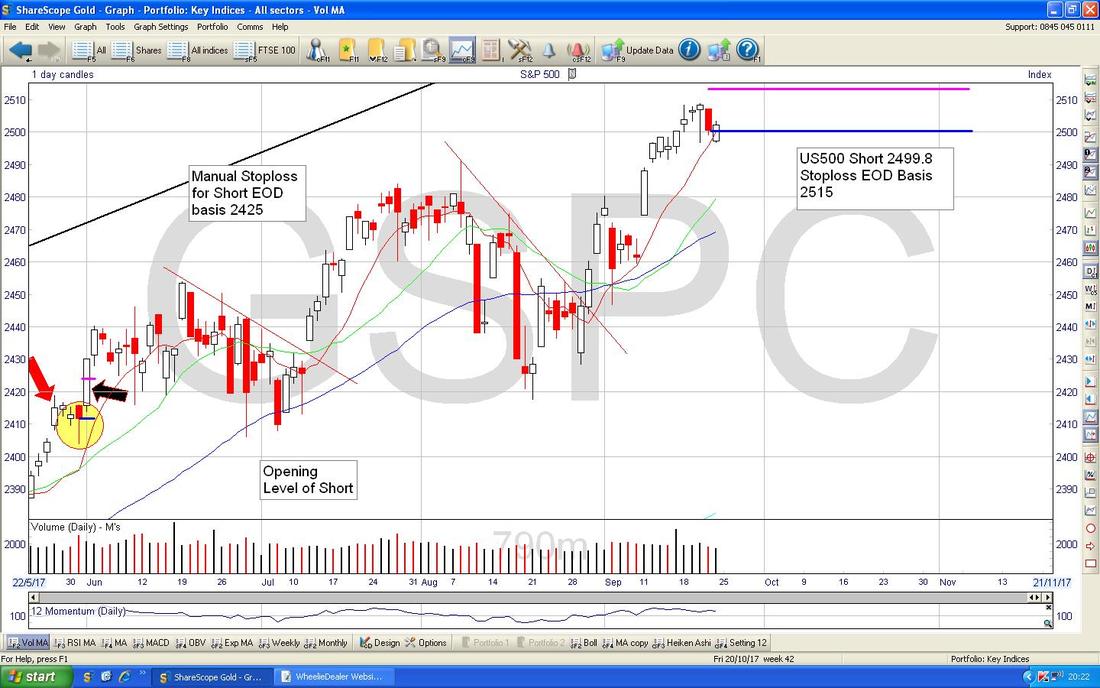
Shown below is my actual live ‘working’ screen - I am just chucking this in for Reader’s insight on how I manage such a Trade and mark up my Charts. You can see the Big Text Box I am sure which shows where the Trade was opened and says what my Stoploss is (EOD means ‘End of Day’ basis) and the Blue Horizontal Line marks where the Short was opened and the Pink Horizontal Line is my Stoploss Level. If this Stoploss line is breached on an End of Day basis, then I will be closing the Short for a small Loss.
As always the Charts are from the superb Mountain Biking Championship winning ShareScope software (that might not be entirely true, particularly because software is probably not great at cycling a bike…….).
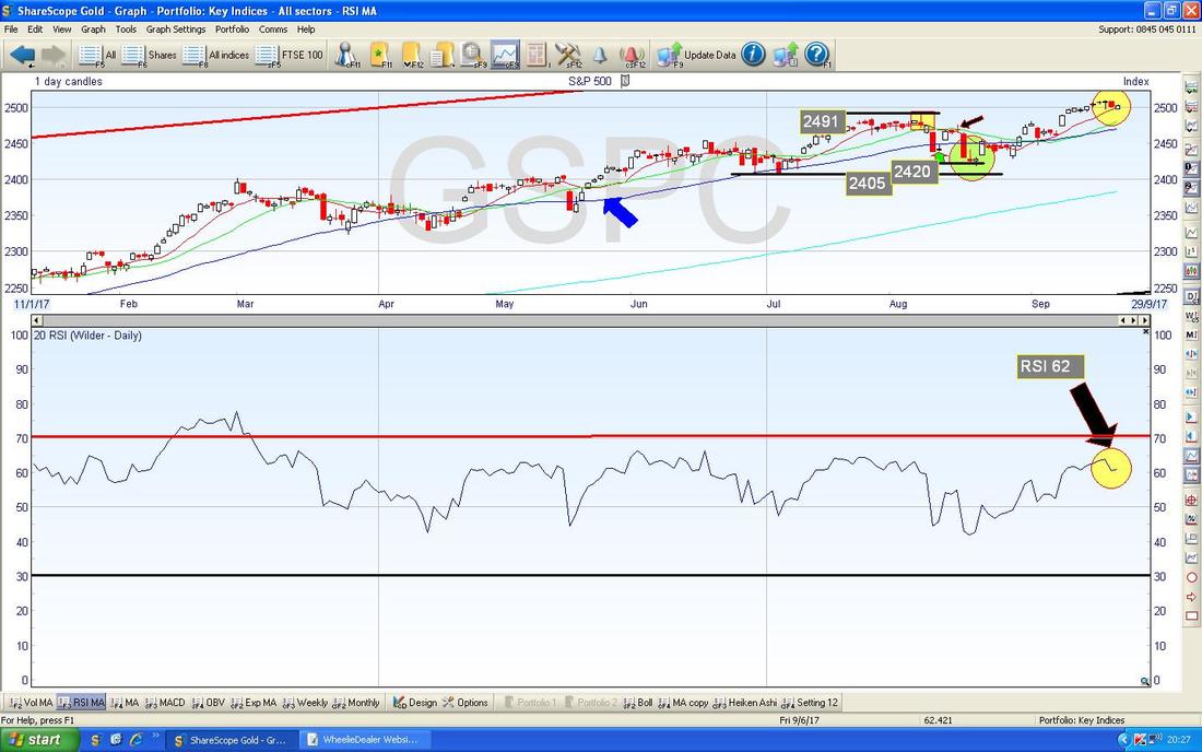
In the bottom window on the Chart below we have the RSI (Relative Strength Index) for the Daily S&P500 - note where my Yellow Circle is that the RSI has turned down and this corresponds with the Price Candles in the Window above where my Yellow Circle is also highlighting how that has turned down. On a Reading of RSI 62 it is still relatively high and can fall further.
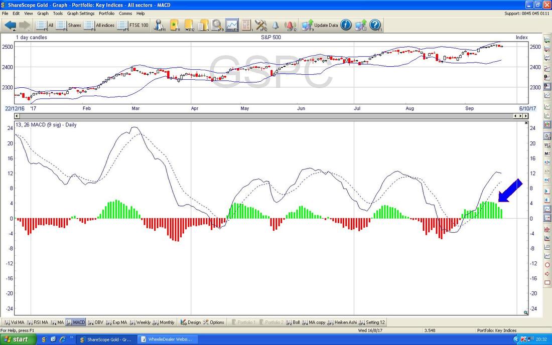
In the bottom window on the Screen below we have the MACD (Moving Average Convergence Divergence) for the S&P500 Daily and where my Blue Arrow is pointing rudely I am trying to show that the Green MACD ‘Hump’ is sort of rolling over - forming a hump really (not a Whale - concentrate damn you). This suggests the Price is falling and the Signal Lines up above are showing a similar thing in a different format.
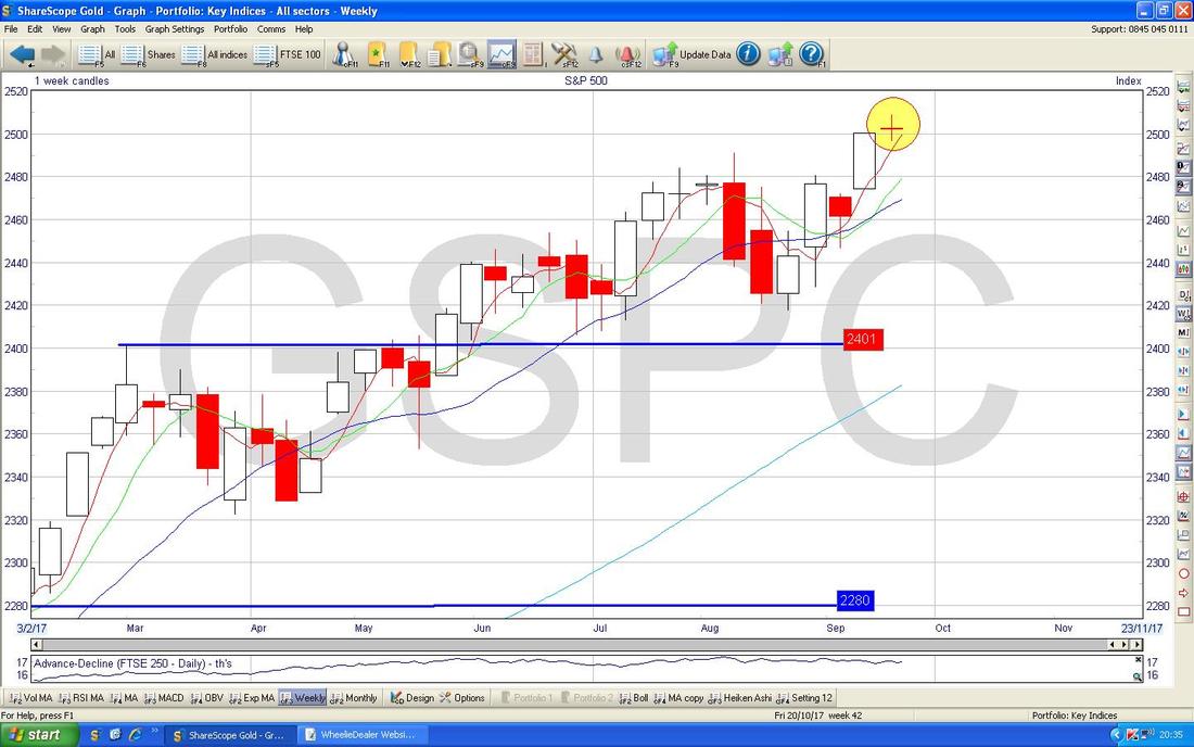
The Screen below shows the Weekly Candles for the S&P500 - where my Mellow Yellow Circle is there is a beautiful classic ‘Doji’ Candle but one like this does not necessarily mark a Reversal Pattern - although it does suggest the move up is weakening. However, as can be seen about 7 or 8 weeks before, these kinds of Dojis can sometimes prefigure a drop.
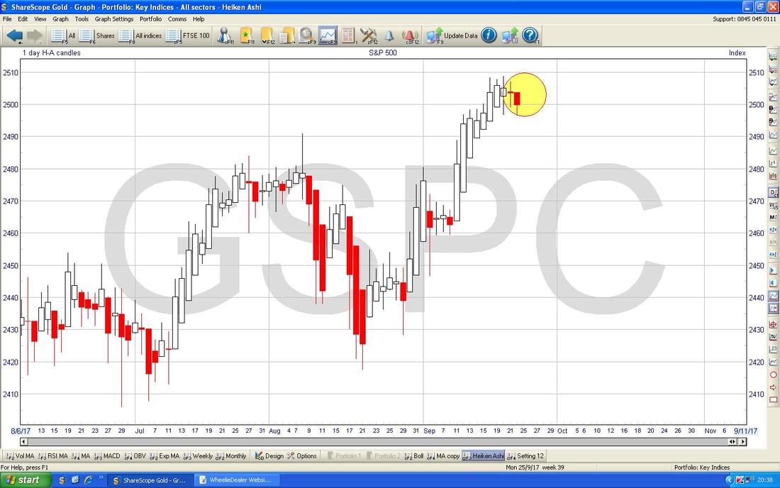
At The Bash yesterday I was droning on about how brilliant Heiken Ashi Candles are and I promised to shove a few in for Tonight’s Charts Blog - so here are the HA Candles on the S&P500 and they are particularly cute in my perverted view.
Note before my Yellow Circle that we got a run up of Large White Up Candles but then at the edge of my Yellow Circle we first got a Narrow Red HA Candle then the next day (Friday) we got a Big Red Down Candle - this suggests a Turning Point and more falls to come which backs up my analysis of the normal Candles and my Charts stuff which I have shown already. This lines up with my Short Position a treat - but as always the actual Market might totally ignore all this and carry on rising which is what my Stoploss is there to protect me against.
Telit TCM
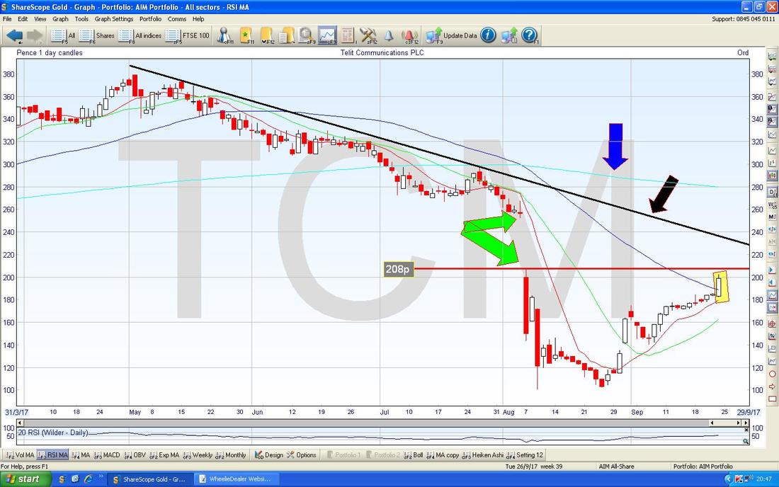
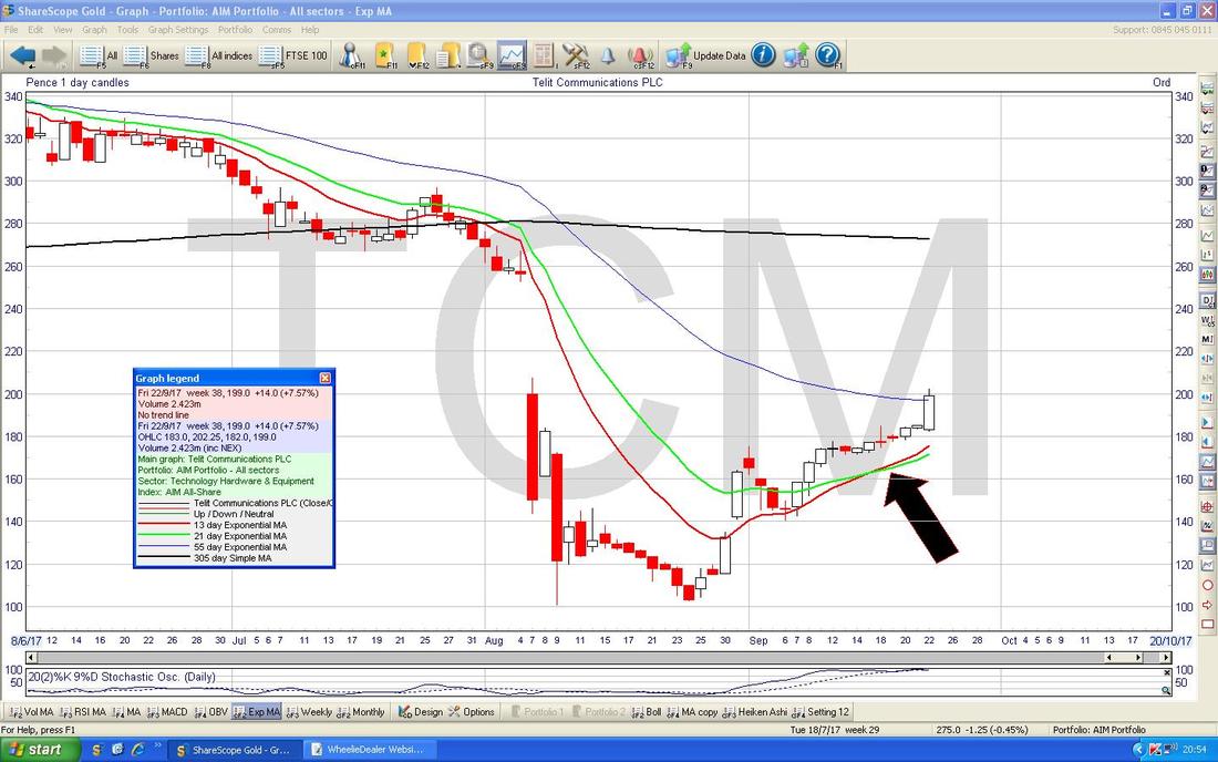
This is obviously a completely contentious Stock and it is one of my more terrifying holdings - but whether or not it is really a Fraud I have no idea. For now it is rising and the Chart is interesting as I will show below, and I am happy to ride it and see what happens. On the Chart below we have the Daily Candles and the key thing is how on Friday we got a big push up which is caught in my Yellow Rectangle - note it is now very near the ‘Breakout Level’ at 208p and if it can break above this, there is a big Gap up to about 250p which I suspect would close very quickly. My Green Arrows are pointing out this Gap. My Black Arrow is pointing to a Downtrend Line which must be broken over and this means a move above about 230p on an End of Day basis - this could occur easily if the Gap closes fast - an interesting Chart setup methinks. My Blue Arrow is showing the 200 Day Moving Average up at around 280p - this could be a difficult level to crack. As always, if you want to see the Chart in more detail, then click on it and it should get more massive in your browser (sorry about my English/Grammar there). Of course the Fundamental Story on TCM is nuts even if the Chart looks superb - however, there is most likely going to be some positive News in coming weeks as they announce the new UK based Non-Execs and all that - this could help support the Technical Picture.
My Black Arrow on the Chart below is pointing to a Bullish ‘Golden Cross’ between the Red 13 Day Exponential Moving Average and the Green 21 Day EMA - I love these because they are quite predictive and such Golden Crosses tend to mean we will see more Gains in coming Weeks. I will settle for some of that !!
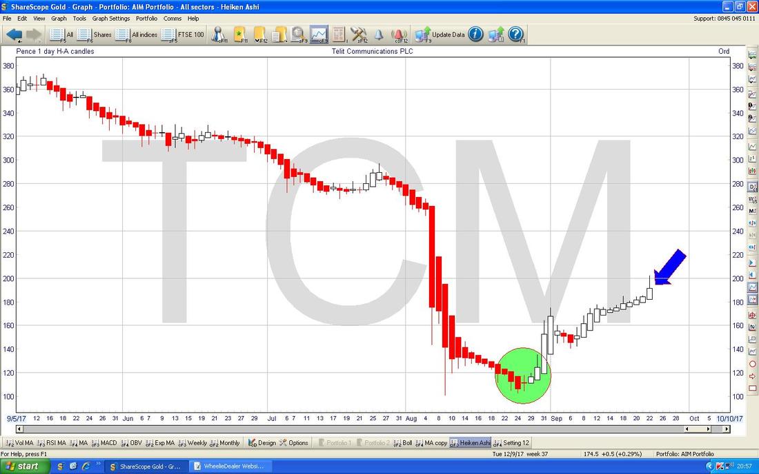
Always trying to be someone who delivers on promises, here is another HA Candle Chart. This is for TCM Daily and where my Green Circle is there is a superb example of how HA Candles can work so well. Note in the Circle how the Big Red Down Candles started to narrow and then they quickly turned White and we got Big White Up Candles - textbook that and think about how much easy money you could have made by using this as a Buy Signal and putting a huge Leveraged Spreadbet on them !!!
My Blue Arrow is showing that on Friday we got a Big White Up Candle and after all the previous White Up Candles this suggests more Gains to come. No narrowing at the moment.
Tristel TSTL
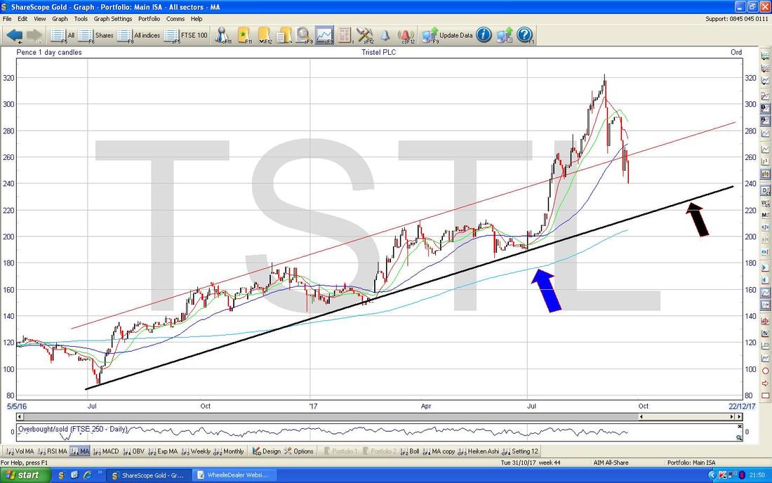
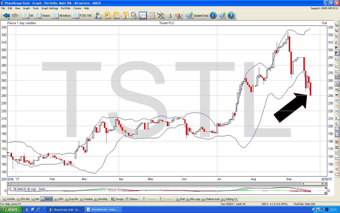
This is another one I hold and after a strong run up it has been falling back lately and the Chart is looking pretty weak - however, on a Fundamentals basis it is not cheap but I am very happy to keep holding and to ride out any weakness. Results are due on Thursday 19th October and any positive news about the US Product Launch would probably be taken very well by the Market - especially if the Shares have got a bit beaten up beforehand. First off I will look at a longer term sort of view and then focus in on more recent moves - the Chart below has a Long Term Uptrend Line marked with my Black Arrow and this should give strong Support down at about 220p - this could actually be a good Buying Area if it can turn up from this Line. A bit lower we have the 200 Day Moving Average which is the Light Blue Wavy Line which I have marked with my Blue Arrow - this is at about just over 200p.
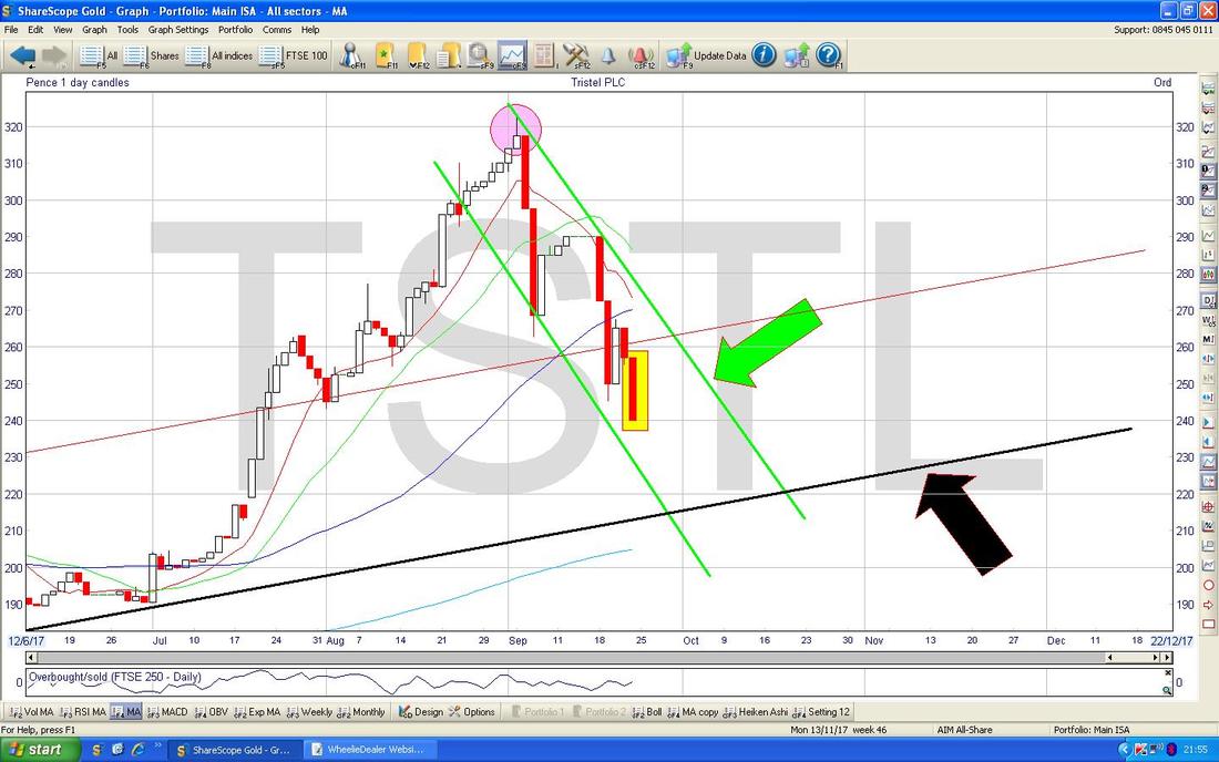
On the Chart below I have zoomed in to recent Daily Candles for TSTL and the obvious thing is the Wave Down that we are now enduring which is marked by my Parallel Green Lines - a Breakout over the Upper Green Line (my Green Arrow is pointing at this Line) would be a good sign that things were moving up again.
My Yellow Rectangle is highlighting a Big Red Down Candle and note this has made new relative Lows against the Days before - not a great sign and suggests more falls in the short term. We need a Reversal Candle (or Pattern) to indicate that Falls are ending. The Black Line with the Black Arrow is the same Support Line that I showed in the earlier Chart. Up at the top my Pink Circle is showing a cracker of an Inverted Hammer - note how this marked the ‘Turn’ and the Price pivoted down off this after the strong move up. I show this for educational purposes only !!! (hopefully I will learn something).
The Chart below has the Daily Price Candles for TSTL with the wiggly Blue Bollinger Bands above and below the Price Line. My Black Arrow is attempting to show where the Big Red Down Candle from Friday is overshooting the Bottom Band - this might hint at a Reversal soon although the Price can ‘hug’ the Band for a while.
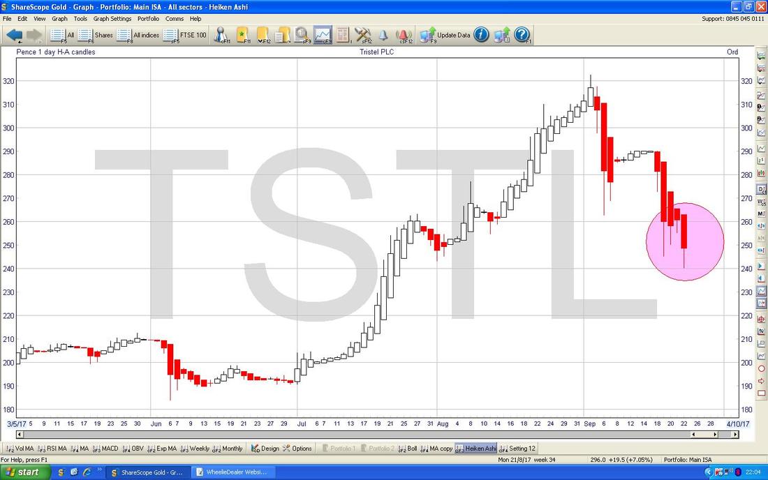
In praise of the Gods of Heiken Ashi (see, I am a bit religious !!) the Chart below is for TSTL and where my Pink Circle is we are getting Big Red Down HA Candles and this suggests the drops haven’t ended yet.
88 Energy 88E
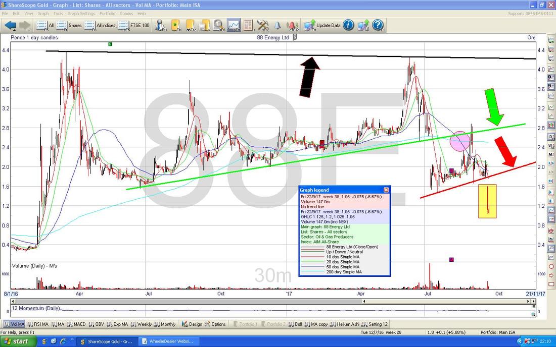
I imagine a few Readers hold this one or at least are very aware of it as the Bulletin Board ramping on this one has been off the scale in recent years. However, it is an interesting Chart and I thought it would be an insightful one for Readers. My Chart below has a lot going on - I love such eventful Charts. This goes back about just under 2 years and if you start off right at the Top we have a Black Line (marked by my Black Arrow) which is clearly a Strong Resistance Line and I suspect if ever the Price gets back up here again (it may not !!!) then Sellers will come in here and it will be difficult to get over 4.4p. Next look at my Green Line (with the Green Arrow) which was good Support for quite some time but it broke-down (never a good thing) and after that the Price moved around for a few Months above my Red Support Line (Red Arrow) and just this last week some more Bad News caused the Price to breakdown through this Support - another negative Chart event. My Yellow Rectangle highlights where the Price is now and there might be the odd bounce but in the bigger picture this is a very weak chart (if the Price does bounce, it might be an opportunity for Holders to sell out if they so wish.) My Pink Circle is pointing out how there was a Bearish ‘Death Cross’ between the Light Blue and Dark Blue 200 and 50 Day Moving Averages - this was a hint of more trouble to come. It is worth thinking now about what happens from here - chances are it will take a long time for the Price to ‘base out’ and form good Support again and it could well be a lot lower down before this happens (assuming it does - Stocks like this often become entirely worthless). Once that is achieved and the Stock conceivably gets into an Uptrend, think about all the Resistance Levels that there will then be on the Chart. This one will probably spend a long time in Rehab before it is free of its bad habits.
FTSE100
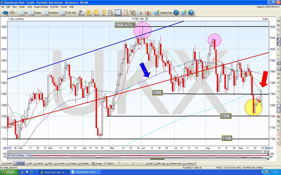
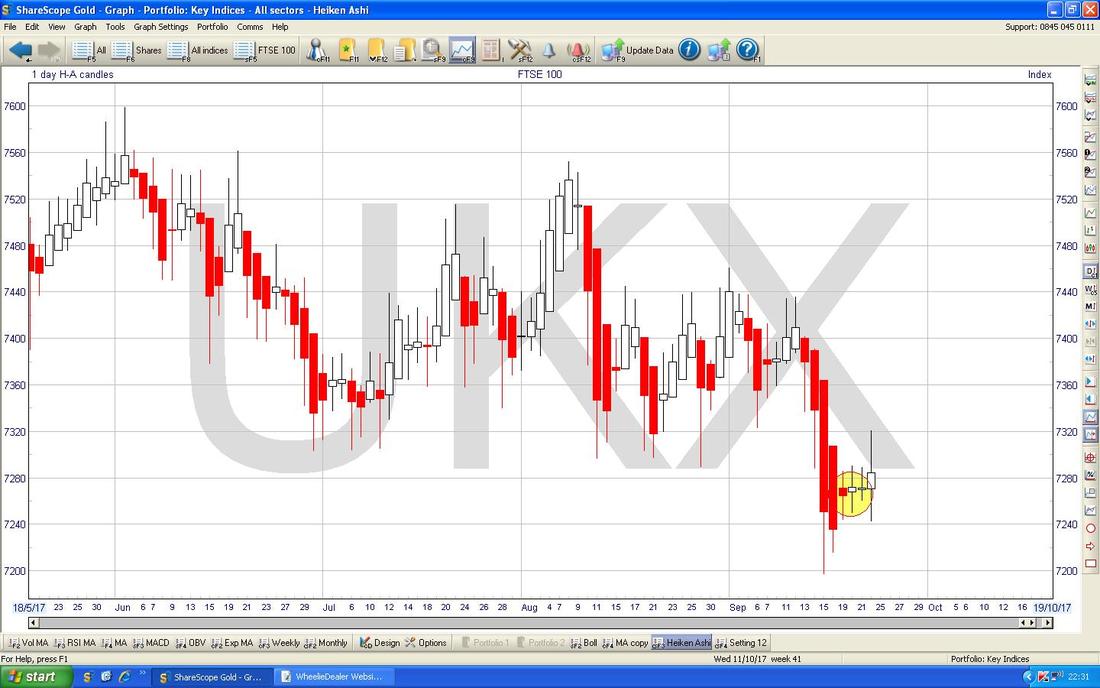
This one is moving around in quite a crazy manner as per usual but it seems to love moving in Sideways Ranges and maybe we will see more of such behaviour - this Chart is hinting at that. I have zoomed in here to much of 2017 and my Red Arrow is pointing at a Big White Up Candle from Friday but note how it hit Resistance at the Light Blue Line 200 Day Moving Average at 7320. It is worth appreciating also how there is a huge mass of Resistance between about 7300 to 7450 and I suspect this will be difficult to get through in a hurry. A major first step would be to see the Price up above 7300 again soon. Note how the Blue Wiggly 50 Day Moving Average (marked by the Blue Arrow) is moving down towards the 200 Day MA - there is a worry here that we will see a ‘Death Cross’ which would suggest more falls in months ahead. My Yellow Circle is highlighting a great example of a ‘Bullish Harami’ 2-day Candle Pattern where we get a sustained drop and then a White Up Candle alongside the last Red Down one - look how this marked the turn up. Something to be pleased about here is that there is a lot of Support just below at 7200, 7100, 7000, 6900 etc.
Cue the music……………Heiken Ashi Time !!
The next Chart has the Daily HA Candles - my Yellow Candle is showing how the Big Red Down Candles started to narrow and then turned White and since that we seem to be White again - ideally we would see Big White Up Candles now but I suspect this one will chop around a bit first !! A clear limitation of HA Candles is that they work well when a Market/Stock has clear up moves and down moves - when it is chopping around in a Range they are less helpful.
Brent Oil (Spot)
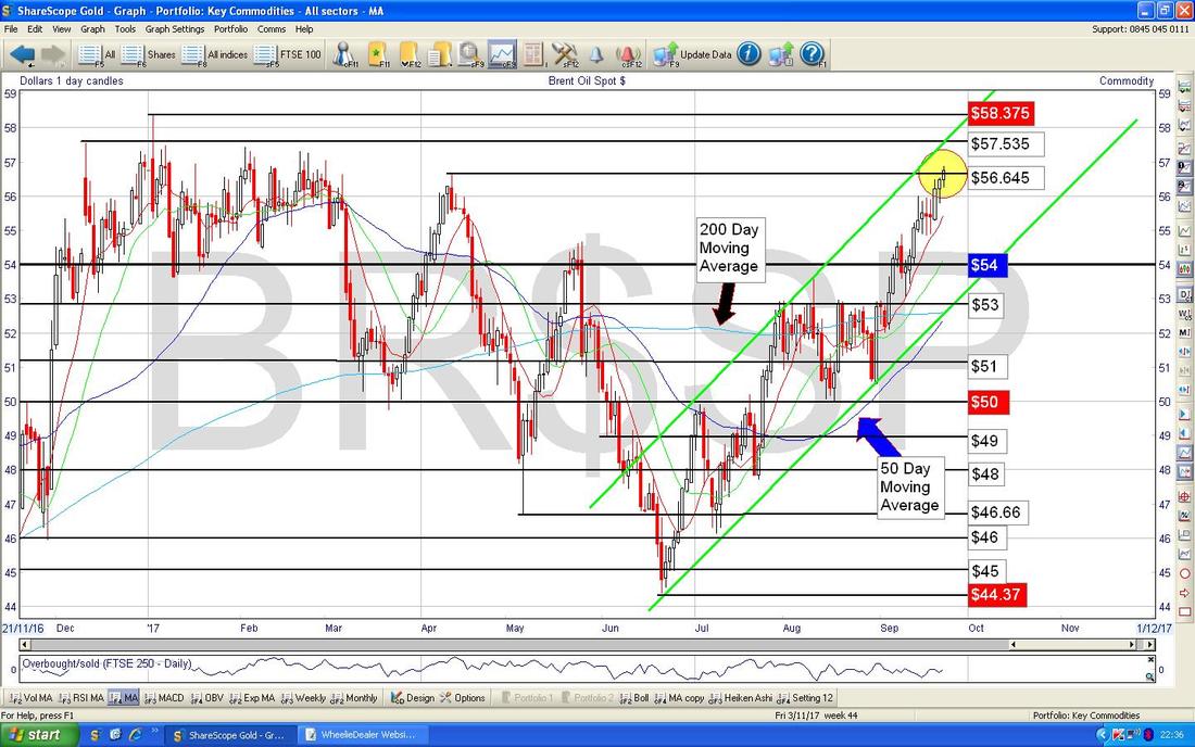
My Yellow Circle on the Chart below is showing where the Brent Oil (Spot) price is moving up and now faces a lot of Resistance at $57 and in particular $58.375 - I suspect this will be a tough level.
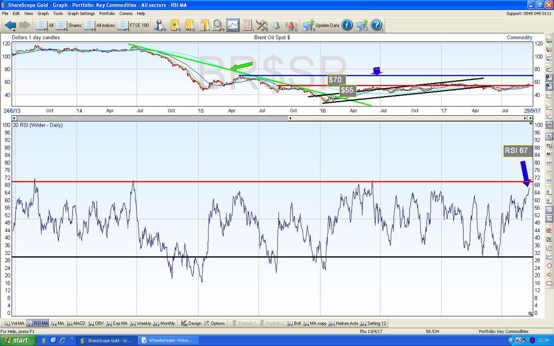
In the bottom window on the Chart below we have the RSI for Brent Oil (Spot) Daily - on a Reading of RSI 67 it is high but can go higher.
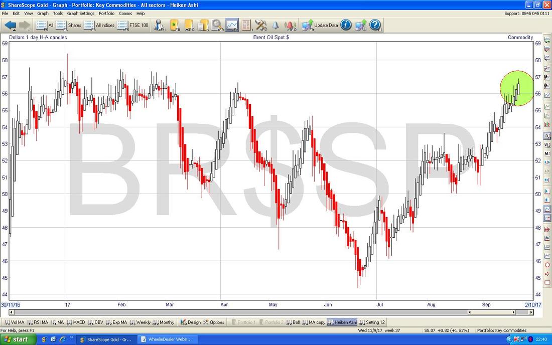
The Chart below has the beloved HA Candles for Brent Oil (Spot) - my Green Circle is showing Big White Up Candles - this suggests more gains to come and no sign of narrowing yet.
Gold (Spot)
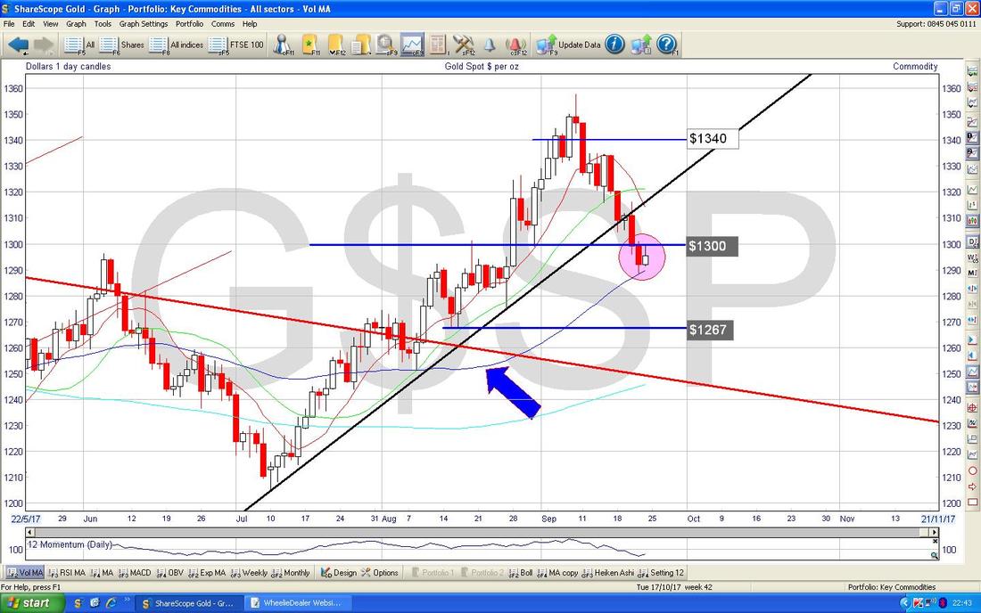
On the Chart below, my Pink Circle marks a Bullish 2 Day Harami Pattern - after about 2 weeks of drops, this suggests a Reversal and the Price could move up from here. Note how it dropped down to the Blue Wavy 50 Day Moving Average (marked by my Blue Arrow) and this has acted as Support and seems to be marking the Turn.
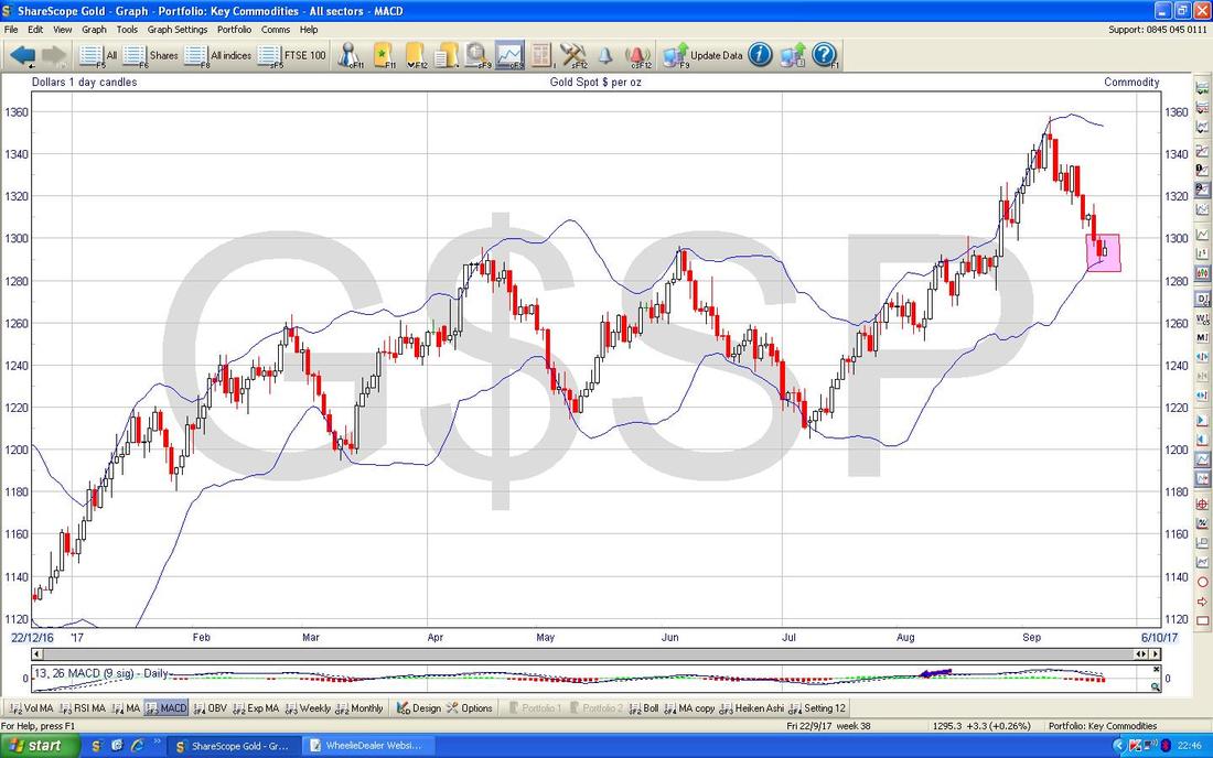
On the Chart below note how where my Pink Box is the Price has touched the lower Bollinger Band - this is quite a nice Technical Setup and supports the story told in the Chart above.
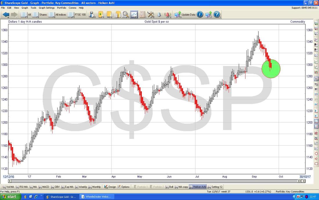
On the Chart below we have the Heiken Ashis for Spotty Gold - my Green Circle is highlighting how we have Big Red Down Candles and as yet not much sign of the Reversal up that is suggested by the Normal Candles in my first Chart. However, this is important to realise - HA Candles give excellent and clear Trading Signals but they are ‘slower’ than normal Candles - this is because they are calculated using the averages of the Prices over 2 days - so they are delayed in effect. Anyway, despite that limitation (arguable an advantage) look back on this Chart and see how beautifully HA Candles have marked the Turning Points on this Asset.
OK, that’s shallot - have a profitable week everyone !! Cheers, WD.
0 Comments
Leave a Reply. |
'Educational' WheelieBlogsWelcome to my Educational Blog Page - I have another 'Stocks & Markets' Blog Page which you can access via a Button on the top of the Homepage. Archives
May 2024
Categories
All
Please see the Full Range of Book Ideas in Wheelie's Bookshop.
|

