

|
educational blogs |
|
On November 5th a Title for my Blog is not too difficult to dream up and Miss Perry has come to my aid as well - and with Stocks shooting upwards like a Rocket it is also appropriate. No doubt there will be some Roman Candles somewhere in the Blog…..
Markets continue with their strength especially in the US and even the FTSE100 is up near its All Time High again - if it can breakout over 7600 then 8000 must be very much in sight perhaps even by Year End. After a couple of grotty weeks my Portfolio managed a nice gain of 1.4% overall last week and I am just a smidge off the All Time Highs I hit back in May - this inability over the Summer to breakout has been driving me to drink and I really hope it will happen soon - but of course anything can happen.
Having said that we are now very much in the stronger part of the Year according to Historic Trends and November tends to be an OK Month and I think December is now the Best Month of the Year - and so often we get a ‘Santa Rally’ where the markets just drift upwards in the last few Days of December. Chris Dillow in Investors Chronicle page 21 this week wrote some interesting stuff about the transition from the Summer Months to the Winter Months - this stood out to me:
“…….the past 52 winters have seen only two losses of more than 10 per cent. But the past 52 summers have seen 11 losses of that magnitude. And winters have seen 21 gains of 10 per cent or more, whereas summers have seen only 11 such gains. All this tells us that prices are often too low in the autumn and too high in the spring - consistent with investors being too optimistic in the spring and too fearful in the autumn.” (For this analysis, Chris takes Summer as May Day to Halloween and Winter as Halloween to May Day.) I won’t dwell on the reasons but there are probably deep psychological reasons which affect Humans around the onset of Winter and at the other end the onset of Summer which impact our attitudes towards buying and selling Stocks - what I am more interested in is the practical implications for us as Investors. I am aware of a lot of chatter around with regards to the level of Risk in the Markets at the moment and it is only natural after such a strong move up for People to get wary and a bit nervous that a Fall is in the offing - however, this might be a big error as we move into the strongest Period of the Year. The simple fact is that History and well-established Trends now favour further gains for Stockmarkets - you might object to this after such a strong run but this is precisely the point - our Brains try to fool us into Selling Stocks and reducing Exposure when in fact the more logical response is actually to increase our Holdings. It is precisely this Fear that makes Stocks too cheap in the onset of Winter and too expensive at the start of Summer. Having said all that, I am not in a mood to go crazy on buying Stocks but equally I see no great need to sell Stocks and now that the particularly awkward months of September and October are out of the way, I think the likelihood of big drops on the Markets has now reduced considerably. It is also worth bearing in mind that Markets which are continually pushing to new All Time Highs are in fact demonstrating some serious bullishness and going against this is in itself probably a mistake. So I am sticking to the stance I have followed for the last few Months of not really doing much - if anything I might lower my Spreadbet Exposure slightly but I am not rushing to do this and will be opportunistic in the sense that if any of my Stocks shoot up, I will be looking to bank some Profits. After so many attempts to Short the S&P500 and getting nowhere, I will be very careful with any more tries to Hedge my Portfolio and I will only get serious if I see a 13/21 Day EMA ‘Death Cross’. Income Portfolio Blogs I am slowly getting out the Blog Series on Income Portfolios and there should be Part 4 this week - it needs a fair bit of work and it is pitched at ‘Newbies’ more than ‘Old Hands’ so it might not be hugely exciting for a large part of WD Readers. Following this, I intend to produce a Blog (part written already) on the physical process of selecting Income Portfolio Stocks and I will knock up something which includes loads of possible Stocks to consider - so that should keep me busy for a few weeks. Whilst on the subject, I was chatting to a mate in the Pub the other night and he mentioned how his Cash ISAs had gone from something like a 1.75% ‘Special Rate’ back to the Standard Variable Rate the particular Bank was paying - and this meant that he was now on something insane like 0.005% - unbelievable. It worked out something like 5p Interest on £1000 of Cash Savings - clearly using an Income Portfolio approach could provide perhaps £40 or £50 in Dividend Income (but there is a Risk to the Capital). Time for some Charts…… BT Group PLC BT.A This one has come up in discussions on Twitter quite a bit this last Week and it is one heck of a minging Chart. The ScreenShot below shows a fairly Long Term view of BT.A and the obvious story here is a good Uptrend which broke back in Early 2016 and since then the Downtrend Channel marked by my Black Lines (pointed at with Black Arrows) has been dominating the Price Action. This really is ugly - there is just no sign as yet of this Stock trying to form a Base of Support and it is in freefall. My Chart also marks the really important Support Levels below - from 240p down to as dire as 120p - my hunch is that the psychological level of 200p is the most likely Area where the Stock might find some stability. In the very Short Term we might see a bounce, but I doubt it would be sustainable - this Stock looks hated to me and of course it has fundamental problems galore (Pension Fund, Accounting Problems in Italy, Competitive Pressures, Regulator Grief). I note that ShareScope is showing a Forward Dividend Yield for 2019 of 6.5% - the Price behaviour here implies that the Market thinks that Dividend is at risk of a cut. This also means that to be a Bull on BT.A at the moment you need to believe that the Dividend is sustainable. You have probably figured out from my comments that I don’t hold BT.A !! 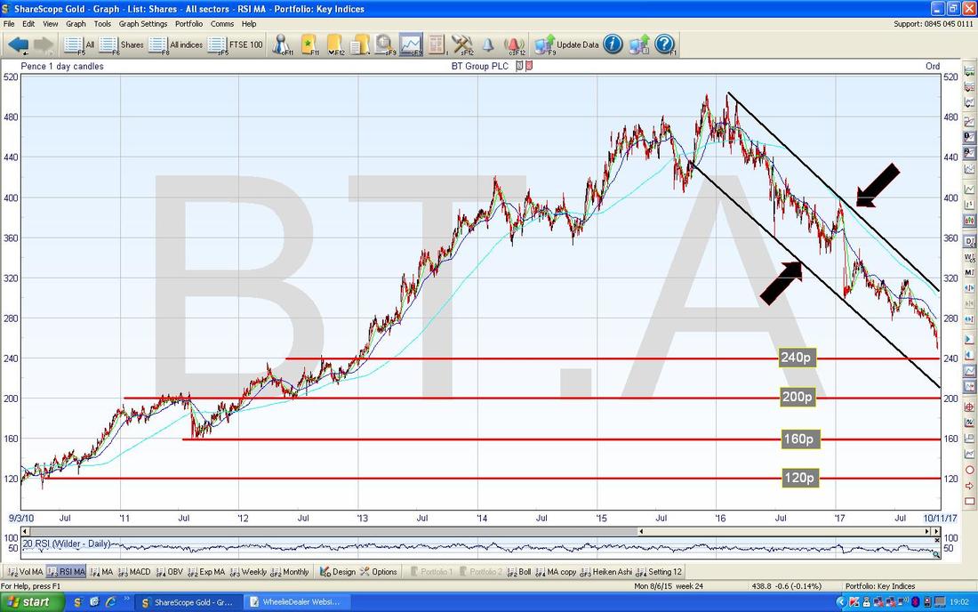
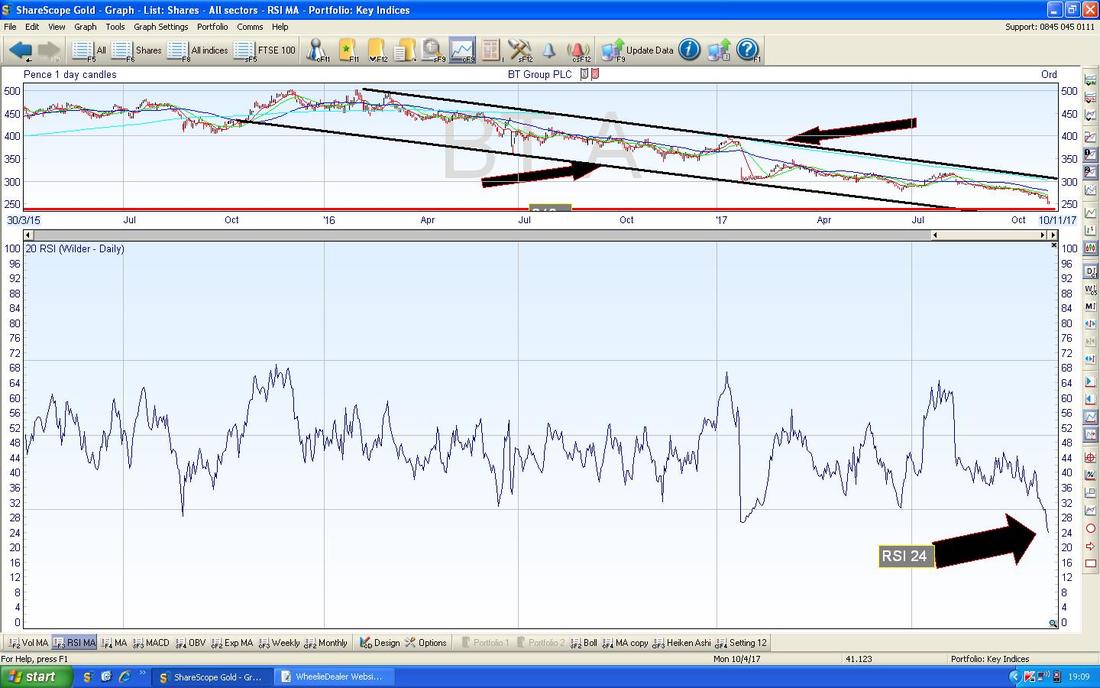
The Bottom Window on the ScreenShot below (as always, these Piccies come from the historically significant ShareScope Software that I use. Most people are totally unaware that its predictive powers were used to trap Guy Fawkes before he could blow up the Pestminster Parliament all those years ago - clearly it’s a shame he failed and we can blame ShareScope for that !!) has the Relative Strength Index (RSI) for BT.A on the Daily and with a reading of RSI 24 this is extremely low and a Bounce is highly likely soon.
On the Screen below we have the Daily Candles for BT.A with the Blue Squirmy Bollinger Bands above and below it. The Yellow Circle is highlighting a Red Down Candle from Friday and as yet it is not really looking like a ‘Reversal’ Candle - this suggests to me that we might see another drop before it Bounces despite the extremely low RSI. An ideal example of such a Reversal Candle would be a Hammer or maybe a Bullish Harami 2-Day Candle Pattern - see what happens on Monday 6th November at the Close.
Note the Candles are ‘hugging’ the Bottom Bollinger Band on the way down - as yet the Price is not really ‘Outside’ of the Bands - such a move would make a Bounce more likely as the Price tends to hate being outside the Bands. 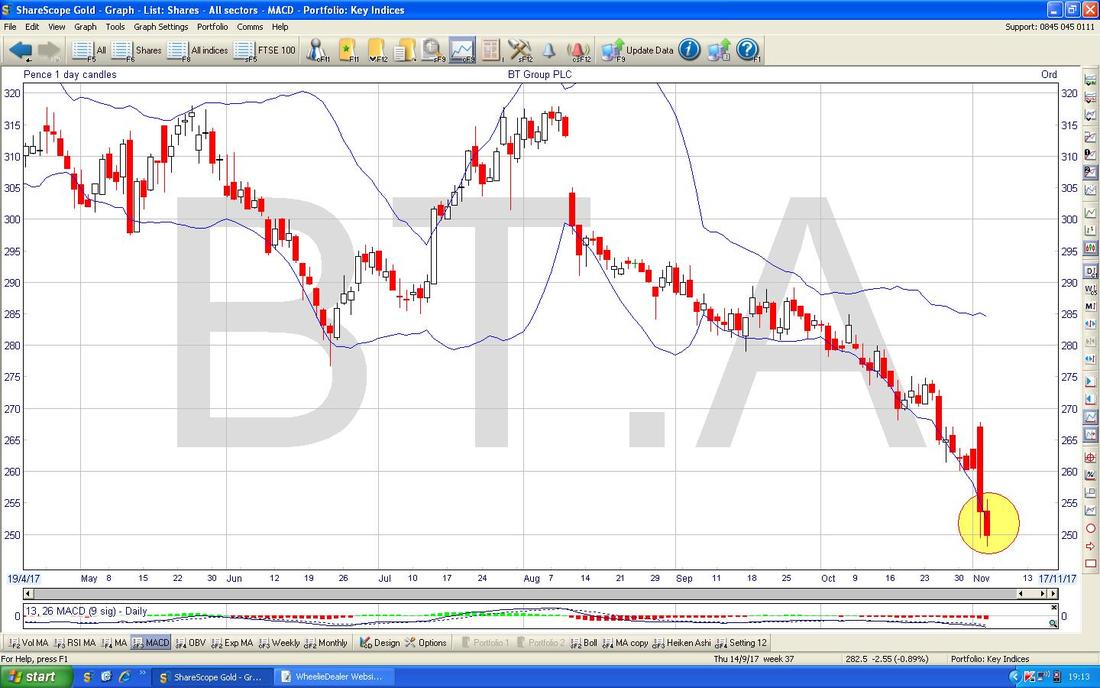
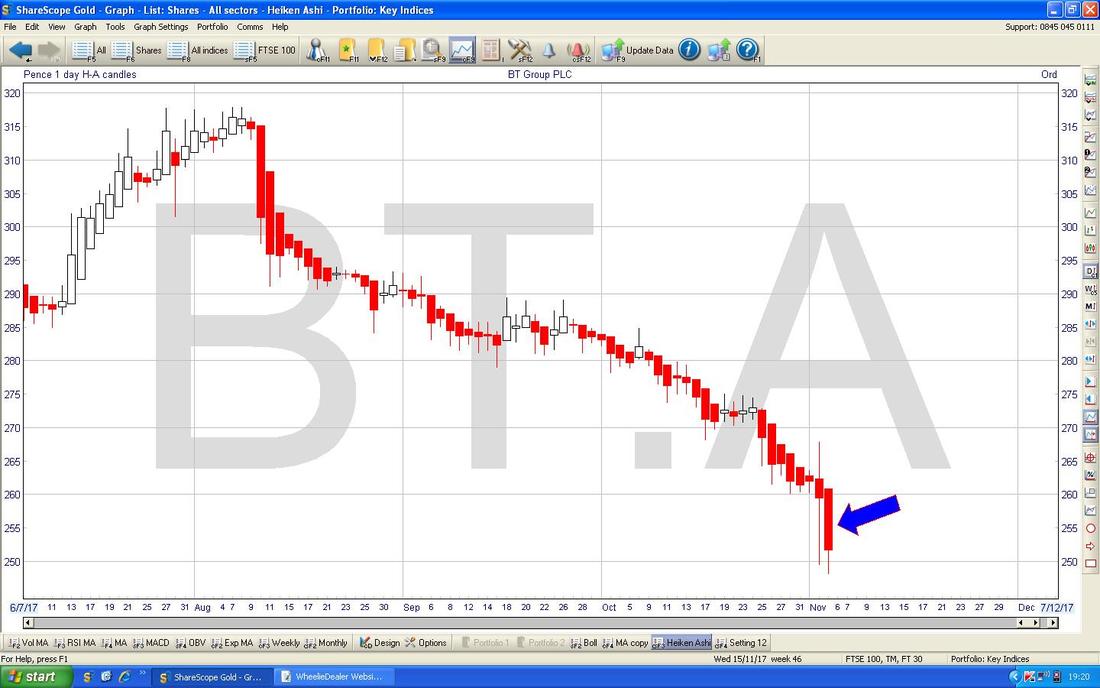
My Screen below has the Daily Heiken Ashi Candles for BT.A - my Blue Arrow is pointing to a Big Red Down Candle from Friday - this implies more falls and as yet there is no sign of any ‘Narrowing’ of the HA Candles, let alone them actually turning back to White (which obviously Bulls require).
McCarthy & Stone MCS
I hold these and they have been pretty frustrating for ages (in other words they keep dropping and have been a total Woofer for me !!) but maybe there is some light at the end of the Retirement Homes Tunnel. MCS is on a Forward P/E of 8.9 and a Forward Divvy of 3.7% - compared to other Housebuilders this isn’t particularly attractive but compared to the past history of MCS, it is not so bad. Starting off we have a Picture going back to the back end of 2015. The main thing here is the Downtrend Line I have shown in Black and marked with the Black Arrow - and note how the Price has recently moved above this Black Line - we will look closer at this in a few secs. Lower down the Chart we have a Green Line (Green Arrow) - this is Support and needs to hold whatever else transpires. 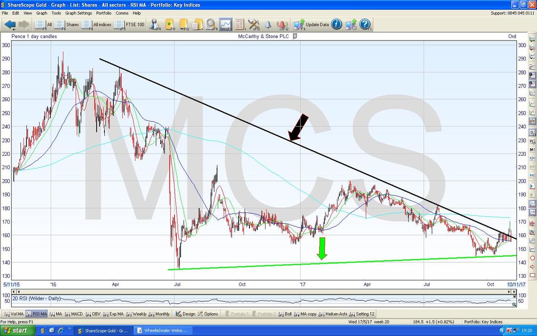
This next Chart is very interesting (and rather disappointing !!) - this zooms in and shows the Daily Candles much clearer (as always, if you click on the Pictures then they should grow much bigger in your Browser thing). Note my Yellow Rectangle which captures a ‘Shooting Star’ Doji Candle from Thursday last week and then on Friday we got a Big Red Down Candle which is pointed at with my Red Arrow - this suggests a ‘Breakout’ of the Black Downtrend Line which is now looking like a ‘Failed Breakout’ because the Price has come back inside the Black Line - not great at all.
At least with a closer look we can now see where the Green Support Line is likely to come into play - this looks to be at about 145p ish and that Level must hold. 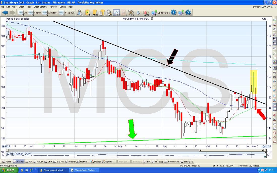
BAE Systems BA.
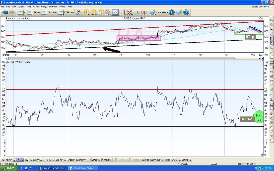
I hold BA. in my Income Portfolio and as a Long Spreadbet so I wanted to have a look at the Chart. In terms of numbers, on a Forward P/E of 13.7 and a Forward Dividend Yield of 3.7% it looks reasonably valued and sadly demand for Weapons is unlikely to reduce. The Chart below goes back to 2011 and the main thing I am looking at here is the Black Uptrend Support Line marked by my Black Arrow - this seems to kick in at about 530p. 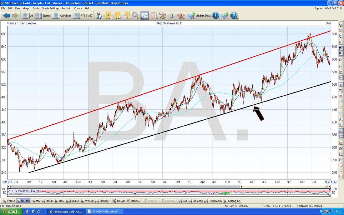
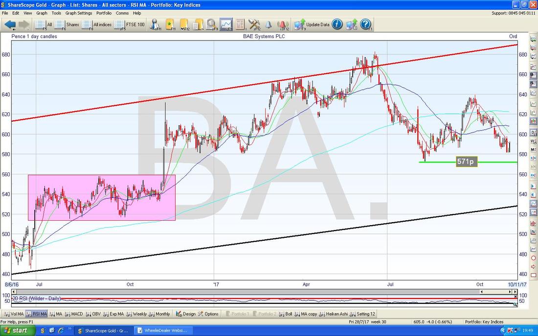
On the Chart below I have zoomed in to about the last year and a bit - note my Green Line at 571p which is important nearby Support now and if this fails to the downside, then Support from the Area marked by my Pink Box will be crucial - this runs from about 515p to 560p.
On the Chart below the Key Thing is the Blue Downtrend Line (Blue Arrow) and it is vital for Bulls (i.e. Me !!) that the Price breaks-out over this Line. My narrow Yellow Rectangle is capturing a Big White Up Candle from Friday and after the ‘Star’ Doji from Thursday this shows the Price has turned up - however, it needs to build on this now and breakout of that Blue Line.
This Chart gives more clarity on the Support at 571p also. 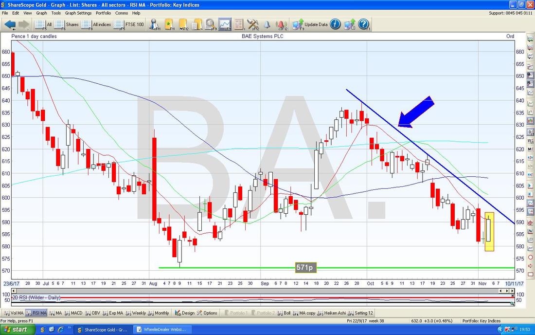
In the bottom window on the ScreenShot below we have the RSI for BA. Daily. On a Reading of RSI 42 it is quite low and note where my Green Circle is that it seems to have built some sort of Base and is moving up - this is promising as it shows a Divergence with the Price which seems to be falling mostly in recent Days.
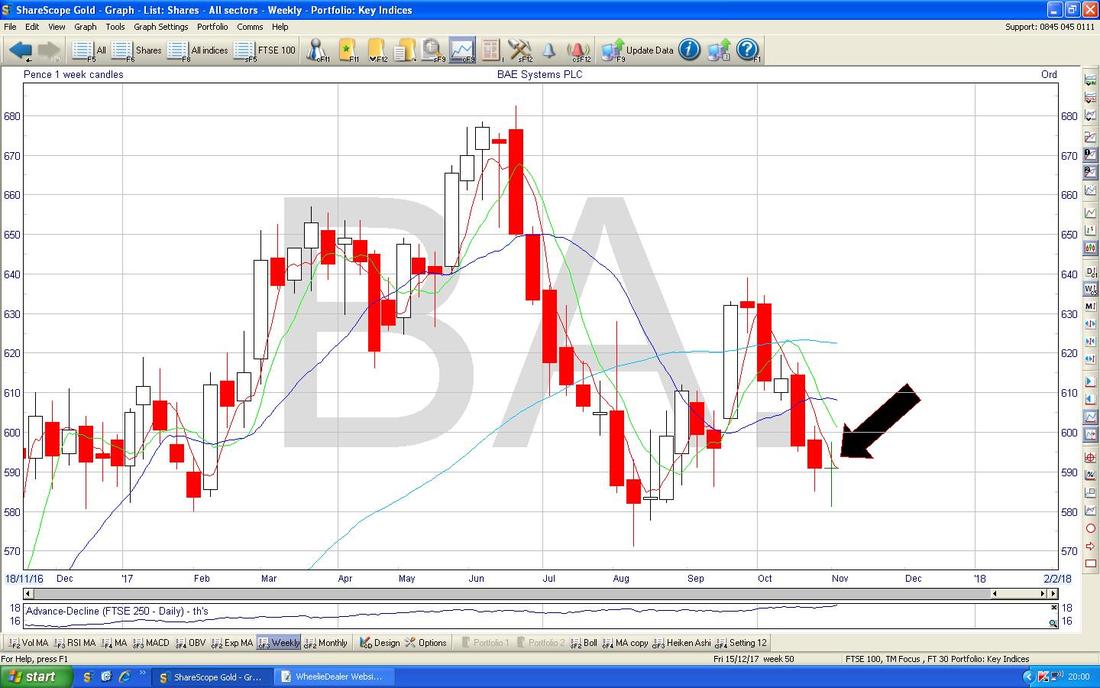
The Chart below has the Weekly Candles for BA. - my Black Arrow is pointing to a nice Narrow Body Doji which could well mark a Reversal after the Falls of prior Weeks - this is promising for Bulls.
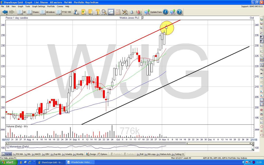
Watkin Jones Group WJG
I don’t hold WJG but it is one that has been getting a lot of coverage lately (often that is a bad sign !!) and it has a belter of an Uptrend Channel going on. WJG sits on a Forward P/E of 16 (less if the Cash is stripped out) and a Forward Divvy of 3% - fairly attractive numbers for a business which seems to be doing very well and with a large Order Book which covers much of the Earnings Forecasts. This is a fairly recent IPO but it didn’t really start seriously moving until early this year and the Uptrend Channel below shows the very well-defined Price Moves since then. The Price is now up at the Top Line (in Red with Red Arrow) and there should be strong Support from the Black Line (Black Arrow) at the bottom. This Stock clearly has Momentum and you would be daft to fight ‘The Big Mo’……. 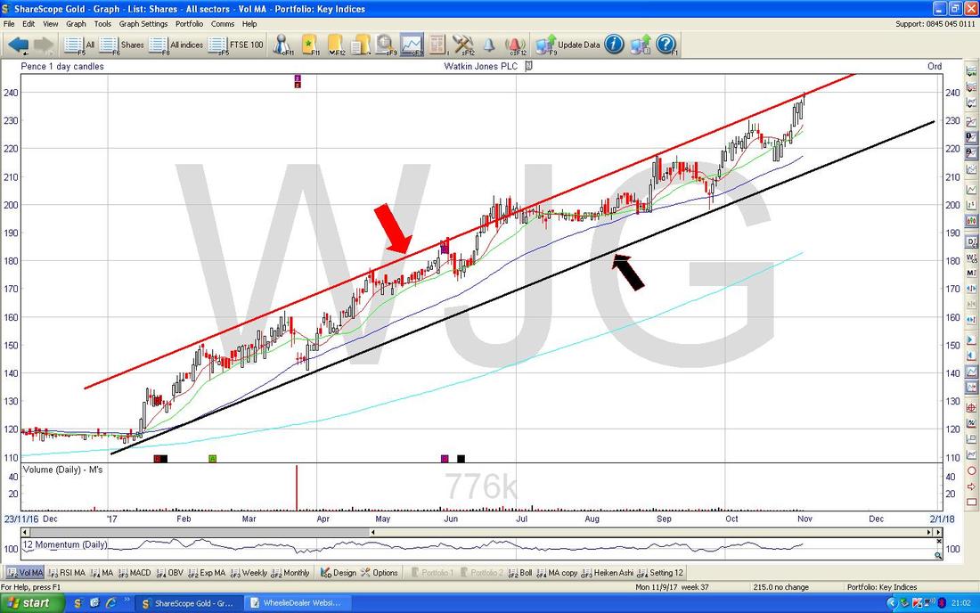
I have zoomed in on the Chart below and my Yellow Circle is highlighting a ‘Hammer’ type Doji from Friday - in the context of a big move up (and bearing in mind it is at the Top of the Uptrend Channel) this could mark a Turning Point - clearly a move above 240p (and a Close above that Resistance Level especially) would suggest it can keep pushing up in the very short term.
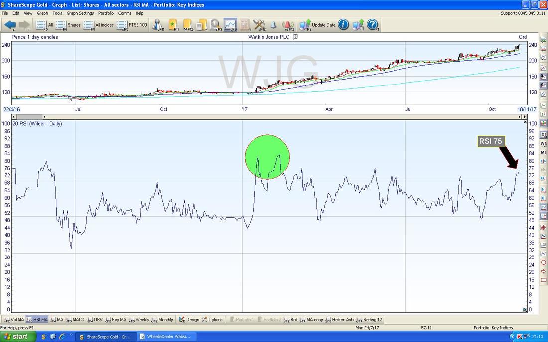
In the bottom window on the ScreenShot below we have the RSI for WJG Daily. On a Reading of RSI 75 it is pretty high but note where my Green Circle is that the RSI went a bit higher back then.
The Chart below has the Daily Candles with the Blue Wiggling Bollinger Bands above and below. My Black Arrow is showing where the Price is now above the Top BB - this is unstable and usually the Price has to go Sideways for a bit or drop back to get back ‘inside’ the Bands.
From what I have seen here, I would probably wait a bit if I was looking to buy WJG - the most likely moves from here are a Pullback or a bit Sideways. Alternatively, I might buy with a small Starter Position and then add as it plays out. 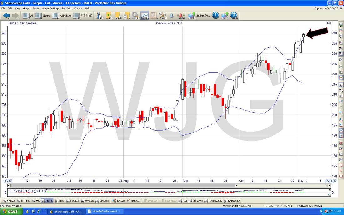
Boohoo.com BOO
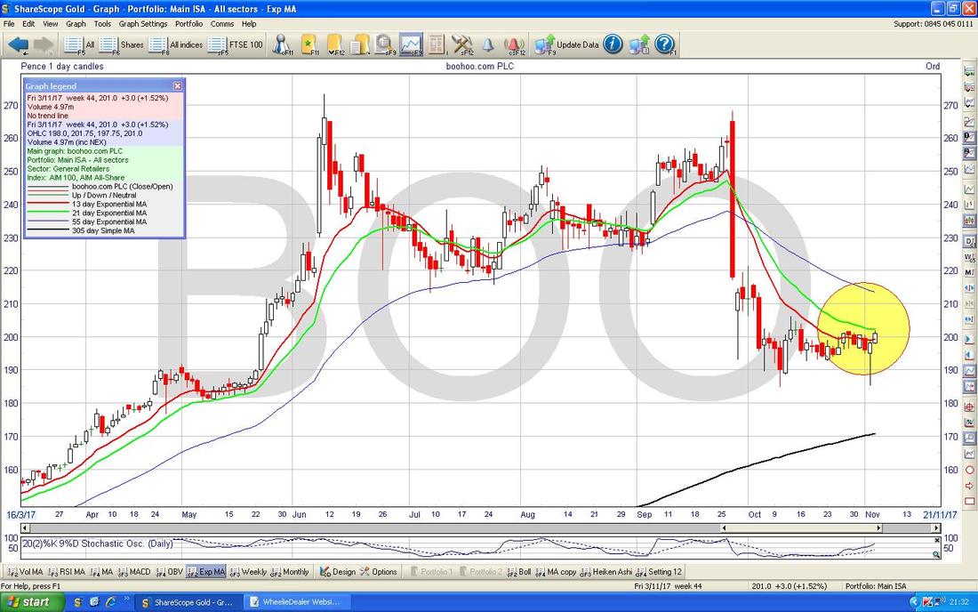
I hold loads of these and I know many WD Readers do also - so I thought it might be useful to check out what is going on. The Chart below is a fairly tight Timescale but that is all we need really to show what is going on here. It is all about Support and Resistance really - to the Downside it is crucial that Support at 185p Holds and to the Upside we need to take out 206p initially (as per my Blue Arrow) and then we need to take out 221p (as per my Green Arrow). If things do perk up here, then right at the Top my Pink/Mauve/Whatever Line (marked by a similar pukey coloured Arrow) will be tough Resistance to get over and this Level is at about 270p ish. Note the Darker Blue Wiggly Line 50 Day Moving Average (marked by my Black Arrow) is heading down towards the Lighter Blue 200 Day Moving Average (my Red Arrow) - this is leading towards a Bearish ‘Death Cross’ and if this happens it is obviously not good. Such a Death Cross would be avoidable but the Price needs to perk up soon or such a Bearish Cross will be nailed on. 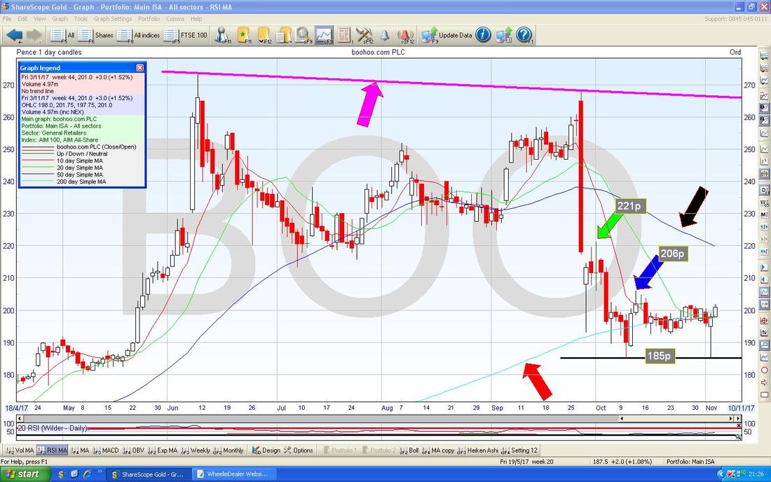
There is a bit of Hope for Corned Beef lovers here - in the bottom window we have the RSI for BOO on the Daily and my Yellow Box is showing how the RSI is rising as the Price has gone Sideways in recent Weeks - this is a Bullish RSI Divergence and could be predicting a move up.
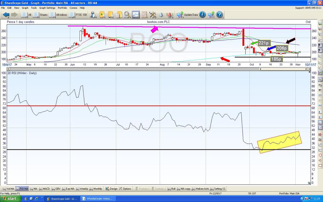
There is something to keep monitoring here - the Chart below has the Daily Candles for BOO with the Red and Green 13 Day and 21 Day Exponential Moving Average Lines as well. My Yellow Circle is pointing out how the Red and Green Lines are converging (moving together for you lot without a Dictionary) and if the Red Line can cross over the Green Line, then this would give a Bullish ‘Golden Cross’ which usually predicts rises for a few Weeks.
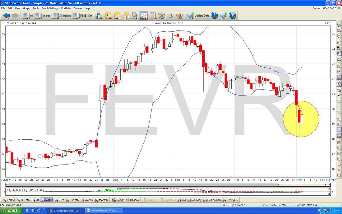
Fevertree Drinks PLC FEVR
I hold this one but only in a small ‘Starter’ Position because it is certainly not something that I could sensibly call “cheap” - however, it is my contention that the Forecasts here are nuts (far too low) and once the Results come out I suspect FEVR will turn out to have been a lot better Value than most people think. Anyway, I have talked about the Fundamentals on this one lots before and I just want to look at the Chart for now. My Chart below shows how the Price dipped down to the Light Blue Waggling Line which is the 200 Day Moving Average and then recovered Intraday where my Red Arrow is - this creates a Strong Support Level at just above 1800p. Note to the Left of my Screen we have a big Box sort of coloured in that horrible Pinky/Mauvey colour again (why on earth do I keep using this?) and this is showing another Zone of Support between about 1600p to 1800p. There is a Short Term Downtrend Line marked in Green (Green Arrow not all that surprisingly) which needs to be broken over if FEVR is going to make more upside progress - this needs a move over roughly 2100p I guess. 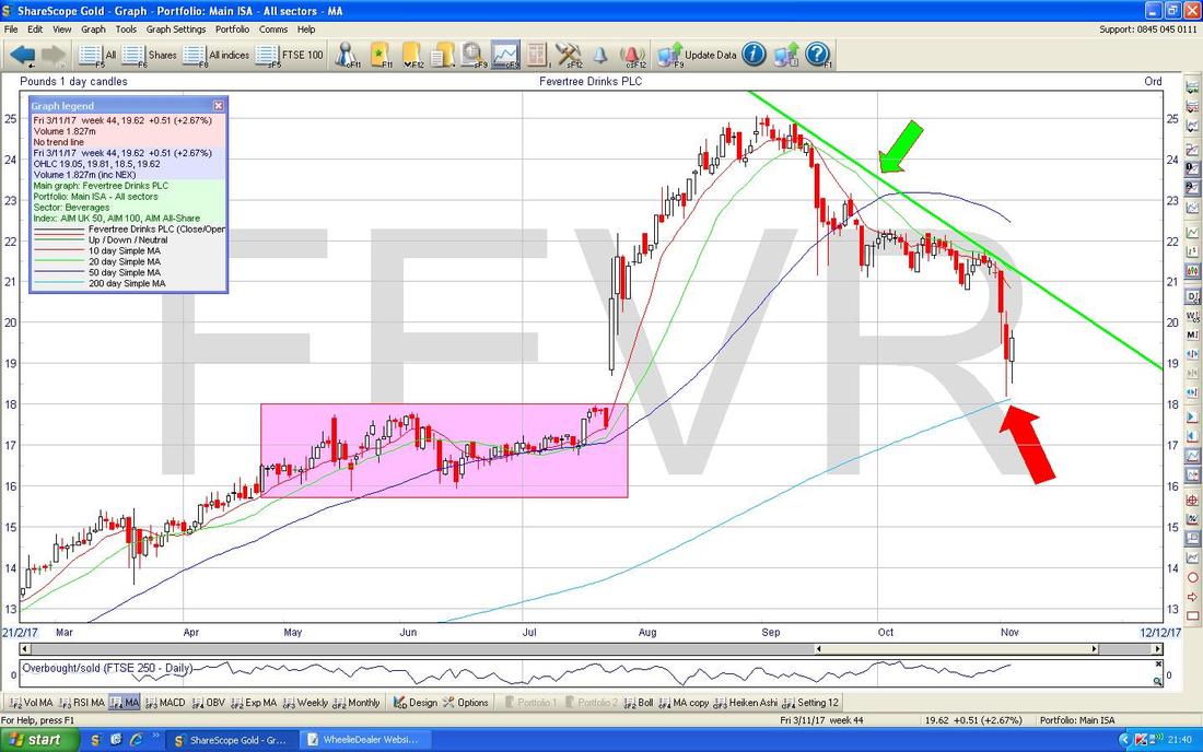
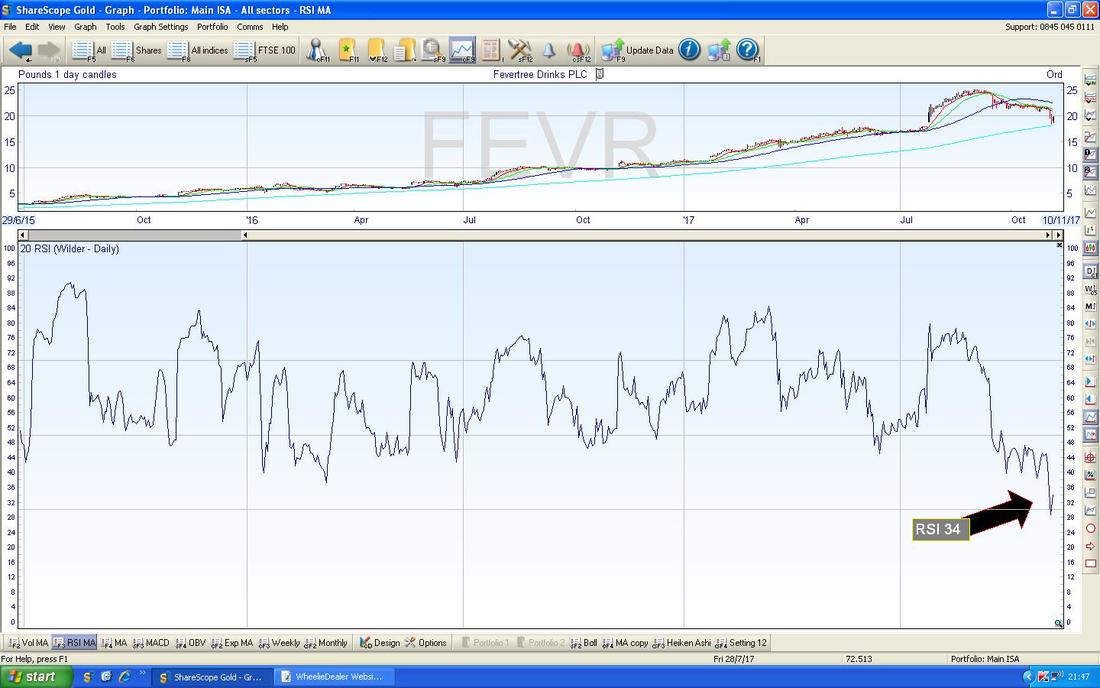
In the bottom window below we have the RSI for FEVR Daily. On a Reading of RSI 34 this is very low and note it has turned up slightly - perhaps this is the start of a recovery but it is far too early to be sure.
The Screen below has the Daily Candles for FEVR with the Blue Squirmy Bollinger Bands above and below. My Yellow Circle is highlighting how for both Thursday and Friday last week the Price was down below the Bottom BB and ‘Outside’ the Bands - this is unstable and it is highly likely that the Price moves up now or at least Sideways so that it comes back within the Bands.
S&P500 (US)
I’ve covered a lot of Stocks this week and time is tight so I will just quickly look at a few Indexes. Regular Readers will recognise the Chart below from previous Weeks and this is my ‘Working’ Screen for the S&P500 where I have had a succession of Short Positions that have hit their Stoplosses. My Yellow Circle is showing where the Price moved up to another New All Time High on Friday 3rd November and this looks Bullish - amazing really. 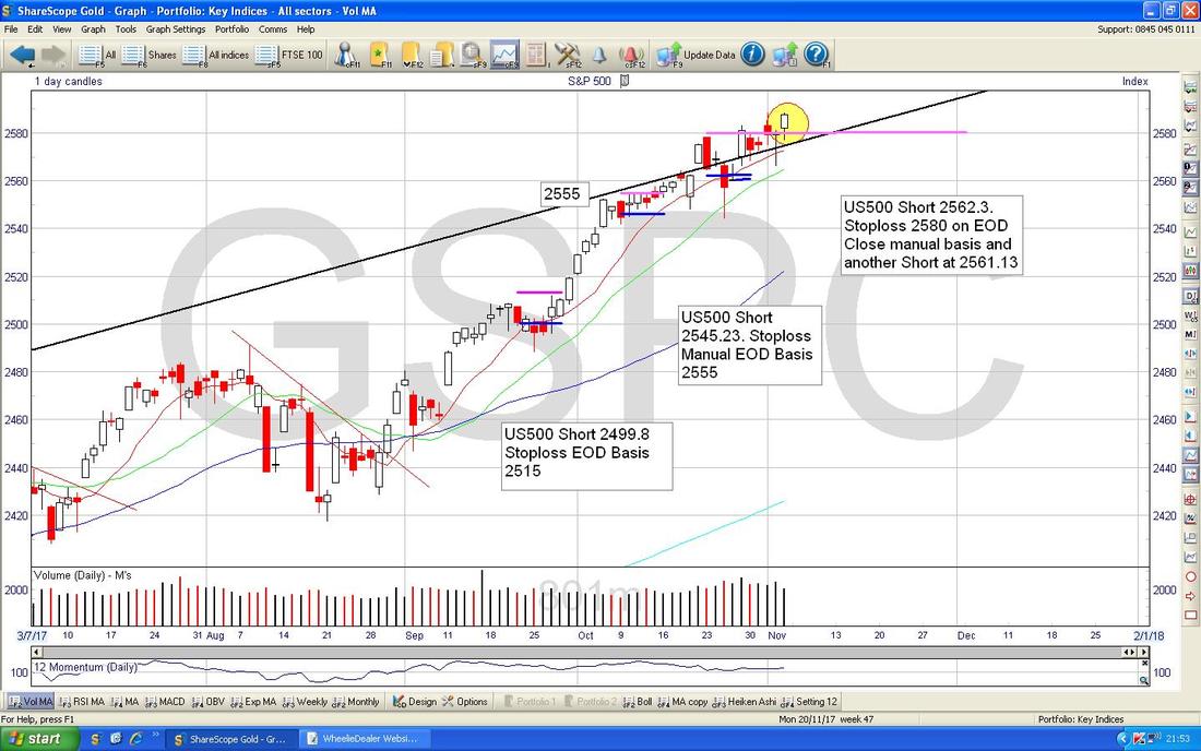
Nasdaq Composite (US Tech)
My Blue Arrow is pointing to a White Up Candle from Friday which as it stands looks bullish - another New All Time High also. 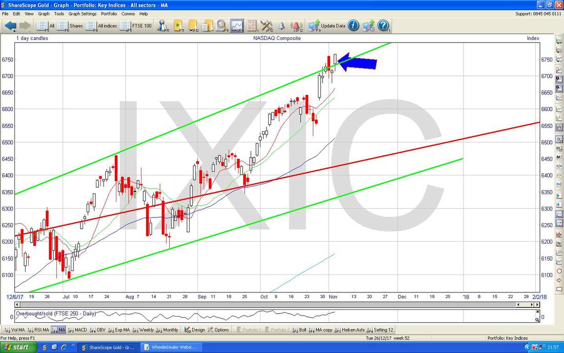
FTSE100
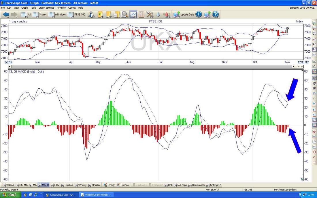
The key thing here is that the FTSE100 is a shade off its All Time High at 7600 and if it can Breakout above this (pretty damn likely in time I would say) then it sets up 8000 as a possible Target. On the Chart below my Yellow Rectangle is capturing a ‘Long Tails Doji’ Candle from Friday and this hit a Peak of 7581 during the Day - if 7600 is going to be taken out then of course first off we need to crack 7581 Resistance. The Red Line with the Red Arrow is the Bottom Line of the Long Term Uptrend Channel from back in 2009 - it is positive that we are back above that Line now. There is good Support below at around 7500 and 7450. 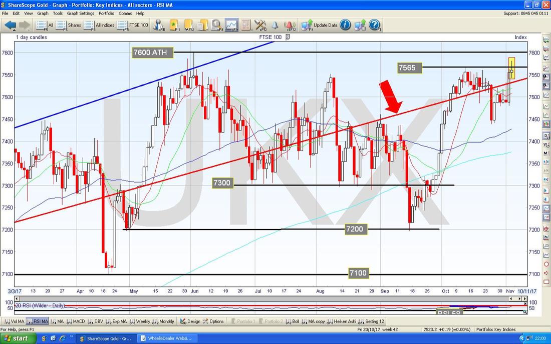
In the bottom window on the Screen below we have the MACD (Moving Average Convergence Divergence) for FTSE100 Daily. My Blue Arrows are pointing to how we are extremely near a Bullish MACD Cross on both the Signal Lines format and the Red and Green ‘Humps’ format.
Pound vs. Dollar
It might be tough for the FTSE100 to move higher and crack above 7600 if the Pound can rise from here - my Chart below is similar to one I showed last Week which had the Black Lines (Black Arrows) which mark an Uptrend Channel whereby the Pound was strengthening against the US Dollar since the big Sell-off after the Brexit Vote. Last week after the Bank of England’s Rate Decision and Commentary, the Pound fell back but my Yellow Circle is highlighting what looks like a possible ‘Bullish Harami’ 2-Day Candle Pattern - this is the ‘Lady with Chelsea Bun in the Oven’ one and could mark a Reversal from which the Pound can rise. If the Pound rises, this might hurt the FTSE100 although the Correlation is not very good really. 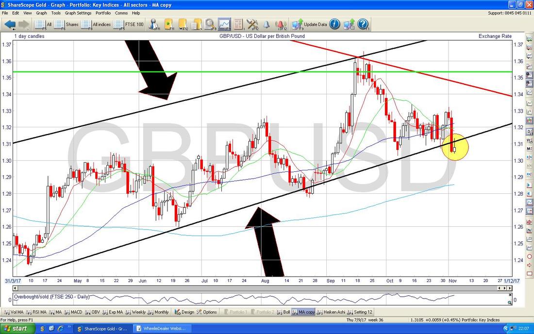
The Chart below has the Pound vs. US Dollar Daily Candles with the Blue Wobbling Bollinger Bands above and below - my Green Circle is showing where the Price is sat on the Bottom BB - this suggests it could reverse up now (Pound Strength).
Right, I am going to leave it there as I need to proof read this garbage and upload it to the ‘system’. I hope everyone has a mega prosperous Week and if not, at least hopefully you will sniff some Beer, Wine and/or Fevertree. Cheers, WD. 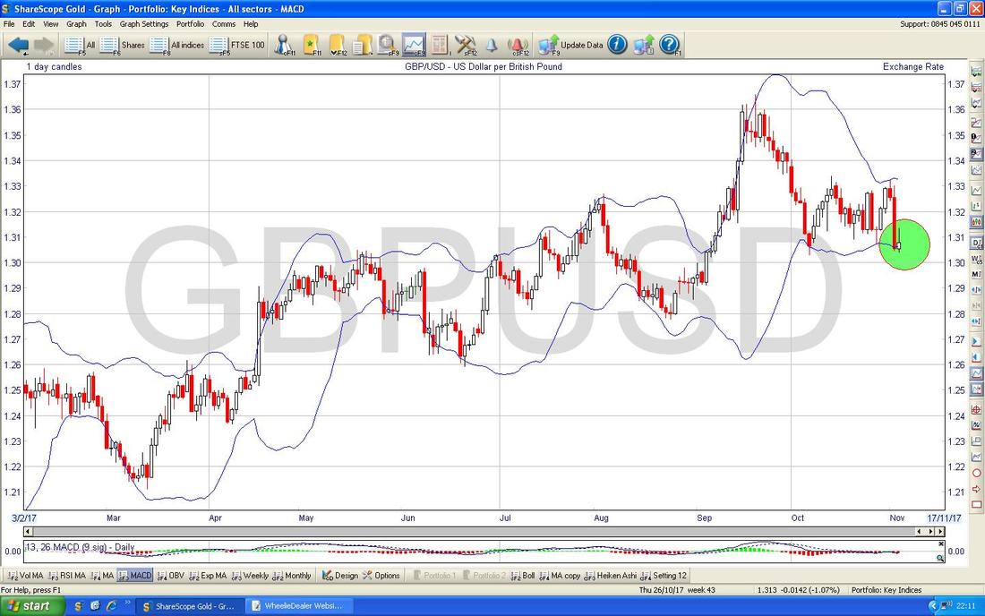
0 Comments
Leave a Reply. |
'Educational' WheelieBlogsWelcome to my Educational Blog Page - I have another 'Stocks & Markets' Blog Page which you can access via a Button on the top of the Homepage. Archives
January 2021
Categories
All
Please see the Full Range of Book Ideas in Wheelie's Bookshop.
|
