|
THIS IS NOT A TIP. I AM NOT A TIPSTER. PLEASE DO YOUR OWN RESEARCH. PLEASE READ THE DISCLAIMER ON THE HOME PAGE OF MY WEBSITES. Right, that’s Turkey and Mince Pies done, now we move onto boring old Insurance…yawn… Again, I will try to only do a short Blog (yeah, right Wheelie, you don’t know the meaning of the word ‘short’…) with an Overview of the Key Fundamental Points for my Buy and a look at Valuations, Targets and Charts. Luckily there is still some fuel in the WheelieCopter after our flight over Major Oil so no need to fill up for a visit to Norwich……..(The Quiz of the Week?….Younger readers have every right to be confused now.) Key Fundamental Points for my Buy Decision To set the scene, Aviva is a huge Life and General Insurance Company - it is very similar to Prudential PRU but arguably has failed Strategically because it has not made the move into the high growth markets of Asia that PRU has so successfully captured. Aviva used to be known as ‘Norwich Union’ but I think it has now dropped that brand entirely. I don’t remember the full history (not even sure I really knew it) but Aviva got in some difficulties in recent years and is in the process of a Turnaround (a favourite ‘Investing Theme’ for me) - it clearly found the Credit Crunch tough (who didn’t?).
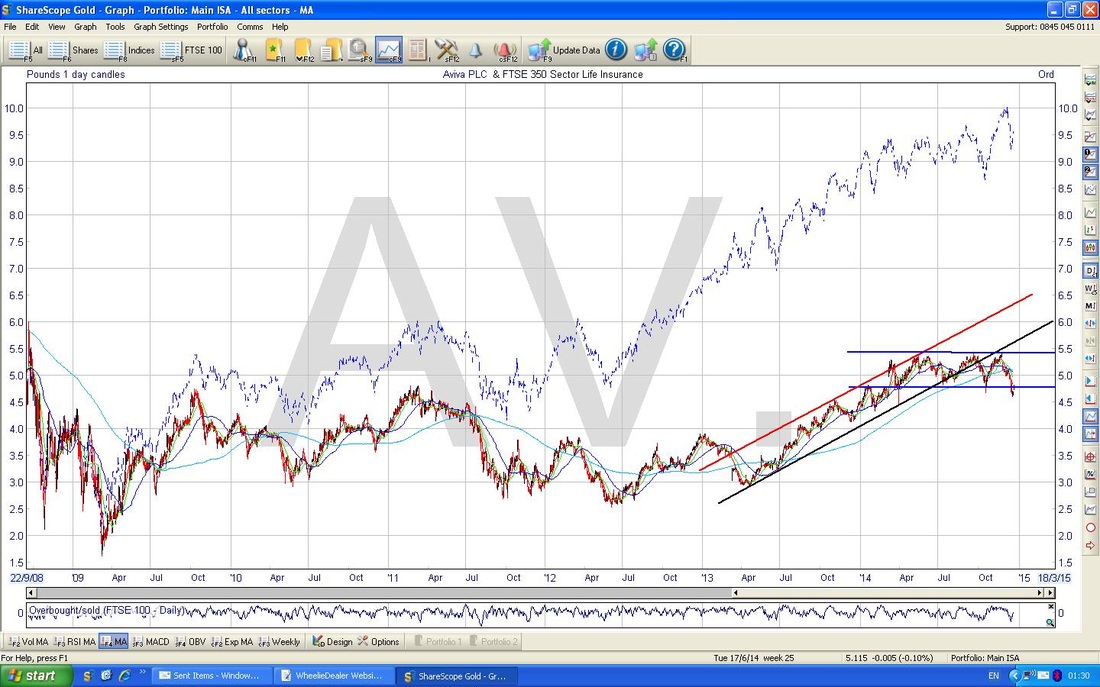
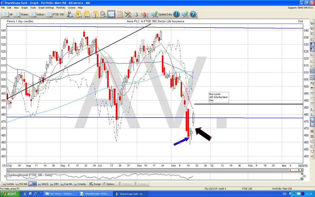
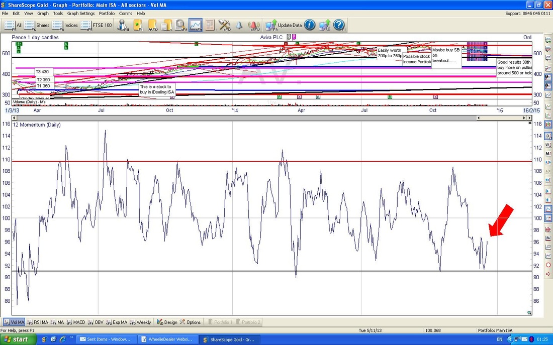
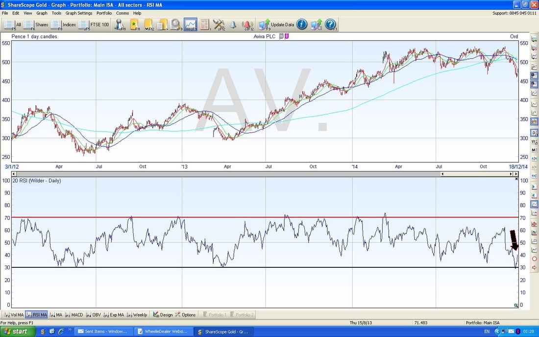
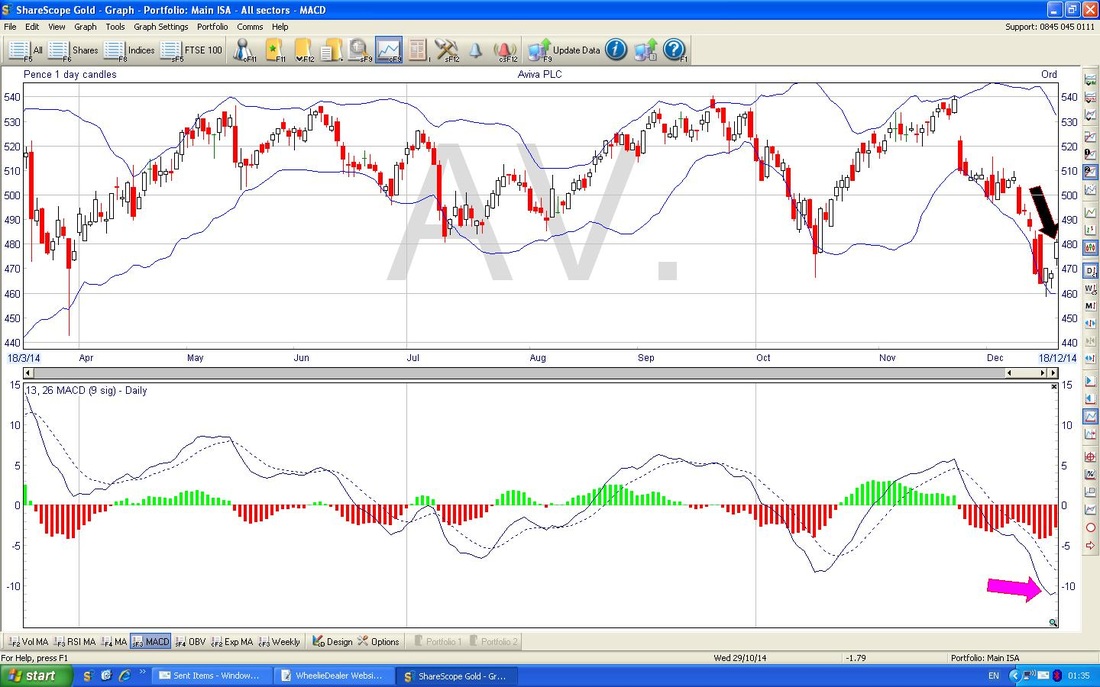
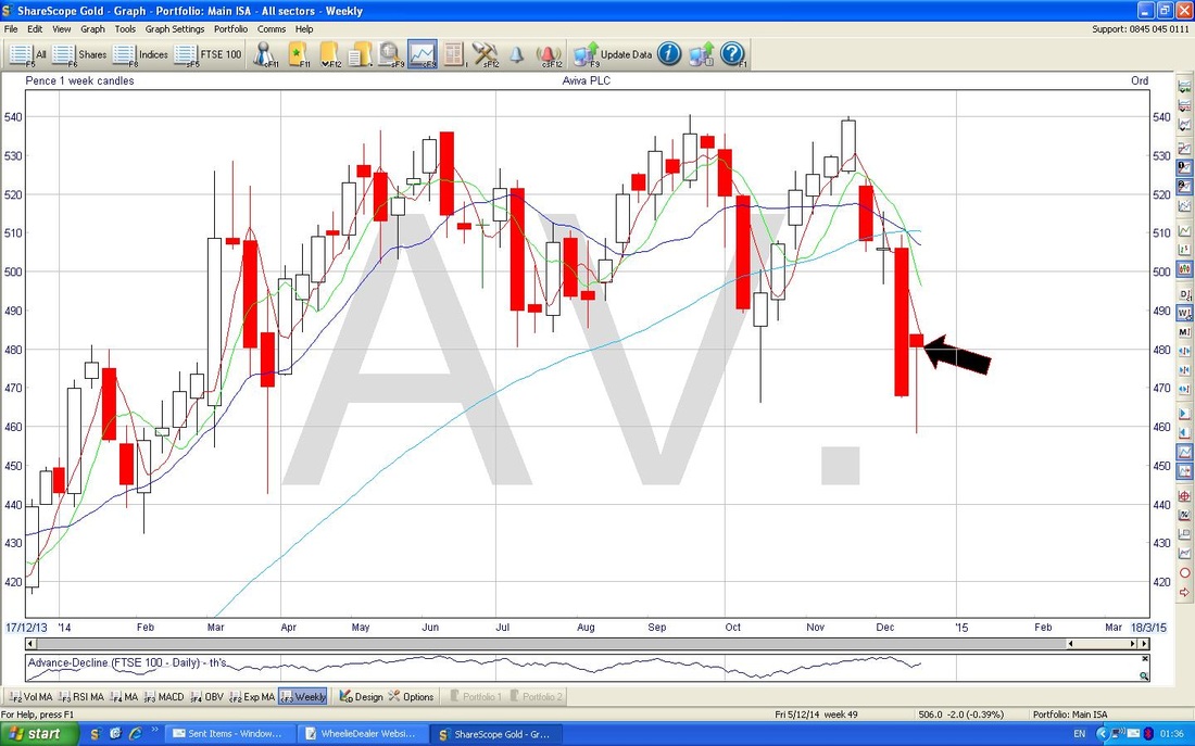
Valuation I am taking these figures from ShareScope as usual and assuming that they incorporate some allowance for the Friends Life combination - I think they must do as there tends to be no Forecasts once a Bid is announced and then the numbers appear a few days later. For 2014, 2015 and 2016, the Forecast EPS (Earnings Per Share) are 48.69p, 49.08 and 53.19p. On my Buy Price of 487.47p on Friday 19th Dec 2014, this means Forward P/E Ratios (Share Price divided by Earnings Per Share) for 2014, 2015 and 2016 of 10.0, 9.9 and 9.2. The usual logic follows that a P/E of 10 or less is good value, so this seems pretty fair. In fact, compared with PRU on a P/E of about 15 this looks on the Cheap side - bear in mind that the Turnaround and Conservative Approach will possibly mean that Forecasts get beaten - more Potential Upside for the Share Price !! The Forecast Dividend Payouts per Share for 2014, 2015 and 2016 are 18.09p, 20.95p and 25.79p. So, at my Buy Price of 487.47p, the projected Dividend Yields for 2014, 2015 and 2016 are 3.7%, 4.3% and 5.3%. I think you will agree that these look like tasty Dividend Streams to pick up whilst my favourite Aussie (obviously excluding Casey Stoner, Troy Bayliss and Mick Doohan) sorts the Business out. Target I really think Aviva is very under-rated and with continued progress on the Strategic Mess, I think a much higher P/E could be justified and the Share Price would also get a boost if EPS can rise faster than forecast - with Mark Wilson’s apparent deliberate policy to downplay expectations, I think we could see the best of both worlds. This means EPS rising and P/E expansion - this could really kick the Share Price a lot higher. Let’s assume that the Forecasts are right and they do not get beaten (a sensible, conservative approach). On that basis, I think a P/E of 14 would be pretty fair, and arguably on the low side. Based on 49.08p of EPS for 2015, this would mean a Target of 687p. I don’t think it would take much imagination to see a slight beat on the EPS and a P/E of 15 - on this basis, I am targeting 750p. It may take a few years, but I am patient and will be picking up those sizeable divvys - and maybe these will come in higher with the FLG acquisition. If you go back to 2008, the Shares were up at 850p - this is a pretty Strong Resistance Level on the Charts and I suspect that it would be a major hurdle for the Share Price and probably it will be many, many, years before it can breach this. For now, I am happy with my target of 750p and the outlier of a bid from Prudential might enable more to be gained. Technical Analysis side of things There are quite a few charts here - I won’t dwell on them, I will just point out the key bits. Please bear in mind that these Charts are from Thursday 18th December 2014 - I wanted to show you the prevailing situation when I made my decision to Buy. Sideways Range Trader In a manner reminiscent of RDSB, AV. Seems to be in a Sideways Range. Look at the Chart below - on the Right Hand Side you should see how the Share Price was clearly in an Uptrend Channel which it followed very nicely up until about August 2014 when it started to go Sideways. The Blue Horizontal lines indicate the Sideways Range which I think the Share Price has now settled in to for a while. While we are on this chart, just look higher up at the Blue Wiggly Line - this is the Sector Line for ‘FTSE350 Life Insurance’ and clearly shows how AV. Has underperformed - some of this is probably because PRU has been so good and it has a large weighting in the Sector Index. Bull Flag? Another point to consider here, is that the Upmove and subsequent Sideways move could be viewed as a Long Term ‘Bull Flag’. I have talked about this stuff before - but think of a Flagpole with a Flag billowing out in the breeze…… The Upmove represents the ‘Pole’ and the Sideways bit is the ‘Flag’. The underlying TA logic here is that Bull Flags tend to point to more Gains to come. In other words, the Share Price moves up strongly first off, then it ‘consolidates’ in a sideways range, and at some point it will most likely ‘Breakout’ from the range and shoot up again. It is amazing how often this works - I would say probably as much as 80% reliable - but that is just me guessing, not a Scientific Academic Study (no doubt there will be plenty of those as ‘experts’ love doing this sort of ‘another planet’ exercise - which you can almost guarantee will be of no actual use to us Real World Investors !!). The other interesting and appealing bit of a Bull Flag is that the next Breakout Move up will be as high as the ‘Flagpole’. In this case, that could mean an Upside of about 200p on top of any Breakout - this could mean a Price Level of 750p - notably consistent with my Fundamental Targeting. Candles Right, now look at the Chart below, particularly at recent days. and the Arrows I have marked in. The Blue Arrow is pointing to a Daily Candle with a Long Tail (or Wick) down. In the Context of the Down Move from about 3 weeks before, this is a significant Candle because it indicates that the Short Term Trend may be coming to an end as we have had a clear Intraday Reversal where the Bulls have taken control from the Bears. I would like to have seen a nicer Candle, like a Dragonfly sort of thing or a better Hammer with a smaller ‘body’ - but this seems to have done the trick. The way to trade these things is not to jump the gun - wait for the next day to ‘Confirm’ the change of direction before you put a trade on. Some traders will make their move as soon as the Change of Direction is Confirmed intraday, but I prefer to leave it another day and see what Candle is formed to be sure we are really at the start of a new move up. I guess it is the difference between a Short Term ‘Daytrading’ or ‘Position Trading’ type approach as opposed to my Longer Term, Lazy, Inactive, Relaxed, Do as Little as Possible or Less, Approach…………. Gap The Black Arrow, I have put in, points to a ‘Gap’; this is where the Bulls are so rampant that the Share Price has jumped up at the Open to the Day - it has ‘Gapped Up’ and is a pretty Bullish sign. It is worth noting though, that ‘Nature abhors a Vacuum’ so you normally find that within a few weeks maybe, the Gap gets ‘filled’ as the shares retrace and fill in the space. Weird, but it happens so often. Nothing more to see here, move along please………. Momentum On the Chart below, I have squeezed up the Top Window so we can focus on the Momentum Window at the bottom. Not much to see really, just look at the Red Arrow and note that it is down at the bottom of the Range within which the Indicator wobbles - and it seems to be moving up off the floor now - Bully Beef !! Relative Strength Index RSI Please look at the Bottom Window in the Chart below. Note the Black Arrow - similarly to the Momentum Chart above, this shows the RSI is moving up from the Floor - this is a move with Horns, not Claws. Bollinger Bands The Top Window of the Chart below shows that the Candles have moved up from the bottom Blue Wiggly Bollinger Band. This is a Bullish Sign. If you cast your eyes to the Left, you will see where this has occurred before. MACD - Moving Average Convergence Divergence In the Bottom Window of the Chart above, you will see I have put a sort of Mauvey, Pinky, Purply, I don’t know what flippin’ colour it is, Arrow which is pointing to the Continuous Blue MACD Line sort of turning up - combined with the Red Histograms above, it looks like these are turning up. This is inconclusive really at this stage - it’s a matter of timing - MACD is a bit later than other Indicators I use like Candles, Momentum and RSI (feeling HOT, HOT, HOT?…) Weekly Candles I like the Weekly Candles because they give amazingly clear signals when viewed form Week to Week. In this case, I have jumped the gun a bit as when I produced this chart it was only Thursday - we did not have a Full Week. This is not really Textbook TA behaviour, but I am using it anyway - strictly speaking, we should wait for the Full Candle to form. The fact is that the Candle I have pointed to is very Bullish in the context of the earlier down move. it’s a nice Hammer - much better than the Daily one I showed you earlier. Right, that’s enough, believe it or not my fingers and forearms are aching - the more I do this blogging mularky the faster I seem to be able to touch type - and it is clearly giving me a jolly good dose of RSI (Repetitive Strain Injury - not Relative Strength Index !!!)
Ok, gotta rush to the doctors………. Happy Day after Boxing Day, wd
6 Comments
Dave Droz
28/12/2014 12:28:10 am
An interesting analysis of a share I also feel is about to flare.
Reply
Jon
29/10/2015 01:02:07 pm
Hi WD
Reply
WheelieDealer
30/10/2015 12:00:24 am
Hi Jon, Funny you should say that - I bought more Aviva AV. this morning at around 490p on a Spreadbet. I put this on the 'Changes List' on the Homepage - that's always the first place to look. I will put it on the Trades Page over the next couple of day. Cheers WD
Reply
Jon
30/10/2015 09:02:07 am
Cheers WD, sounds good.
Phil Sloan
3/11/2015 12:21:57 pm
Hi wd!
Reply
Leave a Reply. |
'Educational' WheelieBlogsWelcome to my Educational Blog Page - I have another 'Stocks & Markets' Blog Page which you can access via a Button on the top of the Homepage. Archives
May 2024
Categories
All
Please see the Full Range of Book Ideas in Wheelie's Bookshop.
|

