

|
educational blogs |
|
We are getting near Autumn now and the traditionally weak month of September (historically the worst month of the year). I am writing this ‘Intro’ after I have actually looked at all the Charts and the thing that stands out is that although there are hints that they are stretched to the upside, there is no really clear evidence that we will turn down yet - maybe if that does happen, it will be more clear in September.
I did however notice that Oil looks a bit toppy short term - if this turns down, it might drag the FTSE100 down with it.
Historical Guidance
For the coming week (w/c 22nd August 2016) the FTSE100 is historically Up for 74% of years with an Average Return of Positive 0.4% - so the precedents are good. Note this week is leading up to the Bank Holiday Weekend and this might influence the Trading Volumes etc. But just to dampen the spirits after that - I looked ahead in the UK Stockmarket Almanac 2016 and all 4 Weeks of September are historically Down - I will give more details in coming weeks as we get nearer to them. FTSE100 I wanted to start with the Weekly Candles because these might be most instructive with regards to where we are heading next. The Screenshot below comes from the unbeatable ShareScope software that I use and the thing to focus on here is the Yellow Circle that encapsulates the Candlesticks created from the last 2 weeks. This looks like a ‘Dark Cloud Cover’ sort of 2-week pattern and in the context of recent gains, this could mark a Reversal and suggests that Prices might fall in coming weeks. Note this Candle pattern is sort of the opposite of a ‘Bullish Harami’ (the Pregnant Woman viewed from the side thing) which you get at the bottom of a Downwards move. Obviously 6955 which was the High Point of last week is now an important Resistance Level that the FTSE100 needs to get over. I have a big Short Position on the FTSE100. 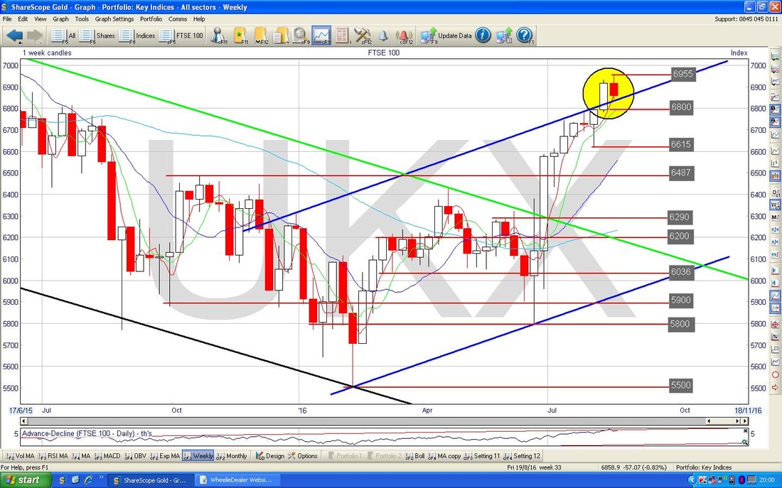
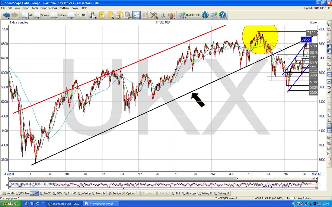
The Chart below has the Daily Candles for the FTSE100 and I have opened it out to show the ‘Big Picture’ and I draw your attention to the Black Uptrend Channel Bottom Line marked with my Black Arrow which was in force for most of the 6 years since the 2009 Lows. This is just to set the scene for the next Chart.
The Chart below zooms in to about the last 1.5 years and resembles a Chart I showed last week. The key thing here is marked by my Green Arrow which shows where the Price moved up and touched the Black Bottom Line of the Uptrend Channel from the previous chart - note how this acted as Resistance and the Price fell away after touching it. The Key Resistance point seems now to be 6955 and just a little higher we have the All Time High line at 7122. The Yellow Circle over in the Left Hand Corner is highlighting where there is a big zone of Resistance for the Price to wade through.
My Blue Parallel Lines mark an Uptrend Channel which has been in place for much of 2016 - we seem to have overshot the Top of this Uptrend Channel and it will be interesting to see if the Price now finds Support here back on the Upper Line or whether it falls back within that Uptrend Channel. 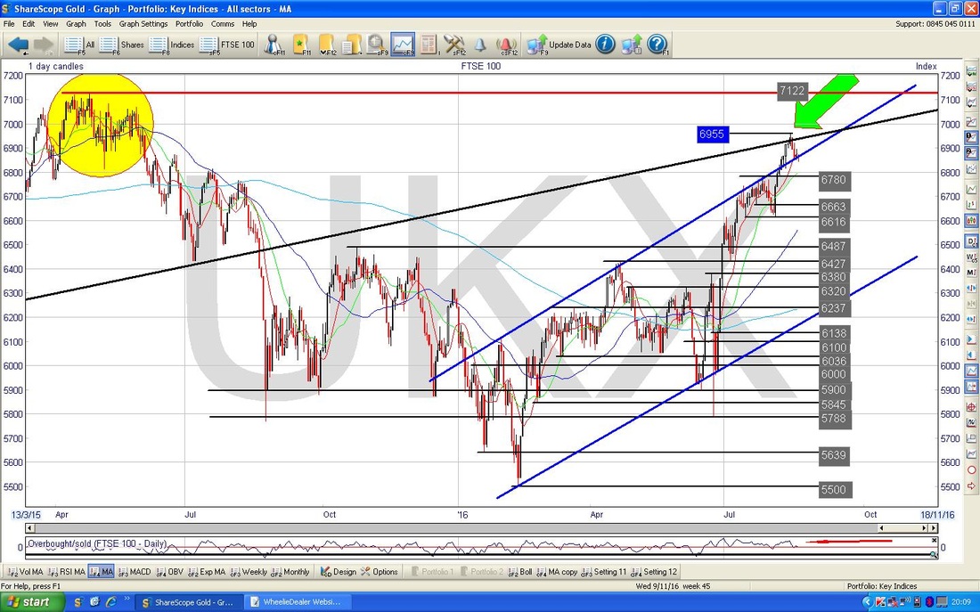
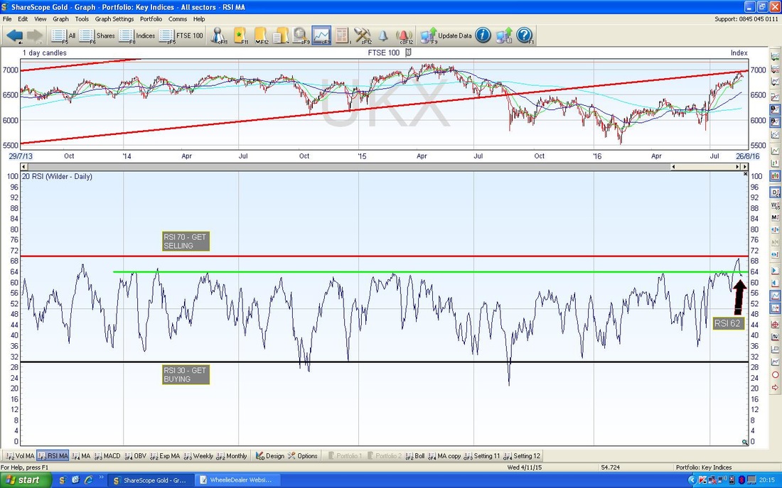
In the bottom window of the Screen below we have the Relative Strength Index (RSI) for the FTSE100 Daily. With a reading of 62 at present it has fallen back from the peak around RSI 69 and is looking like it is dropping now. RSI 62 is still quite high by the standards of the FTSE100 so I would expect it to drop more from here. It is quite unlikely that it will turn up from here - although of course anything is possible.
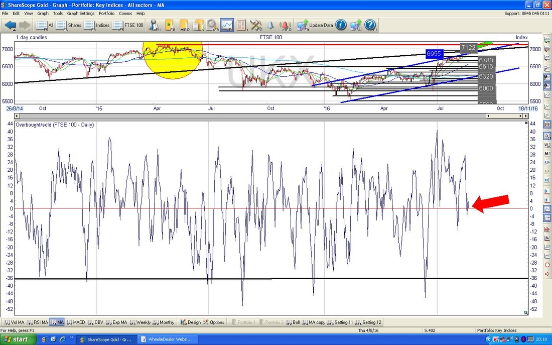
In the bottom window on the Screen below we have the Overbought/Oversold Oscillator for the FTSE100 Daily. My Red Arrow shows that we are pretty much at the exact halfway point and therefore Neutral. The way this Oscillator works is that it tends to swing between the Extremes at either Overbought or Oversold and is a very short term indicator - it can swing around in just a few days.
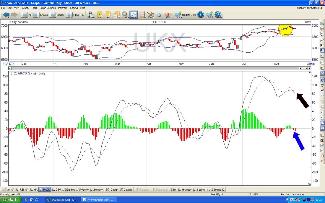
In the bottom window on the Screen below we have the MACD (Moving Average Convergence Divergence) for the FTSE100 Daily. The Blue Arrow is pointing to where we had a Bearish MACD Cross a couple of days ago and the MACD is now negative - hence the Red Histogram Bars below the line. The Black Arrow shows a similar thing but in just a Line form.
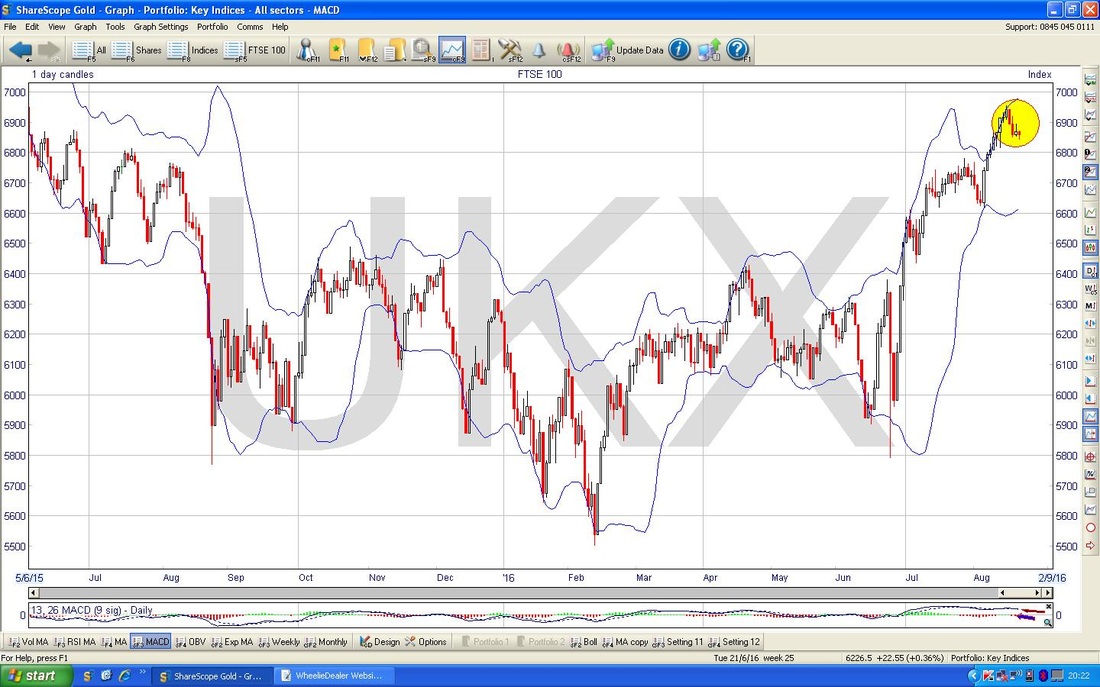
The Upper Window of the Chart below shows the Bollinger Bands for the FTSE100 Daily. My Yellow Circle highlights where the Price Candles have come away from the Upper Bollinger Band and this tends to mean we will move down a bit more - it is quite possible that we will move down to the Lower Band which is at around 6600.
DAX (German)
The Chart below has the Weekly Candles for the DAX going back about 7 years to the Credit Crunch Lows. Note the Black Line at the bottom which sort of marks an Uptrend for most of those Years and then the Blue Downtrend Line which has been in place since about mid April 2015. My Red Arrow is pointing to where the Price has broken-out of the Blue Downtrend Line and this looks pretty bullish. 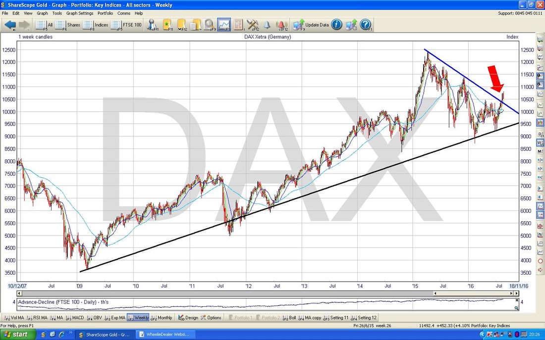
There is a lot going on with the Chart below. Here I have zoomed in on the Weekly Candles for the DAX and my Yellow Circle highlights a Double Candle Pattern similar to the one on the FTSE100 - this might be marking a Reversal after the recent moves up. The High here is 10802 which obviously is a Resistance Level that needs to be got over.
So, even though the Price broke out of the Blue Downtrend Line as per the earlier Chart, it looks like it might fall back within that Downtrend - the Price Action this week should give us more guidance. It might just move back down to the Blue Line and then bounce up again if it acts as Support. My Black Arrow is pointing to where we are getting very near a 50 / 200 Day Moving Average ‘Golden Cross’ and obviously this would be good. However, it is possible that these things can crossover and then not long after cross back under and be negated - so again we should find out in coming days. The 50 Day Moving Average is the Darker Blue Wiggly Line and the 200 Day Moving Average is the Lighter Blue Wiggly Line (that wiggles less fast - i.e. it is a smoother line). 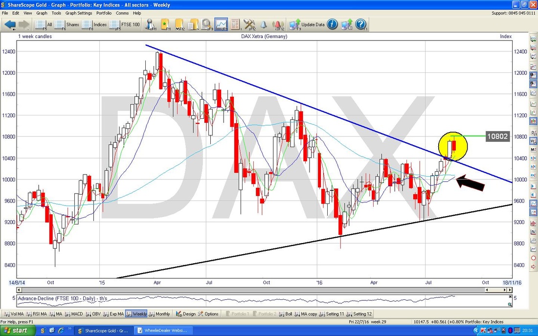
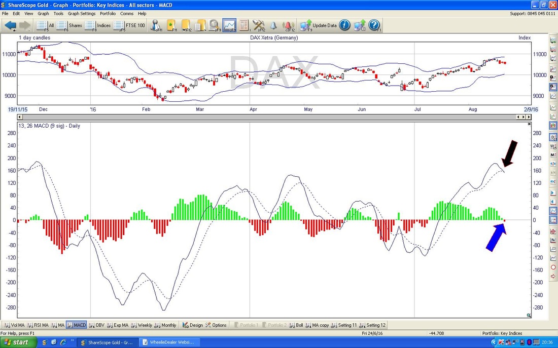
In the bottom window below we have the MACD for the DAX Daily. My Blue Arrow is pointing to where it did a Bearish MACD Cross on Friday on the Histogram Chart and the Black Arrow shows the same thing in the Line format.
S&P500
The Chart below has the Weekly Candles for the S&P500 going back about a year or so. My Black Arrow is pointing to a ‘Doji’ Candle which was produced last week - this might mark a Reversal Downwards after the moves up but it could just be a signal that the Up Move is weakening - which would be no great shock after the recent run up. It is pretty inconclusive and the key thing here is that the new All Time High (ATH) Resistance is at 2194. 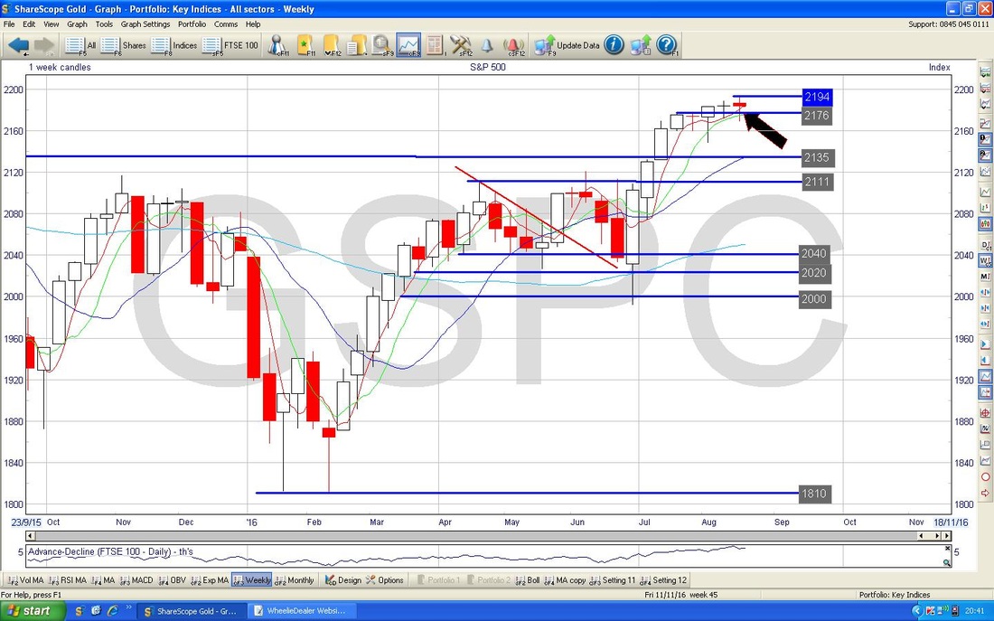
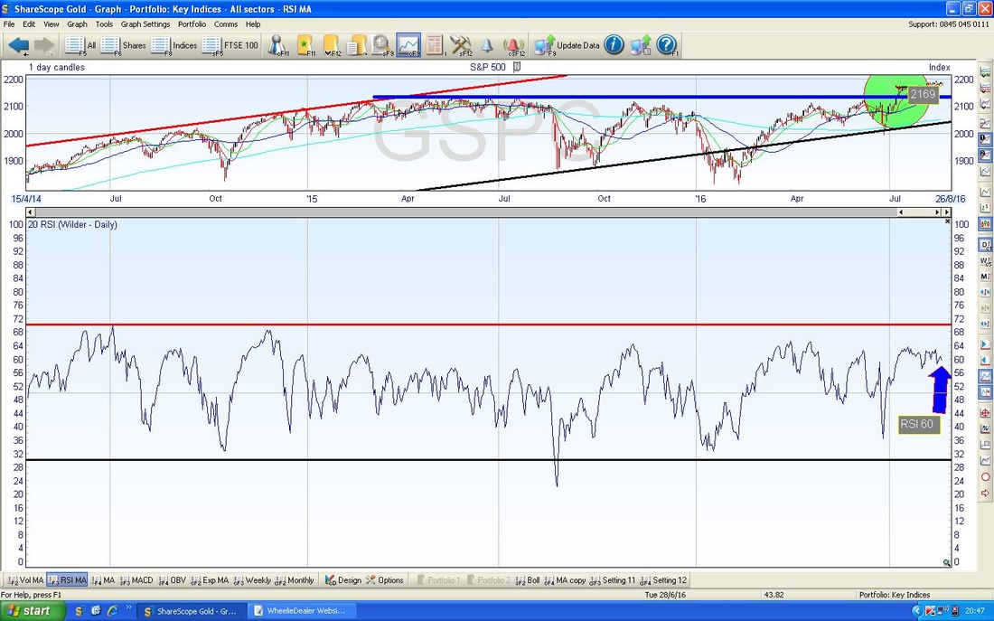
In the bottom window on the Chart below we have the RSI for the S&P500 Daily. With a reading of RSI 60 it has fallen back a bit from the recent Peak at around RSI 64 and is quite high. It would not surprise me if this fell back a bit more.
Looking at other Charts like the MACD and Bollinger Bands etc. for the S&P500 they aren’t really telling me a lot - I think we need to see how things play out this week and that should give more info to go on.
Nasdaq 100 I am obviously quite interested in this one as I have a Short Position on it. The Screen below has the Weekly Candles for the Nasdaq 100 and my Yellow Circle is pointing out a ‘Long Tails Doji’ which was formed up last week. This really does look like a Reversal Signal after the strong run up - obviously this will be confirmed if we have a Down Week in the coming Week. The New ATH at 4838 is clearly the Resistance Level that the Bulls need to take out. 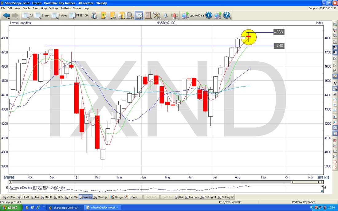
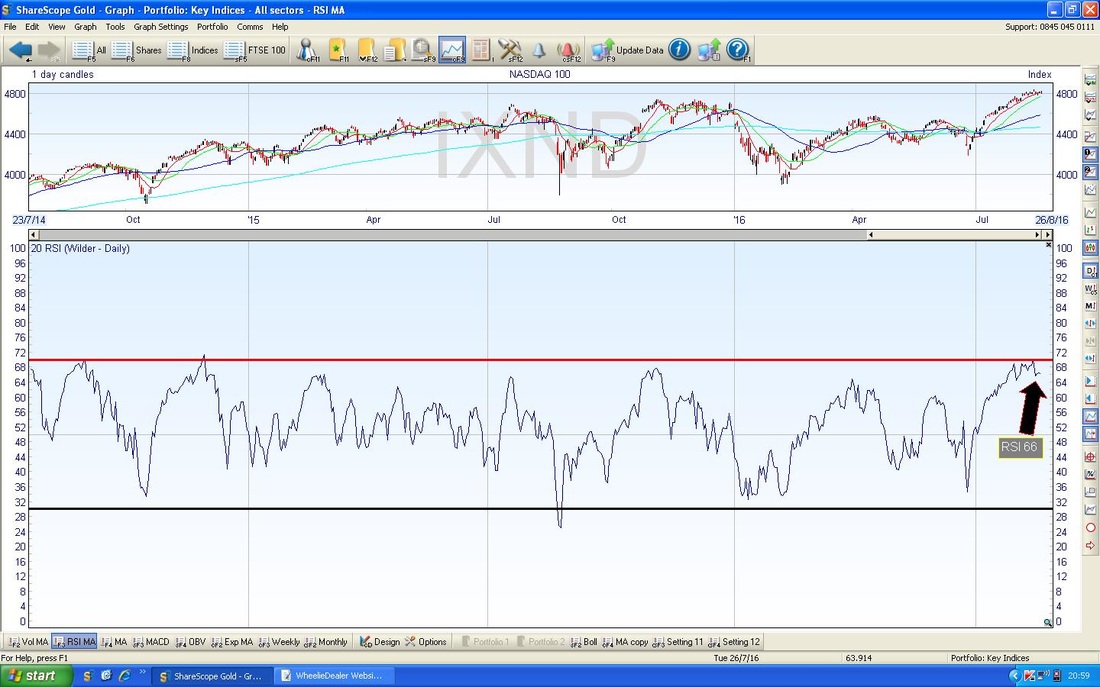
In the bottom window on the Screen below we have the RSI for the Nasdaq 100 Daily. A reading of RSI 66 is still very high even though it has dropped down from RSI 70 - I think this can drop a lot more.
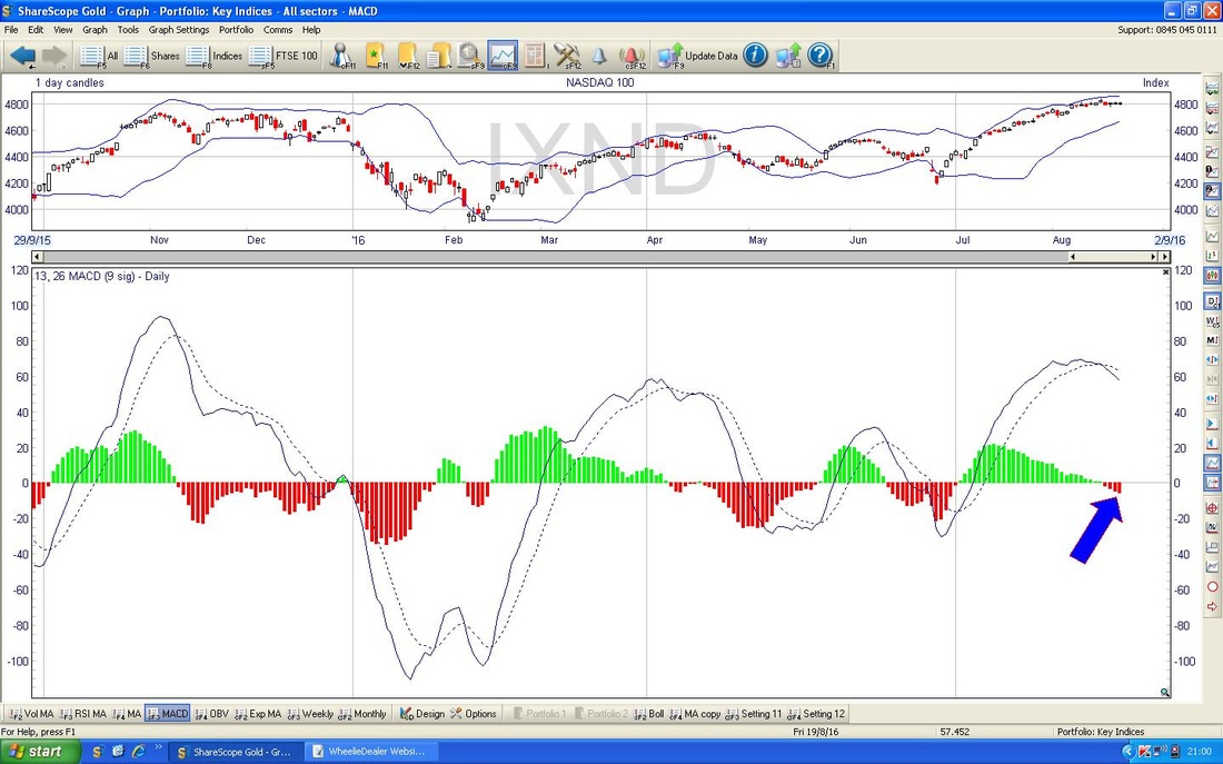
In the bottom window on the Screen below we have the MACD for the Nasdaq 100 Daily - my Blue Arrow is pointing to how the Histograms have gone Red and are showing a Negative MACD - this is the same in the Line Format above but I have not pointed to this as the Histograms are much better at showing it.
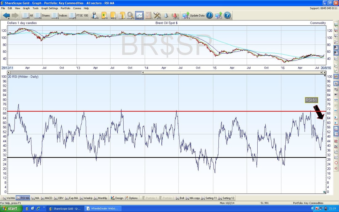
Brent Oil Spot
The Chart below has the Daily Candles for Brent going back about 5 months. My Yellow Circle is highlighting a 2-day Candle Pattern like the one we saw on the FTSE100 earlier - I think this is a ‘Dark Cloud Cover’ and could mark a Reversal Downwards - this is very likely after such an amazingly strong run up in recent days. Something else I notice here is how the 50 Day Moving Average (the Darker Blue Wavy Line) is turning down - if the Price Line falls in coming weeks, we might see this 50 Day MA falling more. 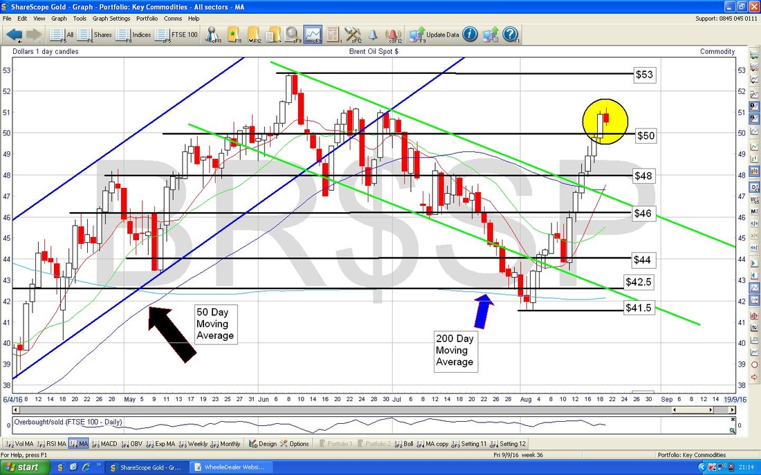
In the Bottom Window below we have the RSI for Brent Oil Spot Daily. With a Reading of RSI 61 it is quite high and you may not be able to see it but it has sort of ‘flicked down’ - it might have peaked out in the very short term.
Gold Spot
The Chart below has the Daily Candles for Gold Spot going back for all of 2016. Earlier this week I tweeted out that there was a Triangle Pattern on Gold and my Black Lines from Early July mark this Triangle. As you can see, we are nearing the ‘Point’ of the Triangle and we need to see if the Price now falls below the Bottom Triangle Line or if it can move Up out of the Top Triangle Line - this will signal the direction for a future move. Right, that’s it this week - bit of a mixed picture with not a huge amount of clarity - lots of Charts seem to be forming up for a big move but it is not yet clear what is going to happen. With Autumn nearly here, I think we need to be on our guard for downside in most Indexes and we might see Gold get a boost if this happens. Good luck everyone, cheers, WD. 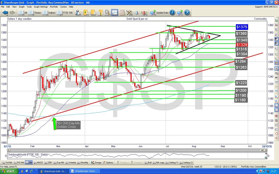
0 Comments
Leave a Reply. |
'Educational' WheelieBlogsWelcome to my Educational Blog Page - I have another 'Stocks & Markets' Blog Page which you can access via a Button on the top of the Homepage. Archives
May 2024
Categories
All
Please see the Full Range of Book Ideas in Wheelie's Bookshop.
|
