

|
educational blogs |
|
THIS IS NOT A TIP OR RECOMMENDATION. I AM NOT A TIPSTER. PLEASE DO YOUR OWN RESEARCH. PLEASE READ THE DISCLAIMER ON THE HOME PAGE OF MY WEBSITES.
This should be a fairly quick WheelieBlog with an emphasis on the Technical Timing Indicators really. Twitter Followers and Readers of the ‘Changes List’ on my Homepage may have noticed that I bought more AstraZeneca AZN via a Long Spreadbet at 4415.9p on Tuesday 26th May 2015 early in the morning. I already hold these in my Income Portfolio (please see my ‘Trades / Portfolios’ Page of this Website for more details on the other Holdings) and I decided on Monday Night to add to this Position after quite a drop in recent Trading Sessions.
I won’t do an explanation of the Business and Stuff, I am sure the vast Majority of Readers are aware of AZN and can have a poke around the Business at their leisure.
As always, I made my Decision to buy outside of Market Hours and the Screen Images from ShareScope shown in this Blog are all the same as what I was looking at Last Night. Bull Case:
Bear Case
Valuation If you look at the ShareScope Screenshot below, you should see ‘Norm EPS (p)’ of 260.14 for 2016 - i.e. Next Year. At the Price I paid of 4415.9p, this gives a Forward p/e ratio of 17. In addition, for the same Year, 2016, the Forecast Dividend Payment is 196.22p. On my Buy Price of 4415.9p this gives me a Divvy Yield of 4.4%. Note, I always work these figures out myself with a Calculator - I never just rely on any figures for Divvy Yields and P/E etc. that are just handed to me on a plate - they are probably wrong !! So, the Forward p/e at 17 is not cheap by any means (‘Cheap’ would be 10 or below really), but for a Quality Business with Defensive attributes it’s probably a reasonable Price. A Divvy of 4.4% is quite decent although as I said earlier, there are better Divvys out there. 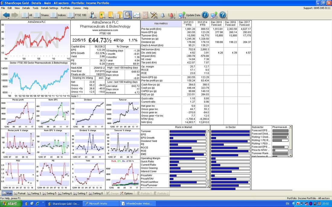
Target
In the near term, there is a lot of Resistance on the Chart at around 4900p - so there is a good chance that this will cap gains for a while. It is pretty likely that I will close this Spreadbet Long Position if it gets up to 4900p but I will keep my Shares in the Income Portfolio because I need the Divvy Yield !! This also has the benefit that if a Takeover Battle does start again, then I am in the gain. If it gets to 4900p, that is 10% gain on my Exposure so I will be happy with that - especially when you consider that this is not really a High Risk trade by any means. In the possible event of a takeover bid, the Previous bid of 5300p must be the Minimum likely but probably 5500p or maybe a bit more perhaps (could we see 6000p?). Technical Aspects As usual, I will run through the Indicators I always use for my Stocks. For more details, have a look at my Series of Blogs that I did on OPAY. It’s worth noting that the Technical Indicators lined up very nicely on this one. If you look at the Chart below, this shows the Long Term picture - I always start by looking over a period of many years. As you can see, the Black Line marks the bottom of an Uptrend Channel and the Red Line marks the top of the Uptrend Channel. I have drawn in a Blue Line which marks a Narrower Uptrend Channel which has formed over the last year or so within the Larger Channel. 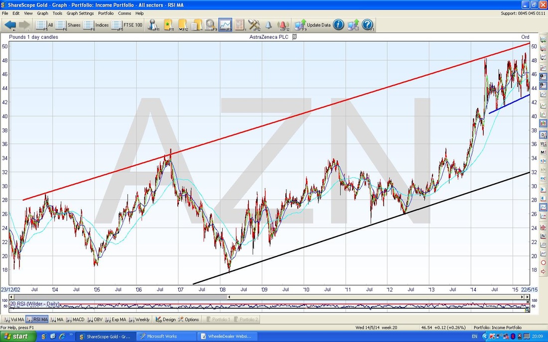
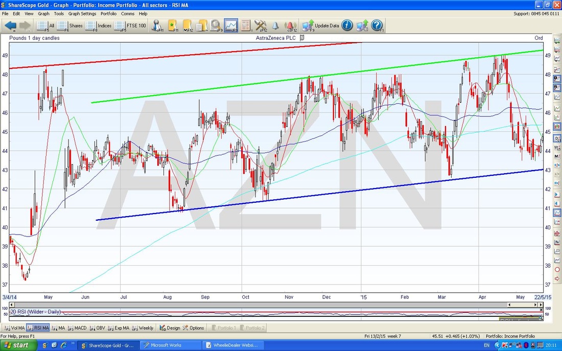
The Chart Below zooms in on the more recent Narrower Uptrend Channel and you can clearly see how the Price is down at the bottom of this Channel. Obviously ‘Buy Low, Sell High’ implies you should Buy at the bottom of the Channel and Sell at the Top !!
The Screen below zooms in on the Daily Candles that I looked at last night when I made my Buy Decision. The Black Circle shows a nice sort of Hammer Candle which usually denotes that the Bulls are coming back in after the Bears have had it their way for some days - look at the Down Candles that preceded it for 9 days or so.
After the Black Circle Hammer, the Price bounced but couldn’t hold up and dropped again - but then we got another Hammer which I have marked with the Green Arrow and then we got a ‘Long Tails Doji’ which is the thing I have circled in Blue. All these Candles show Intraday Reversals where the Bulls have charged in after the Grizzlies tried to take it down. The Black Arrow points to a line of Support around 4350p where the Bulls clearly have decided on 4 occasions lately that enough is enough and it is time to get Buying. The Blue Arrow points to a Candle that was produced on Friday. The interesting thing here is that it shows the Price turning up after the Hammers and stuff but note it is not really a superb Candle. Ideally I would have liked to have seen a Big White Up Candle with no ‘tails’ - this would show strong conviction by the Bulls. As it happens, we got a bit of a ‘Doji’ (bit like a Cotton Reel) which was not really a sign of strong commitment. However, all the other Technical Indicators are so good that I was prepared to not get overly bothered about this. Note the Blue Line from the Uptrend at the bottom of the Screen is another area of Support and I would expect 4300p to be a level where the Buyers come in strong. 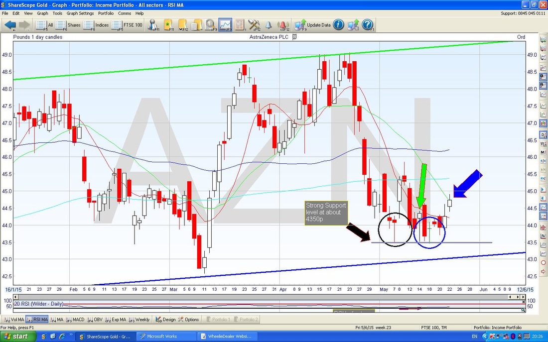
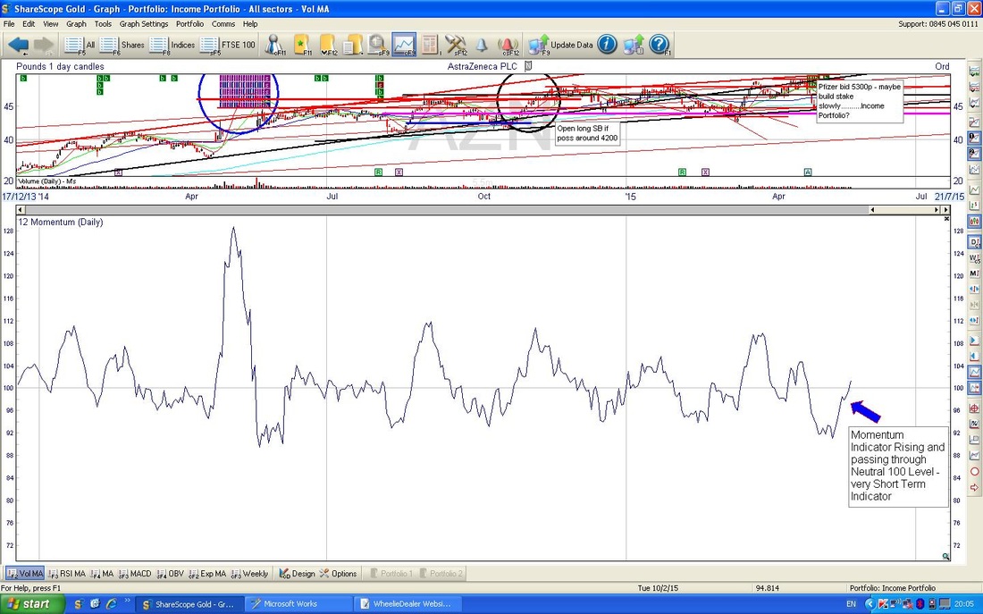
The Chart below shows the Momentum Indicator. This is very much a Short Term Indicator for just a few days - I have put it in here for completeness but it is not really anything like as useful as the RSI which is on the next chart. Note the Momentum Indicator is turning up as I have marked with the Blue Arrow.
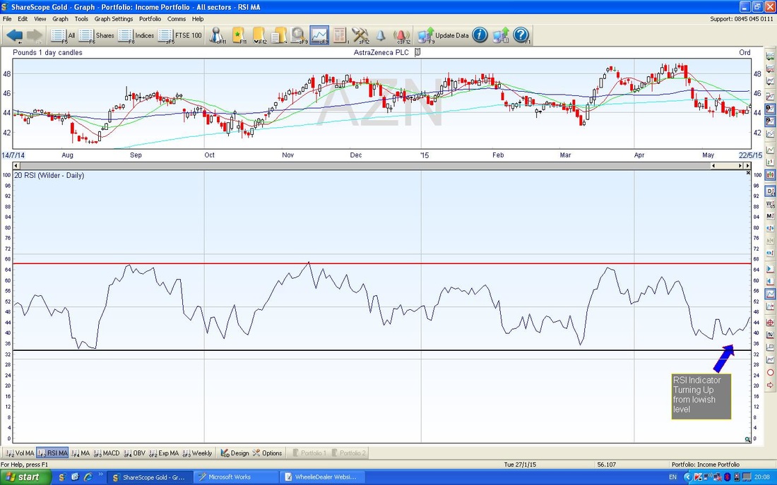
As promised, here is the RSI (Relative Strength Index) - I love this Indicator - definitely one of the most useful and something worth getting your head around. On this Chart below, you should see that the RSI is coming up from a low level and when this happened previously, you should see that the Price Line above, rose.
The Chart below in the Top Window shows the Bollinger Bands (the Solid Blue Lines above and below the Price Candles). As you should see, the Green Arrow points out where the Price Line has moved away from the Bottom Bollinger Band - this is good for Bulls.
The Lower Window shows the MACD (Moving Average Convergence Divergence) Indicator - the Blue Arrow shows that the Solid Blue Line is crossing the Dotted Blue Line - if you look to the left, you should see that when this has happened before, the Price has risen. The Black Arrow points to the MACD Histograms - which is just another way of showing the same thing as the Dotted and Solid Blue Lines - but I quite like these Histogram things - easy to interpret. 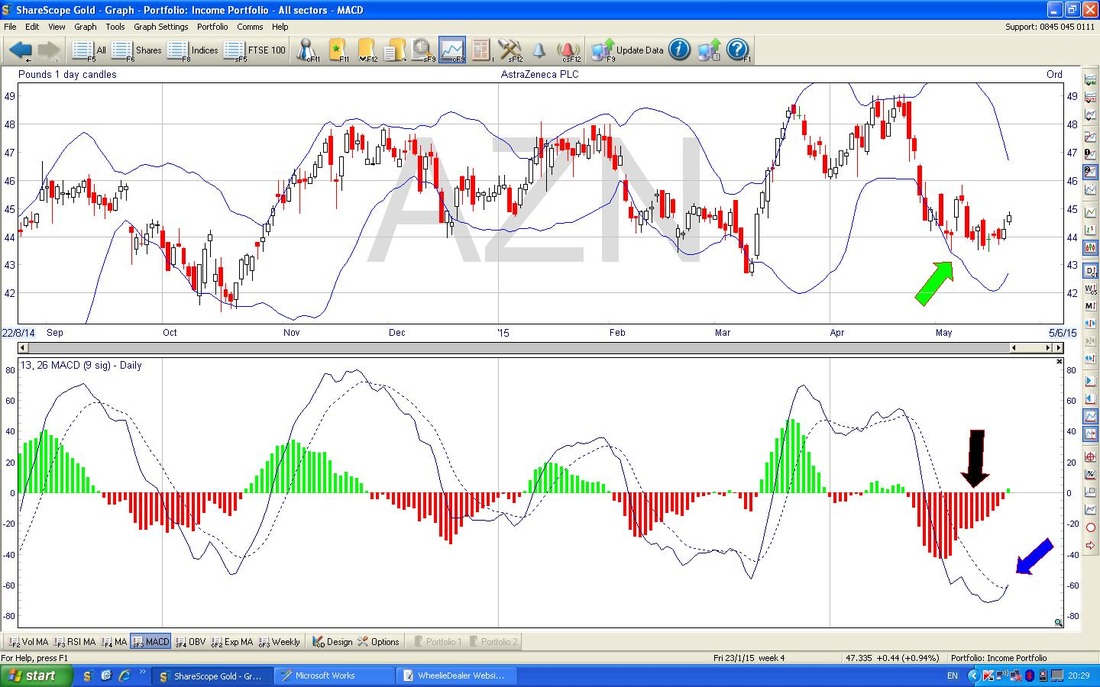
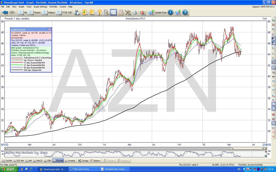
On the Chart below, you should see how the Price is now sat around the 305 day (10 Month) Moving Average Line. When this has happened before, the Price has gone up.
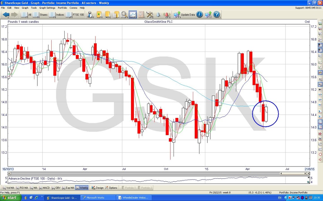
The Chart below shows the Weekly Candles. Note the Blue Circle shows a bit of a ‘ bullish Harami’ formation - this sort of looks like a Pregnant Woman viewed from the side - ok, this is not a great example !!
0 Comments
Leave a Reply. |
'Educational' WheelieBlogsWelcome to my Educational Blog Page - I have another 'Stocks & Markets' Blog Page which you can access via a Button on the top of the Homepage. Archives
May 2024
Categories
All
Please see the Full Range of Book Ideas in Wheelie's Bookshop.
|
