

|
educational blogs |
|
Funny old business last week with a huge drop on Thursday with SuperMario’s mega QE (Quantitative Easing) and NIRP (Negative Interest Rate Policy) spooking the Markets into thinking the Eurozone was in dire Economic straits, followed by a huge Up Day on Friday when the Markets decided that the ‘Stimulus’ effect outweighed the Economic concerns - all very silly really.
My own view is that QE and NIRP are idiotic beyond belief and ultimately we are in for a serious Economic Shock - I will go into this more in coming Blogs no doubt as I have already written a draft one about NIRP and its likely consequences.
The big event next week is Ozzy’s Budget on Wednesday - in general I don’t find these really impact the Markets much but certain Sectors can get hit if he does something specifically detrimental concerning them (ever so rarely he does something a Sector actually likes !!). I guess the usual ones to watch are Housebuilders and General Construction and things like Insurance, Banking, Pension Providers, Gambling etc. Quite often the effect is only felt for a few Days around the Budget - on the whole I get the impression these things are a bit of a non-event for the Markets - but I have not done any detailed analysis of this.
According to the UK Stockmarket Almanac, the coming week is Up for 58% of Years with an Average Gain of 0.2% - so it looks a pretty flat week historically. Note, Friday 18th March is ‘Triple Witching’ Options Expiry in the US which often causes some crazy swings on Friday afternoon. Readers and Twitter Followers may know how I have very little regard for Fridays - I find them very bizarre and unpredictable and I think they are better spent down the PUB doing serious research. It is very rare for me to do any Buys or Sells on a Friday. For a typical March, the Week after (commencing 21st March) is historically a poor Week and finishes with Good Friday on the 25th March - with the End of the Tax Year and stuff I suspect we might have a couple of soggy Weeks ahead - obviously they are two short Weeks as Easter Monday is on the 28th March. Sectors It struck me that when I look at Investors Chronicle in the ‘Companies’ bit at the back, so many of the Charts look ropey - the obvious conclusion was that maybe the recent Recovery in Stocks has been very confined to just a few Sectors - things like Mining and Oil really. I also got the impression that Defensives like Tobacco had done well recently. Anyway, I have not had time to do this in any detail, but out of 37 Sectors that I have set up on ShareScope for the FTSE350 - 13 of them are Up for the Year and 24 are Down for the Year - so it does look pretty uneven and the Recovery doesn’t look particularly widespread. It might be an interesting thing for Readers to look more deeply into. FTSE100 The Chart below from ShareScope has the FTSE100 Daily Candlesticks for about the last 10 months. The key element here is marked by my Green Arrow and is the falling Blue wavy line which is the 200 Day Moving Average - we need this to at least level out to be really sure a durable recovery is on the cards. My Black Arrow points to the darker wavy Blue Line which is the 50 Day Moving Average - this is still falling but seems to have flattened out a bit recently - we really need this to move up and cross the 200 Day from underneath to give a ‘Golden Cross’ - that really would be something to get the Bull Horned Viking Helmet out for. Note how we broke-out of my Red Downtrend Line (marked with the Red Arrow) about 8 days ago (my Blue Circle encapsulates this movement) - however, we have had a Pullback since that and gone below the Red Line again - but we closed Friday above it. We really want to see a sustained move up and away from that Red Line - at the moment, the Jury is out and it could just be an ‘overshoot’ rather than a proper Breakout. Note the Resistance just above at 6216 - this is the first level to crack through. After this, there is a lot of Resistance above - particularly at just under 6300 which is the 200 Day Moving Average and then up to about 6500 which forms a wide Band of Resistance. 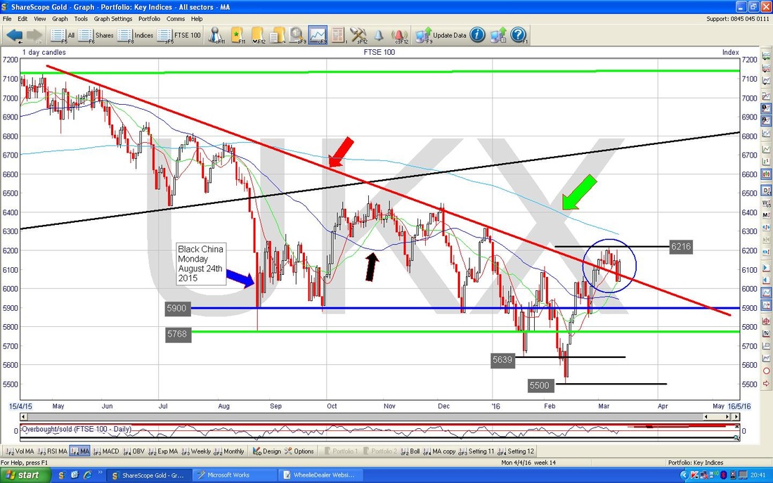
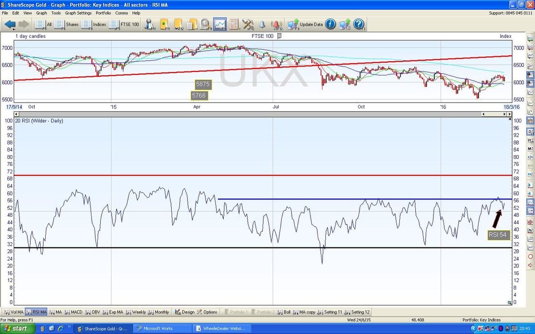
The bottom window on the Chart below shows the Relative Strength Index (RSI) for the FTSE100. A current reading of RSI 54 is not high at all and it seems likely it can go a lot higher before turning down - however, note the Blue Horizontal Line at only RSI 56 ish which is an area that has limited gains for most of this difficult period for the Markets.
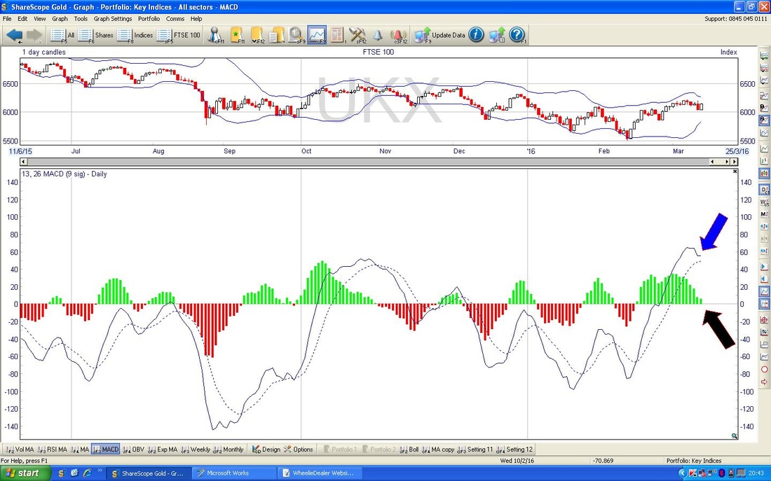
In the bottom window below we have the MACD (Moving Average Convergence Divergence) for the FTSE100. The ‘Lines’ and the ‘Humps’ are different ways of indicating the same thing - my Blue Arrow shows how the Lines are near a Bearish Cross and the Black Arrow shows how the Green Hump could easily go negative (Bearish) and start to form a Red Hump.
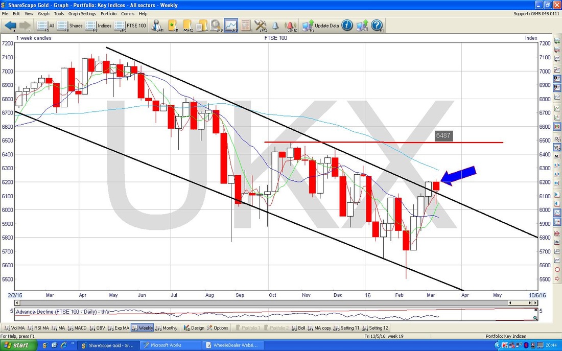
The screen below has the Weekly Candles for the FTSE100. My Blue Arrow points to the Candle from last week which is sort of a Hammer but in this context after 3 good Up Weeks (the white candles before it) this might mark a Reversal - it could be called a ‘Hanging Man’ I think - but it is not the clearest sign I have seen - just something to be aware of.
DAX
I fancied bunging in some Charts of the DAX - the main German Index. My Chart below has the long term view from back to 2008 ish - as you can see it is has really been a pretty decent Uptrend - but we did violate the Bottom Line earlier in this year. 
My Chart below has the Daily Candles on the DAX for the last year nearly. As with the FTSE100, my Green Arrow marks a falling 200 Day Moving Average which is not good and my Black Arrow points to a falling 50 Day Moving Average which is not good either !!
Note the Red Horizontal Line at 10000 - this is a key Resistance Level that needs to be cracked. Equally, the Price Line needs to get over my Blue Downtrend Line marked with my Blue Arrow - around 10400. 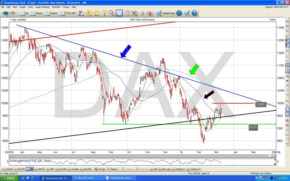
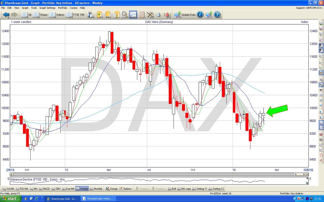
The chart below has the Weekly Candles for the DAX - my Green Arrow is pointing to a ‘Doji’ Candle with some pretty long ‘Tails’ or ‘Wicks’ - this might be a Reversal Signal in the context of the recent run up.
S&P500
The Chart below has the Weekly Candles over about 8 months or so for the S&P500 which is the most relevant US Index in my view. Note the falling 200 Day MA line marked with my Green Arrow and the falling 50 Day MA marked with my Red Line. You know these are not good. My Red Circle marks a huge area of Resistance stretching from about 2040 to 2120 which will most likely be very difficult for the Price Line to wade through - something to watch. My Black Arrow marks the very strong Up Candle we had on Friday - note this is up against the 200 Day MA and once it cracks that, it has to contend with my Purple/Mauve ish Downtrend Line (marked with a similarly horrible colour Arrow). 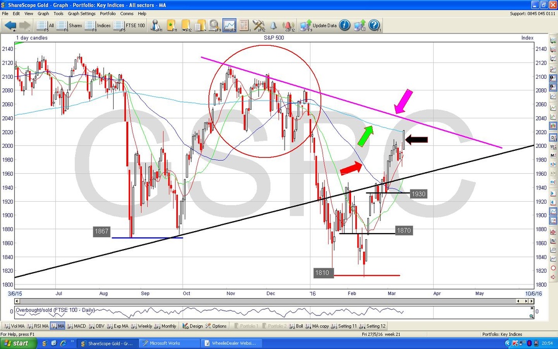
The Upper window in my Screen below shows the Bollinger Bands for the S&P500 Dailies - my Black Arrow is pointing out that it is very near the Upper Band - this is not disastrous as the Price can ‘hug’ the Upper Band and keep moving up - but often the Price will turn down after touching this Upper Band.
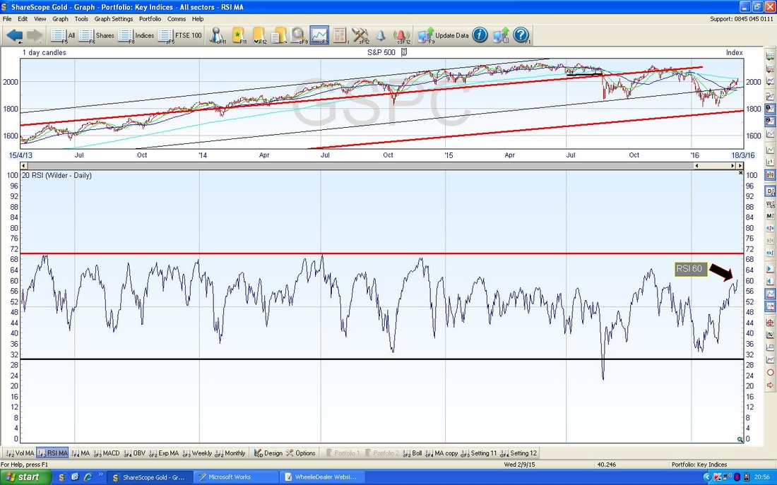
In the bottom window on my screen below we have the RSI for the S&P500 - my Black Arrow is pointing to where we are now on an RSI of 60 - this can go a lot higher but if you look to the left on the screen you will see that it rarely goes up to 70 and could turn down before that.
VIX
The screen below in the bottom window has the MACD for the VIX Volatility Index - this moves Inversely to the S&P500. My Black Arrow and Blue Arrow are pointing out that we are near a Bullish Cross - if this happens, then the VIX might rise which would mean that the S&P500 might fall. 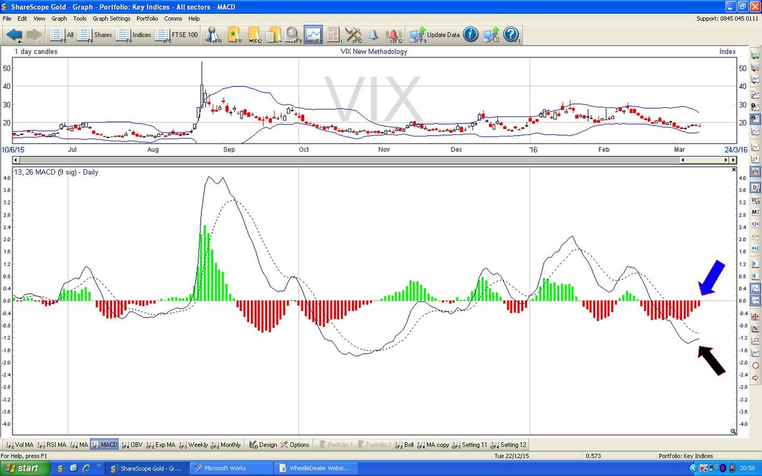
Brent Oil
The screen below has the Daily Candles for Brent Crude Oil going back about 7 months. Note the falling 200 Day MA marked with my Blue Arrow. My Black Arrow points to the 50 Day MA which has stopped falling and has levelled off and started to turn up - this is promising but we need a 50 / 200 Day MA Golden Cross here to really get more confidence that the Bearishness is over for Oil. That still looks some way off at the moment. My Blue Line marks a possible Bottom Line for an Uptrend Channel which might be forming - I have drawn a possible Upper Line for such an Uptrend Channel in Green. If this does come to fruition, then the Price is up near the top of this Channel and at best it might just go sideways for a while - at worst it may drop down to the bottom of the Uptrend Channel. This is mere conjecture as we do not have enough decent reference points yet to really draw a confident Uptrend Channel. My Black Circle marks an Area of Resistance that will need to be cracked - this is roughly $46 to $54. Note also the Level of $41.5 which is the next hurdle for Bulls to get over. The 200 Day MA is at about $46 and this will most likely be tough resistance. 
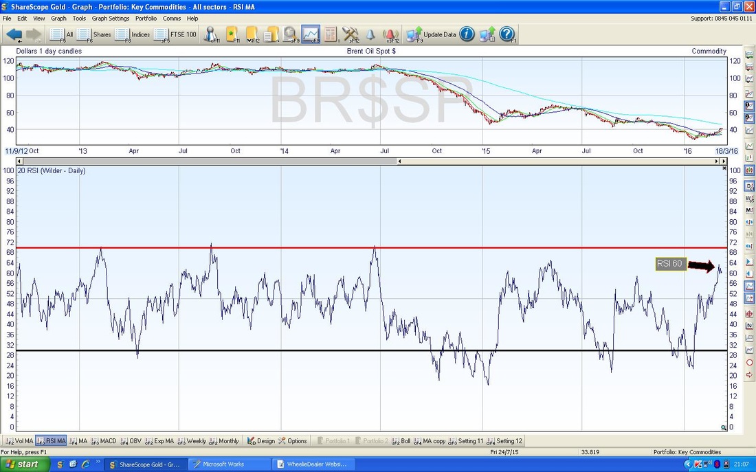
My screen below in the bottom window has the RSI for Brent Oil. An RSI of 60 is not all that high but in the context of Brent’s recent behaviour it might be getting a big toppy - but it could rise a bit more.
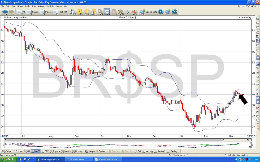
The Chart below has the Bollinger Bands for Brent Crude Oil - my Black Arrow shows how the Price has moved away from the Upper Line - this might mean it moves back down towards the Lower Band.
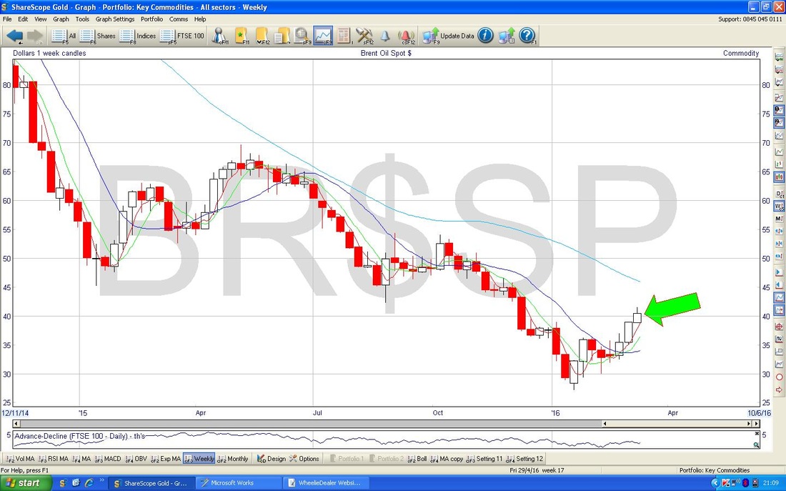
The Chart below has the Weekly Candlesticks for Brent - my Green Arrow is pointing to a possible ‘Inverted Hammer’ which was formed last week. However, it is not a great Signal in this case - the Upper ‘Tail’ or ‘Wick’ is pretty short so it might not be so bad. If it does act as an Inverted Hammer, then it is telling us that the Price will fall in coming weeks after it has had a good run up.
Gold
The Screen below has the Gold Daily Candles for about the last 5 months. Note that $1284 is now the Key Resistance Level to get over. The Price broke up out of my ‘Pennant’ Triangle thing (The Black Lines) but it has failed to really run up as you would normally expect - it really needs to get a grip and crack that $1284 Level. My Blue Arrow points to an Inverted Hammer from Friday - this is a much better example than on the Brent Oil Weekly Chart - although the context is not so clean as ideally you would want several clean ‘Up’ Days beforehand for it to be a really good Bearish Reversal Signal. However, this hints that the Price will fall most likely fall in the short term now. 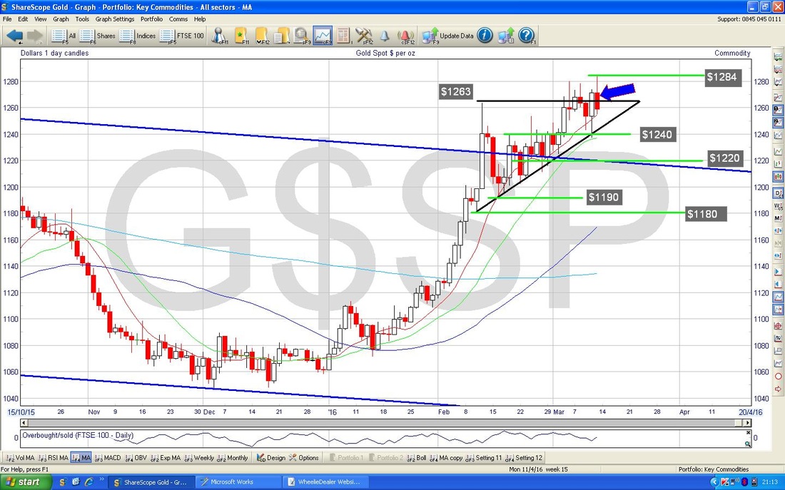
The chart below has the Weeklies for Gold - my Black Arrow is pointing to a ‘Doji’ with some nice long Tails and a very thin ‘Body’ - this could well be a Bearish Reversal Signal.
Right, that’s your small onions for tonight, good luck for the coming fun-filled days !! Cheers WD. 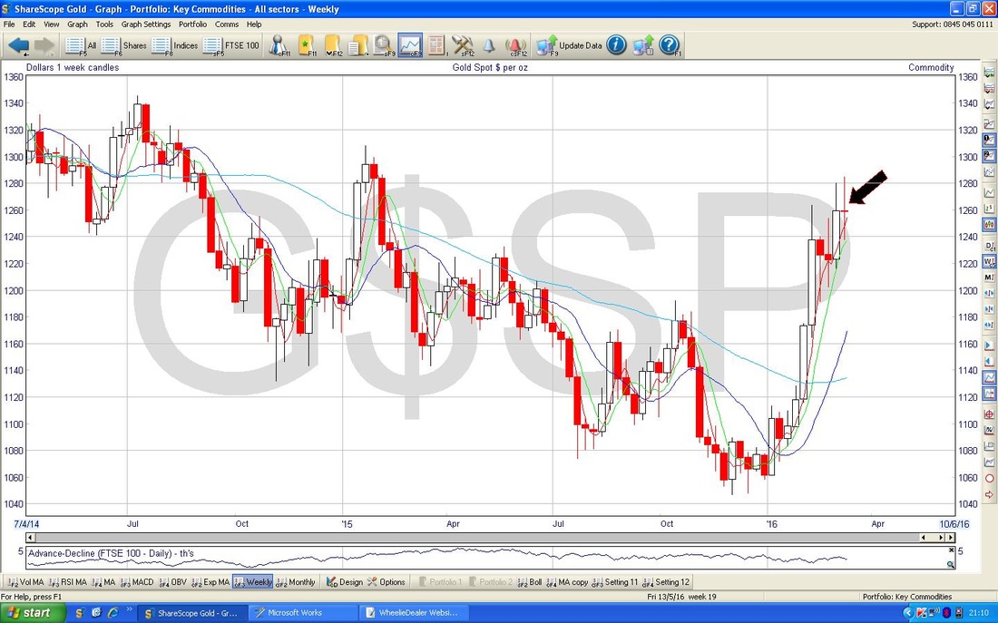
2 Comments
JonH
15/3/2016 07:56:06 pm
Thanks for ongoing analysis of markets. I took out a couple of shorts XUKS when the market was threatening to drop below 5800 as got badly stung during 2008/2009 bear market. This time the market has recovered and would have done better just to stick it out. But taking a position makes you much more interested in what the markets are doing.
WheelieDealer
15/3/2016 09:34:37 pm
Hi Jon, thanks for the comments - I find that writing these Blogs keeps me very focused on the situation in the Markets and as you say, having a position forces you to stay on the ball. Leave a Reply. |
'Educational' WheelieBlogsWelcome to my Educational Blog Page - I have another 'Stocks & Markets' Blog Page which you can access via a Button on the top of the Homepage. Archives
May 2024
Categories
All
Please see the Full Range of Book Ideas in Wheelie's Bookshop.
|
