

|
educational blogs |
|
I must have had this Blog in mind for the best part of three years and the simple concepts within it I have explained to various people in the Pub many a time since I first figured out what Jason @Stealthsurf was up to. What had stopped me writing it up until now was an inability to figure out how to ‘draw’ it and it was only after mucking around with Microsoft Paint to do those ‘Mechanics of a Trade’ Blogs that I realised I had found a tool to enable me to create what was needed here.
OK, I have to admit that despite my truly remarkable MS Paint talents, some of these pictures can hardly be called a Rembrandt or Van Gogh (and I have both my ears thank you very much !! …….or I did last time I looked in the mirror…..) but hopefully they are clear enough and simple enough to get the key points across and to provide Readers with either an entirely new way to go about doing things or at least to give a lot more appreciation of ‘Break-outs’ and how this could help boost their Trading/Investing Returns.
First off I will just introduce a few important Chart concepts that you will need to get your head around really if you are to make much sense of the rest of what I have scrawled here. I was thinking of doing a totally unrelated Blog about these concepts so this whacks 2 birds out of the tree with one well-aimed and lucky chuck (RSPCA !!!).
An Upside Breakout Understanding the concept of a ‘Breakout’ is extremely important and I suspect the vast majority of Long-term Investors have no idea what I am going on about although there must be very few Traders who don’t know what a Breakout is. However, whatever your overall approach is, the principle of a Breakout is extremely useful and even I as a Long-term Fundamentals-driven Investor keep my eyes peeled for Breakouts and will take advantage of them if they suit with the timing of Buy Decisions for me. In the picture below, the Black Horizontal Line represents a Price Level where the Share Price has moved up to and then hit Resistance and then fallen back from. In my simple example, the Price has nudged up against Resistance at the Black Line twice and then finally on the third attempt the Price has smashed through the Resistance Line and we have a bone-fide ‘Breakout’ to the Upside. In practice, you probably get more attempts than this (3 or 4 seems quite common to me) but for simplicity I have just shown the 2 attempts. Think about what is actually happening here in ‘The Real World’. Let’s say the Black Horizontal Line is at 100p. Initially the Price moves up to the 100p level but at this Price there are many Holders of the Stock who decide to Sell for a variety of reasons (this could be that they bought not long before at 80p and they are happy with a nice 25% Profit quite quickly or they might have bought lower down. It could even be people who bought much higher up and they have seen the Price collapse and now it is recovering and they think “OK, I paid 130p for it a year ago but I am happy to get out at 100p and take the Loss.” etc.). So after initially moving up to 100p the Price then falls back as Sellers take control, then after a move down to perhaps 90p, the Bulls come in again and drive it back up to 100p. This time there are still some Sellers around (weak Holders) and some people who might have just bought near 90p and who are very pleased with a small gain very quickly - so yet again the Price falls back. Then there is a third move up when the Bulls come in again at the lower Price and this time the Bulls are successful because the Sellers at 100p are exhausted (they were cleared out on the 2 previous attempts to get over 100p) and now with no Selling Pressure, the Price just smashes through the 100p Level and charges on up as Bulls party hard. In addition, such a Breakout is ‘self-fulfilling’ in that many Traders will see the Breakout happening and they will be buying as well (the way this works is that some Traders see the Breakout early and buy at 101p or 102p etc. and others are a bit late but are still buying at 107p, 108p etc. After a while, the Buyers get exhausted and the Price will fall back and this is exacerbated by early Breakout Buyers starting to Sell). Other factors which affect this Resistance suddenly breaking to the upside are the Targets and Stoplosses of Traders. On the Targets side, Traders who bought lower down may set automatic Sell Orders which trigger once the Price gets up to the Breakout Resistance Level - so every time the Price gets up to that level, ‘Limit Sell’ Orders kick-in and the Price falls back. On the Stoploss side, there might be Traders who are Short who put their Stops to automatically trigger at or near the Resistance Level - although in practice there wouldn’t be many of these unless it is a hugely liquid Stock like a Vodafone VOD or something. The point I am trying to make is that there are technical Trading reasons why a Resistance Level can act to cause Selling and thus force a Price down again. After a while, these Sell Orders and other Sellers get exhausted and the Price can then go above the Level and Breakout. A particular form of Breakout is an All Time High (ATH) Breakout and such events are very bullish because there are no natural levels of Resistance up above - so the Price has ‘clear blue water’. So it is important to realise that such Breakouts to the Upside can give explosive moves and anyone can take advantage of these if they are tuned in to look for them. 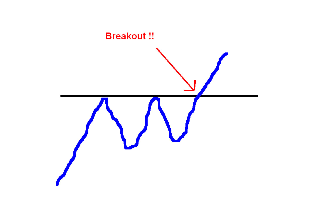
A Break-down
This can also be called a ‘Break to the Downside’ and is really the exact opposite of the Upside Breakout we just covered. This time it takes place within a Downtrend Channel (the Breakout takes place in an Uptrend Channel although both can happen after a Sideways move) and in this case the Sellers overwhelm the Buyers at a given Price Level. On my Picture below, the Black Horizontal Line is a Price Level which is acting as ‘Support’ to the Price but after a couple of attempts to fall below it, the Price finally smashes down through on the third attempt and then the Price just keeps falling until it finds Support at a new lower level. Such levels of Support are sometimes referred to as a ‘Ledge’. As with my Breakout example above, I have only shown 2 failed attempts to break-down, in practice it probably needs 3 or 4 or more. Think about what is happening in reality here. Let’s say the Support Line is at 50p and the Price is in a Downtrend (my, this sounds like a pretty crappy stock !!) and has been falling for a while but finds Support at 50p (this would make sense because numbers like 50p, 100p, 150p, etc. are psychological numbers and often act as Support or Resistance). This time when it gets down to 50p the Bulls come in and start buying because they think it is now ‘cheap’ (nothing is really cheap when a Stock is in a Downtrend Channel because there are immense forces driving the Price down and it is very risky or even foolhardy to be buying a Stock that is collapsing like this) and they drive the Stock back up for a while, but soon the Sellers come in. Other Buyers who might be coming in are Bulls who have been in the Stock for ages as it has fallen and they are now ‘Averaging Down’ which is very dangerous when a Stock is still in a Downtrend. I am a big fan of Averaging Down but ONLY if it is a Quality Company that is turning around and if the Price is starting to move up again and has come out of the Downtrend. You should never buy more of a Loss-making Junky AIM Stock. It is madness. This time the Sellers could be people who bought at 50p or just above and they might be selling at 60p to bank a small profit very quickly or they might be Holders of the Stock who have had it for ages (they might have bought at 130p or something) and they are really upset and exasperated with the Stock and when it moves up to 60p again they take advantage and dump it to get out of a problem (and obviously they accept a nasty Loss on it). After this first bounce off of the 50p level, the Sellers come in again and the Price gets driven back down to the Ledge level. This time a similar thing occurs where Buyers take control again but after a move up, it again falls away as Sellers take command - but on this third attempt at the 50p Support Level there are no willing Buyers left and the Price smashes down through the Level. In a similar but opposite way to the Technical Triggers I mentioned for the Upside Breakout - many Short Sellers will have set-up their Trades in advance to Buy back their Short Position once the Price falls down to or near the Support Level. Once the Price gets at or near the Support Level, the ‘Limit Buy Orders’ automatically kick-in and drive the Price back up again. After a while and a few attempts, all these Buy Orders get exhausted and the Price can drop down through and cause a Break-down. Understanding the power of such Ledges and how they can break-down could save you a lot of Money. The Break-down is not important for Jason’s method but while I was explaining the Breakout to the Upside, it seemed a good time to cover the Break-down as well. By the way, the RSPCA were not very happy with me but fortunately the Neighbour’s Cat had scoffed the evidence……. 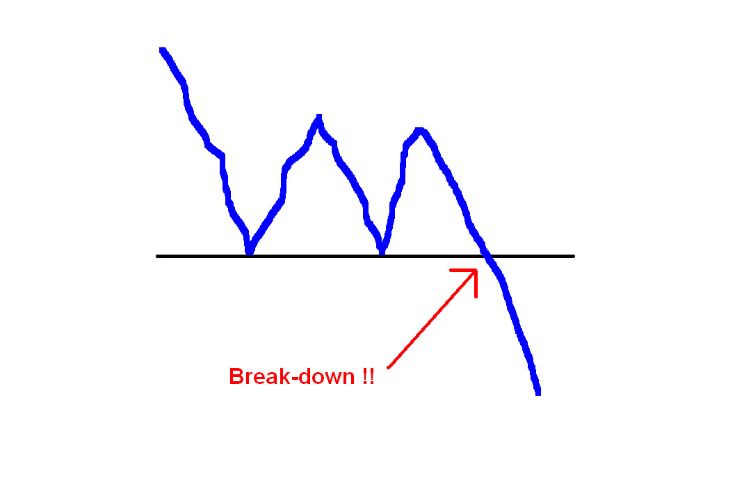
The Staircase
First off my astonishing piece of quality artwork (if you print it out and frame it then you will be a gazillionaire in the future when I am long gone) below shows a sort of typical Chart for a Share Price over time - this could be several years most likely but to an extent the timeframe is less important - although the approach Jason uses is certainly a longer timeframe than just intraday or a few days - it really can be applied over periods of weeks with a high degree of success. The key thing to realise on this typical Share Price Chart is that the Price moves up and down in ‘Trends’ and of course these are Uptrends and Downtrends (regular Readers will know I often call them ‘Channels’ and that is useful terminology I think). In a similar way, within the Uptrend Channel or Downtrend Channel you also get ‘Retracements’ or ‘Pullbacks’ and I like to see these kinds of moves as waves within the larger, dominant, Trend. 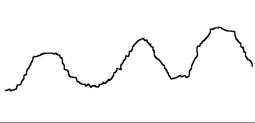
The next image just looks at an Uptrend leg of the Price moves (in other words an Uptrend Channel) - the key point is that it looks like a ‘Staircase’ with moves up, then a sideways period, then a move up, then a sideways period, then a move up……..I am sure you get the point by now.
If you look at a Share Price Chart over a period of Years you can expect to see the Uptrends and Downtrends that I showed on the first Chart and if you concentrate on an Uptrend, you should see similar motions to the Staircase as per my second Chart. Note the sideways movements are what Jason calls a ‘Consolidation’ period (sorry if I am putting words into your gob mate, but hopefully I have captured the essence of what you mean), and he says that such Consolidations can take place either by Time or by Price. In other words, when you have an Uptrend (a Downtrend would be the reverse of this), the Price makes a steep move upwards, then the excitement of the Buyers (the Bulls) needs to calm down a bit and this is the Consolidation period. If the Price just goes sideways this gives the Bulls the time to take a breath but the Sellers (the Bears) are unable to really take the Price down again. After a while, this can be perhaps a few Weeks, the Bulls get all excited again and they manage to overpower the Bears and drive the Price up again, so we get a big rise up. The other type of Consolidation is when the Price has moved up sharply and then the Bulls need to calm down as before, but this time the Bears are a bit more ferocious and they drive the Price down which initially scares a few Bulls into Selling but after a bit of a Pullback, the Bulls realise it is ‘cheap’ again and they come charging in and drive the Price up again and on to new Highs. Something to appreciate on the ‘Staircase’ is that it is rarely perfect like I have shown. In most cases I would expect the Upwards bits to be fairly direct and steady but the Sideways Consolidation periods could be quite messy with the Price chopping about all over the place. In practice this means that the Consolidations are often significant down moves rather than clean sideways moves over a few Days or longer. I have no doubt that there is a certain ’skill’ and ’art’ in recognising these Consolidation periods and sticking with the Trade rather than panicking and selling out too early - as always nothing is straightforward and simple in this game !! 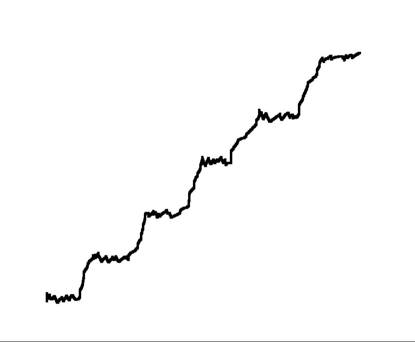
Right, that is it for Part 1 and sets the scene before we get stuck into Jason‘s excellent system. To be honest I would suggest that it might be best to wait for Part 2 which should be out next week before you look at Jason’s Website (it might make more sense if you read my simple explanation first) but if you really can’t wait, then go ahead and take a peek here:
www.tradingbases.co.uk And you can follow him on the Tweets as @Stealthsurf which I strongly recommend. Note, Jason has a few different styles but I am concentrating on the technique he uses to trade ‘Bases’ (don’t worry, it will all make sense after Part 2 !!). Oh, and to be clear, Jason has a subscription service which you can sign up for if you like but I get no kickbacks or anything - I simply wrote this Blog because I think it is a superb system and well worth understanding and I think Readers will find it useful. Of course many of Jason’s ideas were inspired by Mark Minervini and if you buy his Book through ’Wheelie’s Bookshop’ then I get a small gain from Amazon out of it. Feel free to splash your Cash if you want (don’t if you don’t want to !!) Cheers, WD.
1 Comment
Sean
22/6/2020 08:54:15 pm
What happened to part 2? Lol Leave a Reply. |
'Educational' WheelieBlogsWelcome to my Educational Blog Page - I have another 'Stocks & Markets' Blog Page which you can access via a Button on the top of the Homepage. Archives
May 2024
Categories
All
Please see the Full Range of Book Ideas in Wheelie's Bookshop.
|
