|
The thought that we still have about 3 Weeks to go on this General Election run-in is beyond depressing. We all know what the result will be and thankfully the Markets should take this in their stride and any negative forces on Stocks are likely to come from completely different factors if they do occur.
The Campaigns are just so dire - T May seems to have totally absorbed her Conference Speech from many years back where she talked about “The Nasty Party” and consequently you wouldn’t even know she was the Leader of the Tories if you just had a quick look at the Campaign Marketing fodder. It is very much a Campaign to elect T May as the President.
UKIP seem to have got the ultimate Walter Mitty leading them - how Baldy has gone from being quite well respected to one of the biggest fabricators of truth in modern politics (that’s some distinction !!) is impressive and he can only rival Nick Clegg in his decline. But of course the real question is around what the point of UKIP actually is - now Brexit is happening, UKIP seem to look very much like the Party of Fruitcakes and Nutters that Hameron branded them as. Needless to say Voters are deserting UKIP in droves and this is a key reason for a highly likely Tory Landslide.
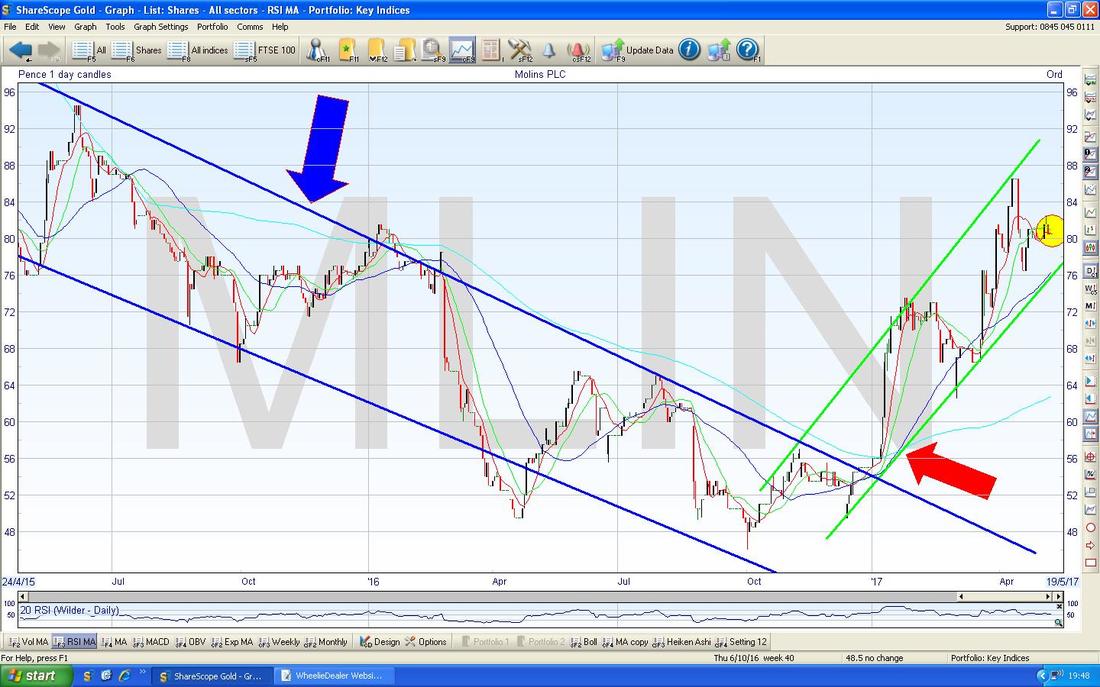
And as for Labour. Oh My Goodness. It’s hard to know where to start. The saddest thing of all is how the Electorate is treated by Labour (and others I must add) in such an infantile manner - although clearly there is a part of the Plebiscite that is so Economically and Mathematically illiterate that they believe the twaddle Corby and his Marxist Shadow Chancellor come out with. The worst thing about all these utterly unaffordable promises is how it gives an impression to a chunk of the voters that ‘Austerity’ can be avoided (don’t believe the hype, there has been no Austerity at all in the UK - Public Spending has grown for every year since the Credit Crunch) and that it is simply because the Tories are so mean that everyone has to suffer. This is extremely dangerous and it strikes me that Labour’s cries for their Manifesto to be reviewed by the Office of Budget Responsibility, ought to be taken up. I think it could be a really good thing if Manifestos were independently reviewed (of course this throws up issues around what ‘independence’ really means) and if a Manifesto is clearly idiotic like Labour’s current effort then that should be made very plain to the Electorate. It cannot be a good thing for our Society to have a large number of people thinking they can get “Something for Nothing” and that Government Money is infinite - this is clearly an unsustainable situation and the kind of behaviour we expect from South American Countries not from a grown up World Leading Economy. It is astonishing how many people seem to have no concept of how the UK is borrowing vast sums every day and think that “The Cuts” don’t have to happen - it is utter fantasy from people with no understanding of Economics or Maths. And then we get the other myth of how ‘The Rich’ don’t pay any tax - pitting one part of the Population against another group like this doesn’t seem a particularly cohesive way to run a Country. Politicians on the Left continually claim that Austerity is a choice and it can be avoided. There are a couple of ways in which they are correct, but sadly they are either too dishonest to explain this to the Voters or perhaps they are just so Economically illiterate that they actually don’t understand this - I fear it is the latter. Labour’s current Manifesto stance is that they will borrow more money and grow the Economy by investing more than the Tories and there is some small truth in this. However, the problem is that their Policies will actually destroy Growth in the Economy and borrowing more Money at the same time will just end in a horrible mess and anyone who has been around a while will know how quickly the Markets can lose faith in a Country’s ability to pay its debts. Already the UK has a huge problem with the amount of Government Spending which is merely servicing the Debt Interest (I think it is around 8% of Government Spending which is clearly Money that cannot be spent on Schools, Hospitals etc.) Adding to the Debt without Pro-Growth Policies at the same time is just ridiculous - and it is notable that Paul Mason who is very much a cheerleader for Corbyn’s Looney Left Economics has stated that Opponents of Labour should look at how Labour will pay for all their Promises when the impact on the Economy is considered. As I mentioned above there are a couple of ways that you can borrow more and get faster Growth - well, in theory anyway although in practice they have rarely been tried or actually worked. Trump bizarrely gets it - he has promised to borrow more Money but the key thing is that he plans to undertake Pro-Growth deregulation Policies at the same time - this is the only way that Borrowing more will have any chance of getting more Growth - otherwise you are merely pushing on a piece of string. Sadly Corbyn and the Bonkers Left are doing precisely the opposite - they plan to borrow Bucket-loads of more Cash but actually regulate more and undertake a long list of Policies which will be self-defeating when it comes to promoting Economic growth. There is another way in which Corbyn might be able to create growth - but this is simply not going to happen (thank the Lord) and would only work for a limited period anyway. Back in the early 20th Century when Russia undertook its massive Social and Economic Experiment with Communism, they actually achieved very fast Growth for the first few years - it seems to be the case that State Control of “the Commanding Heights” of an Economy can boost Growth very well for a while as Resources are deployed in a more efficient manner. The problems arise because a Communist System lacks incentives and reasons to improve things - so over time everything stagnates and it becomes a total joke with queues at the Bakery and everyone driving a Lada. Maybe Corbyn and that crazy Shadow Chancellor want this - but they should be honest and say so. And then we get that Thornberry on Andrew Marr saying “Market Makers are Hedge Funds” and the Long-Bailey talking about “High Frequency Trading” on Sunday Politics and it is hard to bother to keep breathing. Then we have the Greens - what on earth is going on here? They seem to be more of a Bonkers Lefty Party than an Environmental bunch - I can’t even remember the last ‘Green’ Policy they actually announced - why don’t they just join with Corbyn and let Greenpeace do the Green stuff? Today we got Nicola Sturge admitting that kids in Schools were failing at literacy and numeracy - perhaps that is deliberate so that there is a whole new Electorate of kids who don’t have the brain power to figure out that her Policies don’t add up either. And poor Tim Farron - irrelevant. The Tail-End of May The bigger factor that concerns me is really how May normally plays out - from consulting my slightly out of date copy of the UK Stockmarket Almanac, it seems to be that the Month of May tends to have a couple of good weeks and then things slide off and make May the 3rd worst month of the year - so maybe we will see this Seasonal Pattern repeat in the next couple of weeks. Regular Readers will have probably picked up on my theme of Global Economic Growth in recent Weeks - it strikes me things are still progressing in this way with the US seeming to be growing quite well and Europe especially waking up from its long slumber. There are signs the UK is slowing a bit but with Easter being late I suspect the figures are being skewed - despite all the talk of Brexit causing a slowdown, there is in fact very little, if any, evidence that this is happening. It is notable also that Woody Woodford in his recent Video and Update on his Funds mentions how the UK is doing quite well Economically and far better than the Pundits were predicting. If we see these Growth trends continuing, this could fuel any continuing moves up in Global Stockmarkets - and as we will see further down this Blog, the Charts are all backing up the idea of more gains to come although in the very short term maybe we may get some small pullbacks. Time for some Charts - this week I have picked out a few for Individual Stocks that I thought looked interesting. Molins MLIN Starting off we have MLIN which I bought more of last week (see the ‘Trades’ page on the Website for more details) and this Chart is the Daily Candles going back about 2 years or so. Note the Downtrend Channel which is drawn with my Blue Lines and look at how the Price broke-out of the Upper Blue Line (pointed at with my Big Blue Arrow) back in early 2017. Since that Breakout, the Price has been moving in a nice Uptrend Channel which is bounded by my Parallel Green Lines. My Red Arrow is showing a ‘Golden Cross’ between the Darker Blue Wavy Line which is the 50 Day Moving Average and the rather faint Lighter Blue Wavy Line which is the 200 Day Moving Average - this is a good sign for more gains to come.
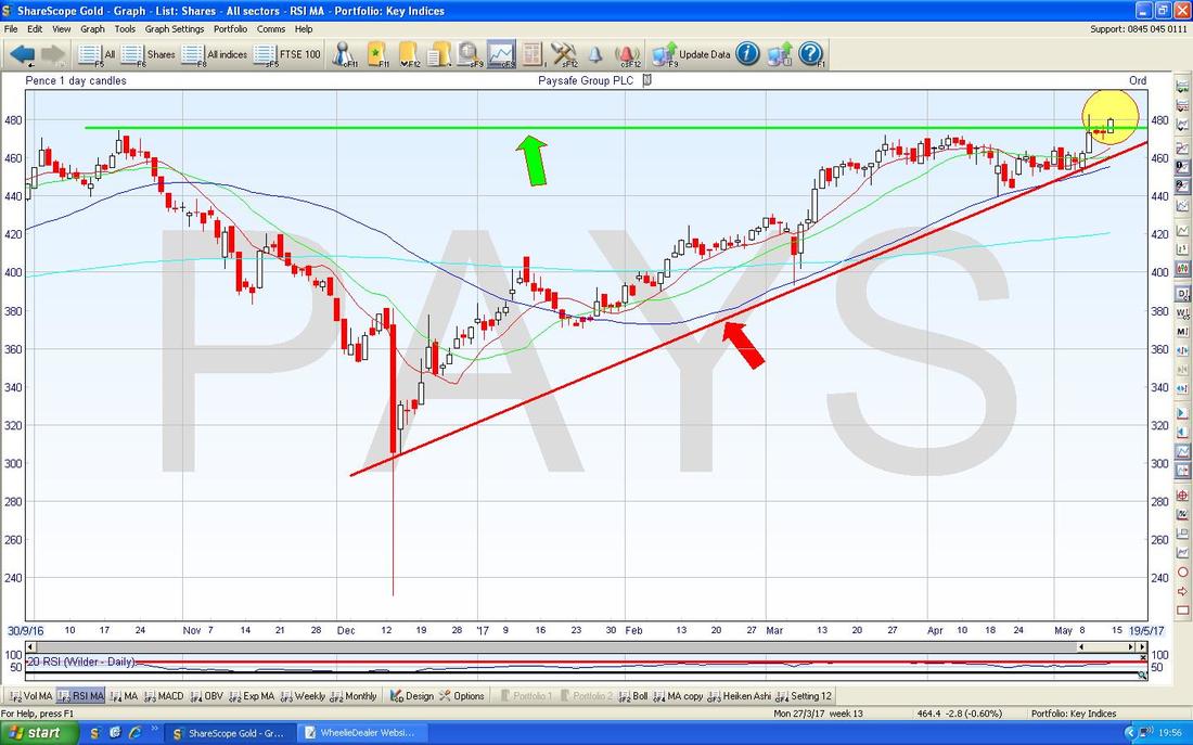
Paysafe PAYS
This is another one I bought more of during the week. The Green Line here at the top (marked with my Green Arrow) shows the Previous All Time High Resistance and my Yellow Circle is highlighting how we Broke-out above this line early in the Week and then on Friday we smashed through it in fine style. Such ATH Breakouts are very Bullish Behaviour and I expect to see a lot more Gains here - the Stock looks decent value as well which you can see from the comments on my ‘Trades’ page. I totally love it when decent Technicals line up with a decent Fundamentals picture as well. My Red Arrow is pointing to a Support Line at the bottom and note how between the Green Line at the Top and the Red Line at the bottom we have a Big Triangle which has squeezed the Price up out of the Top. I really need to patent this as ‘Wheelie’s Dairylea Squeeze Pattern’……..
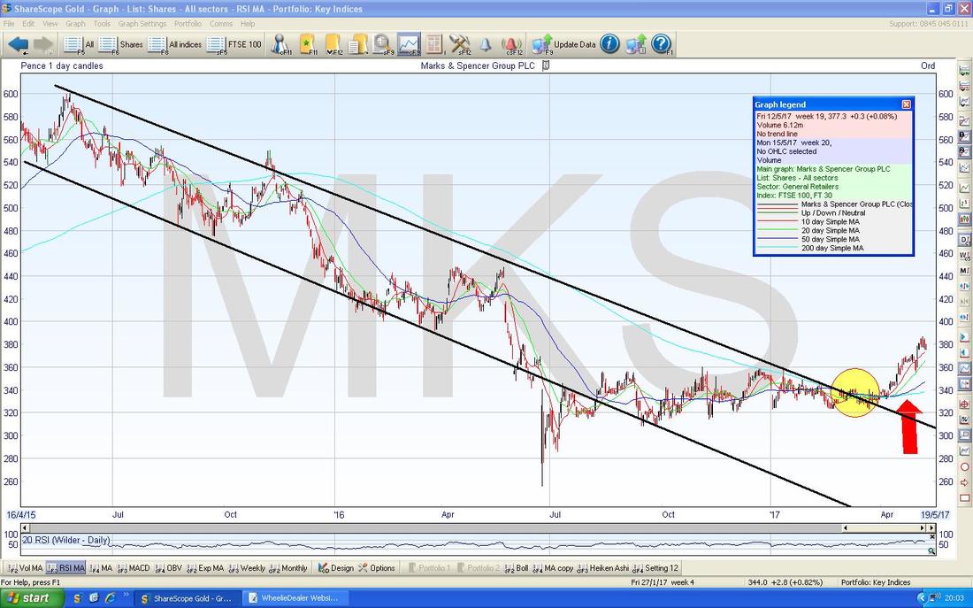
Marks & Spencer MKS
There have been a lot of Senior Management changes at MKS and these could perhaps turn things around after many years of lacklustre performance - in fact, it is quite amazing that the Share Price is still below the 400p that Philip Green offered all those years ago….. It’s an interesting Chart though. As always, my ScreenShots are taken from the ultimate in Charting Software, ShareScope, and if you click on them then they should grow bigger in your Browser and be clearer to see. The Chart below has the Daily Candles for MKS going back around 2 Years and for much of that time the Price has been in the Downtrend that is bounded by my Parallel (OK, they are not perfect !!) Black Lines. Note where my Yellow Circle is that the Price broke-out of the upper Black Line and the Price has been trending up ever since. My Red Arrow is pointing to a 50/200 Day Moving Average ‘Golden Cross’ - this suggests more Gains to come.
88 Energy 88E
Someone asked me about this Stock a couple of days ago. Obviously from a Fundamentals viewpoint I detest it, but from a Chart view it is quite interesting in that what it does next will dictate whether People are going to make Money here in the Short Term or whether they are more likely to get butchered. It really is a huge Triangle formed over around a Year between my Blue Line at the top and the Green Line at the bottom. If it pops out of the top Blue Line then you can expect it to go higher, but if it falls down below the bottom Green Line then Holders will be toast.
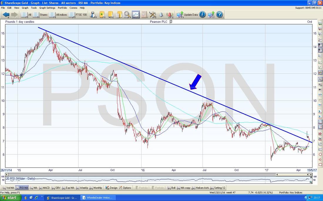
Pearson PSON
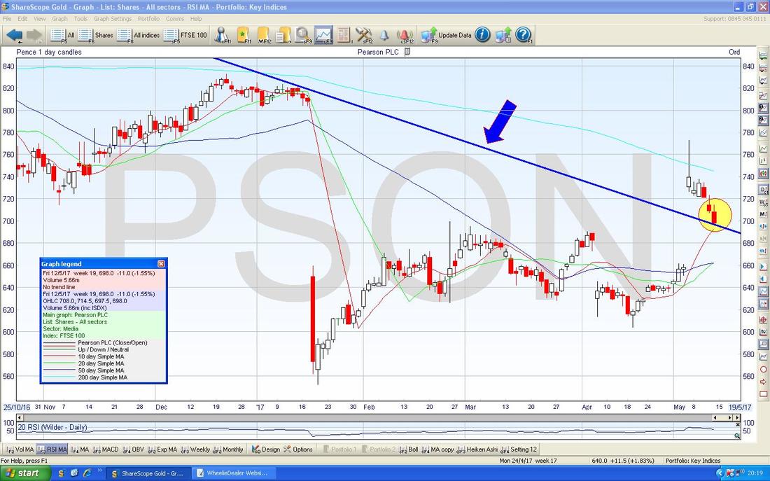
First off look at this Chart which has simply one Line that I have drawn on it which is that Blue Downtrend Line marked with the Blue Arrow.
On the screen below I have zoomed in on the PSON Daily Candles chart and the Blue Line (marked with my Blue Arrow) is the same one from the Chart above and it is obviously an important feature on this Chart. Note where my Yellow Arrow is that the Price initially jumped up and broke out of the Blue Downtrend Line but then fell back and is now touching the Blue Line. It could be that the Price does a ‘Confirmation’ that the Previous Resistance of the Blue Line has now become Support and then moves up off of this or it could be that the Price falls back inside the Blue Line and this would be a negative development.
Note the Darker Blue Wavy Line which is the 50 Day Moving Average is still below the Lighter Blue Wavy Line which is the 200 Day Moving Average and we are still some way off a ‘Golden Cross’. Patient Buyers may want to wait for a Golden Cross or perhaps those who want to buy into a Recovery Story could buy a small chunk soon and then buy more once the Golden Cross has happened. Obviously PSON is in a bit of a mess fundamentally so it is not something I would be too excited about buying into myself.
BT Group BT.A
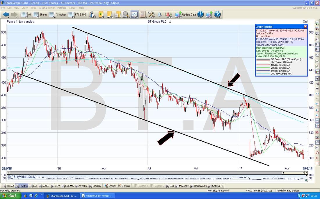
First off here is a relatively Long Term Chart over about 2 Years - the key thing here is a Nasty Downtrend Channel as marked by my Black Lines and Black Arrows. Note also that both the Major Moving Averages (50 and 200 Day MAs) are falling - not good.
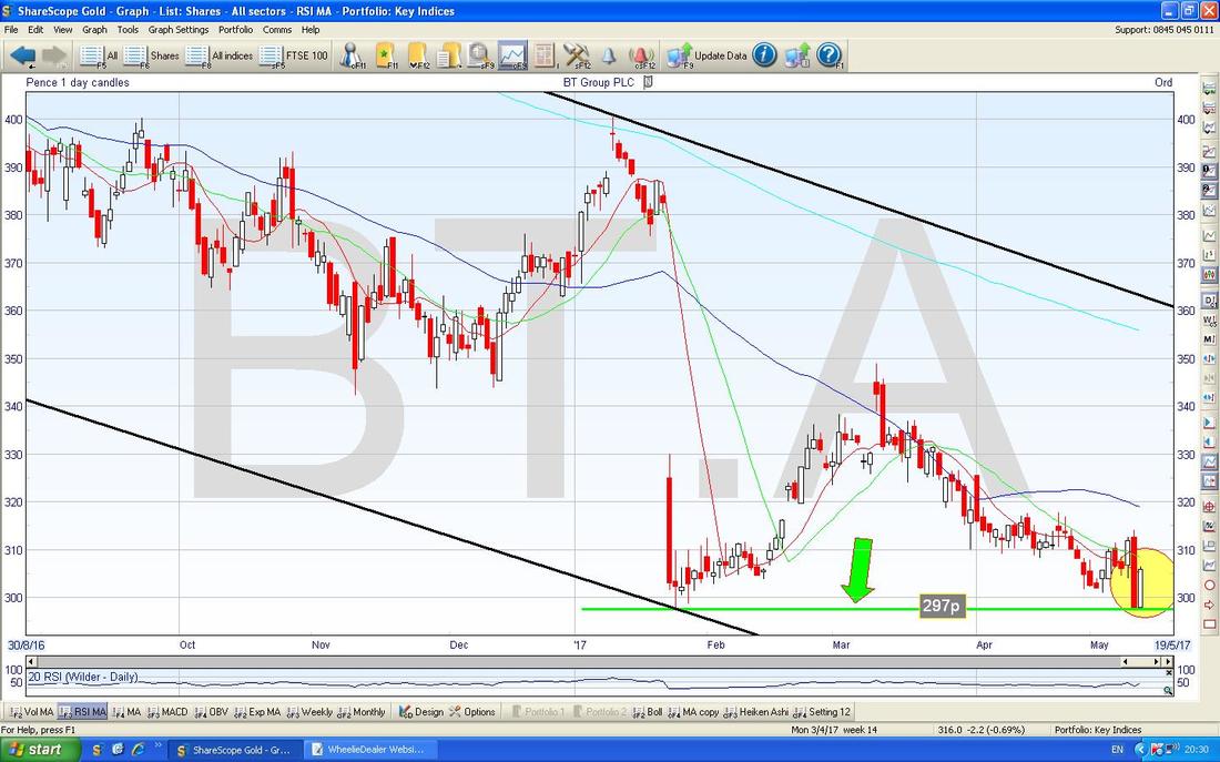
On the Chart below I have zoomed in to about the last 8 Months or so. The Key thing here is the Green Line at the Bottom marked with my Green Arrow at about 297p - it is critical that this Support Level holds - if the Price goes under this, expect more falls.
My Yellow Circle is highlighting what could be a ‘Bullish Harami’ 2-day Candlestick Pattern - this is the Preggers Lady viewed from the Side one - in the context of the recent drops, this could be a Reversal Signal and the Price could move up from here.
Next NXT
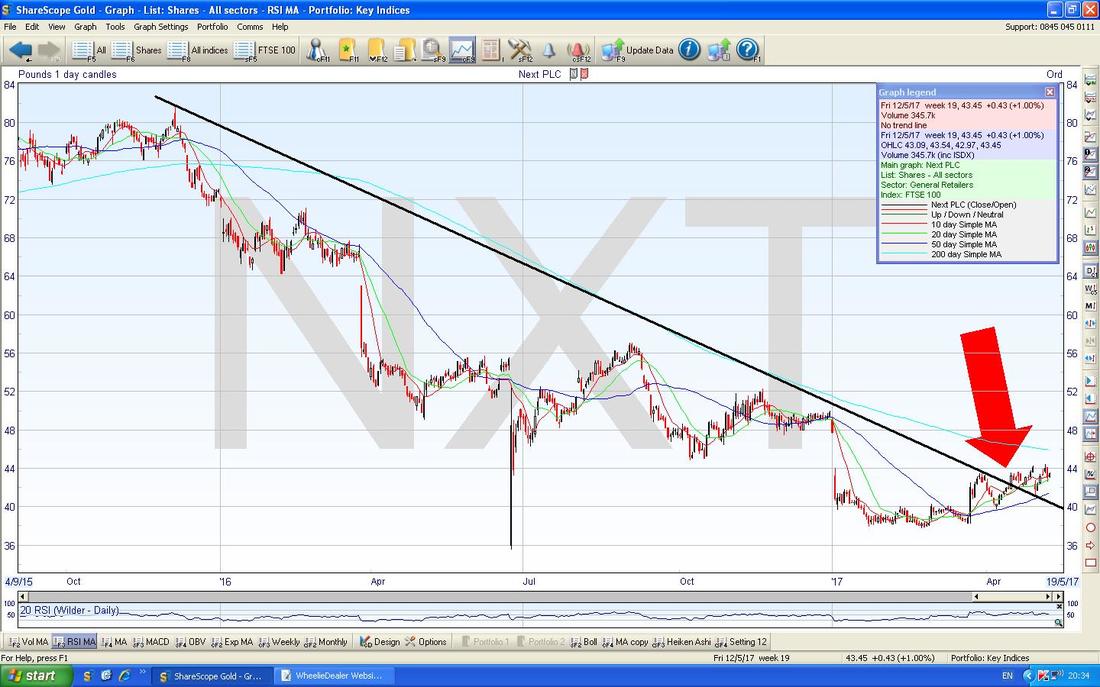
Here is a Chart of NXT going back about 1.5 years. The main thing here is the Black Downtrend Line which was broken-out of recently as pointed at with my Big Red Arrow. Note also how the Darker Blue 50 Day Moving Average seems to be turning up towards the Lighter Blue 200 Day Moving Average - maybe we will see a Golden Cross soon. I don’t hold NXT but I know many Readers and Twitter Followers are in it.
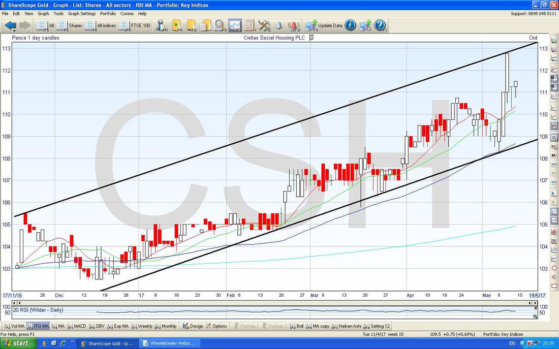
Civitas Social Housing REIT CSH
This is a recent IPO which specialises in buying Social Housing off of Housing Associations and I see it as very much an Income kind of Stock because it is paying about 4.6% Dividend at the moment and this should rise by at least Inflation. I don’t hold but it looks an interesting ‘Steady Eddie’ kind of Stock. The Uptrend Channel here is obvious.
Let’s do some Markets……..
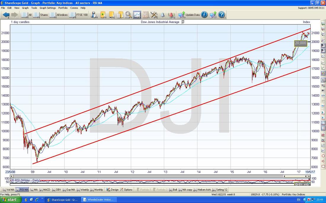
Dow Jones Industrials Index DOW Starting off we have the Long Term Chart with the very clear Uptrend Channel since the 2009 Lows. We could have a really big drop here and still stay within the Uptrend Channel.
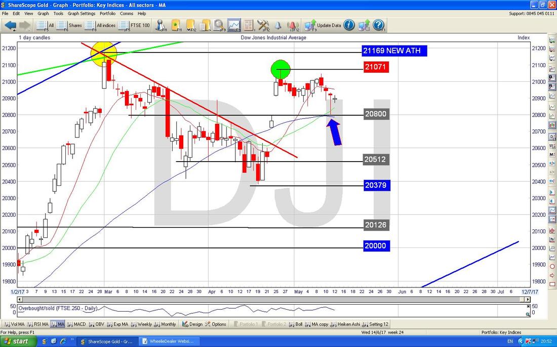
On the chart below I have zoomed in to about just the last 3 and a bit months. First off look at my Green Circle which is a ‘High’ we put in at the end of April and note how this is lower than the All Time High level which was put in where my Yellow Circle is right at the end of February. Making ‘Lower Highs’ like this is not a great sign.
Next look at my Blue Arrow which is pointing to a Hammer Candle we got on Thursday - the Low here was at 20800 and this is clearly good Short Term Support and we need it to hold. Note also that the Blue Wavy 50 Day Moving Average Line is around 20800 also which is adding to the Support.
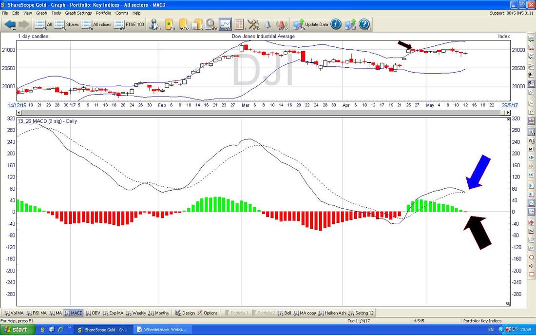
In the bottom window below, note how the MACD (Moving Average Convergence Divergence) for the DOW Daily has done a ‘Bearish MACD Cross’ as shown with my Blue Arrow on the Signal Lines format and with my Black Arrow on the Histogram Bars format.
FTSE100
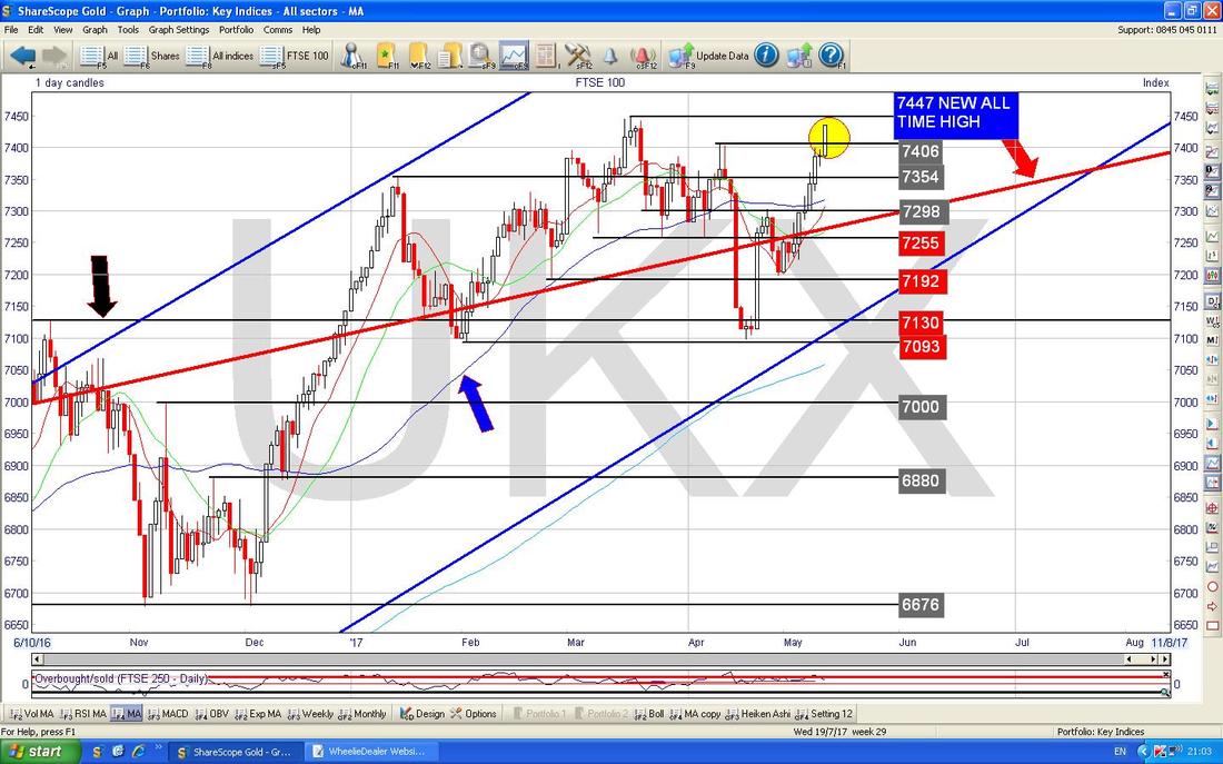
The Chart below has the Daily Candles going back about 7 Months. My Yellow Circle is highlighting a Big Up Candle from Friday and note we are right up near the All Time High at 7447 - if this can Breakout over the ATH, it is very Bullish behaviour. On the downside, note the Red Line marked with my Red Arrow which is the Bottom Line of the Long Term Uptrend Channel from the 2009 Lows which I often show in the Weekend Charts Blogs - it is good that we are back above this line. Support below at around 7100 looks very good.
Pound vs. Dollar
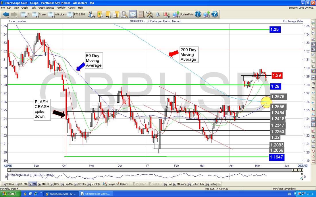
Here is a larger view and the main thing to note here is the 2 Ranges which are between about 1.1947 at the bottom and 1.28 and then higher up between 1.28 and 1.35. Note the Pound is now back up inside the Higher Range and this is a good sign for more gains on the Pound. Next look at my Yellow Circle which shows that we are just about to do the fabled 50/200 Day Moving Average Golden Cross which I have been going on about for months - it is finally here !! Doing the Golden Cross implies more gains in the coming months for the Pound (but remember, such a rise in the Quid might be a negative for the FTSE100).
Brent Crude Oil (Spot)
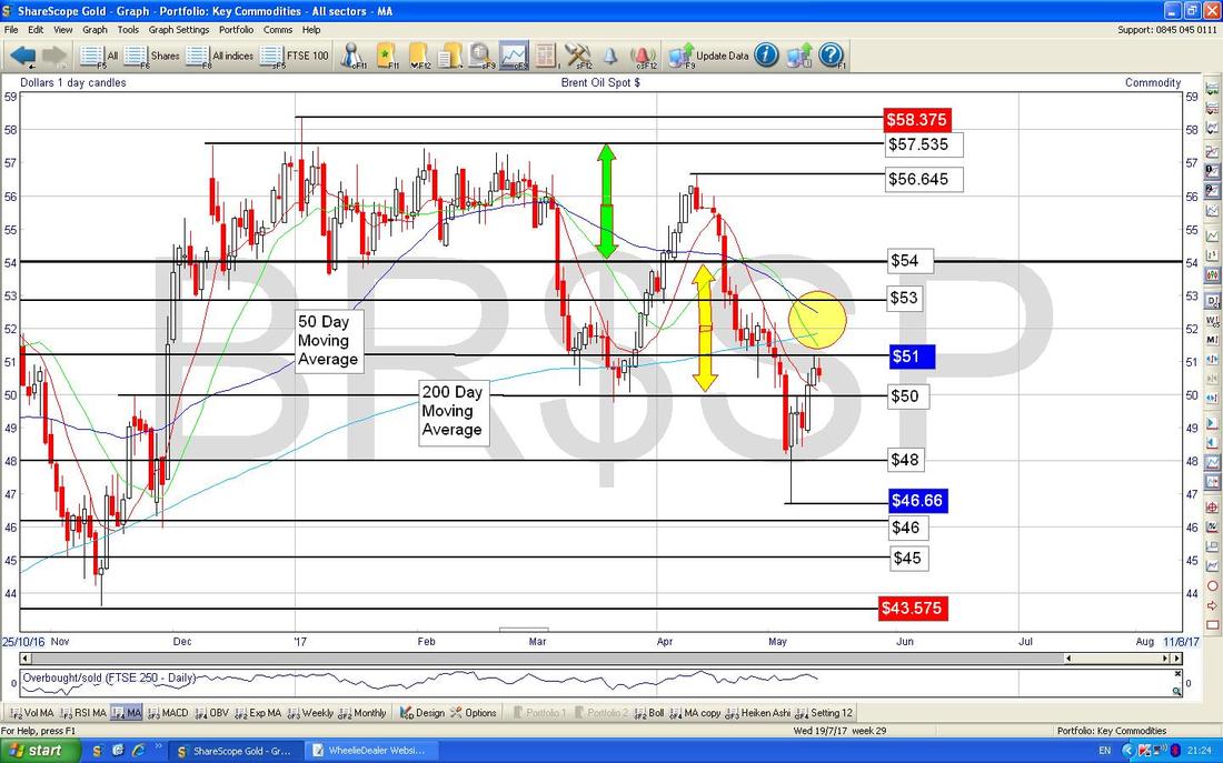
The Chart below has the Daily Candles for Brent Oil (Spot) going back about 6 Months. The main thing here is how the Price has dropped down from a higher Sideways Range between about $54 and $57.535 as marked by my Green Arrows and into a Lower Range between about $50 and $54 as marked with my Yellow Arrows. $51 is looking quite a difficult Resistance Level at the moment and on the Downside there is good Support at about $46.66. My Yellow Circle is attempting to highlight how we are very close to a Bearish ‘Death Cross’ between the 50 Day and 200 Day Moving Averages. Note how the 200 Day Moving Average is also Resistance up around $52. On the whole I find this Chart a bit bland - we are sort of really just wiggling around that $50 level.
Gold (Spot)
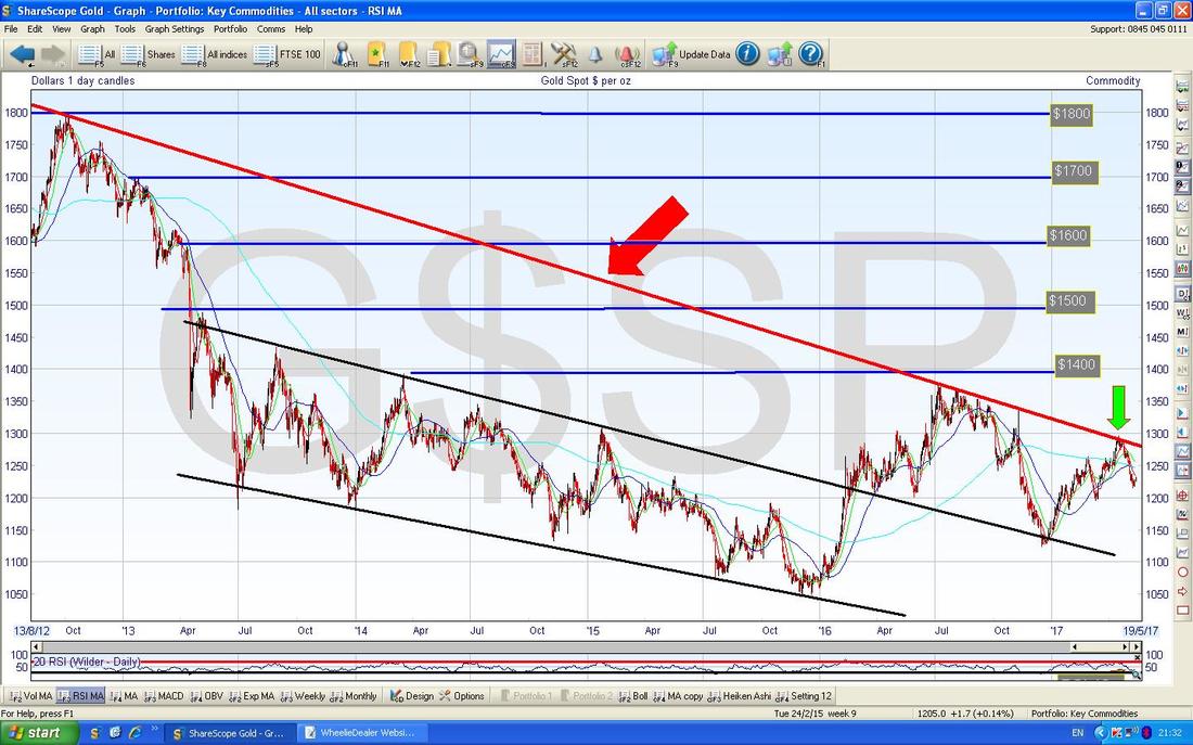
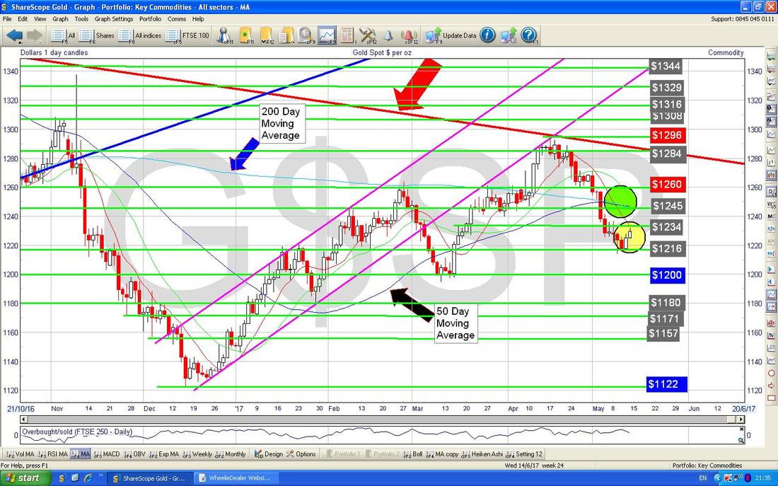
First off the Long Term Chart just to remind us all about that critical Red Downtrend Line as marked by my Red Arrow - we really must get over this Line if Gold is to properly go higher. Note my Green Arrow which marks the most recent attempt to breakout which failed miserably back in mid-April.
This next chart is such a mess !! Anyway, it is what it is. My Red Arrow is marking the Downtrend Line from the previous Chart and the thing to look at now is my Yellow Circle which is showing how we have had 2 White Up Days after a long move downwards - perhaps we are turning up again in the Short Term.
My Green Circle is highlighting where the 50 and 200 Day Moving Averages are - they have been moving side-by-side for a few Days which is most unusual but it looks like they might finally be crossing over so that we have a Bullish ‘Golden Cross’ - about time too !!
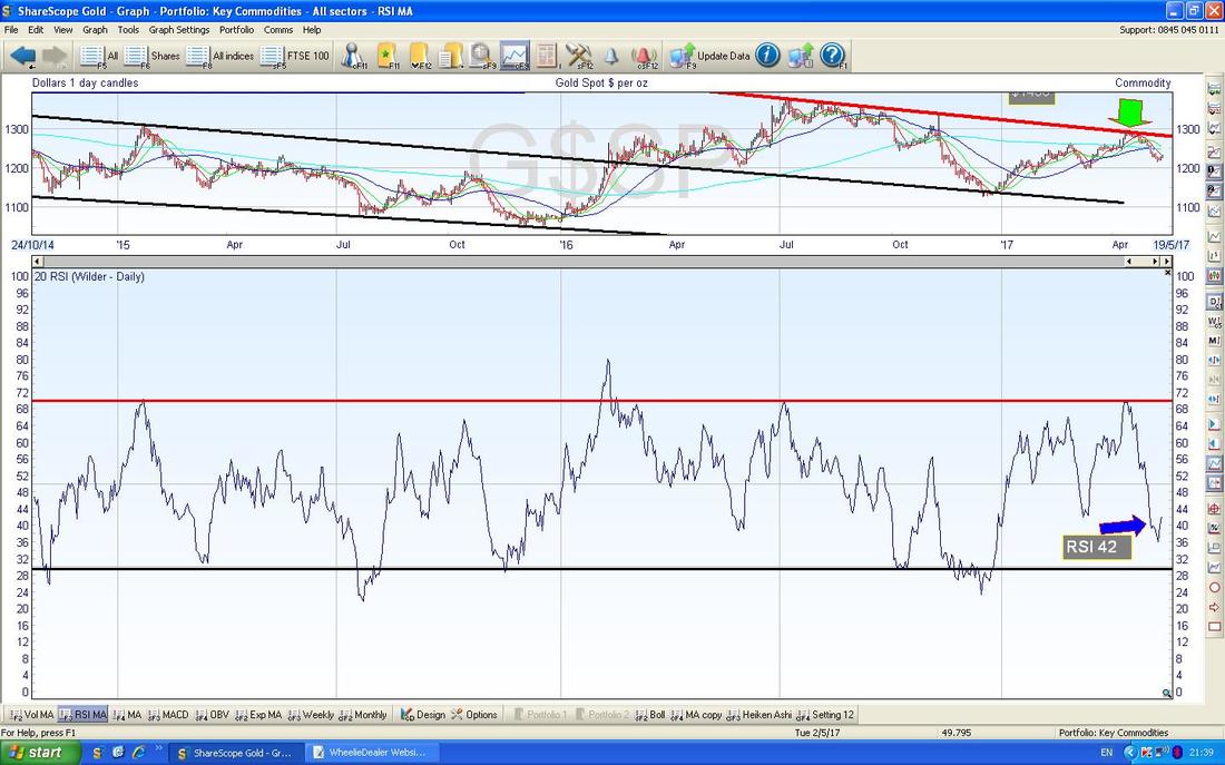
In the bottom window below we have the RSI (Relative Strength Index) for Gold (Spot) Daily - it looks like the RSI is turning up and on a reading of RSI 42 there is plenty of room to go higher.
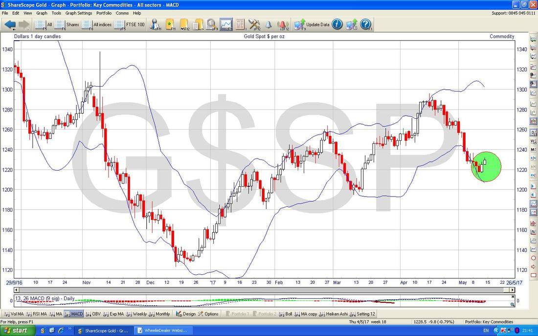
The Chart below has the Daily Candles for Gold (Spot) with the Blue Wavy Bollinger Bands above and below. Where my Green Circle is we have moved up off the Bottom BB and this is promising for Bulls.
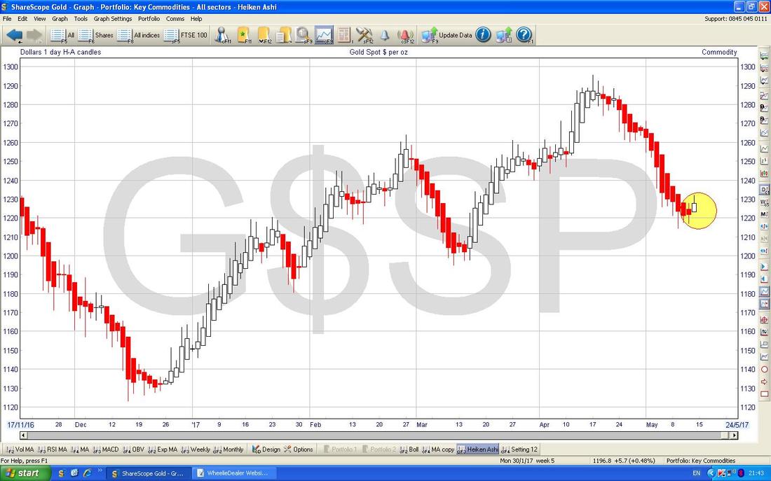
I knew this Blog was missing something - a distinct lack of Heiken Ashi Candles so I better chuck this one in before I finish things up for the Night. The Chart below has the HA Daily Candlesticks for Gold (Spot) and where my Yellow Circle is note how the Candles have gone narrow and then changed colour from Red to White - this suggests a Bullish move up is starting.
Right, that’s it, I hope everyone has a decent Week, Cheers, WD.
0 Comments
Leave a Reply. |
'Educational' WheelieBlogsWelcome to my Educational Blog Page - I have another 'Stocks & Markets' Blog Page which you can access via a Button on the top of the Homepage. Archives
May 2024
Categories
All
Please see the Full Range of Book Ideas in Wheelie's Bookshop.
|


