

|
educational blogs |
|
Last week turned out very nice for me and I am really happy to be nicely back in Profit for 2018 after a Gain of 2.1% for the Week. I updated the ‘Weekly Performance’ Numbers for February on the Homepage a couple of Days ago and the story of the Year so far is very clearly shown there with February being a really tough Month but with how my Portfolio has recovered and with the strength in the US Markets particularly on Friday, it looks like we might be in for a slightly nicer period. As we will see in a bit, the Charts are pretty decent looking.
There has been some Media coverage today about The Chancellor’s upcoming ‘Spring Statement’ (I think it is on Tuesday) where he is due to give an overview of how the Country’s Finances are shaping up and it seems to be the narrative that Tax Receipts are better than forecast and this could mean that ‘Austerity’ (what a joke, there has been no Austerity and Government Spending has risen every year since the Credit Crunch) may be eased, but Spreadsheet Phil (or ‘Philly no mates’ as the Brexiteer Tory MPs call him) won’t be easing the Spending Taps until the Autumn Budget - but if he does ease up then that might be supportive for the UK Economy. Something needs doing because clearly the High Street in particular is really feeling the pinch with large ticket Items like Cars not selling.
An interesting twist to this is that one of the reasons for Labour’s rise in Vote Share at the last Election was partly down to the Public being ‘fed up with Austerity’ (like it is a choice !!) - but if the Tories raise Spending then that could make a key facet of the Labour appeal pointless.
Meanwhile in the US things are going gangbusters - the Jobs numbers from Friday of something like 313,000 or whatever it was, are huge - and another thing worth noting is that the ‘Accounting Trick’ that all Government’s use of ‘Economically Inactive’ people (this merely means that True Unemployment gets hugely understated) is actually coming down - so the Workforce is in effect expanding. This is a good reason why Inflation might not take off (indeed, that was part of the reason that Shares were so strong in the US on Friday according to the ‘Experts’) - there has been a big fear that Inflation will spike up as the Job Market tightens but this could be very misplaced if that enormous Pool of ‘Economically Inactive’ people start to come into the Workforce. So rather than all the Fears of February where it was the End of the World as we Know it (REMember that?), it now seems that we might be on the edge of the mythical fairy tale ‘Goldilocks’ Economy where Growth is super strong yet Inflation is subdued. Good for Stocks. piworld Interview I am sure many Readers have seen this, but in case you haven’t (or if you have forgotten about it already), I recorded a 23 Minute Video with Tamzin and Tim of www.piworld.co.uk last Week on the subject of Social Media. Don’t let this put you off though, although that is the subject, in reality the Video rambles around and touches on lots of other areas of Investing and the response from people who have seen it on Twitter etc. has been overwhelming - I am so pleased that it has been seen as worthwhile and of course in the future I hope to do more of this kind of thing - I really enjoy doing them although they can be a bit tiring when your Brain is having to be fully focused for a long period of time !! You can view the Video at the Link below and while you are there I recommend you have a sniff around the piworld Website as there is a huge amount of useful stuff on there. What they do as I understand it is to interview lots of Company Directors and to film Presentations that they hold from time to time (you might recall I went to one at Trafalgar Square some time ago which was held at the MHP Communications Offices). It is excellent because Tamzin is yet another Output from the Robbie Burn’s School and I am firmly of the belief that People who have gone down this route always seem to be pretty switched on and of course although I have never been to one of Robbie’s Seminars, he has had an enormous influence on how I do things. This gives the advantage that the Questions Tamzin puts to the Interviewee are from the standpoint of a Real Investor and of proper relevance. You can follow her at @tamzinpiworld on the Tweets where you will get early sight of the New Videos she is putting out - and believe me they seem to be producing an enormous amount of material. The Videos on piworld are all FREE to view (that is something we always like !!) and I have used them many a time for Companies I hold (I remember one on Somero Enterprises SOM being extremely useful after a Profit Warning) and for Companies I am considering investing in. You can see the Social Media Video here: http://www.piworld.co.uk/2018/03/08/wheeliedealer-social-media-interview-with-tamzin-freeman/ While I think of it, if you like that Video then there are links on the Homepage to other Videos I have recorded that you might find worthwhile watching. It’s nearly Showtime…… I have sorted my Ticket for the Master Investor Show in Islington at the Business Design Centre which is taking place next Saturday 17th March and you can read about it here: https://masterinvestor.co.uk/show/ If you Tweet me or DM me or Email me or whatever, I might be able to help with a Discount Code so you can get in for nothing. I plan to get there around 12 Noon and no doubt I will be hanging around the Restaurant/Canteen bit for much of the time - come and say ‘hi’ (I’m easy to spot as there are usually very few Wheelchair Users there - so if you see someone doing a convincing R2D2 impression then that is probably me !!). Undervalued Shares It sort of hit me the other day that there are many People who read my Website but don’t necessarily follow me on Twitter (of course you can get a Twitter Account for Free and on my Homepage near the Bottom there is a Twitter Feed which you can read and if you Google ‘Tweets by @wheeliedealer’ then that should bring up my spiel as well), will be missing out on a lot of stuff I talk about and one thing which Readers might find very helpful is a quick list of which Stocks I hold that I think are really good Value. On the Tweets I am saying this sort of thing all the time. In the Charts blogs while the Markets were so ‘Boring’ (but in a good way !!) back at the arse end of 2017 I was able to include quite a few Stock Charts but now things have got more ‘interesting’ in terms of the Indexes (and because I have Active Trades on them), I am focusing on the Index Charts and don’t have time to do the Stocks as well. At the end of the day I have to be driven by what I need for my Investing purposes and of course I am merely telling Readers what I am doing and why I am doing it. In line with that, the following Stocks look very appealing to me and I expect a lot more upside in time:
In addition, there are a few Stocks which COULD be very cheap - but they are HIGH RISK situations (so perhaps a Smaller Position Size makes sense or maybe a Stoploss):
I must just also say THANK YOU to all the people who read my Website but don’t necessarily read my Tweets and also a WARM WELCOME to all the New Readers who have somehow managed to find their way to reading this !! I appreciate all the support and you inspire me to strive to make the whole WD ‘Thing’ better and better. Blog Slate A quick bit on developments here. Last Week I finally completed and published the ‘Evolution of an Investor’ Series and this has had a wonderful response. Next I intend to move onto the EU Supply EUSP ‘Buy Rationale’ Blog but although that is half written, I might delay it a Week or so because I actually wrote an entirely new one last Night very quickly but it is topical and I think Readers will like it. Let’s see how it goes but with all these Drafts in various states there is no doubt going to be a good Weekly flow of Blogs which is what I like to achieve. In addition, I have started on the Blog Series about my New Improved System for Index Trades and this will be coming down the pipe. Better do some Charts then (assuming you are still awake and not entirely comatose). S&P500 I’ll start with the US because the move up on Friday was immense - this is just so, so Bullish and after the declines of February it looks to me like those Bulls have stuffed it to the Bears yet again and they have been sent back to the Forrest with very sore backsides (anyone who has Run the Bulls at Pamplona will know how they feel………Those Horns are sharp you know……) The Chart below has the Daily Candlesticks and I have focused in on a pretty short timescale - because when we are this near the All Time Highs, a lot of the History won’t really mean much (it is more useful for spotting Areas of Support if the Markets drop back at all like they did in February). First off please look at the Green Circle which is capturing the lovely White Up Candle from Friday - this even ‘Gapped’ up at the Open and is clearly a very Bullish Candle. However, note how it failed to take out the Recent Peak at 2789 - if it Breaks-out over this in coming Days then that would be a Buy Signal and I might be tempted to put a Small Long Spreadbet on. Next look at my slanting Yellow Box - this is an attempt to capture the move up after the Low point of February (note the luscious Hammer Candle which marked the Turning Point - the Predictive Power of these things is stunning). The S&P500 then moved up through my Yellow Box until it Peaked in the Short Term up at 2789 and then it Pulled-Back for 3 Days or so but note where my Smaller Green Box is that we got a 2-day Candle Pattern called a ‘Bullish Piercing Lines’ - again this predicted the Turn. It was as a Result of seeing this BPL that I Closed my Short Position (for a small Loss) and clearly that was the right thing to do !! (See the ‘Trades’ page). Note the Current Price is now above the 50 Day Moving Average which is the Blue Line that I am pointing at with my Blue Arrow. This could be Support now. Up above we have Resistance at the All Time High 2873 - A Breakout over here would be Bullish but I would add the caveat that if such a Breakout occurs when the RSI is extremely high, then it might not be sustainable - we will address that in future Weeks if it happens. If it rather early to draw this Line as there are only 2 ‘Touch Points’ but it strikes me that we could have a new Uptrend forming which is where my Red Line is (Red Arrow) - we shall see how correct this is in coming Days/Weeks. It is often the case that ‘Monday reverses Friday’ so I would not be surprised if we saw a bit of a Pullback tomorrow - however, I suspect this Chart is more Bullish than Bearish and ultimately we are going higher. 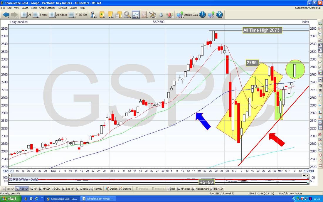
On the ScreenScrape below, we have the RSI (Relative Strength Index - the ‘Speed’ or ‘Force’ of the move if you like) in the Bottom Window for the Daily S&P500 - on a Reading of RSI 57 this has plenty of room to keep moving and if we get to the kinds of levels we had in late December then there could be a lot more Upside before easing back (or going Sideways).
As ever, all Charts are grabbed from the unbeatable ShareScope Software that I use as my ‘Workbench’. 
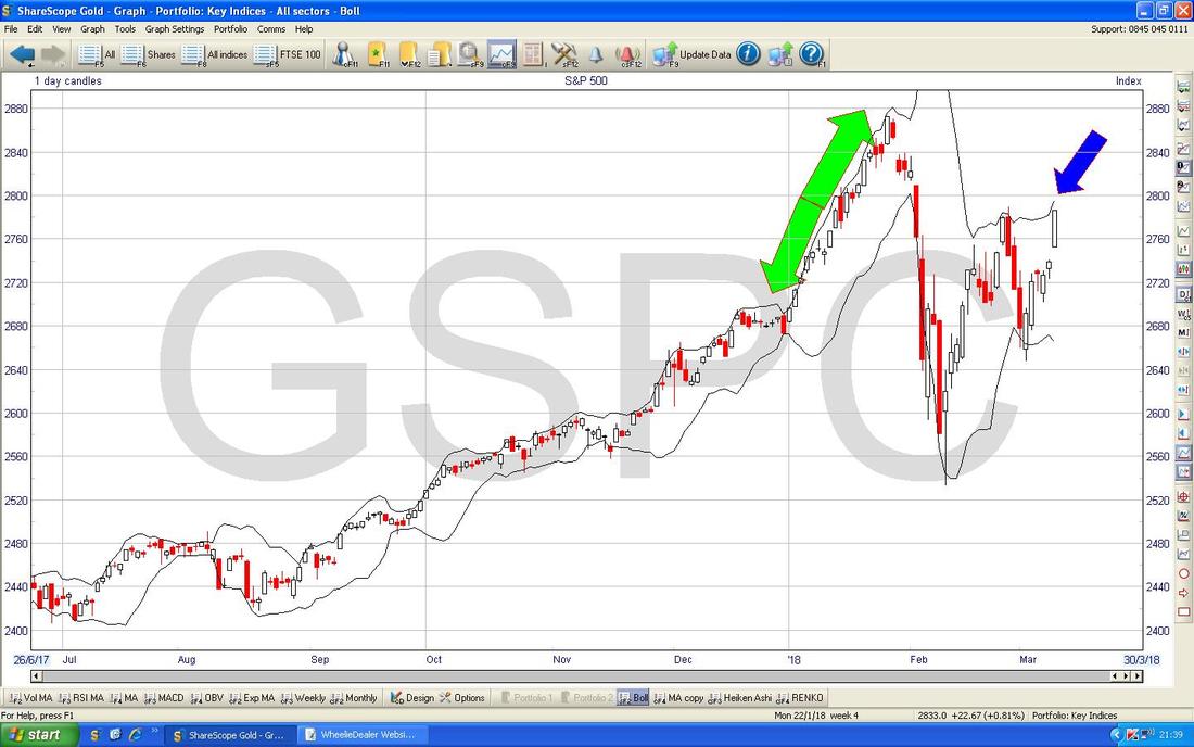
The Chart below has the S&P500 Daily Candles with the Bollinger Bands above and below. Where my Blue Arrow is note how the Price is now up near the Upper Bollinger Band - this could mean that it will turn down soon but if you look at where my Green Arrows are you should be able to see that the Price can ‘Hug’ the Bands for some time - so this is just an Indicator to add to other Indicators rather than one that is super reliable.
Regular Readers (don’t worry, I’m not going to do that pathetic and tired All Bran quip again……) will know this is one of my utmost favouritest Technical Indicators - it is remarkably predictive and when you have an Asset or Index that moves in fairly clear ‘waves’ (rather than chopping up and down) it works superbly. I keep thinking it must be possible to create a Trading System which is purely triggered by these Crosses.
On the Chart below, where my Black Arrow is pointing, we had a Bullish ‘Golden Cross’ between the faster 13 Day Exponential Moving Average (the Red Line) and the slower 21 Day EMA (Green Line) - this implies weeks of gains ahead - yippee !!! 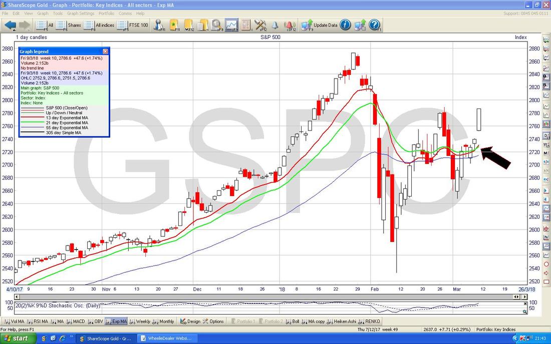
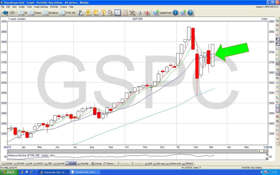
The Chart below has the Weekly Candles for the S&P500 - my Green Arrow is pointing to a lovely Bullish White Engulfing Candle (it has ‘engulfed’ the Red Candle from the Week before) - this is more positive behaviour.
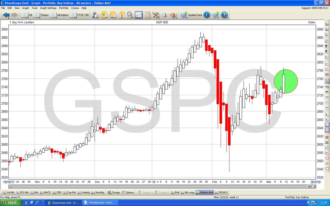
Below we have the Daily Heiken Ashi Candles for the S&P500 (remember, these are totally different to ‘Normal’ Japanese Candlesticks) and my Green Circle is highlighting a Bullish White Big Up Candle.
Here is the Renko Chart for the S&P500 - I have no idea what it means, but my Yellow Arrow is pointing to Black Dots and I am assuming this is a good thing !!
Usually just by looking at a Chart or Indicator over a few Days I can figure out what it is doing (and I rarely if ever need to know how the Signal is derived) - but in this case I am still clueless !! 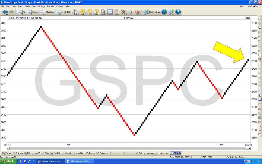
Dow Jones Industrials Index (DOW)
The DOW doesn’t look as advanced as the S&P500 - my Chart below (where the Blue Arrow is) is trying to show how we got another nice Big White Up Candle on Friday but in this case it stopped just above the 50 Day Moving Average Line (the Blue Line). Note how it failed to get up near the Recent Peak at around 25800 whereas the S&P500 is nearly Breaking out at a similar point. Remember the DOW is only 30 utterly Huge Companies and the S&P500 is much broader and probably comprises of a ‘mix’ between the big stuff in the DOW and the more exciting stuff on the Nasdaq Composite Tech Index. I often think the S&P500 moves in a way that would be a hybrid between these 2 Indexes. 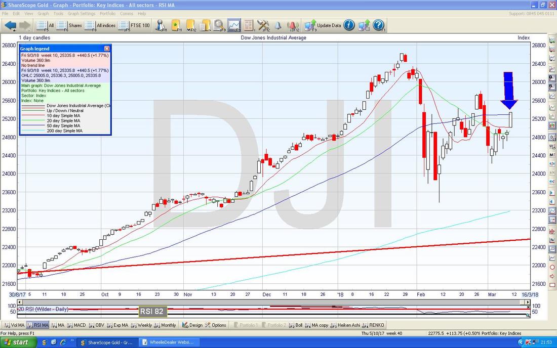
In the bottom Window on the Screen below we have the MACD (Moving Average Convergence Divergence) for the DOW Daily. My Blue Arrow is pointing to a Bullish MACD Cross on the Histogram Bars format and my Black Arrow is pointing to the same Bullish Phenomenon as the Signal Lines. They are the same thing but I prefer the Histograms because they are easier to see.
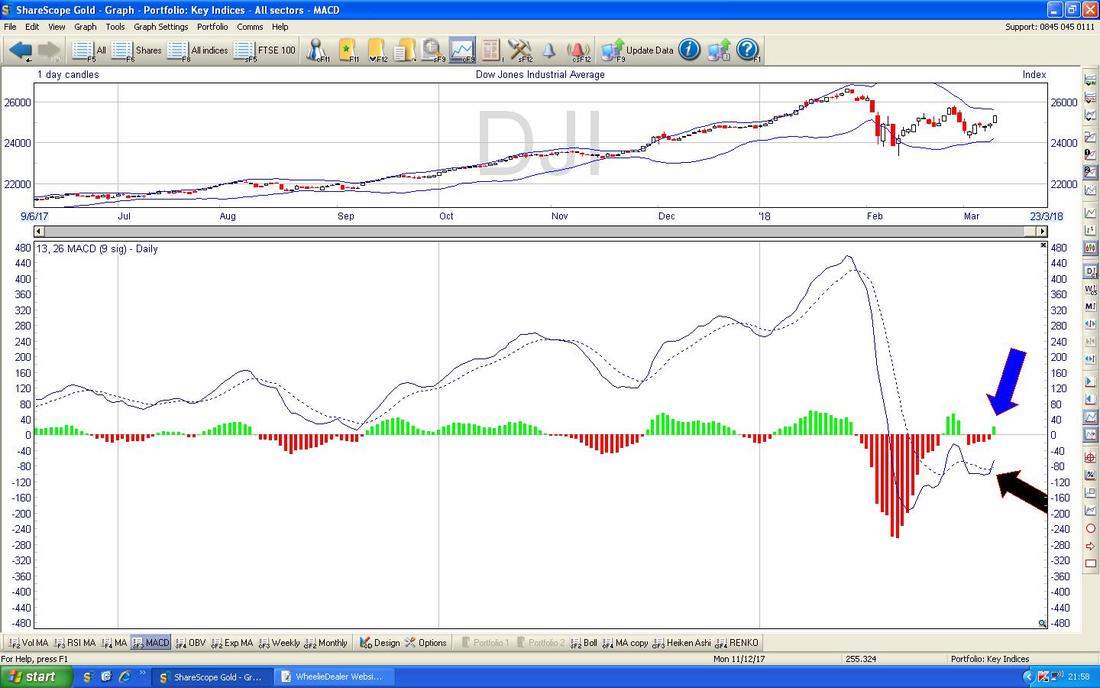
On the Screen below my Black Arrow is trying to show how on the DOW Daily we have not yet had the benefit of a Bullish ‘Golden Cross’ between the Red Line 13 Day EMA and the Green Line 21 Day EMA - but this might happen on Monday or Tuesday - it is clearly imminent (although of course if things go suddenly Bearish then it might miss it - but I think this is unlikely).
While I think of it, if you click on the Pictures they should get bigger in your Browser thingamajig so you might be able to see what I am bleating on about. 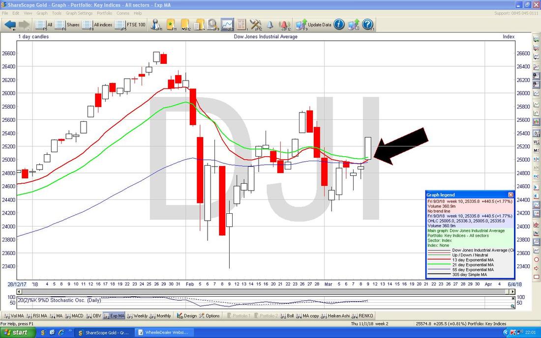
Nasdaq Composite
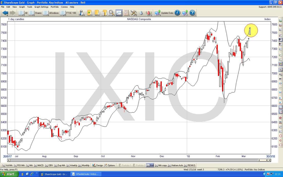
This is just so Bullish. My Green Circle below is capturing the Big White Up Candle from Friday and note where my Black Arrow is that it ‘Gapped Up’ - with the Breakout of the Previous All Time High (ATH) at 7506 this is really Bullish behaviour. We need to check some other Indicators but from looking purely at this Chart I would say a Long Position with a Stoploss at about 7385 (this is just below the Low Point of the Small Doji Candle from Thursday) might work well. I would not put a ‘Firm’ Stoploss with my Broker because it could get taken-out Intraday but would use 7385 as an End of Day (EOD) Trigger Point to close a Long Position if it got hit. It is worth waiting a day to see what transpires on Monday but I am very tempted to put a Long Trade on here - I will look at the Charts on Monday night and consider it. Simple Fact is I have loads of Long Exposure to Stocks anyway so I don’t need to get too greedy - but I do fancy a Small Long somewhere soon. 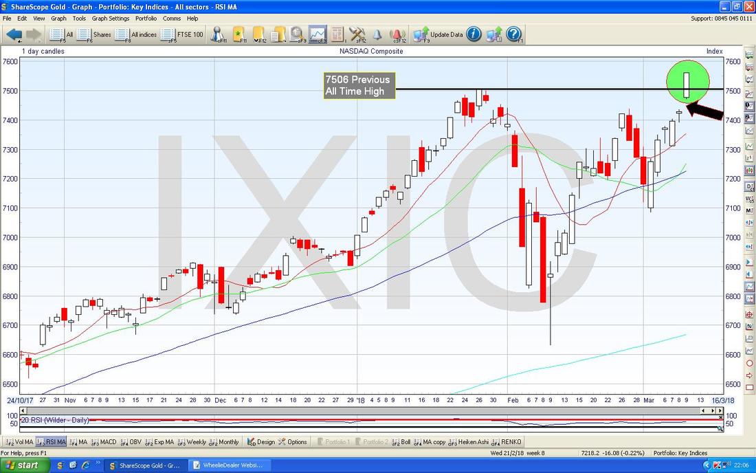
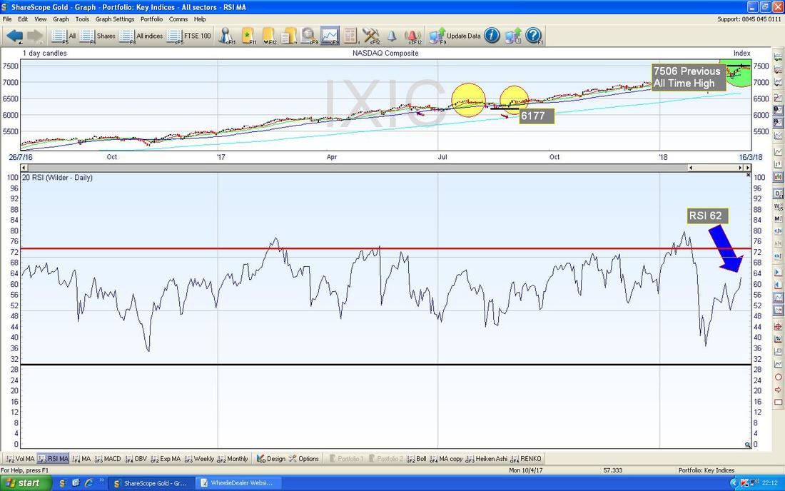
In the bottom window on the Screen below we have the RSI for the Nasdaq Comp Daily - on a Reading of RSI 62 this still has plenty of room to move up and is supportive of putting on a Long Trade.
My Chart below has the Daily Candles with the Bollie Bands above and below. My Yellow Circle is highlighting where the Candle from Friday touched the Upper Band - it could reverse down from this or (more likely I suspect with all the Bullishness on the other Charts) it could Hug the Band and go up a bit more.
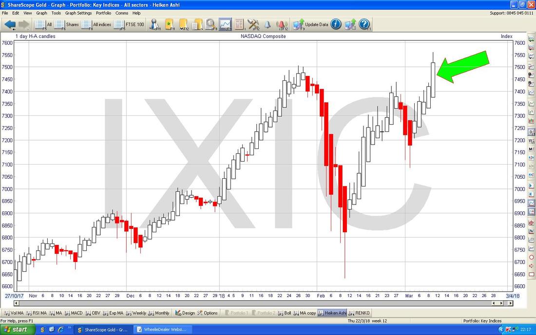
No shocks here but my Green Arrow below is pointing to a Big White Up Candle on the Heiken Ashi Jobbies for the Nasdaq Comp Daily - this is bullish.
FTSE100
The Chart below is my actual ‘Working’ Screen for the FTSE100 Daily and I am using this to track a Long Trade I put on about 4 Days ago (it is working well so far). The Horizontal Blue Line marks where my Trade was opened and the Pink Line lower down is my Stoploss - if this gets hit, I will Close the Spreadbet. My Black Arrow is pointing to a Small White Up Candle from Friday which is sort of OK but the real story here is a Sideways Range between about 7073 ish at the Bottom and 7312 ish at the Top - we need a Breakout above the Top of this Range to really get a strong Bullish feeling. In fact, if that was to happen, I would add to my Long Position most likely. 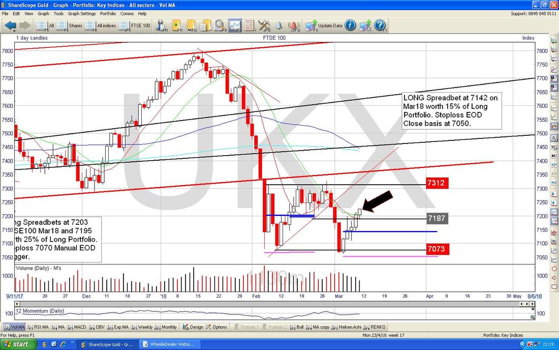
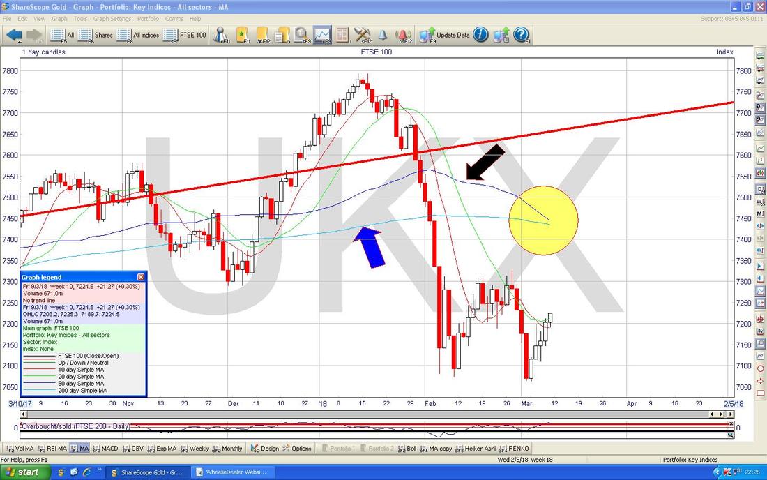
The Chart below is a small variation on one I showed in last Weekend’s Blog - the thing is where my Yellow Circle is we are about to have a Bearish ‘Death Cross’ between the 50 Day Moving Average (Black Arrow) and the 200 Day Moving Average (Blue Arrow). Clearly this would not be good but if the FTSE100 can move up now then it is possible that the Prophecy of such a ‘Death Cross’ might not come to pass because we might fairly quickly get a reverse of this and a Bullish ‘Golden Cross’. If we do not get this more Bullish turn of events, then the implication of the Death Cross is that we might have Months of Weak Markets to come……..
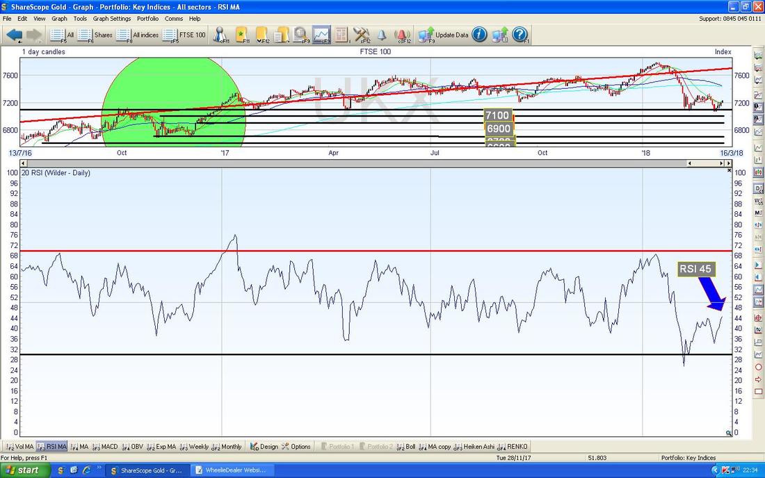
The Bottom Window on the Screen below has the RSI for the FTSE100 Daily. On a Reading of RSI 45 there is lots of room to go up and note the RSI is rising since the Pullback of February.
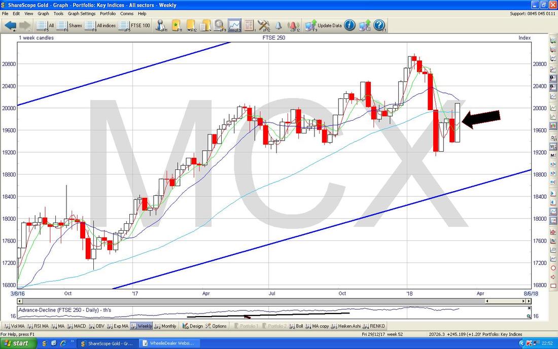
FTSE250
In many ways this Index is more representative of the Portfolios many Readers hold I suspect. The Chart below has the Daily Candles for the FTSE250 and my Yellow Circle is capturing a nice White Up Candle from Friday. It is hemmed in by the 50 Day Moving Average marked by my Blue Arrow but this might not be particularly strong Resistance. Whereas the FTSE100 is caught within that Range I talked about, the FTSE250 has just Broken Out over the Recent Peak where my Black Arrow is - that is Bullish. As with the FTSE100, there is a Risk of a ‘Death Cross’ between the 50 and 200 Day Moving Averages - but whereas that is imminent on the FTSE100, on the FTSE250 it is possible that we can miss such a Death Cross if the Index can move up now. We shall see. 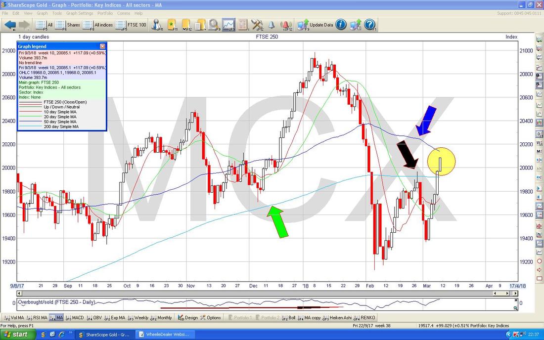
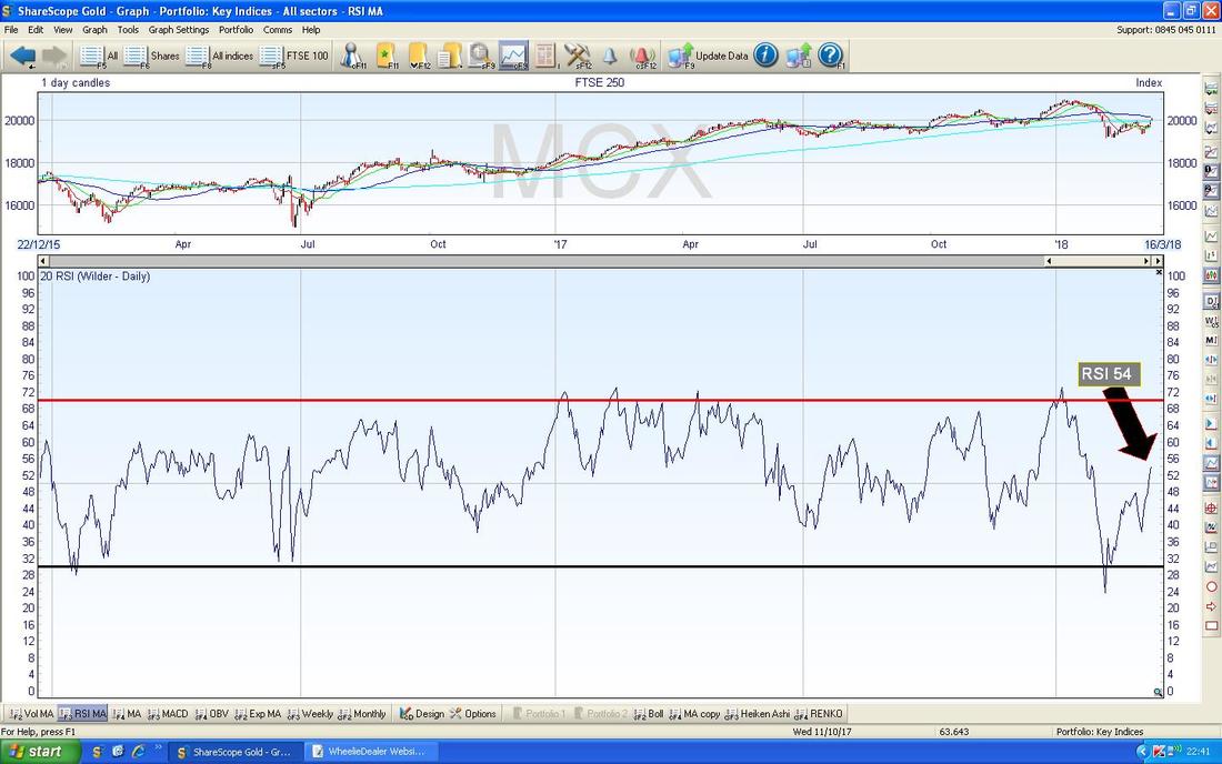
In the Bottom Window on the Chart below we have the RSI for the FTSE250 Daily - on a Reading of RSI 54 this has lots of room to move up and is rising. Looks good.
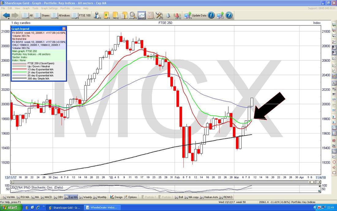
The Chart below has a Huge Black Arrow and this is pointing at how we are bang on the verge of a Bullish ‘Golden Cross’ between the 13 and 21 Day EMAs - this looks highly likely and if it happens then expect Gains in coming Weeks.
Below we have the Weekly Candles for the FTSE250 - my Black Arrow is pointing out a Big White Up Candle - this is clearly Bullish.
Heiken Ashi Candles for the FTSE250 are shown below - my Yellow Circle is showing nice Big White Up HA Candles -that’s bullish.
OK, I will knock it on the head there, I hope everyone has a good week and my Bullish prognosis turns out roughly correct !! Don’t forget to watch the Video !! Regards, WD. 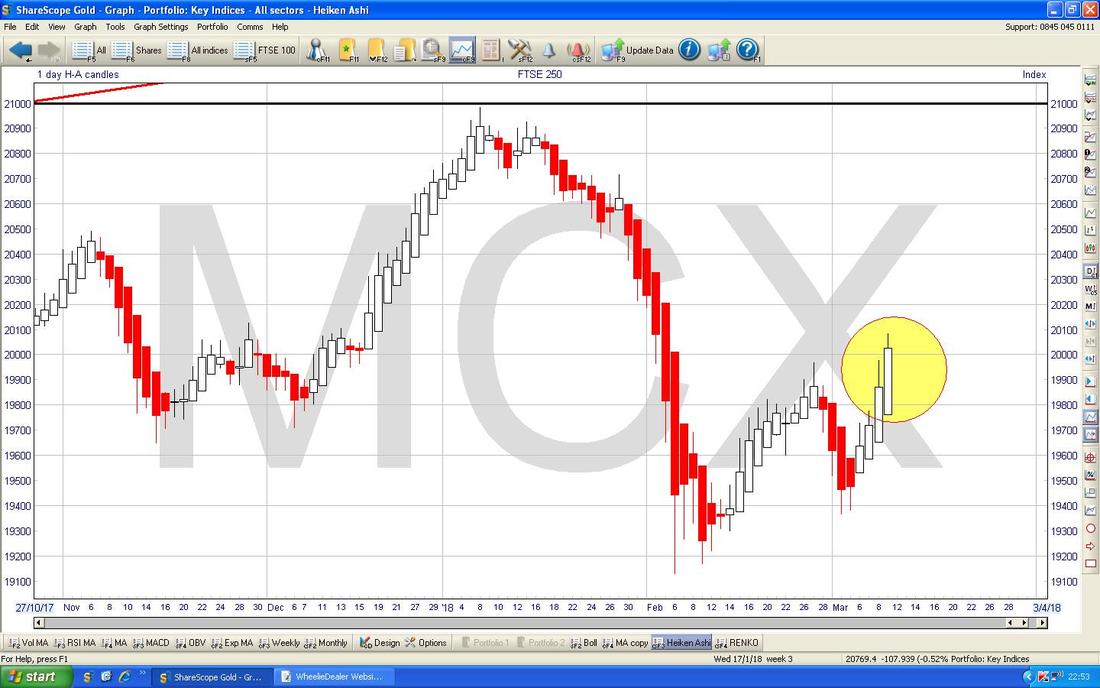
2 Comments
Paul Hunt
12/3/2018 03:28:49 pm
interesting list. That gives me a bit to work through and evaluate
WheelieDealer
12/3/2018 09:39:21 pm
Cheers Paul - I am sure I mention most of these a lot on Twitter but I thought it would be nice to bring them all together in one list - I'm thinking a few of these with patience should have a lot more upside. Leave a Reply. |
'Educational' WheelieBlogsWelcome to my Educational Blog Page - I have another 'Stocks & Markets' Blog Page which you can access via a Button on the top of the Homepage. Archives
January 2021
Categories
All
Please see the Full Range of Book Ideas in Wheelie's Bookshop.
|
