|
This first paragraph is being written after all the rest in this Part of the Blog Series. Having now completed a very good Draft of it, I have decided that it is extremely involved and lengthy and for this reason I will separate the Examples out into its own Part - Part 3 - and now the Blog Series will run to 4 Parts with the final one being a Conclusion that brings everything together.
Finally I have got around to starting on these Examples - I have been struggling with precisely how to do it as I had a few ideas in my head but often that is not actually helpful and it merely meant that this state of indecision was simply stopping me getting on and writing the darned thing !! Anyway, I have sort of settled on the basic way of doing it and I am starting typing and shoving in pictures in the possibly forlorn hope that it will sort of coalesce into something that makes sense.
In Part 2 I laid out that there were essentially either Long Trades or Short Trades that I am looking for and these split another two ways into ‘Reversal’ Trades and ‘Breakout’ Trades. At this stage of doing the Examples, I am of the view that the Long and Short Trades are just mirror images of themselves so I am thinking that I will just do one sort and Readers can figure out that the opposite would apply for the alternative Trade Type. In addition, my Weekend Charts Blogs contains lots on this kind of thing and if I have a Trade running I usually put my ‘Working’ ShareScope Screen in and this should give Readers a good understanding of how I do things in terms of placing Stoplosses and suchlike. I also Tweet a lot about Indexes almost every Night so if you are keen on Trading the Indexes then you might find my Tweets on this kind of thing quite useful (you can follow me using @WheelieDealer).
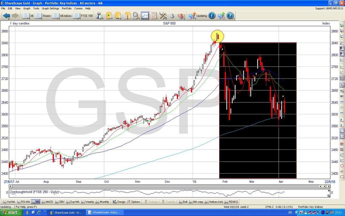
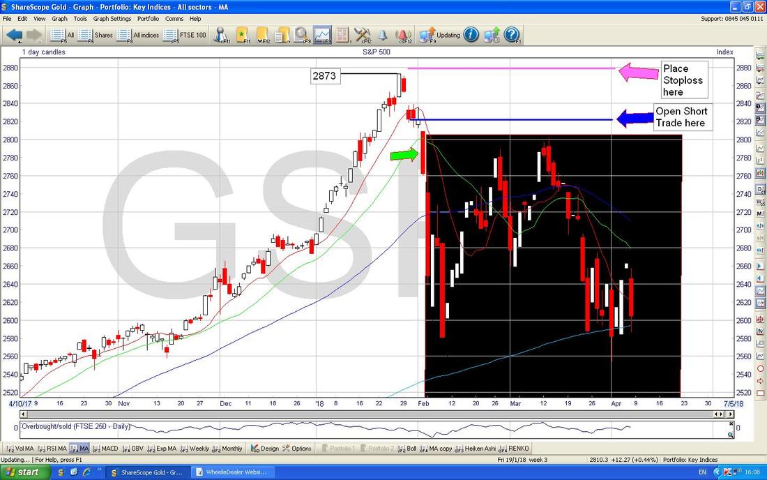
With that in mind, I will start off with a Short Trade based on a Reversal off Market Highs and this in many ways is probably the most useful thing because this is the kind of ‘Hedging’ Trade that is the essence of why I pursue this crazy Strategy of using Indexes to help boost Returns (and more importantly to reduce Drawdowns on my Overall Portfolio). Example 1 - Short Reversal Trade Obviously I have the benefit of ‘Outcome’ Bias and ‘Hindsight’ Bias here and the Examples will no doubt make it all look so easy but of course in the Real World it is far from easy. However, there is little alternative to doing it this way and when you boil it all down the purpose of these Examples is really to give Readers a more ‘visual’ representation of what I have described in this Blog Series and it is really more about where I place Stoplosses and what kind of Technical Indicators I am particularly focused on using. This is similar to an Actual Trade I put on in late January and it worked out pretty well although I recall having a few stabs at getting a Trade on and getting Stopped-Out before I was successful (if you look at my ’Trades’ page it should all be on there) - in the event the S&P500 and other US Indexes along with some other Global ones were getting very overstretched and this was particularly noticeable in the RSI (Relative Strength Index) Readings which were simply off the scale - I will show this in a bit. Of course, with the joy of Hindsight now, it is pretty obvious that this relentless move up was probably a Euphoric Surge higher by the Bulls which has now turned into a proper slump. As always, the Charts I will show are ScreenScrapes from the superb ShareScope Software that I subscribe to but unfortunately as superb as it is, in this case I cannot find a way to create a Rectangle to blank out the Candles I don’t want to show yet - so please use your imagination and on the Chart below of the Daily Candlesticks for the S&P500 please assume that anything in the Big Black Box has not actually happened yet and I might reveal bits of it as I go through the Example. The main thing I want to point out here is that the S&P500 at this time leading into Late January 2018 had an incredible run and was almost starting to ‘go vertical’ - this was a sign that it was getting well ahead of itself. My Yellow Circle is highlighting where we had a Big White Up Day which was then followed by an ‘Inside Day’ which is the Smaller Red Candlestick which is ‘inside’ the Big White Candle from the Day before - the point here is that this is 2 Days out of a 3 Candle Pattern and we needed the third one to complete the Pattern - and it would either be ‘3 Inside Up’ or ‘3 Inside Down’ and if it was the first the Index should keep going up and if it was the latter then it should keep falling. In other words, this 2-Day ‘Inside Day’ Pattern was a warning to be prepared for a Sell Signal (note, with all these kinds of things you can ‘Jump the Gun’ and put on a Trade early but it might be a mistake to do this and I find it is better to be patient and wait for a Clear Signal one way or the other.)
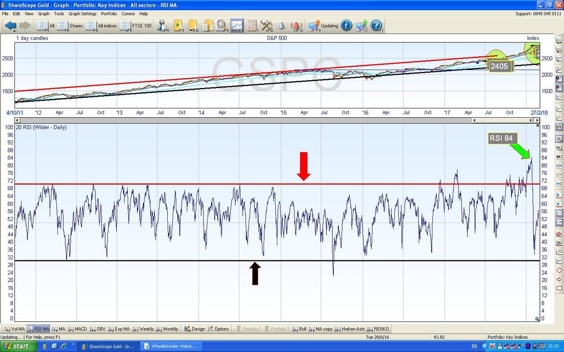
Here is more evidence about how ‘Overbought’ the S&P500 was and at the time I remember writing in my Weekend Charts Blogs about this and I was Tweeting it out regularly and no doubt shaking my head in astonishment as I wrote !!
In the bottom Window on the Chart below we have the RSI (Relative Strength Index) for the S&P500 Daily and where my Green Arrow is the RSI was up at what is probably one of the highest levels ever at RSI 84. My Red Arrow is pointing to my Horizontal Red Line which is at RSI 70 and this is generally taken to mean an Asset/Index or Stock is ‘Overbought’ although with experience you will learn that various things behave differently and it tends to be the highly Liquid things like Indexes where RSI 70 is a very high Reading but on a Small Cap Stock they often go much higher and can still keep going up. However, if you look back to the left, you can see that the S&P500 very rarely went over this RSI 70 level - so RSI 84 was clearly “Cruisin’ for a Bruisin’…” Note, down below we have a Black Line (Black Arrow) which marks the RSI 30 Level and this is generally taken as ‘Oversold’ so when you see it down here, you should be looking for Long Trades (i.e. to Buy the Asset or Index or whatever it is). I love this Indicator - it is one of my favourites and an extremely helpful tool but I must say it is most useful when we are at Extremes.
Here is another useful tool from back in Late January and just before which was hinting that there might be trouble ahead. Again please ignore anything in the Black Box but this time I am showing you the wonderful Heiken Ashi Candlesticks - these things are different to ‘Normal’ Japanese Candlesticks and they are superb because they are extremely clear and easy to interpret. Again I often show these in my Weekend Charts Blogs.
In this case back at the end of December and into January 2018 we had an amazing run up of Big White Candles (this is where my Blue Arrow is pointing) - that was a stunning run and obviously anyone who was even slightly awake must have realised that it was a bit out of the ordinary (and therefore by simple ‘Mean Reversion‘ it was likely to come to an end and it was merely a case of stalking it patiently until we got the Sell Signal). I find this is often the case with Good Trades - they take a while to Set-up and you usually get plenty of time to ‘See them coming’ and get prepared in terms of planning what you are going to do when you get the Trigger - as always it is best to stay calm and objective and not to rush into things.
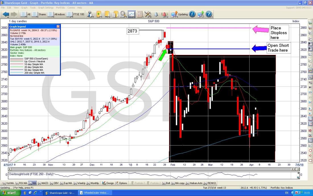
So using the RSI and a bit of nouse it was pretty obvious that the S&P500 was getting very over-stretched to the upside so we were looking for a Signal to Short the devil. As I mentioned on my First Chart, we had an ‘Inside Day’ 2-Day Candle Setup and we needed the third Day to complete the Pattern - as you can see on the Chart below where my Small Green Arrow is, we got the ‘3 Inside Down’ completed Pattern and this was a Predictor of falls ahead.
Therefore the Trade was to go Short straightaway and if you managed to get a Short Trade on at about 2800 ish (note that the Close of the Small Red Down Candle that I am pointing at with my Green Arrow was at 2822 but because we need to wait for a Full Day’s Candle before deciding to place the Short Trade, it is likely that the Spreadbet Price at that time would have been a bit lower - this is normal), and you placed your Stoploss up just above the High at 2873 - for this example let’s say you placed it at 2880 (where my Pink Line is), then you would make a Loss of 80 Points if the Stoploss got Triggered. Before putting the Short Trade on you would have decided where your Stoploss would be and in the numbers I have just given, you would take the Potential Loss of 80 Points and use this to work out your Position Size. For example, if you are prepared to lose £300 on the Trade, then you would divide £300 by 80 Points and this gives a result of £3 a Point or you could perhaps accept a little bit more Loss and go for £4 a Point (this would mean a Loss of 80 x £4 which = £320). As another example, if you were prepared to lose £1500 on the Trade, then you would divide £1500 by 80 which gives you £18 a Point or perhaps you might decide to round it up to £20 a Point which would result in a Loss of £1600. Hopefully that makes sense - but the key point is that you let the Amount you are prepared to Lose dictate your Position Size.
I love this Hindsight Trading - it is so easy !!!
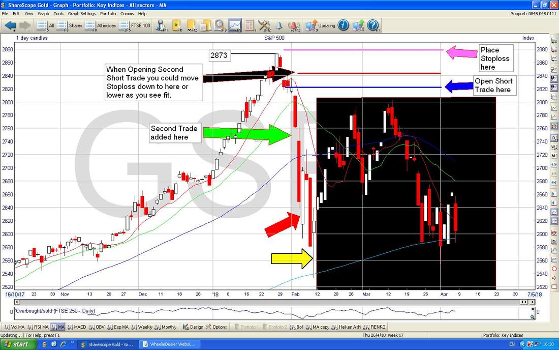
On the next Chart I have moved things along a bit (again, please ignore stuff in the Black Box - imagine it is not there) and look how for a couple of Days the Trade didn’t do much but then all of a sudden where my Green Arrow is the S&P500 had a Big Drop. At this point you would probably have been thinking about adding another Short Position - remember I said in my earlier Parts to the Blog Series that it is best to Enter the Trades in a small way first as this lowers the Risk on your Stoploss - putting on a ‘Half-Size’ Trade probably makes sense. In order to put on another Trade you would be looking at other Indicators like the RSI Index, the MACD Indicators, and my favourite which is the 13/21 Day Exponential Moving Average (EMA) Cross thing which I will show in a second. Oh, I forgot to say, as with all these Charts you can click on them to make them grow bigger so you can see more detail.
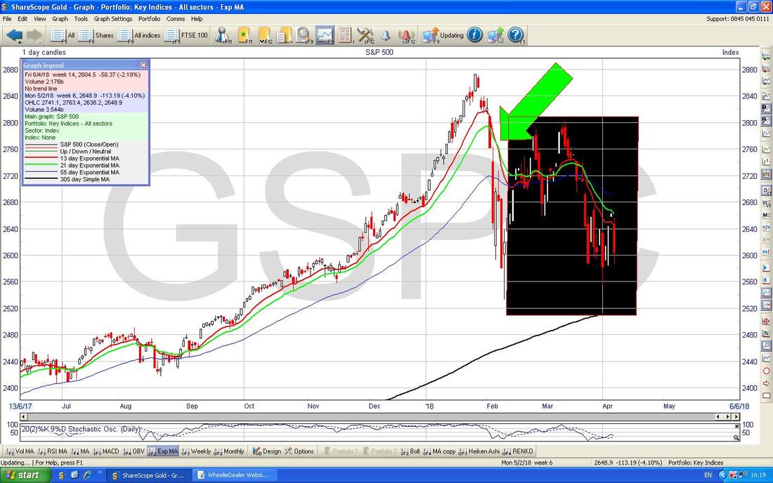
On the Chart below don’t dwell on the details here and like before please ignore the stuff in the Black Box. All I want to show here is that around the time of the Short Trade that we are talking about, there was a Bearish 13/21 Day EMA ‘Death Cross’ which is what my Green Arrow is pointing at. These types of Crosses are superb and they are where the ‘Faster’ Red 13 Day EMA Line crosses the ‘Slower’ Green 21 Day EMA Line from above - the beauty is that if you get these Crosses they often mean Weeks of falls to come. Conversely, if you get the opposite Cross which is a ‘Golden Cross’ then it can often means Weeks of gains ahead. I love the 13/21 Day EMA Crosses and I am convinced that it would be possible to create an effective Trading System which was just based on using Triggers from such Crosses.
Things get a bit more complicated here. On the Chart below I have put in a Big Green Arrow which shows roughly where you might have been able to Open another Short Trade (in reality it is quite possible that the ‘Out of Hours’ Spreadbet Market had already dropped more than this so you might have decided not to add to your existing Short Trade) and when putting on this additional Trade you might have decided to Lower your Stoploss Level and my Black Arrow is pointing to a Horizontal Red Line which is a possibility for where you might want your Stoploss. Of course you could have it lower than this but the key thing to appreciate is that you want to put your Stoploss just above Levels of pretty Strong Resistance in the case of a Short Trade.
My Red Arrow is pointing to a Big White Up Candle and it is very likely that you would have Closed your Short after seeing this created. That would not have been a disaster at all and it would have been a nice Trade (in fact, I have a hunch this is exactly what I did !! I have not bothered checking my Trades List but if you look you might see what I actually did) but with the benefit of Hindsight if you had managed to let the Trade run, then you would have done better to have Closed it after the Hammer Candle which is pointed at by my Yellow Arrow. Hammers like this are a very clear ‘Buy Signal’ so it would be a no-brainer to Close your Short if you still had it running at this point. This does throw up an interesting consideration around how I do my Trades. I work on the basis of Full Daily Candlesticks and this is partly for clarity but it is perhaps more to do with my own ‘Lifestyle’ choices and the fact I don’t want to be looking at Screens and thinking about the Markets all day. It might well be that if you were to use 4 Hour Candlesticks then you might be able to do much better and you would probably get good clarity as well - if you go lower than this to perhaps 2 Hours, it might not be so good. You can experiment as you see fit but the joy is that Candlesticks and many of these Indicators are ’Fractals’ and work on any Timeframe !! (I even saw someone using Quarterly, 3 Month, Candlesticks the other day).
That’s pretty much it for my Example Short Reversal Trade - as I mentioned earlier, a Long Reversal Trade would be pretty much the Mirror-image and you would be tracking a move Down and waiting for the Opportunity to catch the Turn and go Long.
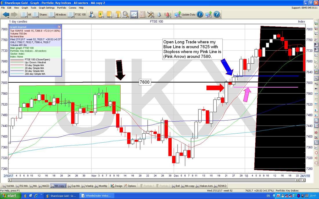
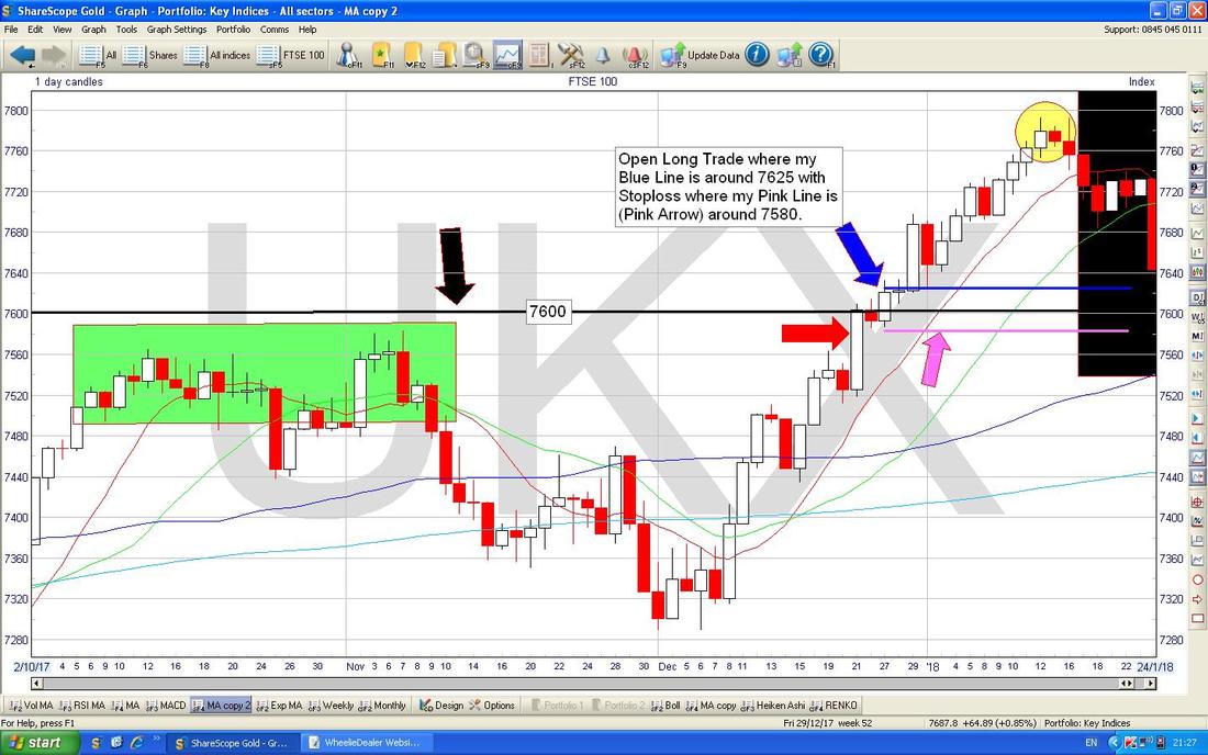
Example 2 - Long Breakout Trade This is an example for Bulls and going ‘Long’ but the opposite would hold true if a situation Sets-up where the Market is likely to fall - this is obviously for Bears and you go ‘Short’. I am pretty sure that if you read my Weekend Charts Blogs sooner or later we will get plenty of examples of where we get Short Breakdown Trades from a Horizontal Support Level which fails. Such Short Breakdowns would be based on a ‘Ledge’ where the Price hits a Support Level again and again and then finally smashes down through that Support. For a tad of variety, I will use the FTSE100 this time and there was actually a nice example of a Long Breakout Trade quite recently. If you look at my Chart below, as before please imagine that anything in the Black Box has not happened yet - it is your imagination - it is not really there !! (by the way, I was thinking about this and I reckon the way to achieve what I tried to do before is to use the Timeframe function in ShareScope where you select the Dates ‘from’ and ‘to’ that you want to display on the Chart - it would work but is a lot of faffing about and I am sure you would all rather I focus on the Quality of the Words etc. rather than wasting time trying to figure out exactly how to achieve the same effect I can get from very quickly sticking a Black Box over it !!). Where my Yellow Circle is the Price moved up in May 2017 and there was a ‘Shooting Star’ or ‘Inverted Hammer’ Candle where it touched 7600 Intraday (where my Horizontal Black Line is with my Black Arrow) and then fell back (by the way, that would have been a beautiful Signal to go Short for a Reversal Trade !!) and of course 7600 was a bit of a round number and a Key Psychological Resistance Level (these kinds of Psychological Numbers are brilliant - both on the Upside and the Downside - for example, if we ever get up to the dizzy heights of 8000 on the FTSE100, this could be a great Resistance Line from which to look for Shorting Opportunities and if it eventually Breaks-out from 8000 that would be a Signal to go Long). After the Shooting Star in the Yellow Circle the Price got into a Down Wave and then after a while it turned up again and where my Pink Circle is we nearly got back up to 7600 but it would have been telling us that whenever the Price got back up near 7600 it would reverse back down - that is normal behaviour when a Market has run up so much as it did last year. After the Pink Circle, the FTSE100 dropped down again and it was quite a while before it did another turn up and where my Green Box is the Price got right up near 7600 and at this Point the Canny Trader would be thinking “This thing is bashing up near that 7600 Horizontal Resistance Level here and I will watch it extra closely because if it Breaks-out above 7600 that could be a superb screaming Trade that makes me a nice stack of Cash with pretty low Risk” (the ‘Low Risk’ aspect will become apparent in a bit when we talk about where to place the Stoploss). Then after the Green Box the Price fell away again, and of course our Super-Genius Trader would now be Short and enjoying the move back down but of course He/She would be disappointed that the Breakout Long Trade had not yet happened but they would be keeping in mind that it might still be a possibility. Anyway, as it turned out, if you look in the Black Box, the Price turned up again in December 2017 and our Ultra-Talented Trader was now thinking “I can do a Santa Rally Trade here and if it Breaks-out of 7600 as well then I will really have a huge Turkey on the Table this year !!”.
Not that I have much idea what I’m doing, but I do remember I was Long on some sort of Index around Xmas time and I did quite well on it - see my ‘Trades’ Page - but I was probably playing the Santa Rally (the trend for Markets to rise in the Days just before and around Xmas and New Year) rather than being some sort of Chart Breakout Genius !!
On the Chart below, I have shortened the Timeframe so we can see more detail and the Big Green Box is the same one as in the previous Chart if that helps you get your bearings. Where my Red Arrow is we got a Big White Up Candle on Thursday 21st December and look how it actually Closed slightly above 7600 (it closed at 7604 after hitting 7609 Intraday). At this point you could probably have gone Long with a Spreadbet or Long ETF or something but because it only just slightly managed to creep over the Critical Horizontal Resistance Level at 7600, you might have held back and waited. If you had waited, then on the next Day (Friday 22nd December) there was a Small Red Doji Candle where the FTSE100 just wiggled about (no shock on a Friday just before a Xmas Weekend !!) but if you look where my Blue Arrow is, on Wednesday 27th December we got a Proper Breakout with a nice Big White Up Candle - this was the Signal to put on a Long Trade. As per my whole ‘System’, I would be looking at the Chart on the Night of Wednesday 27th December and I would perhaps have put a Long Trade on - clearly that was what the Chart was telling me to do. First off you would need to ‘Plan’ the Trade - I would look at where the FTSE100 Closed (if you look in the Top Left Hand Corner there is a ‘Graph Legend’ Box which has the details for OHLC [Open High Low Close] for ‘Wed 27/12/2017’ and this is where I get the Numbers to help me place my Stoploss etc.) and this was at 7620.7 and I would assume that because I do my Trade on a Spreadbet after the Market has Closed, the Spreadbet Price would probably be something like 7625 (if you like, you can log into your Spreadbet Platform and check the exact Number - but remember in the time it takes to Plan your Trade it will most likely have moved a bit) and I would use that as the ‘Open’ Price in my Plan. Next I would look at the Lowest Point of the Candlestick that was created that Day - this is at 7586.4 and is represented on the Candlestick by the little ‘Tail’ or ‘Wick’ at the bottom. I would then Plan to put my End Of Day Stoploss at perhaps 7580 - i.e. just below the Low Point of the Day. With these Numbers of 7625 to Open and 7580 as the Stoploss, then if the Trade did not work out, I would have to live with a Loss of 45 Points (7625 minus 7580). I would then use this Number to work out my Position Size. For example, if I wanted to bet £10 a Point, my Loss would be £450 (£10 times 45 Points). As another example, working it the other way round on what amount I am prepared to lose, if I was able to live with a Loss of £3000 on the Trade, then I would bet perhaps £65 a Point (£3000 divided by 45 is 66.66 so you would round it up to £65). If you were to bet the Minimum that igIndex usually allow of £2 a Point, then you could lose £90 (£2 a Point times 45 Points of Loss). Of course in all these examples, you could Close the bet earlier if you liked and this would reduce the Loss - it is only if you let it run to the Stoploss Level that you will take the full hit (or even a bit more if you get some ‘Slippage’.) I am still experimenting with this myself but I am tending to find that if a Trade doesn’t start to go my way fairly soon after I place it on, then it might be best to just Close out the Trade and take a tiny Loss. If we go back to my Chart now, you should be able to see a Horizontal Pink Line where my Stoploss would be placed and a Horizontal Blue Line where the Trade is Opened. I wrote just now about how to ‘Plan’ the Trade (by the way, you could add in a Target Price as well if you like although I tend to do that later), and obviously the next step would be to actually place the Trade with your Broker and that would inform where your Blue Line actually is in reality. I would then write a Text Box on my ShareScope ‘Working’ Screen with the relevant details on it and I would fill out my Spreadsheet Entry where I record my Trades. Of course an extra job for me is to Tweet out the Trade and also to update the Website - I usually do this before completing my Spreadsheet and updating the ShareScope Screen, so my Tweets are very near ‘Real Time’. Earlier I spoke about this being a ‘Low Risk’ Trade and what I mean by that is Horizontal Breakouts like this mean your ‘Gap’ between your Opening Price and your Stoploss Level can be relatively tight compared to some other Trade Types. In the example I have just ‘Planned’, I set my Stoploss just underneath the Daily Candlestick but an alternative would be to put your Stoploss just below the Horizontal Breakout Level - in other words something like 7594 or similar would be suitable - it is up to you but the Risk is that if your Stoploss is too tight, then you could get Stopped Out just before the Trade turns and goes your way anyway - it is always such a Trade-off and compromise that you have to make. Personally I like fairly tight Stoplosses (remember mine are Manually Triggered and based on an End of Day [EOD] Close basis, not an Intraday wiggle) but not so tight that I don’t give the Trade room to ‘breathe’. As an aside, I know many People use Stoplosses on their Stocks etc. and it often strikes me that if you are going to do this then rather than using an arbitrary 10% or 15% or whatever it might be better to use extremely good Entries and match them with Tight Stoplosses in the way I have outlined here. If you were to use 7594 as your Stoploss Level, then you would be Risking 31 Points of Loss (7625 minus 7594) so for a given Total Loss that you find acceptable, you could have a Bigger Position (which would be good if the Trade goes your way). For example, if you are prepared to accept £200 of Loss, then with the Wider Stoploss you could do about £4 a Point (£200 divided by 45 Points is £4.444) but if you used the Tighter Stoploss then you could do about £6 a Point (£200 divided by 31 Points is £6.45). Clearly the benefit of the Bigger Position is that if the Trade goes your way then you will make more Money (nice !!). But don’t get greedy. Of course with the Higher Stoploss you would have to move the Pink Line up a bit. For managing these Positions I find my Blue and Pink Lines etc. really helpful - they are a Graphical representation of what is happening when I update my ShareScope Software at 10pm each Night - if you can find some Software that enables you to Chart using Candlesticks and to draw in such Lines for Opening Level and Stoploss Level etc., then that would probably help you manage the Trade a lot.
The Screen below is very similar to the one above, but I just want to talk about ‘managing’ the Trade after it was placed. Anyway, it soon got into its stride and the Markets rose nicely and the first proper sign of trouble was where my Yellow Circle is where there was a White ‘Doji’ Candle which was then followed the next Day by a smaller Red Doji Candle which was ‘Inside’ the one from the previous Day. These 2 Candles formed a ‘Bearish Harami’ setup and this would be a warning that the Market might be about to turn down again - you could look at other Indicators like RSI, MACD, Bollinger Bands for more clues on this.
As it happens, the next Day there was a Big Red Down Candle (you can see this just inside the Black Box which I told you not to look at !!) and this would have been a final Signal to Close your Long Trade although you might already have Closed it after the 2 Day ‘Bearish Harami’ had formed. Of course, as the Price ran up to the Yellow Circle, you would have had plenty of opportunities to move your Stoploss up behind it although you need to be careful to still allow it room to ‘breathe’. I think I mentioned this elsewhere in the Blog Series but the approach I take is to move the Stoploss up slowly at first and then once the Trade is getting pretty ‘Long in the Tooth’ I might tighten up the Stoploss a lot - however, I am more driven by what the Candles and other Indicators are telling me.
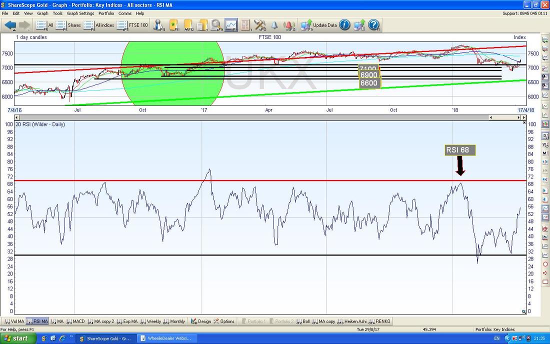
I will just chuck this in to help illustrate the Trade. In the bottom window on the Screen below we have the RSI (Relative Strength Index) for the FTSE100 and my Black Arrow is pointing to where it Peaked at RSI 68 which was at the same time as the Bearish Harami Candlestick Pattern in the Yellow Circle on my previous Chart - so this was telling you that the Trade was getting ‘tired’ and it would soon be time to Close it.
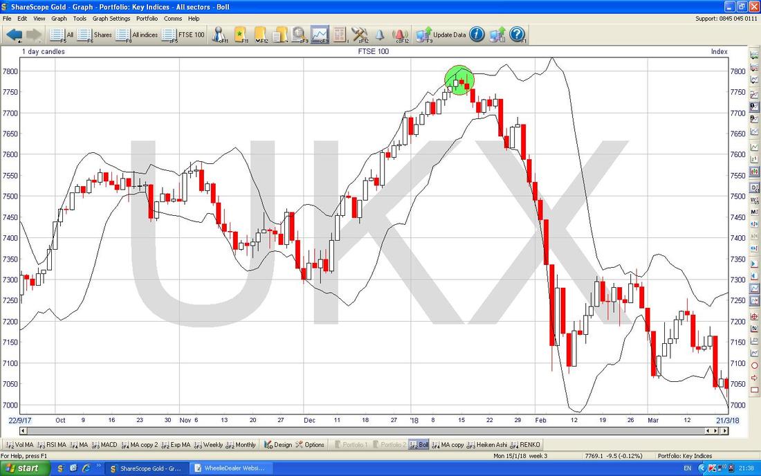
On the Chart below, we have the FTSE100 with the Black Wiggly Bollinger Bands above and below. Where my Green Circle is we have the Bearish Harami 2-Day Candlestick Pattern which was in my Yellow Circle and note how up until this point the Price had ‘hugged’ the Upper Bollinger Band but after this Bearish Harami, the Candles started to move away from the Upper Band - this was a signal the Upmove was ending.
Nice Trade though !! OK, those Examples got quite drawn out but I think they should give a very good steer on how to do things from a more practical viewpoint. I will end this Blog here and in the next one we have a Conclusion which brings the Key Points together and hopefully will help cement the concepts of my ‘Index Trading System’ firmly in your Brain. From reading through this again for the Proof Read it strikes me how important the Candlesticks are to how I do things - if you are interested in this kind of Trading then I recommend you go to ‘Wheelie’s Bookshop’ and get yourself a copy of ‘Candlestick Charting for Dummies’ - it is an excellent book and very simple to understand. Cheers, WD.
3 Comments
Jon Craig-Tyler
13/4/2018 06:13:55 am
Great article, thanks for all the effort. I think the candlestick patterns are fascinating. I've had a few dabbles myself, but I think I'm focusing on timeframes that are too short ie intraday. Much better looking at the daily candles.
Reply
WheelieDealer
13/4/2018 11:14:36 pm
Hi Jon, thanks for your comments. I find the Candlesticks take a while to sort of 'gel' in your head but after a while you start to get it. Context is so important - I find Candles superb for spotting Turning Points (especially when combined with simple TA stuff).
Reply
Jd123
8/7/2018 04:34:50 pm
Hi WD
Reply
Leave a Reply. |
'Educational' WheelieBlogsWelcome to my Educational Blog Page - I have another 'Stocks & Markets' Blog Page which you can access via a Button on the top of the Homepage. Archives
January 2021
Categories
All
Please see the Full Range of Book Ideas in Wheelie's Bookshop.
|

