

|
educational blogs |
|
You clearly don’t need to be the World’s most genius Investor to figure out that Stockmarkets have had an extended run for all of 2017 and the tail end of 2016 and things are looking Toppy - at least in the Short Term if not on a Longer timeframe. I have been flagging in my Weekend Charts Updates how Markets have got quite extended and it looks to me like we might be turning down now - I am so convinced of this that I put a Short on the Nasdaq 100 back on Thursday Night - see the ‘Trades’ page for details.
As I mentioned in recent weeks, there is a lot of Support not far below on all Major Indexes pretty much so I am not expecting a protracted and panicky Sell-off - and there is no doubt that a move down would be very healthy to take out some over-done ‘heat’ and to shake out the weak Holders and enable Markets to go higher in coming months.
FTSE100
As usual, we do ‘Big Picture’ first and here is the FTSE100 Daily Chart going back to the Lows of 2009. You should be able to see that we are still up in the Long Term Uptrend Channel which is bounded by my Parallel Red Lines (marked by the Red Arrow) although it does look to me like the Bottom Line of that Uptrend Channel is being tested now to the Downside and if this fails, then that would not be great. However, the next important bit of Support comes from the Horizontal Black Line (marked with the Black Arrow) and this kicks in around 7100 to 7130 so we might be able to move back up from here. 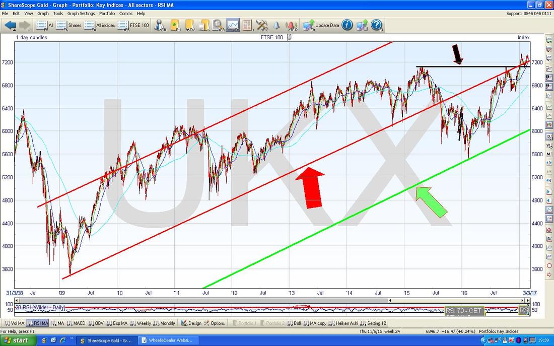
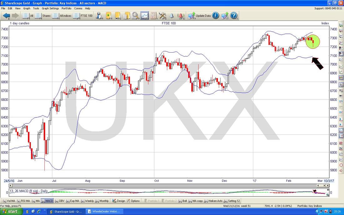
On the ScreenShot below (as is the long established tradition, all pics are from the stonkingly brill ShareScope software I use to manage my Stocks) we have the Daily Candlesticks for the FTSE100 going back about 6 months. This should explore more closely the Support I talked about on the first Chart and give some idea of where we are going next.
The Red Line (with Red Arrow) and the Black Line (Black Arrow) are the ones from the previous Chart and what I said there might make more sense now you can see this. The Yellow Circle is marking out a Down Candle from Friday 24th February but note it has a long ‘Tail’ or ‘Wick’ downwards which shows how the Price recovered later in the day after a big drop early on. However, despite this showing a nice ‘Reversal’ Intraday, I suspect it is a leap too far to say this is a proper Hammer Candle and we should move up now - the ‘Context’ here is not great - ideally we would want to see a sustained move down of perhaps 5 or 6 Candles and then get a Hammer - this would be a proper Reversal. I find the whizzy ‘new’ Heiken Ashi Candles superb for these kind of situations - I will show them in a mo but I suspect they will give a much clearer indication that we are likely to drop more before turning back up. My Green Arrow is pointing directly down at a ‘Narrow Body Doji’ or maybe a ‘Shooting Star’ from Monday 20th February and look how this signalled the Turn down perfectly - it does make me smile when I see/hear people criticising the use of Candlesticks when they are clearly so powerful at predicting moves - few other Tools are as good at this especially in such a ‘timely’ manner. Note the Intraday High on this Doji was 7330 and this is now quite a strong level of Resistance to get over and of course we are then confronted by the All Time High at 7354 - maybe if we do keep our poise then there might be a bit of a Sideways Range for a while - maybe between 7100 and 7330 but it is a bit early to tell as of now. Back to the Hammer thing in the Yellow Circle, note how the bottom of the ‘Wick’ or ‘Tail’ went down to 7192 before finding Support and turning up during the day on Friday - look how this was pretty much bang on the Blue Wavy Line which is the 50 Day Simple Moving Average. 
Talking of the wonderful Heiken Ashi Candles - let’s do them now. The Chart below has the Daily HA Candles for the FTSE100 going back about 8 Months - I have simply chosen this timeframe so that the Candles are of a suitable size for us all to see and also because the ‘History’ of the recent moves should enable Readers to look back at how these Candles work when they transition from Red to White and then White to Red - and go narrow in between the change. Amazingly powerful and simple to ‘read’ (if you are struggling to see the detail, then if you click on the Chart it should miraculously grow much larger).
My Yellow Circle is highlighting exactly what I suspected we would see when I wrote the bit of text above the last chart. This HA Candle from Friday is a Bearish Candle and suggests we will see more falls in coming Days. Don’t get confused with the fact it looks like a ‘Hammer’ as on the previous Chart - remember HA Candles do not work like ‘Normal’ Candles and one like this with a long ‘Wick’ or ‘Tail’ down tells us it will probably fall more. Note how in the days prior to the Candle in my Yellow Circle we had a string of White Up Days and then the Candles started to narrow at the top and then turn down and give us the Big Red Down Candle with the Tail that we got Friday - this is a classic indication that the Trend is turning down - you can see this in the ‘history’ from previous moves to your left. While we are on this subject, look at my huge Blue Arrows - they are a bit ‘loose’ but I merely want to point out to Readers the long string of about 27 White Up Candles - this shows you the power of HA Candles - you could have gone ‘Long’ on the FTSE100 (via perhaps a Long FTSE100 ETF or as a Long Spreadbet or CFD or something) in the early days of this move up and the HA Candles would clearly have kept you in the move because they never went Narrow and/or turned Red for the whole period - amazing power these things and I love them !! All you Traders out there - if you are not using these things then I suggest you check them out as they work really well on any timeframe from what I can see. 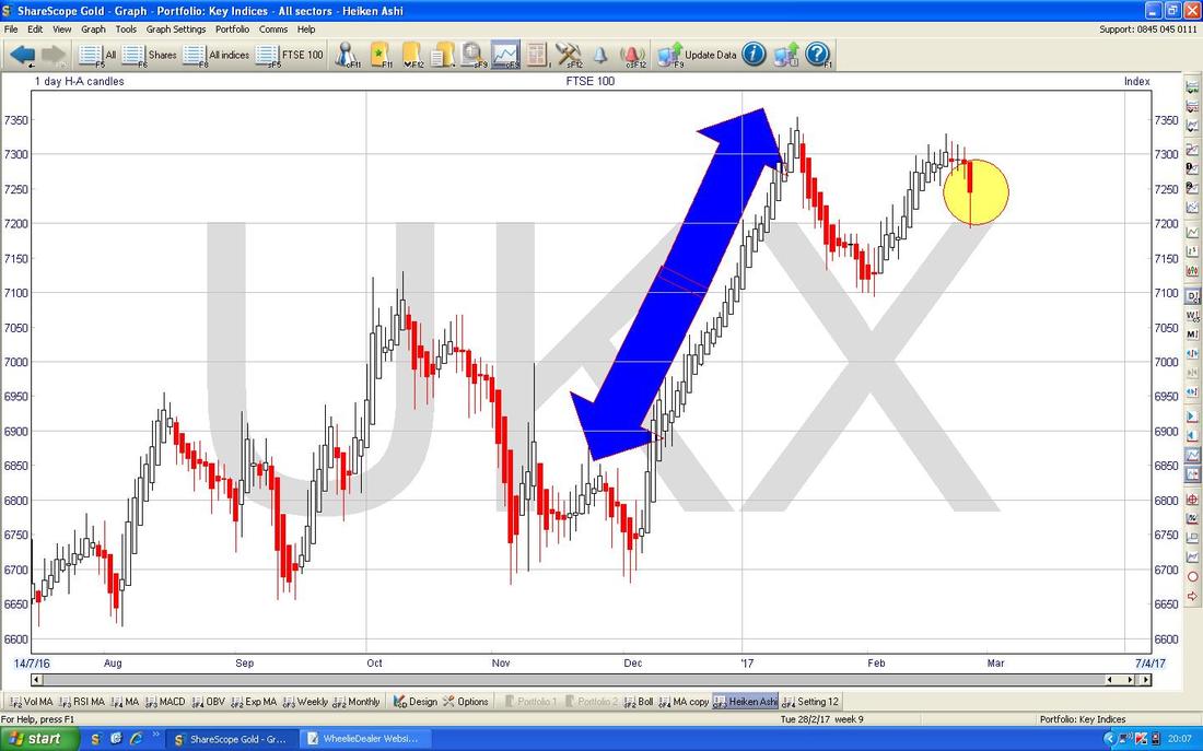
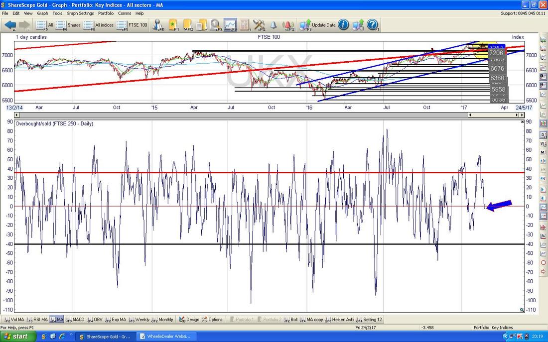
In the bottom window on the Screen below we have the ‘Overbought/Oversold’ Oscillator for the FTSE100. My Blue Arrow is showing that it has dropped from a pretty high Peak in recent days and is now sort of midway. I suspect it will drop more to the bottom before we see the FTSE100 turn up at all and the important thing to understand about this Oscillator is that it is extremely short term and this picture could change in as fast as 1 or 2 days. But the ‘takeaway’ from this is that we are most likely to see more drops early next week.
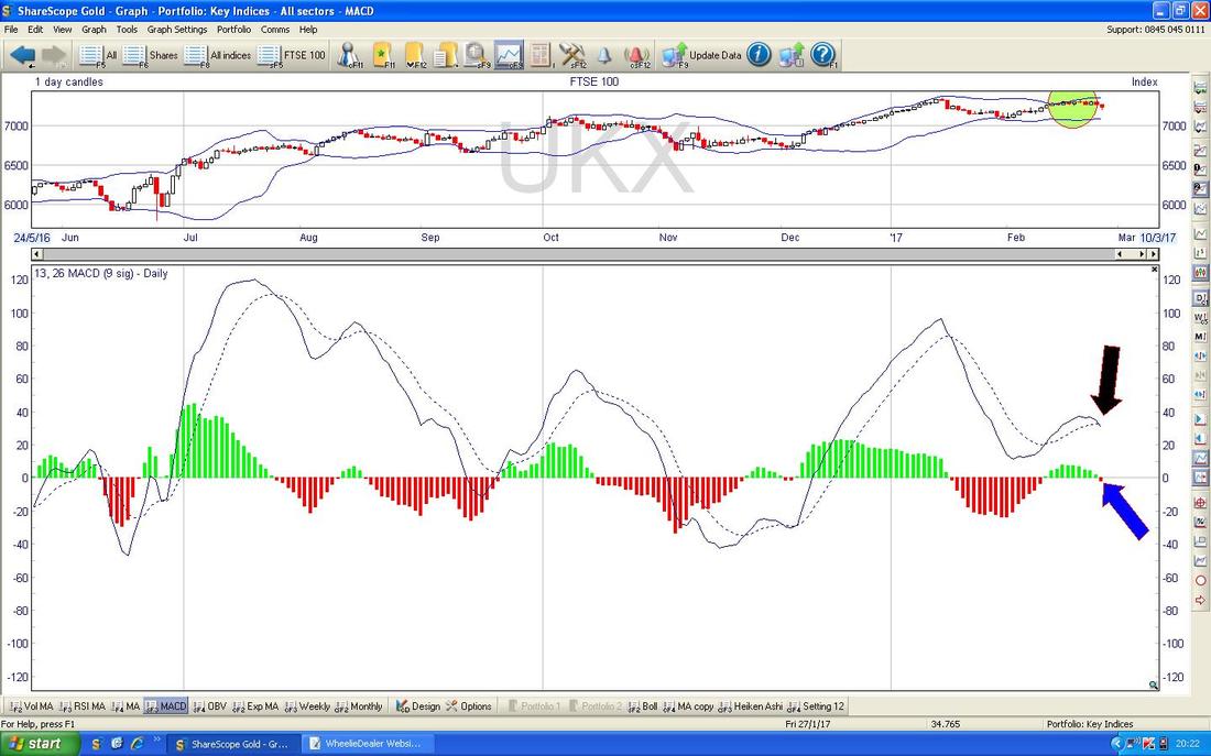
In the bottom window on the Chart below we have the MACD (Moving Average Convergence Divergence) for the FTSE100 Daily and my Arrows are showing where we have a ‘Bearish MACD Cross’ (obviously not good !!) in both the Signal Lines and Histograms formats.
The Chart below in the top window has the Daily Candles for the FTSE100 with the Blue Wiggly Bollinger Bands above and below. My Green Circle is highlighting how the Candles of recent Days have fallen away from the Top BB and my Black Arrow is pointing to the Bottom BB and how this might act as Support at about 7100 - this lines up with the earlier Charts.
The Chart below has the Weekly Candles going back about a year and 2 months on the FTSE100. My Green Circle is highlighting a Down Candle from last week and this is consistent with things dropping a bit - although we could have had a much ‘worse’ Big Down Candle.
Note my Parallel Blue Lines marked with the Blue Arrow - this Uptrend Channel gives more areas of Support around 6500/6600 - if we get a nasty Sell-off, then these Levels should kick in as Support.

I’m jumping the gun on the next Chart, but there is an important development to watch out for here. This Chart has the Monthly Candles for the FTSE100 but the Candle for February (marked with my Yellow Arrow) is not complete yet and therefore has ZERO validity as yet. However, the thing to watch out for here is that if we get a sizeable Drop over the next 2 remaining days of February and the Candle Closes below the Low of 7093 that it Opened the Month at, then this would look pretty Bearish in the context of the Inverted Hammer Candle which we got from January which I have marked with my Blue Arrow. Such a resulting Red Down Candle would suggest more falls in coming months - so this is something to look at when the Market Closes on Tuesday Night and we get a Full (and therefore valid) Candle for the month of February.
It is quite likely I will comment on this via Twitter on Tuesday night and I might even do a ‘Technical View’ like I often do at the top of the ‘M3 Manifesto’ page. 
CAC40 (France)
I won’t do much on the CAC because it is not something I am particularly interested in - however, it will demonstrate the sort of coordinated Global weakness that seems apparent in all the Indexes. The Chart below has the MACD in the bottom window for the CAC40 Daily and my Arrows are pointing out how we are on the Verge of a Bearish MACD Cross. I won’t show it here, but the DAX30 (German) is almost identical on nearly all the different Indicators I use. 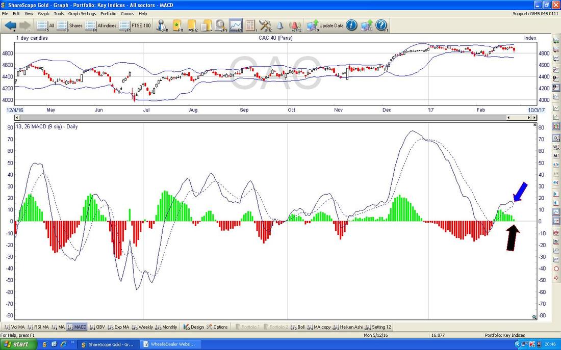
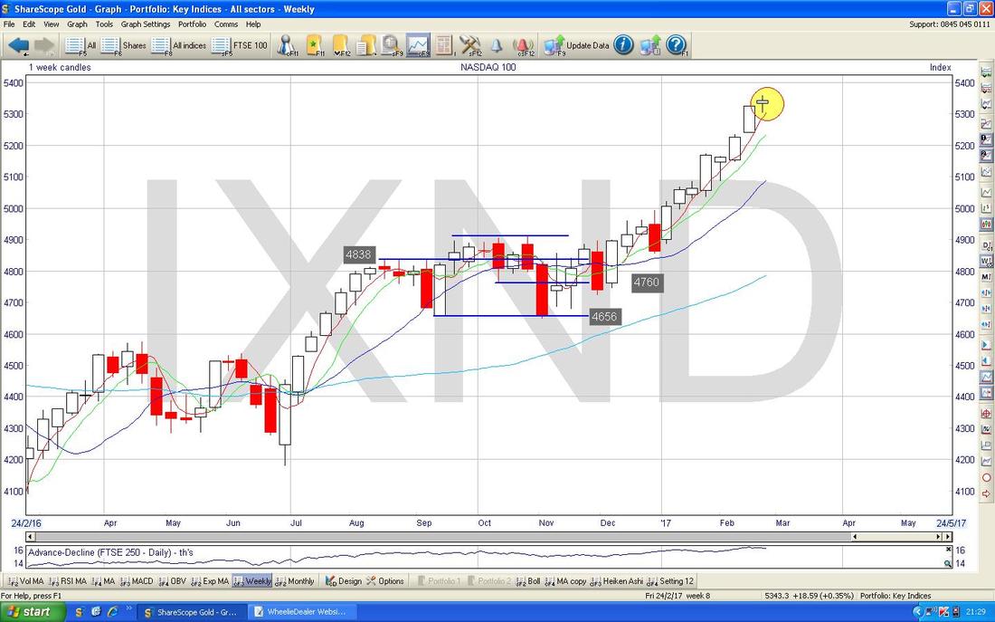
Nasdaq 100
I won’t show the DOW and the S&P500 this week but they are very similar to the Nasdaq Composite and the Nasdaq 100 although these Tech Indexes look a little bit more advanced in terms of their Bearish Signals. I am using the Nasdaq 100 here because I shorted this one on Thursday Night and I want to investigate this for my own selfish purposes and you Peeps might as well benefit from my observations !! First off on the Chart below we have my actual working Screen that I am using for my Short Spreadbet. The Horizontal Blue Line up at the top of the chart shows the Level where I opened my Spreadbet at 5329 and the sort of Horizontal Aqua coloured Line right at the Top is where my Manual ‘End of Day Close’ Stoploss is placed at 5370. I will use this Chart to manage the Trade and if it goes up above my Stoploss Level then I will close the bet and take a small hit of about 40 Points. My Black Arrow is pointing to a Red Down Candle from Thursday which was a pivot down off the small Doji Candle from the day before - in line with other Indicators which were looking like a Pivot was in place, this made me place my Short on Thursday Night. On Friday we got an Up Day but this looks like a ‘Continuation’ Candle to me and suggests the Nasdaq 100 will continue to fall - my other Indicators which we will check out in a bit will clarify this. Note, I use the Nasdaq 100 because igIndex do not enable me to Short the Nasdaq Composite - their Tech Index for this is called ‘US Tech 100’. 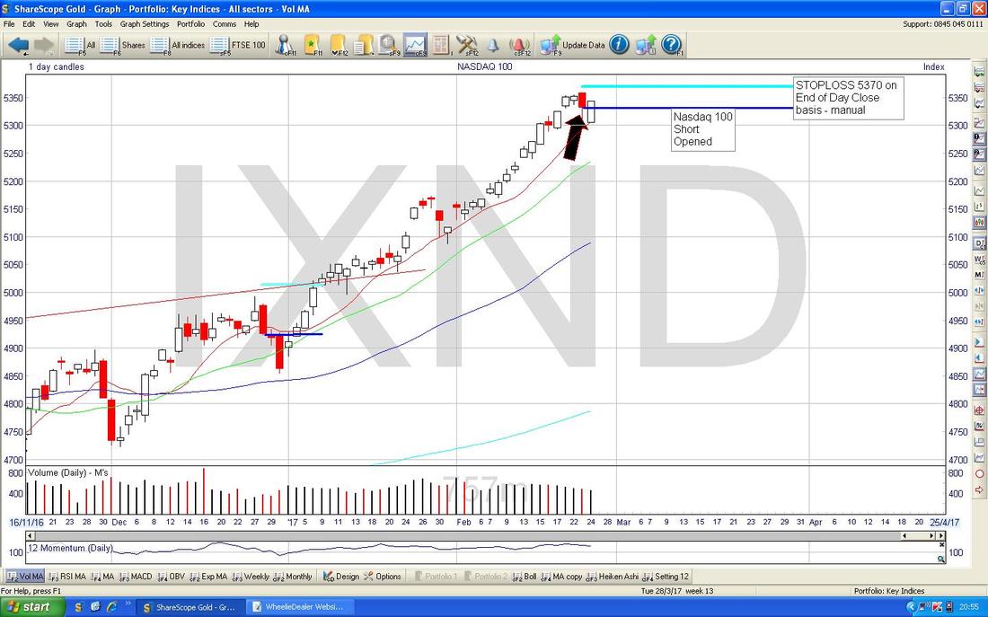
The bottom window on the Screen below has the RSI (Relative Strength Index) for the Nasdaq 100 Daily. On a Reading of RSI 76 and dropping from RSI 80 this is insanely high and certainly the most Overbought the Index has been going back beyond 2004 !! Note, many people say that the Price can still go higher when an RSI is up around here but this is unlikely on Major Indexes - with Stocks (particularly at the Smaller end) you can get rises even with extremely high RSI readings up around 80 or so but this doesn’t seem to work on Indexes or Big Stocks. Of course things can change but “this time it’s different” is rarely correct.
These extreme high RSI Readings are one of the main reasons I have shorted the Nasdaq 100. 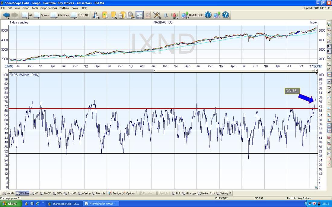
The Screen below has the Daily Candles for the Nasdaq 100 with the Blue Wiggly Bollinger Bands above and below. My Yellow Circle highlights how the Price had dropped down away from the Top BB and this hints at bearishness - note on Thursday when I placed my Short that the Price had dropped off. My Green Arrow is pointing to where the Bottom BB is at about 5100 - it is very possible that the Price could drop down to this level and I would love it if this happened - a nice 200 Points or so of Profit if it does for me - however, I will run the Short and look for Indications that it is turning up again from things such as the Candles and the HA Candles etc.

The Chart below has the Weekly Candles for the Nasdaq 100. Please ignore the numbers and blue Lines but what we are interested in here is the Doji Candle in my Yellow Circle - in the context of the strong run up (and we know it is extremely overbought from the RSI we saw earlier) this looks like it will mark a Pivot Point where the Index turns down from.
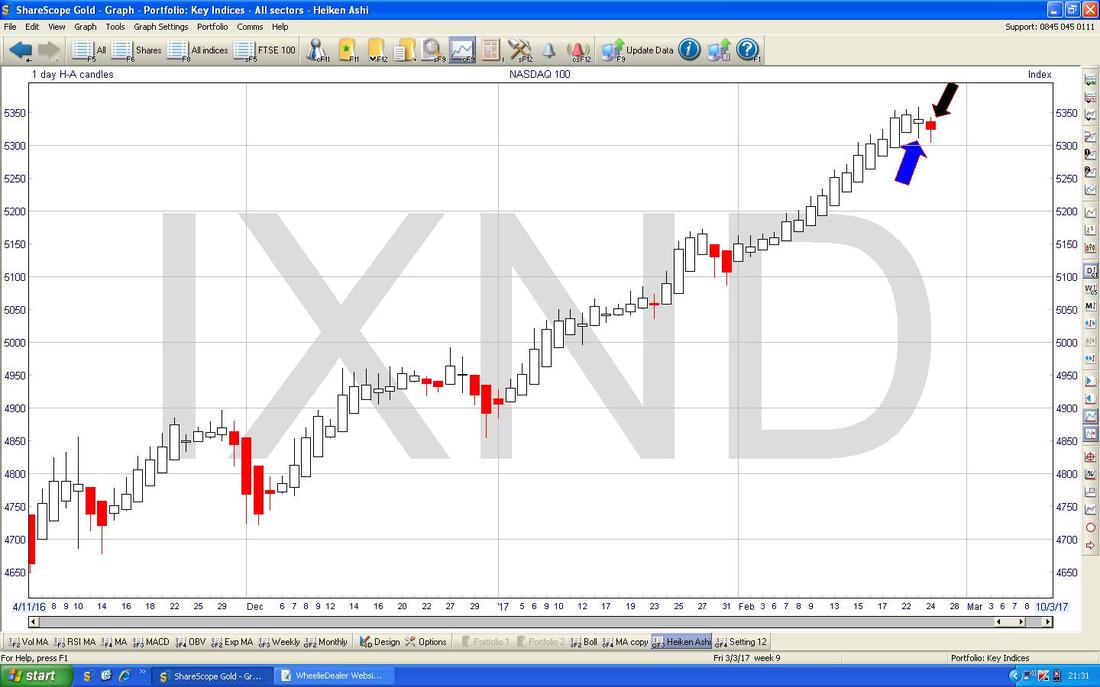
The Chart below has the Daily HA Candles for the Nasdaq 100. It is very clear that we are turning from nice White Up Candles to Red Down Candles - my Blue Arrow is pointing to how we got a Narrow White Candle on Thursday which hinted that a Change of Trend was coming and on Friday we got a Red Down Candle which confirms the move (marked with my Black Arrow). OK, we might not drop far (who can know?) but it seems most likely some sort of drop is imminent.
Pound vs. US Dollar
The Screen below has the Daily Candles for the £/$. As per recent weeks, it looks to me like we are sort of going Sideways in a Range about 1.2347 at the bottom and 1.2676 at the top - or maybe a bit tighter than this. My Green Arrow is pointing to a Big Red Down Candle from Friday and this is still within the Range. Remember, a Weaker £ tends to help the FTSE100 and a Stronger £ tends to hurt the FTSE100 - for this reason, I am not so keen to Short using the FTSE100 these days - it trades more like a Currency than a Stock Index. Note also the £ is very near the 50 Day Moving Average at about 1.24 which could act as Support (that’s the Darker Blue Wavy Line). 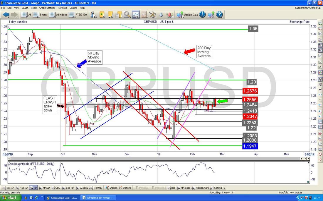
Brent Crude Oil (Spot)
As in recent weeks, Brent looks stuck in a Range between about $54 and $57.535 as per my Chart below with the Daily Candles in it. My Green Arrows are pointing out this Range. The FTSE100 could be affected by moves in Oil but with how this is looking at the moment, I can’t see a lot happening until we get a Breakout from this Range - either to the Upside or Downside. 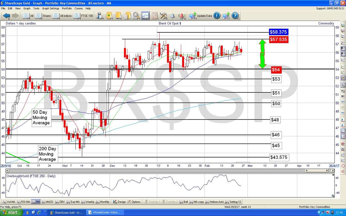
Gold (Spot)
This is another reason why I shorted the Nasdaq 100 - that might sound strange but on Thursday we got a Breakout to the Upside on Gold through the Resistance Level of about $1245 where we had 2 sets of ’Tweezers’ Tops which I have marked on the Chart below with Yellow Circles (this is a Daily Candlesticks Chart by the way). Such strength in Gold suggests to me that Stocks might come off a bit as we are going into a period which is a bit more Risk Averse or ‘Risk Off’ (ugh). My Green Arrow is pointing to an Up Day from Friday but note it couldn’t quite hold the Intraday High at about $1260 which is where the 200 Day Moving Average happens to be as well and this might be a tough Resistance Level to get over. My Black Arrow is pointing to the 50 Day Moving Average Line (the Darker Blue Wavy Line) - note how this is curving up and it will be worth watching to see if we get a Bullish ‘Golden Cross’ between the 50 and the 200 Day MAs if they crossover in coming weeks. 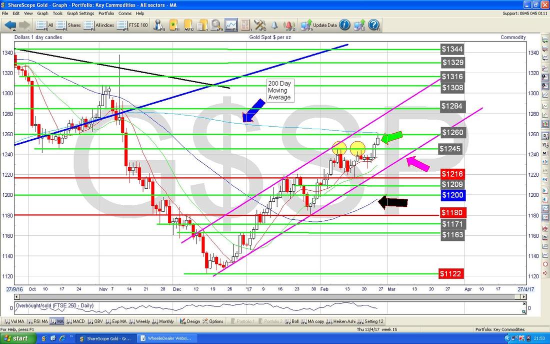
The Chart below has the Daily HA Candles for Gold (Spot) - my Yellow Circle is pointing to some Bullish looking White Up Candles.
That’s it, I need to eat, Cheers, WD. 
0 Comments
Leave a Reply. |
'Educational' WheelieBlogsWelcome to my Educational Blog Page - I have another 'Stocks & Markets' Blog Page which you can access via a Button on the top of the Homepage. Archives
January 2021
Categories
All
Please see the Full Range of Book Ideas in Wheelie's Bookshop.
|
