

|
educational blogs |
|
In keeping with my usually pattern of being quite focused on the Markets for Monday through to Wednesday and then starting to lose interest on Thursday and doing very little on Friday, I spent yesterday up at Duxford Aerodrome near Cambridge where they have loads of Historic Planes (both Military and Civilian) and it really is an excellent day out from the grind of our tough lives battling the Markets. Of course as it happens I met up with 2 Traders/Investors from Twitter (@aimprospector and @LairdElmski) so I didn’t manage to fully avoid thinking about Stocks and it was very productive and interesting to get their views on many Shares and how the Markets were panning out. And of course I can never get too much of the SR71 Blackbird………
The Market Gods certainly dolled out the love to me last week with my Portfolio rising 2.7% which is a big move for a collection of so many Stocks and with relatively Low Risk compared to a far more concentrated approach. It is especially good when considering how all my Losses for June have now been fully recovered and my Portfolio Value has pushed on to Fresh New Highs - a really sweet position to be in.
PAYS
One of the big contributors was Paysafe PAYS which is subject to a Takeover Bid at 590p - to an extent I am chuffed about this and it has mucho sentimental value as PAYS (when known as Optimal Payments OPAY) was probably the second Stock I wrote about on this Website many moons back and it has turned out to be a pretty decent selection and I recently added more which has looked to be super shrewd (ok, more likely to be Luck but I have been saying for ages that this Stock looked very undervalued compared to how other ePayments Stocks were being assessed). The catch here is that the Bid looks far too low - on an Earnings Per Share Consensus Forecast of 39.71p for next year, the Bid at 590p is on a Forward P/E Ratio of 14.9 which looks way way too low. It should also be borne in mind that the Forecast does not include anything for the Acquisition they announced on Friday which should add a little more to the EPS numbers. Anyway, I reckon a more reasonable (but still miserly) Forward P/E of 18 would be nearer something sensible - this would give a Takeout Price of 715p. If I was really cheeky, a Forward P/E of 20 would not be stretching things, which would push the Takeout Price to near 800p. The simple reality is that whatever I think doesn’t mean much (if anything) - either the Bid will go through at 590p, or it will be rejected or another higher Bid will be made (either by the Current Bidders or by other interested Parties) - it is out of my Hands so I will sit tight on my PAYS Shares and Spreadbets and see how things play out. Whatever happens, it is nice to know that I am choosing Stocks that are clearly of appeal to other Players in the Industry and I have managed to be in Stocks attracting Bids a lot lately. August Market As always time is whizzing by and we are at the tail end of July and my thoughts are drifting towards August and of course September which I am very wary of as it has the reputation of being historically the Worst Month of the Year. From a butchers at my 2016 UK Stockmarket Alamanc (ok, it is a tad out of date but not enough to make much difference to the established Monthly Trends), August for the FTSE100 has been on average the 7th Best Month (so not as good as July which is ranked 4th Best) and has given a Positive Return 58% of the time with an Average Return of 0.5% - so the odds are in the favour of the Bulls. A typical August for the FTSE100 tends to drift lower in the first 2 weeks and then recover strongly for the last 2 weeks - the Almanac also adds that International Indexes tend to struggle in August. You may well think of much of these historical trends as mumbo jumbo but it is still playing out that 2017 has been totally ‘Textbook’ to these Trends so far. Spreadbet Trimming List A key task for me in the coming week is to draw up a list of Spreadbet Positions which I want to TopChop during August so that I can go into September with less Long Exposure and with a larger Cash Position. September (and October) are historically troublesome months and it seems prudent to be prepared in advance - especially as my Stocks are really doing well at the moment and I would like to protect a bit of those Gains. I had a stroke of luck just recently where by sheer fluke I happened to open one of those Daily PDF Emails that igIndex sends out to me every day (I honestly don’t think I have looked at one of these for 5 years and I have no idea what drove me to do it) and I realised that they now give Equivalent ‘Normal Shares’ Exposure for each of my Positions and this will save me a shed load of time. I can simply look through one of these Statements and use my brain a bit to figure out which Positions I want to reduce (and by how much) and which ones I might dump altogether (for instance, I hold Empiric Student Property ESP as Normal Shares for the Divvy but the Share Price barely moves so there is not a lot of point in holding it as a Spreadbet and it is taking up valuable Capital which is tied-up as ‘Margin‘). The other advantage of doing this is that I will then be in a Cashed-up situation to be able to Buy some Long Spreadbets near the Lows in the Autumn if we do get such a drop. If Markets don’t fall, I won’t be too bothered because I will still have my Normal Share Positions and a lot of Spreadbets anyway. My intention is to be Shorting an Index or 2 during September if need be. In terms of my Normal Shares, I am building Cash in my ISA and I would be very happy to add to this in coming Weeks but I am in no rush to be selling anything in this Account. Enough already, let’s get some Charts up !! DAX (German) As I have written in recent Weeks, I have screwed up on a DAX Long Trade and as is always the way, it keeps getting worse !! So this has got me thinking about how to play things and I have in essence the following 3 Options:
Anyway, those are the Choices, what are the Charts suggesting will happen next? The Chart below shows the Daily Candles for the DAX for the last 5 months or so - as always the ScreenShots are from the wunderbar ShareScope Software that I subscribe to - well worth the money. The first things to look at are my Parallel Green Lines which are perhaps showing a Downtrend Channel which has formed up recently since I did the Long Position which was Opened up where the Blue Horizontal Line and Blue Arrow are - which is typical !! If the DAX stays in this Downtrend Channel, then it could go a fair bit lower (this has me thinking a Short to Hedge my Long would make a lot of sense). However, it is worth realising that I drew the Upper Green Line first and there are only 2 ‘Touch Points’ and I then drew the Bottom Line (marked by the Green Arrow) as a Parallel Line to this - so I could be hugely wrong here. Next note how the Price on Friday (this is the Long Down Red Candle captured by my Yellow Rectangle) dropped down through the Black Line (marked by my Black Arrow) at about 12300 - this is not good when Support like that gets broken down through. In a similar vein, note how the Price also fell through the Support from the Previous All Time High (ATH) at 12390 as marked by my Red Line and Red Arrow. Something else to consider though is that we often get treated to extreme moves and ‘overshoots’ on a Friday - it could be this kind of move. If you look closely you might be able to see a bit of the 200 Day Moving Average Line at about 11800 (it is just below the Green Arrow) - I suspect 12000 and 11800 could be good Support here but that is still a long way to fall so it also points me towards Hedging Out my Long Position for the time being. 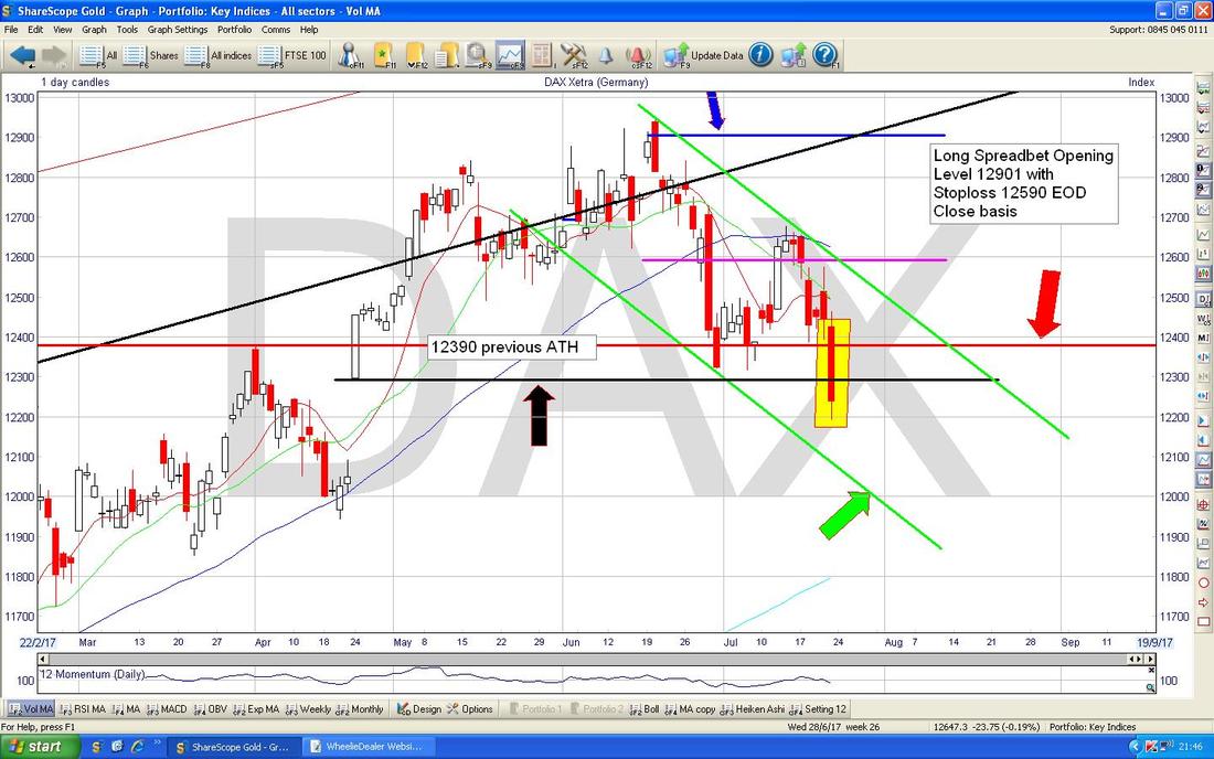
The bottom window on the Screen below has the RSI (Relative Strength Index) for the DAX Daily - on a current Reading of RSI 39 it is fairly low but can go a lot lower.

This is very interesting - my Yellow Circle is pointing out how the Price has dropped down to the Lower Bollinger Band at about 12200 - it could turn up from here although of course the Price can ‘Hug’ the Band and go lower………
Anyway, from what I can see it looks like the DAX could fall more - for now I will not do anything (the earliest I can move is after 10pm on Sunday Night anyway) but I will certainly look at triggering one of the Options on Monday Night - I suspect I will be going for a Short Hedge. 
Euro vs. US Dollar
I’m not certain of this, but in very much a similar way to how the FTSE100 has been reacting to movements of the Pound recently, it strikes me that the DAX has been falling as the Euro has strengthened - so I wanted a quick look at the Euro vs. the US Dollar. The Chart below shows the Big Picture going back about 3 years - the thing to note is how the Euro/$ has really been in a Sideways Range for much of that time as per my Parallel Black Lines - the Black Arrow on the Upper Line is pointing to roughly where the Price is now and if it Breaks-out of that Black Line then expect the Euro to go higher. 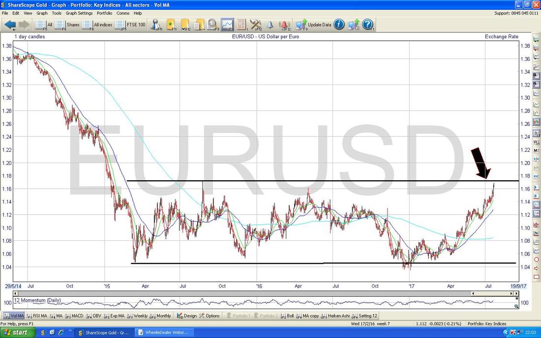
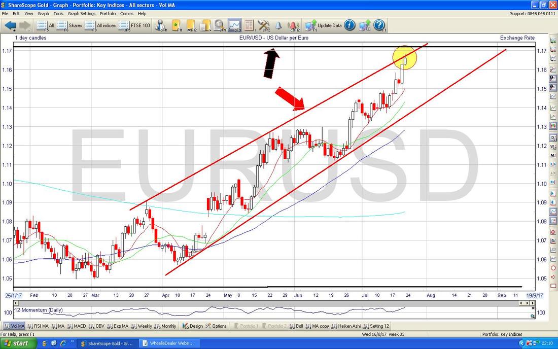
On the Chart below I have zoomed in on the Euro/$ and my Red Lines are showing some sort of Uptrend Channel although it is a bit ‘Wedgy’. My Yellow Circle is pointing to a Small Doji Candle from Friday which couldn’t hold the Highs and with it up near my Upper Red Line (marked with Red Arrow) and also near the Black Line from the previous Chart (marked with Black Arrow) it could be that the Euro will find things tougher in the very short term and might pull back a bit before another attempt at breaking out. If things play out like this, then that might cause the DAX to rise in the Short Term which would suit me fine !!
Imperial Brands IMB
Several people have mentioned this one to me lately so it is a good subject to look at the Chart on. I don’t hold IMB but fundamentally I find it quite appealing (of course there is an ethical side to the Fag side of things) and with a Forward Dividend Yield of 5.3% and it being a possible Takeover Target, there is a lot to like. The Chart below really is a ‘Big Picture’ with a marvellous Uptrend going on for at least 16 Years. I drew in the Black Bottom Line (marked by my Black Arrow) and then did the Blue Line as a Parallel one (marked by Blue Arrow) but there has been some subjective ‘Best Fit’ work by me here. Anyway, this is sort of suggesting to me that we might soon see the end of the recent Down Move. 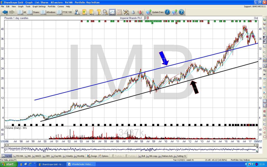
On the Chart below I have zoomed right in on the IMB Daily Candles and my Black Line marked with the Black Arrow is showing the confines of a Downtrend that has been in place for about 3 months or more. This is quite a drop and where my Yellow Circle is there could be decent Support - this is around 3400p. Note this is down at my Blue Line from the previous Chart - but remember that was a very subjective bit of Line Fitting by me. The thing now is for the Price to properly Breakout of that Black Downtrend Line and to stay above 3400p - if it can manage that, then Bulls will be pretty happy.
Note it goes ExDiv on the 17th August - this might help give Support to the Price (this is the Text Box in the bottom Right Hand Corner). 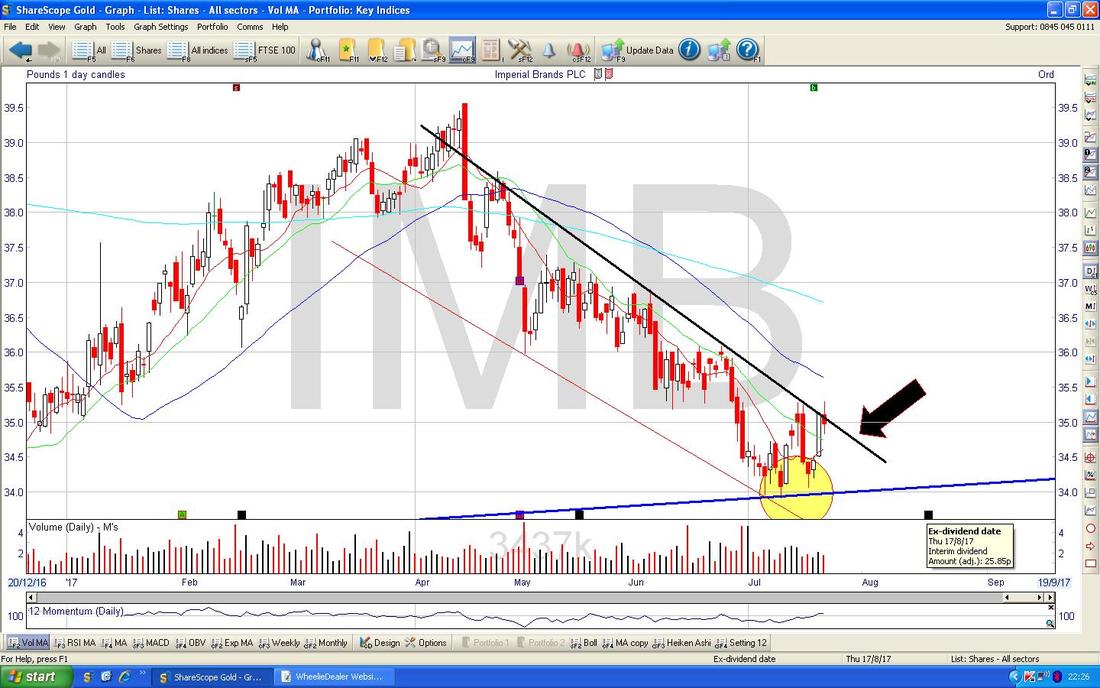
NCC Group NCC
This is one I am quite interested in myself because I want a CyberSecurity Pure Play and NCC has dropped a lot after getting into problems with Acquisitions and Rob Cotton the CEO has got the boot (a Change of Management is always something that excites me on a Recovery Stock). I am in no rush to Buy, but I thought a look at the Chart might give some hints at a Recovering Share Price. Note also that Investors Chronicle this week was still very negative on the Stock. This is actually very interesting - the big standout here which smacked me straightaway is how we are nearing a 50/200 Day Moving Average ‘Golden Cross’ which is where my Green Circle is on the Chart below. This kind of Cross usually suggests more gains to come and it looks like there is a new Uptrend Channel here as marked by my Parallel Blue Lines and note where my Yellow Circle is that the Price broke-out of the Black Downtrend Line back in Late March. From looking at this Chart, if the Fundamentals stack up, then NCC is a decent Buy now I suspect. 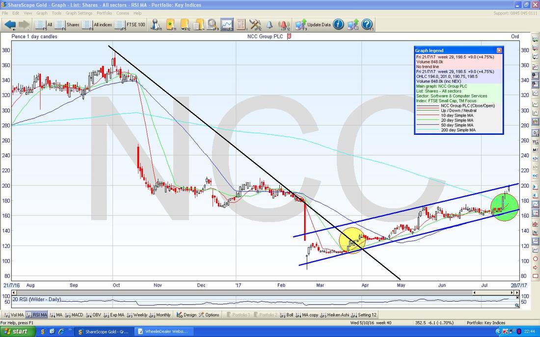
British Land BLND
I was reading about this one in Investors Chronicle today and it struck me that a near 30% Discount to Net Asset Value (NAV) and Forward Divvy of 5% might be good value. Anyway, that is for People to decide but the Chart situation is pretty straightforward as we have a very distinct Triangle as shown below between the Blue Line and the Black Line (with appropriate coloured Arrows). If the Price Breaks-out to the Upside through the Black Line then Bulls are gonna be well happy but if it drops down through the Blue Line then the Bears will be having a celebratory picnic. BLND has a lot of London Property and my hunch is that any periodic softness in Building Valuations will soon be reversed as London will always be a major Global City where Wealth will naturally gravitate towards. 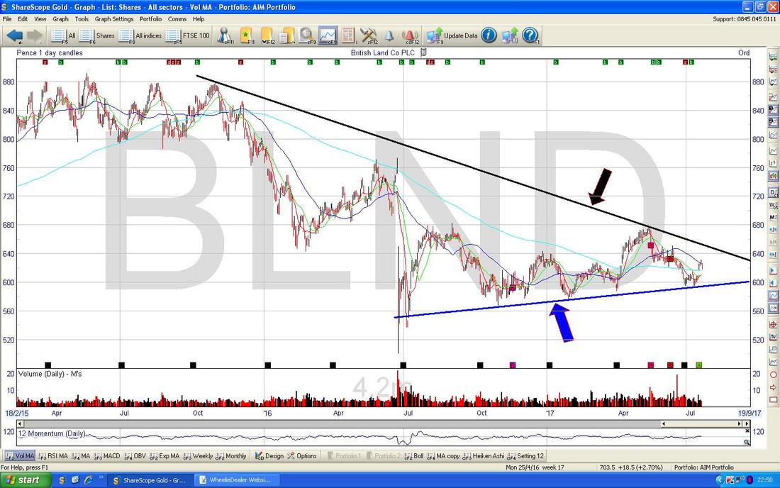
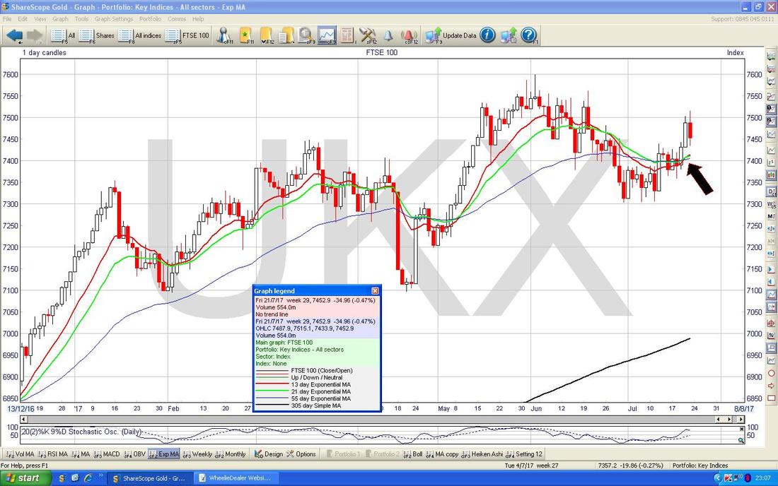
FTSE100
I reckon this looks pretty good. First off on the Chart below note how we are up above that Red Line (marked with Red Arrow) which just so happens to be the Bottom Line of the Long Term Uptrend Channel which I often show on my Weekly Blogs but I will skip this week. Anyway, it is really positive to be back firmly inside the Long Term Uptrend Channel. My Blue Arrow is pointing to the 50 Day Moving Average at about 7450 - this has acted as Support on Friday and can probably continue to do this. To the upside the All Time High at 7600 will probably be tough Resistance but a Breakout over this would be extremely Bullish as ever. 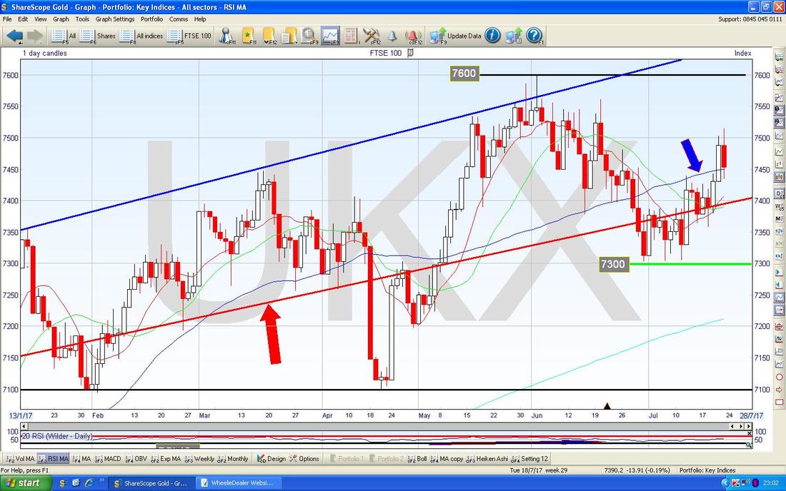
Another Bullish development on this Chart. This shows the 13 Day Exponential Moving Average (EMA) in Red and the 21 Day EMA in Green - where my Black Arrow is they have just done a ‘Golden Cross’ - this is great and suggests more Gains in coming weeks. If you look back, you can see where this has occurred before and what usually happens next.
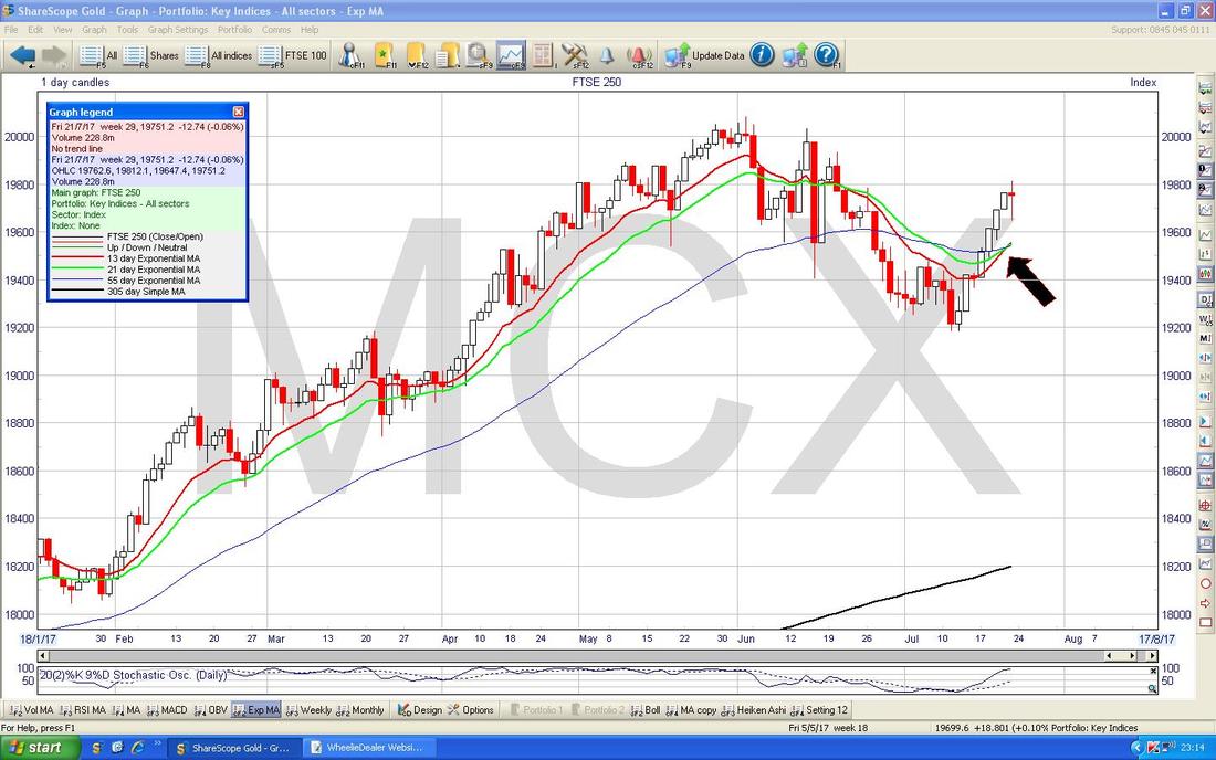
FTSE250
The Chart below is pretty short term and my Yellow Rectangle is capturing a ‘Long Tails Doji’ Candlestick from Friday - after a run up of about 7 Days this might be telling us that the move up is weakening and could reverse back down soon - but this looks to me like it can go higher. 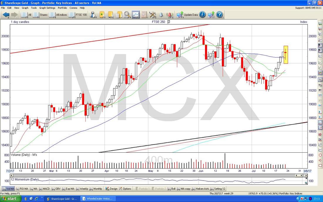
Like with the FTSE100, the Chart below shows a ‘Golden Cross’ between the 13 and 21 Day EMA Lines - suggests more Gains in coming weeks.
S&P500
First off here’s the Long Term Picture - a gorgeous Uptrend Channel since the 2009 Lows. 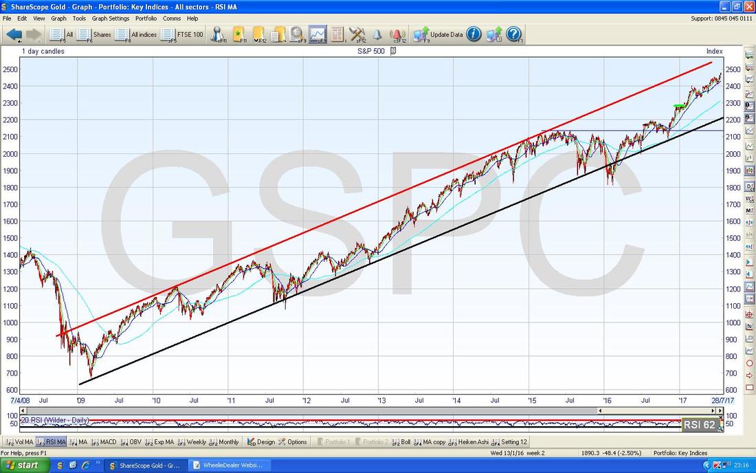
On the Chart below I have zoomed in on the S&P500 Daily and the simple fact is where my Yellow Circle is we made another New All Time High and this Chart is hugely Bullish still. We might get a Short Term Pullback but this Chart shows no signs of Topping Out yet.
The DOW and the Nasdaq Composite Indexes are very similar to this. 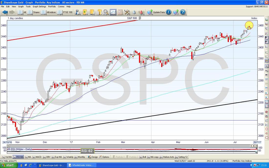
Pound vs. Dollar
A lot of the action here seems to be happening on a fairly ‘High Level’ view - the Chart below shows the Daily Candles for £/$ going back to around the Brexit Vote in 2016 and the key thing here is how the £/$ was in a Lower Range between 1.21 and 1.26 for quite some time but then broke-out into a Higher Range between 1.26 and 1.315 and then just over a week ago it broke higher again above 1.315 which is shown with my Small Green Circle. Last week the Pound dropped back and is back below 1.315 but after making the Breakout it seems likely the Pound can go back above it again - supporting this is the fact that the 200 Day Moving Average Line (this is the very faint Blue Line which is pointed at with my Blue Arrow) has started to turn up - this denotes an Uptrend. The ridiculously big Yellow Circle is showing a 50/200 Day MA ‘Golden Cross’ and this again is highly predictive of further gains for the Pound. Up above, 1.35 looks like difficult Resistance to get over and if it can crack this Level, then 1.40 is next - if these can happen, I suspect they will take time. In the very short term, there are more reasons to think that the Pound will continue to drop a bit (MACD, Heiken Ashi Candles, dropping off Upper Bollinger Band) - if so, this would support the FTSE100 most likely. 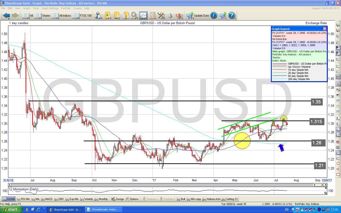
Brent Crude Oil (Spot)
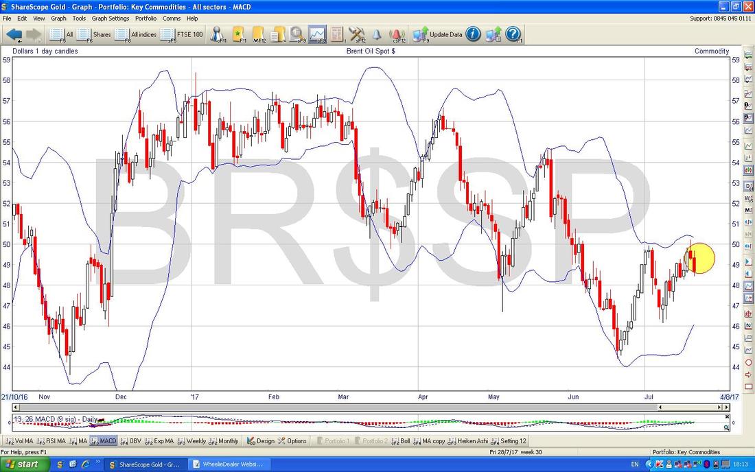
The Chart below has the Daily Candles for Brent Oil (Spot) going back about 8 Months ish. The thing to notice now is how the Price is struggling to get over the 50 Day Moving Average which is the Darker Blue Wavy Line which my Blue Arrow is pointing at. My Black Arrow is pointing to an ‘Inverted Hammer’ kind of thing from Thursday 20th July which hit Resistance Intraday at just over $50 - it seems likely that this is a Turning Point and Oil will head lower from here. Down below there is plenty of Support around $46 and then $45 and $44 - so we could be in a Range with $50 at the Top for a while maybe. 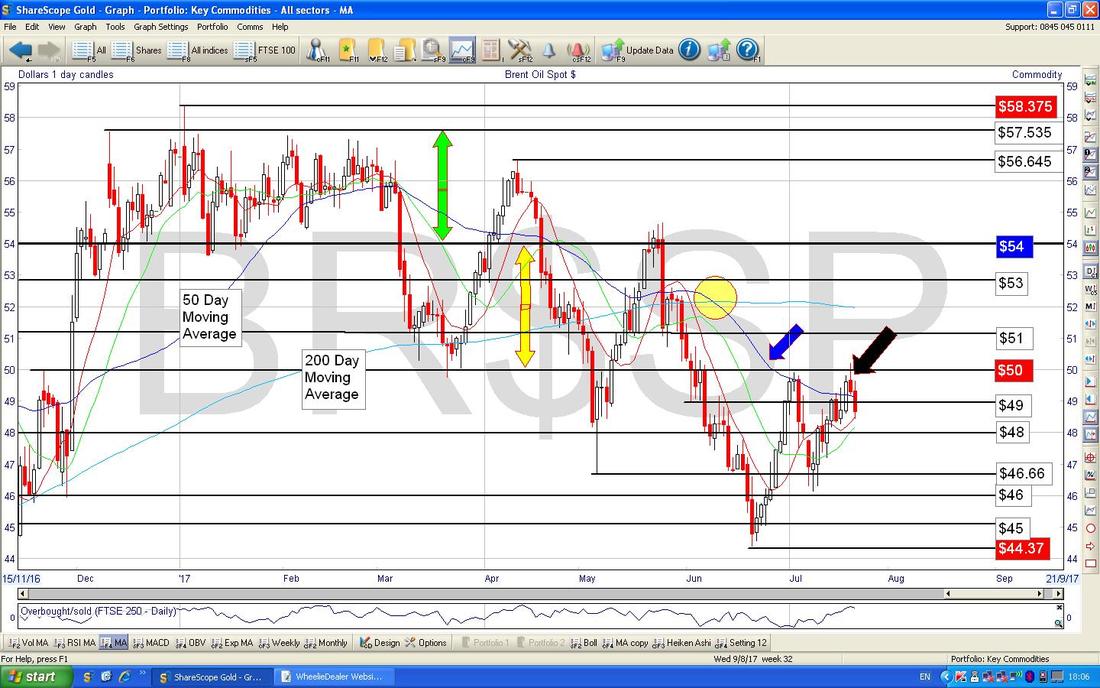
The Chart below has the Daily Price Candles with the Blue Wiggly Bollinger Bands above and below. My Yellow Circle is showing (hopefully) where the Price Candles are dropping away from the Upper Bollinger Band.
Gold (Spot)
First off here’s that infamous Big Picture which shows the Red Downtrend Line (marked with Red Arrow) which has dominated this Chart and called the Shots for ages now. Put simply, without a proper Breakout of this Line, Gold is gonna keep going down. 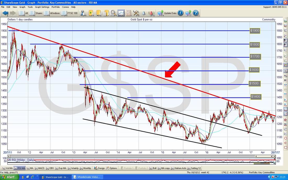
Zooming in on the Chart below, my Yellow Circle shows a nice Up Candle from Friday and we are nearing the Red Downtrend Line - can we breakout and sustain it this time though? (I say this because there was a ‘False Breakout’ back in June).
OK, that’s it for this week, I hope everyone has a profitable period ahead. Cheers, WD. 
0 Comments
Leave a Reply. |
'Educational' WheelieBlogsWelcome to my Educational Blog Page - I have another 'Stocks & Markets' Blog Page which you can access via a Button on the top of the Homepage. Archives
January 2021
Categories
All
Please see the Full Range of Book Ideas in Wheelie's Bookshop.
|
