

|
educational blogs |
|
THIS IS NOT A TIP. I AM NOT A TIPSTER. PLEASE DO YOUR OWN RESEARCH. PLEASE READ THE DISCLAIMER ON THE HOME PAGE OF MY WEBSITES. IF YOU COPY MY TRADES, YOU WILL PROBABLY LOSE MONEY.
You may have noticed that I picked up some more OPAY yesterday morning - I won’t do a detailed Blog here, but I just wanted to show you why I pounced. I haven’t had time to add the Trade to my ‘Trades/Portfolios’ page yet - but as usual, it was flagged in almost Real Time on Twitter and I put it on the Homepage ‘Changes List’ not long afterwards. OPAY has been in a Downtrend for quite a while and not really done much since I first bought in last year. I suspect this is partly due to fears over the launch of ApplePay which some people may think will be a big competitor for OPAY - it may be in the Handset Payment side of things, but OPAY is a much broader business than just that.
OPAY did a Rights Issue recently at 166p a Share to fund the Acquisition of a major Competitor, Skrill. With the current Price around the 262p I paid for my Topup, it is understandable that People who got Shares at 166p think they are being clever by Selling. Personally, I think they are plain daft and there is a lot of Upside to come.
With the Shares grinding down in recent months, I did get a little bit concerned - however, the Trading Update on 3rd July fully put my mind at rest. I have done lots of Blogs on OPAY - the first one here, is the best one to read to get a feel of what the business does, but of course it predates the Skrill acquisition (by the way, the enlarged group intends to apply for a FTSE250 listing) and the ApplePay launch. http://wheeliedealer.weebly.com/blog/my-rationale-for-buying-optimal-payments-opay Valuation As usual, all ScreenScrapes are from the brilliant ShareScope and taken from the prevailing situation as it was presented to me on Monday Night - the point at which I made my Decision to Buy more OPAY Stock. Long Term Readers will know that I try to make all Buy or Sell Decisions outside of Market Trading Hours - this gives me the advantage of objective Chart Patterns / Technical Analysis Signals but also, more importantly, means that I am making a cold, hard, rational (Mr Spock) Decision without being influenced by the constant Market Gyrations and silliness. CUT OUT THE NOISE. Part of the reason I bought more Stock was because the Share has done so poorly since I bought in - I wanted to take advantage of what I see as an Anomaly - other Stocks have rocketed since this time, OPAY has been left behind - for no good reason in my view. 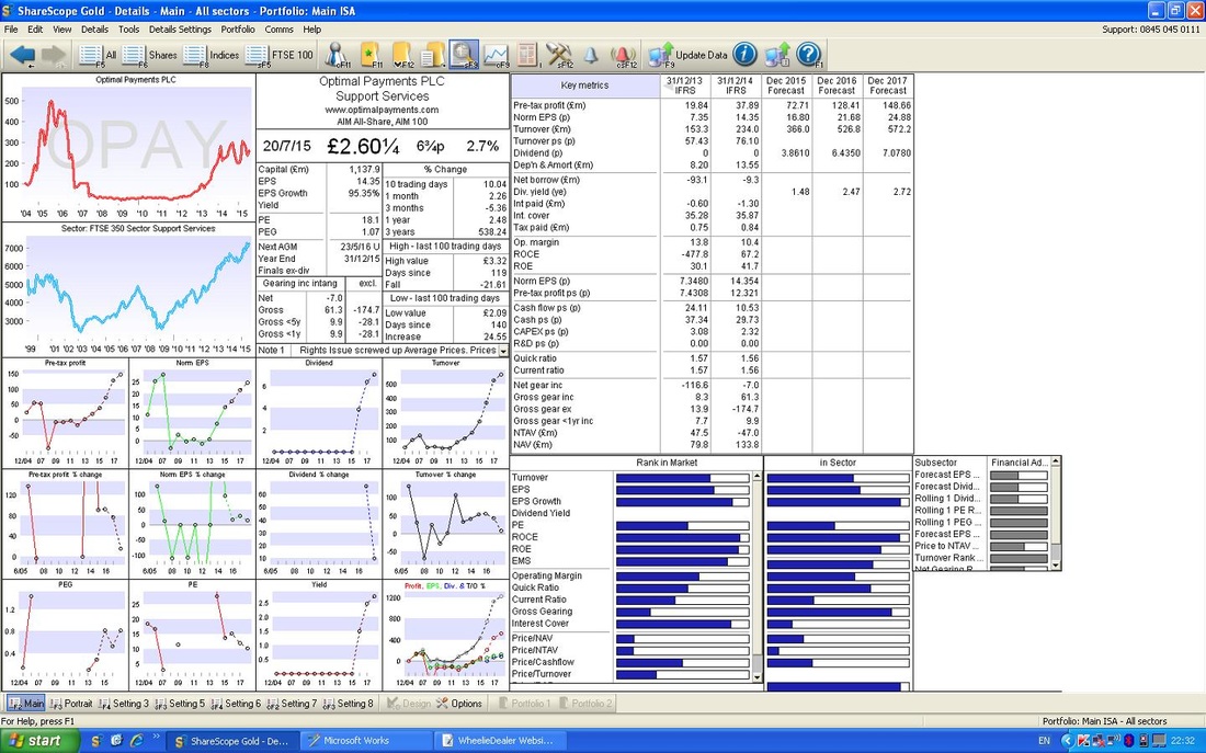
If you look at the ShareScope ‘Details’ Screen above, you should see ‘Dec 2016 Forecast’ ‘Norm EPS (p)’ of 21.68p for Next Year. On my Buy Price of 262p, this gives a Forward P/E Ratio of 12 (262p divided by 21.68p) - that seems cheap to me for a Good Company in a Red Hot Sector. For the year after, the Forward P/E falls to 10.5.
The Forecast figures look believable for such a High Growth business. From the Screen, for Dec 2016, the Divvy Payment is expected to be 6.4350p per Share. On my Buy Price of 262p, this gives a Dividend Yield of 2.4% (6.4350 divided by 262p multiplied by 100%). For the following year, this Divvy Yield should rise to 2.7%. So it’s a reasonable Divvy on top of an Undervalued Stock in a Red Hot Booming part of the Tech Sector - Mobile and E-Payments. In addition, this must be a Takeover Target for a US Tech Player on a bonkers valuation with expensive Stock to use as Capital………. Targets I see no reason why a P/E of 18 could not reasonably be applied here. On Next Year’s earnings of 21.68p, that would give a Target of 390p. But hell, this is one Hot Sector - why not a P/E of 22? That would Target around 475p. The obvious Chart Target (look at the First Chart below to get a feel for this) is around 350p. So, at a Buy Price of 262p, there is plenty for me to aim at here. I really would like to see 400p. Technical Picture As ever, I have bleated on and on about other stuff but my original plan was to do a very fast Blog just to highlight the Chart Breakout that made me buy !! If you look at the Chart below, you should see a Long Term Chart with a nice Uptrend where the Black Line marks the Bottom of the Channel. My Blue Arrow points out that the Price has move up off the bottom of this Channel. Remember, in Charting, always start with the Long Term Picture, and then drill down. 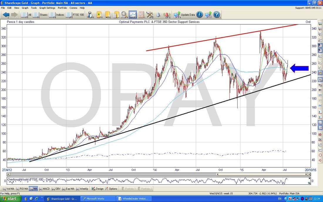
Right, the Chart below is of just 2015 really - and this is what I wanted to show you with regards to the Breakout and the reason for this Blog.
You should see the Parallel Blue Lines (Top Line marked with the Blue Arrow) that mark the Downtrend Channel since the Rights Issue was announced - the Key thing is that my Green Arrow points out where the Price has now moved out of that Channel (that is the ‘Breakout‘). You may notice that the Price had moved out of the Channel on Monday with a little White Candle - however, I wanted to be really sure the Breakout had occurred before I made my move - sometimes it’s worth missing a small part of a move up just to be that much more sure you have got it right. Monday’s move up could easily have been just an ‘Overshoot’ or a ‘False Breakout’. 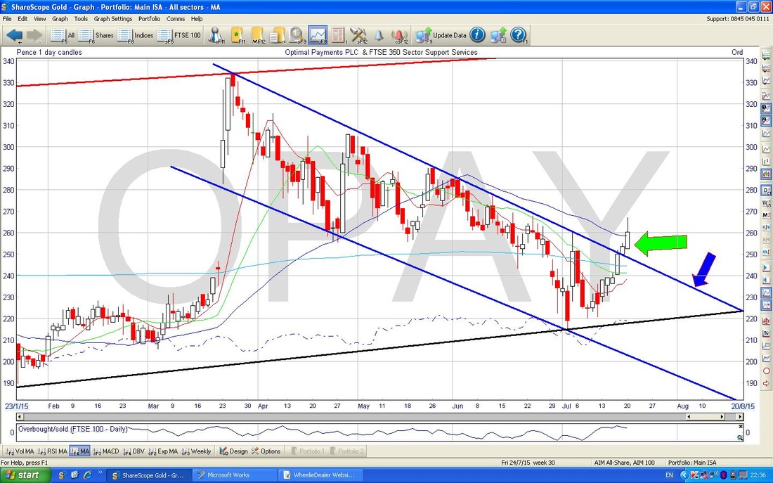
In the Bottom Window on the Chart below, you should see the Relative Strength Index (RSI). My Red Arrow points out that the RSI is now moving up and has passed through 50 (I am told this is a good thing !!) and with an RSI around 53 ish, there is lots of room to move up before it becomes ‘Overbought’ when the RSI gets up around 70. I love this Indicator.
That’s it. Hope you are all doing swimmingly, WD. 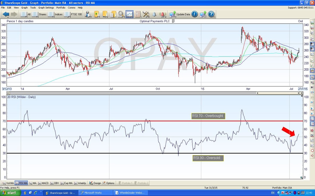
0 Comments
Leave a Reply. |
'Educational' WheelieBlogsWelcome to my Educational Blog Page - I have another 'Stocks & Markets' Blog Page which you can access via a Button on the top of the Homepage. Archives
January 2021
Categories
All
Please see the Full Range of Book Ideas in Wheelie's Bookshop.
|
